Every year, new trends are introduced in video presentation designs. Some trends that are good have been adapted into the standard for video presentation while those that only add aesthetics are usually the ones that change every year. It is important to consider these design trends if you want to use your presentation as a powerful sales tool for your marketing campaign. The following are the top 8 presentation design trends in 2019. ![]()
1. Scrolling Effect

A recent trend is to create a continuous scrolling effect on your presentation. The effect gives the impression as if you are scrolling through a web page. You can do this by using a slide template that has built-in animation. The continuous flowing effect can encourage the audience to pay attention to your slideshow. It works well, especially if your slideshow has some graphics that tell a story to market your product.
2. Flat Presentation

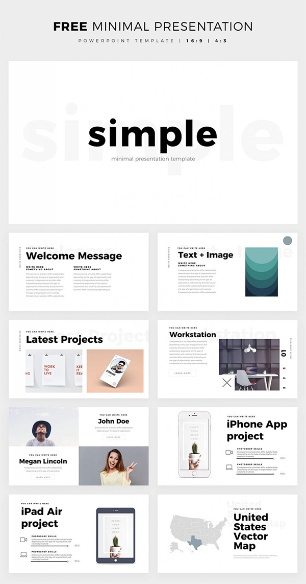
The Flat presentation is not a new trend and it has been around for many years. This type of presentation focus on a minimalist design for the slides. It does not involve the use of any 3D graphic object to capture the audience’s attention. Instead, it emphasizes on highlighting important information with bold formatting or unique fonts. It allows you to convey your message to the audience without distracting them to the graphics.
3. Use Actual Photo

Many people prefer the convenience and choose to use a stock photo for their presentation background. The downside of using the stock photo is that the same photos are being downloaded many times. Therefore, if you use these photos, your presentation will not appear unique. Instead of using stock photos, you should use the actual photos of the object that you are talking about in the presentation. Before using the actual photo, make sure to touch up it and add some details to make it look more interesting.
You can use the free image editing app on Instagram to edit your photos. Using real images is the key to stir up emotions in the audience. Stock photos show people who aren’t really associated with your product but you can take your own photo of customer who has really used your product. As you can see, the difference here will add genuineness to the photo and increase the likelihood of people buying your product.
4. Include a Playful Graphic or Draw Your Own Illustration

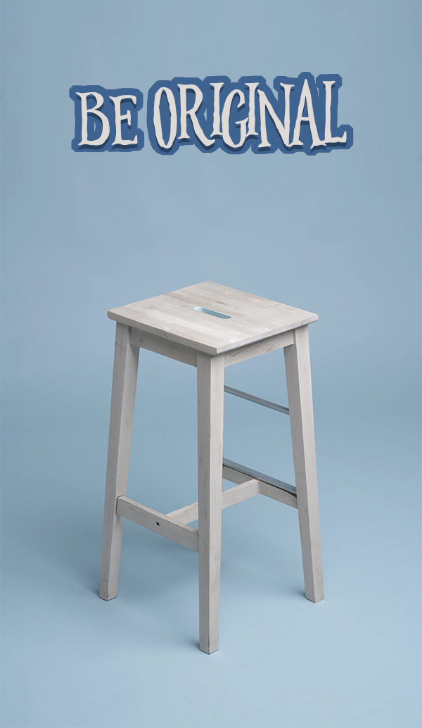
If you don’t want to use the actual photo, just use a background with a solid color and then incorporate a playful graphic plus a small block of text to convey your message to the audience. You can use your drawing skill to add a creative touch to the photos you use in the presentation. For example, you can use your drawing tablet to draw a custom illustration. After that, you can transfer the graphic to your computer to use in the presentation.
5. Handwritten Text

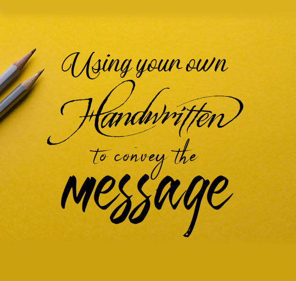
Handwritten text is increasingly popular in video presentation trend. No font will look like your handwriting. Consumers are wary from buying the product from sellers that use impersonal marketing campaign. Using your own handwriting to convey the message can give a personal impact on the people who are viewing your presentation. There are lots of handwritten fonts to choose if you prefer not to use your own handwriting. In addition, you can add hand-drawn icon to the presentation to compliment with the handwritten text. Examples of hand-drawn icons are arrow, and social media.
6. Using Typography in a Creative Way

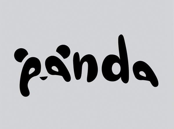
Another way to get your message across to the audience is through the creative use of typography. The size, arrangement, and spacing of the fonts can influence the impact you make on the audience. If you want to use two fonts, make sure they are not from the same classification. It is best to stick with using only one font in your sales presentation.
If you keep using the same font in your typography, you will eventually master it and know how to use it for your marketing campaign effectively. One place where you can find a lot of free professional fonts for commercial use is Google Fonts. The type of font you choose must have good readability and the color of the font must be in contrast with the slide background.
7. Align Your Presentation Text to the Left

Many people like to align their text in their presentations to the center because they think center alignment can attract the audience attention. Actually, center alignment is the weakest position for getting the audience’s attention. The reason is that most text you read on newspaper, books, magazine and web page, they are aligned to the left. So, it is best to align the text of your presentation to the left if you want people’s eye to be the focus on it. The first paragraph line should not be indented.
8. Add Retro Font or Background Image in Your Presentation

There is a trend on including retro style in a sales presentation. Retro may look old fashion but they can add a cool look to the presentation. You
can use a retro font with the 1920’s – 1960’s style. You will want to make the design of your presentation compliment with the retro font in some way. If you don’t want to use retro font, use a retro image as the presentation background instead. You can use the filters in the photo editing software to make your photo appear washed out.
Conclusion
In video editor for Mac, you can add a retro style to the video by adding the retro filter. First, you must open the video by dragging it to the timeline. When the video is load on the video track, select the filters tab which has a magic wand icon and goes to the Retro section. In the Retro section, you must select an appropriate retro filter and drag it onto the video clip to add it. A star icon will appear after you have applied the filter. When you click on the star icon, you can see a list of filters you’ve applied onto the video clip. If you want to delete a filter, just select it and press the Remove button in the pop-up filter list. Finally, don’t forget to press the Export button to save the retro effect you’ve just made on the video.
