#4 Give certainty
When designing a form, we should present users with all the information they need so they can navigate the form easily. Don’t keep them guessing or be ambiguous.
The achievement of the goal should be clear and leave the user with the feeling that the task is (really) done.
When examining the previous form we noticed that the closure of the form was a bit unclear.
There was an inline scroll box with a confined privacy statement, which introduced needless friction. This design pattern can be convenient to fix space problems but it adds extra complexity: there is a lack of overview of content, and most operating systems hide non-active scroll bars. It is not very intuitive and not savvy users can miss information.
We also discovered that users can’t make changes after submitting a funds request. This rule could be a surprise to some form-fillers. Since the user can’t reverse the ‘submit’ action we thought it was important to highlight this.
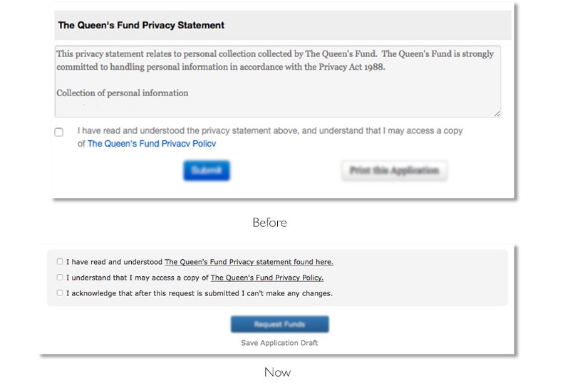
Fig 6. The closing section of the form should be simple.
To improve the closing section, we removed the inline scroll box and opted for a ‘bulleted list’ of checkboxes of all the conditions that had to be met before submitting a form. A compact, clean and simple solution that makes each item stand out and easy to scan.
We also included a checkbox note to remind users that they can’t make changes after submitting an application. This will invite users to pause and review their submission before they commit.
Insights from testing sessions
One of the issues raised by users after the launch, was that they had limited time to complete the form. Form fillers had to complete the application in one go. Sometimes users had to, however, interrupt the form filling task to conduct further client research.
There should be an opportunity to continue the conversation ‘later’. So to ‘pause’ the conversation we added ‘saving draft’ as a secondary option (see Fig. 6). Now the form filler has the certainty that the effort they put into completing the form will not be lost.
#5 Provide a sense of closure
We tend to end conversations with a clear intent: “I will shoot you an email”, “I will bring dessert” or “See you tomorrow”. No clear intention creates confusion: “You hang up… No, you hang up… No, you do… Ok… no, no you hang up…”.????
One of the 8 rules to design better interfaces by computer scientist Ben Shneiderman is to “design dialogue to yield closure”. On form design, users should be guided through a process that leads them to achieving a goal. Hence, we have to provide a sense of achievement. This can be a feedback message: “Room successfully booked”, or it can be a clear call to action (CTA) related to the ‘conversation’ they are having with an organisation.
“Sequences of actions should be organised into groups with a beginning, middle, and end.”
~Ben Shneiderman
If we conceive forms as conversations with users, they should end with intent. For the conversation to flow fluently, we should direct users to take specific actions. So we can’t be vague and should avoid unexpected surprises.
In our case the previous form included two competing CTA buttons. There was “Submit” and “Print this application”. At this point users won’t know if they can print the form after they hit “submit”, or if they print, will the page refresh and lose all data?
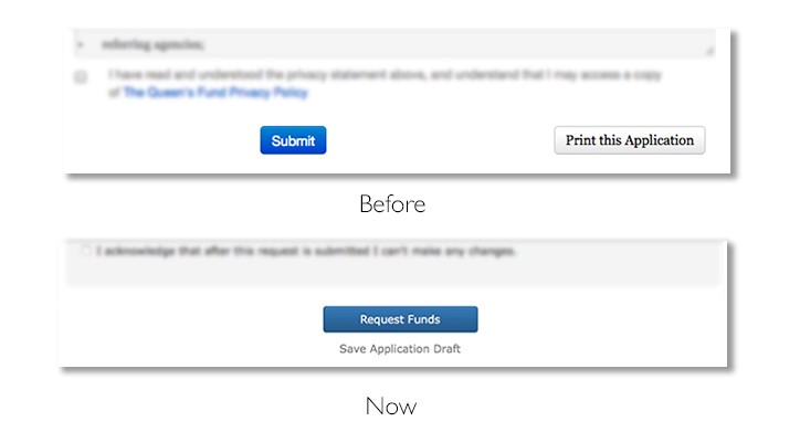
Fig. 7. Two competing CTA buttons can create unnecessary confusion. However sometimes more than one CTA is needed, in such scenario use very distinctive options to avoid competition.
To improve this, we moved the “Print this application” button from the application form page to the following confirmation page. This flow is familiar to most users. Users print their concert or plane tickets after they hit the “buy” button, never before.
After removing the print button, the “submit” button got a prominent and centred position. Still there was room for improvement.
A CTA button is action-orientated, it should describe what it does. This makes them more meaningful. It should “state the intent” and a generic “submit” wasn’t doing that. So it was changed to “Request funds”(see Fig. 7). As usability expert Jared Spool would say, it describes exactly what “that link is going to deliver”. Bringing certainty at the end of the journey.