Auto Layout is one of the most powerful features of Figma and today we will be creating a card design inside Figma using Auto-Layout which will be fully responsive, i.e would respond to the screen size.
Before we get started, there are 3 main things we are talking about in this article.
3 Main Things
- Auto-Layout: Auto-Layout is one of the powerful features in Figma that you can add to frames and components. It lets you create designs that grow to fill or shrink to fit, and reflow as their contents change. It also helps you keep consistent spacing along frames and components as you add or remove content.
Suggested (Watch this): You can know more about the functionalities of Auto-Layout by watching this playlist on youtube created by the folks at Figma itself.
But if you already are familiar with Auto-layout then, let’s continue. - Responsive Design: In straightforward words, Responsive Design is Design that responds automatically to any specific changes, for eg. Changes in the size of the screen, adding or removing content, etc. Now, that definition is just to set the stage here, Responsive Design in itself is a pretty technical and prominent term for UI/UX Designers as well as Developers.
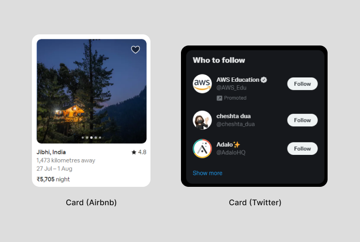
- Cards: By the words of Material Design, “Cards are surfaces that display content and actions on a single topic”. For eg, For a renting platform cards can be used to show pictures of the house and its specific details such as location, distance, and price.
Now that the stage is set, let’s start working on our card design.
What would we create?
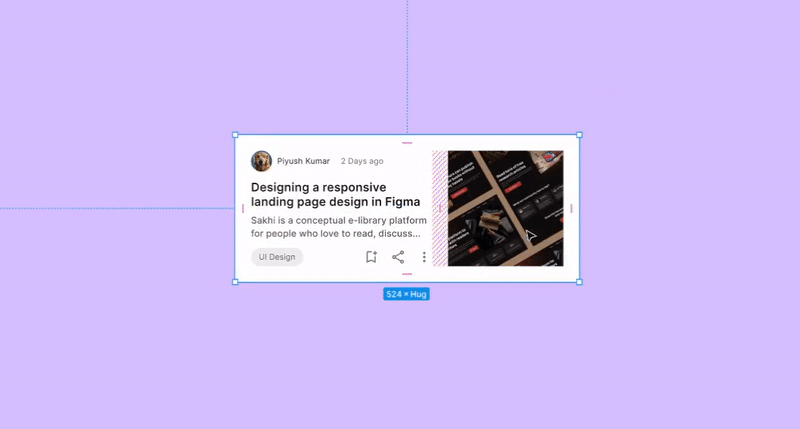
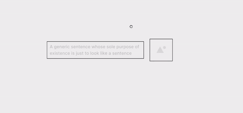
So, we will be looking at a blog card design inspired by medium’s design but I tried to keep it simple for better understanding. But, if it (image below) feels overwhelming, bear with me. I will try my best to explain the concept.
First, we will be looking at all the individual atoms (single building block-reference to the book: Atomic Design) making this card component.
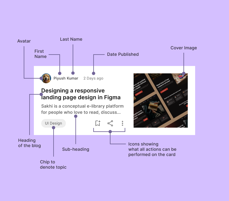
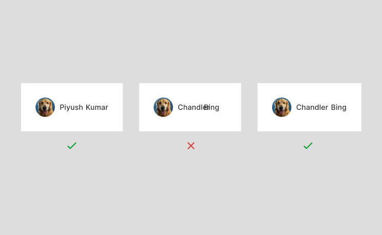
What is shown in the image above ^are all the individual elements making up the card component and we have to set a system for them to react how we want them to respond to any kind of changes. If you’re following along, I would suggest having your individual elements ready as well. Let’s simplify it even a bit further.
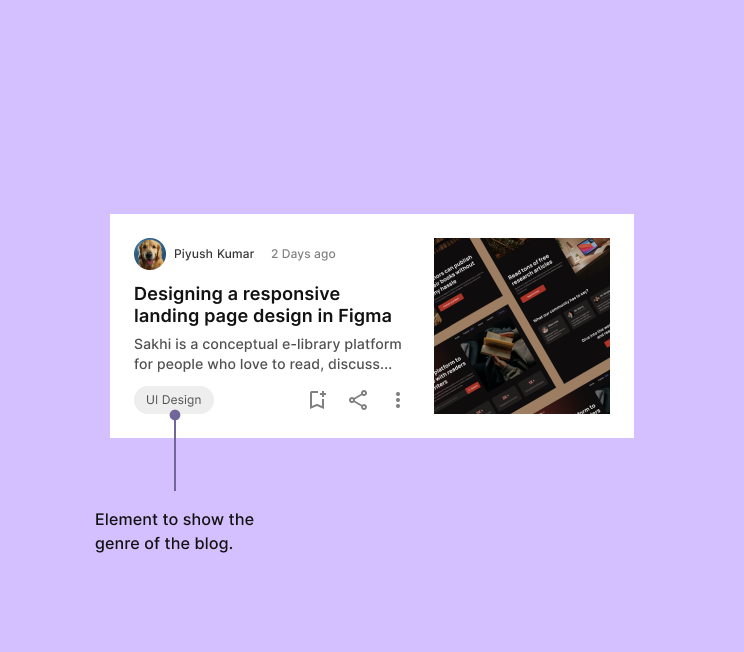
Now we are looking at elements or atoms combined to make a molecule. For example, if we combine avatar, first name, and last name, that makes up a molecule to where a user can identify the author of the blog or article. (1st box in the image above)
2nd box is a way to tell users how recent or old the article is for them to decide whether they want to read the article or not.
As I’ve simplified the design now, we have 7 significant elements to look at, let's look at them one by one and try to understand how they should behave.
Breaking down the Card Design
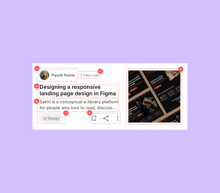
Author’s Section
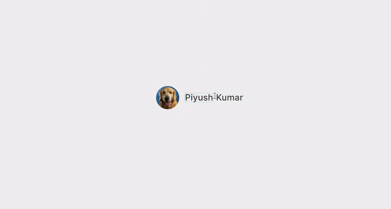
The first is our author section which contains an avatar, first name, and last name. Avatars would be adjusted and updated in the circle which would not hamper vertical or horizontal space. What can affect the horizontal spacing are first and last names. It only makes sense for us to design a system where when changing the first and last names, the spacing stays consistent and does not run into each other.
One way to accomplish this is by using Auto-Layout. If the first name is one input field and the last name is the second input field, we can add auto-layout by selecting both input fields and pressing shift + A on your keyboard.
This will constrain the text input fields to have the defined space between them in each case. As the space is constrained, there is one more parameter we need to define for auto-layout and that is how an element would behave. It is called Resizing.
Basics of Resizing in Figma
Resizing is basically what it sounds like “Re-Sizing”. It defines how a particular content would behave after some changes. There are two types of resizing in Figma, horizontal resizing and vertical resizing.
- Horizontal resizing: How the content would behave horizontally.
- Vertical resizing: How the content would behave vertically.
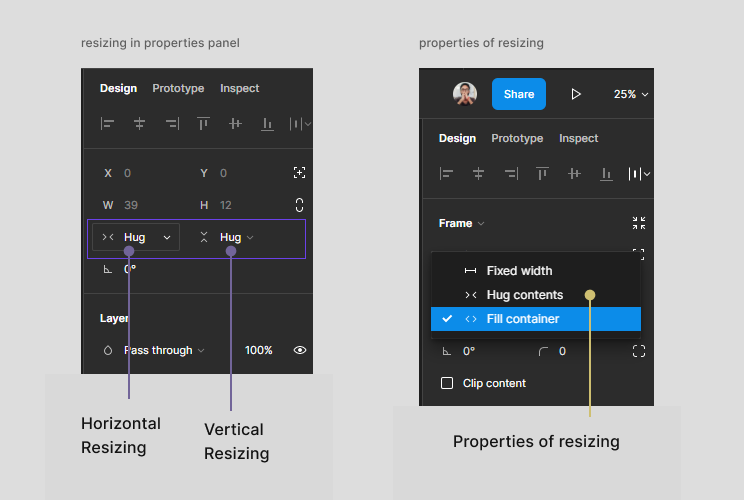
There are 3 parameters that we can set for resizing.
- Fixed Width/Height: As the name sounds, the content’s width/height would be fixed and we will have to define width/height.
- Hug Contents: As the name sounds, the content’s width/height would not be fixed. It would depend upon the content, so the width/height would change as the content changes.
- Fill Container: As the name sounds, the content would fill whatever container area is specified for it.
Suggested (Watch this): You can know more about resizing and its properties by watching this 4 min video for a better understanding.
Now as we have added auto-layout to both the input fields, it’s time we specify the space that Figma should maintain between them and their resizing properties.
As for spacing, I followed a 4px spacing grid. You can also follow 8px or 2px spacing grids. It’s up to the designer’s decision.
Now as for first name and last name, we don’t want a fixed width because character lengths can be different, fill container would also not make sense otherwise name would take the full container’s width and we don’t want that. We want our text to hug the contents with the space assigned. So Hug contents would make sense.
We also want our Author’s section to be left aligned to the screen so the text fields should also be left aligned.
Summary of Author’s section
- Select the first name text field and last name input field and add auto-layout to them.
- Left align the texts.
- Specify the space between them, in my case, it was 4 pixels.
- Specify their resizing properties as (Hug x Hug).
- Select the newly created frame and avatar image and add auto-layout to them making sure the distance between them also stays the same.
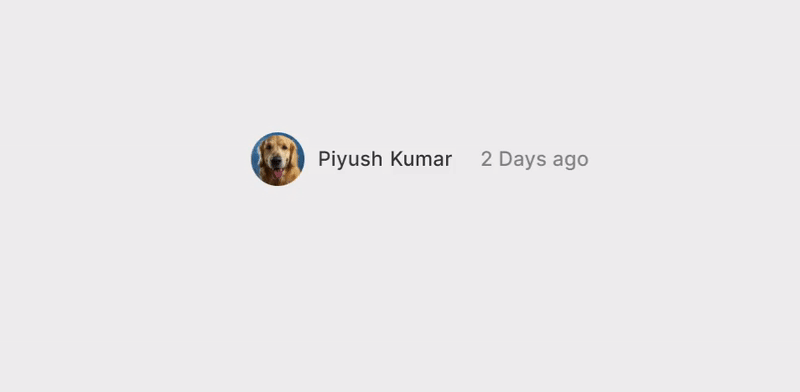
Date Section
Our 2nd element is the date the article has been published. I would like the date to follow along with the author’s section. It means as the name characters change, I would like the date to grow or shrink with it. It’s a design decision, you can also align the date to the right side. But, I wanted it to tag along with the Author’s Profile.
How do we do that?
We have Author’s profile section and we want the date to maintain consistently defined space, which means we use Auto-Layout.
- Select the Author’s Frame and the date and add Auto-Layout to them.
- Set the resizing of the date and of the new frame created to Hug x Hug because it can change.
- Define the space to be maintained by Figma. (16px in my case)
Heading & Sub-heading
Our third element is the Heading and our fourth element is the sub-heading of the Blog. Headings and sub-headings can get pretty big. So we will have to think of a system that handles dynamic texts like a charm. So what can we do? Yes, you guessed it. We are pressing Shift + A, but this time with some slight changes. This time I want my texts to take up all the space excluding the image and the space that is to be maintained. In simpler words, I would like it to fill the container, in that way, if I shrink/expand the card, the texts would shrink/expand with it.
- Take the heading and sub-heading and add Auto-Layout to them, but because they’re stacked vertically this time, Figma would automatically create a vertical Auto-Layout, which is exactly what we want.
- Take both the texts and set the resizing properties as Fill x Hug, because we want the text to take the entire horizontal space and we want it to hug contents on vertical space to maintain the defined spacing.
- Select the outer frame and set its resizing properties to fill x hug as well.
The topic of the blog
Our fifth element is a text which shows what a particular blog is about (looks like a chip). Topics can be dynamic as well, so we will have to keep this element dynamic which means as the content changes, it should also change.
We also want to stick towards the left and grow only towards the right, where there is space.
So, let's create it.
- Take the text and add an Auto-Layout to it.
- Add a fill or stroke as you wish.
- Left Align the text.
- Give horizontal and vertical padding as you wish.
- Set the resizing properties to Hug x fixed because we want the text to hug horizontally but the height should be fixed, so fixed height on the vertical axis.
The Icons
The sixth element of the card component is the icons. They represent what actions are possible for the card such as bookmark, share, etc. We will also add an Auto-layout to the icons so it’s easier for us to manage them, add or remove or change positions of them while managing consistent spacing all along.
- Select all 3 icons and add Auto-layout to them.
- Specify the distance between them through the Auto-layout properties box.
- Set the resizing properties to hug x fixed.
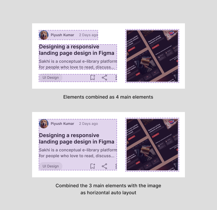
Now, we have one frame for Author’s section + Date Section. Second frame for Heading and Sub-heading. We will create one more Auto-layout frame combining the topic and the icons. We will specify the Space between them as “Auto”. This way when the card's horizontal length increases/decreases, the space between the topic and the icons changes.
Adding in the Image
Now we have 3 major frames all stacked on top of each other, we will add a vertical Auto-layout to them so that they maintain the defined space between them. Now, as all the content is under one frame, we will have to add just one more Auto-layout to maintain the space between the content and the image.
As we do this, we can add some padding across all the sides and create a functional responsive card with Auto-layout in Figma.
This was all about creating responsive cards with the help of auto-layout in Figma. I hope this article helps you in designing better card components. Happy Designing :)
How to create responsive cards with the help of auto-layout in Figma? was originally published in UX Collective on Medium, where people are continuing the conversation by highlighting and responding to this story.