Of all the ways to make money on the internet, eCommerce is one of the most popular. Selling products online is much more cost-effective than in a brick-and-mortar store. Even sellers who do have physical locations recognise the importance of using online revenue channels. When you decide to sell products online, the design of the website on which you sell them is of utmost importance – it directly impacts the user experience (use these sites as UX benchmarks).
The website isn’t just the channel through which people will purchase your products. It’s also how they find them and what they use to decide whether to buy them. It’s your shop-front and your sales funnel, as well as your check-out. There are many essential elements you should include on your eCommerce website. Make sure you consider the things below for eCommerce web design.
Conversion Optimisation
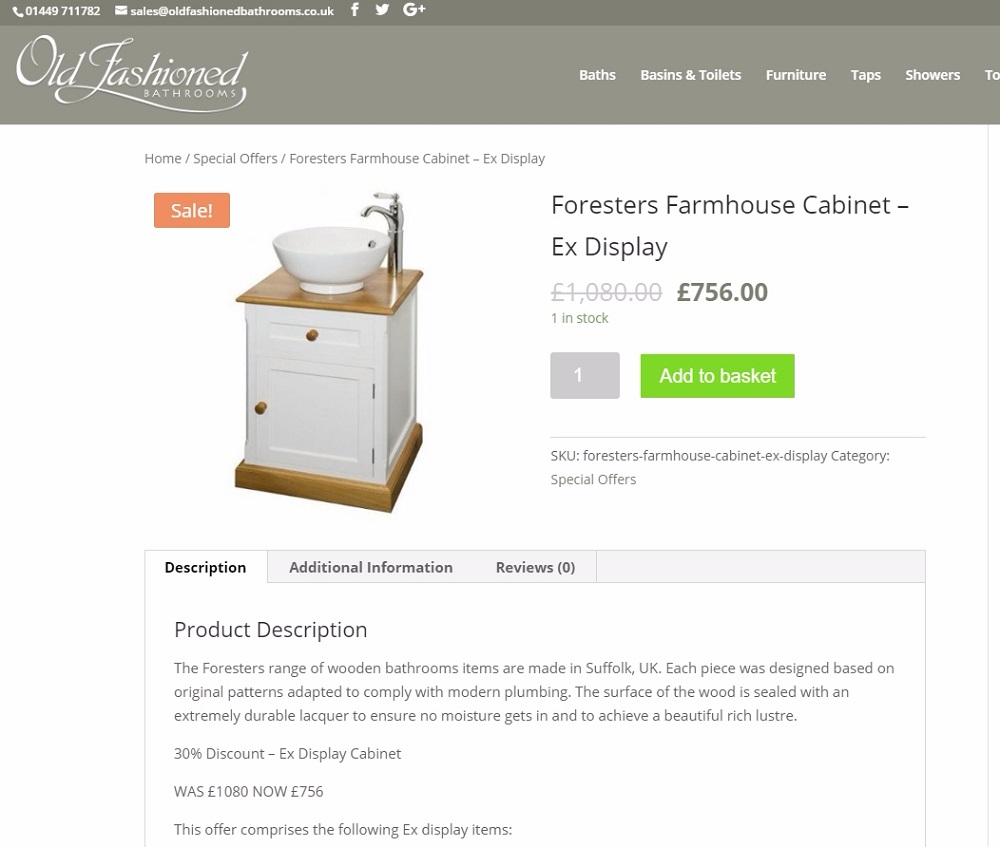
Your conversion rate is clearly a key metric that you should keep in mind at all times. You will probably have a number of different conversions types. A sale is one of them, but there are other actions you can regard as conversions too. These might include signing up for your newsletter or creating an account. Optimising conversions involves a range of different methods you should apply to your site. One of the things you should think about is your sales funnel, and how you lead your customers towards making a purchase. An example of how you can do this is using attractive links that take people down the right path. Another way to improve your conversion rate is to make the purchase process easier.
The above image is taken from Old Fashioned Bathrooms. The green button might look out of place but it certainly draws the visitors eye to the right place.
Simplicity of Checkout and Purchasing
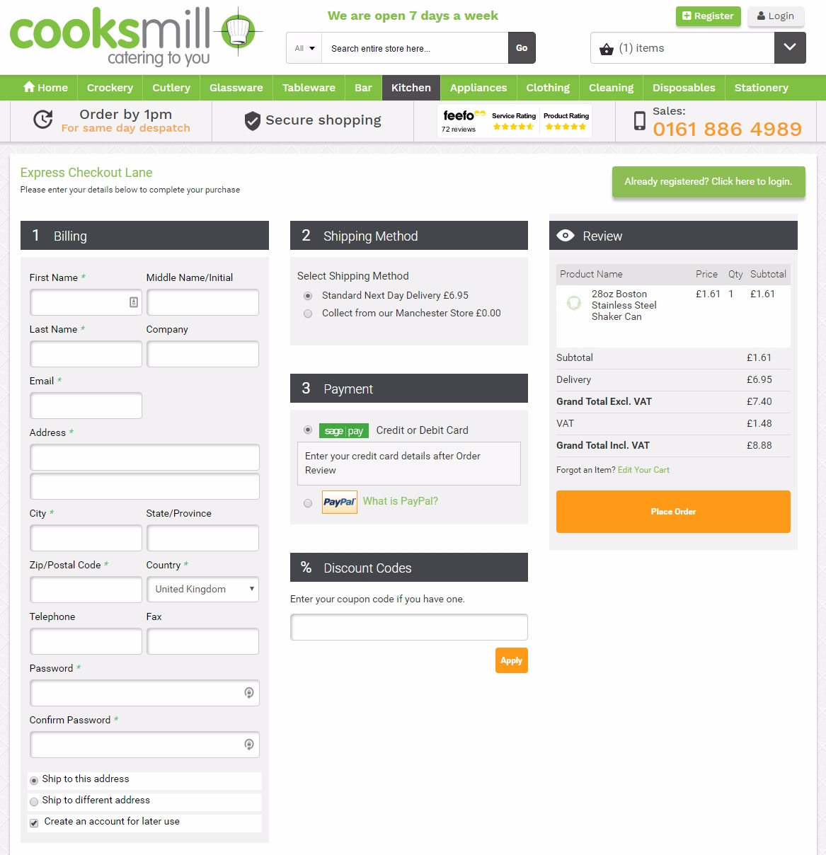
People can easily give up on a purchase if it’s taking them too long. If there are too many steps or they encounter problems, they can go somewhere else. Cooksmill.co.uk use a simple and clean one-page checkout to increase conversions.
So making your purchase and checkout process as easy to use as possible is an essential thing to do. There are several ways you can do this. One of the first things you should think about is whether you need your customers to register. It’s good if you can get them to create an account, but do you want to lose a sale because they don’t feel like it? Allowing checkout without having to sign up or log in makes it easier to navigate.
Before reaching checkout, there are ways to make the process easier too. For example, you could include a hovering tab from the cart when an item is added to show a subtotal.
Rich Media
Rich media is one of the things that will improve the design of your eCommerce website. First, you need to understand what it is. The term refers to advertising that uses video, audio or other advanced media to create interactive content. Rich media on your eCommerce site could include having product videos on each page. These videos could be a demonstration of how to use the product or an in-depth view. Other types of rich media you could use include have a 360-degree virtual image of the product. Customers can click and drag to rotate the product they’re looking at and see it from all angles.
Out of Stock Products
What should you do when a product is out of stock? Removing it from your website isn’t convenient if you’re going to have more stock soon. But if a customer wants it and it’s not there to buy, you might have lost a sale. You could choose from a couple of options to add to the design of your site. One of the things you can do is have a button so people can be notified when something is back in stock. Another option, if you want to go a step further, is to have a pre-order button. They can place their order so that it can be delivered to them as soon as you have the stock. Both of these options mean you can get the customer’s email address if you don’t already have it.
Mastering Calls to Action
Your calls to action are a vital part of the design of your eCommerce website. Choosing where to put them, what they should look like, and where they lead is important. You should spend time testing out locations and appearances to see which ones work best. You don’t want to hide your call to action somewhere it won’t get noticed. Many designers find that clear and attractive buttons are often most effective. But you need to be careful to keep your design clean and tidy too. Consider the different elements of your button, from size and colour to font and positioning – here are some great examples of CTA’s done right.
Add a Search Function
Allowing your customers to search for what they want is essential. If you don’t include a search function, they will have to guess at where to find what they want. It’s easy to add a search bar to make it easy to find your products. It’s also more helpful if you provide the option of filtering results. For example, if you sell clothes, there could be a range of features customers will want to filter by. Some of them include size, colour, brand, and style. Of course, as well as a useful search function, your products should be categorised well too. Here’s a great piece of information on optimising site search.
Avoid Customer Drop Offs
One of the perils of running an eCommerce site is the risk of abandoned shopping carts. Customers don’t always leave before checkout because they don’t want the items anymore. There are many reasons why the might leave and want to come back later. They might want to think about the purchase a bit more, for example. Perhaps their computer or browser crashed, and they forget to come back. There are elements you can include in your site design to help them out. Firstly, you can save their shopping cart, so the items are still there when they come back. You can also email them to remind them they were partway through the sales process.
There are many elements to a successful eCommerce website design. Getting it right is an ongoing process, involving plenty of trial and error.
Author bio:
Matt Janaway is a digital & online entrepreneur and marketer, specialising in the retail & eCommerce arena. He has built, purchased, optimised and sold in excess of 10 eCommerce businesses with multi-million pound revenues and he’s now heading a team project optimising 30 websites with over 20,000 products. He considers his methods, scientific and incredibly advanced.

