When designing modern websites, it is important to bear in mind the criticality of creating a well-balanced, user-friendly form as visitors make their first impression about a business by looking at their online portal. In several cases, the design of the form can make or break the future of the website.
User experience plays a crucial role here. Visitors want more than just a good-looking website with strong code. They want an experience where they’re guided along their path, tipped off on what is to come, and promises are delivered. They expect the same with forms as well. The best forms do all of this with minimum or no glitches.
Needless to say, users use forms with a concrete purpose – to procure information, buy a product, or register for a service; and they want to see tangible results for the effort they’re putting in.
Understanding a Web Form
Before getting into the nitty-gritty of what an effective form constitutes, it makes sense to understand what a web form (or a form) actually is.
Wikipedia defines a web form as, “A webform, web form or HTML form on a web page allows a user to enter data that is sent to a server for processing.”
As per Techopedia, “A web form, also called an HTML form, is an online page that allows for user input. It is an interactive page that mimics a paper document or form, where users fill out particular fields. Web forms can be rendered in modern browsers using HTML and related web-oriented languages.”
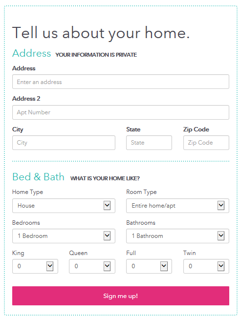
It can, therefore, be understood that forms are made of several fields and provide multiple options. Users can input various data and even use it to search for a keyword. They make for a suitable tool to gather and monitor information from website visitors, thereby playing a big role in helping businesses achieve their goals.
There is a fine line of difference between an effective and an ineffective form. Almost all its features, like its placement, the size and the color of the buttons, have bearings on the form’s output. This is the main reason why there are no hard and fast rules for designing web forms. However, you can count on the following dos and don’ts to get some great results.
Dos
Consider Where You Place Your Form
When designing a great form, you need to keep the user in mind. More often than not, forms are ineffective not because of poor design or copy, but because they’re not placed where they should be. The flow plays a major role here.
If you’re placing a subscription form, for example, it needs to be placed close to the CTA on the webpage. This creates an intuitive flow and users feel well-guided. If your users can stick to the flow you provide, you will be able to convert them without much effort.
Use Contrast to Your Advantage
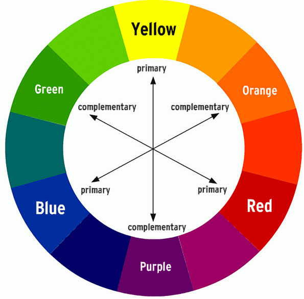
Guiding your website visitors to your form isn’t enough. You also need to make sure that the form stands out on its own, to begin with. The look of the form should convey to the visitors that they’re expected to fill it out. Using colors is a great way to convey this. You can use contrasting colors to do this.
The contrast effect can work well because placing a primary and complementary color together will help the form stand out. Placing a light-colored form over a dark-colored background (and vice versa) will not only look attractive, but also help it get instant attention. Also, limiting other page components and/or text in the same periphery will focus visitors’ attention where you want to.
Use Legible Copy and Content
Your form is probably made of a lot of text, which is why it is important that it is impactful and legible. Make sure that these qualities are consistent throughout the form. Copy is not just about the text, but about other elements like the fonts, font colors, font size, the background, and the placement as well.
Use high-quality content to tell people about your product or service in a compelling manner. Remember, it is the content you provide that will persuade visitors to click on your form. Ideally, your content should be:
- Relevant: What your visitors read and what you ask them to do must be in tandem with each other. If you make promises through your content, ensure to deliver on them. Only then will the content be considered relevant by your visitors.
- Succinct: Your website visitors will probably not be willing to spend too much time reading and filling out online forms. It is, therefore, suggested that the content be to-the-point and straightforward. Visitors will waste no time in abandoning the form if they find it to be time-consuming and/or ambiguous.
Steer Clear of Errors
Errors will ensure that your form is ignored.
- Ensure input controls aren’t mixed up. For example, checkboxes should be used when you want to help users choose properly from among multiple options. Avoid using them if the user needs to proactively opt for something, like a subscription or a newsletter.
- See to it that your field labels are clearly mentioned. Field labels that are absent or vague will only leave your visitors confused.
- When designing mobile forms, ensure that they’re optimized to perform on different screen sizes. Keep the copy concise to hold users’ attention. Provide multiple choice input controls to keep data-input fatigue at bay. Bear in mind that in such forms, the form buttons and check boxes will have to be tapped by users, and not clicked; while the pages will have to be swiped, and not scrolled.
- Entry fields in your web and mobile forms need to follow an order so that users don’t feel lost and abandon the form. Keep easier fields, such as name and contact details, at the beginning of the form followed by the harder fields such as credit card details so that users can build their concentration progressively.
- Slow forms can leave users frustrated and lead to increased drop-off rates. It is recommended to provide autofill or prefill options to mitigate this.
- Sometimes, users will point to errors when they’re still filling out a form. This isn’t unheard of and such situations can’t be avoided entirely. This is why you need to have well-designed error messages that have a clear and legible message for users. This will keep them motivated to stay on your site.
Don’ts
Go Into Too Many Details
Users will rarely want to spend much time in filling out web forms unless it is for a survey or a contest. At the same time, you don’t want to annoy them with too many questions. Avoid asking for too many user details and ask only for information which is most pertinent to your conversion rate. Long forms are a big no-no.
Avoid asking for information that you want, and focus on asking for the details you need. There will be plenty of time to ask for other details later on.
A great way to help users spend less time accessing the form is by providing social logins. All they will have to do is click a button, and let a website they trust keep their data.
Make provision to validate user information as the user inputs it. This way, users will know they’re on the right track. Several websites use tick marks (they appear next to the field as soon as it is correctly filled out) to do so. This saves users’ effort and time.
Miss Out on Testing Your Forms
If you think your job is done with designing a great form which is ready to go live, you couldn’t be more wrong!
Because there’s no one-size-fits-all formula to designing the perfect web form, you need to test them for their efficacy. You can then make changes to the form design accordingly.
Enter: A/B testing. You can test elements such as field length, form placement, form size and styles, among others.
However, for the testing to be successful, you need to have a test plan in place. An effective test plan addresses the following concerns:
- What is being tested – which pages, URLs and/or forms are to be tested?
- Which web browsers are compatible with the web form?
- Which mobile browsers and devices are compatible with the mobile form?
- Which screen resolution is best suited to the web form?
- What are the time limits w.r.t. the designing of the web form?
- What is the budget and who will bear the expenses for testing and quality assurance?
- What is the scope of the mobile form (i.e. which devices can be ignored and which pages don’t need much attention)?
Conclusion
All said and done, web forms need to serve a purpose if they are to enable users and businesses to achieve their goals. The way a form is designed goes a long way in determining its usability. Do bear the above dos and don’ts in mind to design web forms that help your business flourish and your website visitors receive the desired results.
Author Bio:
Les Kollegian is CEO of Jacob Tyler, San Diego’s Top Web Design & Branding Agency specialized in Web Design, User Experience, Brand Development, Marketing Strategy, and Digital Marketing.
Author: Noemi Twigg
Editor of Splashpress Media, writer, and geek bitten by the travel bug. You can follow her on Twitter @noemiruth.


