Every week users submit a lot of interesting stuff on our sister site Webdesigner News, highlighting great content from around the web that can be of interest to web designers. The best way to keep track of all the great stories and news being posted is simply to check out the Webdesigner News site, however,… Continue reading Popular Design News of the Week: June 1, 2020 – June 7, 2020
Tag: Slack
Perfect Your Feedback Process With BugHerd
When you’re designing a website, the single most important thing you can do is gather strong feedback, so your team knows what’s approved, what needs improvement, and what direction to take the project. Unfortunately, the most important group to gather feedback from, your stakeholders, is also all-too-often the least technically able. BugHerd should be your… Continue reading Perfect Your Feedback Process With BugHerd
Popular Design News of the Week: May 4, 2020 – May 10, 2020
Every week users submit a lot of interesting stuff on our sister site Webdesigner News, highlighting great content from around the web that can be of interest to web designers. The best way to keep track of all the great stories and news being posted is simply to check out the Webdesigner News site, however,… Continue reading Popular Design News of the Week: May 4, 2020 – May 10, 2020
Unlock Your Team’s Potential With Teamstack
Teamstack is a password manager for your whole team. Running in the cloud it allows you to manage your tools and resources, and seamlessly scale your teams’ access, from a single, easy-to-use control panel. Teamstack is powerful, and secure with multi-factor authentication, single sign-in, SAML and form-based authentication. It works with desktop and mobile apps,… Continue reading Unlock Your Team’s Potential With Teamstack
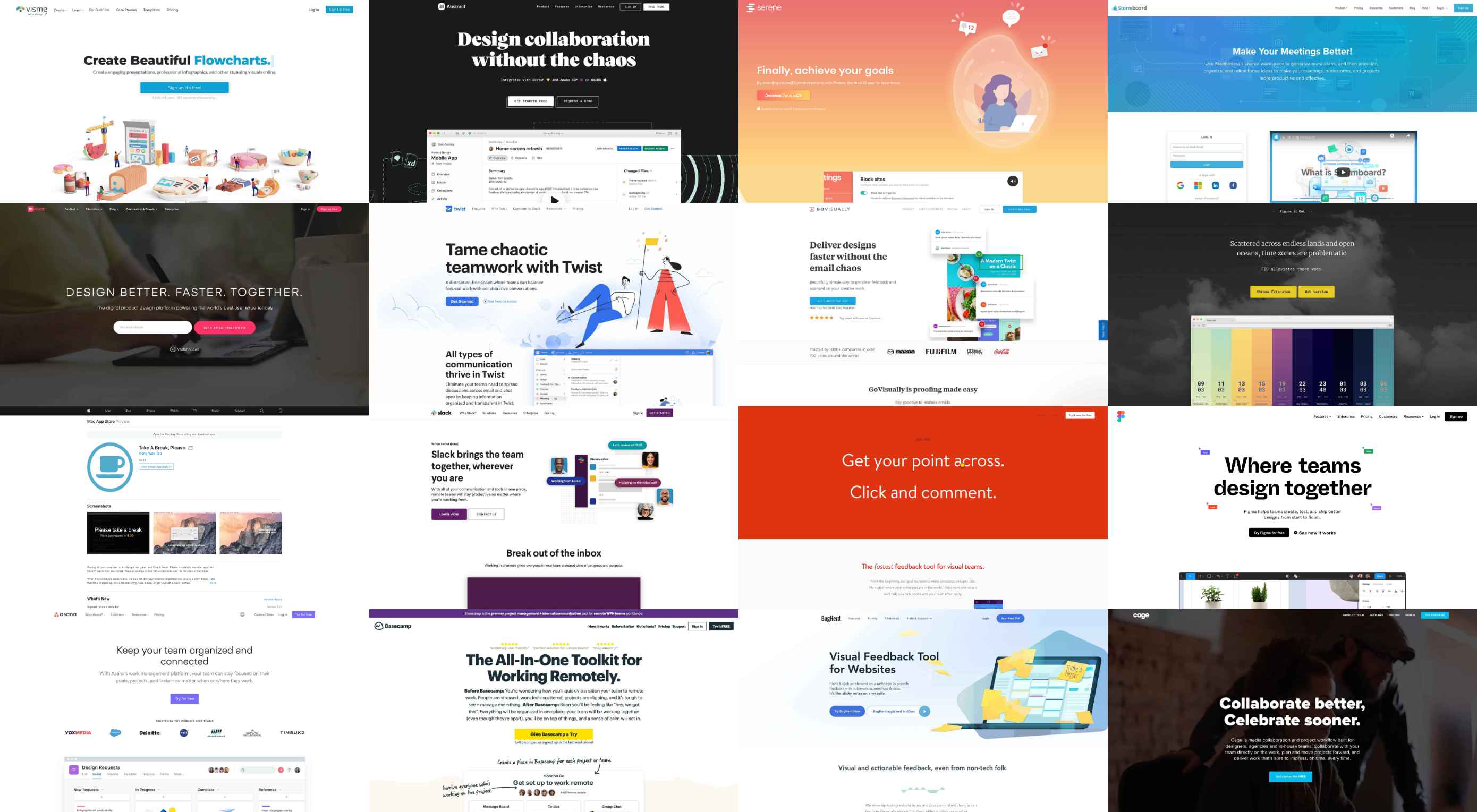
16 Tools for Keeping Your Remote Design Team Together (and on Task)
One of the biggest perks of a career in Web Design is the potential for working remotely. As long as you have access to Wi-Fi, you can basically work from anywhere, whether it be from home, a co-working space, or even the beach — the world is your proverbial remote oyster. Whether you’re new to… Continue reading 16 Tools for Keeping Your Remote Design Team Together (and on Task)
Exciting New Tools for Designers, January 2020
We typically start the month with a roundup of new tools and resources for designers, but with the start of a new year (and new decade), we thought a roundup of things to help you get more organized would be appropriate. Some of these tools have been around for a while with features you might… Continue reading Exciting New Tools for Designers, January 2020
Exciting New Tools for Designers, December 2019
As you are shopping this month for others, why not find a few goodies for yourself? Our roundup of new tools and resources is packed with usable items. And most are free, so there’s no shame in trying out something for yourself. Here’s what’s new for designers this month. CSS Background Generator CSS Background Generator… Continue reading Exciting New Tools for Designers, December 2019
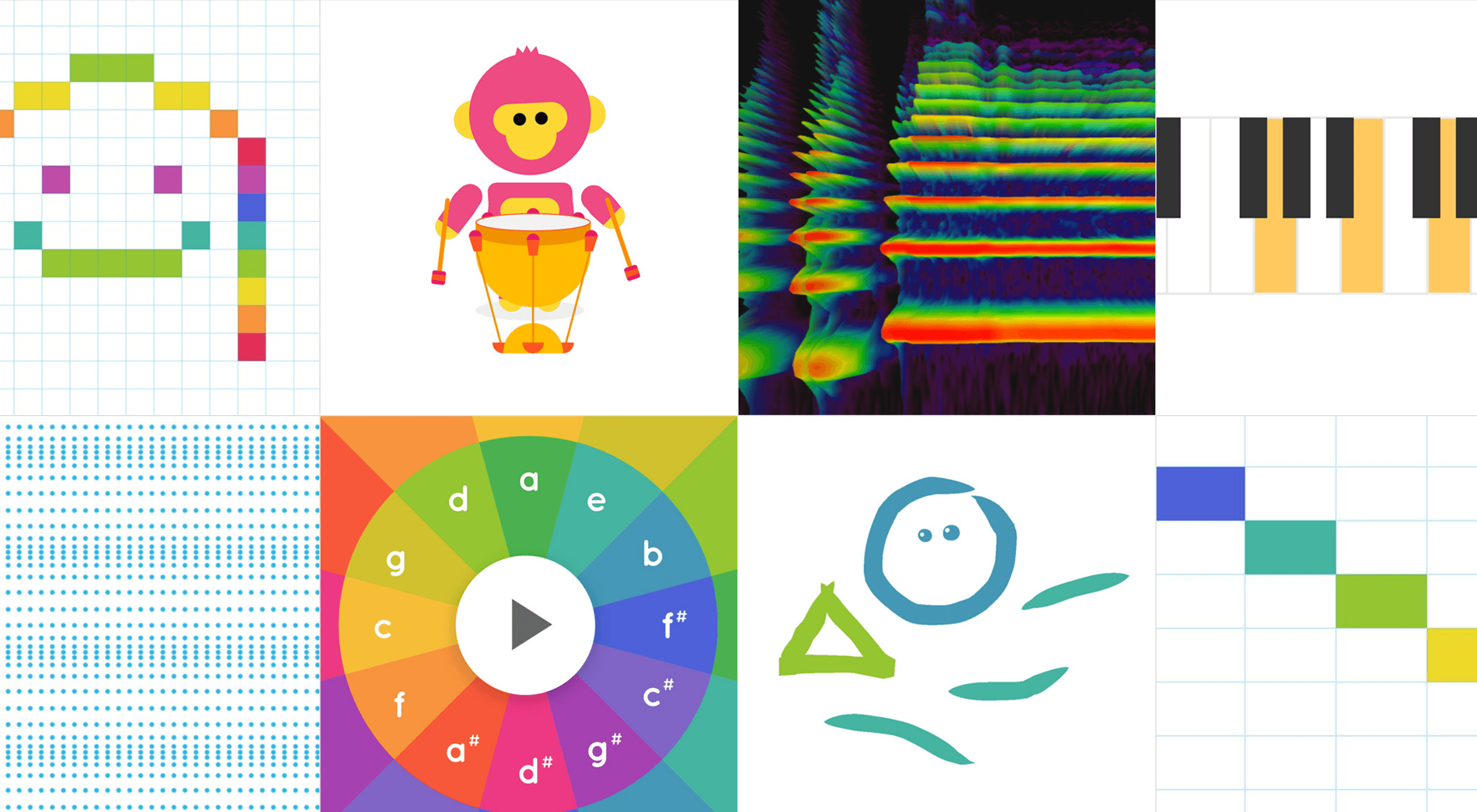
How to Add Sound to Your Site, Without Infuriating Users
Once in a while, every professional comes across a challenge so great, so ridiculous, that they just can’t help themselves. They just have to go for it. It’s like the story of David and Goliath… if David was just bored and Goliath wasn’t threatening his entire nation. As for me, I’m about to argue for… Continue reading How to Add Sound to Your Site, Without Infuriating Users
Raising a Design System in a team
DDesign systems have been around for quite a while. They’ve arisen with the need of designing for not only one thing, but for a whole set of elements, keeping the same look & feel among them, so all the individual parts look as though they belong to the same family. Design systems were first developed… Continue reading Raising a Design System in a team
Competitive analysis is a method, not a solution
Pineapples might look cool, but that doesn’t mean that every fruit should be spiky. (source) We all have been there: you have been with your team in a room for a couple of hours now, and it seems you hit a dead-end while discussing one design problem. Suddenly, someone brings up the solution for it all:… Continue reading Competitive analysis is a method, not a solution
The 6 types of user segmentation and what they mean for your product
MYOB People by Nick, https://dribbble.com/shots/3322055-MYOB-People Marketing helps you understand your user, focus your product on your user needs and take the product to market. This post is set up to mimic what would you go through when segmenting your customers. Marketing segmentation Only few companies are big enough to supply the needs of an entire… Continue reading The 6 types of user segmentation and what they mean for your product
Enterprise design stack: the tools we use to design the datacenter operating system
I love reading about how other Design teams are working together and what tools they’re using. It’s reassuring to know teams you admire and respect use the same tools you do. It’s also usually a trigger for me to try some other tools that either I haven’t heard of or that I’ve been meaning to… Continue reading Enterprise design stack: the tools we use to design the datacenter operating system
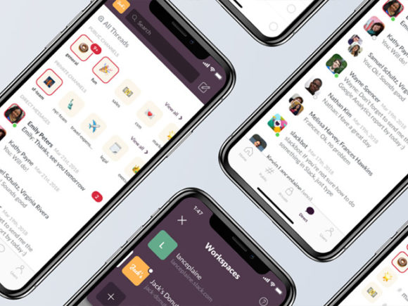
Slack iPhone UI redesign concept
This Slack UI kit for iPhone has been released by Kevin Lanceplaine and carefully explained on an interesting Medium article. It is basically a redesign concept that tries to solve some of the UX pain points. Freebie includes 15 app screens and provides interaction capabilities allowing you to view an interesting preview at this link. Download freebie
Build A Pomodoro Timer ― Scotch
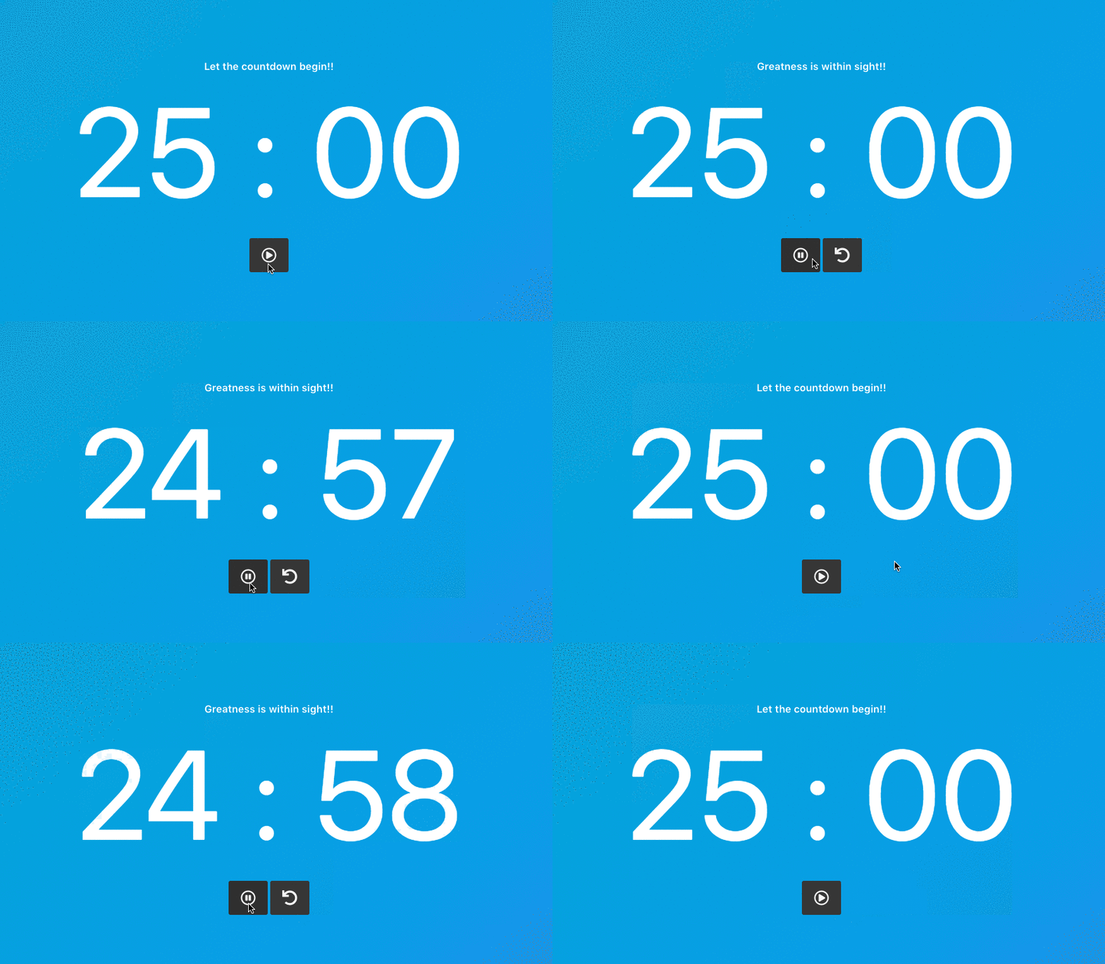
Last week on the code challenge #5 we looked at building a movie player using a provided API. Here is the solution to the challenge built with Vue.js. This week we’ll be building a Pomodoro timer. A Pomodoro timer is a time management tool which breaks down task completion time into intervals of about 25… Continue reading Build A Pomodoro Timer ― Scotch
CSS Lightsaber Checkbox ― Scotch
Welcome to our Code Challenge #3. Way back when about five years ago when we started Scotch.io, one of our very first articles was to create lightsabers using plain CSS. Let’s bring that back and see how we can build out the same thing in this week’s code challenge. The Challenge The challenge is to… Continue reading CSS Lightsaber Checkbox ― Scotch
How to Write Helpful User Tutorials and Onboarding Guides
Writing user tutorials is essential to launching any new software project. But writing helpful user tutorials requires a careful hand, with a correct understanding of the user’s needs and expectations. With a solid foundation of empathy and understanding, we can build user tutorials that will educate our users without losing their attention or going over… Continue reading How to Write Helpful User Tutorials and Onboarding Guides
When AI gets in the way of UX
Interest for “Artificial Intelligence” over the last 5 years, according to Google Trends. Artificial Intelligence is the big buzzword of today. If you are a digital designer, there are good chances that a quick scroll through your RSS reader, Twitter feed or Slack channels will show you more instances of the term “AI” than you would… Continue reading When AI gets in the way of UX
Notification overload and coping with dark design patterns.
Design in 2017. Here’s how most of ours days start. We wake up swearing because we need another 2 hours sleep, turn off the alarm and check our phone. When we swipe down the notifications drawer, we see tonnes of work emails, Instagram and Facebook notifications, Slack messages and calendar invites. Even Medium notifies me of… Continue reading Notification overload and coping with dark design patterns.
The age of empathy, Slack groups, designing with AI and more UX links this week
If you like the links, don’t forget to ???????????????????????????????????????????????????????? Stop doing user interviews; start having conversations → There’s something I’ve realized lately, that’s making my user interviews go smoother and getting deeper, more nuanced insights. The key is this: relax. Take a step back, for a moment. What is a user interview? If yours are… Continue reading The age of empathy, Slack groups, designing with AI and more UX links this week
When Copy Loves Itself Too Much
One time, I nearly lost my mind while brainstorming copy for a holiday print ad. I was writing for Havenly, an interior design company, and we were advertising in a popular home decorating magazine. “Keep it simple,” I told myself, “this has been done hundreds of times before.” An ad that took way too long… Continue reading When Copy Loves Itself Too Much
5 Key Areas to Help Manage Your Design and Content Creation Team
Even more radical than funny cat videos and memes in GIF form, the rise of the Internet has really empowered companies of all sizes to work with remote teams all around the world. This has dramatically impacted how modern business is being conducted because you could have team members everywhere from Sacramento to Sri Lanka. In addition… Continue reading 5 Key Areas to Help Manage Your Design and Content Creation Team
Digital suffocation.
It’s dawned on me how incessant and intrusive phone notifications are. I may be realising this late. About two months ago I installed an app called 360 Security on my Android phone. One of the many functions it had was a ‘Notification Manager’. I switched it on and let it do it’s thing. A week… Continue reading Digital suffocation.
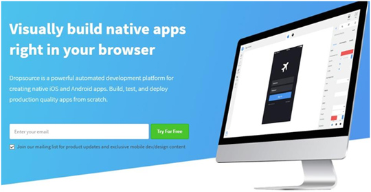
Visually Build Native Apps Right In Your Browser With Dropsource
Dropsource is a brand new mobile application development platform that was built with the developer’s needs in mind. What does this mean exactly? It means that its sole purpose is to make a developer’s job easier and to make building a data-driven native mobile app as simple as drag and drop. Dropsource comes equipped with… Continue reading Visually Build Native Apps Right In Your Browser With Dropsource
Popular design news of the week: November 14, 2016 – November 20, 2016
Every week users submit a lot of interesting stuff on our sister site Webdesigner News, highlighting great content from around the web that can be of interest to web designers. The best way to keep track of all the great stories and news being posted is simply to check out the Webdesigner News site, however,… Continue reading Popular design news of the week: November 14, 2016 – November 20, 2016

