Writing user tutorials is essential to launching any new software project. But writing helpful user tutorials requires a careful hand, with a correct understanding of the user’s needs and expectations. With a solid foundation of empathy and understanding, we can build user tutorials that will educate our users without losing their attention or going over their heads.
Onboarding Tips
If you’re educating new users about the basic functions of your app or website, that’s actually part of the onboarding process. While these tips would be great for all user tutorials, they’re especially apt when users start using your app.
Don’t create friction
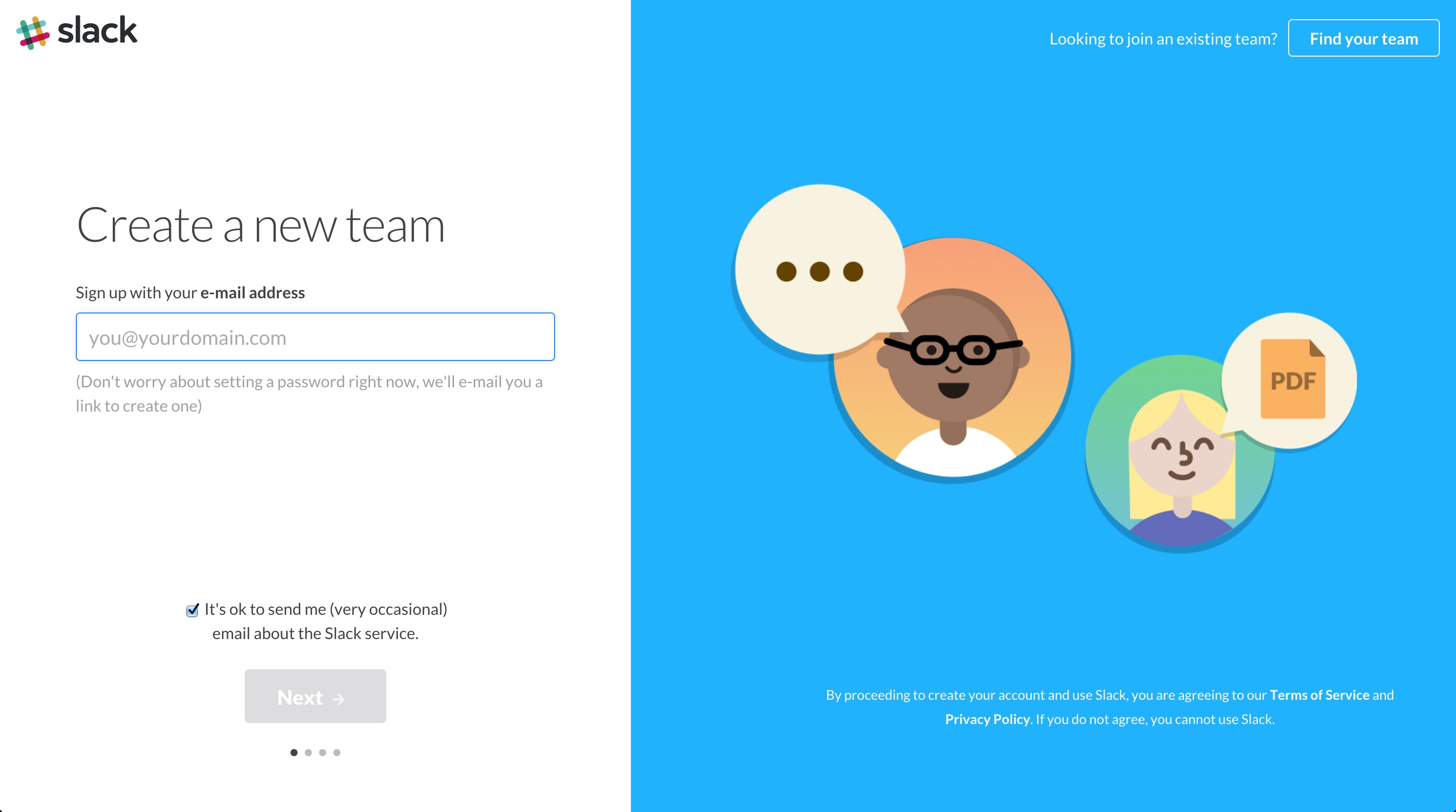
Signing up for a website often requires a number of small annoyances. These create friction, slowing down the user and making them gradually less and less interested in the product. Avoid doing things like confirming the users email address immediately, and focus on getting right to the heart of the matter. Slack does a great job of it, avoiding a ton of up-front friction and sliding you gracefully into the app’s core functionality. You don’t even need to create a password until you know how the whole thing works.
Let users learn by examples
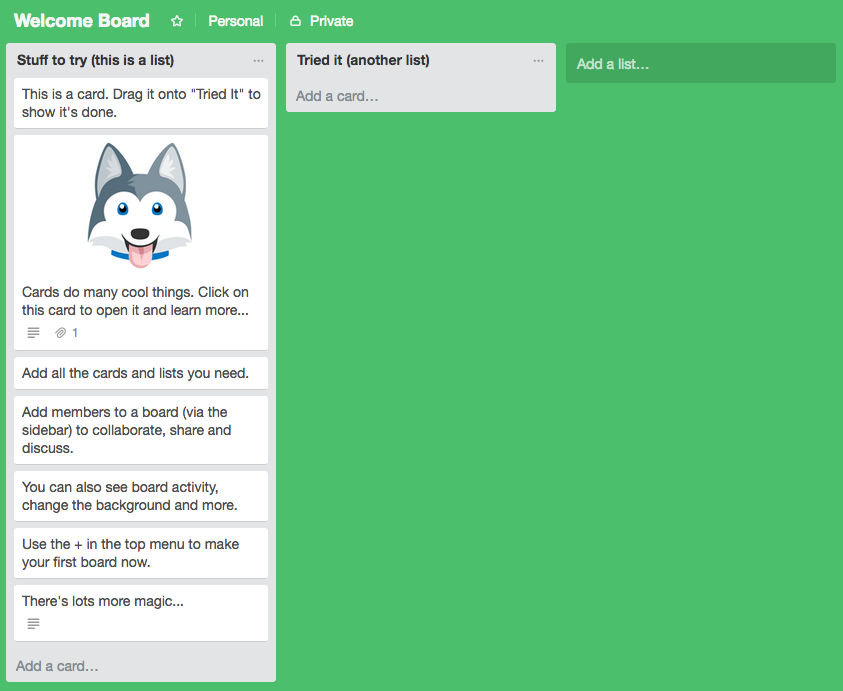
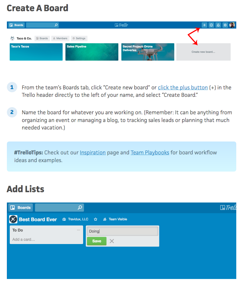
Trello eases the user in to the application’s vast functionality with an example project. Each card offers an explanation of its basic functionality, helping new users understand how the app works even as they interact with it. A link to their longer user tutorials is included in the final card, giving curious users a way to explore more. Impatient or more familiar users can get started from the get-go, and aren’t forced to follow a tutorial they’re rather ignore.
Use contextual tips
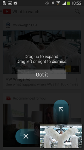
You don’t need to slam the user with everything right away. You might avoid longer user tutorials and use contextual tips to explain functionality as it becomes relevant. Wait until a user clicks on the crop tool, for example, to show off the crop tool’s options. This way, the user both retains the guidance and appreciates it more, since it’s especially relevant. Just make sure you don’t do it every dang time the crop tool is invoked. The YouTube app for Android provides this guidance the first time you minimize a video, and then never again.
Maximize “empty states”
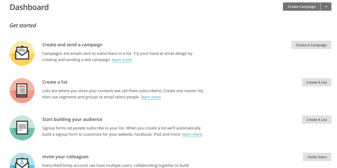
Empty states are often where the user starts. They have no projects, no messages, no photos: nada. Instead of making these pages dead zones, activate them as learning areas. Mailchimp does an excellent job with this, providing links to common activities from the new user’s otherwise empty dashboard. By enrolling this empty space in your instructional process, you can engage users without slowing them down, keeping their momentum moving.
Avoid long, up-front guides
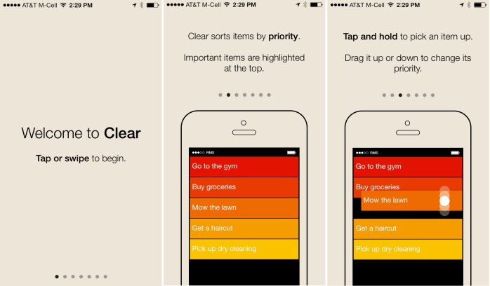
Clear’s compulsory seven page manual. Don’t do this: this is bad.
So many apps assume the reader needs to literally read an instruction manual before they start the application. It doesn’t matter how simple: Clear, the now-defunct to-do list manager praised for its clarity and simplicity, had a seven-page manual users were required to read before they could proceed. And their idea was so simple you could literally pick it up at a glance. These guides are momentum murders, killing the user’s excitement. And if your product requires that much explanation before the user can even try to make sense of it on their own, your UX needs a second look.
Writing Longer User Tutorials
For more complicated applications, onboarding isn’t enough to explain the app or service’s full functionality. Users require a more detailed guide to the finer points. In that case, you’ll need to augment your onboarding tutorial with actual documentation. Follow the tips below to make sure you’re writing clear and helpful user tutorials that your user will appreciate.
Provide reasonable examples
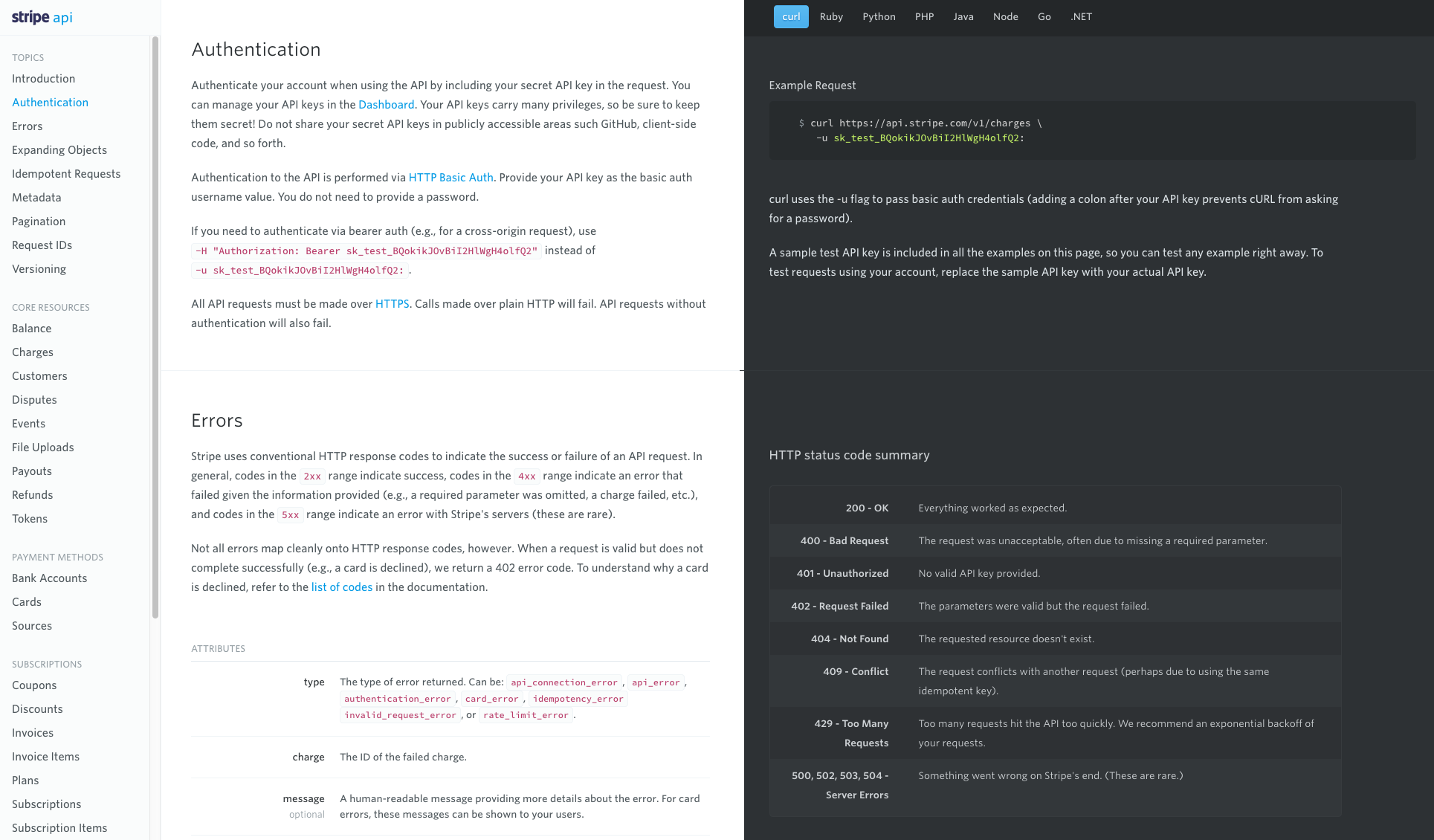
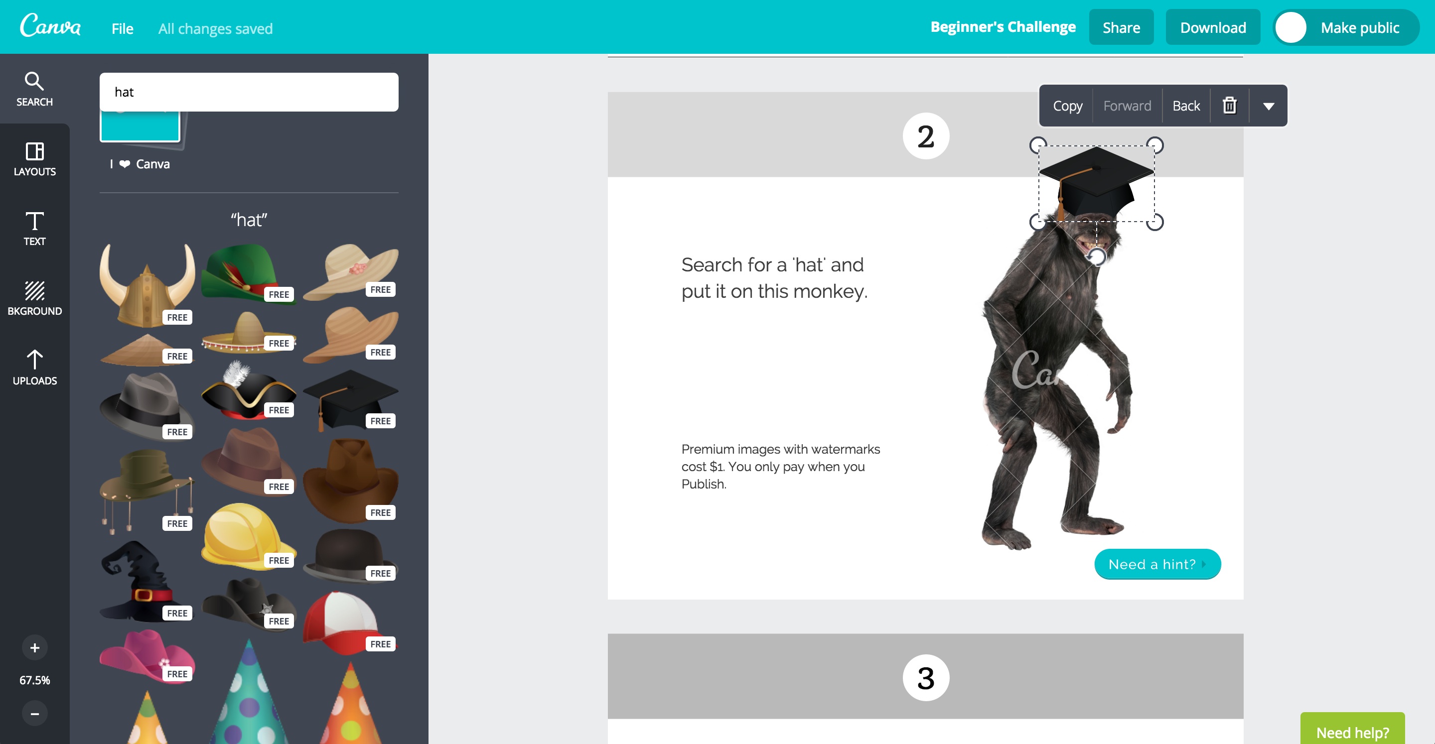
If you’re teaching a user how to accomplish a specific goal, you must provide examples. These can be anything from screenshots showing the appropriate steps to pre-built projects the user can experiment with to code samples that work with your API. Regardless of what sort of example you provide, folks often learn more quickly when getting instruction via multiple inputs. Text-only instruction is detailed but hard to recall or understand quickly, so augment with visual examples. Stripe, shown above, provides code snippets in multiple languages for its examples, allowing advanced users to literally grab and go, confident the code will work. Trello, which we mention below again, uses annotated screenshots.
Create a clear goal
The best user guides follow a clear and obvious structure. Whether its progressing through a full project from start to finish or just completing a single tasks, users should know where they are in the “story” of the tutorial and what to expect when they arrive at the end. This can be accomplished by careful use a detailed titles. The titles of your chapters, sections or posts should describe what the user will learn by describing the end goal. “Learn the basics” isn’t too helpful, but “Share a new post” or “Delete old contacts” is great. Trello uses clear, obvious titles in their longer user guide that tells the user example what their goal should be.
Understand your user’s goals
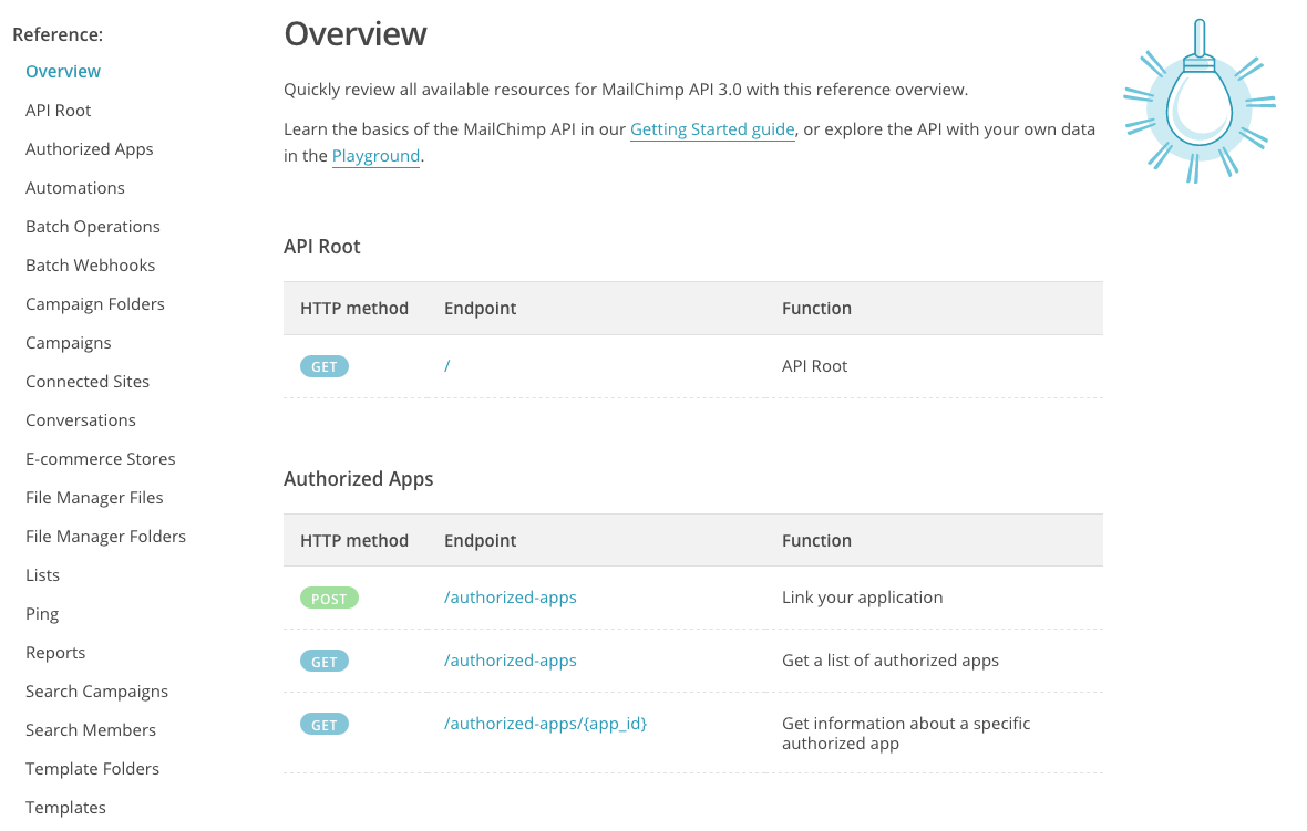
Users have come to your documentation for a specific purpose. They’re looking to understand how to fix their problem or accomplish their goal. So think about what kind of users visit your documentation. Mailchimp simultaneously speaks to two kinds of user in their API Reference: those that need a quick cheat sheet and those that want to figure things out from the beginning. There’s a big list of topics on the left for users to explore, as well as a guide linked on top. Advanced users can even fiddle with their own ideas in the Playground, allowing for free exploration. Make sure your users can experience their documentation in a way that’s useful and functional for them.
Avoid dwelling on the UI
You might love your UI like a baby. You’ve probably spent ages on in, perfecting everything and puzzling over every single detail. Unfortunately, your user doesn’t care even half as much. The user does not want to learn about the UI. They do not want to learn about the name and location of every tool in the application, or how to “navigate the workspace.” They want to get something done, and so help you if you start out by naming every tool the user can click on. How are they supposed to remember that? By the time they get to what they actually want, you’ve lost their goodwill and their interest.
Conclusion: Treat the user with respect
All this tips are variations on one central concept, which you must follow above all others: respect the user. Respect their time, intelligence and maturity. Treat them fairly and decently, and take the time to make your user tutorials less of a frustration.
