Another collection of condensed fonts which are best for big bold headings. the best condensed fonts are useful when space is limited but you still need strong message. Ultra slim fonts help fit more words in one line without breaking the layout. Many designers use condensed fonts for big bold headings, posters, and thumbnails. These… Continue reading 35 Best Condensed Fonts for Bold Design
Best Photoshop Tutorials to Master Retouching, Sketching & Photo Manipulation

Photoshop tutorials help you learn how to edit images step by step without confusion. These tutorials show simple actions like using layers, brushes, and tools. You can follow manipulation tutorials to combine photos, change backgrounds, and fix small details. Start with basic lessons and repeat each step until it feels clear. Practice is important because… Continue reading Best Photoshop Tutorials to Master Retouching, Sketching & Photo Manipulation
How to make LibreWolf your default browser on macOS
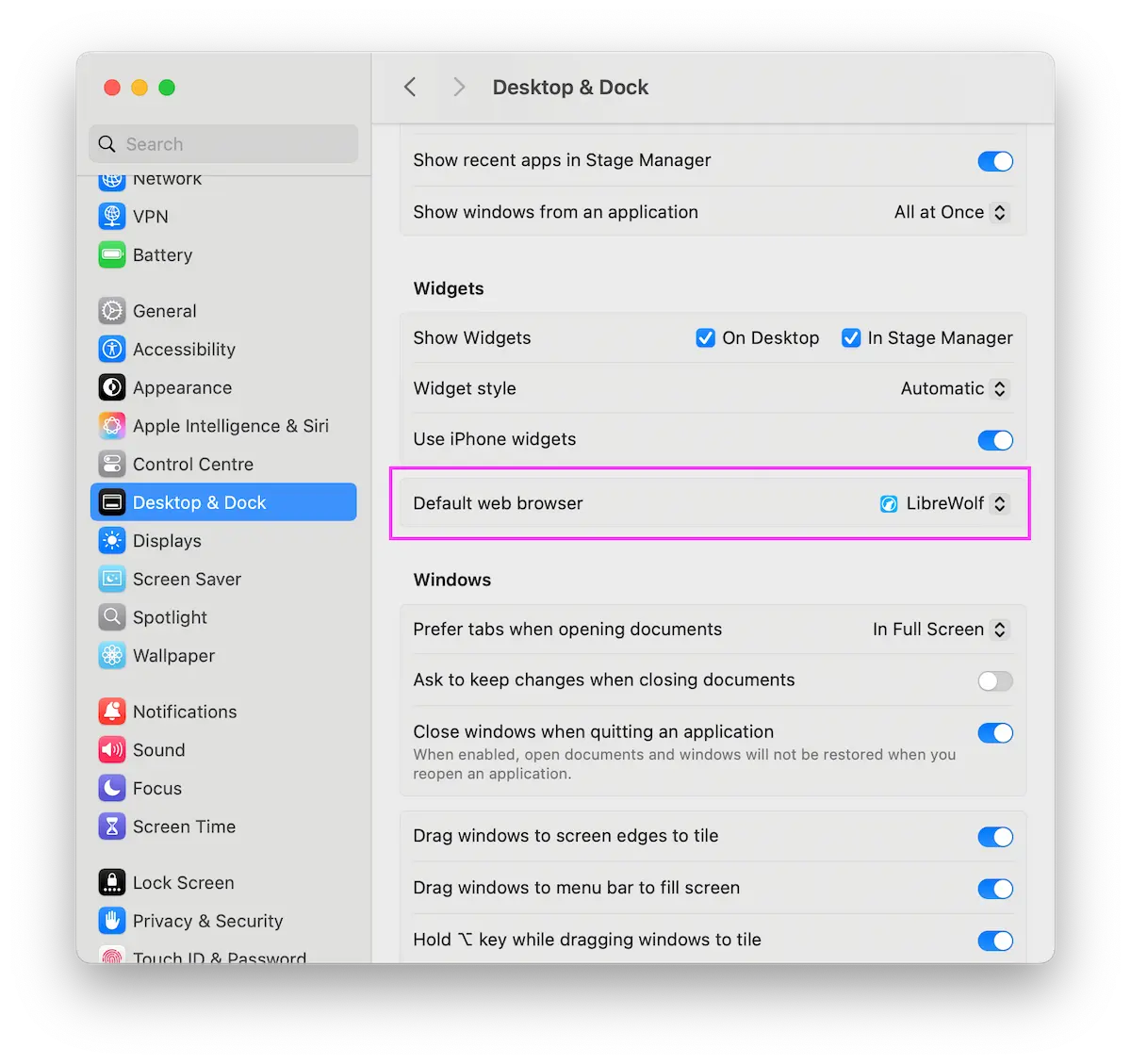
I recently switched to LibreWolf as my default browser, and I also wanted links to open by default inside it, but there isn’t an option in LibreWolf like in other browsers. Luckily, there’s another way. At least I found a solution for macOS: Click the Apple menu in the corner of your screen. Select… Continue reading How to make LibreWolf your default browser on macOS
Logo Design Pricing Guide (USA/UK)
If you are a graphic designer or just starting to sell your work on platforms like Fiverr, Upwork, Dribbble, or Behance, one of the first questions that will trip you up is pricing. What do you charge for a logo? What counts as a logo package? Why is one designer charging $25 and another charging… Continue reading Logo Design Pricing Guide (USA/UK)
How to Get Your Phone Out of SOS Mode

How to Get Your Phone Out of SOS Mode Learn how to get your phone out of SOS mode on iPhone and Android. This guide explains what SOS means, why your phone shows no service, and step-by-step fixes to restore normal connectivity. You glance at your phone and instead of your carrier name in the… Continue reading How to Get Your Phone Out of SOS Mode
Information Seeking in China: A Different Ecosystem, Familiar Behavior
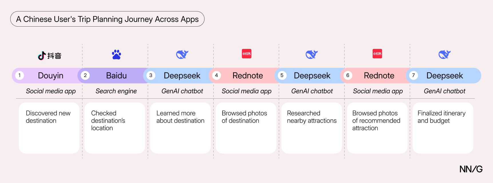
Summary: Information seeking in China is driven by mobile social-media apps. But how users prompt and engage with genAI mirrors what we’ve seen in the West. Our recent research on information-seeking behavior found that generative AI (genAI) is meaningfully reshaping how people search — cutting through the friction of keyword foraging, accelerating habit change, and… Continue reading Information Seeking in China: A Different Ecosystem, Familiar Behavior
Breaking up with my X
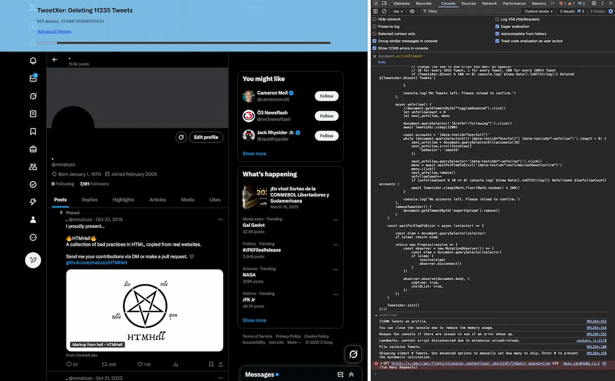
About 2.5 years ago, I was banned from Twitter for no apparent reason. I wrote about it on this blog and described the events and personal consequences. I broke the rules. Your account is permanently suspended Restart When I was first shadow-banned and then permanently banned, I tried a couple of times to contact Twitter… Continue reading Breaking up with my X
7 Best Design Tools & Resources for Faster Web Builds in 2026

Best design tools and resources are those that can lay claim to characteristics that typically include ease of use and related workflow characteristics, future-readiness, easy integration with supporting tools or resources, and overall performance. All of these lead to the establishment of exceptional brand reputation for the product in question. Future-readiness can be of outsized… Continue reading 7 Best Design Tools & Resources for Faster Web Builds in 2026
Thoughtful AI Implementation for UXR Leaders
Thoughtful AI implementation for UXR leaders Setting a vision will guide you and team to the right tools, in the right context. Source: Aurora-Alley on DeviantArt I’m an AI skeptic. That feels like a room-clearing and potentially career-limiting statement these days. I’ve been met with more than one uncomfortable silence from my colleagues. I call myself an AI… Continue reading Thoughtful AI Implementation for UXR Leaders
Usability, accessibility, and the human-AI paradigm
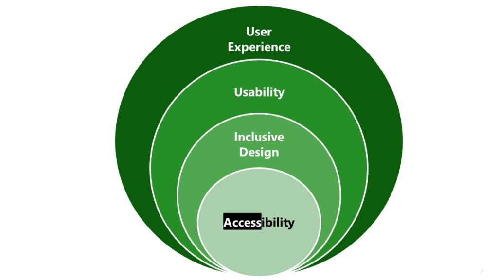
The divergence between usability and accessibility in the age of AI and vibe coding Usability and Accessibility Today, during what began as a routine discussion on accessibility with my Project Manager, the conversation took an unexpected turn. She suddenly looped in a senior member of the development leadership to “help move things forward.” In the middle… Continue reading Usability, accessibility, and the human-AI paradigm
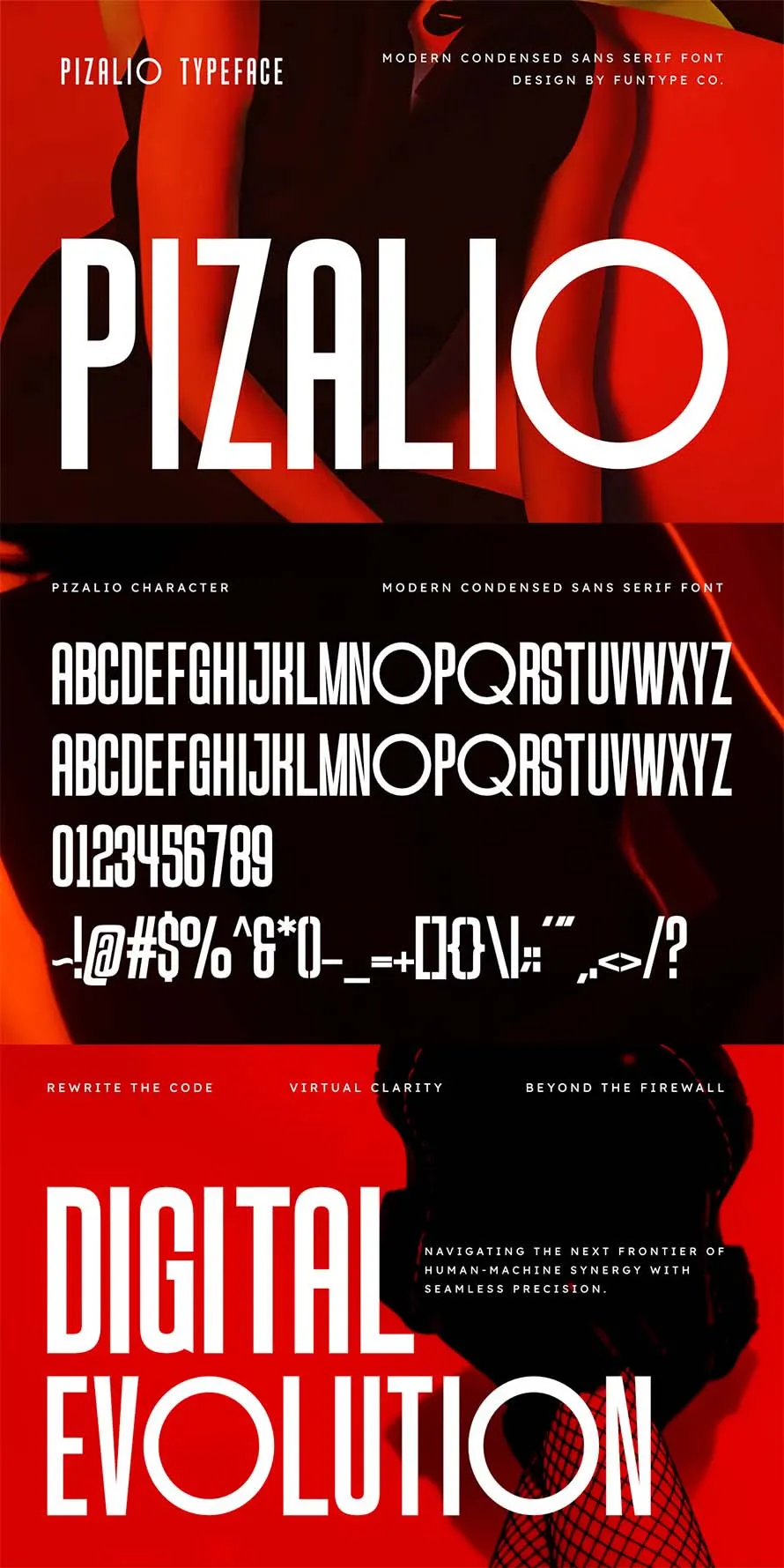
30 Best Condensed Fonts for Powerful Headings – Free & Paid
Best condensed fonts are useful when you need strong and powerful headings in small space. Condensed fonts also knows as “Slim fonts” help fit more words without breaking layout. Many designers use condensed fonts for posters, logos, and social media graphics. These fonts keep text clear while saving space. You can mix condensed fonts with… Continue reading 30 Best Condensed Fonts for Powerful Headings – Free & Paid
What’s an interactive element?
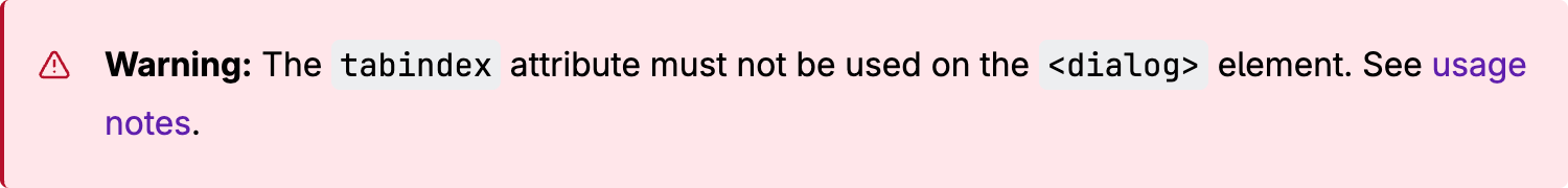
Two years ago, I wrote an article about the dialog element. I tested where focus goes when you open a modal dialog via the showModal() method. I tried different combinations of elements and attributes to see what happens because back in 2023, the behaviour was very inconsistent. In one of my tests, I put the… Continue reading What’s an interactive element?
10 Best Online Qualitative Research Tools & Platforms
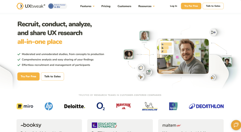
📌 Top 3 best alternatives at a glance: UXtweak – UXtweak has exceptional ratings on both G2 (4.7/5) and Capterra (4.8/5), and is recommended for its broad mix of usability testing, surveys, and prototype validation tools that support full UX research workflows. It offers a forever-free plan, and a Business plan starting at €92/month. Dovetail… Continue reading 10 Best Online Qualitative Research Tools & Platforms
How To Stop Hitting Your Claude Code Limits
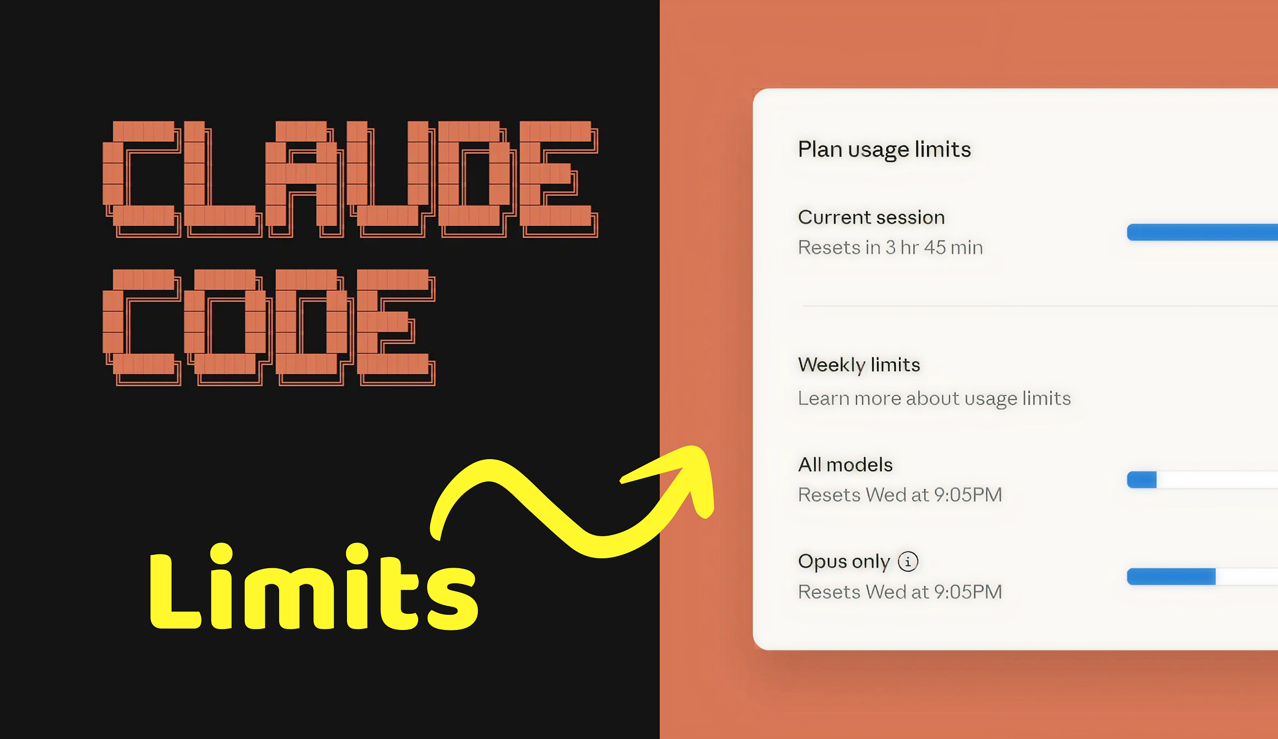
More and more Claude Code users are reporting problems with token usage. If you don’t want to burn your weekly usage quota lightning fast… Continue reading on UX Planet »
AI Belongs in Context, Not Just in Chat Windows
We need to stop treating AI as something you visit in a separate chat interface. The current approach is backwards. The typical implementation goes like this: build an application, then add an AI chatbot in the corner. Users click the chat icon, type their question, get an answer, close the chat, and go back to… Continue reading AI Belongs in Context, Not Just in Chat Windows
Minimalist Design Business Cards for Modern Brands
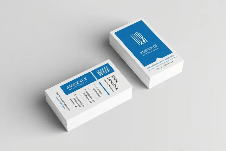
Minimalist design is a popular choice for modern business cards used by corporate brands. These business cards focus on clean layout, clear text, and enough space to read details without confusion. A company name, logo, phone, and email are placed in a simple way so people can quickly understand the information. This style helps brands… Continue reading Minimalist Design Business Cards for Modern Brands
New Creative Website Design Inspiration for UI/UX Designers
Beautiful website design is not about showing too many effects. It is about clear web design that people can use without thinking too much. UI and UX designers focus on how a user moves on a page, where they click, and what they see first. Simple layouts, readable text, and proper spacing help users stay… Continue reading New Creative Website Design Inspiration for UI/UX Designers
15+ Best Creative Brand Guideline Templates for Strong Branding
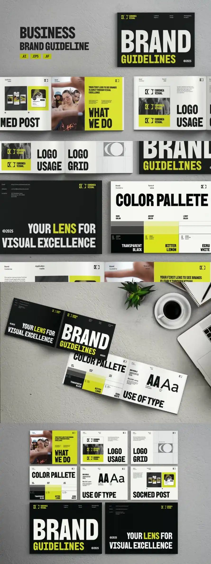
Brand guideline templates help teams keep their brand look clear and steady. A beautiful and creative set of brand guideline templates shows logo use, colors, fonts, and spacing in one place. This makes it easier for designers and clients to follow the same rules. When rules are clear, work looks neat and stays on track.… Continue reading 15+ Best Creative Brand Guideline Templates for Strong Branding
I’m speaking at Web Day Out 2026
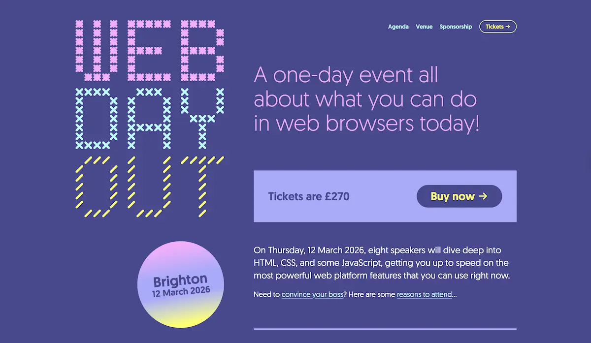
The first Web Day Out conference is taking place next year on March 12, my birthday, in Brighton, and I’m one of eight speakers. The core idea of the event is to get you up to speed on the most powerful web platform features that you can use right now. I love that because it… Continue reading I’m speaking at Web Day Out 2026
Logo Design After AI: How Designers Create Powerful Brand Logos in 2026
AI tools have changed how logo design for brands begins—but not how it succeeds. Today, designers can generate logo concepts in seconds, explore styles instantly, and speed up the creative process. However, creating a logo that is clear, memorable, and meaningful still requires human thinking and strategy. Many people assume AI tools can replace graphic… Continue reading Logo Design After AI: How Designers Create Powerful Brand Logos in 2026
Why User Panels Fail
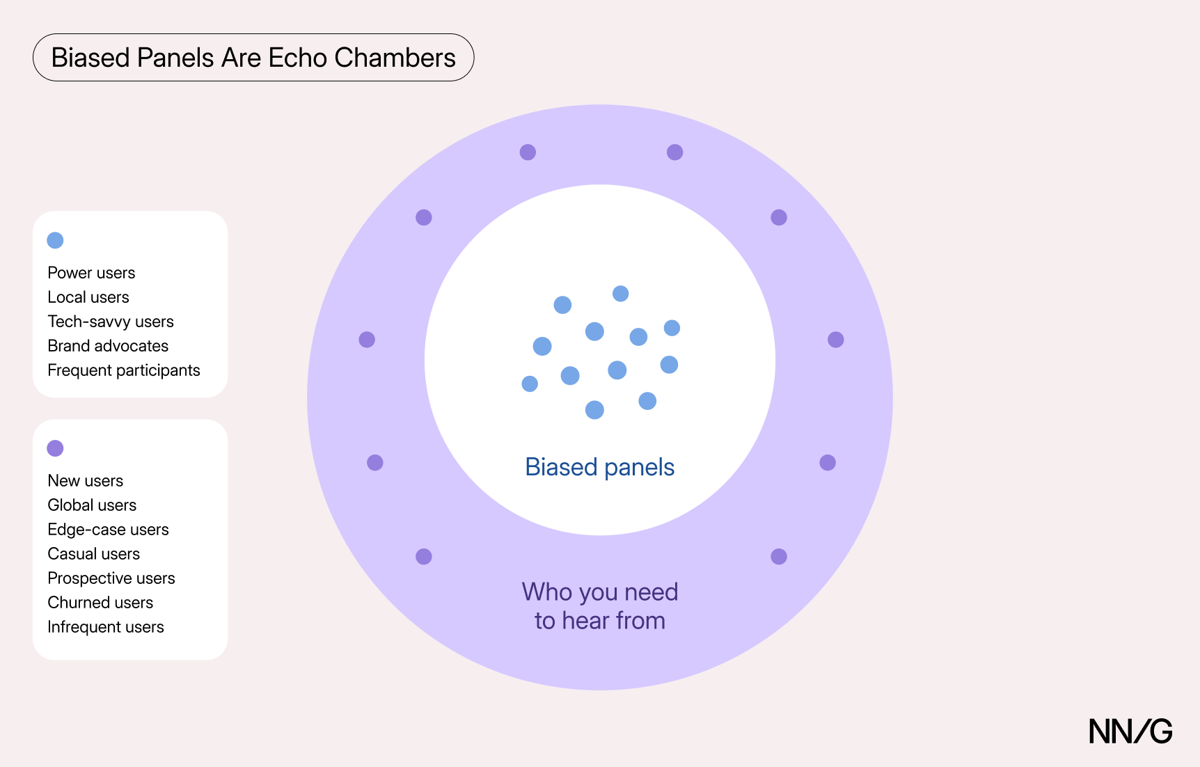
Summary: User panels can deteriorate in predictable ways, introducing bias and reducing their effectiveness for ongoing research. Internal research panels are often seen as a perfect solution to the participant-recruiting challenges. And in many cases, they are. Well-designed panels can accelerate studies, save money, and yield higher-quality participants. However, managing a panel requires ongoing effort… Continue reading Why User Panels Fail
How Templo Built the CASI Brand Identity
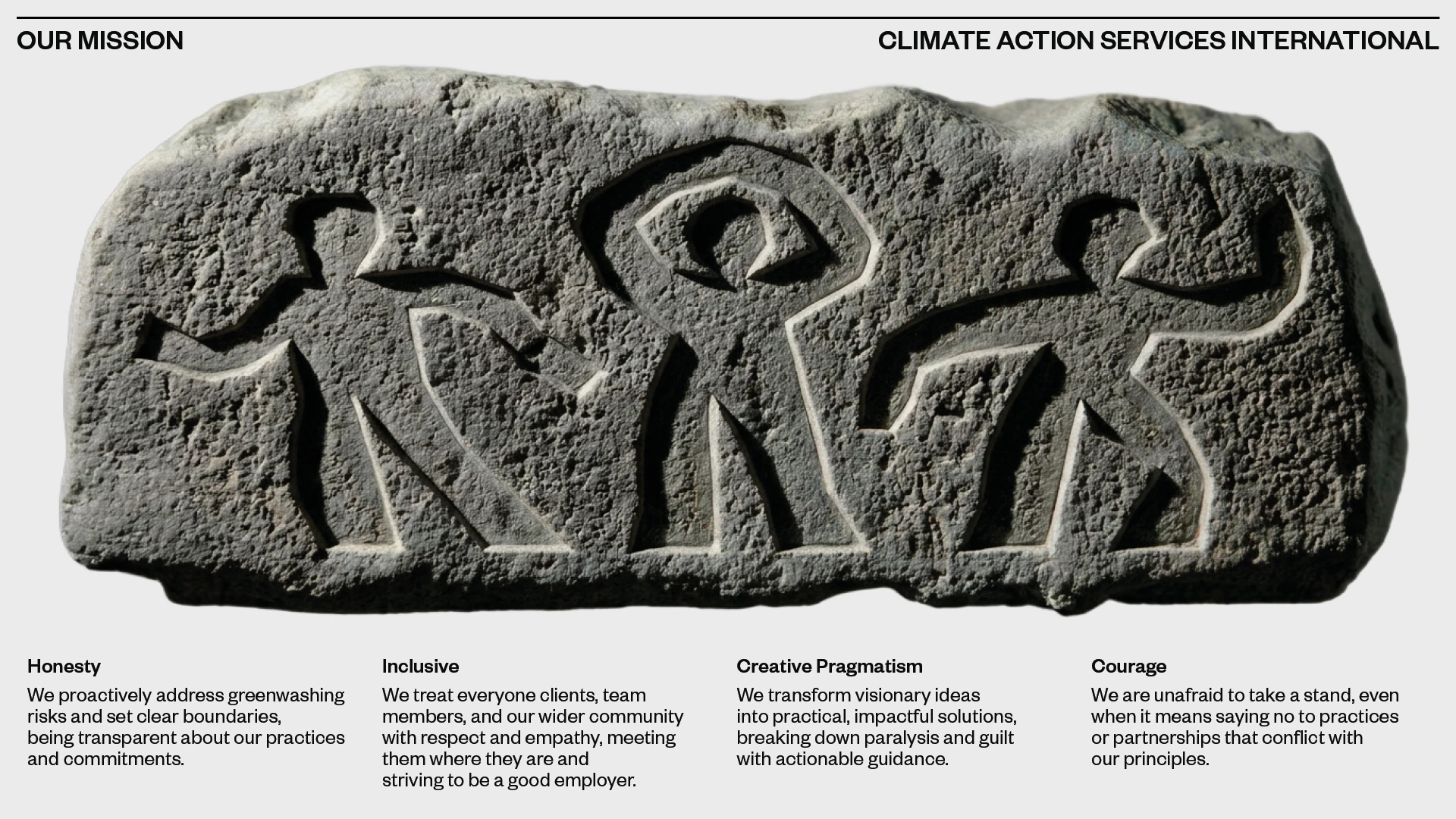
London studio Templo designed the CASI brand identity around hobo hieroglyphics and Matisse cut-outs: a climate brand built to inspire rather than alarm. CASI (Climate Action Service International) is the sister organisation of the Gallery Climate Coalition, a non-profit focused on sustainable practices in the visual arts. The brief to Templo was clear: build a… Continue reading How Templo Built the CASI Brand Identity
Powerful Corporate Visual Identity Designs That Stand Out
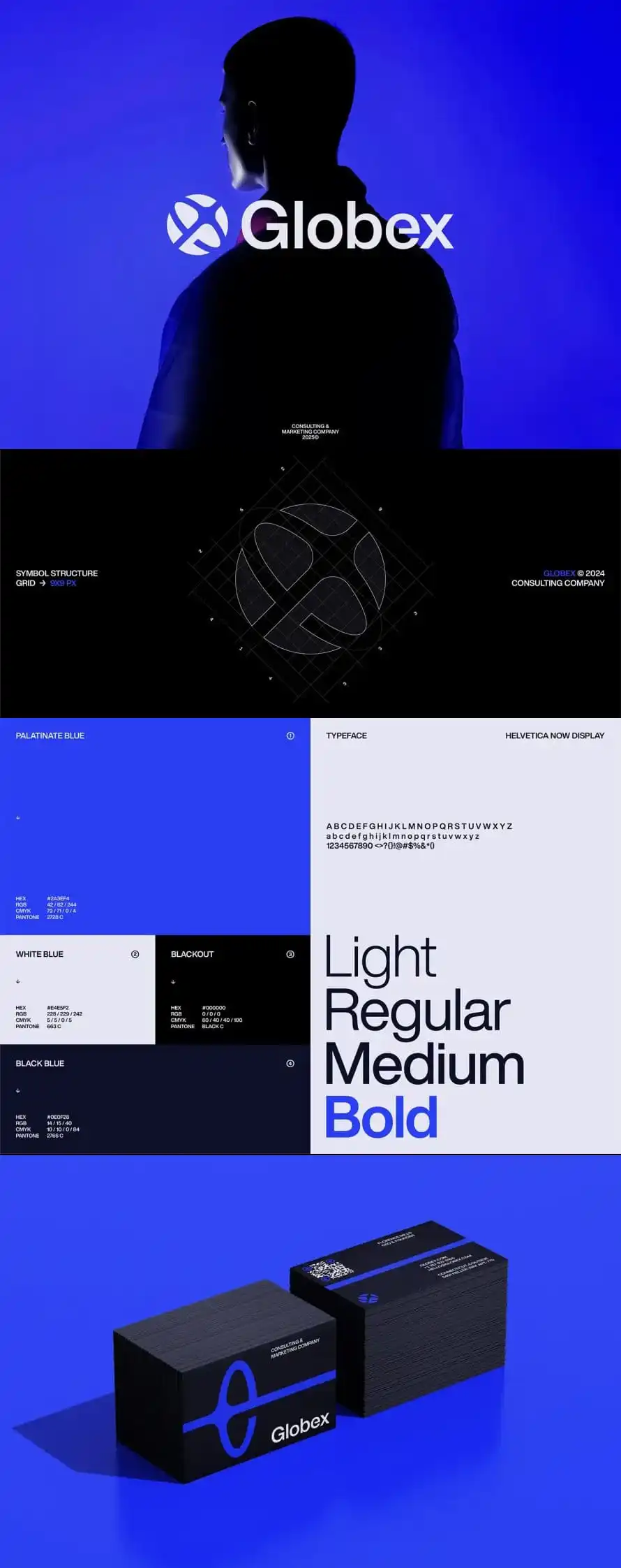
Strong brand identity helps people know a company fast. A clear corporate visual identity uses simple things like logo, colors, fonts, and layout. When these parts stay the same across website, social media, and print, the brand looks stable. People can remember it without effort. Creative brand identity design is not about adding many elements.… Continue reading Powerful Corporate Visual Identity Designs That Stand Out
10 Guidelines for Designing Your Site’s AI Chatbots
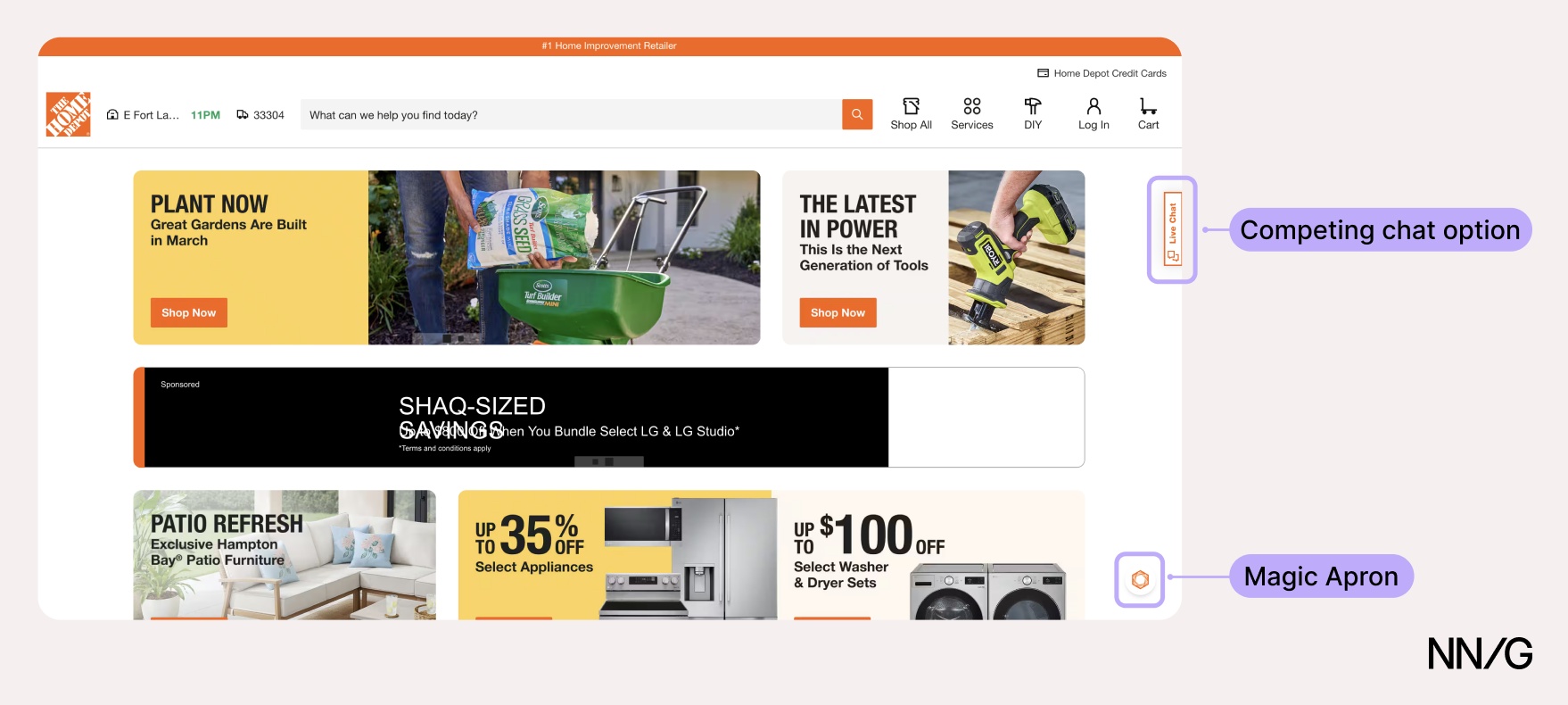
Summary: Helpful site-specific AI chatbots clearly state their capabilities, offer relevant prompt suggestions, and quickly signal they know what users are looking at. AI chatbots are increasingly becoming a standard feature on many websites. As more sites adopt them, the question is not only whether to have one — it’s how to design one so… Continue reading 10 Guidelines for Designing Your Site’s AI Chatbots