In today’s modern era of artificial intelligence, digital typography plays a pivotal role in shaping user experiences across websites, mobile apps, and other digital platforms. Digital typography refers to the art and science of arranging typefaces in a way that enhances readability, usability, and aesthetic appeal within digital interfaces. As screen resolutions improve and devices diversify, the demand for well-crafted fonts and innovative techniques has surged.
From minimalist sans-serif fonts to dynamic variable fonts, designers leverage typography to guide users intuitively through content while maintaining visual harmony. Effective use of typography not only improves accessibility but also strengthens brand identity, making it an indispensable tool for modern UI/UX design.
Understanding Digital Typography: Key Concepts and Principles
Digital typography is more than just selecting attractive fonts; it involves a deep understanding of how text interacts with its environment on digital screens. At its core, typography combines elements such as hierarchy, spacing, alignment, and contrast to create a seamless reading experience. Hierarchy ensures that users can easily distinguish between headings, subheadings, and body text, guiding their attention logically through the interface. Spacing—both horizontal (kerning and tracking) and vertical (leading)—is critical for legibility, especially on smaller screens like smartphones or tablets.
Alignment helps maintain consistency and balance, while contrast highlights important information without overwhelming the user. These principles work together to ensure that typography supports both functionality and aesthetics, creating a cohesive design language.
The Role of Fonts in Shaping User Experience
Fonts are the backbone of digital typography, influencing how users perceive and interact with content. Serif fonts, characterized by small decorative strokes at the ends of characters, convey tradition, reliability, and sophistication, often used in editorial or formal contexts. Sans-serif fonts, on the other hand, offer a clean, modern look that aligns well with contemporary design trends, making them ideal for tech brands and minimalist interfaces.
Display fonts, known for their unique styles, add personality and flair but should be used sparingly to avoid clutter. Script and handwritten fonts evoke emotion and creativity, suitable for branding or storytelling purposes. Choosing the right font family depends on the target audience, platform, and overall design goals, ensuring that the typography resonates with users while fulfilling practical needs.
Digital Typography Fonts
Choosing the right font is crucial for creating visually appealing and functional designs. Below is a curated list of 10 standout fonts from CreativeMarket that are perfect for modern UI/UX projects, offering versatility, readability, and style. These fonts cater to various design needs, from minimalist interfaces to bold branding.
List of Modern Digital Typography Fonts – PEMIUM:
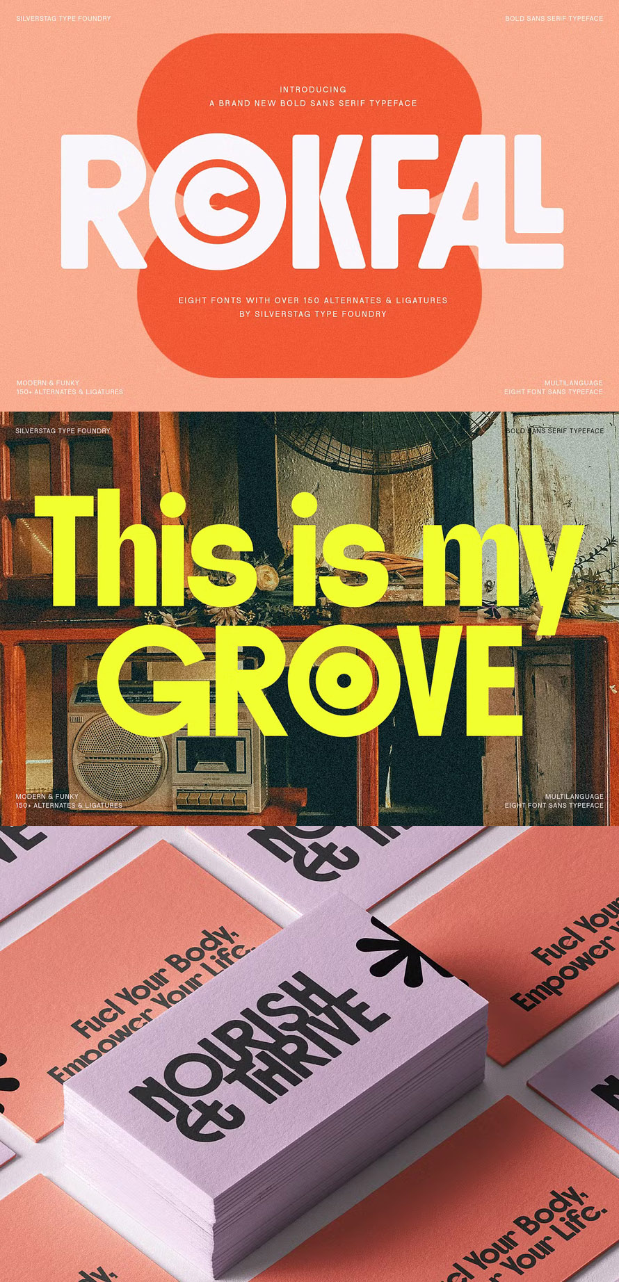
Rockfall – Bold Ligature Typeface
Introducing Rockfall – A Bold Retro Typeface, Channel the raw energy of the 70s with Rockfall, a bold retro typeface that commands attention. Inspired by iconic rock posters and vintage signage, Rockfalls chunky and powerful lines capture the essence of a rebellious era. Each character is meticulously crafted to evoke a sense of nostalgia and rebellion, perfect for capturing the spirit of classic rock posters, vintage logos, and bold headlines.
Castre – Serif Font Family
Castre is a serif font family to better charm your designing experiences. This package package to please you with a variety of choices for your own project consisting of eight different choices of thickness level. It is designed to be simple and easy to read without losing the modern feels. The uppercase design is paired with thin lines allow us to dive more into the world of modernity.
Refract – A Modern Grotesque Font
Step into a world of geometric precision and visual brilliance with Refract, a captivating grotesk sans serif font that shatters the boundaries of conventional typography. Inspired by the mesmerizing beauty of light as it refracts through prisms, this font embodies a captivating blend of clarity, structure, and elegance.
Tf Nukes – Bold Display Font
Introducing TF Nukes – the boldest display style font that will capture the attention of your audience and make your message stand out! This bold, strong font is perfect for headlines, titles, and any other text that needs to make a statement.
Argile Fusion Font Family
Argile Fusion is an innovative pairing of two distinct fonts: a sleek, geometric sans and an expressive, hand-drawn lettering. Designed to coexist in perfect synergy, these two fonts can be seamlessly mixed and matched to create stunning, contemporary designs. Whether you aim for modern minimalism or vibrant creativity, Argile Fusion empowers your projects with a dynamic balance of precision and personality! Embrace the future of typography with Argile Fusion, where elegance meets artistic flair.
Franie Geometric Sans Family
Franie is designed to be your go to geometric sans font family. It is serious, but has playful moments like the lower X hight of the lower case “I” in the heavy wights. and the straight angled curve of the lower case “g”. Fanie However is not your average Geometric Sans. Franie Comes in 18 styles 9 weights + Italics and it is all variable. with a weight range of hair to black and an italic angle form 0 to 12° you will be able to dial in the exact feel that you are looking for.
First Contact – 16 Fonts In One Pack
Elevate your designs with First Contact – a comprehensive and versatile ultra-condensed typeface family. With its striking presence and space-saving design, First Contact is ideal for commanding headlines, unforgettable logos, cutting-edge web design, dynamic packaging, and any project that demands bold typography.
Neuething Sans Family: 30 Fonts
Neuething Sans has Expanded! This sans serif typeface comes with 30 fonts: 6 weights and five widths It is the perfect font for headlines, posters, display, as well as long blocks of body copy. I use Some version of this font in literally every design. It is my Helvetica. but… with a modern retro sign painter vibe this sans is sure to sand out (but not too much) and add an unpalatable elevation to your design: be it branding, logos, social media, magazines, or whatever you are working on.
Headliner – A Powerful Sans Family
Proudly introducing the Headliner font family. 12 display fonts specially designed to grab and hold attention. This loud and proud family will make a powerful addition to your existing arsenal of design assets. Featuring Opentype kerning and multilingual support, this family is ready to command & conquer your projects right from the offset.
Morl Font Sans-serif Family
Morl Developed from condensed san serif families of the 90s to 00s, Morl brings together the distinctive features of the time but presented in a simpler design. Its potential is increased with Original, Sans, and Rounded options which offer varied moods. Suitable for publications, web and product designs, Morl can fit either headlines or body. It is also effectively supported in various devices. The family comes in 10 weights, making it available to use for your required tasks in 60 styles.
List of Modern Digital Typography Fonts – FREE:
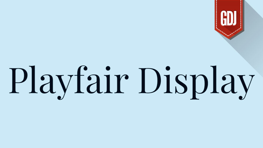
Playfair Display:
This elegant serif exudes a classic yet modern feel. Its clear letterforms and graceful curves make it perfect for headlines, branding materials, and editorial design.
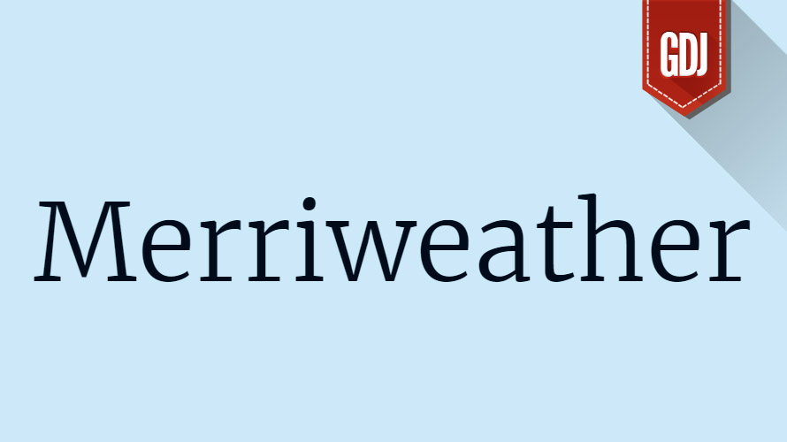
Merriweather:
This versatile serif offers a warm and inviting personality. Its readability makes it ideal for body text, web content, and long-form publications.
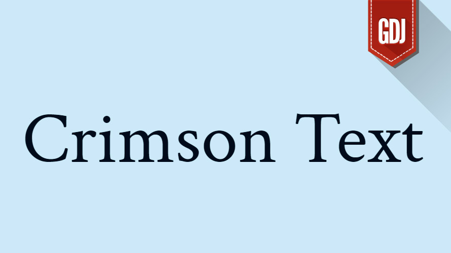
Crimson Text:
This refined serif boasts a timeless elegance with slightly contrasting stroke weight. It shines in editorial design, body text, and presentations.
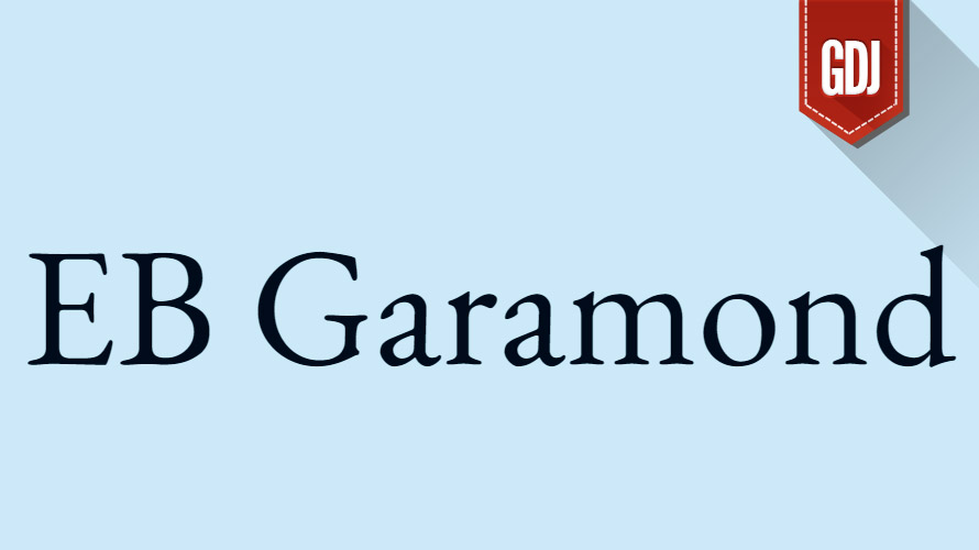
EB Garamond:
Inspired by 16th-century typeface designs, EB Garamond offers a historical charm. Its detailed letterforms and flowing curves are well-suited for invitations, certificates, and high-end packaging.
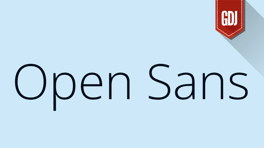
Open Sans:
This clean and open sans-serif has become a Google Fonts favorite. Its neutral style makes it incredibly versatile, working well for body text, headlines, and UI design.
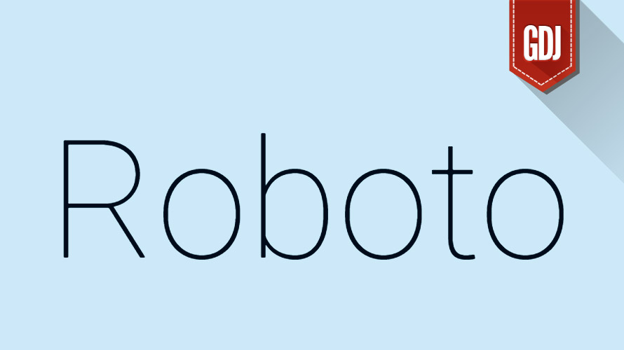
Roboto:
Another ubiquitous Google Font, Roboto is a geometric sans-serif with a professional air. It’s perfect for web design, user interfaces, and branding materials that require a clean, modern look.
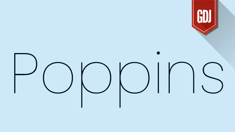
Poppins:
This geometric sans-serif offers a friendly and approachable personality. Its wide range of weights and styles make it adaptable to various design projects, from web layouts to posters.
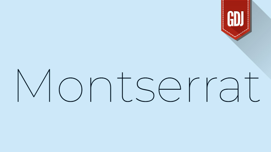
Montserrat:
This modern sans-serif has a slightly industrial feel with strong letterforms. Its versatility makes it suitable for branding, posters, and headlines.
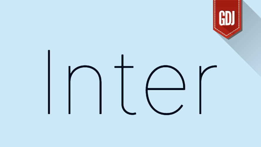
Inter:
This geometric sans-serif prioritizes legibility across various screen sizes. Its clean design makes it ideal for web interfaces, mobile apps, and user experience (UX) design.
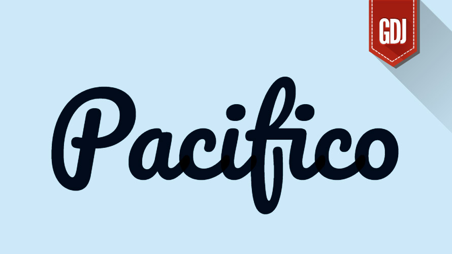
Pacifico:
This playful script font adds a whimsical touch to designs. Its hand-written style is perfect for logos, branding materials, and display text for invitations or greeting cards.
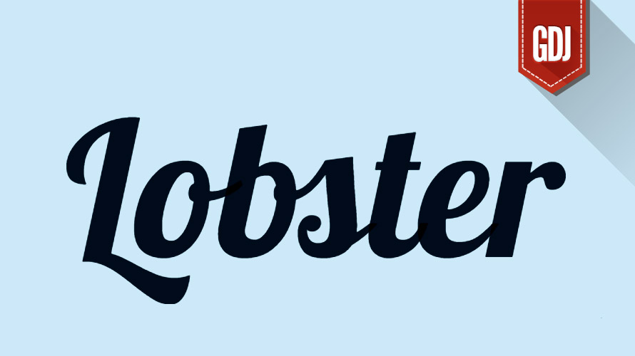
Lobster:
Another whimsical script font, Lobster offers a bold and quirky personality. Its chunky letterforms make it stand out in headlines, posters, and packaging design.
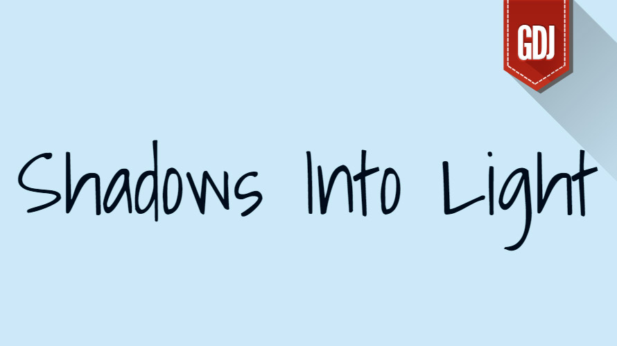
Shadows Into Light:
For those seeking a dramatic entrance, Shadows Into Light delivers. This display font boasts a striking 3D effect with a sense of depth, perfect for creating a lasting impression. Use it sparingly for headlines or logos to add a touch of drama and intrigue. Imagine crafting a movie poster with the title set in Shadows Into Light, instantly captivating viewers and hinting at the film’s captivating story.
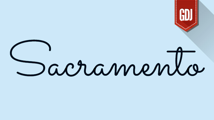
Sacramento:
Embrace the California cool with Sacramento, an elegant script font that evokes a vintage California vibe. Its classic style is perfect for branding, packaging, and headlines for invitations or wedding materials. Sacramento can add a touch of timeless elegance to a wedding invitation, setting the tone for a sophisticated and memorable celebration.
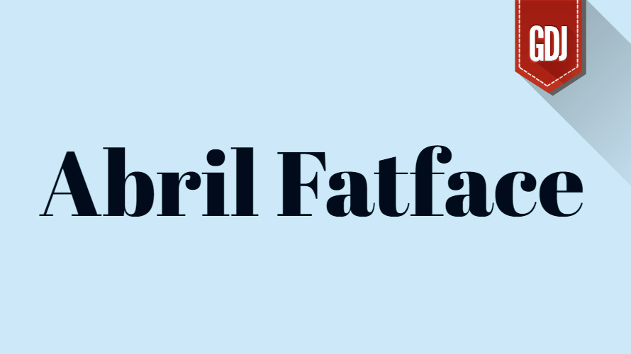
Abril Fatface:
Sitting at the crossroads of formal and playful is Abril Fatface, a geometric script font that bridges the gap with its bold curves and smooth edges. This versatility makes it a great choice for branding materials, logos, and display text with a modern touch. Imagine crafting a brand identity for a fashion boutique with Abril Display at its core, conveying a sense of modern sophistication and style.
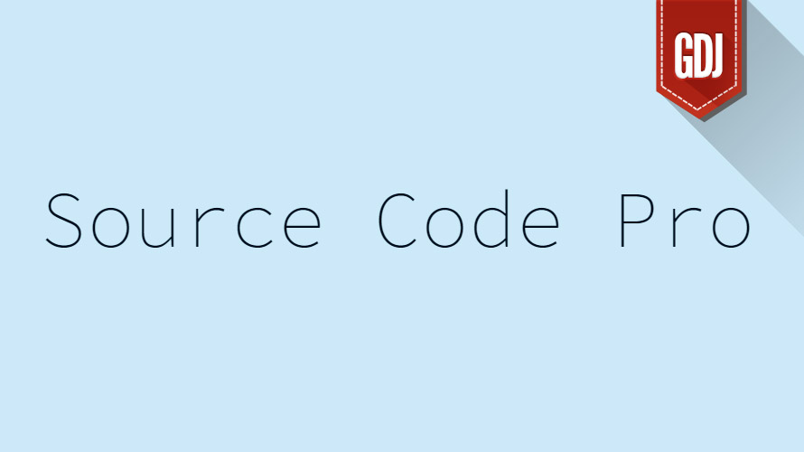
Source Code Pro:
Programmers, rejoice! Source Code Pro offers a clean and legible monospace font designed with your coding needs in mind. Its consistent letter spacing makes it ideal for coding environments and displaying code snippets within design projects. Source Code Pro ensures clarity and readability for developers, allowing them to focus on crafting beautiful and functional code.
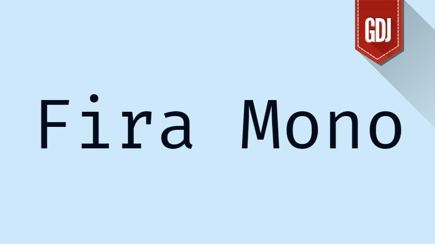
Fira Mono:
Another excellent option for code display and UI design, Fira Mono offers a clean and modern aesthetic with good legibility. Fira Mono allows designers to seamlessly integrate code snippets into user interfaces, maintaining a consistent visual style and enhancing user understanding.
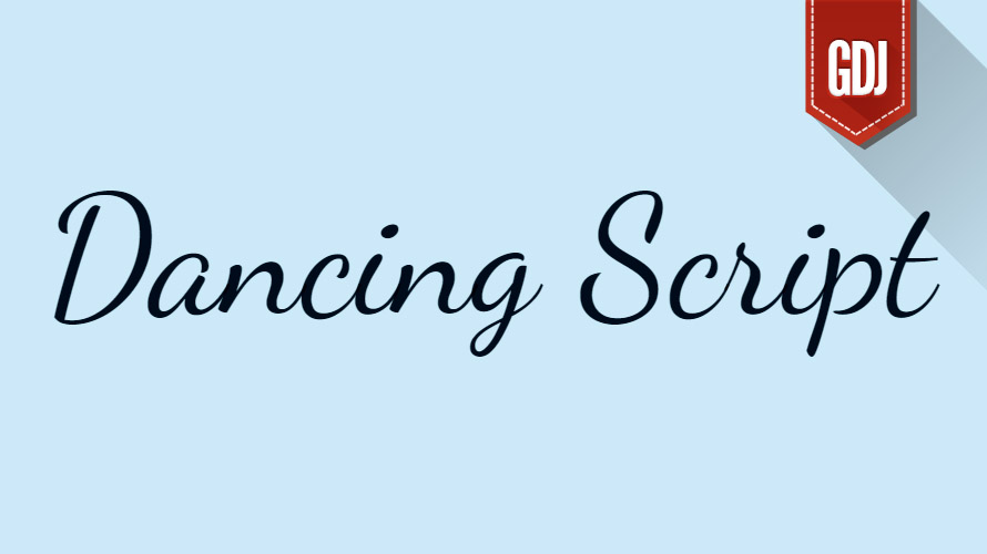
Dancing Script:
This elegant script font feels light and graceful, with flowing letterforms that make it suitable for wedding invitations, greeting cards, and text overlays on photos. Dancing Script can add a touch of romance and elegance to a wedding invitation, making it a cherished keepsake for the couple and their guests.
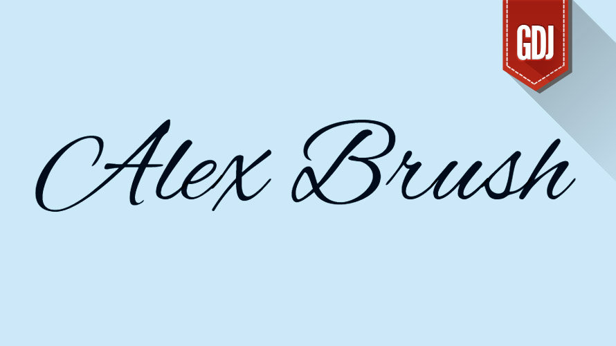
Alex Brush:
Inspired by brush lettering, Alex Brush offers a casual and handwritten feel, perfect for creating informal logos, social media graphics, and display text with a personal touch. Alex Brush can add a touch of informality and authenticity to a social media post, fostering a more personal connection with the audience.
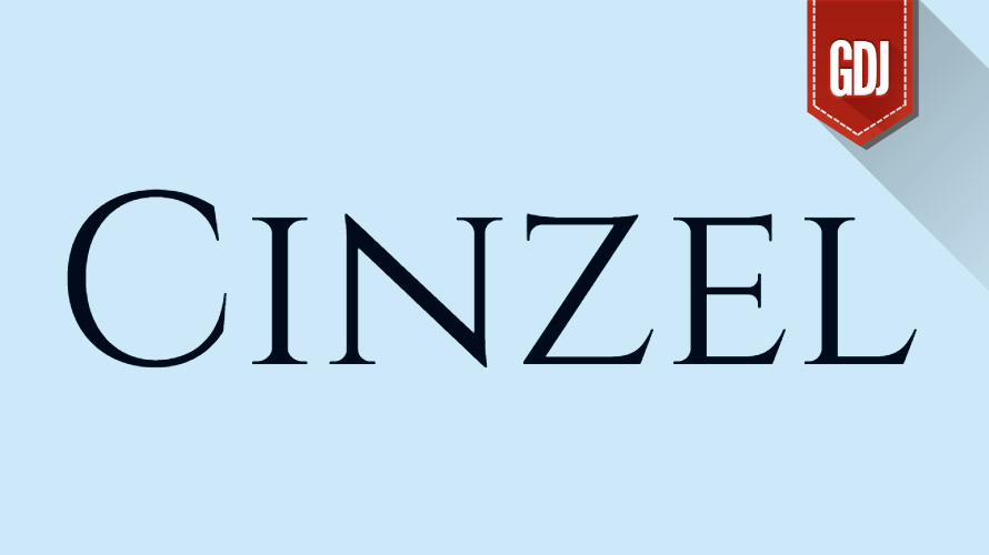
Cinzel:
For a touch of classic elegance, Cinzel offers a decorative script font with a clean, almost calligraphic feel. Its clean lines and sharp edges make it a great choice for invitations, certificates, and high-end branding. Cinzel can elevate a restaurant menu, conveying a sense of sophistication and enhancing the dining experience.
These fonts are widely praised for their adaptability, aesthetic appeal, and ability to enhance user experiences across digital platforms. Incorporating them into your projects can elevate both functionality and visual storytelling.
Advanced Techniques in Digital Typography for Enhanced Usability
Modern UI/UX design leverages advanced typographic techniques to enhance usability and engagement. Responsive typography adapts seamlessly across different screen sizes and resolutions, ensuring consistent readability. This is achieved using CSS media queries and fluid typography principles, where font sizes adjust dynamically based on viewport dimensions. Variable fonts, a groundbreaking innovation, allow designers to manipulate weight, width, slant, and other attributes within a single file, reducing load times and offering greater flexibility. Microtypography focuses on fine-tuning details such as ligatures, optical kerning, and character spacing to optimize legibility.
Additionally, animations and transitions applied to text elements can draw attention subtly, improving interactivity without compromising usability. These techniques collectively elevate the user experience by making typography functional, adaptive, and engaging.
Accessibility and Inclusivity in Digital Typography
Accessibility is a cornerstone of effective digital typography, ensuring that content is usable for individuals with diverse abilities. Proper font selection and sizing are crucial for readability, particularly for users with visual impairments. Sans-serif fonts are generally preferred for accessibility due to their simplicity and clarity. Adequate line height and letter spacing prevent text from appearing cramped, which aids comprehension.
Color contrast between text and background must meet Web Content Accessibility Guidelines (WCAG) standards to accommodate colorblind users. Furthermore, incorporating scalable vector graphics (SVG) for custom fonts ensures sharp rendering on all devices. By prioritizing inclusivity, designers create interfaces that cater to a broader audience, fostering equitable access to digital content.
Tools and Technologies for Crafting Exceptional Digital Typography
Designers rely on a variety of tools and technologies to implement cutting-edge typography in UI/UX projects. Adobe Fonts and Google Fonts provide extensive libraries of free and premium typefaces, enabling designers to experiment with diverse styles. Figma, Sketch, and Adobe XD facilitate collaborative workflows, allowing teams to prototype and test typography effortlessly. For developers, CSS frameworks like Tailwind CSS streamline the implementation of responsive and adaptive typography. Browser developer tools help debug rendering issues and ensure cross-browser compatibility.
Variable font generators, such as FontForge and Glyphs, empower designers to customize existing fonts or create new ones tailored to specific project requirements. Leveraging these resources ensures precision and efficiency in delivering high-quality typographic designs.
Case Studies: Successful Implementation of Digital Typography
Several industry leaders have demonstrated the transformative power of thoughtful typography in their digital products. Airbnb’s redesign introduced a custom sans-serif font called “Cereal,” which unified its global branding and improved readability across platforms. Medium employs sophisticated typography to prioritize long-form reading, utilizing generous line heights and carefully chosen serif fonts to enhance comfort during extended sessions.
Spotify uses bold, playful typography to reflect its energetic brand identity, complemented by vibrant colors and dynamic animations. Similarly, Apple’s use of San Francisco—a system font designed specifically for legibility on Retina displays—exemplifies how typography can harmonize aesthetics with functionality. These case studies underscore the importance of aligning typography with brand values and user expectations.
Digital Typography Examples
Typography is not just about functionality; it’s also an art form that can inspire and captivate audiences. Below are 10 stunning examples of typographic quotes from Behance, showcasing creativity and innovation in digital typography. These projects highlight how designers use fonts, layouts, and techniques to convey emotions and messages effectively.


These examples demonstrate the endless possibilities of digital typography, blending aesthetics with storytelling to create memorable designs. Each project reflects the designer’s unique vision while adhering to principles of readability and engagement.
Learn How to Create Digital Typography in Photoshop, Illustrator, and Procreate
Mastering digital typography requires familiarity with industry-standard design tools like Adobe Photoshop, Illustrator, and Procreate to create digital typography. These platforms offer powerful features for crafting custom typefaces, experimenting with layouts, and refining designs. Below is a list of 10 YouTube tutorials that provide step-by-step guidance on creating stunning typography in these tools:
How to create a better typography on Procreate
Photoshop Tutorial: How to Create A Gold Text Effect!
The ULTIMATE Guide To Typography For Beginners
Creative Hand Lettering | Adobe Fresco Tutorial
How To Make 3D Distorted Graffiti Bubble Text In Illustrator
Procreate – How To Shade 3D Lettering (+ Free Brushes)
Bevelled Lettering Effect in Procreate
Designing Digital Typography
These tutorials cater to designers of all skill levels, from beginners to advanced users, and cover a wide range of techniques and styles. Whether you’re creating web-ready fonts or experimenting with artistic text effects, these resources will help you elevate your typography game.
Trends Shaping the Future of Digital Typography
The future of digital typography is shaped by emerging trends that blend technology with creativity. Augmented reality (AR) and virtual reality (VR) present new opportunities for immersive typographic experiences, where text interacts with 3D environments.
AI-driven tools are revolutionizing font creation, enabling designers to generate bespoke typefaces quickly. Sustainability in typography focuses on eco-friendly practices, such as optimizing font files to reduce energy consumption during web loading. Dark mode typography continues to gain popularity, offering reduced eye strain and battery savings. Meanwhile, experimental fonts that incorporate motion, texture, and sound push the boundaries of traditional design. Staying ahead of these trends allows designers to innovate and deliver impactful user experiences.
Best Practices for Integrating Typography into UI/UX Design
To maximize the effectiveness of digital typography, designers should adhere to best practices that balance form and function. Start by defining a clear typographic hierarchy, establishing distinct roles for each level of text. Limit the number of font families to two or three to maintain coherence and avoid visual clutter. Prioritize readability by choosing fonts with open counters and ample x-heights, especially for body text.
Test your designs across various devices and browsers to ensure consistency. Incorporate whitespace strategically to give text room to breathe, enhancing focus and comprehension. Finally, conduct usability testing to gather feedback and refine your typographic choices, ensuring they align with user needs and preferences.
Conclusion: The Enduring Impact of Digital Typography
Digital typography is an ever-evolving discipline that bridges artistry and technology, playing a vital role in crafting intuitive and engaging UI/UX designs. By mastering key principles, leveraging advanced techniques, and embracing emerging trends, designers can create interfaces that captivate users while remaining accessible and inclusive.
Thoughtful typography not only communicates information effectively but also reinforces brand identity and fosters emotional connections. As technology advances, the possibilities for innovation in digital typography will continue to expand, offering exciting opportunities for designers to push creative boundaries. Whether you’re building a website, app, or multimedia platform, investing in exceptional typography is essential for delivering memorable and impactful user experiences.
(Visited 162 times, 29 visits today)
