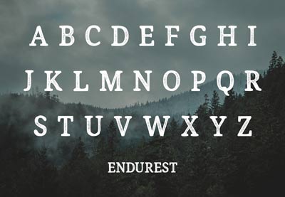
In this article, we’ll take a look at the history of sans serif typefaces. You’ll learn what makes them great and discover some wonderful options to consider for your next project.
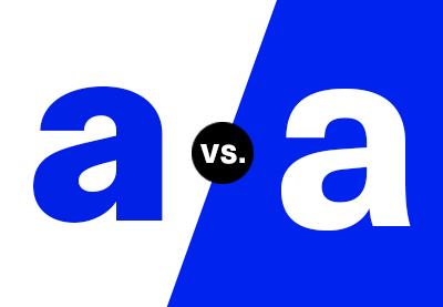
In the last few years, there has been a big shift in branding. Many high-profile companies have redesigned their logos and replaced classical serifs with sans serif typefaces. The popularity of social media and digital display has influenced the way we think about typefaces and brand development.
Let’s start by looking into the development of sans serif fonts, and then we’ll see what makes them great and go through a few tips when choosing one for your next project.
Follow along with us over on our Envato Tuts+ YouTube channel:
The History
Sans serif fonts started developing slowly before the 18th century but weren’t used widely. In 1816, William Caslon IV created a sans serif typeface called Two Lines English Egyptian, which was commissioned by a specific client.
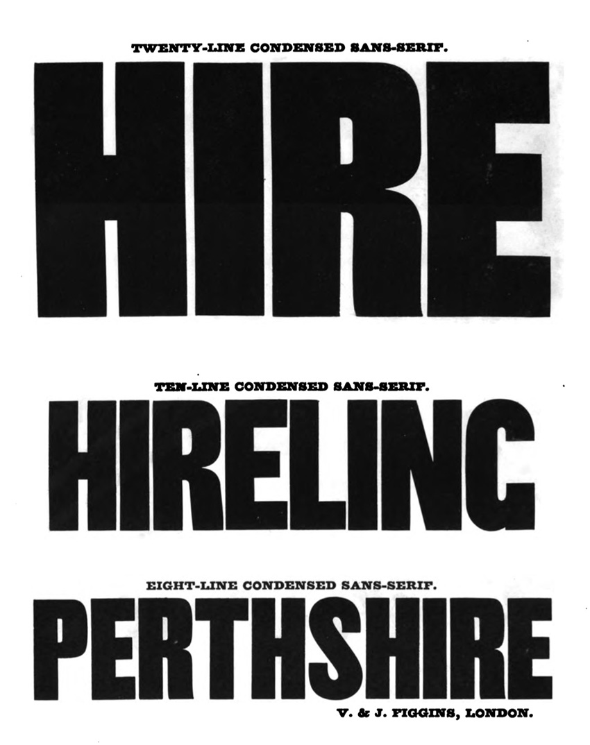
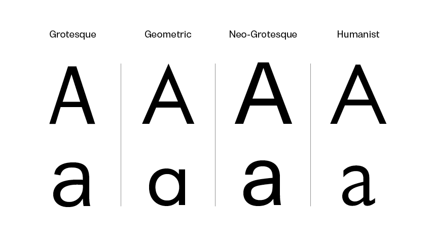
The Figgins foundry in London released a new sans serif in 1830 that was primarily used in advertising or headings. The anatomy of the face was condensed and bold, resulting in a font that grabbed attention. At this point, sans serifs were called Grotesque due to their “malformations”.
Later in the 1920s and 1930s, the Bauhaus popularized sans serifs as a reaction to the embellished Art Nouveau style. Bare typefaces were considered beautiful as they didn’t include unnecessary additions. Sans serifs were appreciated for their simple, clean look and high efficiency for reading. Futura, one of the most popular Geometric sans serif styles, was released in 1928. While it features strong geometric lines, Futura followed the styles of its time.
In the 1960s, the International Typographic style took over the design world by using Helvetica and Univers. This modernist movement emphasized the use of clean and minimalist layouts. Both of these fonts became examples of neo-grotesque typefaces due to their no-nonsense anatomy. Both typefaces included extensive families that would make them suitable for anything designers would need, from headings to body copy.
Sans serif typefaces went through another evolution process in the 1970s. The overuse of neutral neo-grotesque typefaces led to the creation of Humanist sans serifs. At this point, typefaces were lacking the human touch. Humanist fonts are inspired by traditional serifs and calligraphy. Gill Sans, for instance, includes similar forms to those found in Helvetica, but it’s less geometric. Therefore, the typeface is friendlier and more relaxed.
Legibility
Most recently, we’ve seen the rebrand of many labels switching from classic serifs to sans serif typefaces—anything from luxury brands to digital and even bank institutions. Why is sans serif so appealing?
Sleek? Check.
Sophisticated? Check.
Legible? It depends…
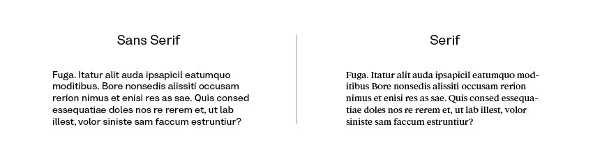
Many designers still believe that serifs rule the printed media world, making it easy for our eyes to follow and jump from letter to letter. Sans serifs are increasingly becoming popular as body copy, with great legible typefaces being currently developed. Sans serifs do take the win when it comes to digital displays. Our screens have improved in the last decade, and serifs tend to glare quite a bit in digital displays. We’d need to up the point size significantly to appreciate their beauty. Sans serifs are definitely legible at smaller point sizes, both printed and on screen. Flip through a magazine and you’ll notice that the picture captions and credits are mostly set in sans serifs. They are crisp.
Personality
In the last few years, many trends came and went away faster than ever. It is difficult to keep up with the increasing use of social media. Aside from being clean and modern, sans serif typefaces offer that trend fluidity that brands are looking for. It has become a priority to accommodate clients and their personality.
Serif fonts tend to be conservative, classic, and are often classified as feminine. Sans serifs, on the other hand, are more gender neutral and highly adaptable. The redesign of many logos is not only trend-led, it goes hand in hand with the cultural and political climate we’ve been experiencing in the last decade.

Choosing the right font is one of the most important parts of the design process. A thoughtfully chosen typeface can be the foundation that brings a brand together. If you’re looking for that cool, sophisticated look and feel, take a look at a few of our suggestions. Envato Elements has an extensive font library that can help you choose the one typeface for your next project.
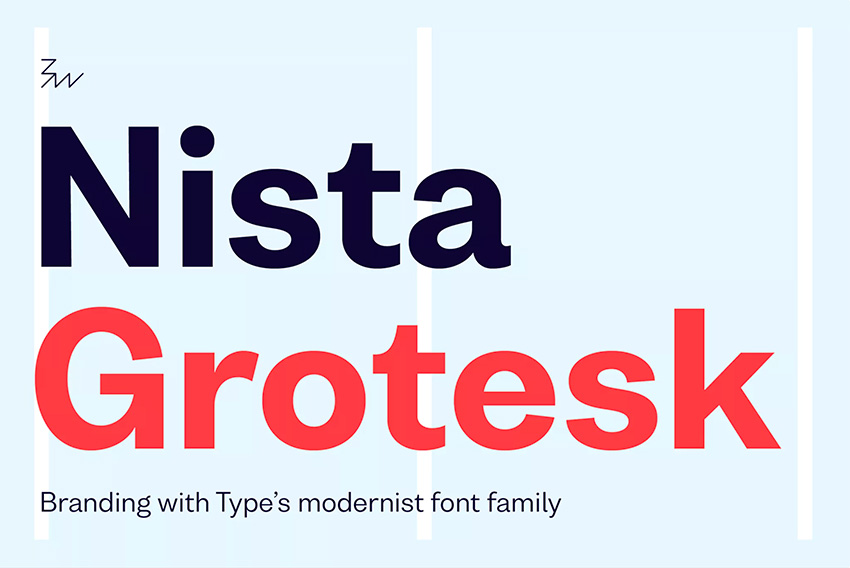
Nista Grotesk
Bw Nista is a neutral and clean sans serif font. The anatomy contains clean shapes with quirky details that make it different from regular neo-grotesque fonts. The font comes in seven weights, making it highly functional for any layout or brand development project.
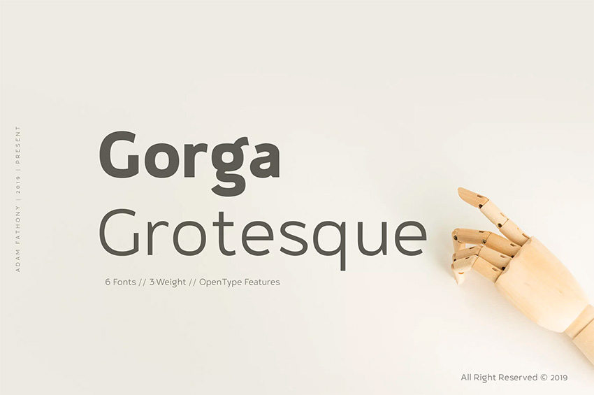
Gorga Grotesque
Gorga is a humanist sans serif font. It has playful curves, which separate it from cold sans serifs. The package comes with three different weights and their respective italic versions. Gorga Grotesque supports multiple languages.
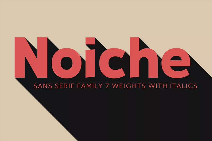
Noiche Sans Serif
Noiche is a mix of neo-grotesque and a geometric sans serif. The small details like the angle cut on the vertical strokes give it an edgy personality. The font comes in seven different weights and italics. This is perfect if you plan on covering a lot of ground with a single awesome font.
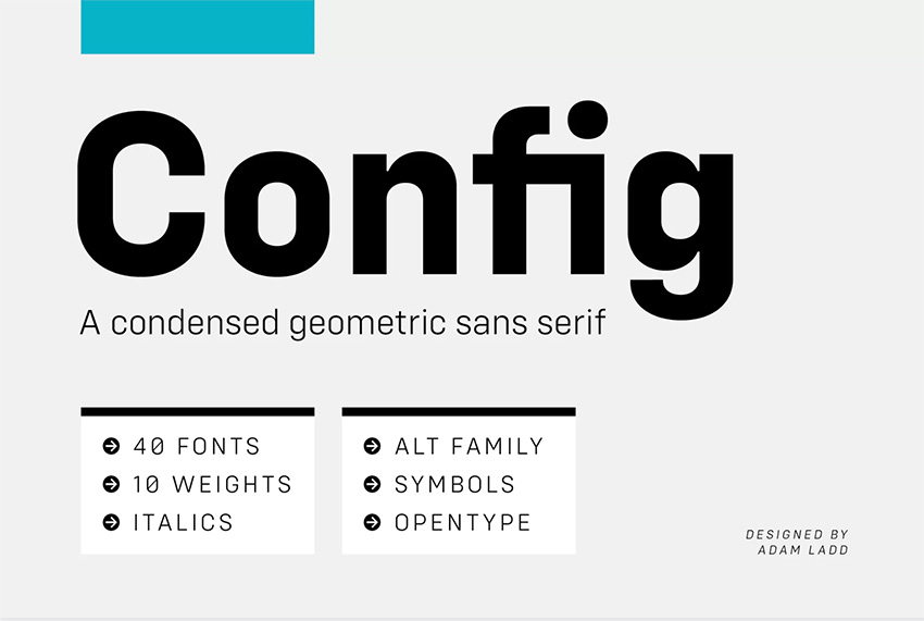
Config Font Family
Config is a large family that includes ten weights, italics, and 600 glyphs that support multiple European languages. The font is a condensed geometric sans serif with circular forms. This font has been carefully designed, and all aspects of each character have been considered. The font includes alternates for specific characters that make them interesting when used on display text.
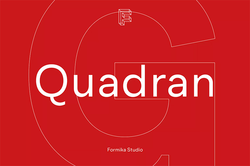
Quadran
Quadran is the right balance of neo-grotesque and geometric sans serif. This contemporary font is contemporary while still maintaining a few classic attributes. The package includes multiple font weights and supports many languages.
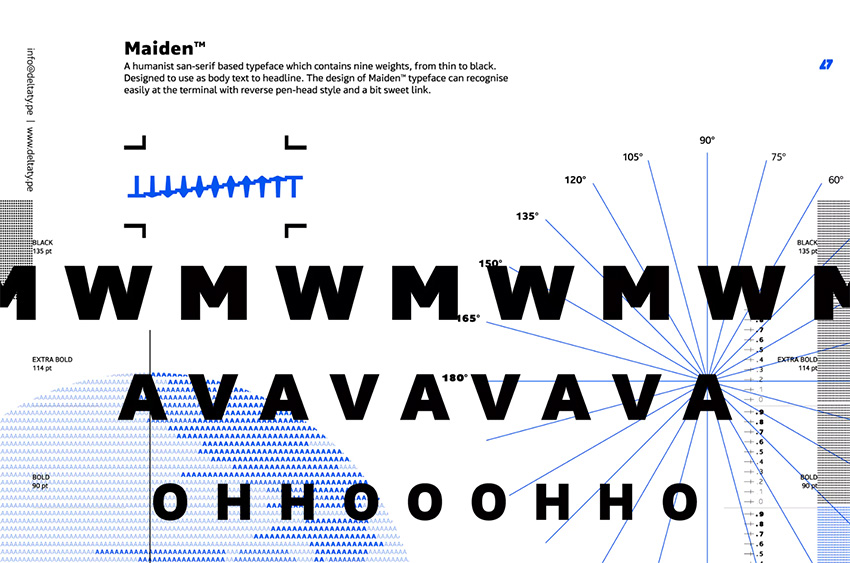
Maiden
This humanist sans serif is inspired by a reverse pen-head style. This package is available with nine weights, from thin to black. This highly legible font is suitable for display text and body text. The discretionary ligatures are beautifully designed and can replace any of the common ligature combinations.
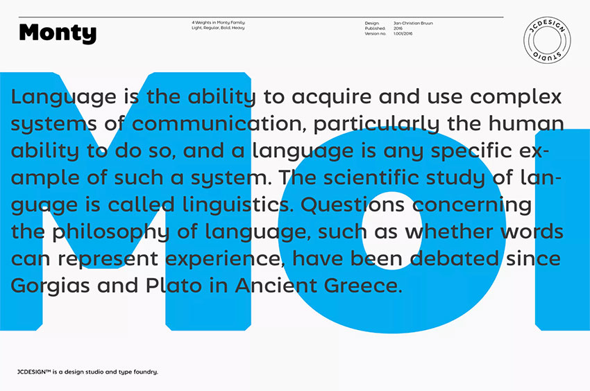
Monty
Inspired by grotesque fonts, Monty adds a softness by using round curves. This versatile font has a quirky personality that makes it perfect for branding. It’s clean, sophisticated, and fun. The package includes four weights and supports multiple languages.
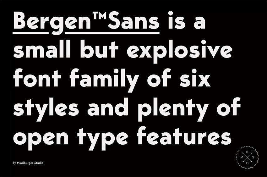
Bergen Sans
Bergen Sans is inspired by the Bauhaus aesthetics. This contemporary sans serif is geometric and clean. The font supports multiple languages and has many OpenType features. It is a small font family, but each font is carefully crafted, including many glyphs in different languages.
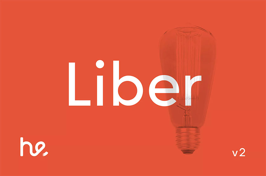
Liber
Liber is inspired by the geometric forms of Avenir and Futura. The contemporary geometric characters are built on geometric circles and squares while taking roman text fonts into consideration. This modern font includes ten weights, making it suitable for brands and layouts leaning on a single font.
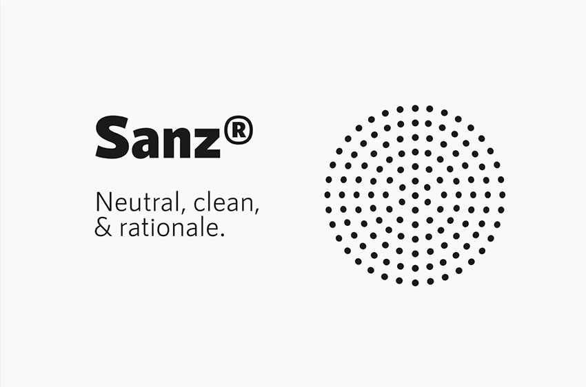
RNS Sanz
RNS Sanz is a neutral, clean, and contemporary sans serif. The open counters on each character make it highly legible and suitable for body copy. RNS Sanz is versatile and is sure to adapt to any theme. The family contains seven weights and standard and tabular figures.
When to Choose a Sans Serif Font
It’s important to note that sans serif fonts aren’t the right fit for every brand. While they are currently trendy and pretty much everywhere, those shouldn’t be the only reasons for a rebrand.
When you are redesigning or designing a logo from scratch, examine the brand very carefully. Be specific about your brand, what its personality is, and what you want it to communicate. Think of what can set your brand apart and how your logo can stand out from the same trendy crowd. If you do end up choosing a sans serif font, make sure that you are balancing your design with originality.
Trends tend to be a reaction to what came before. The modernist styles developed in the 20th century were a reaction to Art Nouveau. Art Nouveau was characterized by organic forms and highly stylized elements, while the new modernist styles were composed of abstract compositions, using basic graphic elements and colors. As we see sans serifs becoming trendy, we’re sure to see a reaction to it in the next few years.
Want to learn more about the world’s most divisive sans serif font? Check out this awesome video by the Envato YouTube channel:
In a hurry? We’ve got amazing sans serif fonts over at Envato Elements and GraphicRiver. Go check them out!
If you liked this article, be sure to check out:
 FontsSerif vs. Sans Serif Fonts: What Is the Difference?
-
TypographyThe Complete Beginner’s Guide to Chinese Fonts
-
Hand LetteringHand Lettering: Understanding Types of Type
-
InDesign TemplatesHow to Create Layout Templates in InDesign (For Magazines, Newsletters, and More!)
-
FontsThe Must-Have Fonts for Graphic Designers and Font Lovers
-
Graphic DesignThe Best Alternatives to the 10 Most Popular Fonts