Summary:
As a UI design style, neobrutalism focuses on raw, unrefined elements like bold colors, simple shapes, and intentionally “unfinished” aesthetics.
Emerging as a reaction against sleek, minimalistic designs, neobrutalism creates a striking (almost rebellious) visual style. But while neobrutalism draws attention, designers must carefully balance its distinctive look with usability to avoid ending up with an overwhelming or confusing interface.
Defining Neobrutalism
Neobrutalism (or neubrutalism), an evolution of traditional brutalism, is a visual-design trend defined by high contrast, blocky layouts, bold colors, thick borders, and “unpolished” elements.
Brutalism vs. Neobrutalism
Brutalism and neobrutalism are both edgy visual-design styles that draw inspiration from the architectural movements they get their names from. In digital design, brutalism tends to appear raw, harsh, unfinished, or utilitarian. Brutalist websites might use plain HTML elements and limited color palettes.
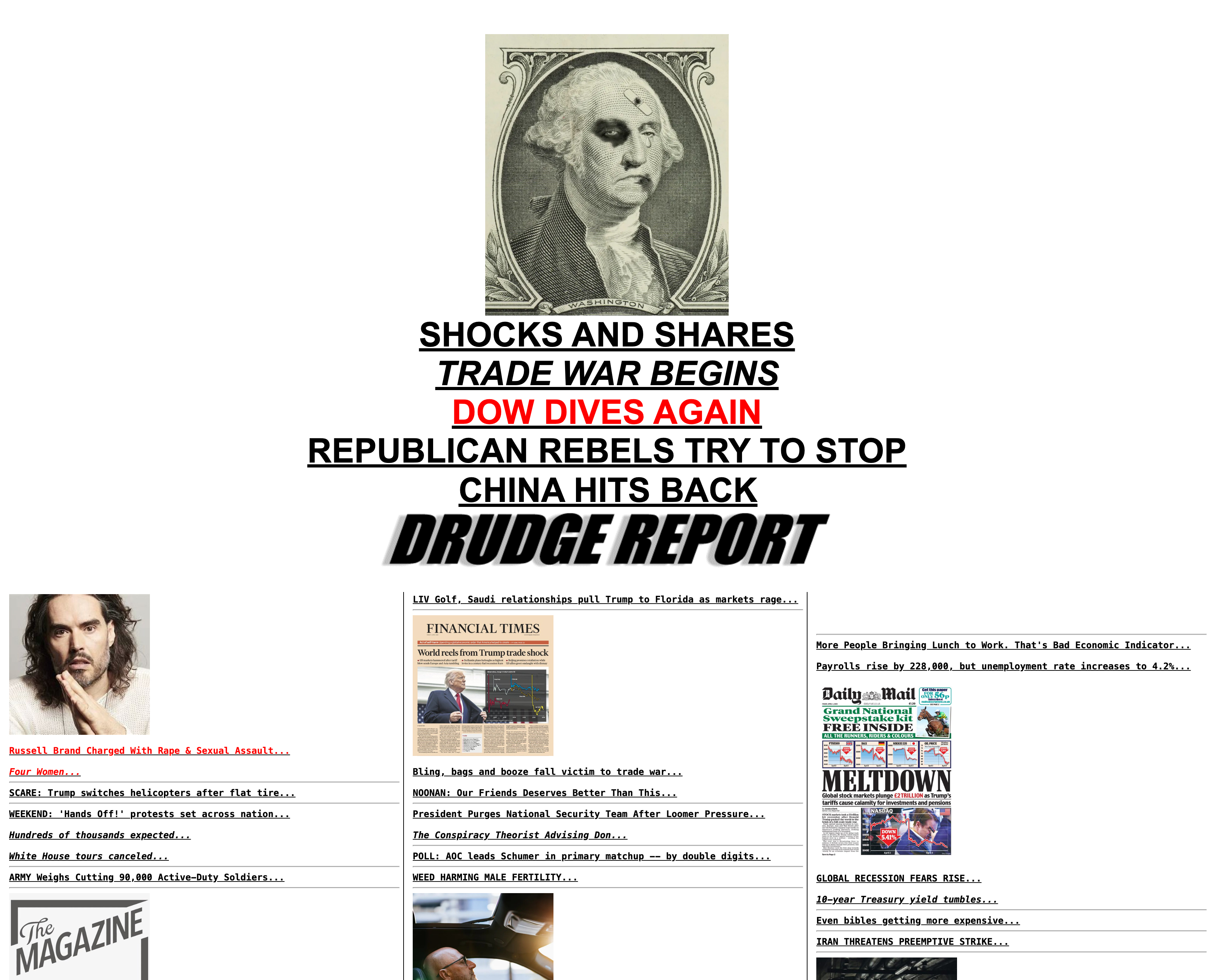
For example, Drudge Report embodies brutalist aesthetics with its barebones HTML structure, monospaced headlines, and rigid table-based layout, evoking the look of the pre-CSS web.
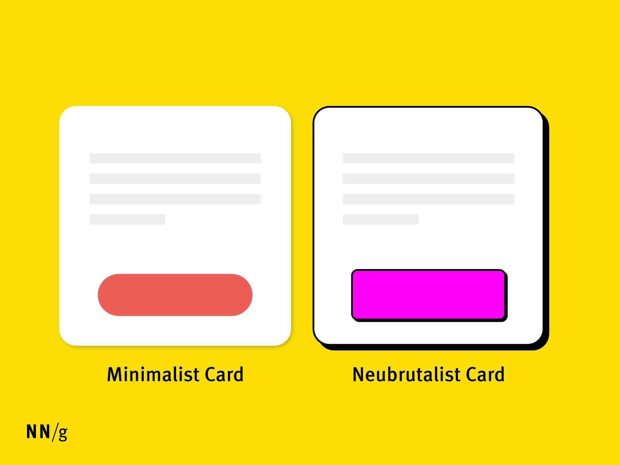
In contrast, neobrutalism combines the brutalist design style with nostalgic 90s graphic-design elements. Unlike true brutalist web design, neobrutalist designs are likely to be more colorful and orderly.
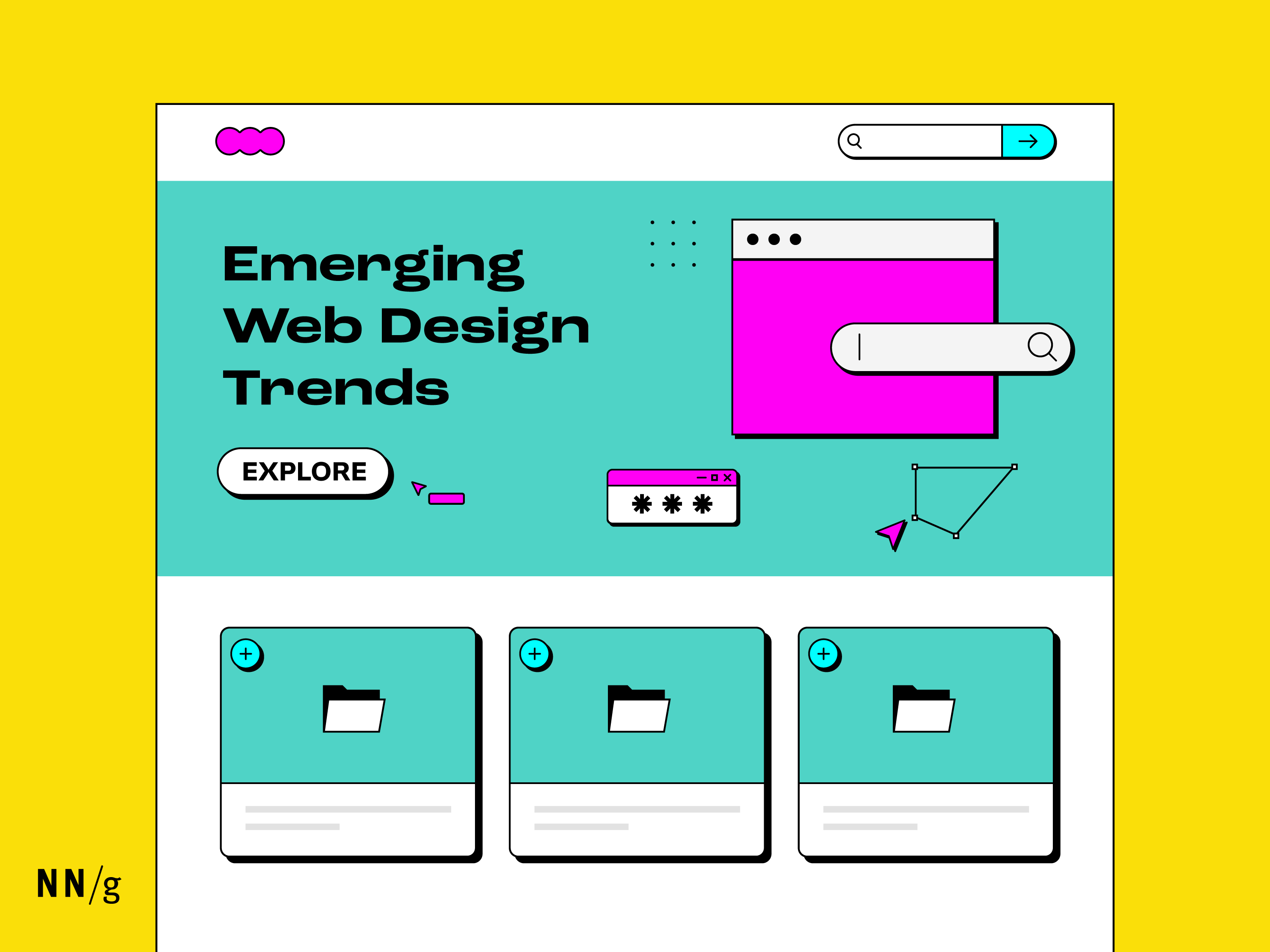
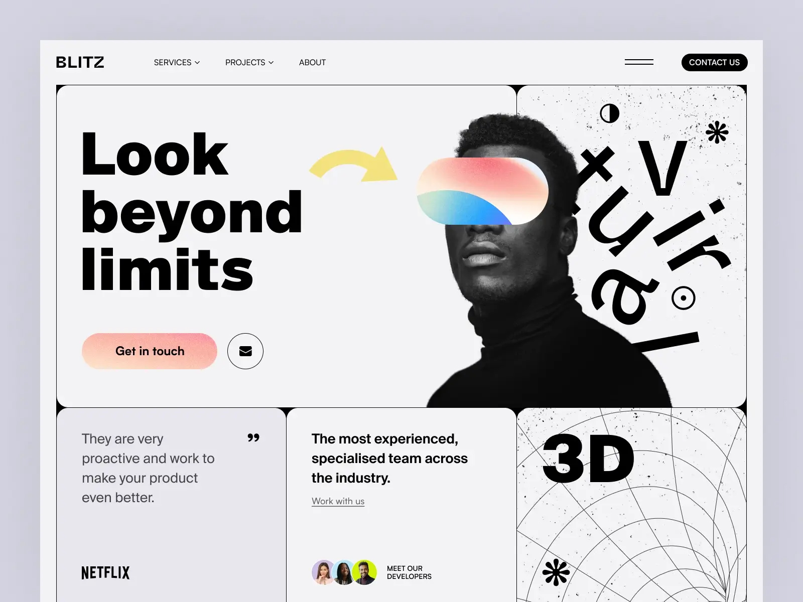
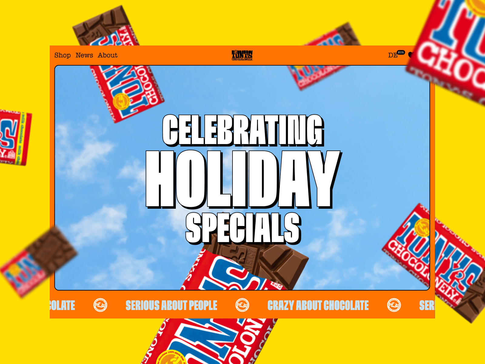
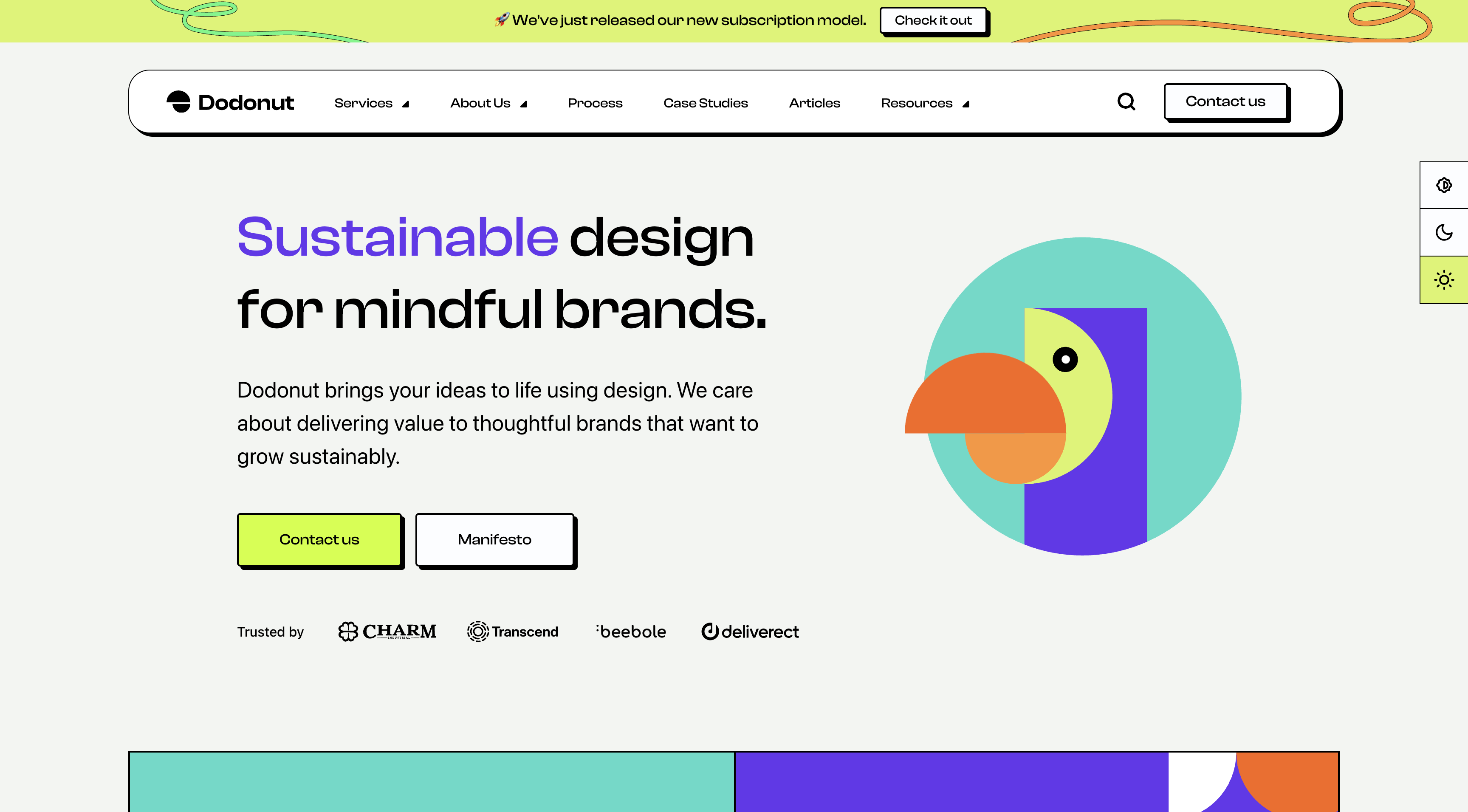
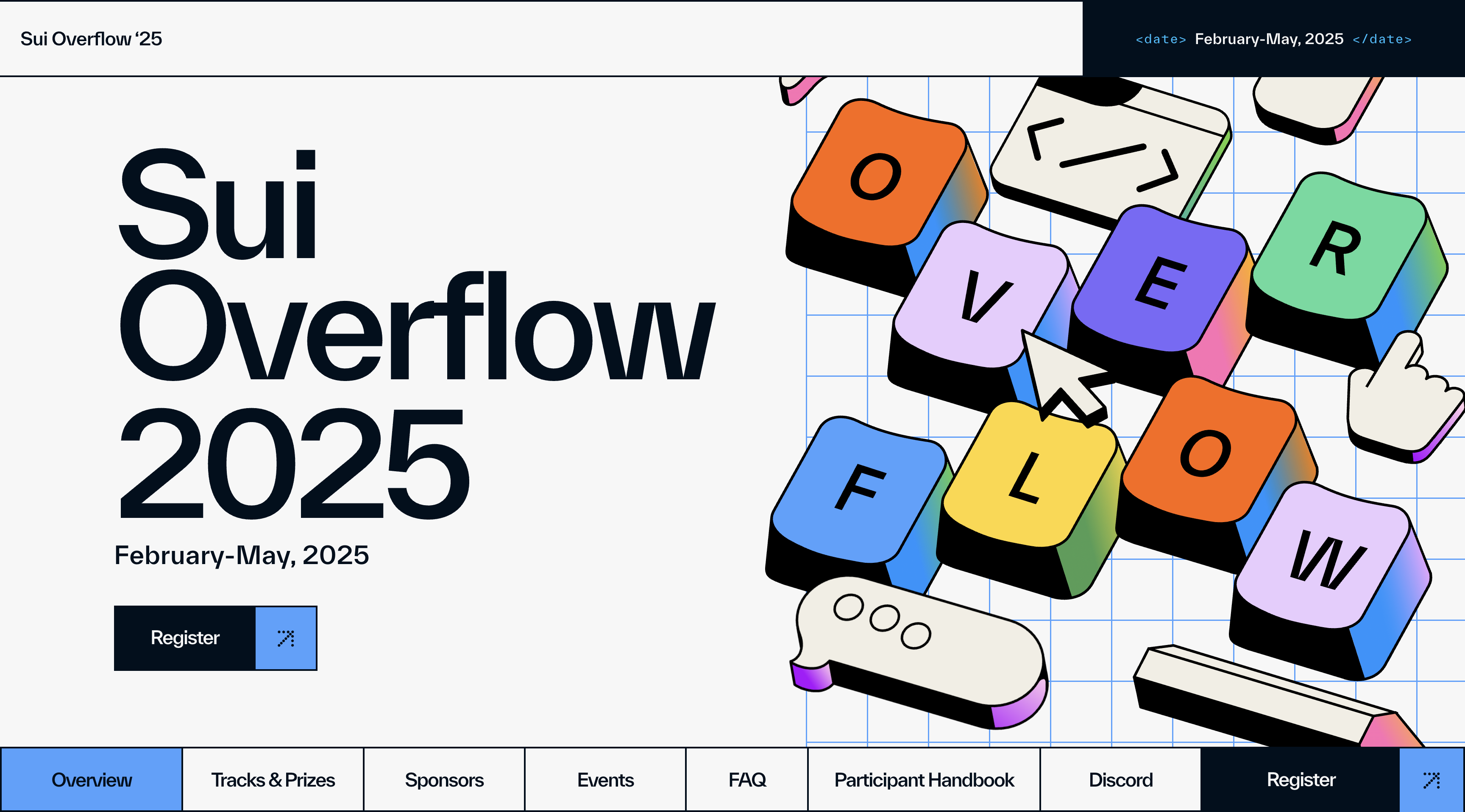
A striking example is Look Beyond Limits by Halo Lab, which features oversized typography, bold dividers, thick strokes with a pop of bright colors.
Characteristics of Neobrutalism
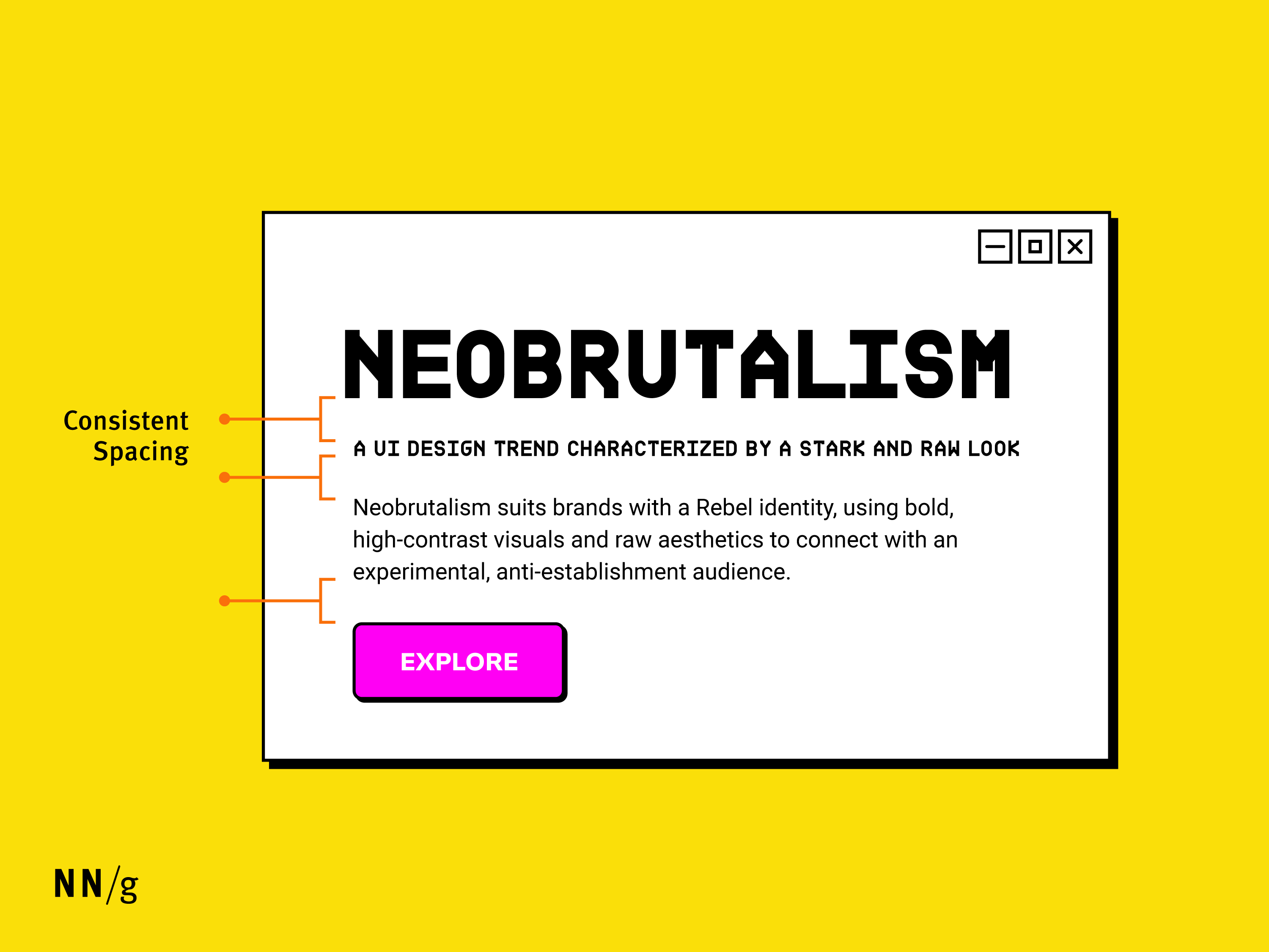
High Contrast and Bright Colors
Neobrutalist designs use bold, primary colors and high-contrast combinations to emphasize key functions and UI elements. This approach introduces striking, contrasting hues to capture attention and enhance visual impact. It also helps users focus on essential elements while creating an unconventional, memorable experience.
Thick Lines and Geometric Shapes
This style does not shy away from using thick borders, angular forms, and solid lines that create structure without relying on gradients or shadows.

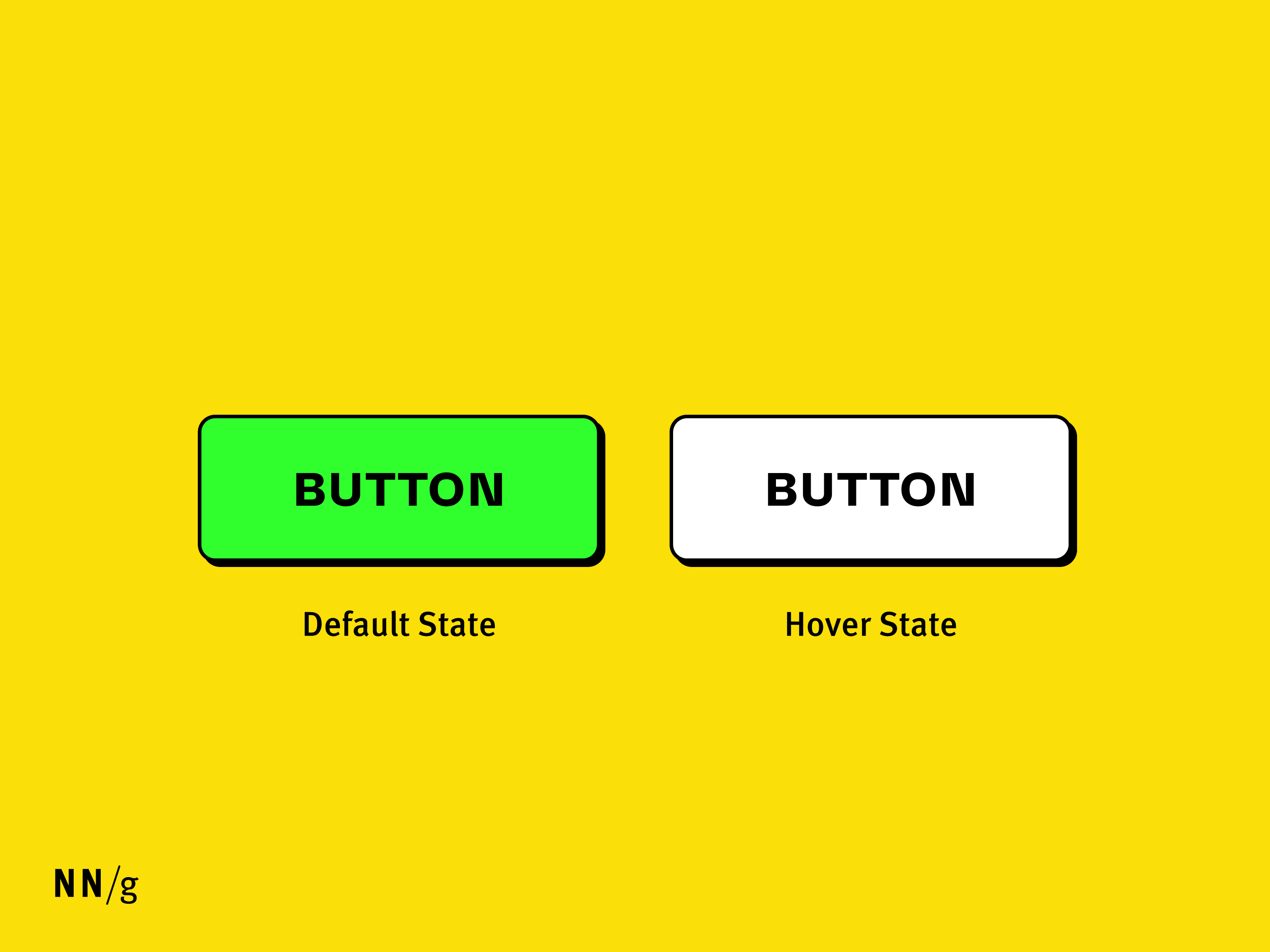
Stark Drop Shadows
Unlike minimalism, neobrutalism encourages bold, striking shadows instead of soft, layered ones. It incorporates solid, single-color shadows (e.g., a black drop shadow offset by 4px) to add depth while maintaining the “raw” aesthetic.
Bold Type
Neobrutalism promotes the use of bold, “unpolished” elements that often include quirky or slightly eccentric typefaces. Despite their expressive forms, these typeface choices are balanced by a generous use of whitespace, creating a visual rhythm that feels deliberate rather than overwhelming. Typography in neobrutalism serves both as a functional element and as a focal point of the overall design.
Skeuomorphic Elements
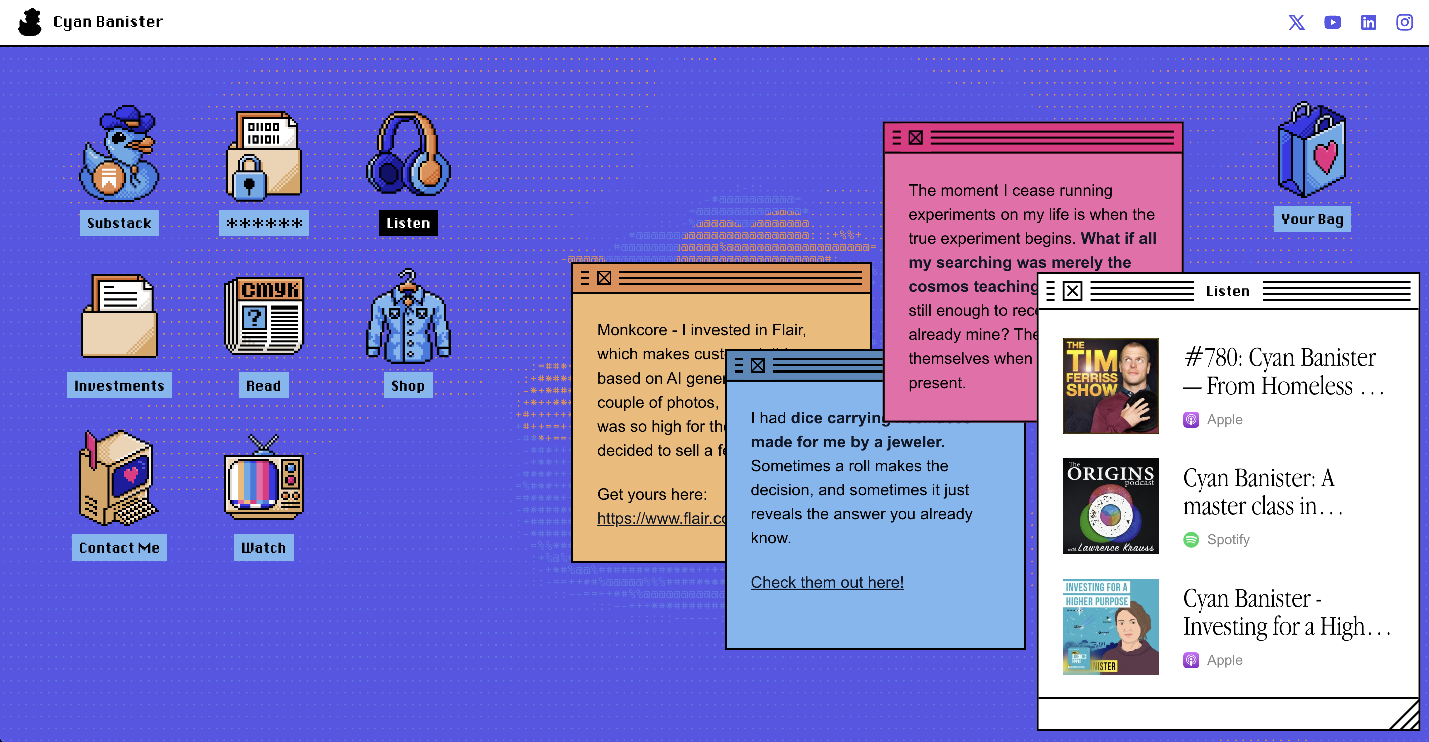
Neobrutalism might incorporate nostalgic elements from early digital interfaces, such as Windows 98-style buttons and monospace fonts. These features create a sense of familiarity while blending retro aesthetics with modern design. For example, a neobrutalist design might use UI elements from an old browser, with traditional iconic buttons and appearance mimicking early web experiences.
Examples of Neobrutalism in Practice
Many brands are embracing the bold, raw aesthetic of neobrutalism to create memorable experiences through striking contrasts, unconventional typography, and minimalistic design. This approach reflects a shift toward prioritizing purpose and functionality over excessive polish, allowing brands to stand out in a crowded digital landscape.
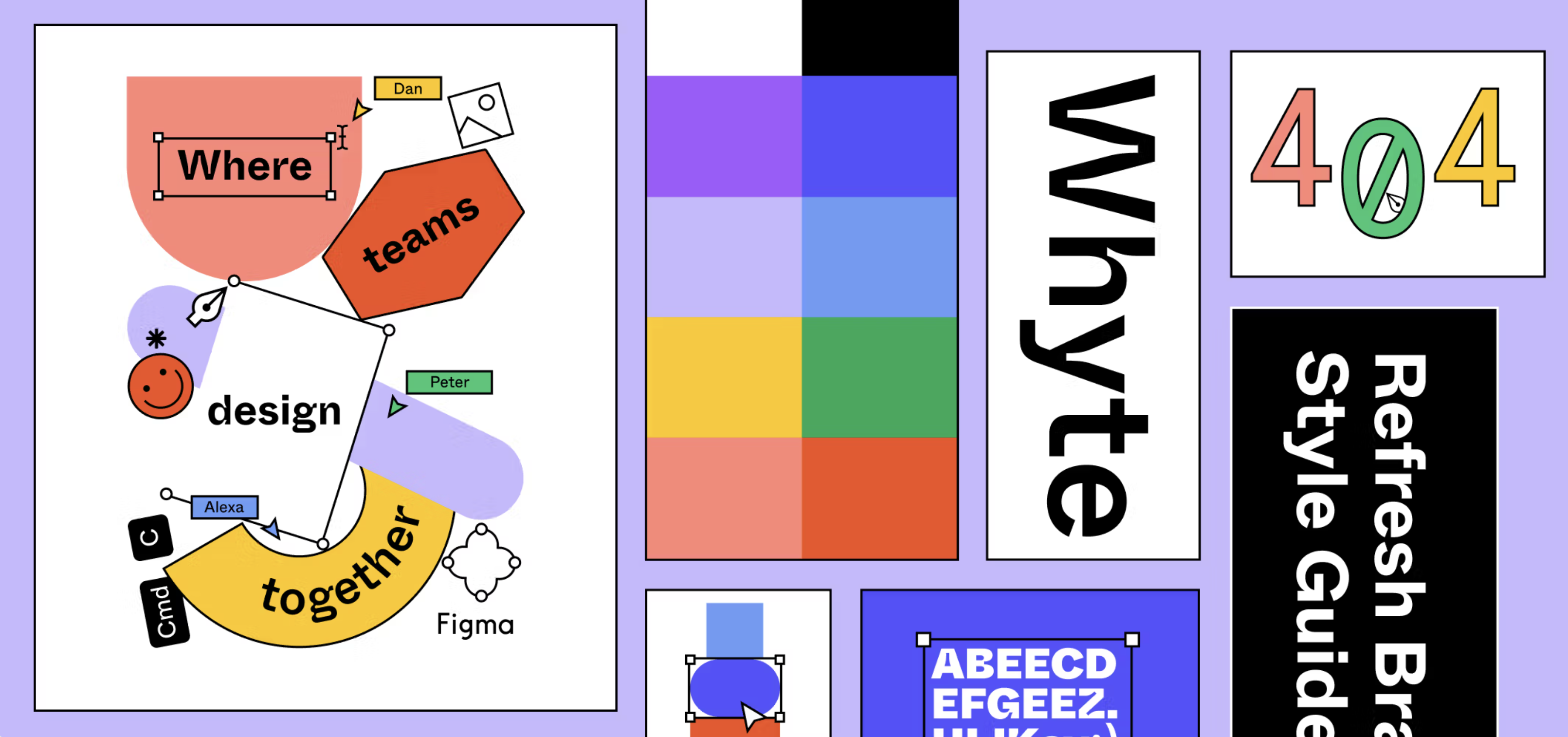
Brands like Figma and Gumroad incorporated bold, high-contrast colors and raw elements, with a focus on user experience and simplicity.
Figma’s brand refresh, with its use of bold contrasts and unconventional typography, exemplifies neobrutalist design. Just like its tools, the refreshed identity emphasizes creative freedom, flexibility, and a dynamic user experience, allowing users to work in ways that feel authentic and engaging.
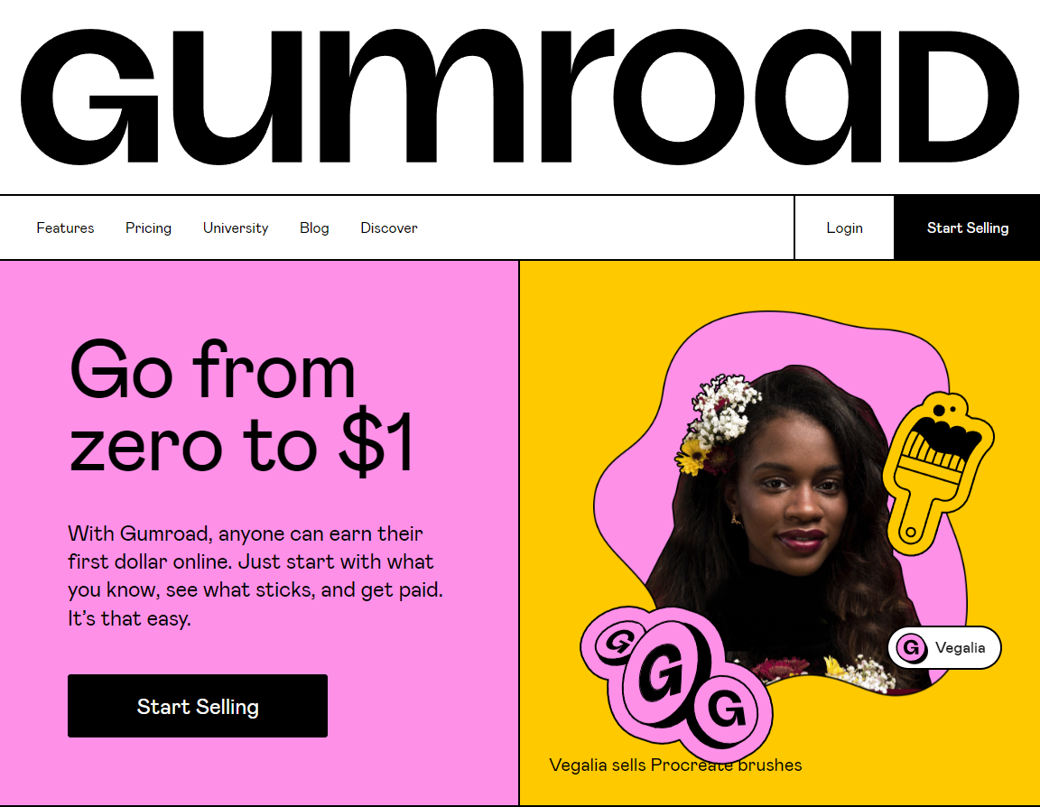
Similarly, Gumroad, an ecommerce platform for independent creators, uses neobrutalism’s raw aesthetic to align with its ethos of empowering independent creators. By stripping away unnecessary polish and focusing on functionality over flourish, the platform emphasizes simplicity and accessibility, staying true to its purpose of providing creative freedom and a straightforward user experience.
Designing with Neobrutalism: Best Practices
While neobrutalism thrives on bold colors, heavy typography, and sharp contrasts, without balance, it can overwhelm users and hinder accessibility. These tips help create designs that are both visually striking and user-friendly.
Design with Usability at the Forefront
Prioritize usability with clear buttons, readable type, and ample whitespace to keep the experience intuitive and accessible, even within a bold, raw aesthetic.
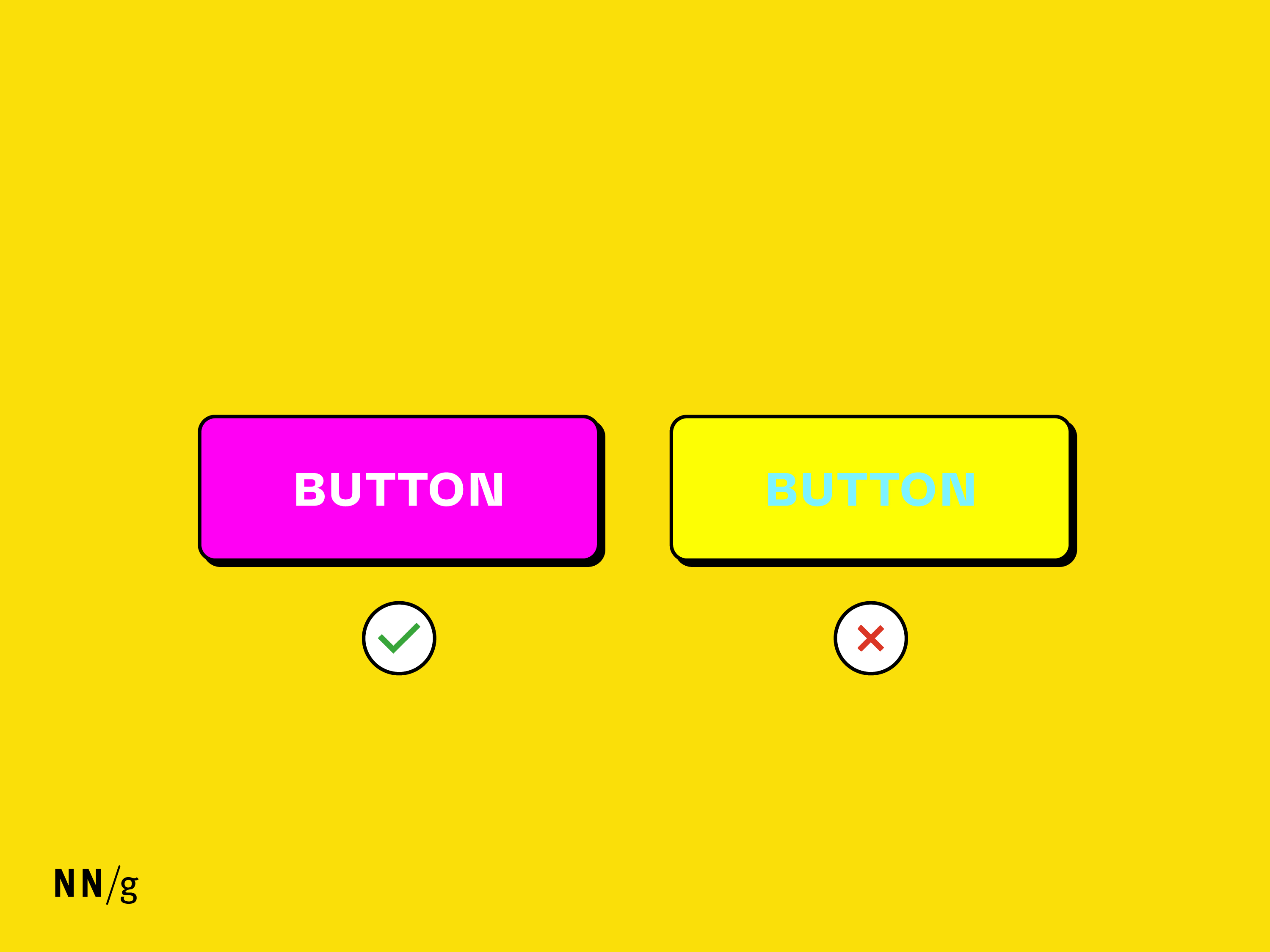
Contrast Ratios Matter
Bold colors must meet text-contrast standards. Avoid pairing vibrant hues like yellow and cyan that fail readability tests. Tools like Coolors’ contrast checker ensure that combinations remain accessible while staying visually striking.
Limit Your Color Palette
Restrict your palette to 2–3 bold, high-contrast colors (e.g., black, neon green, electric blue) to avoid overwhelming users.
Prioritize Readability
Pair bold, unconventional headlines (e.g., a chunky sans-serif font) with clean, neutral body fonts like Roboto or Inter. Avoid overly decorative or condensed typefaces for paragraphs to maintain legibility across devices.
Use Whitespace Strategically
Offset dense geometric shapes and thick borders with generous padding (e.g., 24–32px margins) to create breathing room, prevent clutter, and guide users to key actions or content.
Test Interactions
Ensure that interactive elements (buttons, links) remain recognizable. Use underlines on hover or subtle color shifts to indicate state changes. For example, a neon button could lighten on click to signal feedback without gradients or shadows.
Avoid Oversimplification
Retain hierarchy through size variation (e.g., headlines twice as large as body text) and color intensity. Even in a minimalistic layout, ensure that clear calls to action and key usability elements stand out to create a seamless user interface.
Key Takeaways
Neobrutalism’s rebellious aesthetic can grab attention, but its success hinges on balancing boldness with usability. By grounding the style in accessibility principles and testing with users, designers can create interfaces that are both striking and functional.