[unable to retrieve full-text content] Data ethics principles and processes are useful, but they are often of limited use when it comes to addressing the social and environmental harms of the data economy. This post is about using creative R&D to build data technologies that embed a different set of values from the ground up,… Continue reading How to build tech that does things differently
Category: UX
Bringing self-compassion into product management
[unable to retrieve full-text content] Encouragement to shift your perception of what ‘high performing’ looks like Continue reading on UX Collective »
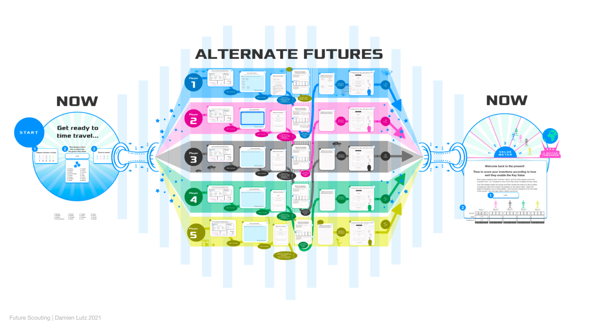
Future Scouting#1 — Designing a speculative design game
[unable to retrieve full-text content] Gamifying an introduction to speculative and values-driven design Continue reading on UX Collective »
A deep dive into Bootstrap
[unable to retrieve full-text content] Sometimes to change your opinion, you have to force yourself to look at things differently. Continue reading on UX Collective »
We need more friction in our algorithms
[unable to retrieve full-text content] Companies have paid lip service to our digital wellbeing for too long. Now we need to see real change. Continue reading on UX Collective »
Design critiques, now
[unable to retrieve full-text content] I have personally done some of my best work as part of a design culture in which viewpoints are freely exchanged and argued upon. I started thinking about the importance of such a design culture and drafted out guidelines for the remote working environment due to a worldwide pandemic. My… Continue reading Design critiques, now
Putting to the test Google’s plan to disrupt the university degree
[unable to retrieve full-text content] A UX design and ethical analysis of Google’s UX Design Professional Certificate Course. A screenshot of Google’s UX design course on Coursera I usually only binge-watch Netflix shows. But after reading about Google’s plan to disrupt the college degree, following an announcement from Sundar Pichai, CEO of Google, on March 11… Continue reading Putting to the test Google’s plan to disrupt the university degree
The immortality of typefaces
[unable to retrieve full-text content] And why there is no need for continuing to creare typefaces again and again. Continue reading on UX Collective »
Figma for education: Design for learning experiences
[unable to retrieve full-text content] Why would a teacher be interested in Figma? Why would a designer be interested in classroom prep? Join our little Figgy educators group. Currently, I work in the EdTech product design industry (K-12) as an experience designer. I am a former 7th-grade science teacher and am planning to return to… Continue reading Figma for education: Design for learning experiences
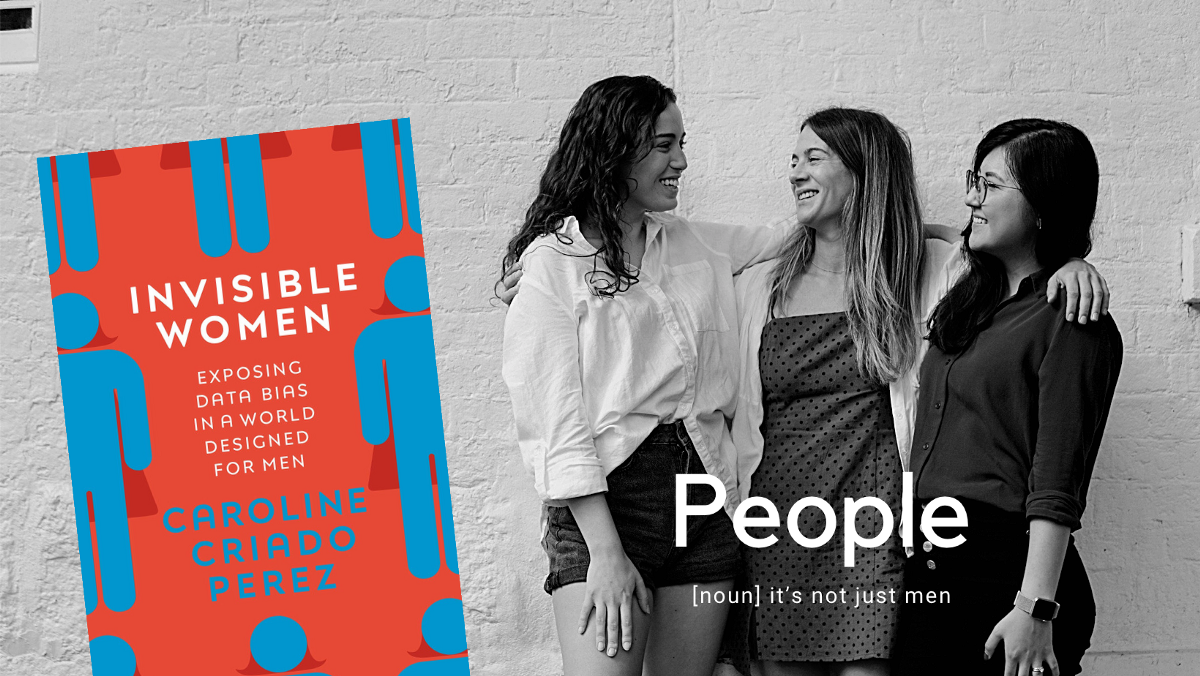
Invisible women: When you only design for 50% of the population
[unable to retrieve full-text content] Over a year ago, my ex-boss sent me a screenshot of a book cover on Telegram. I just knew I have to read it. I know I am not supposed to judge the book by its cover but I did. Not because the cover is particularly spectacular but because the… Continue reading Invisible women: When you only design for 50% of the population
Portugal by Sebastião Rodrigues’ pencil
[unable to retrieve full-text content] A journey that merges with the country’s history © Tamanna Rumee The recent history of design in Portugal in general and graphic design, in particular, is certainly still to be written. In other words, it is a story that is written every day, thanks to the work, often in difficult contexts,… Continue reading Portugal by Sebastião Rodrigues’ pencil
Starting your project on the right foot
[unable to retrieve full-text content] Many times I’ve been asked by friends, mentees and design students: “What should I ask on the first kickoff meeting with my client?”. In this article, I will note all the questions that have made my design projects successful over the last few years, and hopefully, it will serve you… Continue reading Starting your project on the right foot
Choosing a chart with your audience in mind
[unable to retrieve full-text content] Using user-centered design to figure out the best chart for your audience. Continue reading on UX Collective »
In defense of design challenges
[unable to retrieve full-text content] With specific conditions, of course. Continue reading on UX Collective »
I’m a designer. I earned $50K more because of COVID last year.
[unable to retrieve full-text content] Pandemic-induced efficiency is real, and we’re all better off for it. Continue reading on UX Collective »
Ethics, UX and our role in all this
[unable to retrieve full-text content] Ethics, UX, and our role in all this We live in a world where our behaviours are accurately being predicted every step of the way. It sometimes feels like apps and products know us more than we know ourselves. This is not necessarily bad, or that we should be scared every… Continue reading Ethics, UX and our role in all this
Elevating your aesthetics for beautiful business outcomes
[unable to retrieve full-text content] Why great design is a must for everyone. Continue reading on UX Collective »
Peek like a Geek, steal like the greatest
[unable to retrieve full-text content] How to use metaphors to gain an understanding of your customers mental model? Continue reading on UX Collective »
Early-career UXers: Your most impressive work is missing from your portfolio
[unable to retrieve full-text content] Let’s talk about what early-career UX folks should put in their portfolio and in interviews, especially when searching for the first job. Continue reading on UX Collective »
How to deal with designers in 10 easy steps
[unable to retrieve full-text content] This is is a satire. Did you just hire a couple of designers, thinking they would sit quietly and create some visuals? I have bad news for you. They are already thinking about changing things, while blabbing about people, ethics, experiences, and a guy named Norman. Soon enough, they will audit… Continue reading How to deal with designers in 10 easy steps
Applying white space in UI design
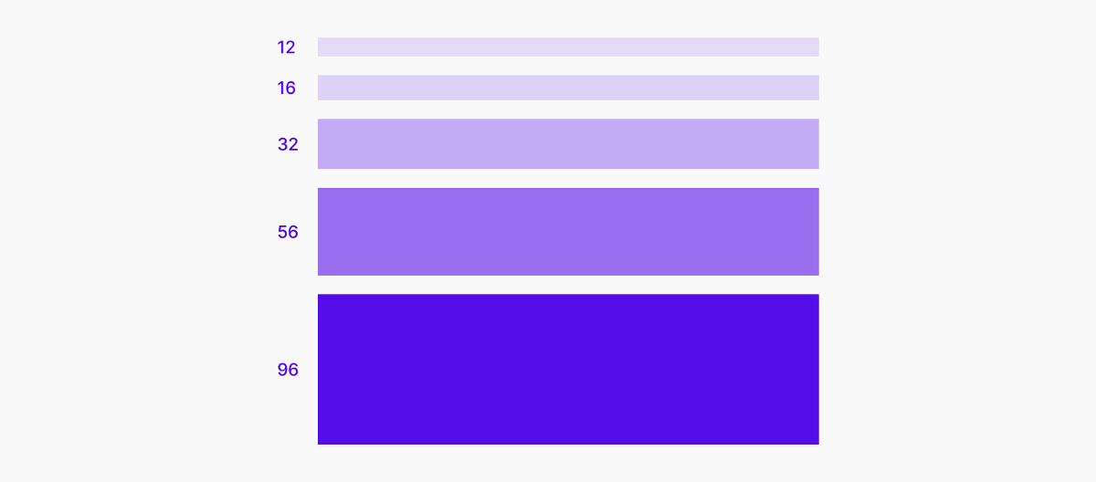
[unable to retrieve full-text content] 8 practical tips, with examples. Good UI design is the thoughtful application of whitespace at all scales of an interface, from component to page, micro to macro. When whitespace is used well, the result is an interface that is harmonious, legible, and, above all, effective and easy to use. 1 /… Continue reading Applying white space in UI design
InVision hype, card game in Figma, how to estimate design work
[unable to retrieve full-text content] Your weekly list of curated design resources, brought to you by your friends at the UX Collective. Things were still good on the InVision train, at least for us designers. But for InVision, the writing was on the wall. Or, it should have been. These new design tools were a… Continue reading InVision hype, card game in Figma, how to estimate design work
The ‘what’ and ‘why’ of design debt
[unable to retrieve full-text content] The first part of the ‘Design Debt 101’ series. The ‘what’ and ‘why’ of design debt Monday afternoon. Kick-off meeting. This new project looks very promising, you may have discovered a niche no one knew about. It turns out, you need notifications. “Great! We have a notification system. It shouldn’t be an… Continue reading The ‘what’ and ‘why’ of design debt
Creating a space for authentic connections within your design team
[unable to retrieve full-text content] Reflections on navigating 2020, and tools & techniques that have helped us intentionally design authentic virtual team connection. Continue reading on UX Collective »


