Humans are simple creatures. We understand instructions very well and know how to follow them through.
In one of my previous posts, I explained how offering users too many choices most often overwhelm and confuse them terribly. It is simpler for users to be told exactly what needs to be done, and how to go through with it. Steve Krug’s book ‘Don’t make me think’ talks about how software should seamlessly allow users to accomplish the task on hand intuitively.
So, what can we designers do to create instantly intuitive experiences?
Create traffic lights in your designs!

Let me break it down further. There are 3 instances where pro-active information makes the user’s experience better –
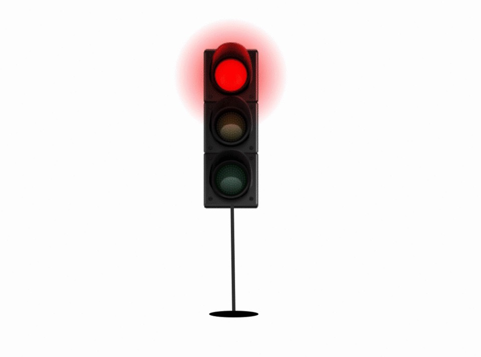
1. The red light
While signing up for a software that offers a free trial before it becomes paid, there are a lot of times where users are asked to fill out their credit card information before they get access to the trial period. This is an instant breach of trust. It also creates a dark pattern.
(Ref: See ‘Forced continuity’ and ‘Hidden costs’ on the article here)
At any point in the flow, if the user cannot proceed, they should be informed about it at the very beginning.
This holds true for any situation that might create a halt or even a pause in the user’s flow. Adding a ‘What-to-expect’ is always a good idea at the very beginning of any long user journey. It prepares the users beforehand so that they aren’t greeted with anything out of the ordinary.
Another tip would be to notify the user in case their journey is interrupted. It is essential to convey to the user what went wrong during their journey, and how it can be rectified. The user is allowed to make mistakes at any given point. As designers, we’re responsible to account for such situations and create our fail-safes.
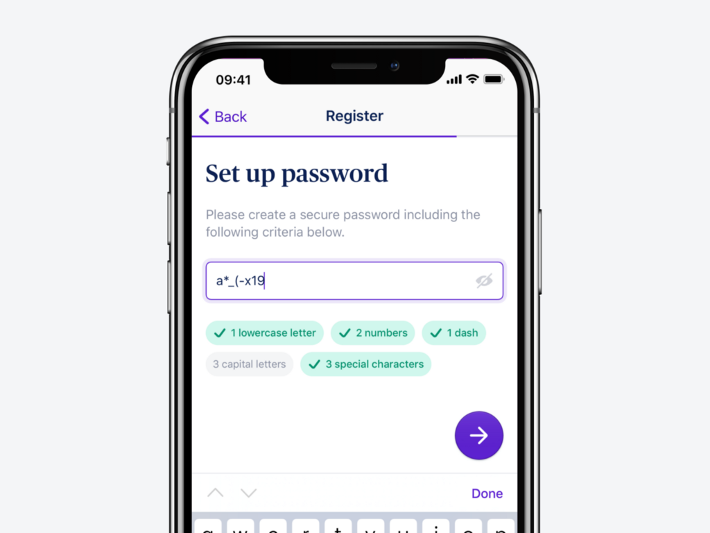
2. The green light
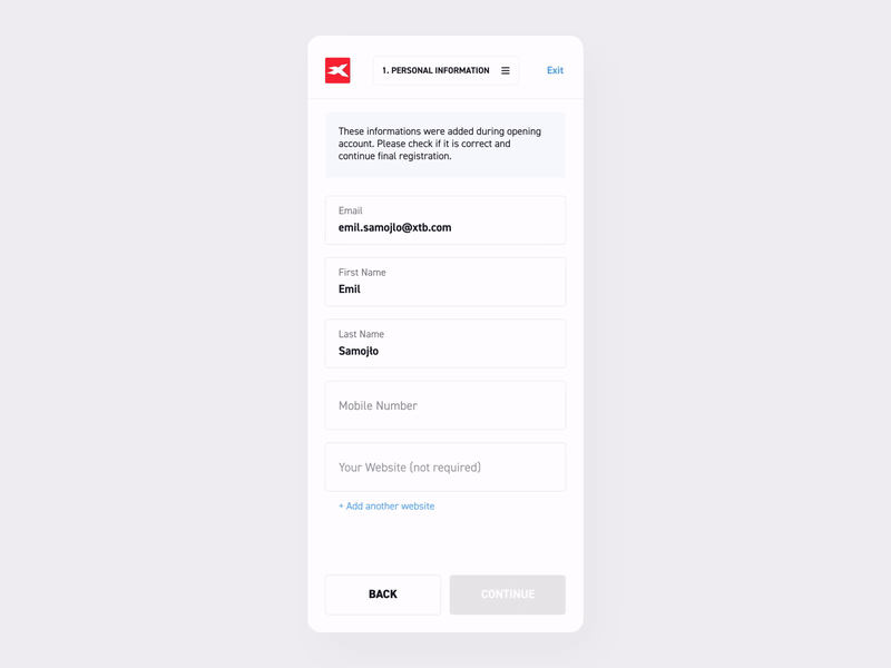
When going through a flow, there are certain checkpoints or requirements that need to be met before the user can proceed.
The most basic example of this is mandatory fields in a form. You will come across several forms where mandatory fields are marked with tiny red asterisks. Only after filling out all those fields is the user allowed to proceeds. Some forms keep the CTA active at all times. So, if the user clicks on the active CTA without filling out all fields, the response they receive is in the form of an error message, creating an instantly negative experience.
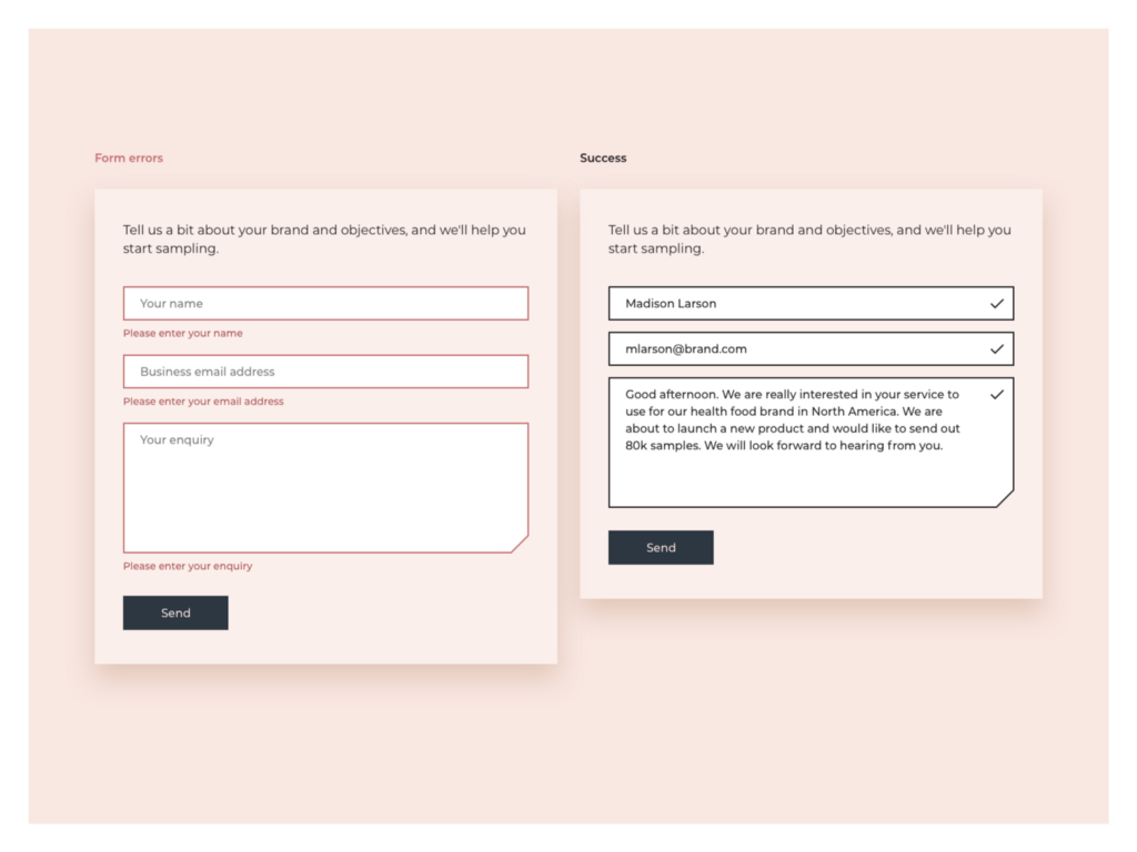
As designers, it is our job to create positive experiences at all times. The same way we create red lights to inform the users about not being able to move ahead, we need to create green lights that notify the user when they can proceed with their journey.
This can be done in several ways.
One small example is simply disabling the CTA until the needed information has been filled out. Another example would be progress indicators. Progress indicators not only showcase the steps that have been completed in the past, they show the steps ahead and how to reach them.
3. The Yellow light –
A yellow light in design can be interpreted in two ways — the first way is to serve as a warning that might indicate a break in the flow, and the second way is to be used as an indicator to nudge the user to proceed.
For example, very recently when I was about to hit my Google Drive limit, I received a prompt that said that my memory was 85% full, and I should consider purchasing some space.
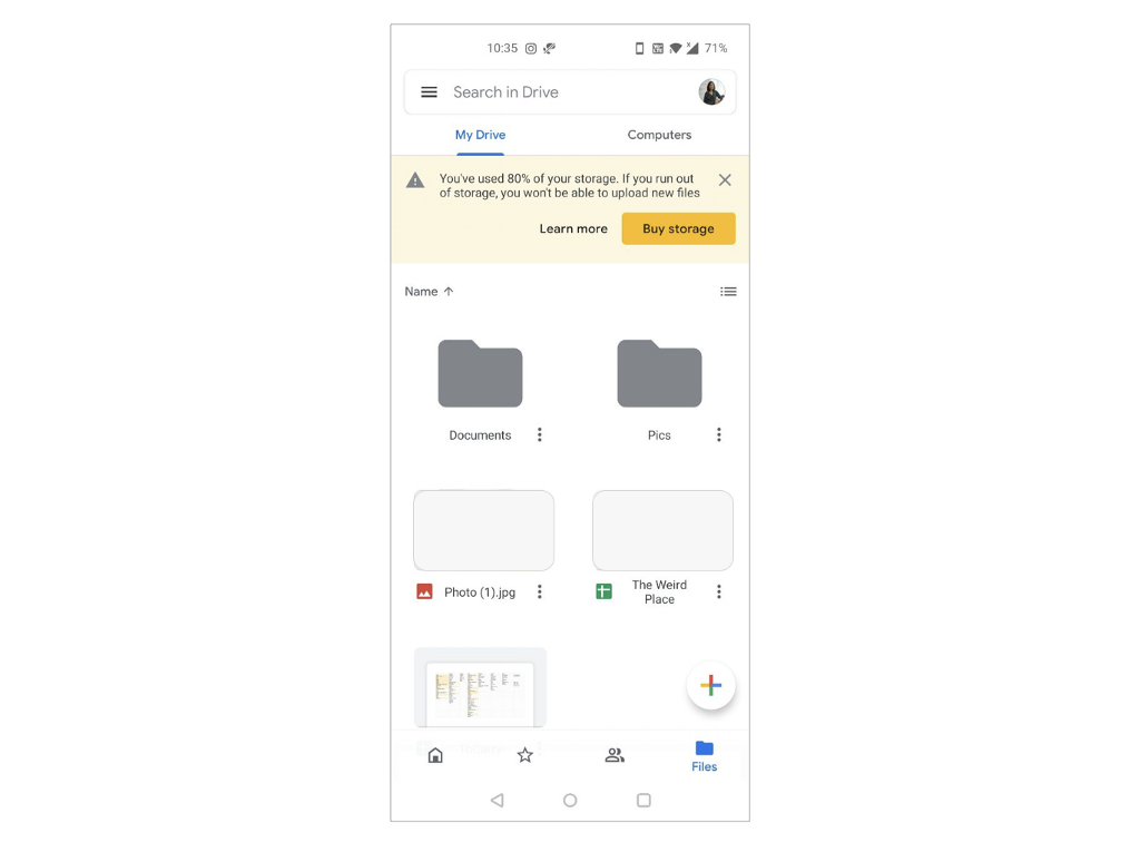
This is what good experience looks like! Instead of blocking me from uploading my documents when the storage was full, I was informed well in advance so that I could take the needed action.
Informing the user that they might hit a dead-end or hurdle soon always accounts for good experience, because it prepares the users and allows them to plan their journey better.
Another way to create yellow lights is in the form of instructions. Instructions added to a user flow account for better usability. As mentioned in the previous example, providing a set of clear and comprehensible directions to users allows them to follow them through without needing to rack their brains.
So, how do we use this mechanism?
When creating your user journey, markdown avenues where you think the users could do with a signal, be it red, yellow or green. This makes it easier for us to create relevant designs when the wire-framing/UI phase begins.
At every point in the journey we should think to ourselves, “Is there an avenue to provide more clarity here?”. If the answer is yes, pick a signal and design away.

![]()
Traffic lights in user experience was originally published in UX Collective on Medium, where people are continuing the conversation by highlighting and responding to this story.