Icons are tiny pictograms that you’ll find in almost any app. They help us save screen space, communicate efficiently, and make interaction with a product more fun. But despite their size, creating and using icons in UI design isn’t easy. Since icons directly impact feature discoverability and the number of errors users make when they… Continue reading 7 Basic Rules for Using Icons in UI Design
Tag: Correctly
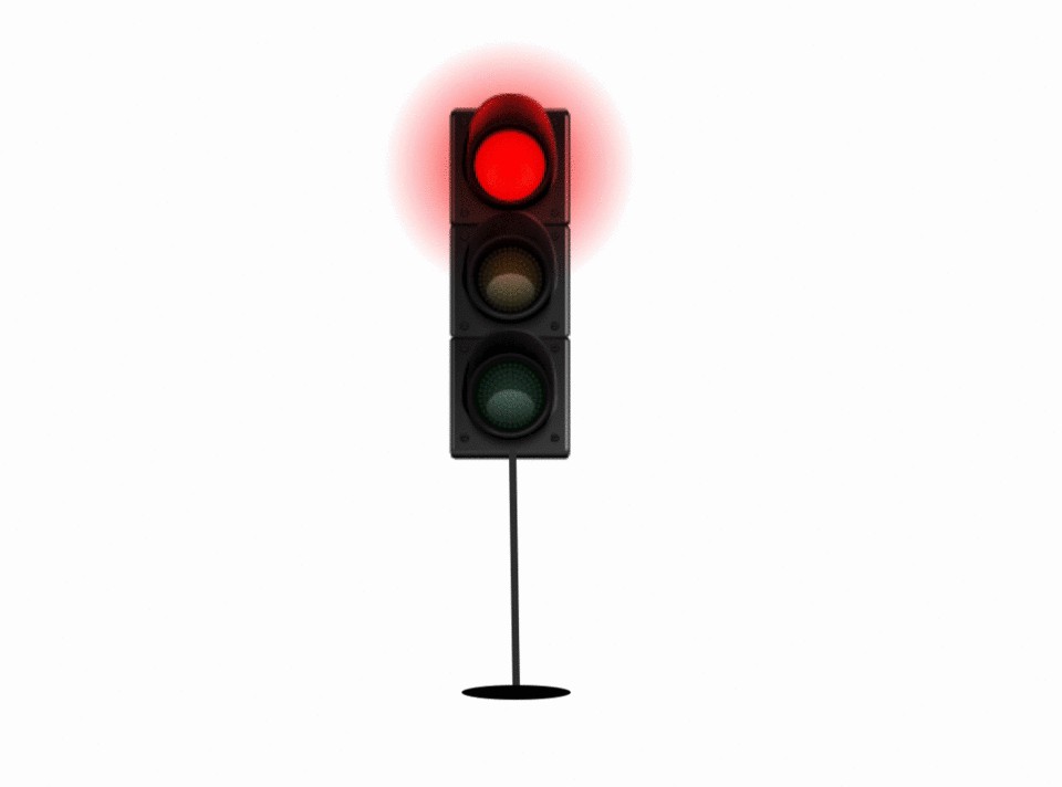
Traffic lights in user experience
[unable to retrieve full-text content] Humans are simple creatures. We understand instructions very well and know how to follow them through. In one of my previous posts, I explained how offering users too many choices most often overwhelm and confuse them terribly. It is simpler for users to be told exactly what needs to be done,… Continue reading Traffic lights in user experience

