Icons are tiny pictograms that you’ll find in almost any app. They help us save screen space, communicate efficiently, and make interaction with a product more fun.
But despite their size, creating and using icons in UI design isn’t easy. Since icons directly impact feature discoverability and the number of errors users make when they interact with a product, loosely designed icons can have a significant negative impact on the user experience of your product. That’s why UI designers have to consider a few integral rules for creating and using icons.
In this quick guide I want to cover the seven design principles for using system icons.
Web Design Assets on Envato Elements
You will find some of the best premium icon kits on Envato Elements. These premium assets include high quality features that make it fast and easy for you to use them in your website designs. You’ll find icons compatible with Figma, Adobe XD, Sketch and more. Not only that, with your Elements subscription you’ll get unlimited access to UI kits, web templates, fonts, WordPress themes and other useful stuff for any web designer.
1. Ensure the Meaning of the Icons You Choose is Crystal Clear for Your Users
Clarity is one of the most important properties of user interface design. Clear interfaces are more intuitive to use. When it comes to icon design, clarity can be measured by how well icons communicate their meaning. After all, an icon is just a visual representation of a specific action, object, or event. And when this representation isn’t clear to users, the icon immediately loses its practical value and becomes a decorative rather than functional element.
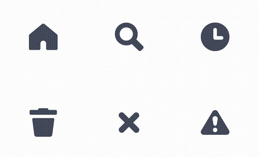
It should be easy for users to understand the meaning of an icon. Ideally, the user should be able to tell what the icon does just by looking at it, either intuitively or through previous experience. But when it comes to visual design that’s easier said than done. The problem is that there is a limited number of icons that everyone understands. A house icon representing a home page, a printer icon representing printing, a magnifying glass icon representing the search, and a paper envelope representing mail are almost all visual metaphors familiar to people. Apart from those, other icons might be unclear to the mass audience.
You might assume that when users see an unfamiliar icon, they will be willing to interact with it to see what it does, but this is a common misconception. Most of the time, when users see an unfamiliar icon without an accompanying label, they’re more likely to skip it. So the features hidden behind this icon remain undiscoverable.


There are a few simple techniques that can help you improve the clarity of your icons:
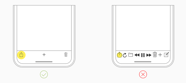
- Don’t redefine the meaning of universal icons. When the icon’s functionality differs from what users expect (i.e., the home icon acts as an exit), users will be left confused.
- Don’t use icons with conflicting meanings. Icons that can represent the same thing should not be used together in one UI. For example, “heart” and “star” icons can both mean “add to featured.” When you introduce both icons in your UI, you immediately create confusion.
- Add text labels where appropriate. An icon with a label is better than an icon alone. If you want to use an icon and are unsure if it’s clear, you can always add a text label next to it. Users will read the label and more easily understand the meaning.
- Add alt text for icons. Alternative text labels, also known as accessibility descriptions, aren’t visible to users, but they allow accessible tech (such as VoiceOver tools). Such tech tells visually impaired users what’s displayed on the screen.
- Conduct competitor analysis. Competitor analysis will tell you what your users expect to see. A user’s ability to decode the meaning of an icon is based on their previous experience. Since users learn from the products they use, you can conduct competitor analysis to understand what icons your competitors are using in their products. It will increase the chance that you select icons your target audience will be familiar with.
- Use a 5-seconds test. This technique will help you to ensure that you choose the appropriate visual representation for your interface element. If it takes more than five seconds to think of a proper icon for an object/action/event, it’s unlikely that you will be able to find a relevant visual representation for it.
2. Keep Icons Simple and Schematic—But Not Too Schematic!
It might be tempting to create icons with many visual details to make visualisation more realistic. However, this approach can negatively impact your design process. The more visual details you add, the more tedious the icon design process becomes. We often design a set of icons, not just a single icon, so that the icon design process can become time-consuming.
Sticking to the rule of using simple icons will also give you one significant advantage—they look equally good on different screen sizes and resolutions. Given that we usually design responsive apps, this property becomes very important. Nobody wants to develop a separate set of icons for small-size screens.
You might wonder how to find the right balance between “too much” and “too few details.” The answer is simple—get rid of any unnecessary decorative detail that doesn’t help communicate the meaning.
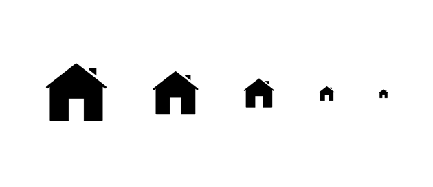
3. Ensure Your Icons Scale Well
Even if you use schematic icons it doesn’t guarantee that your icons will scale well. You need to test them to ensure that your icons can be recognized at small sizes. Scale your icon to 16 x 16px and see if they still can be easily distinguished.


4. Choose the Right Size for Your Icons
The size of your icons matters. When you make your icons too small, users will have problems distinguishing them, and possibly clicking them on touch interfaces. But when you make icons too big, they will demand too much attention from your users. The size of your icons should be selected according to the medium you design for and in proportion to other elements of your UI.
Let’s talk about medium first. If you design for a desktop, you can go for 24 x 24 pixels for regular icons, 16×16 pixels for small icons, and 32 x 32 pixels for large icons. When you design a mobile app, the size of your icons should be selected based on the recommended size of touch targets. Since users interact with touch screens with their thumbs, your icons should be thumb-friendly. Both Apple and Google suggest relatively the same size as a touch target—Apple Human Interface Guidelines suggest using 44 x 44pt.


At the same time, Google Material Design recommends a 48 x 48px touch target. In absolute values, it should be around 10mm (which is the width of the average adult finger). But no matter what platform you design for, ensure that your users can use your product without zooming (they shouldn’t have to zoom in to distinguish icons).
Icon Proportions
Now let’s talk about proportions. All visual elements in UI should be sized proportionally to each other. When it comes to icons, the size of icons should be selected in proportion to the container they are placed in. For example, if you want to design a button with an icon, you need to consider the width and height of the button and choose the size of icons so they can fit organically in this container.
5. Strive for Visual Consistency
Consistency helps improve comprehension of the user interface. When visual design elements are used consistently in your product, users learn how to use your product faster because they can transfer their knowledge from one part of the app to another. Like any other parts of your user interface, icons should be used consistently in your design. You cannot use one set of icons in one part of the app, another set in another, and expect a seamless experience, because it will make your UI look fragmented.
Visual consistency also means using the same graphic style for your entire icon set—style attributes such as shape, stroke thickness, and perspective should remain consistent for your icons. Ideally, your icons should come in weights that correspond to the app’s primary font weights.
Last but not least, ensure that icons look equally good on light and dark backgrounds. Most apps feature dark UI, so it’s essential to ensure that all visual attributes of your app look equally good both on light and dark themes.
6. Consider Platform Specifics
On all platforms, the system defines many icons for standard items. Even before you start to design icons for your app, check what the icons system provides. Most of the time, you will be able to find everything that you need in the system library.
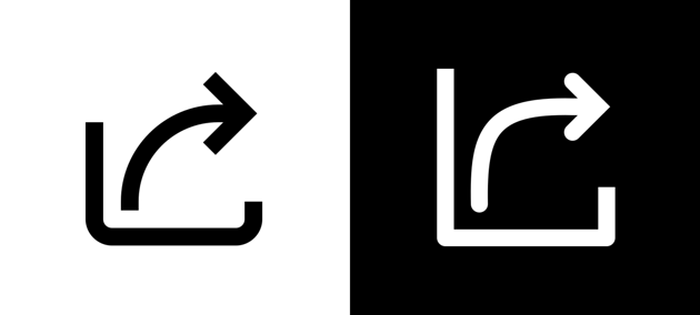
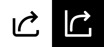
You also need to remember that different platforms might use different visual representations for icons with the same meaning. For example, a “Share” icon in Material Design (Android) and share icon in iOS (Apple) look different.
Before creating icons set for your app, check the platform guidelines and ensure that the icons you want to create align with the guidelines.

7. Test Your Icons With Users
No matter how much time you spend designing your user interface, you should always conduct usability testing for it. Usability testing will reveal usability issues that your UI has and help you understand whether your users can understand the icons you’ve chosen.
The following techniques can be great for testing icons:
- Recognizability test. Show a test participant an icon without any labels and ask what it does. You can run a recognizability test in the context of your UI (show the test participant a mock of your user interface) or show a stand-alone icon. If most of your test participants can tell what an icon does, your assumption about icon design was valid.
- Memorability test. After users interact with your product, show them your icons and ask whether they can remember what each icon does. Icons that are hard to memorize most of the time are highly inefficient.
It’s also worth testing how users feel about your icons. The aesthetic appeal of your design has a direct impact on the user experience. Users tend to perceive attractive products as more usable. That’s why it’s vital to ensure that your visual style resonates with your target audience and their sense of taste.


Conclusion
Icon use in UI design is something of a tightrope! Do it properly and you can vastly enhance the user experience of your product, but get it wrong and you can do real damage. These 7 rules for icon usage should help you get it right.