Standing out on Twitter can be hard for newcomers. You can get better results by only choosing a color for your entire content.
I analyzed +200 Twitter profiles to find what color performs better.
What color should you choose?
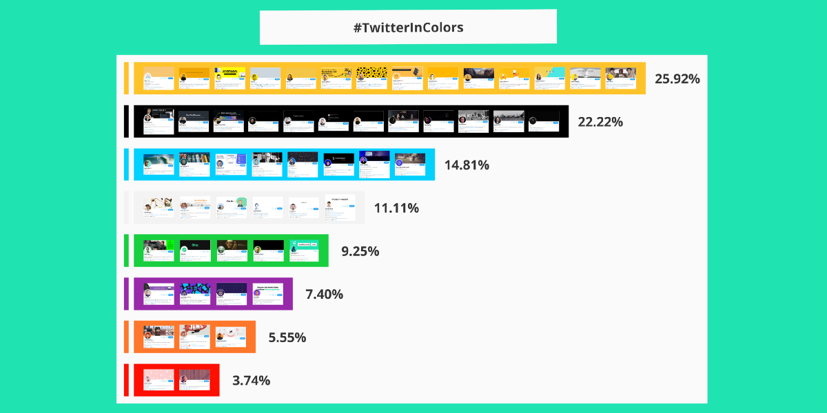
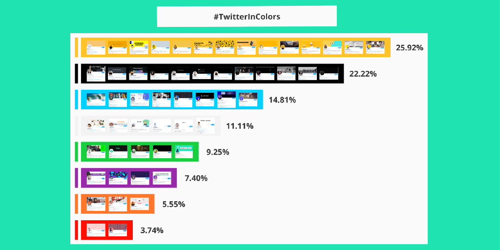
According to my research, this is the portcetange of usage:
- Yellow: 25.92% |||||
- Black: 22.22% ||||
- Blue: 14.81% |||
- White: 11.11% ||
- Green: 9.25% ||
- Purple: 7.40% ||
- Orange: 5.55% |
- Red: 3.74% |
Why is it important to have a brand color?
When someone likes a tweet they go to visit your profile account, then they see:
- Your fixed tweet.
- Your header image.
- Your profile image.
- Bio description.
If you have a bright color within every image on your profile, and your content also uses it, in the long run people will remember you for that color.
So when your content is shared, it can be related to your profile.
This is an easy way to create your personal brand.
Benefits of using a brand color:
- Differentiate from other profiles.
- Influence moods or feelings. (Depends on cultural differences, personal experiences or context)
- Your profile looks more professional.
More benefits:
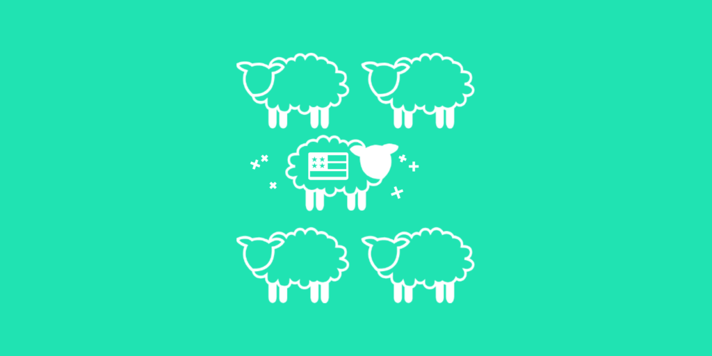
- Easier to remember.
- Easier to create new content with that, USA flag colors are used constantly in products with the real form of the entire flag.
People are very good at recognizing patterns and faces. The combination of a color pattern with a face is a brutal combo for our brain.
This is one more reason to start using a certain color in your profile and content.

Context is king, for instance in some eastern cultures the green is associated to be unlucky, also as it is associated with infidelity.
You need to do some research first.
We are going to walk through the profiles with the most used color to the profiles with the least used colors.
You will find which color is the best for your profile and content.
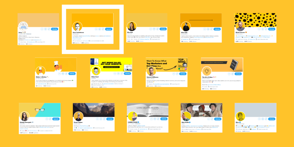
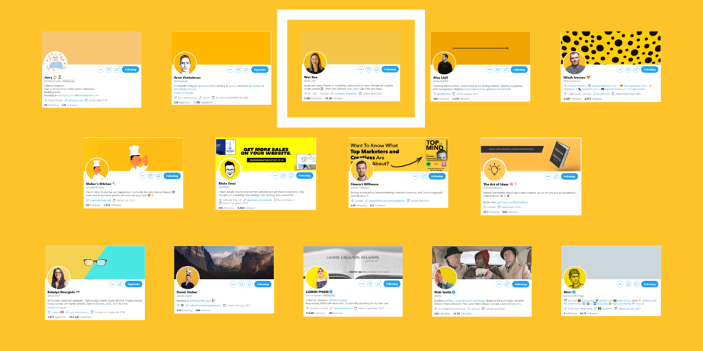
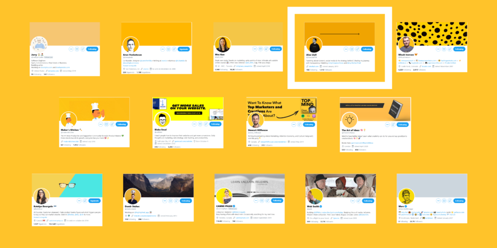
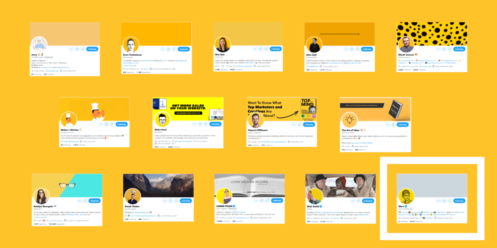
🟡 Team Yellow (25.92%)
Its brightness is particularly useful in catching the consumer’s eyes and it’s used to simulate relax, awake awareness.
Lots of profiles are using yellow as their main color, probably because it’s very cheerful.
It works because it pushes you to press the profile picture.
But if a lot of people use it, it stops drawing attention.
So probably not the best choice right now if you want to stand out.
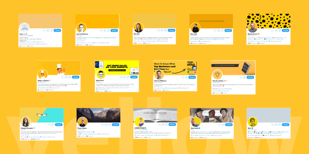
🟡 @hellojerryalex uses a light tinted yellow on his profile pic, but the drawing in it make it unique! Also, emphasizes his profile choosing a yellow flat cover pic.
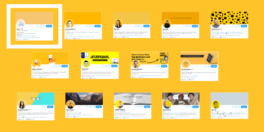
🟡 @zhenpixels has a cool face sketch, that makes the difference. In this case, he also chooses a yellow flat cover pic, so the main focus is in his sketch face.
🟡 @wes_kao stands out for the clarity and contrast of her photo with the yellow background. Also, she uses the yellow flat cover pic team, simplicity is cool!
🟡 @AlexLlullTW has a black & white filter on his photo, which contrasts more with the yellow background. The black arrow on his cover pic adds personality to his profile, simple and effective.
🟡 @MicahIverson uses black circles on his cover pic that reminds me to a cheetah, has a lot of personality and only with a few circles!
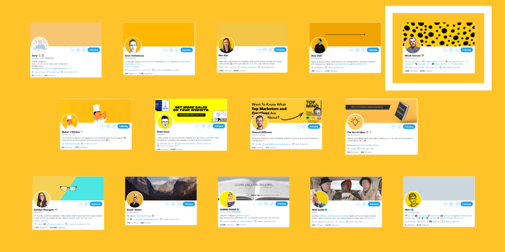
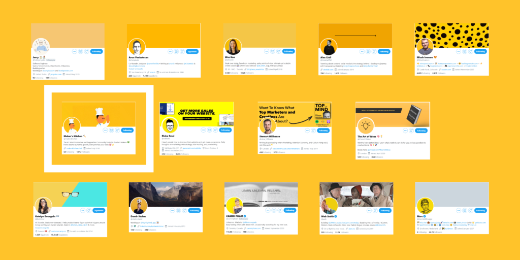
🟡 @makerskitchen profile stand out because they mix the illustration of a chef with the community of makers and uses the same illustrator for their cover pic, a good choice to define the brand.
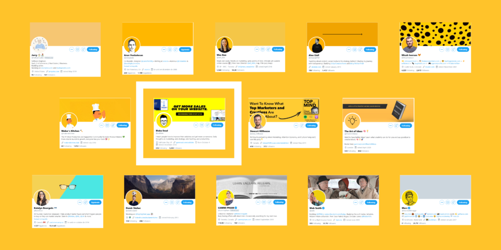
🟡 @uxblake has a nice black and whote illustrator of his face making a perfect contrast with the yellow background and very easy to recognize. He takes advantage of his cover pic to explain what his product is about.
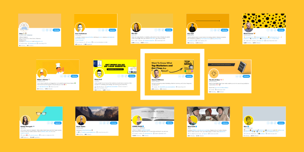
🟡 @stew_hillhouse has a nice white stroke around his head and it gives him a nice personal touch. On his cover pic he is promoting his podcast, sad that a piece of text is covered by his profile pic.
🟡 @TheArtOfIdeas a light bulb black icon reinforce the purpose of the account. On the cover pic shows a book available to buy with a great slogan. Yellow can also be related to light, so it makes sense.
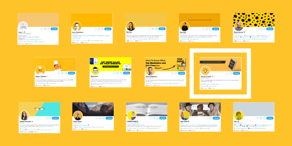
🟡 @KateBour her glasses add personality. She uses a lighter yellow tone but the glasses and the contrast with blue on her cover pic makes his profile always recognizable.
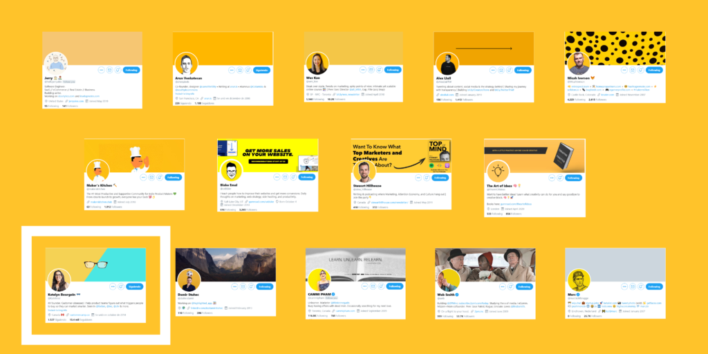
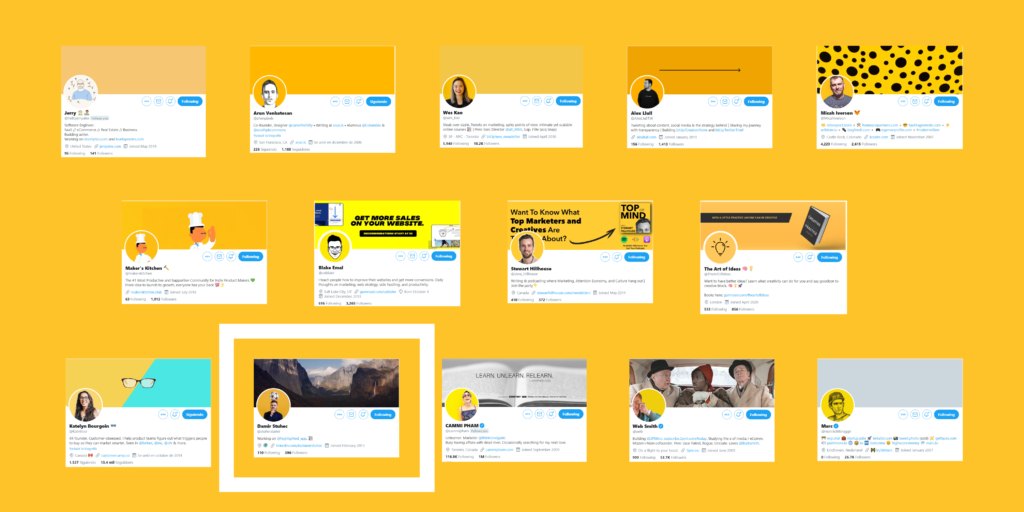
🟡 @stuhecdamir profile pic stand out because of yellow but most importantly, the soccer ball on his head! As his app is about highlighting, yellow is the best choice.
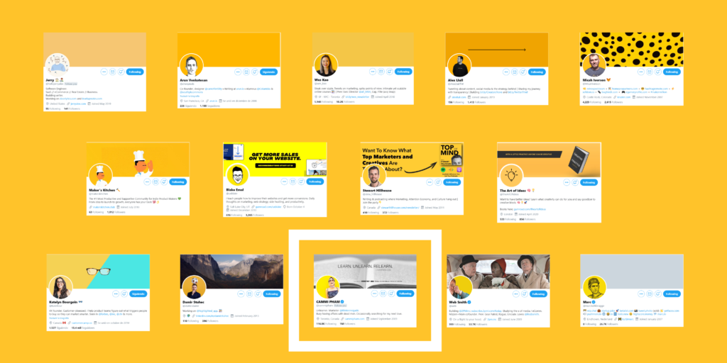
🟡 @cammipham yellow takes almost half part of her profile pic and makes sense because she looks very happy. Yellow evokes happiness, so is a nice choice!
🟡 @web yellow takes almost all of your profile picture, that’s why it stands out. He looks happy too, so yellow is a good choice because it also represents positivity.
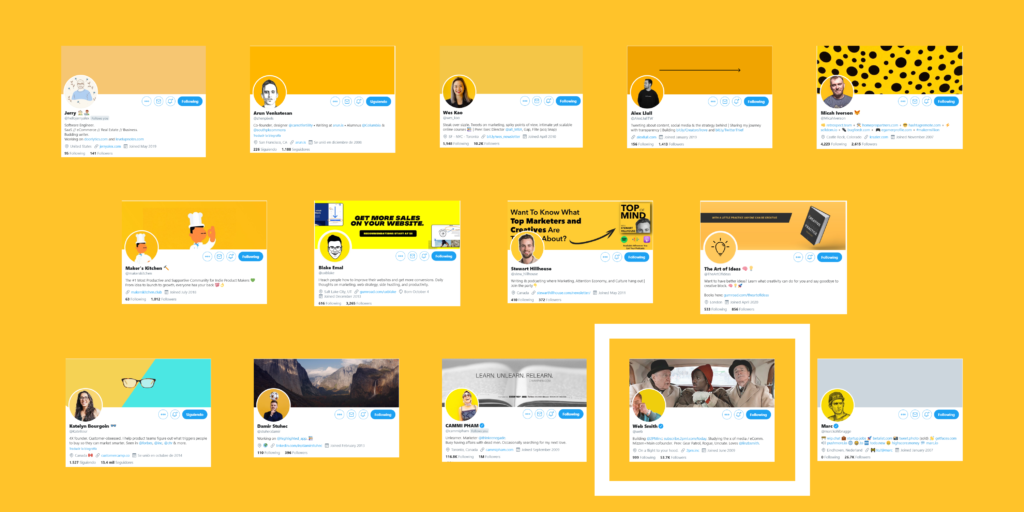
🟡 @marckohlbrugge the facial expression of the black sketch and the yellow background makes it stand out a lot, the cap is also an identifying element. All this gives a great personality to the profile pic.
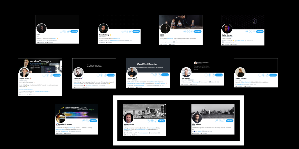
⚫ Team Black (22.22%)
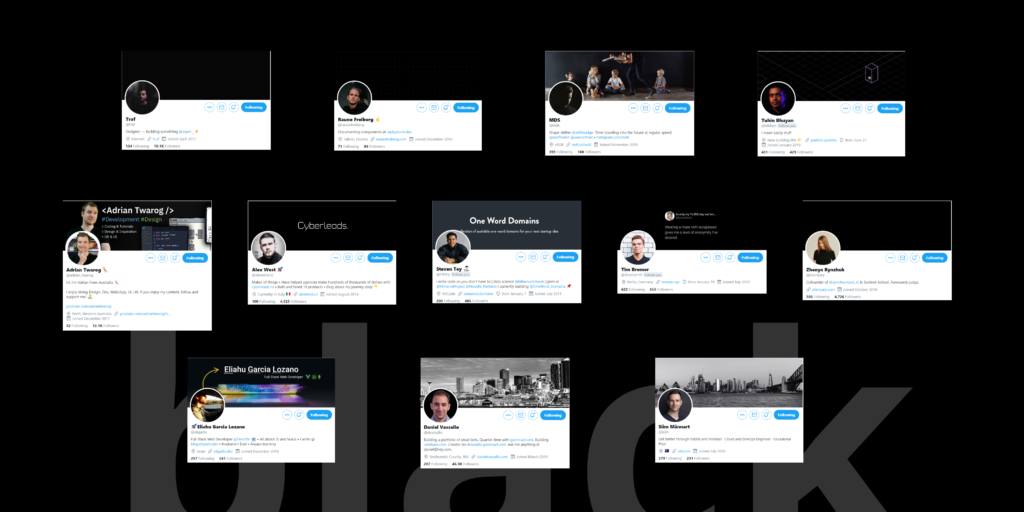
Works well for brands wishing to promote power, formality, profession, etc and used to hide feelings, intimidate, radiate authority.
People wearing a black t-shirt, people with black backgrounds, people with both!
Good for light mode, bad for dark mode.
⚫ @traf profile pic is a nice example of blending yourself with the background, in this case he achieves it by wearing a black t-shirt and adding black shadows.
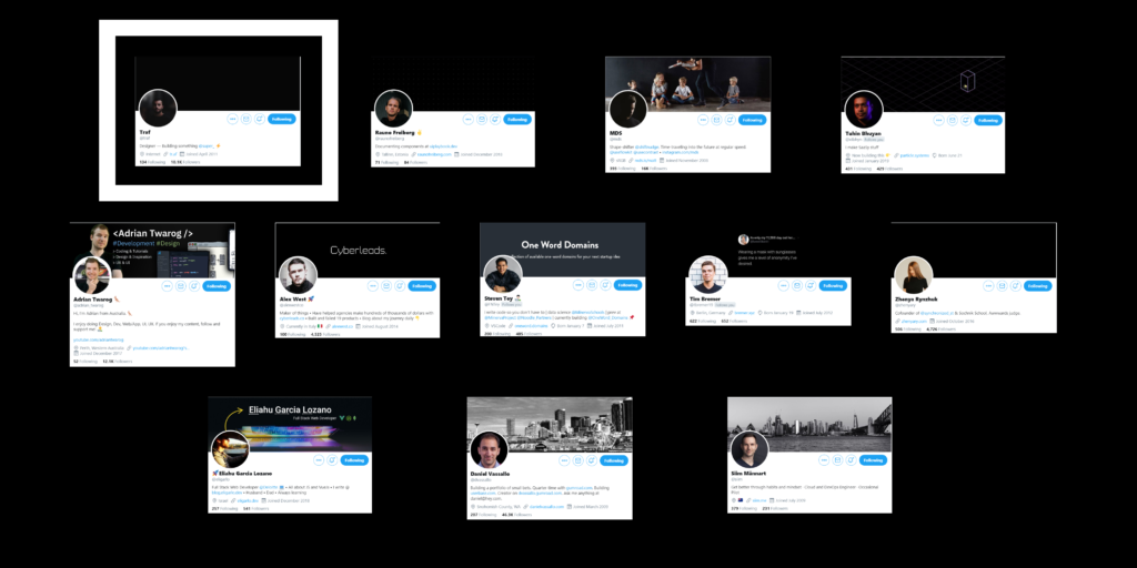
⚫ @raunofreiberg black t-shirt blends with the background and makes a good contrast with his skin color. Also, he is in black flat cover pic team.
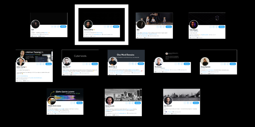
⚫ @mds profile pic is almost covered by black, but the nice light applied on his faces makes is profile easy to recognize. His cover profile is very funny and different from other profiles, we can remember this account thanks to this funny photo.
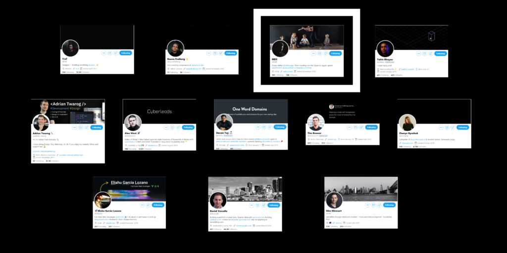
⚫ @xtbhyn the orange an blue shadows on his face makes the difference, bringing personality and contrasts with the black background.
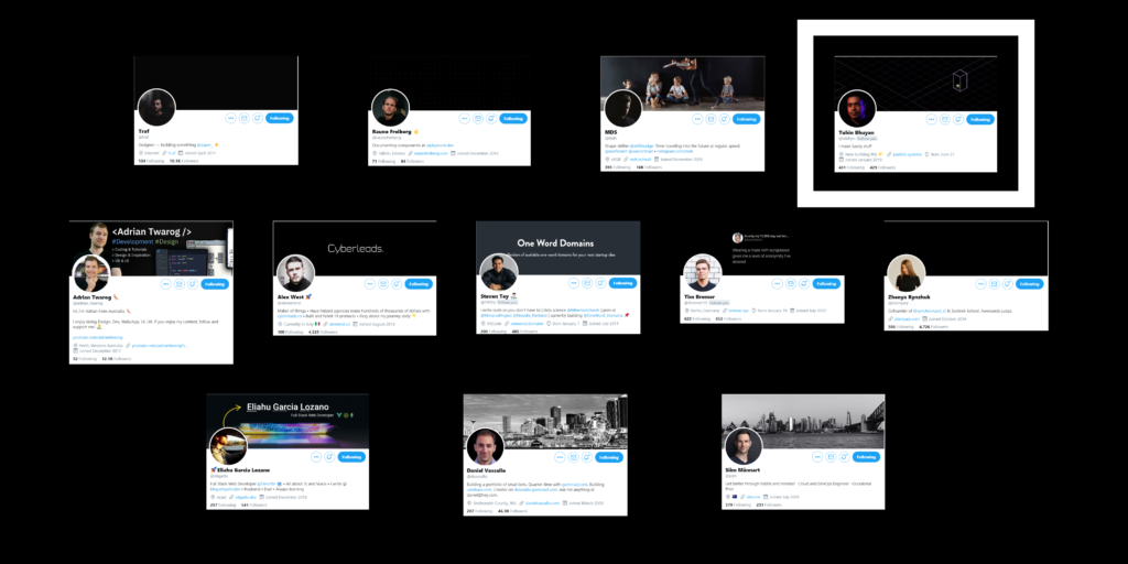
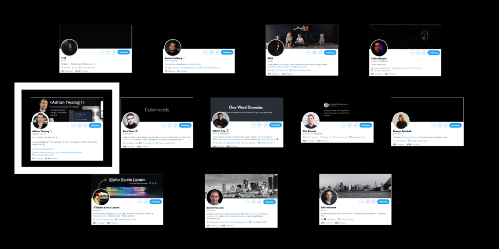
⚫ @adrian_twarog is in black t-shirt team! He makes a good use of his cover pic showing the type of content he creates.
⚫ @alexwestco is in black t-shirt team too! The contrast with the white background is very clear and draws attention. With a simple text on his cover pic shows his product.
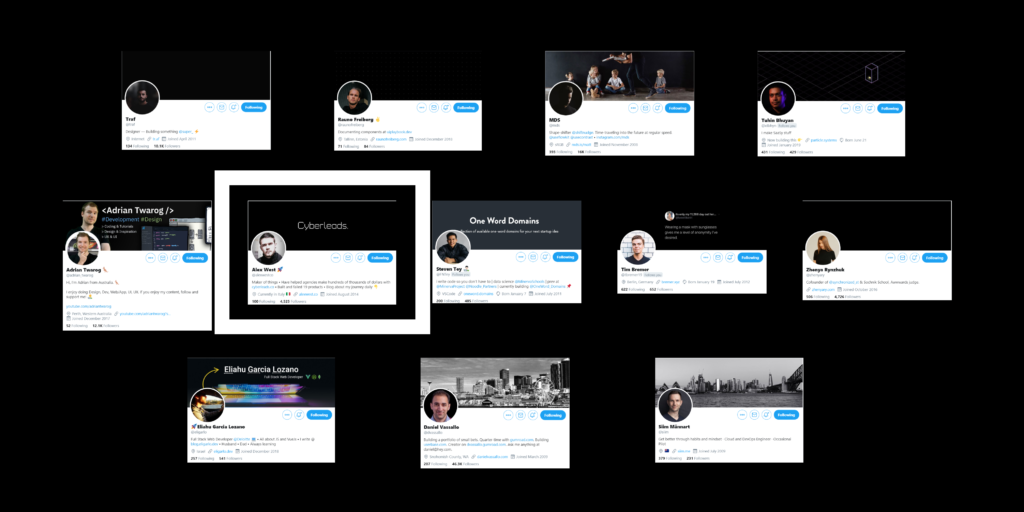
⚫ @FNTey black t-shirt team as well, in this case black jacket. Very clear slogan on his cover pic explaining what his product does. Sometimes you don’t need too much text.
⚫ @tbremer19 black t-shirt team! Super nice contrast with the white wall on his background and his funny face make this account memorable.
⚫ @zhenyary black t-shirt team, black flat cover pic and contrast with the white background. Her pose in the photo is what makes the difference, so you can be creative and search for a cool pose.
⚫ @dvassallo and @siim profile pic are professional, clean and their facial expression gives a sense of positivity but also formality.
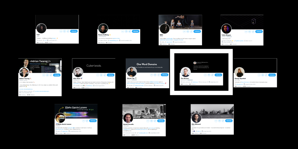
🔵 Team Blue (14.81%)
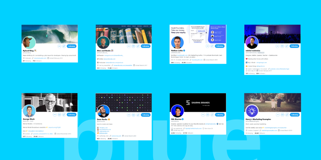
Is the most popular color in terms of brand creation, basically because it reduces stress, relax, secure and it brings order.
I thought I would find more blue color profiles, as there are many studies that say that it’s the color that people like the most.
But probably, since blue is everywhere, it is not the best to attract attention.
🔵 @rylandking uses literally a profile pic, this pose is not common and neither is the turquoise background color! His profile is aesthetically pleasing, his header pic contains a wave with a little surfboard that works well with the blue-ish color.
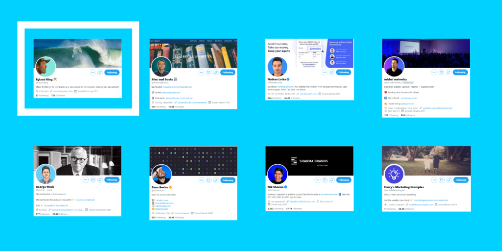
🔵 @AlexAndBooks_ is all about blue, he uses blue on his website as well creating a link between the web and Twitter. Also, he uses a stroke on his pic to highlight himself.
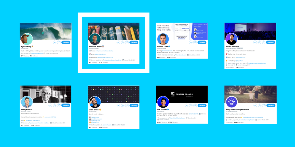
🔵 @NathanLatka has a site where blue is the main color, so choosing it for his profile pic is a good move. He also uses his profile pic to show his product, highlighting the important part in blue.
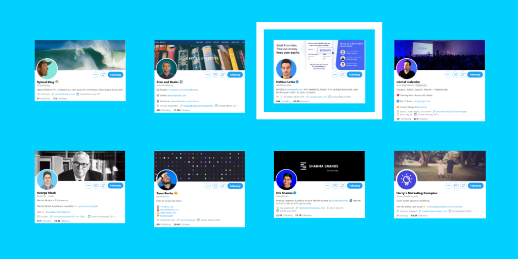
🔵 @michalmalewicz use a gradient between blue and purple, to be honest I didn’t see almost anyone using a gradient for their profile pic, so it can be a good way to stand out! Also, notice how the lights on his cover pic match the background gradient of his profile.
🔵 @george__mack the particular illustration of himself and the celestial background are what make his profile easy to remember.
🔵 @zenorocha uses a particular pose to stand out and the blue background reinforces it. As I said before, a genuine pose and a background color can make the difference.
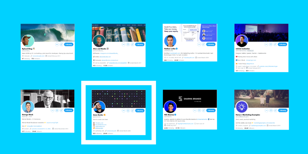
🔵 @mrsharma has a happy face and an electric blue background, a profile pic that sends good vibes is always a good choice!
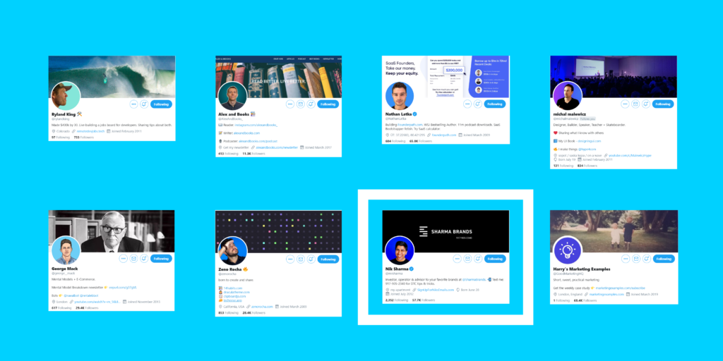
🔵 @GoodMarketingHQ profile is very easy to recognize. He changed his profile pic some time ago and he had to put the bulb logo back again, because people were confused and they didn’t recognize the brand.
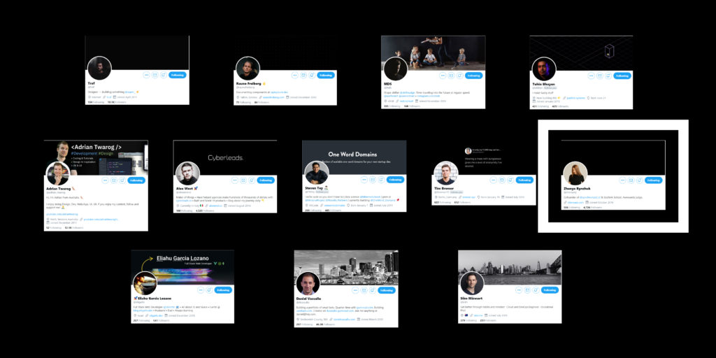
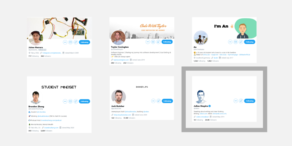
⚪ Team White (11.11%)
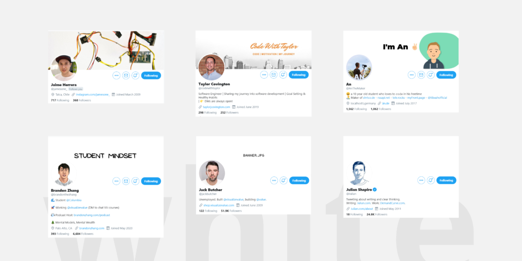
White is widely used in websites because it’s easy to make contrast with all colors tones. Also gives a sense of cleanliness.
White has the same problem as black.
Bad for light mode, good for dark mode.
⚪ @jamesone_ is in white t-shirt team, funny face plus a cap makes the difference in this case. Also his cover pic is very uncommon and original and can be considered as his brand.
⚪ @codewithtaylor white t-shirt team! Not sure if it’s purely white, but stands out because of the bricks on his background. His brand is written down on his cover pic with a similar color as the bricks.
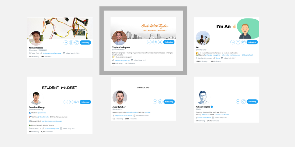
⚪ @AnTheMaker has blended a white circle and the word “AN”, is very neat and stands out because of the white “AN”. Also, reinforces his brand with his cover pic, he is An and we have it clear.
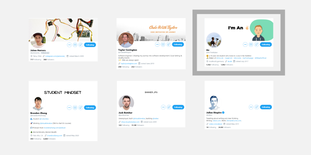
⚪ @brandonthezhang He has a very origin making his profile easy to remember. The white background helps make the artwork stand out, making it a good choice. The quote on the cover pic reinforces his brand.
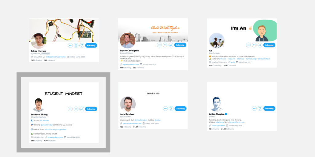
⚪ @jackbutcher profile will probably be remembered for his banner. His own profile picture is already associated with his brand.
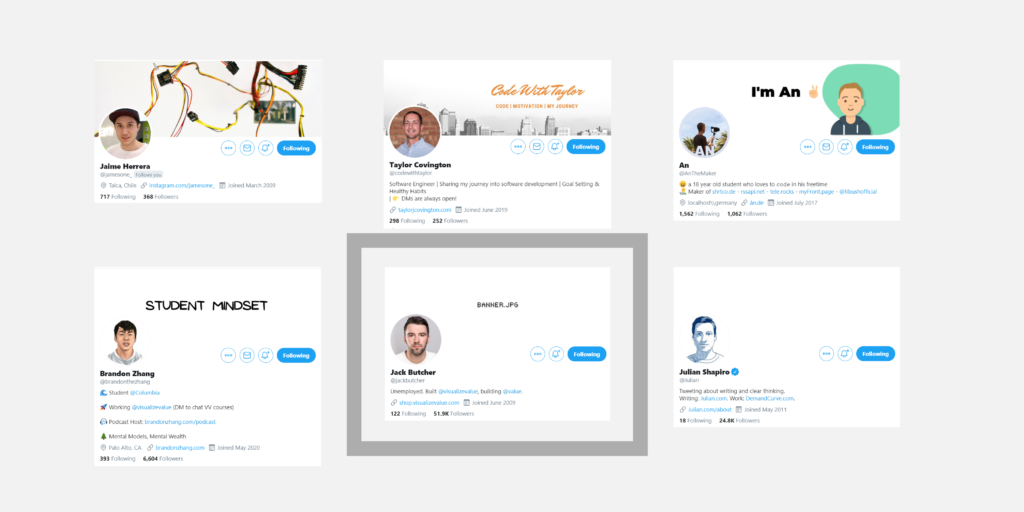
⚪ @Julian profile pic is also very branded, we can easily recognize his profile because of his blue sketch. He doesn’t need anything else.
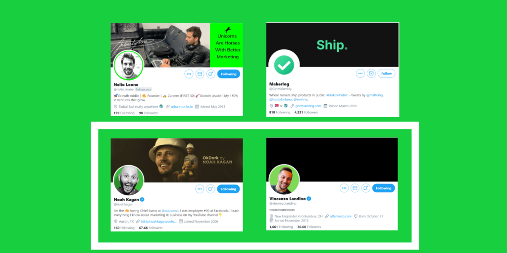
🟢 Team Green (9.25%)
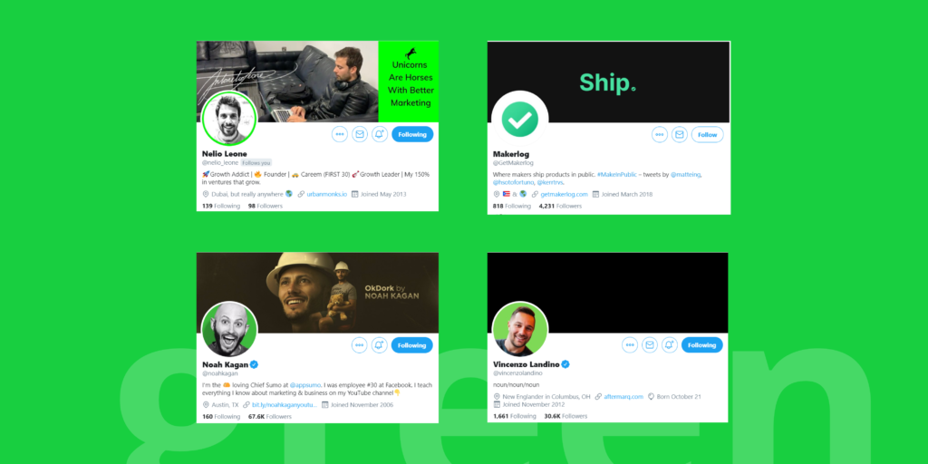
It can have a balancing and harmonizing effect and it’s used for relaxation, revitalization and encouragement.
Not many people use green for his profiles.
So maybe you can find some eye-catching green tone and use it like me.
🟢 @nelio_leone his profile pic isn’t green at all, but the green outline stroke helps his pic to stand out. Uses the same color on his cover pic to present his slogan.
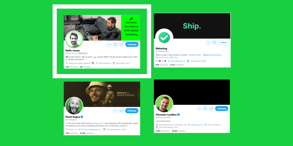
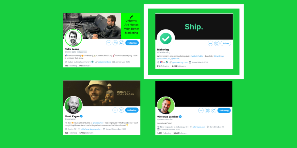
🟢 @GetMakerlog is a about shipping products in public, so the green color on their profile pic represents positivity and the icon is easy to recognize. The word “ship” on the cover pic makes clear their purpose.
🟢 @noahkagan and @vincenzolandino have profile pic with their face and a green background. I didn’t find much like this one.
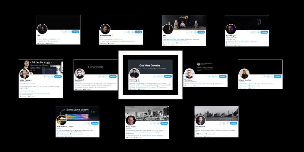
🟣 Team Purple (7.40%)
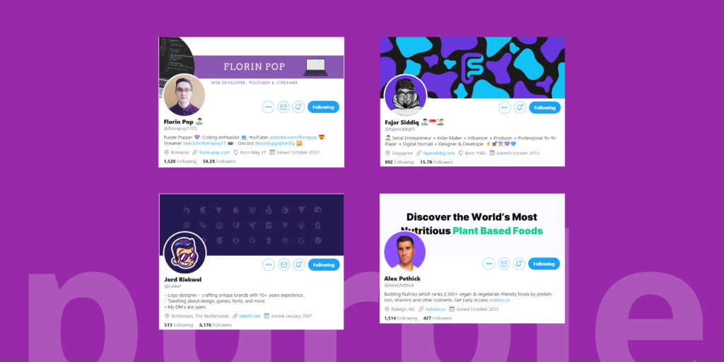
Inspires reflection and self-awareness and uses for royalty, luxury, dignity, etc.
There aren’t many profiles using purple as their main color, so can be another good option to choose.
🟣 @florinpop1705 great use of purple in many of his content, he and his personal brand are related with this color. Purple color instantly drives to his profile, this is a great example of color related to a person.
🟣 @fajarsiddiqFS is a perfect example of a well branded profile. His balance between blue and purple is easy to recognize, reinforced by a personalized sketch.
🟣 @Larkef profile pic has a lot of personality thanks to his incredible crispy illustration! His cover pic shows us that he is a logo designer.
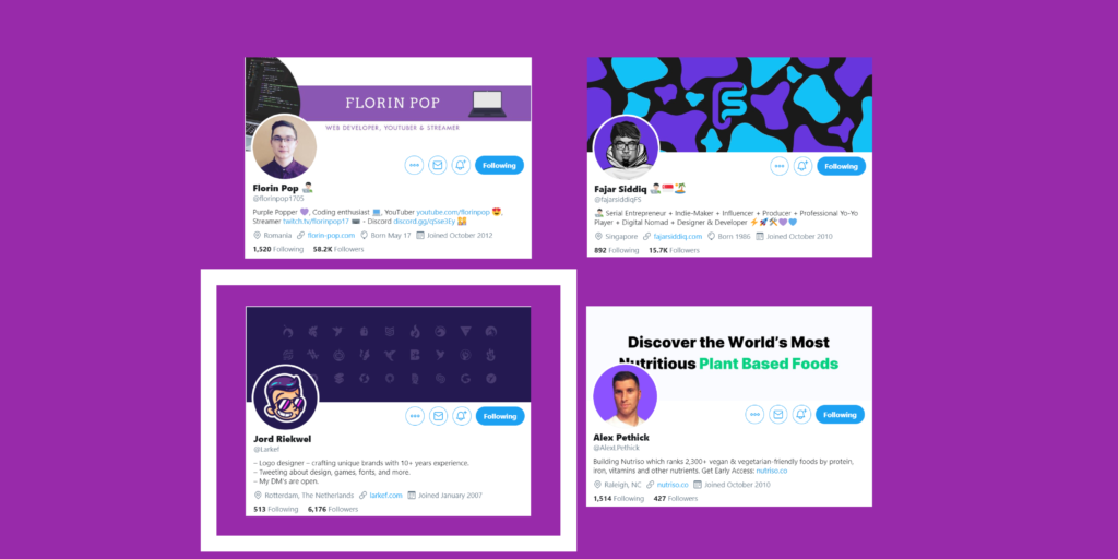
🟣 @AlexLPethick is the only one profile pic that I found with a photo and a purple background. Purple profiles are not that common, another reason to use this color.
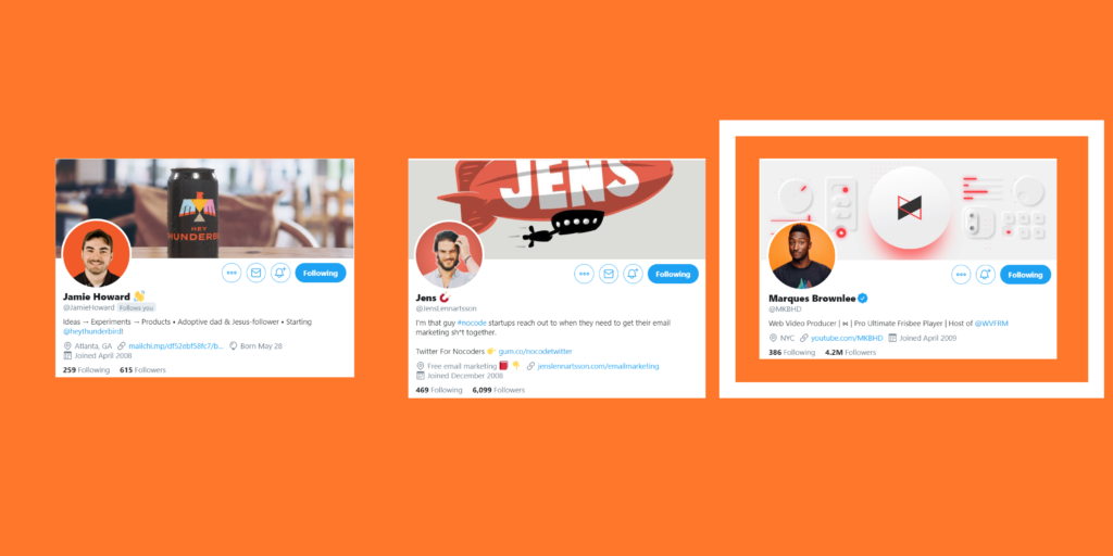
🟠 Team Orange (5.55%)
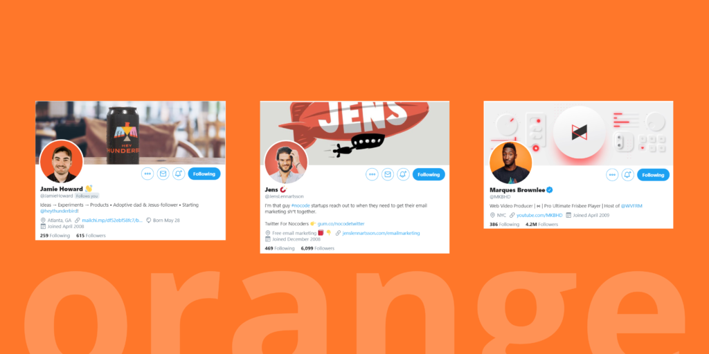
A color of joy used for optimism, impulse, freedom, creation, communication and fun. Orange is king to draw attention. No wonder why Amazon uses it on their buy button.
Few profiles are using orange!
🟠 @JamieHoward profile is simple and clean. The orange on the can works wonders with his profile pic background.
🟠 @JensLennartsson profile is a good example of a brand. You can’t miss the zeppelin.
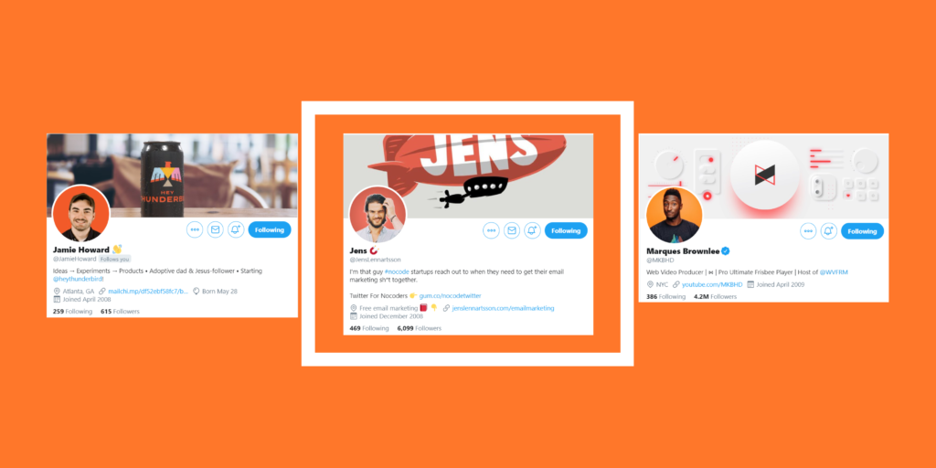
🟠 @MKBHD profile pic is another example of clarity. A facial expression works like a charm with that crispy orange tone.
🔴 Team Red (3.70%)
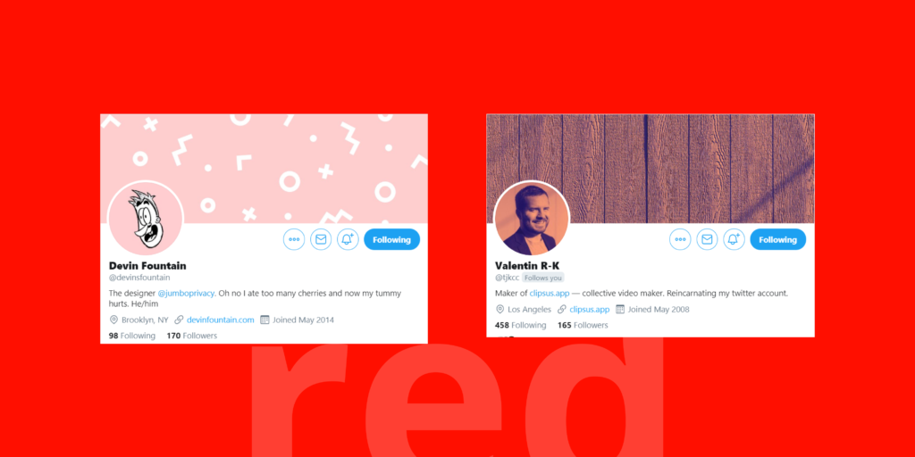
Attracts the most attention and is associated with strong emotions like excitement, love, romance, style.
I didn’t find any red personal profile and I was shocked because with red you can capture attention very easily.
It can draw negative emotions so be careful with red.
Red is usually used to draw attention, if you use another less attractive color and add a single dot of red, everyone will focus on that point.
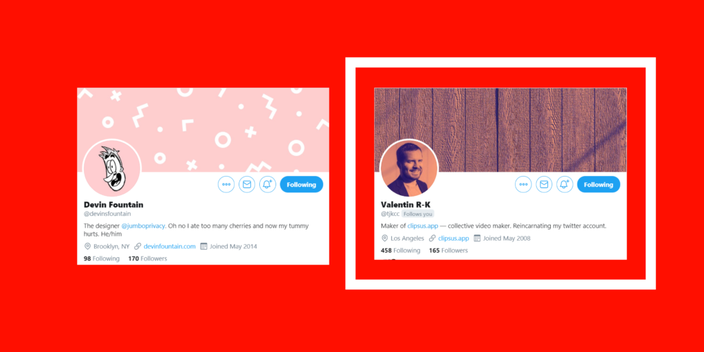
🔴 @devinsfountain profile uses a rare pinkish color. I have classified it as red because pink can be considered as light red. His illustration helps him to stand out plus his cover pic has patterns that are easy to remember, patterns are powerful tools, so use them.
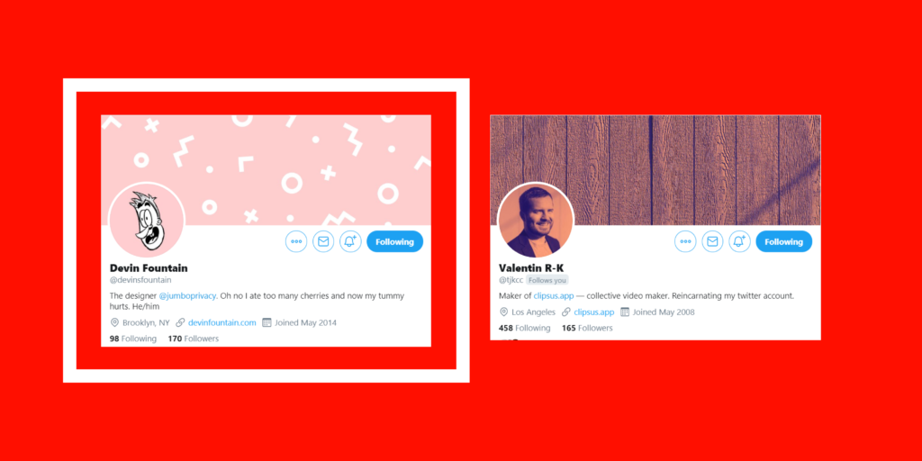
🔴 @tjkcc uses a salmon tone. I put it on “Team Red” because this color is a shade of red. The filter applied on his photo gives a different touch that not many profiles have.
Take action
How can you find your perfect color?
- Scroll down your Twitter feed and see which profile pictures catch your attention.
- Find a color that not many profiles use and represent your brand with it.
Conclusions
- Yellow is widely used.
- Illustrated profile pics are increasing.
- A nice pose on your profile pic and a shiny background catch the eye.
- Color filters are rarely used, you have a great opportunity to use them and stand out.
Last thing,
- Stick to the color you have picked.
It’s not a good idea to change your profile picture very often because people will start associating the color you have picked with you.
If you change it, people may not recognize your content at first sight.
Did you like this article? If this helps you out, please spread the love to the Twitter thread.
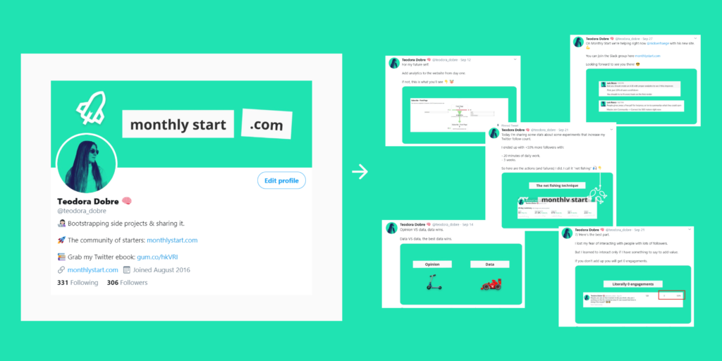
I write about startups and building a business 👉 monthlystart.com. Monthly Start is also a community of starterts, you can join us for free.
📚 My ebook: 3 Techinque to Rocket Launch your Twitter Account

![]()
How to stand out on Twitter using color theory was originally published in UX Collective on Medium, where people are continuing the conversation by highlighting and responding to this story.