
We’ve already covered the thirty CSS selectors that we should all memorize; but what about the new CSS3 properties? Though most of them still require a vendor-specific prefix, you can still use them in your projects today. In fact, it’s encouraged!
At the conclusion of this article, we’ll work on a fun final project.
1. border-radius
Easily the most popular CSS3 property in the bunch, border-radius was sort of the flagship CSS3 property. While many designers were still terrified of the idea that a layout could be presented differently from browser to browser, a baby-step, like rounded corners, was an easy way to lure them in!
The irony is that we’re all perfectly fine with the idea of providing an alternate viewing experience for mobile browsers. Strangely, however, some don’t feel the same way when it comes to desktop browsing.
border-radius: 4px;
Circles
Some readers may not be aware that we can also create circles with this property. All you have to do is set the radius to half the width or height of the element.
border-radius: 50px;
And, if we want to have some fun, we can also take advantage of the Flexible Box Model (detailed in #8) to both vertically and horizontally center the text within the circle. It requires a bit of code, but only because of the need to compensate for various vendors.
display: flex;
align-items: center;
justify-content: center;
2. box-shadow
Next, we have the ubiquitous box-shadow, which allows you to immediately apply depth to your elements. Just don’t be too obnoxious with the values you set!
box-shadow: 1px 1px 3px #292929;
box-shadow accepts four parameters:
- x offset
- y offset
- blur
- color of shadow
Now, what many don’t realize is that you can apply multiple box-shadows at a time. This can lead to some really interesting effects. For example, we can use a blue and green shadow to magnify each shadow.
box-shadow: 1px 1px 3px green, -1px -1px 3px blue;
Clever Shadows
By applying shadows to the ::before and ::after pseudo-classes, we can create some really interesting perspectives. Here’s one to get you started:
The HTML
<div class="box">
   <img src="http://code.tutsplus.com/tuts.jpg" alt="Tuts" />
</div>
The CSS
.box:after {
  content: "";
  position: absolute;
  z-index: -1; /* hide shadow behind image */
  box-shadow: 0 15px 20px rgba(0, 0, 0, 0.3);
  width: 70%;
  left: 15%; /* one half of the remaining 30% (see width above) */
  height: 100px;
  bottom: 0;
}
3. text-shadow
Similarly to box-shadow, it must be applied to text, and receives the same four parameters:
- x-offset
- y-offest
- blur
- color of shadow
 h1 {
    text-shadow: 0 1px 0 white;
    color: #292929;
 }
Text Outlines
Again, much like its sibling, box-shadow, we can apply multiple shadows, by using a comma as the separator. For example, let’s say that we want to create an outline effect for the text. While webkit does offer a stroke effect, we can reach more browsers by using the following method (though not quite as pretty):
body { background: white; }

h1 {
   text-shadow: 0 1px 0 black, 0 -1px 0 black, 1px 0 0 black, -1px 0 0 black;
   color: white;
}
4. text-stroke
Be careful with this method. It is a non-standard feature. The text-stroke property isn’t yet part of the CSS3 spec. However, it is now supported by all major browsers if you use the -webkit- prefix.
h1 {
   -webkit-text-stroke: 3px black;
   color: white;
}
Feature Detection
How can we provide one set of styling for, say, Firefox, and another set for Safari or Chrome? One solution is to use feature detection.
With feature detection, we can use JavaScript to test if a certain property is available. If it’s not, we prepare a fallback.
Let’s refer back to the text-stroke issue. Let’s set a fallback color of black for browsers which don’t support this property (all but webkit currently).
var h1 = document.createElement('h1');
if ( !( 'webkitTextStroke' in h1.style ) ) {
   var heading = document.getElementsByTagName('h1')[0];
   heading.style.color = 'black';
}
First, we create a dummy h1 element. Then, we perform a full cavity search to determine if the -webkit-text-stroke property is available to that element, via the style attribute. If it’s not, we’ll grab the Hello Readers heading, and set its color from white to black.
Please note that we’re being generic here. If you need to replace multiple
h1tags on the page, you’ll need to use awhilestatement to filter through each heading, and update the styling or class name, accordingly.We’re also testing only for
webkit, when it’s possible that other browsers will eventually support thetext-strokeproperty as well. Keep that in mind.
If you want a more comprehensive feature-detection solution, refer to Modernizr.
5. Multiple Backgrounds
The background property has been overhauled to allow for multiple backgrounds in CSS3.
Let’s create a silly example, simply as a proof of concept. For lack of any suitable images nearby, I’ll use two tutorial images as our backgrounds. Of course, in a real-world application, you might use a texture and, perhaps, a gradient for your backgrounds.
.box {
background: url(image/path.jpg) 0 0 no-repeat,
 url(image2/path.jpg) 100% 0 no-repeat;
}
Above, by using a comma as the separator, we’re referencing two separate background images. Notice how, in the first case, it’s placed in the top left position (0 0), and, in the second, the top right position (100% 0).
Make sure that you provide a fallback for the browsers which don’t provide support for multiple backgrounds. They’ll skip over the property entirely, leaving your background blank.
Compensating for Older Browsers
To add a single background image for older browsers, like IE7, declare the background property twice: first for old browsers, and the second as an override. Alternatively, you could, again, use Modernizr.
.box {
/* fallback */
background: url(image/path.jpg) no-repeat;

/* modern browsers */
background: url(image/path.jpg) 0 0 no-repeat,
 url(image2/path.jpg) 100% 0 no-repeat;
}
6. background-size
Before modern CSS, we were forced to use sneaky techniques to allow for resizable background images.
background: url(path/to/image.jpg) no-repeat;
background-size: 100% 100%;
The code above will direct the background image to take up all available space. As an example, what if we wanted a particular image to take up the entire background of the body element, regardless of the browser window’s width?
body, html { height: 100%; }

body {
 background: url(path/to/image.jpg) no-repeat;
 background-size: 100% 100%;
}
That’s all there is to it. The background-size property will accept two parameters: the x and y widths, respectively.
While the latest versions of Chrome and Safari support background-size natively, we still need to use vendor-prefixes for older browsers.
body {
 background: url(path/to/image.jpg) no-repeat;
 background-size: 100% 100%;
}
7. text-overflow
Originally developed for Internet Explorer, the text-overflow property can accept two values:
- clip
- ellipsis
This property can be used to cut off text that exceeds its container, while still providing a bit of feedback for the user, like an ellipsis.
Did You Know? Internet Explorer has provided support for this property since IE6? They created it!
.box {
   text-overflow:ellipsis;

   overflow:hidden;
   white-space:nowrap;

   border: 1px solid black;
   width: 400px;
   padding: 20px;

   cursor: pointer;
}
At this point, you might consider showing the the entirety of the text when a user hovers over the box.
#box:hover {
  white-space: normal;
  color: rgba(0,0,0,1);
  background: #e3e3e3;
  border: 1px solid #666;
}
A bit oddly (unless I’m mistaken), there doesn’t seem to be a way to reset the text-overflow property, or “turn it off.” To mimic this “off” functionality, on :hover, we can set the white-space property back to normal. This works, because text-overflow is dependent upon this to function correctly.
Did You Know? You can also specify your own string, that should be used in place of the ellipsis. Doing so will render the string to represent the clipped text.
8. Flexible Box Model
The Flexible Box Model, will finally allow us to get away from those mangy floats. Though it takes a bit of work to wrap your head around the new properties, once you do, it all should make perfect sense.
Let’s construct a quick demo, and create a simple two-column layout.
<div id="container">

 <div id="main"> Main content here </div>
 <aside> Aside content here </aside>

</div>
Now for the CSS: we first need to instruct the container to be treated as a flexible box. I’ll also apply a generic width and height, since we don’t have any actual content in play.
 #container {
    width: 600px;
    height: 450px; /* just for demo */

    background: #e3e3e3;
    margin: auto;

    display: flex;
 }
Next, let’s apply, for the demo, unique background colors to the #main div, and the aside.
#main {
   background: yellow;
}

aside {
   background: red;
}
At this point, there’s not much to look at.
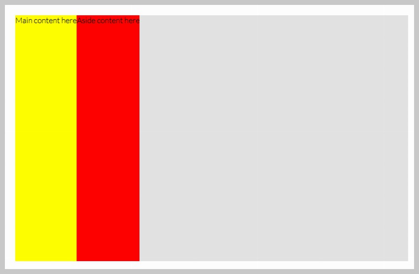
One thing worth noting, though, is that, when set to
display: flexmode, the child elements will take up all vertical space; this is the defaultalign-itemsvalue:stretch.
Watch what happens when we explicitly state a width on the #main content area.
#main {
  background: yellow;
  width: 400px;
}
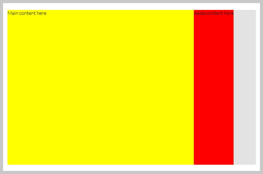
Well that’s a bit better, but we still have this issue where the aside isn’t taking up all of the remaining space. We can fix this by using the new box-flex property.
flexinstructs the element to take up all available space.
 aside {
    display: block; /* cause is HTML5 element */
    background: red;

   /* take up all available space */
    flex: 1;
 }
With this property in place, regardless of the width of the #main content area, the aside will consume every spec of available space. Even better, you don’t have to worry about those pesky float issues, like elements dropping below the main content area.
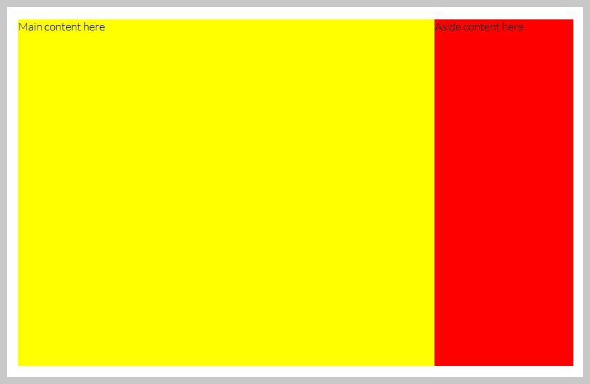
We’ve only scratched the surface here. To learn more about Flexbox, check out our complete guides! This feature is now supported by all major browsers and you can expect it to work properly on over 99% of the devices.
 FlexboxA Comprehensive Guide to Flexbox Alignment
-
FlexboxA Comprehensive Guide to Flexbox Ordering & Reordering
-
FlexboxA Comprehensive Guide to Flexbox Sizing
9. resize
The resize property—part of the CSS3 UI module—allows you to specify how a textarea is resized. It is now supported by all major browsers except IE and iOS Safari.
<textarea name="elem" id="elem" rows="5" cols="50"></textarea>
Note that, by default,
webkitbrowsers and Firefox 4 allow fortextareasto be resized, both vertically and horizontally.
textarea {
   resize: vertical;
}
Possible Values
-
both: Resize vertically and horizontally -
horizontal: Limit resizing to horizontally -
vertical: Limit resizing to vertically -
none: Disable resizing
10. Transitions
Perhaps the most exciting addition to CSS3 is the ability to apply animations to elements, without the use of JavaScript.
Let’s mimic the common effect, where, once you hover a link in a sidebar, the text will slide to the right ever-so-slightly.
The HTML
<ul>
   <li>
      <a href="#"> Hover Over Me </a>
   </li>
   <li>
      <a href="#"> Hover Over Me </a>
   </li>
   <li>
      <a href="#"> Hover Over Me </a>
   </li>
   <li>
      <a href="#"> Hover Over Me </a>
   </li>
</ul>
The CSS
 ul a {
    border-left: 10px orange solid;
    transition: border-width 0.4s;
 }

a:hover {
  border-width: 20px;
}
transition will accept three parameters:
- The property to transition. (Set this value to
allif needed) - The duration
- The easing type
The reason why we don’t directly apply the
transitionto thehoverstate of the anchor tag is because, if we did, the animation would only take effect during mouseover. On mouseout, the element would immediately return to its initial state.
Because we’ve only enhanced the effect, we’ve done absolutely no harm to older browsers.
Final Project
Let’s combine the bulk of the techniques we’ve learned in this article, and create a neat effect for displaying flip cards.
Step 1. The Markup
We’ll keep it simple; within our .box container, we’ll add two divs: one for the front side, and the other for the back.
<body>

   <div class="box">
      <div>Hello</div>
      <div> World </div>
   </div>

</body>
Step 2. Horizontally and Vertically Centered
Next, I want our card to be perfectly centered on the screen. To do so, we’ll take advantage of the Flexible Box Model.
As our page will only contain this card, we can effectively use the body element as our wrapper.
body, html { height: 100%; width: 100%; }

body {
  display: flex;
  align-items: center;
  justify-content: center;
}
Step 3. Styling the Box
We’ll now style our “card.”
.box {
  background: #e3e3e3;
  border: 1px dashed #666;
  margin: auto;
  width: 400px;
  height: 200px;
  cursor: pointer;
  position: relative;
  transition: all 1s;
}
Note that we’ve also instructed this element to listen for any changes to the state of the element. When they occur, we’ll transition the changes (if possible) over the course of one second (transition: all 1s).
Step 4. An Effective Shadow
Next, as we learned earlier this article, we’ll apply a cool shadow by using the ::after pseudo class.
.box::after {
  content: "";
  position: absolute;
  width: 70%;
  height: 10px;
  bottom: 0;
  left: 15%;
  z-index: -1;
  box-shadow: 0 9px 20px rgba(0, 0, 0, 0.4);
}
Step 5. Styling the Child divs
At the moment, the child divs are still right on top of each other. Let’s position them absolutely, and instruct them to take up all available space.
.box > div {
  position: absolute;
  width: 100%;
  height: 100%;
  top: 0;
  left: 0;
  background: #e3e3e3;
  transition: all 0.5s ease-in-out;

  font: 45px/200px bold helvetica, arial, sans-serif;
  text-align: center;
  text-shadow: 0 1px 0 white;
}
Step 6. Fixing the Front
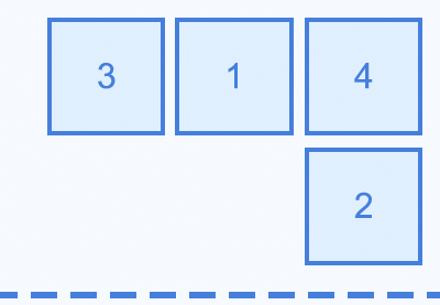
Refer to the image above; notice how the back-side of our card is displaying by default? This is because, due to the fact that the element occurs lower in the markup, it, as a result, receives a higher z-index. Let’s fix that.
/* Make sure we see the front side first */
.box > div:first-child {
  position: relative;
  z-index: 2;
}
Step 7. Rotating the Card
Now for the fun part; when we hover over the card, it should flip around, and display the back side of the card. To achieve this effect, we use transformations and the rotateY function.
.box:hover {
  transform: rotateY(180deg);
}
Step 8. Mirrored Text
Doesn’t that look awesome? But, now, the text appears to be mirrored. This, of course, is because we transformed the container. Let’s offset this by rotating the child div 180 degrees as well.
.box:hover > div:first-child {
  opacity: 0;
}

.box:hover div:last-child {
  transform: rotateY(180deg);
}
And with that last bit of code, we’ve achieved our neat effect!
Conclusion
Thank you so much for reading, and I hoped you learned a lot!
