Responsive web design as a concept has been around a long time now; in fact, it’s the de facto way of building websites nowadays. Right now people are accessing websites with mobile phones more than any other device, so it’s really important to ensure that your website is suited to small and large screens.
It’s useful to remind ourselves of the basics, so in this article we’ll cover 4 aspects of HTML and CSS which make a website responsive.
These are the areas we’ll be focusing on—they serve as a kind of checklist:
- Viewport
- Media queries
- Media
- Responsive containers
1. Check the Viewport Meta Tag
The viewport is the visible area of a web page on a device. The first step in making your website responsive is making sure that the website scales accurately across all screens.
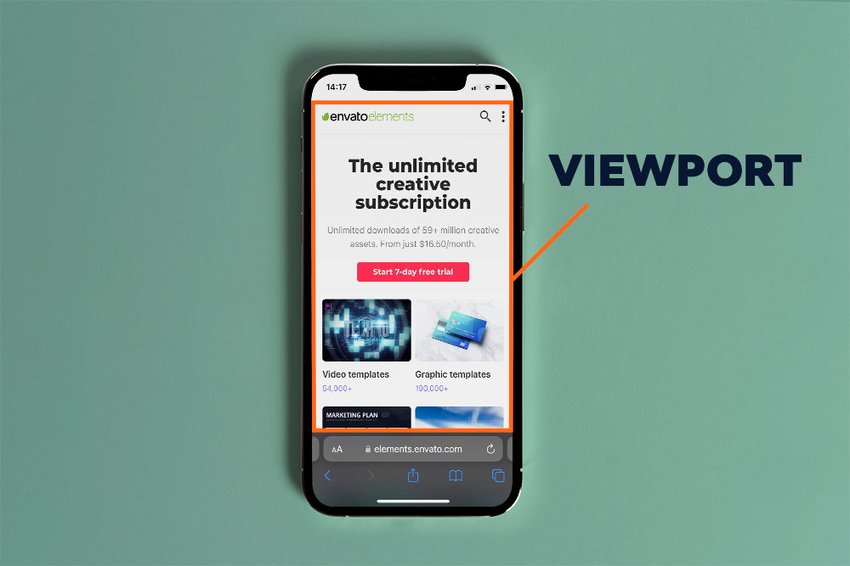
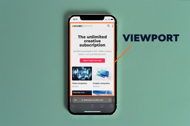
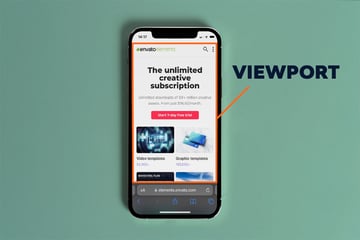
The viewport meta tag is used to set the viewport scale:
<meta name="viewport" content="width=device-width, initial-scale=1">
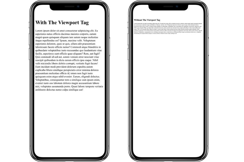
width=device-width sets the width of the viewport to the width of the device that the webpage is being loaded on. initial-scale=1 sets the viewport to a zoom scale of 1 (or 100%) of the device width.
“Without a viewport meta tag, mobile devices render pages at typical desktop screen widths and then scale the pages down, making them difficult to read.” – web.dev


Another fact to note is that the <meta name="viewport"> tag is looked for by search engines to determine how mobile-friendly a website is so it directly affects your site’s SEO.
2. Media Queries are Your Friend
Responsive web pages will have different layouts depending on the amount of space available. Smaller screen sizes are more likely to have simpler, one-block layouts while larger screens may have more complicated layout designs.


A media query is used to change styling of a webpage across different screen sizes. It uses the @media rule to define a condition for which CSS styling should be applied. The media rule consists of a media type and a media feature, in the format:
@media screen and (max-width: 768px) {...}
The above media query would apply to webpages on a screen with a maximum width of 768px.
In this demo, we use media queries to apply different layouts for mobile, tablet and desktop screens (here’s the full page version to make resizing easier).
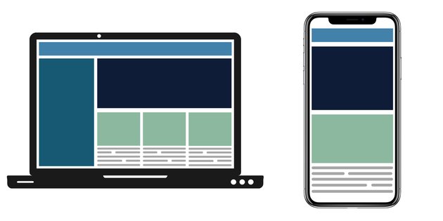
Use Mobile-First Design
Since more people view websites on their phones, mobile design should be prioritised. Starting with the mobile design first is a good way to ensure that the core elements of your page are displayed on all screens.
Also, mobile screens usually have simpler layouts which means it’s easier to build up from a basic mobile foundation than to break down a complicated desktop layout for mobile screens.
If we were to recreate the layout in the above image for mobile screens, it would look something like this:
<nav></nav>
<aside></aside>
<main>
  <header></header>
  <article></article>
  <article></article>
  <article></article>
</main>
nav {
  width: 100%;
  height: 50px;
  background-color: #4282aa;
  margin-bottom: 8px;
}

aside {
  display: none;
}

main {
  width: 100%;
}

header {
  width: 100%;
  height: 200px;
  background-color: #0F1C37;
  margin-bottom: 8px;
}

article {
  width: 100%;
  height: 100px;
  background-color: #8CB89F;
  margin-bottom: 8px;
}
Now that we have the base styling down, we can extend it to larger screens. We’ll use a “minimum width” condition, rather than a “maximum width” condition. This will dictate that once a screen reaches a minimum width of 768px we can introduce more complex styles. This is what the styling for tablet screen layout would be:
@media (min-width: 768px) {
  main {
    display: flex;
    flex-wrap: wrap;
  }

  header {
    flex: 1 0 100%;
  }

  article {
    flex: 1 0 30%;
    margin-right: 8px;
  }

  article:last-child {
    margin-right: 0;
  }
}
And finally we extend our minimum width and include styling for desktop and larger screens:
@media (min-width: 1024px) {
  aside {
    display: block;
    float: left;
    width: calc(30% - 8px);
    background-color: #175873;
    height: 308px;
    margin-right: 8px;
  }

  main {
    width: 70%;
    float: left;
  }
}
3. Responsive Media is Important!
When it comes to responsive media, it’s important to set images and videos to scale according to screen size.
Rendering images or videos in their original sizing without scaling runs the risk of having the media cause an overflow on the webpage.
We can avoid media that’s larger than the webpage size by setting the max-width property in CSS:
img,
video {
  max-width: 100%;
}
With this property, all media present on the webpage will only be as large as the width of its parent container.
In some cases you might need to use height: auto; too
For more information on different ways of embedding videos check out this post on CSS Tricks.
Rendering Different Images Based on Screen Size
Another aspect of responsive media is displaying the right image for the right screen size. If a large image is scaled down for a mobile screen, the content might become unreadable. It’s also unnecessary to load in an overly-large file if its width isn’t needed anyway. Let’s get more selective!
The concept of rendering different images using media queries can be carried out with the picture tag.
<picture>
  <source srcset="...1024x800px.png" media="(min-width: 1024px)">
  <source srcset="...768x600px.png" media="(min-width: 768px)">
  <img src="http://webdesign.tutsplus.com/...480x375px.png" alt="background">
</picture>
In this code, the default source for the img tag is set as the smallest image. The source tags updates the img src tag with the correct srcset when the media condition is met.
Resize the demo below to see how the images update based on screen size (here’s the full screen version to play with):
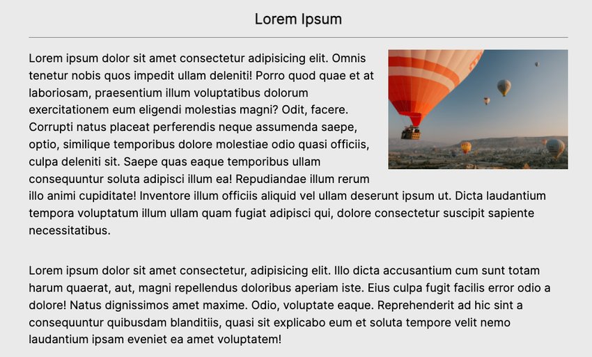
4. Responsive Containers for Better Layouts
A responsive website looks good across all screens and that includes larger screens. One of the downfalls of not designing for larger screens is having your webpage look stretched out when displayed on a wide screen or projector. Here’s a simple article layout where we float some images to the left and right:
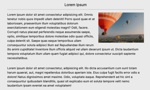
And this is the article on a larger screen:
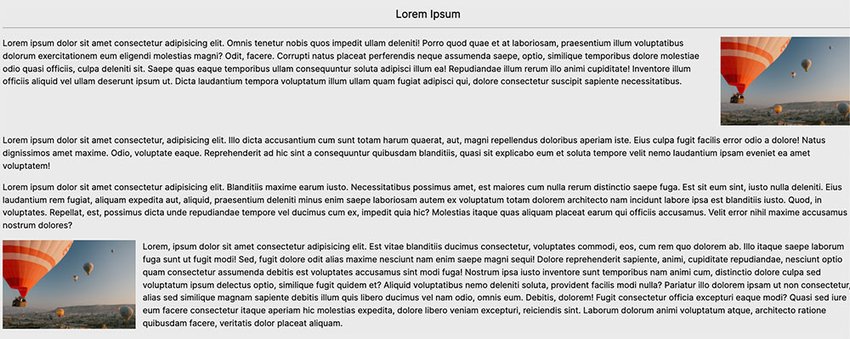
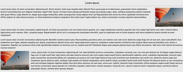
The lengths of the paragraphs become so long that the content is almost unreadable. And the images cause a huge gap between the lines of text.
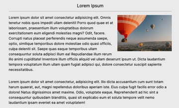
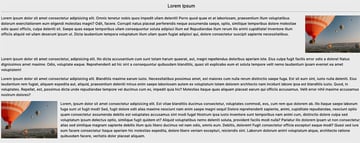
We can solve this problem by using a responsive container:
.container {
  max-width: 900px;
  width: 100%;
  margin: auto;
}
The container takes a max-width value and uses the auto margin to place the content in the center.
We’ll add the container class to the content in our markup:
<header>
  <div class="container">
    <h1>Responsive Containers</h1>
    <p>Create content for large screens</p>
  </div>
</header>
<main class="container">
  <h2>Lorem Ipsum</h2>
    <img src="http://webdesign.tutsplus.com/" />
    <p>Lorem ipsum dolor</p>
</main>
Resize the demo see how the content looks in smaller and larger screens.
And there you have it, an easy implementation for responsive content on large screens.
For next-level modern layouts, you can use CSS grid too. Check out our beginner’s guide:


Conclusion
To summarise, to make a website responsive, you’ll have to:
- Set the meta viewport tag to scale
- Use media queries to design different layouts
- Set max-widths for media on the page to prevent overflow
- Use containers to fit the content on larger screens and shrink on smaller screens.