My first UX Research role was at a small digital agency, where the discipline was still new. Sales teams would frequently sell clients research, without fully budgeting in participant recruitment.
Shoestring budgets meant I often had to find my participants using creative, scrappy methods. For one of my first projects, I actually cold-called restaurants, asking if I could observe their staff ring up orders. Amazingly, some of them actually said yes.
In 2016, I joined Atlassian as a UX Researcher. I had high expectations: none of this scrappy recruiting business, it was a public tech company, after all!
Unfortunately, I quickly learned this wasn’t the case. Alongside planning and running studies, Atlassian’s small team of researchers were also creatively coming up with their own ways to find participants.
Over the next two years, there were attempts to improve this. A research sign-up page was posted on our website (which went to a spreadsheet). Atlassian hired a Research Coordinator. But the process was still quite manual, slow, and perceived as a bottleneck. Frustrated, many researchers resorted back to finding participants on their own.
Atlassian needed to fix recruiting
In mid-2018, Leisa Reichelt (Atlassian’s Head of Research & Insights) accurately identified recruiting as one of the biggest blockers for scaling our team. At the time, we didn’t have a Research Ops team, so she asked me to step in to help.
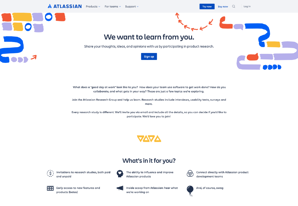
The goal was to build an internal panel of participants: a database of our users we could reach out to for research studies. Two years later, the panel (named the Atlassian Research Group) has over 50,000 Atlassian customers in it.
It took three months of planning, frustration, collaboration and technical exploration to get our ‘MVP’ off the ground. If you’re considering creating your own participant panel, here are my key learnings.
Map it out, end-to-end
To start, I got in front of a whiteboard and mapped out all of the people, touchpoints and systems I would need for this to work with a service blueprint.

Unlike a typical service blueprint where there’s one customer, a participant panel effectively has two ‘customers’:
- the actual customer: participating in the research, or receiving the email, considering if they should participate
- and the internal ‘customer’: the team member conducting research
Each customer has distinct needs, requiring different kinds of communication, through different mediums. For example, customers needed to have confidence that this email and the study was official, and they knew exactly what were signing up for. For internal team members, seeing the status of their request was important, along with simple back-and-forth communication with a Coordinator.
The blueprint proved to be an invaluable artifact to visualize the complexity of the systems that I’d need to set up, end-to-end. It also helped me take stock of all the tasks ahead of me, and their priorities. Where were the linchpins, the things that had to run smoothly and reliably? What were nice to have, but nonessential?
Tooling usability matters as much as functionality
My service blueprint also mapped out the technical complexity to get the panel up and running, and there was a lot of it.
We needed:
- A professional-looking sign-up form and screeners
- A means to get the sign-up form in front of customers (a webpage and other marketing initiatives)
- Secure storage of participant data
- The ability to pull lists of participants, based on specific criteria
- A way to edit participant information, manually and automatically (as they filled out screeners).
- A way to delete participants, when requested
- Email messaging, with professional-looking layouts
- An official Research@ email address
- Simple scheduling, so participants could select a session time
- Incentives redeemable around the world
- An internal request/ticketing system
To start, I used a combination of Jira Service Desk, Ethnio, Calendly, and Qualtrics. Qualtrics was our main tool: we just signed a contract with them, they were GDPR-compliant, and had good survey functionality.
While Qualtrics worked fine for gathering and storing participant data, it was terrible to use when actually recruiting participants day-to-day. For example, its messaging capabilities were quite poor: I was hacking together HTML code to make email messages look somewhat decent.
Not to mention it was hard to use. Confusing. Fragile. It took days of training and lots of documentation to explain the intricacies of Qualtrics to new Research Ops team members. It was clear this wasn’t a long-term solution.
A year later, the newly formed Research Ops team (led by Kate Towsey) moved the panel to a more user-friendly CMS-like system with User Interviews. This was a massive improvement, which allows researchers to self-serve when they need participants.
My learning: don’t jump to a certain tool just because it’s easily available. If you make tooling compromises, understand who that affects — who will be using the tool, day-in and day-out? How painful will that be for them?
Also, keep an MVP mindset, and be willing to iterate.
The sign-up form matters, but maybe not as much as you think
I spent a lot of time thinking through what information we should collect from participants as they signed up to the panel. The more data we had on a participant, the easier it would be to pull email lists later.
I imagined future requests: Do you want to reach out to every Jira administrator, who lives in the UK and works at companies over 5000 employees? You got it!
However, once we actually began using the panel, we realised we could never wholly rely on the information in our database. Not because people were lying — but because their situations may have changed from the time they initially signed up.
For example, even if our database stated a person used our product Confluence, we always had to double-check. Perhaps the person was working for a new employer, and no longer used it anymore.
Screeners became a much more accurate and up-to-date source of participant information.
My learning: Filtering and pulling email lists for research recruitment is like a blunt machete to hack away and remove big chunks. Screeners are your scalpel to delicately trim from there. So spend time on your form, but know that the screeners will matter most once you begin using the panel.
Define your voice and brand from the get-go
As researchers, we know how valued our participants are. They have an incredible impact on product decisions. I wanted to communicate that clearly to customers: making the panel feel special, exciting and worth joining.
To do this, I asked other teams at Atlassian for their help.
There are tons of writing in recruiting. Our internal content designers helped craft our initial key messages like website copy and invitation emails to participants. We collaborated to define a voice & tone for the Group, which built off Atlassian’s product voice and tone guidelines.
I also wanted a consistent visual look for the panel. This branding would go on our website, our emails, our screeners, and more. The panel needed to be clearly be associated with Atlassian, so participants knew it was legit. But I also wanted it to look differentiated enough that it didn’t feel like Marketing.
Sara VanSlyke on our brand team defined our look. We collaborated through several iterations of ideas, eventually choosing one that took the Atlassian color palette and riffed on the idea of research and insights— incorporating speech bubbles, organic shapes, and arrows.
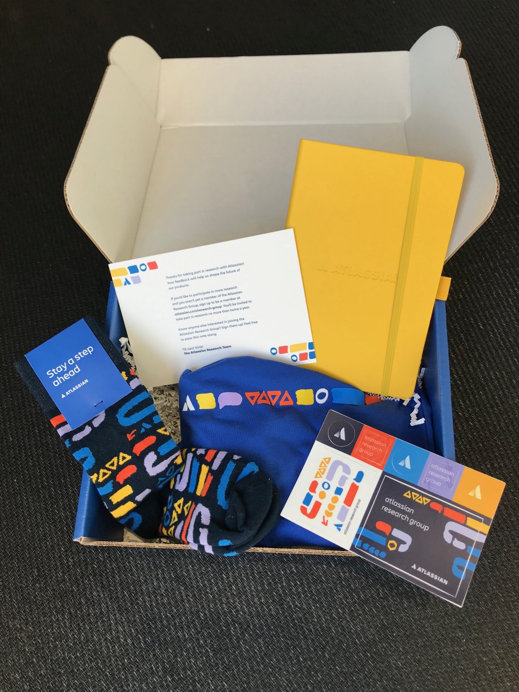
Defining the Group’s voice and brand early on made so many other decisions down the line easier. For example, later on, myself and the Research Ops team created swag boxes, as an alternative incentive to gift cards.

Start with a solid base, and create a steady stream of new sign-ups
You can’t set up a sign-up page on the website and call it a day, because your panel was only as useful as the number of participants in it.
Our panel got a head start by beginning with a few thousand customers. These were aggregated from years worth of surveys where customers had opted in to be contacted about research, plus our old spreadsheet system.
But the panel also needed a steady stream of new participants coming in. The Research Ops team and I set up the following ways to replenish it, regularly:
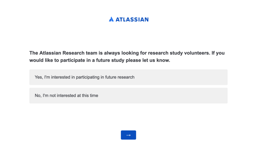
- Quarterly surveys, with a final question asking if the person wants like to participate in future research with Atlassian.

- In-product pop-up surveys. After providing feedback on specific features, users can opt-in for future research
- The Atlassian Community. Posting on the online forum about research opportunities, and getting involved in in-person meetups
- A booth at our annual company conference, Summit
- Encouraging past participants to invite their colleagues and friends
- And of course, a page on our website
Without these methods, we would have quickly exhausted our initial participant list.
My learning: Like a little plant, if you set up a participant panel, you’ll need to constantly look after it and help it grow. I suggest looking at quarterly data like how many customers are being reached out to, response rate, how frequently new customers are joining, etc. to make sure your panel is staying heathy.
6. Scale slowly
When I launched the Atlassian Research Group, we began with a few low-risk, pilot studies. This ensured the panel worked the way we expected it, and gave us a gauge on response rate, and total recruitment time.
From there, the recruitment service was rolled out to the entire company. But as Kate Towsey has shared, it quickly became clear the Research Ops team took on too much, too soon.
“As the service got more well-known, the two week [service-level agreement] went from three weeks, to four weeks, and then eventually just bust. We had so many tickets requesting research recruitment, we couldn’t possibly have covered it with a team of five people.” — Kate Towsey
(While I wasn’t intimately involved with the panel at this point, I was still on the Research & Insights team, and learned by observing my fellow teammates.)
My learning: An internal panel certainly makes recruiting easier, but one person — no matter how amazing they are — can only do so much in a day. A few successes doesn’t ensure you’re ready to recruit for the entire company. It’s a delicate ecosystem. So start small, and scale slowly.
Final thoughts
6 months ago, I was hired at Canva as their first Design Researcher. Our company is facing many of the same recruitment challenges Atlassian once was. As I consider whether Canva should create our own participant panel, I reflect on these things:
A panel won’t work for everyone. A participant panel typically works well for companies with a large, existing user base. It also helps if your product already has fairly engaged users — a lively online Community, Twitter chatter, or social media followers is a good sign.
A panel won’t reach everyone. A panel works well when you’re trying to find more general product users, but not so well for niche participants, like people with disabilities, or C-level executives. You’ll likely need to supplement your pane with additional recruitment methods. For example, with online panels like Respondent or professional vendors. Of course, this will depend on your researchers and who they expect to need to reach most.
A panel won’t run itself. It’s not set it and forget it — you need a process for who’s able to use the panel, how, and how frequently. You could set up a dedicated Research Ops team, let it be self-serve, or somewhere in-between. Each has their own pros and cons. You’ll also need to think through budgets.
In closing, a panel may be a great first step towards better participant access, but it won’t solve all your recruitment woes. Be ready for frustrations, challenges, and excitement as you get it all set up. Take it in stride, and keep in mind the bigger picture: helping your team get quality insights, faster!
Thanks to Kate Towsey, Sarit Geertjes and Theresa Marwah for reviewing this piece. Opinions expressed are solely my own and do not express the views or opinions of Atlassian as a company.

Lessons from setting up an internal research participant panel at Atlassian was originally published in UX Collective on Medium, where people are continuing the conversation by highlighting and responding to this story.
