
Summary: Contextual menus reduce clutter and interaction cost but have low information scent. Prioritize clarity, consistency, and proximity to balance the tradeoffs. When used well, contextual menus help reduce visual noise, streamline layouts, and support focused interaction. But when used inconsistently, or when mislabeled, misplaced, or overloaded, they introduce confusion and can slow users down.… Continue reading Designing Effective Contextual Menus: 10 Guidelines
Quantifying UX Success and Proving Value
Learn to measure and communicate UX value through quantitative data, qualitative stories, and financial impact calculations. Last week, I talked about building credibility by looking outside your organization for validation. External benchmarking, expert opinions, and industry recognition all help shift internal perception. But validation only works if people understand the actual value you’re delivering. That… Continue reading Quantifying UX Success and Proving Value
Smarter Surveys in UXtweak
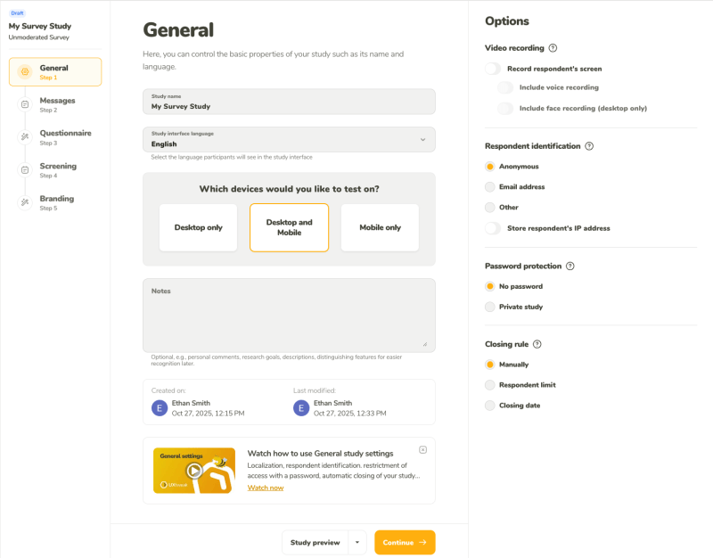
Hi UXtweakers! We’re excited to share another step forward on our journey to becoming the best UX research platform on the market–the release of a reworked version of our Survey tool and its related features. Surveys are a quintessential research method, helping you better understand your users–their needs, opinions, and motivations. Knowing how important they… Continue reading Smarter Surveys in UXtweak
Good Visual Design, Explained
Summary: To create appealing designs, align type and elements to a grid, build a clear visual hierarchy, use color intentionally, and stay consistent with every design choice. In this 3rd article in the anatomy-of-good-design series, I explain visual-design principles that contribute to good-looking designs, with real-site examples. How something looks does affect the perception of… Continue reading Good Visual Design, Explained
Beyond the Primary User: 3 Types of Smart-Home Users
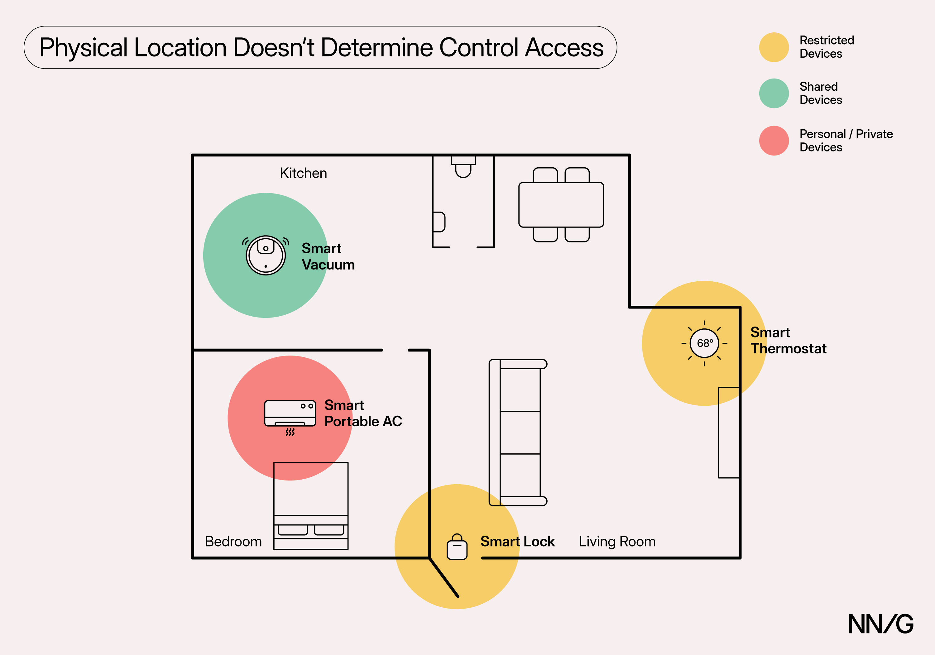
Summary: Smart-home devices often serve multiple users with different needs and preferences. Designing for shared use can reduce unnecessary friction and dependency. Smart-home devices, such as smart cameras, thermostats, and lights, are becoming increasingly ubiquitous, with Horowitz Research and Aviva reporting that nearly half of American households and about 80% of adults in the UK… Continue reading Beyond the Primary User: 3 Types of Smart-Home Users
Ads and accessibility mismatch

Examples when it does not work Contrast issues Contrast issues affect all users and impacts users with vision loss most. It puzzles me that companies paying for ads do not think of visibility since they pay for creators the work and for the placement. This is too common on bus-ads where you have so little… Continue reading Ads and accessibility mismatch
Axe-con 2026: Full agenda reveal!

When it comes to the most exciting digital accessibility event of the year, there’s no better time to start planning than right now, because we’re revealing the full agenda today. If you thought last year’s event was amazing, wait until you see what we’ve got in store for you in 2026! We’ve already announced Dr.… Continue reading Axe-con 2026: Full agenda reveal!
Free & Premium Poster Fonts for Powerful Visuals
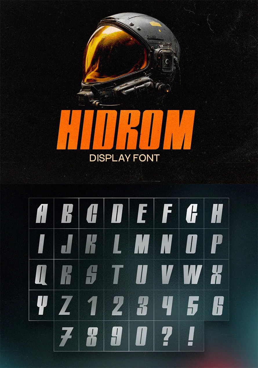
Poster visuals depend heavily on typography, and the right poster font can instantly transform a simple layout into a striking design. Bold letterforms, sharp contrasts, and expressive styles help capture attention from a distance, making your message stand out in busy environments. Whether you’re designing event posters, promotional graphics, or creative artwork, choosing the right… Continue reading Free & Premium Poster Fonts for Powerful Visuals
The Designer-Developer Handoff Is Still Broken — why?

Let’s be honest: the designer-developer handoff was never really “working”—at best, it limped along with annotated PDFs and passive-aggressive Figma comments. At worst, it bred siloed teams, bloated timelines, and a whole lot of mutual eye-rolling. But in 2025, after a decade of Figma, a thousand design system evangelists, and an ocean of bridging tools, you’d… Continue reading The Designer-Developer Handoff Is Still Broken — why?
WPLP Compliance Platform Review: A Practical Look at How Well It Handles Modern Privacy Requirements
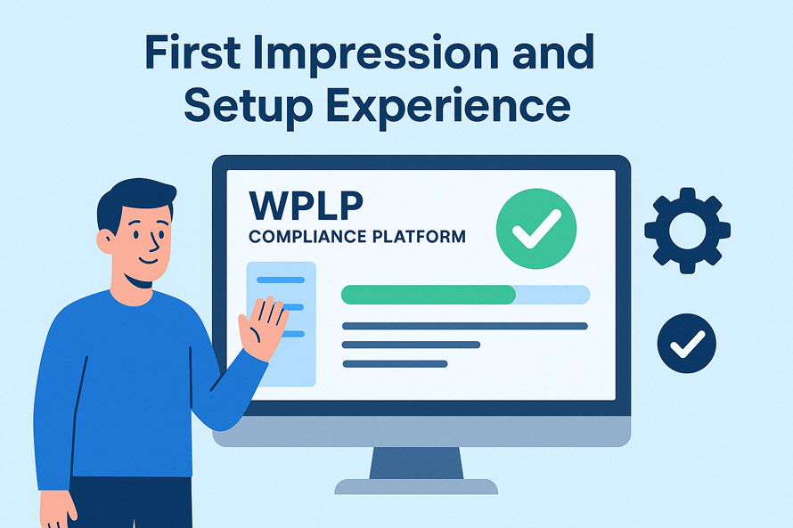
If you own a website, you probably know that a point comes when “just adding a cookie banner” doesn’t cut it anymore. Browsers keep changing how cookies behave, and you must adopt your approach to the evolving privacy laws to stay on the safe side. If your site handles traffic from the EU, California, Brazil,… Continue reading WPLP Compliance Platform Review: A Practical Look at How Well It Handles Modern Privacy Requirements
UX Conference February Announced (Feb 4 – Feb 12)
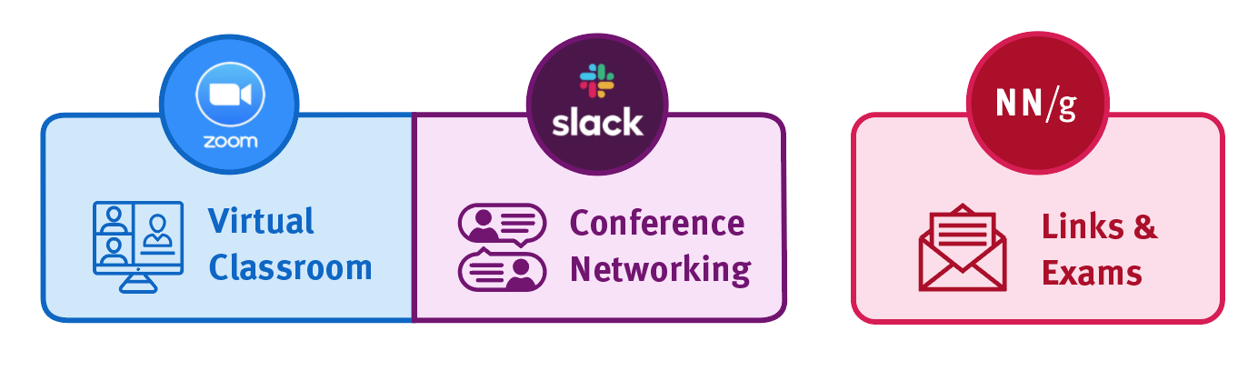
How will the Virtual Event work? Meetings will take place using the video conferencing tool Zoom, collaboration tools (such as group document editing and whiteboarding tools), and the social discussion tool Slack. You’ll also be able to use Slack before, during, and after the event to participate in social events and network with other… Continue reading UX Conference February Announced (Feb 4 – Feb 12)
25+ Remarkable Typography Quotes for Inspiration
Typography quotes have become a powerful source of motivation and visual inspiration, blending meaningful words with artistic design to create messages that truly stand out. 25+ Remarkable Typography Quotes for Inspiration celebrates this creative fusion, showcasing how type, layout, and style can transform simple phrases into impactful visual statements. These designs transform simple sentences into… Continue reading 25+ Remarkable Typography Quotes for Inspiration
40+ Corporate Business Card Designs and Creative Ideas
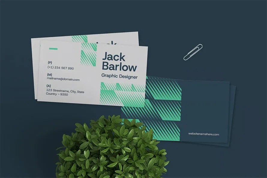
Download the most popular corporate business card templates, designed with high-quality layouts, pro concepts, and creative ideas. Each template looks like it was made specifically for your corporate brand. These designs are not “easy to edit” by anyone. Every business card needs a professional designer who understands your brand, color theme, and business nature, so… Continue reading 40+ Corporate Business Card Designs and Creative Ideas
Kaleidoscope Font
Kaleidoscope Font What Font is Kaleidoscope? Kaleidoscope Font captures the bold and vibrant energy reflected in the series’ mysterious and dramatic tone. The typography most closely matches Montalban Bold, a striking sans-serif typeface with strong geometric lines and a cinematic feel. This font conveys confidence and intrigue, much like the shifting narratives in the show.… Continue reading Kaleidoscope Font
DKNY Font
DKNY Font What Font is DKNY? DKNY 2025 Font features a strong, contemporary aesthetic that reflects the brand’s urban sophistication and bold minimalism. The typography closely resembles Handbills And Posters JNL by Jeff Levine, a commercial font known for its structured and timeless appeal. Its solid, confident strokes capture the energy of New York City—modern,… Continue reading DKNY Font
Research Operations and How They Impact UX Design

Key takeaways 📊 ResearchOps streamlines the logistical and operational aspects of UX research. 🔄 Effective ResearchOps enables teams to focus on insights, not administrative tasks. 📚 Building a solid ResearchOps framework improves research efficiency and consistency. 🤝 Collaboration across teams is essential for successful ResearchOps implementation. 🐝 Tools like UXtweak simplify participant management, data collection,… Continue reading Research Operations and How They Impact UX Design
Insights Aren’t Outcomes: Research Recommendation Breakage
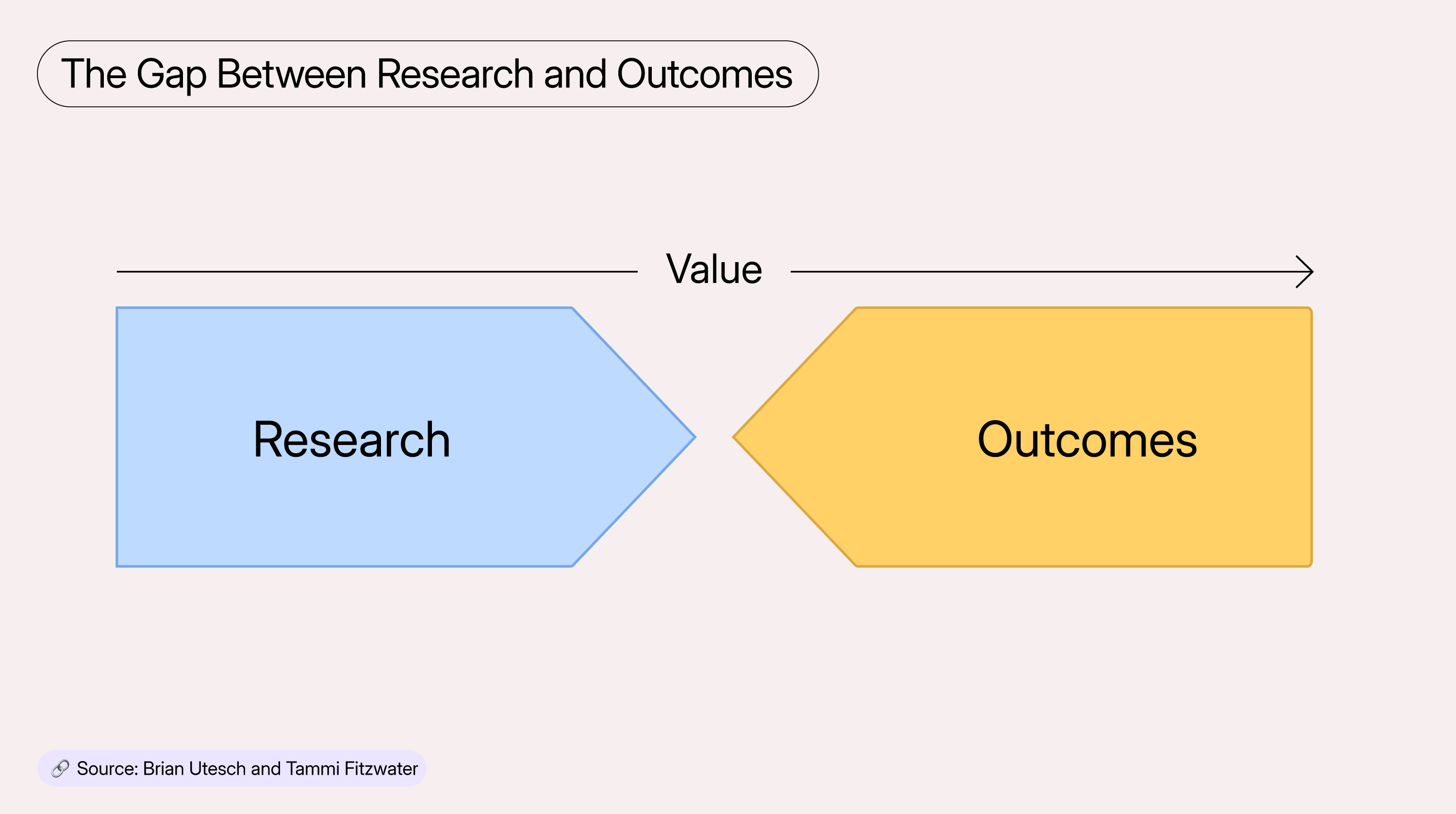
Summary: Research recommendations often fail to reach users. Without tracking adoption, teams rely on hope instead of evidence to confirm their work creates change. Many research teams do good work. They identify the right problems, recruit the right participants, and run studies that reveal what is really going on. The end product is often packaged… Continue reading Insights Aren’t Outcomes: Research Recommendation Breakage
AI in UX Research Revisited: What Really Changed Since 2023?
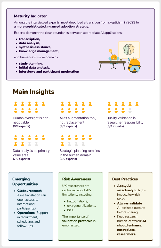
What is this report about? 📚 In 2023, at the beginning of the still-ongoing AI frenzy, we asked expert UX researchers how they viewed the rise of AI in the UX Research industry. At that time, responses were a mix of curiosity, skepticism, and early experimentation. Two years later, driven by rapid progress in AI… Continue reading AI in UX Research Revisited: What Really Changed Since 2023?
15 Great Tools & Resources for Designers & Agencies in 2024
Posted · Category: Design, Tools <!– –> It’s 2024 and the number of web design resources and tools on the market seems overwhelming. That’s good news since you need the right tools and resources to come up with competitive designs. The bad news is, rather than sifting through thousands of products to get the ones… Continue reading 15 Great Tools & Resources for Designers & Agencies in 2024
Dissecting a Wavy Shader: Sine, Refraction, and Serendipity
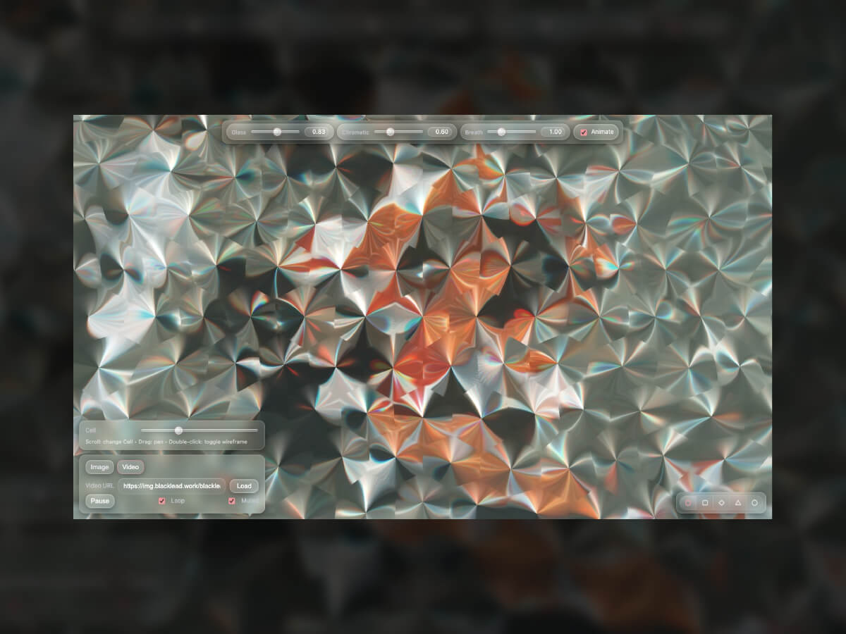
Every creative studio has its weird internal rituals. Ours? A challenge we call “12 Pens in 12 Months” — one experiment each month, no rules, no clients, just play. Somewhere between caffeine and chaos, one of our devs made this — a wavy, hypnotic, jelly-like motion effect that instantly became the team’s favorite. We didn’t… Continue reading Dissecting a Wavy Shader: Sine, Refraction, and Serendipity
Engaging Stakeholders in UX Activities
Getting stakeholders involved in UX work builds empathy, support, and advocacy for user-centered thinking across your organization. Last week I talked about marketing UX within your organization and how you can use internal marketing strategies to build awareness and executive support. This week, I want to dig into a more hands-on approach: getting your stakeholders… Continue reading Engaging Stakeholders in UX Activities
4 Proven Methods to Get the Most Out of ChatGPT-5
[unable to retrieve full-text content] ChatGPT 5 is the latest version of OpenAI’s AI model. This model shows better performance in several areas, including improved accuracy on advanced math and coding tasks, and it has a larger context window for processing long documents. However, despite all the advantages of this new model, it has one… Continue reading 4 Proven Methods to Get the Most Out of ChatGPT-5
70+ Best Food Fonts That Look So Good
Looking for food fonts that make people hungry? You’re in the right place! These 70+ best food fonts are tasty for the eyes and perfect for restaurant menus. They’re fun, bold, and full of flavor, just what your brand needs to stand out. Use these fonts for logos, menus, and food packaging that make everyone’s… Continue reading 70+ Best Food Fonts That Look So Good
Good from Afar, But Far from Good: AI Prototyping in Real Design Contexts
Summary: AI prototyping tools follow general directions but lack the judgment and nuance of an experienced designer. Over the past few months, the UX design field has been flooded with AI-powered prototyping tools that generate interfaces instantly from natural-language prompts. Despite the massive marketing hype, our evaluation with real design scenarios revealed that these tools… Continue reading Good from Afar, But Far from Good: AI Prototyping in Real Design Contexts