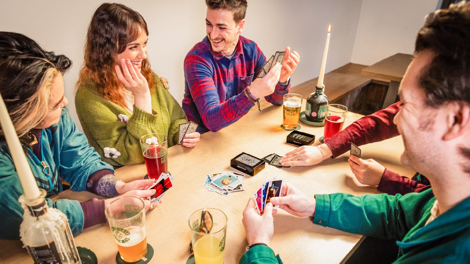
Belfast’s Whitenoise agency marks 25 years with custom playing cards. Each card features unique graphic design. A celebration of design and play. To celebrate its 25th anniversary, Belfast-based agency Whitenoise created a unique and playful project: a custom deck of playing cards. This initiative showcases the agency’s graphic design talent and its passion for storytelling.… Continue reading Whitenoise Celebrates 25 Years with Graphic Design Playing Cards
Before We Charge Ahead, Let’s See Where We’re Standing
Audit your UX role, resources & leverage: 10-minute exercise to see where you stand before we redefine UX. In Lesson 1 we travelled from Roman amphitheaters to modern apps and saw that user experience is not what many consider it to be and needs repositioning. In Lesson 2 I asked whether you’re ready to lead… Continue reading Before We Charge Ahead, Let’s See Where We’re Standing
Professional Brochure Catalog Templates: 25 Print Ready Designs
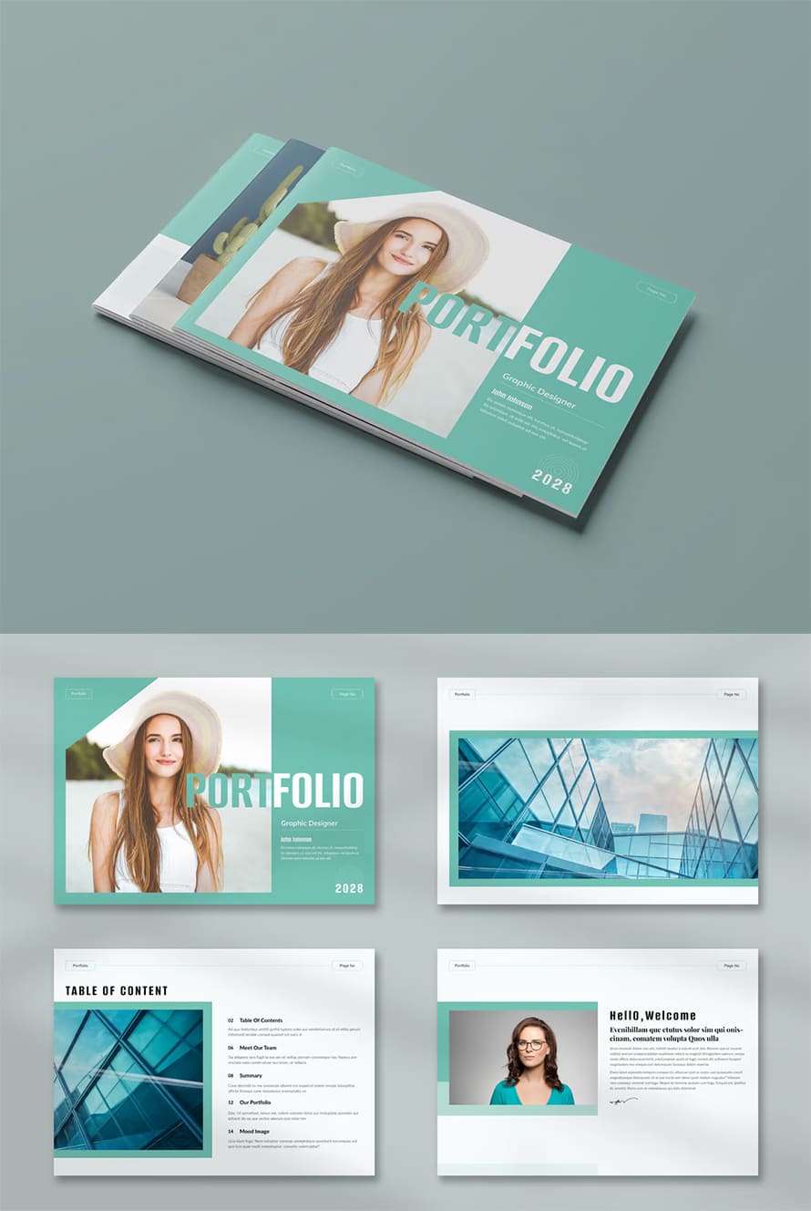
A brochure catalog templates remains one of the most effective tools for brand communication. The catalog templates, lookbook brochure, and portfolio templates delivers information clearly while showcasing products, services, or collections in a structured format. Choosing the right catalog design template enhances visual appeal and strengthens brand identity. Creating a brochure, lookbook or portfolio from… Continue reading Professional Brochure Catalog Templates: 25 Print Ready Designs
AI Design Tools Are Marginally Better: Status Update
Summary: Despite improvements in narrow-scope AI design tools, most design-specific AI cannot replicate human designers’ output quality. This is a follow-up to the 2024 article AI UX-Design Tools Are Not Ready for Primetime: Status Update. In April 2024, AI-powered design tools were not useful to designers. As of May 2025, their usefulness has improved, but we’re… Continue reading AI Design Tools Are Marginally Better: Status Update
How to create a colorful fan art portrait in Procreate
In this tutorial, we’ll learn how to draw a portrait in Procreate from scratch. We’ll draw Jinx from Arcane series, and we’ll take some inspiration from comics and Art Nouveau styles. We’ll explore different drawing techniques, and we’ll learn to use textures to make your fan art portrait expressive and vibrant. Creating a fan art… Continue reading How to create a colorful fan art portrait in Procreate
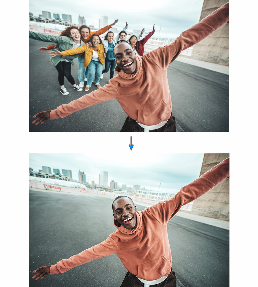
How to extend the background of a photo
Do you want to extend the background of a photo to give your image more breathing room or a different aspect ratio? This quick tutorial will show you how to achieve fast, professional results using the AI tools in Envato’s ImageEdit and the latest features in Adobe Photoshop—no advanced skills required! We’ll cover how to… Continue reading How to extend the background of a photo
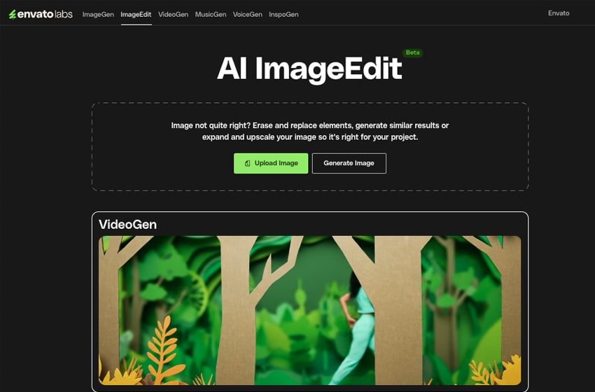
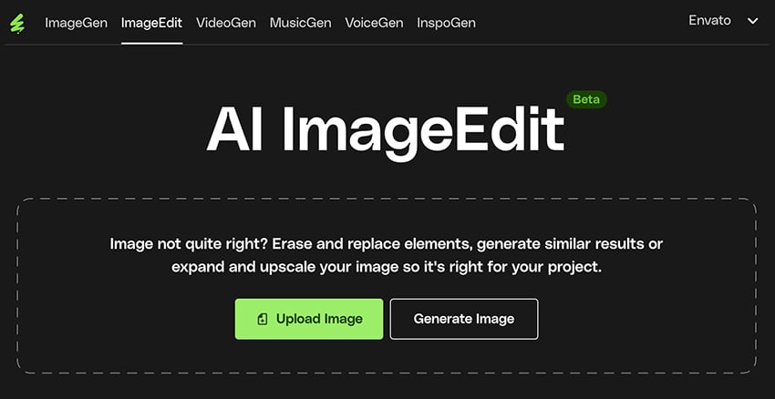
How to edit images with AI ImageEdit
While editing images, it can be tough to find a tool that is both easy to use and has advanced features. Envato’s AI ImageEdit makes this easy, providing both beginners and expert creators with tools that take away the difficulties of regular editing. Ready to breathe new life into your uploaded images with this all-in-one… Continue reading How to edit images with AI ImageEdit
A Deep Dive into Today’s Best Online Meeting Apps
In our increasingly digital workplace, online meeting platforms have evolved from convenient alternatives to essential tools for global collaboration. As remote and hybrid work arrangements become standard practice, the demand for reliable, feature-rich virtual meeting solutions continues to grow. Whether you’re managing a distributed team, connecting with clients overseas, or organizing virtual events, finding the… Continue reading A Deep Dive into Today’s Best Online Meeting Apps
How to remove people in the background of photos
We’ve all been there—you spend ages taking the perfect shot, only to find a random person lurking in the background. Whether it’s a stranger in your travel photo or a blurry figure messing it all up, it can be very frustrating when these things happen to your creative work. That’s why I love using ImageEdit… Continue reading How to remove people in the background of photos
How to remove a background from a logo
If you’ve ever been handed a logo that’s buried in a busy photo or slapped onto a textured background, you know how frustrating it can be to clean it up. Whether you’re dealing with brick walls or busy gradients, trying to extract a clean and transparent version that you can use can be a real… Continue reading How to remove a background from a logo
New Mapping Feature Available with Every Email Send
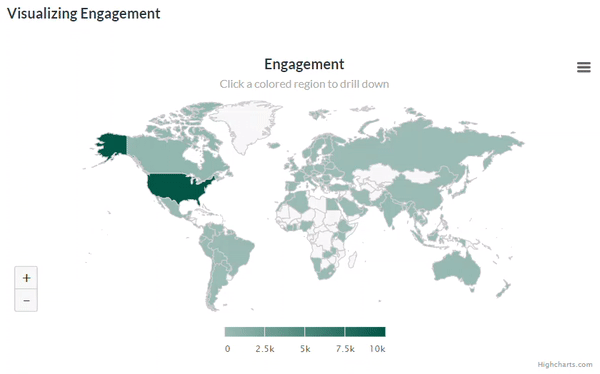
Zoom in to discover where your emails are being read. A great new feature offering more insight into your subscribers is now available with every email send and monthly insight report: Geographic data on engagement stats. And not just the numbers, the team went a step further and added a mapping feature for visual representation.… Continue reading New Mapping Feature Available with Every Email Send
How AI Models Are Trained
Summary: Training modern LLMs is a costly process that shapes the model’s outputs and involves unsupervised, supervised, and reinforcement learning. By this point, you’ve undoubtedly heard that the large language model (LLM) behind your favorite AI tool has been “trained on the whole internet.” To some extent, that’s true, but after training hundreds of UX… Continue reading How AI Models Are Trained
Are You Ready to Become a UX leader?
Discover your true role as a UX leader—regardless of your job title or organization. Understanding Where You Fit If you’re reading this, chances are you’re passionate about user experience. But maybe UX isn’t actually in your job title. Perhaps you’re a marketer, project manager, developer, copywriter, or business analyst who deeply cares about making your… Continue reading Are You Ready to Become a UX leader?
Avoiding Common Bias Traps in UX Surveys
[unable to retrieve full-text content] Part 3 (of 3) in the Crafting Effective UX Surveys series. In Part 1, we covered the essential “Do’s” for creating impactful surveys, and in Part 2, we focused on identifying and eliminating bias in survey questions. In this final part, we’ll explore the broader landscape of common bias traps that… Continue reading Avoiding Common Bias Traps in UX Surveys
Button States: Communicate Interaction
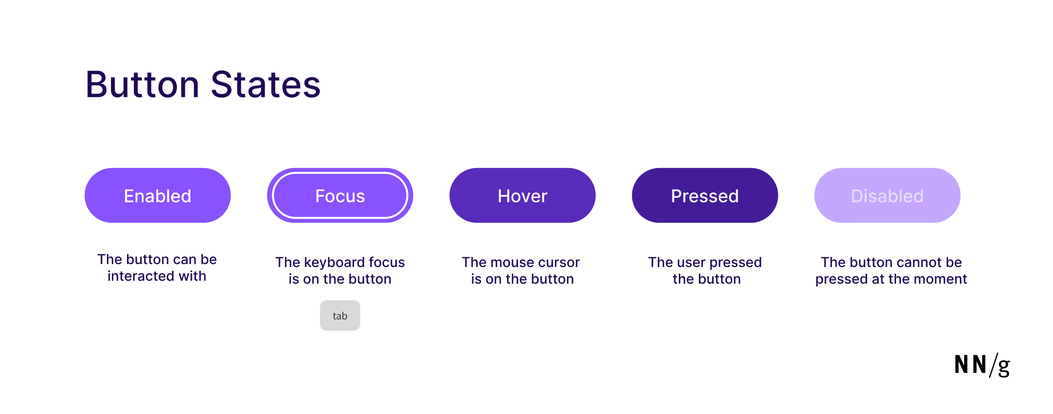
Summary: Minor visual changes help users distinguish between 5 different button states: enabled, disabled, hovered, focused, pressed. Buttons are core user-interface elements that, when clicked or tapped, execute an action. When designed correctly, buttons set accurate user expectations and help them understand how to interact with the interface. In addition to clear button labels, effective… Continue reading Button States: Communicate Interaction
Beyond the Model: a systems approach to AI product design

[unable to retrieve full-text content] Integrating AI from technical components to user experience. Source Reading Paz Perez’s “The Rise of the Model Designer” offers a clear and accessible perspective on the current wave in AI product development. She makes an interesting case for why designers should step beyond the interface and help shape the very… Continue reading Beyond the Model: a systems approach to AI product design
Prompt Suggestions
Summary: System-generated suggestions for AI prompts must be contextually relevant, personalized, and specific to the task and the user’s level of experience. Prompt suggestions are a common design element in AI-chat features, but users often ignore them, especially when they’re not in the right place or don’t feel useful. Done well, though, prompt suggestions can… Continue reading Prompt Suggestions
How to enlarge an image without losing quality?
How do you enlarge an image without pixelation? Have you ever wanted to enlarge a picture for your designs, only to end up with a blurry and pixelated mess? Enlarging images without pixelation is crucial for all designers. It’s a common problem, but thankfully, modern AI tools can help maintain the sharpness of your images… Continue reading How to enlarge an image without losing quality?
Developing WP Theme With Interactive Features

In the world of WordPress (WP) theme development, interactivity and functionality are at the heart of a modern, engaging user experience. Today’s web users expect responsive designs, seamless animations, and real-time feedback from the websites they visit. Achieving these interactive elements in WordPress themes requires a solid understanding of front-end development—particularly JavaScript—alongside WordPress’s PHP-based structure.… Continue reading Developing WP Theme With Interactive Features
Figma AI Tools
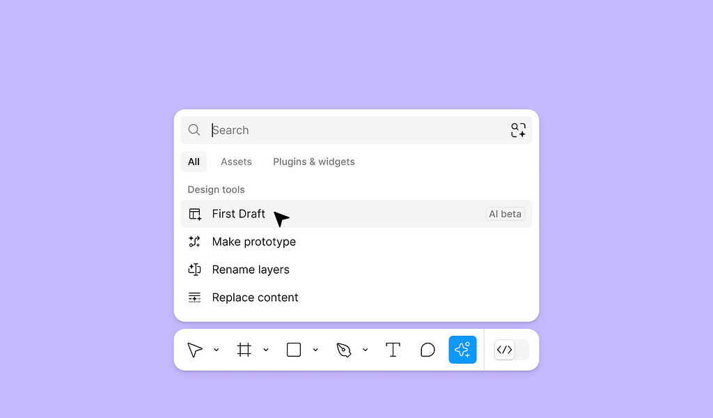
[unable to retrieve full-text content] In this article, I will review a few new AI tools that Figma recently introduced. https://medium.com/media/bd5872bb7c297a17ab1e0a646a348f86/href Note: You should have Figma paid plan to use AI tools. First Draft First Draft is a fancy name for a UI design generator. To use it, click Actions and select First Draft. When you click… Continue reading Figma AI Tools
Overnice Squeezy Posters: Variable Font Graphic Design
Explore Overnice’s Squeezy variable font posters. Awesome graphic design merging digital flexibility with print for your next project. Hey design friends! Let’s talk type. For the longest time, fonts felt pretty fixed, right? You picked a weight, and that was that. But things are shifting, literally. Variable fonts have opened up a whole new playground… Continue reading Overnice Squeezy Posters: Variable Font Graphic Design
35+ Unique Business Card Templates – Ready to Use
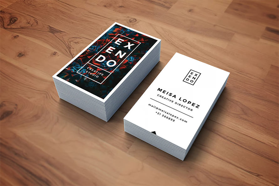
In today’s competitive world, first impressions are crucial. With the right business card templates, you can align your brand or visual identity and create a lasting connection with potential clients, partners, or employers. With our collection of 35+ unique business card templates, you’ll find the perfect design to represent your brand while ensuring it stands… Continue reading 35+ Unique Business Card Templates – Ready to Use
How to create an animated Lottie logo

Virtually all video on the internet is comprised of thousands or millions of individual raster images, or frames. While compression greatly reduces the file sizes, each frame is still essentially a raster image that is resolution-dependent, and the video itself is frame-rate-dependent. You cannot make the video larger or add more frames after it is… Continue reading How to create an animated Lottie logo
From Beta to Bedrock: Build Products that Stick.

As a product builder over too many years to mention, I’ve lost count of the number of times I’ve seen promising ideas go from zero to hero in a few weeks, only to fizzle out within months. Article Continues Below Article Continues Below 1 Comment Share this:#section1 Become a patron Build advanced skills for growing… Continue reading From Beta to Bedrock: Build Products that Stick.