Summary
This is a rant about poor email communication that relies too much on embedded images being shown (they rarely are). Bad examples of newsletters and other types of email are shown (some are truly horrible) along with good examples to learn from. This is not an in-depth how to guide on coding accessible email but I will share resources to get you started.
Introduction to my rant
So across my many email accounts I get roughly 300 emails every week. Important stuff such as invoices and meeting plans, updates from the kids’ school and doctor appointments. Also, I get calendar reminders, updates regarding services, and countless marketing newsletters.

Too many marketing emails rely on using images. But guess what, I never load images in my Gmail accounts! Images are deactivated by default and other email services and it takes a manual click to load them. When I travel abroad I have limited data plan I need to be mindful of the mobile data usage, even though I have unlimited data plan in Sweden.
So, with a well structured email, a great subject and well described content you have perhaps half a second to get my interest so that I will open your email. Given these challenges and the resources required to communicate or sell through email, I just really hate to see companies mess up by relying too much on using images in their emails. You have customers who actually want to read your content – make sure they can by making it accessible for all of them.
Do you have the time to listen to me whine? Let’s go 🙂
Transparency
I myself or colleagues at Axess Lab has worked or are actively working with with several of the clients listed. Often we work with departments that do not directly work with marketing and they often do not see improving newsletters as a priority. I hope this is a wake-up call for our clients and everyone else reading the article – that you need to get your stuff together! We or other professionals are out there to help.
Reason to not load images
There are many reasons to not load images, these are some of my reasons.
Bandwidth restrictions
You might have a slow internet connection, it might be to low speed in your home or while travelling on a train. Going hiking often poses threats to your ability to load before the request times out.
Limited data plan
There are many reasons not to have unlimited data plans. They might not even be available in your country or as I often find myself while travelling abroad they are capped to a certain gigabyte. It might be very expensive and even paying by megabyte (MB) usage. So really it could be for some to choose between food or buying mobile data.
Privacy
When you load external images, you give away data about reading the email. Putting that in correlation with clicks on links and previous data shared it adds into the vast knowledge bank put in the hands of multinational companies working for profit.
Examples of emails
Emails that suck
ICA bonus update newsletter
My main interest with this newsletter is to know how many bonus points I have from the grocery stores ICA. Or more specifically how much I get back in money which I can deduct when shopping.
Almost everything in the image above is text, except for how much bonus I get… Aaahhh!
They also have some inspirational content to help you with shopping and what to eat. ALT-text is showing same text as heading.
Let’s head to the loaded images!
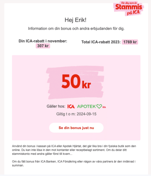
And here comes the loaded image, visually showing bonus amount of 50kr.
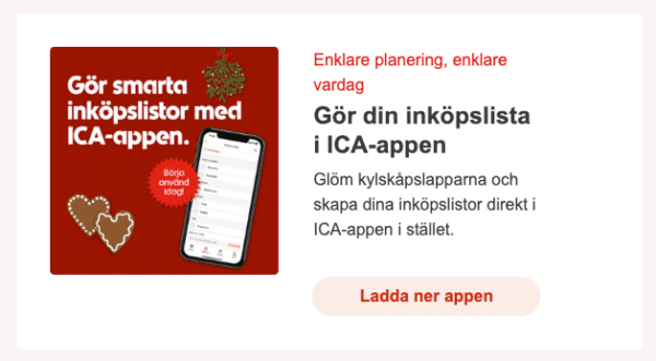
The duplicated text is visually showing image about the shopping app. The text in the image is also different, so I suspect they did have a plan here…
Kry newsletter
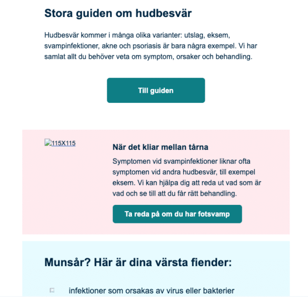
Quite good layout with different backgrounds, headings and non-image call to action buttons.
ALT-text says 115×115, probably perfect for the one editor. Not very helpful for the thousands of recipients.
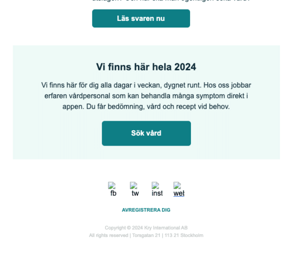
The footer of the email has contrast issues and cryptic ALT-texts.
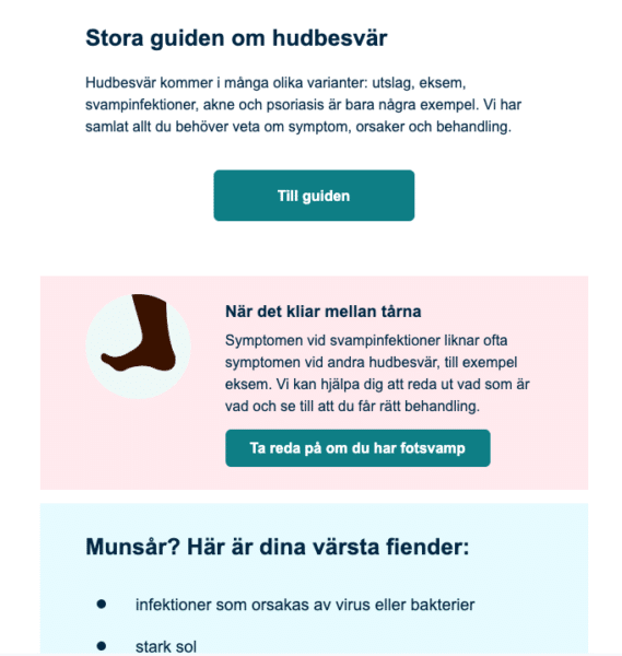
115×115 ALT-text shows an illustration of a foot.
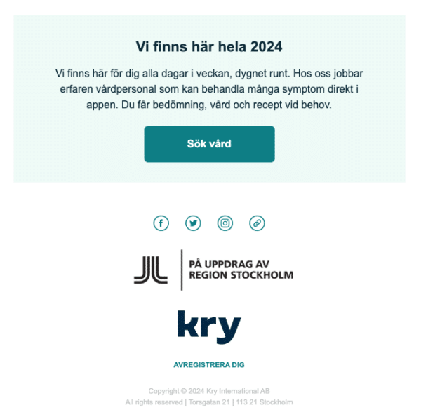
Also, missing information about the sender. The two logos that had no ALT-texts was beneath social icons.
TallinkSilja Club One newsletter
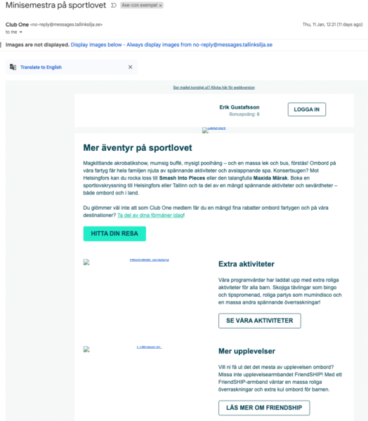
ALT-texts are different from the headings, I think… But they are cut-off, only showing half.
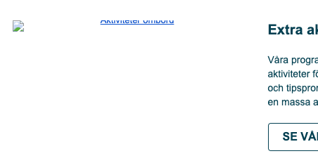
Zoomed in on ALT-text example only showing half.
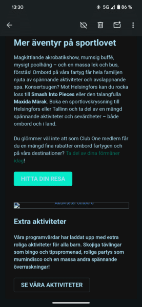
In darkmode the light green button background make the changed white text unreadable.
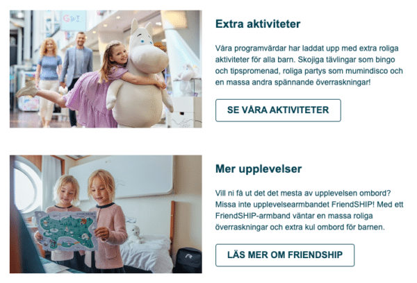
Two ALT-texts provided:
- Aktiviteter ombord
- FriendSHIP
Images displayed are not matching ALT-text description.
FKP Scorpio newsletter
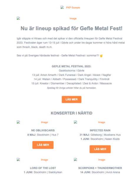
Really poor contrast values on text and all images says “image” in their ALT-texts. Contrast of 3:2:1 on very light grey text on white background.
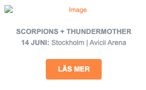
Zoomed in on alt text saying “image”.
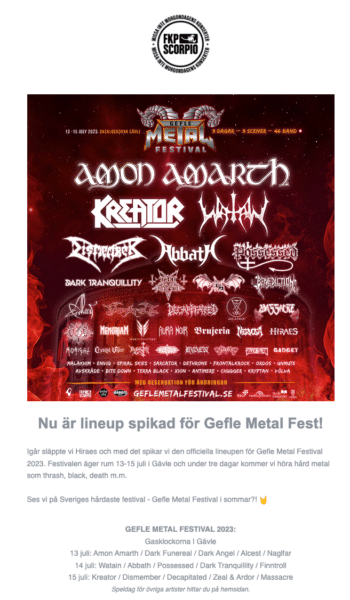
Loaded images, showing lineup poster with a lot of band names.
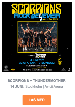
ALT-text “image” on loaded image is a concert poster.
Bengans friday newsletter
A
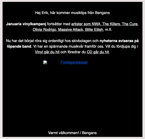
ALT-text on image in email from music store says “Friday releases”.
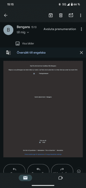
On mobile the email is zoomed out to desktop version. Unreadable.
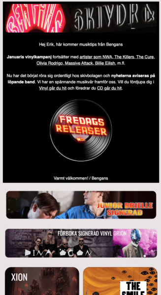
First part of Friday releases visual image loaded. Consisting of a lot of band names and albums.
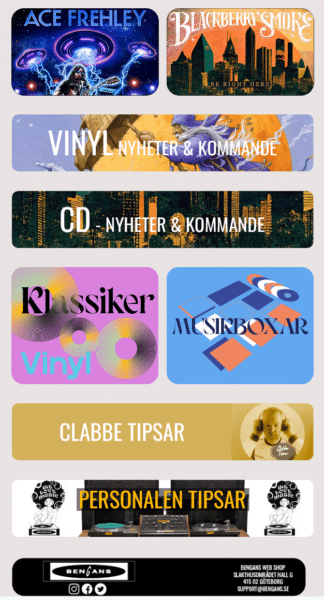
Last part of Friday releases with a lot of band names and editorial pitches.
Haupt Lakrits newsletter
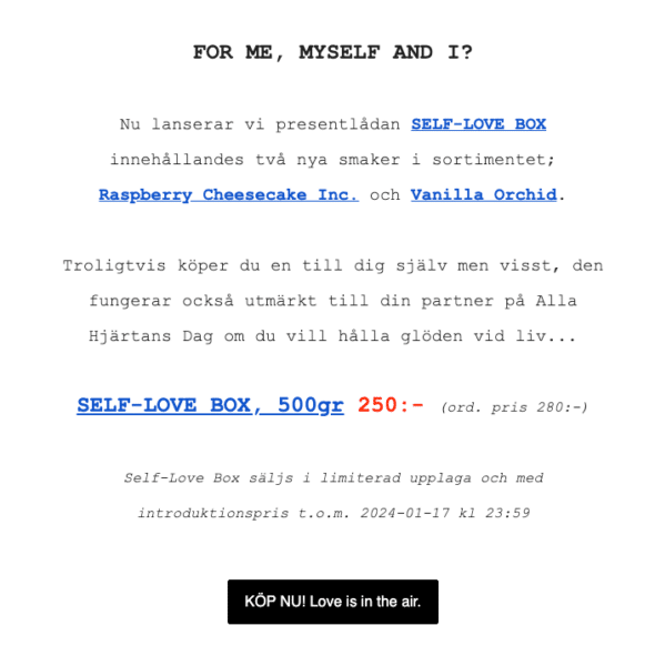
Example of desktop email with no huge issues.
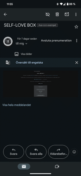
Example of same email in mobile, unreadable zoomed out desktop version.
Quickpix4u newsletter
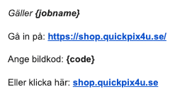
Broken attributes “jobname” and image code that should have been something else.
Coop membership survey
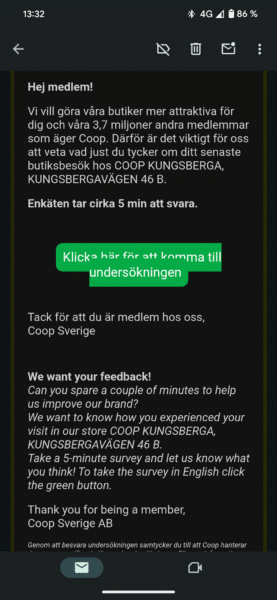
In mobile the button line-breaks and overlaps.
BokaDirekt newsletter
Thanks to Amin Amini for finding this example!
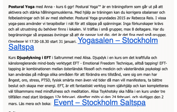
Using CSS to make extra link large and covering surrounding text.

Even the text next to link looks depressed as a sad smiley.
Kronans apotek newsletter
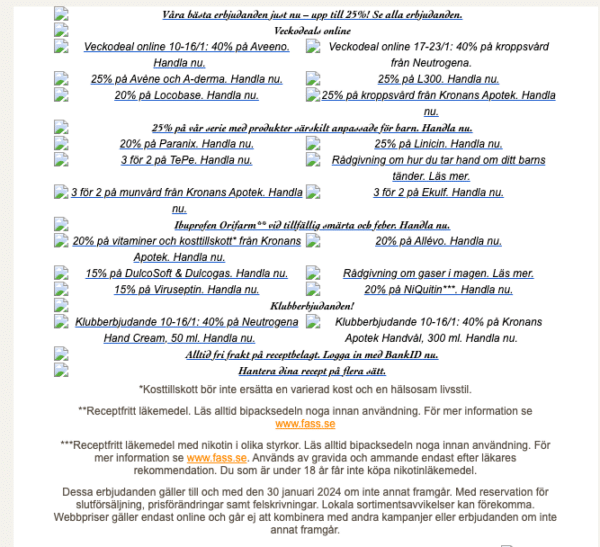
A lot of ALT-texts written which is on a positive note, but there’s no space in between and strange fonts makes it very hard to read.
Horror section
Kronans apotek
Welcome as member at Kronans Apotek!
So I became a member when I tested the site and made a purchase. Nice with a hello and welcome… But… It was very empty, which I thought was a huge waste of opportunity to make me buy more stuff.
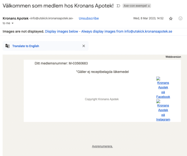
It was suspiciously empty with unloaded images. I needed to ease my suspicious mind…
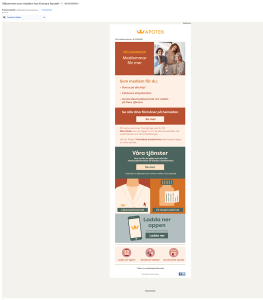
And behold, there was a lot of information about their offering, services, apps and much more. Everything is image-based with image-map links. It almost made me cry!
Campaign newsletter at Kronans Apotek
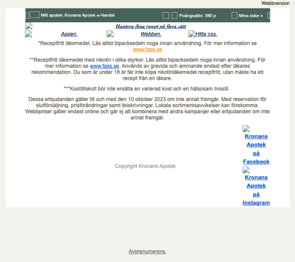
Campaign newsletter missing ALT-text for main image.
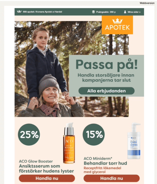
Main image with a lot of offers.

Main image zoomed out with about 20 call to actions in the image.
MyFujifilm
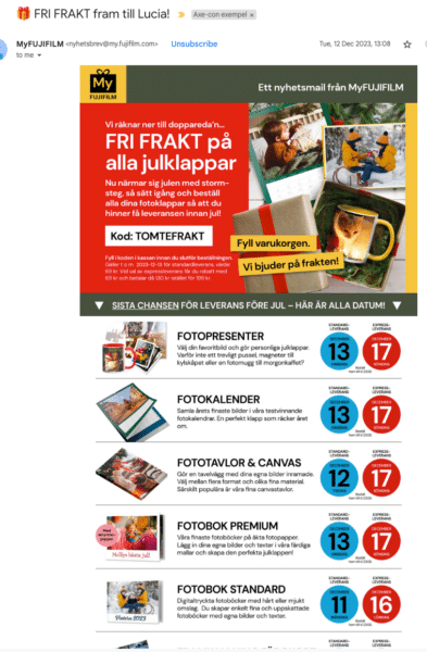
Empty email with only a footer.
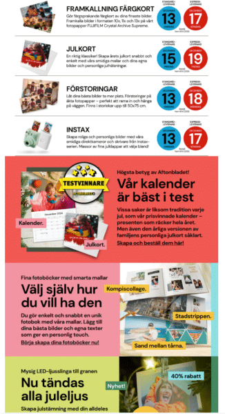
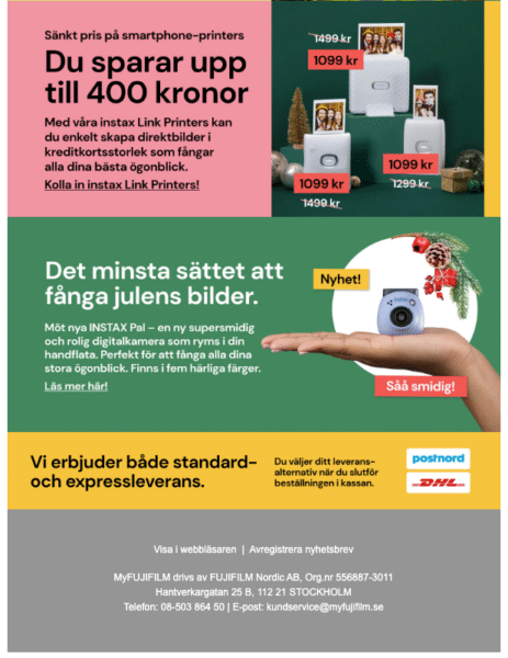
Let’s look at it with loaded images, surprisingly it has a lot of call to actions.
Ubisoft newsletter
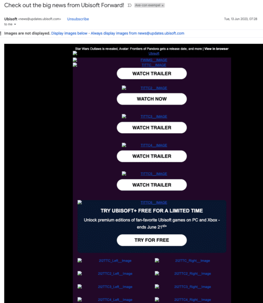
Check out the big news from Ubisoft Forward! Unreadable alt-texts and no headings. 2:8:1 Contrast ratio on blue ALT-text on dark background.
ALT-text has really generic naming that probably makes sense to the editor.

Unsubscribe link. Link not underlined, it looks like text. Grinch not happy!

Zoomed in on one of many ALT-texts having a generic name saying 212TTC_Right_Image. There’s probably some content behind the puzzle of ALT-texts?
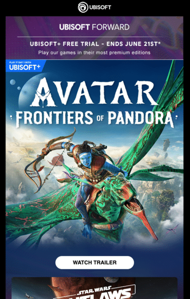
Images loaded showing text in images with key information about the offer.
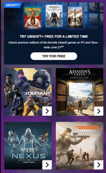
More text in images showcasing different games.
SF Anytime latest movie releases
This is from a Swedish online movie streaming provider.
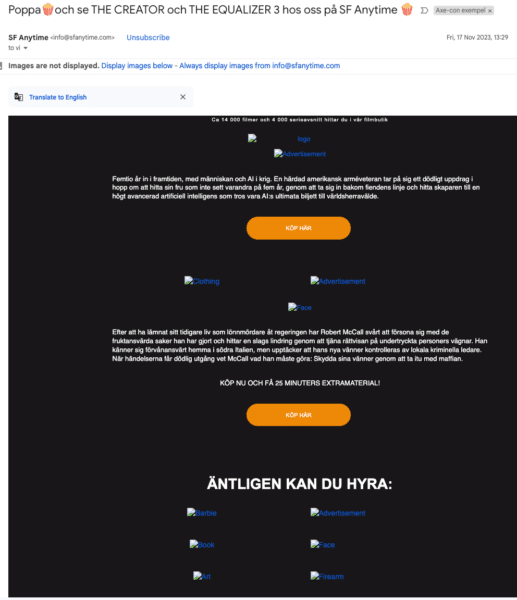
The ALT-texts are really hard to read, dark blue on black background.
ALT texts beneath heading “Finally you can rent:”.
ALT-texts:
- Barbie.
- Book.
- Art.
- Advertisement.
- Face.
- Firearm.
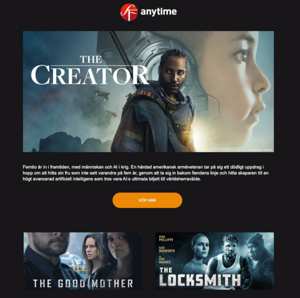
Movie posters not conveyed in text.
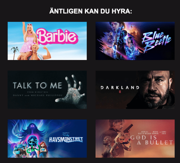
Random words for ALT-texts were different movie posters. Example “Face” was for the movie Darkland 2.
Kila möbler Christmas offerings
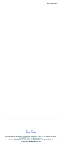
Empty email from Kila möbler. Zoomed out full empty email with only a footer. My ALT-senses are tingling again!
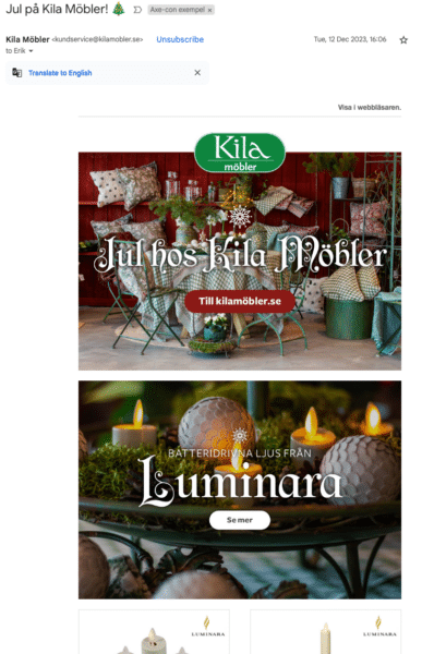


About 60 CTA’s in the email, not displayed for potential customers.
Stadium Outlet
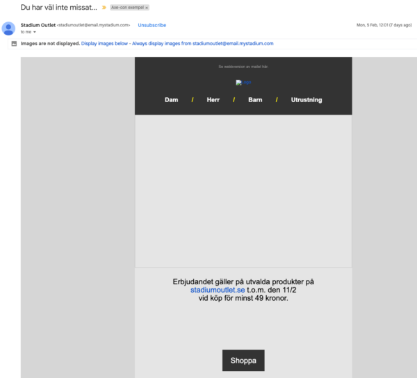
Email with product categories and text that says the terms of the offering and a “Shop”. The title is the best, “You haven’t missed…” Well in fact… I have missed all of it…
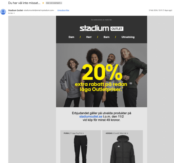
Yet another text in image marketing letter.
Debaser concert news
Concert information heading “Dont miss this” followed by two empty images.
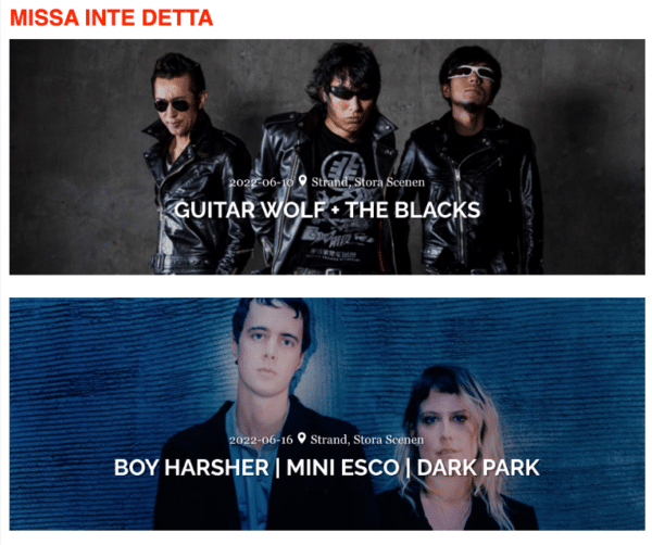
Don’t miss this, images loaded shows date, location and band names.
To be fair they have improved their email marketing letters since.
Eventim localised newsletter
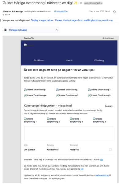
Eventim newsletter in Swedish with event suggestions.

Eventim suggestions zoomed in, generic ALT-texts are written in German. “Unsere Empfehlung 1” “Unsere Empfehlung 2” and so on.
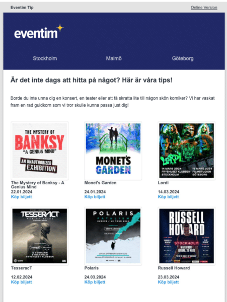
Eventim suggestions loaded images, showing poster, location, date, band name, and call to action to buy a ticket.
Random Christmas newsletter
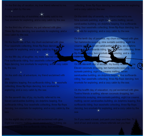
Christmas email sent out. Two column layout. Black text on dark blue to black background with stars, and a moon overlayed by reindeers flying a sleigh. Unreadable.
Thanks to Homer Gaines for sharing this horrific example 🙂
Better examples
There’s a soothing light in the tunnel and it is not just a freight train coming your way. There are better examples out there. And by better, I do not mean perfect. There are parts in the same email that are good and some not so good. The examples I will describe are simply just better in providing content that does depend on images.
Impecta fröhandel
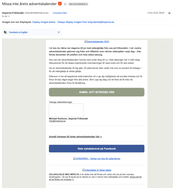
Newsletter with ALT-texts, normal text and CSS call to action buttons.
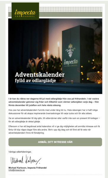
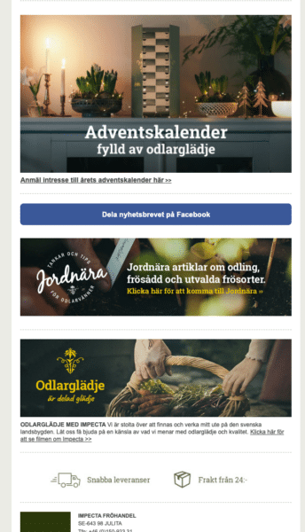
Loaded images, looks a lot prettier but it is mostly added visual goodies.
Ebay newsletter
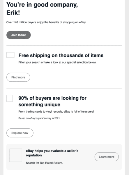
Ebay newsletter showing good structure with headings and text.
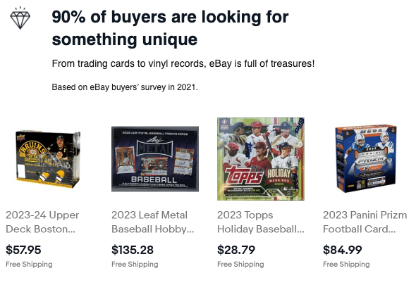
Ebay could improve adding product suggestion image ALT-texts.
Runkeeper yearly update
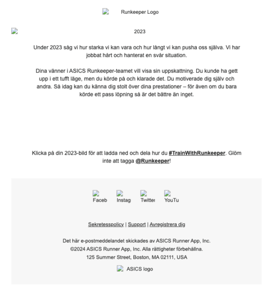
RunKeeper has ALT-texts and text content. Text content instructs to click on 2023 image to load the data, which has corresponding ALT.
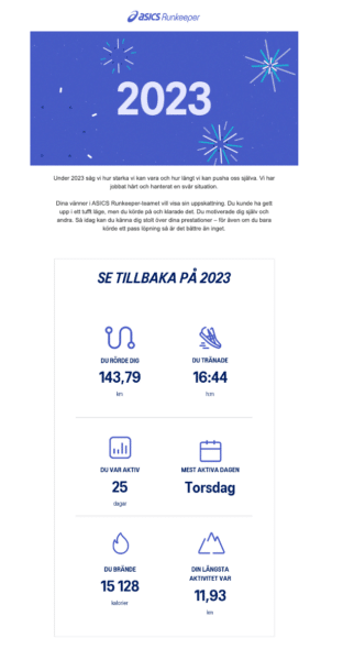
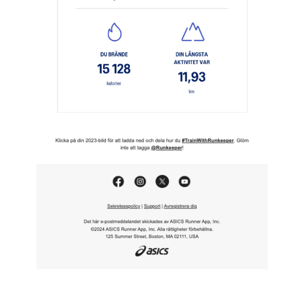
RunKeeper images loaded, visuals could be added as text instead of text in image.
Eventim newsletter
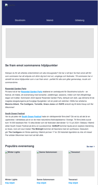
Better example from Eventim where image content is conveyed in text.
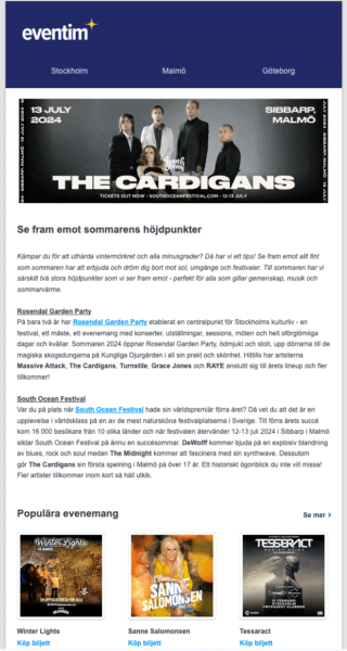
Eventim email with loaded images.
Jula weekly newsletter
Email from Jula, a Swedish retailer.
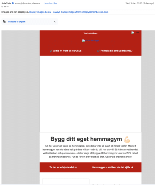
Using Headings and text and layout with spacing.
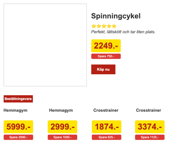
Easy to see titles and pricing without images.
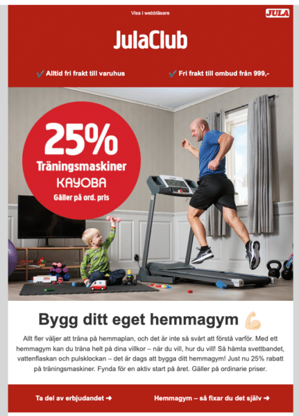
Email from Jula with loaded images. The image content is conveyed in text.
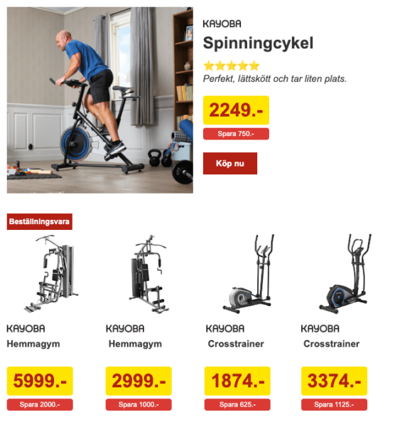
Product brand name is missing, could be added.
Concert news from Live Nation

Concert update from Live Nation missing ALT-texts but the headings are sufficient.
Unsubscribe links
In all my newsletters I’ve seen a pattern. Make it as damn hard as possible, or even impossible to unsubscribe. Do you know what happens to these emails? They get marked as SPAM and that surely decreases your visibility even more. Getting flagged as SPAM, unwanted or fraudulent email is not good… Sad but true!
Bingolotto
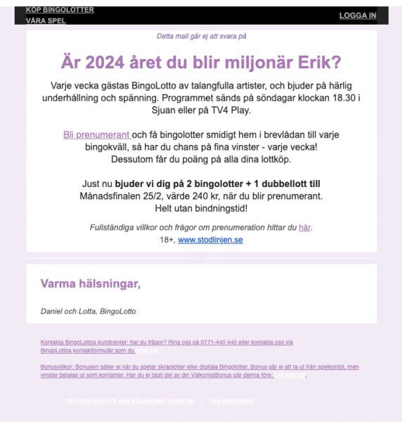
Horrible example and this is not by changing colors due to dark mode. This is just one of the worst examples I could find, it has 1:2:1 contrast ratio.
Foursquare

Just linking the word “Click here” and with a really really poor 2:5:1 contrast ratio Foursquare deserves the SPAM folder. It is extra evil making the font very very small.
FKP Scorpio
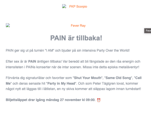
If the contrast was good enough the content would actually be good. Headings and paragraph text. 3:2:1 contrast ratio on text

Unsubscribe link, good clear wording but bad contrast. 2:4:1 contrast ratio on orange link. Just fix the contrasts, pretty please…
Bahnhof
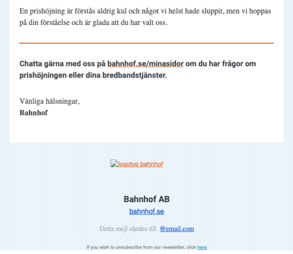
Unsubscribe link in a different language and only the word “here” is linked.
Demando
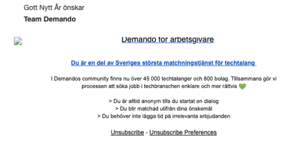
Unsubscribe link in a different language. Most people in Sweden speak English, but this is also a strange context switch.
Nintendo
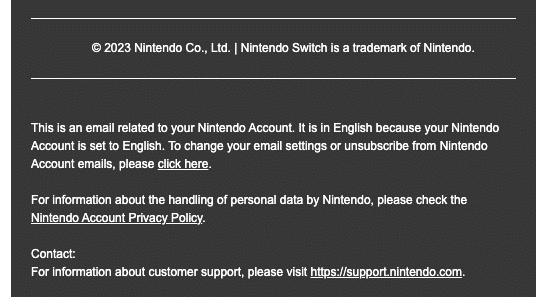
Unsubscribe link with the word “Click here”. So you need to read the full paragraph to know what they refer to.
Readly
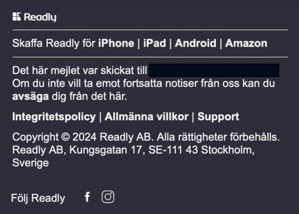
Unsubscribe link in text content only shown as bolded text with the word decline.
Thanks to Martin Falk Johansson for this example 🙂
Ebay
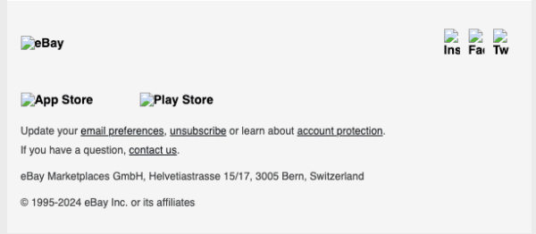
eBay example with underlined, good contrast unsubscribe link
Amazon
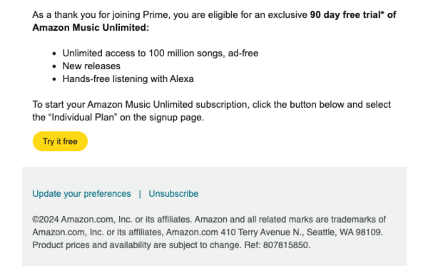
Amazon email example on desktop, yellow button background with black text. Good contrast.
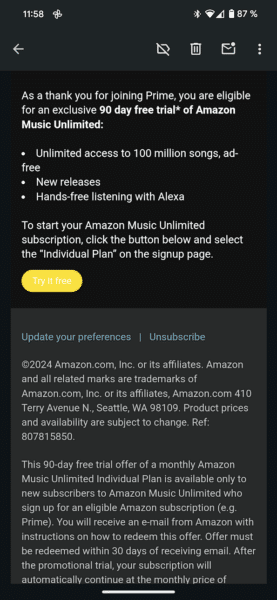
Amazon email example on mobile dark mode, yellow button background with white text. Unreadable.
Resources
If you want to know more about how to make email more accessible and consistent across platforms, then these resources will help you along!
A good resource from Harvard University about who to compose your emails Creating Accessible Emails.
In 2019 i went to SmashingConf in Freiburg. I met Rémi Parmentier and listened to his interesting talk Think Like An Email Geek about how to combat a well designed email in different email systems, such as Outlook or Gmail. When I was looking for the link to this talk I also saw that he returned to Freiburg in 2022 expanding the subject with issues in Dark mode in the talk Shining the Light on HTML Email Dark Modes. Really interesting and he finished off with announcing the great resource Can I email which is based on the well known Can I use. There’s also an in-depth article Essential Tips and Tricks for Coding HTML Emails. Hats off for Rémi for sharing!
You can always register and watch my talk at Axe-con 2024 on demand.
Conclusion
Just by testing your shit in at least a few email clients regularly you can avoid loosing potential customers not buying your products or services.
There are really small fixes in which you can be visible to all your subscribers and…
…tadaaa! You also make it more accessible for people who can’t see loaded images.
Avoid the SPAM folder and make an A11y Grinch happy!
