Impact of AI in design When it comes to design, AI has great creative capacity, given its text generation and text-to-image capabilities. Seeing some photorealistic images generated by AI, we cannot help but wonder what this means for us as designers. Some of the questions that were on our minds: How can we use this… Continue reading Best AI Design Tools: Insights & Tips From 50+ Tools
Category: UX
How To Use Testing To Escape Iteration Hell And Gain Respect
Learn about lean user research and testing this May with my upcoming workshop. Find out more here or just email me and I’ll tell you all about it. https://cdn.simplecast.com/audio/9a370638-98b2-4070-b6d0-c16b5b5c99b3/episodes/e9e3e2bb-eda5-44de-877c-f6daa5560e9a/audio/c3110270-9a86-4259-8de2-97bfe6a1c86e/default_tc.mp3?nocache Listen to this post and subscribe using Apple Podcasts, Google Play, Spotify or RSS Hey all. I’ve been working on preparing the user research and testing… Continue reading How To Use Testing To Escape Iteration Hell And Gain Respect
How to Design a Stellar UX for Long-form Articles
After putting in multiple hours on researching, outlining, writing, and editing the first draft of your article, you’re eager to press the publish button. You want to share it with your audience, and earn some appreciation. But guess what? Your audience won’t bother reading your article unless they find its packaging appealing. You need to… Continue reading How to Design a Stellar UX for Long-form Articles
How to Tackle Prompting Challenges with AI Writing Tools
With the rise of readily available generative AI tools, it is now possible to create large bodies of text in a matter of seconds. However, crafting the right prompts to achieve the desired output can be challenging. In this article, we will examine the complexities of prompting and how AI writing tools can simplify the… Continue reading How to Tackle Prompting Challenges with AI Writing Tools
UX vs. UI: Guide to Distinguishing User Experience and User Interface Design
Well, they certainly sound like they’re all about the same thing. When you design the user interface, surely what you are dealing with is user experience. Is it that simple? Or are there significant differences between the two? What consequences would such a difference have for design? Will there be any more questions in this… Continue reading UX vs. UI: Guide to Distinguishing User Experience and User Interface Design
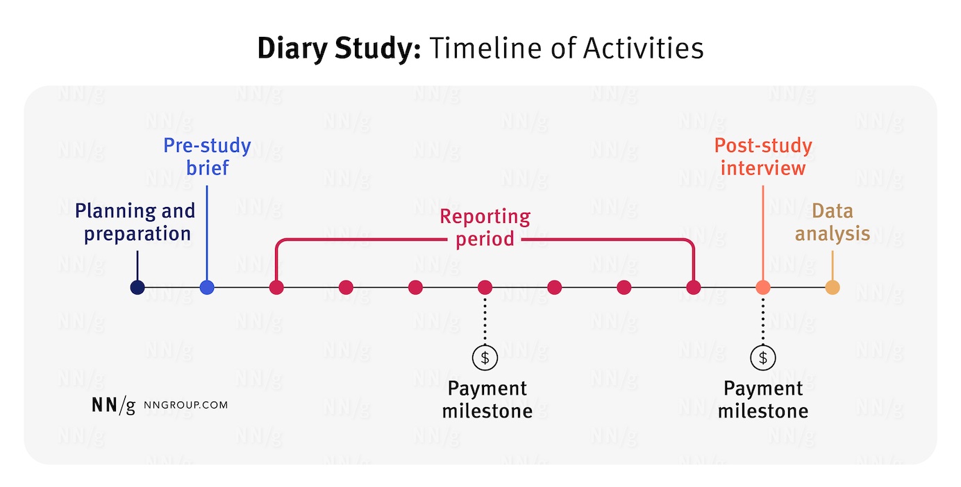
Diary Studies: Understanding Long-Term User Behavior and Experiences
Summary: Participants log daily activities as they occur to give contextual insights about real-time user behaviors and needs. Defining Diary Studies A diary study is a qualitative user research method used to collect insights about user behaviors, activities, and experiences over time and in context. During a diary study, participants report their interactions and experiences… Continue reading Diary Studies: Understanding Long-Term User Behavior and Experiences
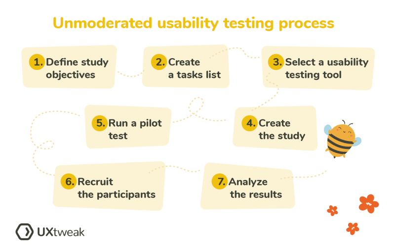
Basics of Unmoderated Usability Testing
This article will introduce you to the basics of Unmoderated Usability Testing. We will explain why you should conduct such testing, how to prepare tasks, or how to recruit the right participants. You are currently reading one of our 101s. This blog introduces you to the basics of Unmoderated Usability Testing. If you… Continue reading Basics of Unmoderated Usability Testing
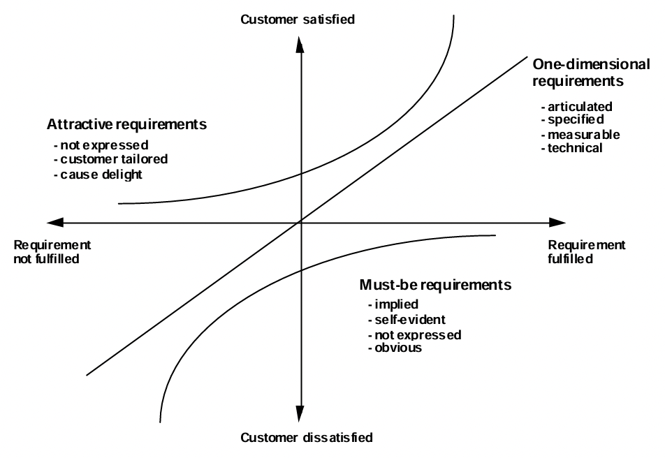
Modernizing LOTO — Prioritizing User Requirements with the Kano Model
[unable to retrieve full-text content] I worked on this project for nearly 2 years at my previous workplace, and although I can’t dive deep into the technical details due to NDAs, the process itself was an incredible learning journey for me. And that’s what we will be focusing on, the journey not the destination. In… Continue reading Modernizing LOTO — Prioritizing User Requirements with the Kano Model
How this year’s hair trends translate to the state of content design
[unable to retrieve full-text content] Wispy bangs and that little bit of extra texture in your content design org Still from the song ‘Hair’ from the musical ‘Hair’, 1979 Hair has always been big for me. Not just because my favorite movie is the musical movie ‘Hair’ from 1979 but also because I’ve always considered my usually… Continue reading How this year’s hair trends translate to the state of content design
Top 10 Mistakes When Creating User Journey Maps
[unable to retrieve full-text content] Here are the top 10 common mistakes to watch out for when creating user journeys: 1. Not defining clear objectives Creating a user journey without a clear goal is like setting out on a trip without a destination. It’s crucial to know what you’re trying to understand or achieve with… Continue reading Top 10 Mistakes When Creating User Journey Maps
The GenAI Compass: a UX framework to design generative AI experiences
[unable to retrieve full-text content] Patterns for implementing human-centric design thinking and UX to GenAI Generative AI is reshaping the landscape of design, ushering us into an era where deeply individualized user experiences become the norm. Personalization reaches beyond the tailored, transcending into the realm of the deeply individualized, fostering one-on-one connections at scale — true hyper-personalization. I’m… Continue reading The GenAI Compass: a UX framework to design generative AI experiences
Unleashing the power of Pixar’s storytelling in product design
The struggle is real, we simply can’t escape companies constantly bombarding us with digital experiences everywhere on the internet via websites and apps on our phones, watches, computers, VR headsets — download this! sign up here! join for free! At last count, there are approximately 1.13 billion websites and 9 million mobile apps in existence! Credit: Gaurav There… Continue reading Unleashing the power of Pixar’s storytelling in product design
12 Figma tips to work more efficiently
We all know Figma makes regular updates to their features that can be new and awesome, like previewing typography, or it can be a modification that may change an established workflow, like the infamous local variables. So as someone who uses Figma almost every work day, minus some meeting-heavy days, learning to apply new features… Continue reading 12 Figma tips to work more efficiently
The power of beauty in communicating complex ideas
Can we defend pursuing beauty when communicating science or innovation? When creating visuals to explain complex ideas, cutting edge innovations or new scientific research we often focus on the images’ ability to carry information. But data visualization, infographics or even schematics have a hidden power we rarely discuss: beauty. Obviously not all images are beautiful. As… Continue reading The power of beauty in communicating complex ideas
Why UI designers should understand Flexbox and CSS Grid
CSS for UI Designer Or bye bye, 12-column grid layout Most designers are familiar with responsive design, a column-based layout approach with fixed breakpoints to cover all screen sizes. However, we can move beyond the rigid structure with modern CSS layouts, crafting flexible and dynamic designs that seamlessly adjust to different screen sizes. Designers and developers having different… Continue reading Why UI designers should understand Flexbox and CSS Grid
90% of designers are unhirable?
Or why your cookie-cutter portfolio doesn’t cut it and how to fix it Image by Matej Latin (Author) Here’s the harsh truth: I’ve reviewed more than 1,000 portfolios in my design career so far, and I turned 90% of them down because of one thing — the linear design process. By “linear design process” I mean cookie-cutter case studies that… Continue reading 90% of designers are unhirable?
UX leadership is failing, multi-brand design systems, proxies in UX
Weekly curated resources for designers — thinkers and makers. “What is the effect of constant exposure to information on our attention? Who benefits from a dramatic change in our attention, and when and why has this happened? One hypothesis is that companies have created an ecosystem to encourage continual consumption of information, and they profit from our addiction… Continue reading UX leadership is failing, multi-brand design systems, proxies in UX
Company culture is more than just office perks
How product culture and company culture are intrinsically related. Image by Creative Lab @ scop.io “Company culture is the backbone of any successful organization.”—Gary Vaynerchuk A goal is something to aim at Company culture is a powerful hiring magnet and a common discussion topic both in- and outside of companies. It starts with providing good environment and… Continue reading Company culture is more than just office perks
Six-and-a-half Philosophies for Experience Design & Innovation
Ross Dillon · Follow Published in UX Planet · 13 min read · 2 days ago — Listen Share TikTok, the most downloaded app of all time, broke a lot of design rules. Its concept, however, originates from musical.ly which was a piece of genius design. Alex Zhu the designer of musical.ly built something of… Continue reading Six-and-a-half Philosophies for Experience Design & Innovation
Designing genAI-enhanced features
Elevating user experience through intelligent content enhancement and personalization. Futuristic workspace (Created with Dall-E) Chatbots serve as an accessible gateway to the realm of Generative AI features, a fact underscored by the success of ChatGPT. Their simplicity, requiring only basic instructions to engage in natural dialogues, allows them to integrate across various digital platforms seamlessly. Yet,… Continue reading Designing genAI-enhanced features
Enhancing User Experience through Mobile Scanning at Scalable Capital
Investing and managing assets can be a daunting endeavor for many individuals. Recognizing this, Scalable Capital aimed to alleviate apprehensions and empower users with a deeper understanding of risks. Their vision centered on simplifying investment management like never before, leveraging technology at every juncture of the process. This commitment to technological innovation distinguishes Scalable Capital’s… Continue reading Enhancing User Experience through Mobile Scanning at Scalable Capital
A proposal for modern UX Researchers
A glimpse of the current standing of UXR and strategy on how to stay relevant with the workforce demand. Photo by Unseen Studio on Unsplash “The UX researcher fallacy: ‘My job is to learn about users.’Truth: ‘My job is to help my team learn about users.’”– Caroline Jarrett As 2024 starts, layoffs are still everywhere, specifically in… Continue reading A proposal for modern UX Researchers
Mapping Homeownership: An Ethnographic Expedition through 2023’s Real Estate Landscape
Here, I would like to discuss the two key insights that emerged from our comprehensive research. Storyboard of first time home buyers journey steps (Icons credit: Noun Project) Above storyboard is just a simple overview of house buying journey, each of these steps have multiple micro steps and concerns that buyers have to cater to.… Continue reading Mapping Homeownership: An Ethnographic Expedition through 2023’s Real Estate Landscape
Hey AI, what is the rush?
Understanding the trends accelerating our new AI obsession. Continue reading on UX Collective »
