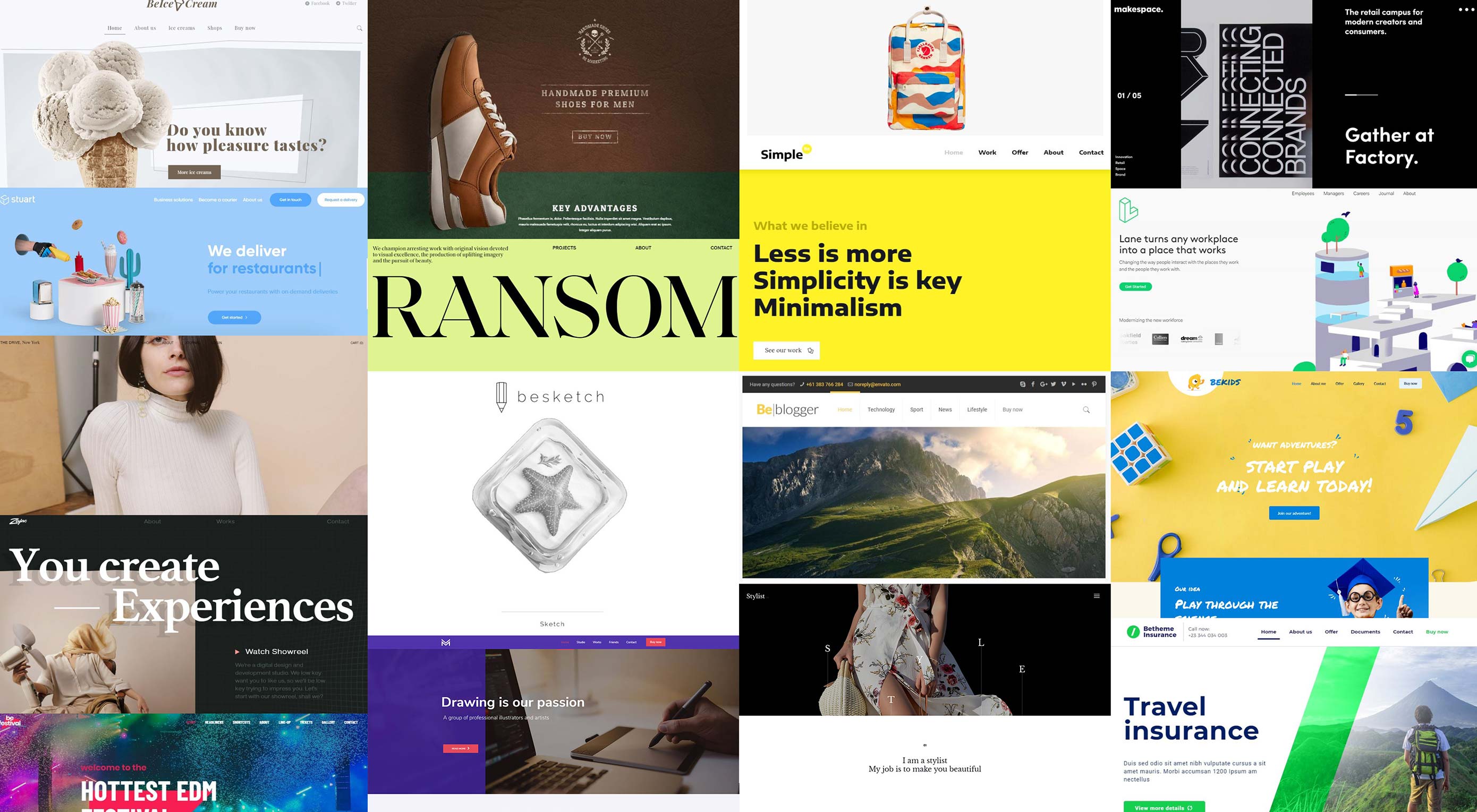
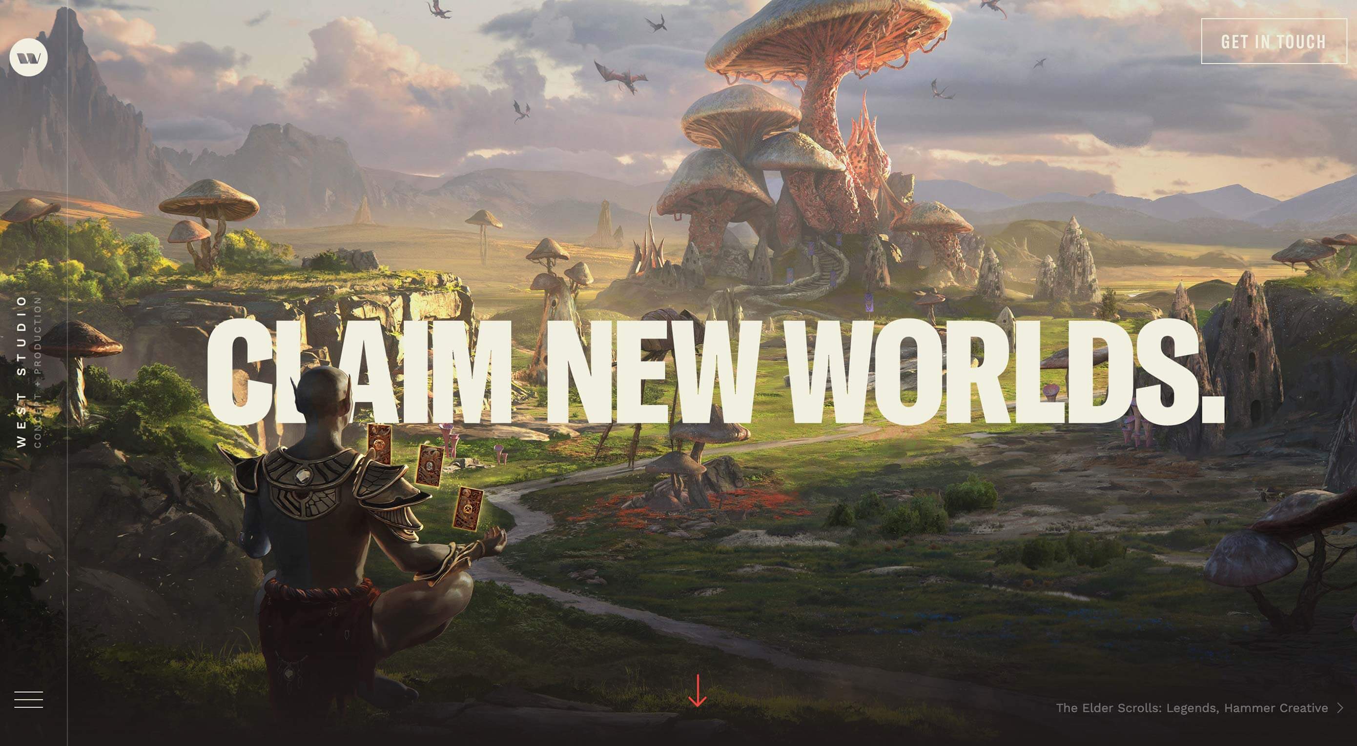
There’s always a balance between visual design and functional design. Many of the “rules” of design as we know them exist to make visuals more functional. That’s not exactly true of all of the techniques that are trending right now. But sometimes rules are made to be broken, right? You can take these trends in… Continue reading 3 Essential Design Trends, November 2019
Tag: space
How to Use Proven Industry Data to Guide Your Clients
As a web designer, you may be starting with little to no data of your own. It’s not until a website has launched (or relaunched) that you can start gathering real analytics on its performance. Even then, it can take awhile to draw any meaningful insights from it. So, in many cases, what web designers… Continue reading How to Use Proven Industry Data to Guide Your Clients
How to Use the Free WordPress FooGallery Plugin to Create Image Galleries
Some websites require you to add many images in a single post or webpage. For example, you might want to upload a lot of images from an art exhibition or an event on a website. Similarly, any business that focuses on products and services might add a lot of relevant images on a single page.… Continue reading How to Use the Free WordPress FooGallery Plugin to Create Image Galleries
26 Best InDesign Calendar Templates (New for 2020)
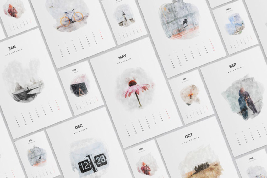
What You’ll Be Creating What do you have in store for 2020? Create a productive year with these InDesign calendar templates. 26 Best InDesign Calendar Templates (New for 2020) Add a little creativity and efficiency to your life with a stunning InDesign calendar template. Not only are they great for decor overall, but they also… Continue reading 26 Best InDesign Calendar Templates (New for 2020)
How to Choose a WordPress Slider or Carousel Plugin
Sliders are very popular design elements. They are the most dynamic way to display visual media on your website. You can use them in hundreds of ways to engage visitors on your website. There are hundreds of slider plugins available for WordPress to help you build, organize, and manage your sliders. In this article, I… Continue reading How to Choose a WordPress Slider or Carousel Plugin
18+ Best Personal WordPress Portfolio Themes for 2020
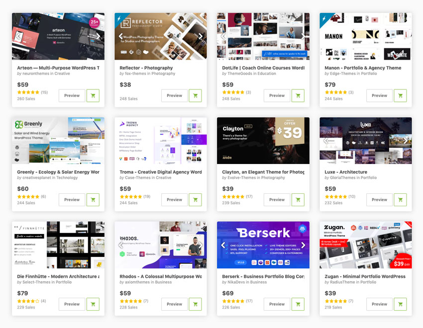
Having a website that features your portfolio is crucial if you want to attract more clients. A WordPress portfolio site is also necessary when you’re trying to land a job in a creative agency or another business looking to hire a designer, illustrator, architect, or anyone else who needs to display their work. “56% of… Continue reading 18+ Best Personal WordPress Portfolio Themes for 2020
A Guide to Using SMS Marketing to Generate More Leads
Mobile eCommerce, or mCommerce, is a term used to cover online browsing for products and their purchase, with customers using their smartphones, tablets or personal computers to place the order. In recent years, portable devices have been quick to replace desktop computers, making the need to address mobile marketing more crucial than ever. The rapid… Continue reading A Guide to Using SMS Marketing to Generate More Leads
Tips On Designing Creative Websites That Will Wow Your Clients
The global market keeps getting bigger and bigger, which should be good news for web designers – but there’s a catch. The clients you can expect to serve are more sophisticated and want creative websites, not just the regular HTML and CSS. You can’t deliver just anything and expect them to be happy. You’ll also… Continue reading Tips On Designing Creative Websites That Will Wow Your Clients
How to Use HTML5 “picture”, “srcset”, and “sizes” for Responsive Images
<picture> is an HTML5 element designed to give us more versatile and performant responsive image functionality. Instead of loading a single image and trying to resize it to suit all possible viewport sizes and layouts, the picture tag loads multiple images of different sizes and resolutions, choosing the best fit for different scenarios. How Does <picture>… Continue reading How to Use HTML5 “picture”, “srcset”, and “sizes” for Responsive Images
How to Create a Typographic Album Cover
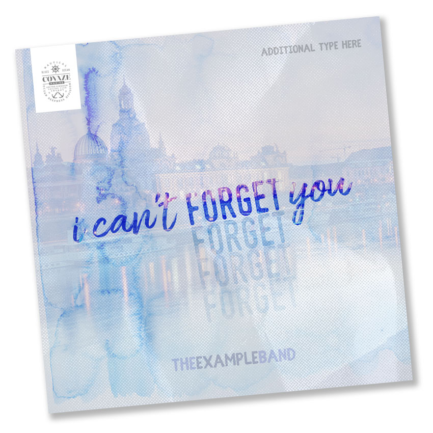
What You’ll Be Creating In this article, we’ll analyze some album cover design examples that have an emphasis on typography. Then, we’ll take some of these album cover ideas and experiment with them in a sample typographic album cover. Whether your focus is on CD album covers, a cover for your podcast, or creating and… Continue reading How to Create a Typographic Album Cover
20 Best New Portfolios, September 2019
Every month we roundup the best portfolios launched by agencies, freelance designers, and other creative professionals, into one easy-to-digest collection. And now we come to September. The kids are off to school (the poor dears), the teachers are off to school (the poor dears), and you’re free to spend some time thinking about the most… Continue reading 20 Best New Portfolios, September 2019
Fifteen Ways To Create A Flawless Photo
Photography is rare among the fine arts, since it has remained relevant even throughout our advancement into the digital age, due to our love of beautiful photos. But how should you approach creating a ‘perfect’ photo? Here are fifteen possible ways to release your inner master photographer. Rule Of Thirds First of all, keep in… Continue reading Fifteen Ways To Create A Flawless Photo
Mega Menus, Sticky Menus and More
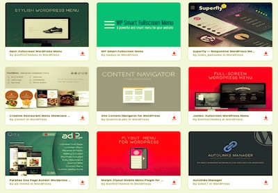
Of things that users expect when they are on a website, navigation menus are the most important. It’s hard to imagine a website without them. A website menu is made up of a collection of links. These links are road signs that make it possible to navigate and interact with a website. They guide users… Continue reading Mega Menus, Sticky Menus and More
Solving Problems With CSS Grid: The Gantt Chart
We recently published a tutorial explaining how to build a JavaScript-driven Gantt Chart. I think it’s the perfect case study for CSS Grid, so in this tutorial we’ll see how well suited CSS Grid Layout is for building a flexible Gantt Chart. Our CSS Grid Gantt Chart Here’s what we’re building. It uses CSS Grid… Continue reading Solving Problems With CSS Grid: The Gantt Chart
Making A Real Impact With Real Estate Web Design
Real estate marketing has come a long way from a simple sign posted in the yard, and today’s real estate professionals need to make web design a priority if they want to be successful. If your agency hasn’t revamped its site recently, take a moment to evaluate these 4 elements and make some updates. They’ll… Continue reading Making A Real Impact With Real Estate Web Design
How to Find the Best WordPress Gallery Plugins for Images or Video
How you present your visual content is key to the success of your website or online store. When visual content is done beautifully it encourages visitors to stay longer on your website. It also improves your SEO ranking and make your website easier to find in search results. However, creating a beautiful gallery for your… Continue reading How to Find the Best WordPress Gallery Plugins for Images or Video
20 Best New Portfolios, August 2019
It’s August, which means the rain is finally slowing down, and I have a chance to get my roof fixed. While I wait here under a literal tarp-fort that I hung up in my office, I thought I might as well compile some of the best recent portfolios for you all to look at. We… Continue reading 20 Best New Portfolios, August 2019
Eliminate Old Technology to Declutter Your Space
Developing and accomplishing a total decluttering plan for your home or workspace can be overwhelming. So many books and videos instruct you to tackle an entire room or more all at once, and who has that kind time? This all-at-once approach also leads you to get rid of things you need, causing you to spend… Continue reading Eliminate Old Technology to Declutter Your Space
5 Things That Significantly Improve User Experience
There are some truly stunning websites out there. But just because something looks pretty, doesn’t mean it will be functional and drive your target customers to action. “Most client web design requests will begin with a request for stellar web design, not a fully-functional one,” says an article from the digital marketing agency Active Web… Continue reading 5 Things That Significantly Improve User Experience
How to Conduct a UX Card Sorting Workshop
The act of card sorting is a hands-on and quick way of creating a category tree (information architecture) based on users’ understanding of the topics of a product. The simple idea of the workshop is to ask users to organise cards that already contain written content into groups. In this tutorial you will learn how… Continue reading How to Conduct a UX Card Sorting Workshop
How to Create an Instagram Post Template in Photoshop
What You’ll Be Creating Today we will be taking a quick look at how to create an Instagram post template in Adobe Photoshop! Whether it’s for a hot sale your site is having, you’re announcing a huge giveaway or maybe you just want to wish your followers a happy holiday, having a blank Instagram post template… Continue reading How to Create an Instagram Post Template in Photoshop
How to Create a Church Newsletter Template in InDesign
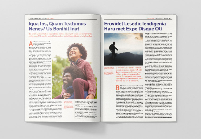
What You’ll Be Creating In this tutorial, you’ll learn how to create a four-page newsletter template. We’ll put this template together in no time, and you’ll be able to reuse it for your future projects. Newsletter templates are great to communicate with your community and update them of… Continue reading How to Create a Church Newsletter Template in InDesign
Rethinking the Exploration Phase of Design
Starting off a project is often described as being the exploration phase of a design process–during this phase, you quickly diverge with lots of ideas, generating many potential leads on concepts and hypotheses to test with customers. However, the notion that conceiving creative ideas is more akin to sudden unexpected flashes of brilliance obscures the… Continue reading Rethinking the Exploration Phase of Design
How to Build a Responsive Navigation Bar with Flexbox
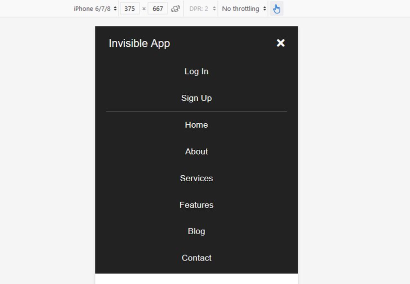
Time for a practical exercise in flexbox! In this tutorial we will use flexbox to create a mobile-first, responsive, toggleable navigation bar with different layouts for mobile, tablet, and desktop screens. Flexbox is Perfect for Responsive Navigation Flexbox is a versatile layout module with which we can create one-dimensional layouts that require flexibility, such as… Continue reading How to Build a Responsive Navigation Bar with Flexbox


.jpg)
