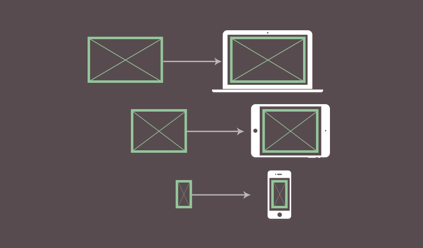
<picture> is an HTML5 element designed to give us more versatile and performant responsive image functionality. Instead of loading a single image and trying to resize it to suit all possible viewport sizes and layouts, the picture tag loads multiple images of different sizes and resolutions, choosing the best fit for different scenarios.
How Does <picture> Work?
It works similarly to the way<audio> and <video> elements work, allowing you to place multiple source tags within the parent <picture> element, each using the srcset and sizes attributes to specify different image files along with the conditions under which they should be loaded.
However, as powerful as the <picture> element is, sometimes it gives us more power than is actually needed to achieve suitable responsiveness. Sometimes all it really takes is a regular <img> element using the srcset and sizes attributes inline.
Coming up in This Tutorial
In this tutorial we’ll solve any confusion you might have. We’ll see what the srcset and sizes attributes can do, how to use them with an <img> or <picture> element, and how to know which combination is the right choice.
Use these links to skip to each section:
- Start with a Default <img> Element
- How to Use “srcset” for a Set of Images
- Using “sizes” to Control Image Layout
- When to Use the <picture> Tag
- How to Use <picture>
- Browser Support for <picture>
1. Start with a Default <img> Element
This is our starting point, a regular old vanilla <img> element with an alt attribute to provide a text based description.
<img src="http://webdesign.tutsplus.com/image.png"
    alt="Image description">
At the base level of responsive images this is typically paired with a little bit of CSS that allows this single image to shrink if its parent container becomes too small to hold it:
img {
    max-width: 100%;
    height: auto;
}
This does the essential job of making sure the image isn’t sized dramatically incorrectly, but it still leaves us with just one image for all cases, regardless of how well (or poorly) that one image works:

It solves the problem in one respect, allowing us to display the same image under many different circumstances. But it doesn’t allow us to specify different images for differing circumstances. For example, it’s quite possible that the original image is impractically large (in terms of file size) for some users to download on their mobile network.
Tip: Take a look at What Does My Site Cost? by Tim Kadlec to get an idea of the real cost of mobile data for users all over the world.
“According to the July 1, 2019 run of HTTP Archive, the median site now weighs 1937kb.” – What Does My Site Cost?
To start working up a better solution let’s move on to srcset.
2. How to Use “srcset” for a Set of Images
Instead of using just one image everywhere, it’s much better if we can have a set of images we load depending on the size of the viewport, loading large images for wide viewports and small images for narrow viewports.
That’s what the srcset attribute is for: a set of images rather than just one via the src attribute.
Width Switching
When an image is loaded with only a regular src attribute the browser doesn’t know how wide it is until after it’s loaded. But with the srcset attribute we can tell the browser how wide each of our images is in advance. It can then use that information to load the most appropriate image depending on the size of the viewport at the time.
You’ll still use the src attribute when using srcset as this provides the default image the browser should use, and acts as a fallback if someone is using an old browser that doesn’t support srcset.
Go Mobile First
It’s a good idea to follow a mobile first approach here and load your smallest image via the src attribute. Then add your default image and its larger alternative images inside the srcset attribute as a comma separated list, specifying the width of each, (after a space), with [width]w:
<img src="http://webdesign.tutsplus.com/image-small.png"
    srcset="image-small.png 320w, image-medium.png 800w, image-large.png 1200w"
    alt="Image description">
It’s important to include your default image in the srcset along with its width, despite advice you may have heard to the contrary, or the browser will not include it in the list of options to choose from and so it will never load at any viewport width.
With the above code the browser will load the small image at small viewport sizes, the medium image at medium viewport sizes, and the large at large viewport sizes. (Describing viewport sizes very roughly).
If the browser doesn’t support srcset, (something that’s only an issue for quite old browsers), it will fall back to showing the small image. If catering for older browsers is necessary for your projects be sure to include some CSS to scale your default image to the correct size.
Note: Despite the fact the above code will work as is, according to the srcset attribute spec if you use srcset for width switching, you must also include a sizes attribute, which we will talk about shortly.
Pixel Density Switching
You can also use srcset to load images according to their DPI instead, but instead of specifying their width you should show their pixel density represented as [density]x:
<img src="http://webdesign.tutsplus.com/image-defaultdpi.png"
    srcset="image-hidpi.png 2x, image-higherdpi.png 4x"
    alt="Image description">
However, you cannot use pixel density and width in the same srcset attribute, and you cannot use pixel density specifications with the sizes attribute we are about to add into the mix. For that reason, you are generally more likely to find you’ll want to use width specifications in your srcset attributes.
3. Using “sizes” to Control Image Layout
The sizes attribute allows you to specify a width for the image layout. Note this is a separate concept to the real image widths specified per file in the srcset attribute. The width given in sizes is related solely to layout, and can be thought of as creating empty placeholder slots into which the browser can insert images from your srcset.
It doesn’t matter which image file the browser chooses to load from your srcset, it will display it at the width you specified in sizes.
For example, if you wanted your image to always appear at 80% the width of the viewport you could use:
<img src="http://webdesign.tutsplus.com/image-small.png"
    srcset="image-small.png 320w, image-medium.png 800w, image-large.png 1200w"
    sizes="80vw"
    alt="Image description">
Note: percentage values are not allowed, but vw (viewport width) values are.
In this example the browser will still choose between the small, medium and large images depending on the size of the viewport, but whichever image is chosen it will display at a width of 80vw.
Adding Media Conditions
In our example above we used only one value in the sizes attribute, but you can conditionally change up your image layout by adding “media conditions”. Media conditions are the true or false states we evaluate when we use media queries, and when evaluated in sizes allow you lay out your images differently depending on things like viewport width.
For example, we might want an image to be laid out at a width of 80vw so there is some empty space to its left and right, as per our previous example. However we might only want to spare that much of our viewport if it’s sufficiently wide, say a minimum of 60rem.
We can achieve this by changing our code to add the media condition (min-width: 60rem) before our 80vw size, like so:
<img src="http://webdesign.tutsplus.com/image-small.png"
    srcset="image-small.png 320w, image-medium.png 800w, image-large.png 1200w"
    sizes="(min-width: 60rem) 80vw"
    alt="Image description">
Now the image will only be sized at 80vw if the viewport is at least 60rem wide.
We can also have our image layout default to a width of 100vw if the viewport does not meet the media condition we just added. Because a default value in sizes doesn’t require a media condition, all we need to do for this is add the 100vw value, after a comma:
<img src="http://webdesign.tutsplus.com/image-small.png"
    srcset="image-small.png 320w, image-medium.png 800w, image-large.png 1200w"
    sizes="(min-width: 60rem) 80vw,
           100vw"
    alt="Image description">
If we choose to, we can also add another size and media condition in between, so that as the viewport narrows to 40rem we set the length to 90vw:
<img src="http://webdesign.tutsplus.com/image-small.png"
    srcset="image-small.png 320w, image-medium.png 800w, image-large.png 1200w"
    sizes="(min-width: 60rem) 80vw,
           (min-width: 40rem) 90vw,
           100vw"
    alt="Image description">
“sizes” Does Not Directly Determine “srcset” Image Selection
Note that in our examples above, regardless of the layout we give our images via the sizes attribute, the browser will still select the image of best fit automatically, just as it did before we added any media conditions.
You might see it said that you should use media conditions in sizes to determine which image should be loaded from the list in your srcset. This is indirectly the case, but it can be unhelpful to think of the functionality in this way.
The reason I say that is you might be led to believe you need to use media conditions within sizes the way you might use them in regular media queries, i.e. designating a specific media condition to trigger each image you want to load. However this is not quite how things work here.
Rather, the browser is always going to handle the image selection automatically.
What’s really happening is that with sizes you’re saying:
“At [this] viewport size I want an image slot [that] wide.”
You’re not saying which specific image file you want to load, just that you want to create a placeholder “slot” of a certain size to fit your layout.
And with srcset you are saying:
“Here are my images, pick whichever one you think is best.”
The browser will generate empty image “slots” based on your sizes attribute, then choose the best fitting images from your srcset to fill them.
At a glance your slot sizes and image widths won’t necessarily seem to closely correspond. You might have four images in your srcset and only two flexibly sized “slots” in your sizes and still all four images could be used at different times by the browser.
We saw something like this in our earlier example, where we created a “slot” size that is active between 40rem and 60rem viewport width, and lays out an image with a width of 90vw.
This pixel width of this slot could hence calculate to anywhere between roughly 570px and 860px. In our example we provided images at widths of 320px, 800px and 1200px.
The browser will generally choose the smallest image from the srcset that is still wider than the current “slot”. As such, if the “slot” were at a width of of 810px it would load the 1200px image, but if the slot were at a width of 790px it would load the 800px image. One media condition, two possible images.
The only reason what you put in sizes influences which image is selected from srcset is that it changes the size of “slot” the browser is trying to best fit. But the two concepts are still quite separate and should be thought of as such.
So to summarize:
- First, think of your image layout as a series of placeholder slots and decide what size those slots should be.
- Then, create a set of images with widths that will best fit the slots you have decided to create.
4. When to Use the <picture> Tag
So far we’ve talked a lot about srcset and sizes, and you might be wondering, what about the <picture> element?

Use for “Art Direction” Not “Resolution Switching”
With our examples so far we’ve purely been swapping images from a set in which the width or pixel density might differ, but the aspect ratio and orientation remains identical in each case. This is known as “resolution switching”.
But sometimes you want to do more than that. Sometimes you want to include images for the browser to choose from that are cropped differently, or you might want to provide both landscape and portrait orientation options.
Adding these types of images into the mix is known as “art direction”, and that’s where the <picture> element comes into play, adding another layer of responsive image functionality on top of what we’ve looked at so far.
<picture> is entirely capable of handling resolution switching, however you shouldn’t use it if that’s all you need. In such cases stick with a regular <img> element plus srcset and sizes. However, if you need art direction as well, it’s <picture> time.
Use for Partially Supported Image Formats
On top of using <picture> for art direction, you can use it when you want to deploy newer image formats like WebP but still fall back to fully supported formats like PNG. We’ll see how shortly.
5. How to Use <picture>
The <picture> element does nothing in and of itself. Rather, it is designed to wrap around an <img> element and one or more <source> elements. The <source> elements give the browser more information to help it decide which file it should render, and at what size, through the <img> element.
The <picture> element’s child <img> element is required, and that child should not have its own srcset and sizes attributes because that functionality will be shifted to the <source> element. Further, the <img> element must also have src and alt attributes. So let’s take the example code we’ve put together so far and convert it into the format <picture> requires:
<picture>
    <img src="http://webdesign.tutsplus.com/image-small.png" alt="Image description">
</picture>
To reintroduce the functionality we had in our srcset and sizes attribute we can add a <source> element with the same attributes, like so:
<picture>
    <source
        srcset="image-small.png 320w,
                image-medium.png 800w,
                image-large.png 1200w"
        sizes="(min-width: 60rem) 80vw,
               (min-width: 40rem) 90vw,
               100vw">
    <img src="http://webdesign.tutsplus.com/image-small.png" alt="Image description">
</picture>
That has everything working again, but as we mentioned earlier, there’s no point in using <picture> if all we’re doing is resolution switching. So let’s imagine all our currently loaded images are in landscape orientation, then we’ll add in a whole second set of images for use in portrait orientation instead.
The first thing we’ll do is specify that our current set of images should only be used when the viewport is in landscape orientation. In our <source> element we can do this by adding a media attribute with the value (orientation: landscape)
<picture>
    <source
        media="(orientation: landscape)"
        srcset="image-small.png 320w,
                image-medium.png 800w,
                image-large.png 1200w"
        sizes="(min-width: 60rem) 80vw,
               (min-width: 40rem) 90vw,
               100vw">
    <img src="http://webdesign.tutsplus.com/image-small.png" alt="Image description">
</picture>
From here, we can add a second <source> element that only activates when the site is in portrait orientation. This element will provide a new srcset, with new image widths, but will still use the same layout sizes as before. This way we’ll keep the same amount of empty space either side of the image at various viewport dimensions:
<picture>
    <source
        media="(orientation: landscape)"
        srcset="image-small.png 320w,
                image-medium.png 800w,
                image-large.png 1200w"
        sizes="(min-width: 60rem) 80vw,
               (min-width: 40rem) 90vw,
               100vw">
    <source
        media="(orientation: portrait)"
        srcset="image-small-portrait.png 160w,
                image-medium-portrait.png 400w,
                image-large-portrait.png 600w"
        sizes="(min-width: 60rem) 80vw,
               (min-width: 40rem) 90vw,
               100vw">
    <img src="http://webdesign.tutsplus.com/image-small.png" alt="Image description">
</picture>
There we go, now we’ll have portrait images in portrait orientation, and landscape images in landscape orientation–some nice art direction to go along with our resolution switching.
We could build on this a lot further if we needed to. For example, as well just having a set of regular landscape images, we could have <source> element with a set of wide-landscape images. We could set this to show if the site is both in landscape orientation and at least 1200px wide: media="(orientation: landscape) and (min-width: 1200px)"
Note: While the media and sizes attributes both contain media conditions, they are not used in the same way. The sizes attribute is specifically used to create a collection of layout sizes, with a layout width specified after each condition. The media attribute contains just a media condition, and only if it evaluates to true does the <source> element it’s attached to activate.
Additional note: I have seen it said you should not simultaneously use the media and sizes attributes on a <source> element, however I have not found verification of this in the spec, and in my tests the two seem to work together swimmingly.
<source> Order Matters
When constructing your <picture> elements, be mindful of the fact that as soon as the browser hits a <source> element with a media attribute that returns true it will stop looking and render from the srcset for that element. So make sure you put media queries with higher specificity first.
For example, we just mentioned the option of having a <source> element with a media query looking for both landscape orientation and a min-width of 1200px. If you first placed a <source> element that needed only landscape orientation, it would activate before the browser got the chance to go any further. So in this example don’t do this:
<picture>
    <source media="(orientation: landscape)" ... >
    <source media="(orientation: landscape) and (min-width: 1200px)" ... >
</picture>
Do this:
<picture>
    <source media="(orientation: landscape) and (min-width: 1200px)" ... >
    <source media="(orientation: landscape)" ... >
</picture>
Using <picture> for Partially Supported File Types
The fact that <picture> will go through a stack of <source> elements until it finds an image it can load successfully means you can use it quite handily to load newer file formats that don’t have 100% browser support yet.
In this example, if WebP is supported in the browser it will load as it’s specified in the first <source> element. If the browser cannot load the WebP image it will attempt to load the SVG from the second <source> element. And finally if neither are supported, the PNG will load instead:
<picture>
  <source type="image/webp" srcset="illustration.webp">
  <source type="image/svg+xml" srcset="illustration.svg">
  <img src="http://webdesign.tutsplus.com/illustration.png" alt="A hand-made illustration">
</picture>
You’ll notice that in this example the type attribute is used. When loading alternate file formats through <picture> you should specify the MIME type in this way to allow the browser to instantly check on file type support as soon as it hits the <source> element in question.
A Note on Accessibility
Screen readers will use the alt text supplied in the fallback <img> element for whichever image is displayed in the browser. Make sure, therefore, that the alt text represents all the images equally well!
6. Browser Support for <picture>
Browser support for the <picture> element is very solid nowadays, though like many other aspects of modern CSS and HTML Microsoft lean on the Edge browser, rather than IE, to fly the team colors.

By using the fallback <img> tag within <picture> you’re still catering for anyone using a non-supporting browser.
Conclusion
Between srcset, sizes and <picture> we have incredibly robust and extensive control over your responsive images, as well as the ability bringing new file formats onto the stage with graceful degradation.
Useful Resources
Try out srcset, sizes and <picture> in your project today and see what you think!