 As a web designer, you may be starting with little to no data of your own. It’s not until a website has launched (or relaunched) that you can start gathering real analytics on its performance. Even then, it can take awhile to draw any meaningful insights from it.
So, in many cases, what web designers are working with before and while they design a new website is industry data: audience insights; competitive research; keyword analysis; Google announcements; marketing surveys and reports.
For someone who builds websites day in and day out, it makes sense to watch industry insights closely. For your clients, though, it might not
For someone who builds websites day in and day out, it makes sense to watch industry insights closely. For your clients, though, it might not.
That’s because they come from a place where they make business decisions based on internal data — data about their audience, their location, their product, etc. They might use industry analytics as benchmarks, but not to drive something as important as their company’s direction.
Let’s take a look at why this issue might arise and how you can overcome it by showing how analytics from a website paired with industry data is the best solution for designing a website.
What if Your Client’s Analytics Conflict with Industry Data?
In 2015, Google announced that mobile searches had surpassed those on desktop. The news had everyone talking and eventually gave rise to trends like mobile-first, micro-moments, and voice UIs.
In the web design space, there was no direction to go in but mobile-first. That didn’t mean that desktop users were completely forgotten; it just meant that mobile needed to take a front seat when designing the user experience.
But let’s say you’re approached by a client who needs a redesign. They keep hammering home that they don’t want you to put too much effort into mobile since their analytics show that less than 9% of their traffic comes from mobile devices. The previous designer didn’t bother with mobile, so you shouldn’t either.
While it would be nice to give a definitive response to this, there are two possible reasons why their mobile traffic is so low:
- They’re targeting an audience that isn’t heavy on mobile users to begin with;
- The website was designed for desktop and so it doesn’t rank well for searches performed on mobile.
Now, you don’t want to brush your client off. Analytics are clearly important to your client, right? So what you need to do instead is broach the matter with facts.
Presenting Your Client with the Facts
There are a number of ways you can use hard facts to convince your clients that the direction you want to take their website is the right one.
1. Use Proof from Google
Mobile-first indexing officially became the way Google indexes and ranks all new websites in 2019. Even if your client believes that their audience primarily comes from desktop, it’s still important to play by Google’s rules in search if they want traffic from it.
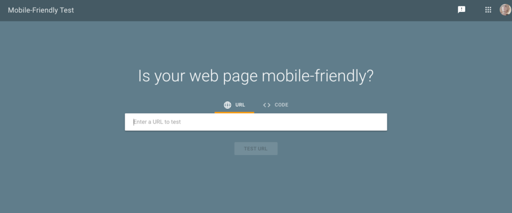
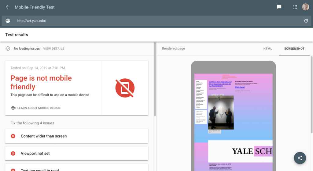
If you really want to drive this point home, you could run their website through Google’s Mobile-friendly Test:

Seeing a result like the one the Yale School of Art gets would certainly help you strengthen your argument:

2. Use Proof from Their Own Google Analytics
While your client’s traffic mostly comes from desktop, it might be the previous designer’s choice to favor desktop that could be the reason for the low mobile numbers. If the website isn’t mobile responsive, let alone mobile-first, it’s not going to rank well.
That said, there might be more to the story than just, “We only get 8% of our traffic from mobile, so ignore it.”
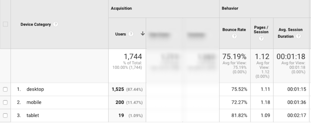
Take your client to their Google Analytics and dig deeper into the Mobile tab.

You need to get them to focus on more telling analytics, like the bounce rate and average time on site.
Even if mobile traffic is lower (which you’ve already explained might be because the UI was designed for desktop) those users might be the ones that more favorably respond to the content on the site. And that’s ultimately what’s important here. They need visitors to look through the site and convert, not bounce away from it.
If you can use their own data to make the point that mobile visitors are a more worthwhile bunch to go after, it would make the decision-making process much easier.
3. Use Real Proof from Other Websites
Don’t forget to show them proof outside of Google.
Do you have case studies from clients you can share with them? If not, try to find examples from other designers or agencies to make your point. Make sure the websites are similar to theirs in terms of audience or goals, so they can see the correlation between the changes they made and what you’re proposing.
You can show them how:
- A redesign from desktop to mobile didn’t just affect traffic, but conversions, too;
- A move from mobile to PWA improved customer retention on an already well-performing site;
- An adjustment of their SEO strategy increased visibility with mobile users and demonstrated that they were a worthwhile segment to target.
The Bottom Line
You want to paint this as a decision that’s in their best interest, not as something that’s going to cost them more money or that might compromise the amount of visitors they currently get.
A move to mobile (or any other data-backed change you’re proposing) will only help your client in the long run. Just make sure you show them that it’s the potent combination of on-site analytics and industry data that should drive their (and your) design decisions.
Featured image via DepositPhotos.
p img {display:inline-block; margin-right:10px;}
.alignleft {float:left;}
p.showcase {clear:both;}
body#browserfriendly p, body#podcast p, div#emailbody p{margin:0;}