Notifications are a crucial part of any app. Not only are they a key part of keeping users engaged with your application: many apps require notifications for their basic functionality. You won’t have much of an email app, for example, if you don’t have notifications. But the line between good notifications and bad notifications is fairly clear. What can you do to make sure you stay on the good side of that line when designing push notifications and desktop notifications?
This post will focus on push notifications for mobile devices. However, the same rules apply to desktop notifications.
Ask at the right time
Some apps ask users to enable push notifications at first launch. As a user, how likely do you think you would be to say yes? Unless you’re an auto-clicker, you’re unlikely to accept that. This will only work when the requirement for push notifications is immediately obvious (see food delivery and ride-sharing apps). Otherwise, users don’t want to open the door to potential notification spam. They don’t yet know what your app does, if they like your app, or if they even want to keep in on their device. Why should they give your app special permissions before they can even evaluate it?
Wait to ask for notification permission until the user can understand what they’re for and why you need them. Let’s say the user just ordered a delivery. At this moment, throw up a popup to ask if they want up-to-the-second updates on their orders. Explain that they’ll need to enable notifications for this functionality. You’re far more likely to get affirmative permission this way.
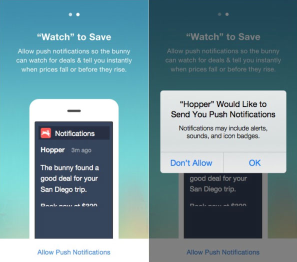
The same goes for asking users to turn on notifications during your app’s onboarding process, as Hopper does. The copy explains why the notification will be useful to the user, and what they’ll gain as a result of enabling them.
You can also store a settings toggle, but that’s less likely to draw user attention. This is the best move for apps that really have no explicit need for notifications. Take Overcast, a podcast app. It allows you to set notifications for new episodes, but there isn’t much a situation where the app could prompt the user. So, since Overcast respects its users, the notification settings are stored in toggles.
Restrain yourself!
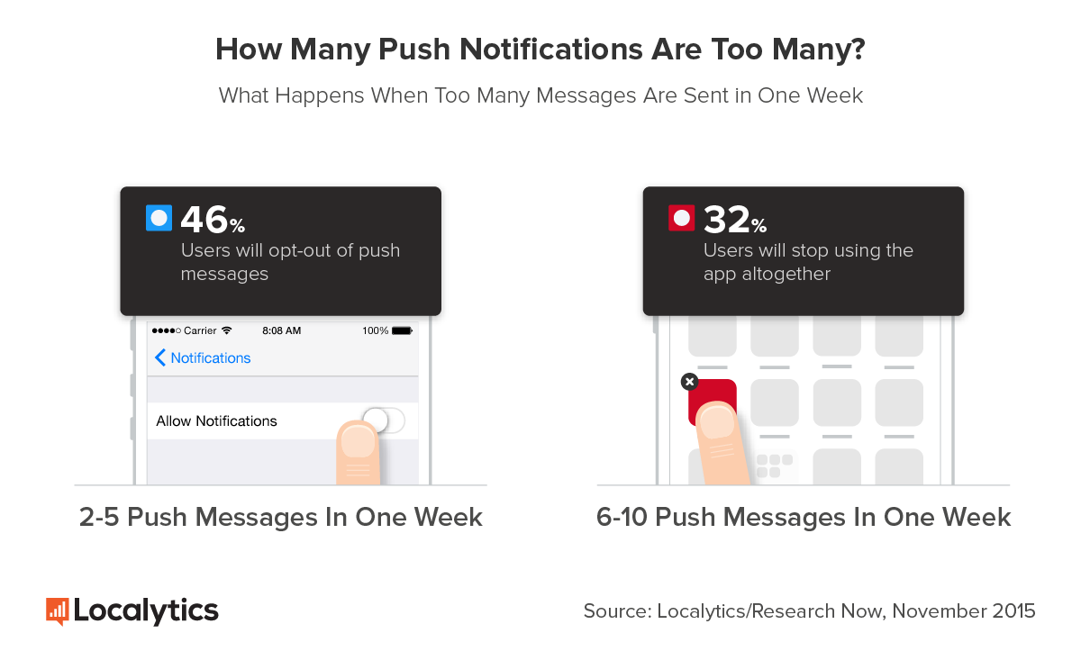
Notifications are not a mandatory component of your app. Sometimes notifications are a bad idea. Before designing push notifications for your app, you should be absolutely sure that they’re either necessary or valuable to the user. If they’re not, any smart user will disable notifications.
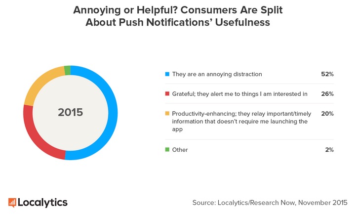
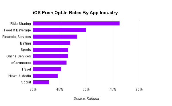
And users are already wise to the notification spam game. Research conducted by Localytics shows that 52% of users view push notifications as “an annoying distraction.” Other data from Kahuna shows that many users choose to disable push notifications. Classified by app type, the data show that nearly ever user opts out of social media and news push notifications, likely due to notification spam. Ride-sharing is more successfully, but that’s mostly thanks to the functional requirement for push notifications. The user wants to know when their ride arrives, so the notifications serve an obvious, useful purpose.
User’s disinterest in push notification was created directly by our industry. Developers weren’t careful about push notifications. They pummeled users with an avalanche of desperate “look at me!” notifications, begging for any strategy to drive user engagement. User’s hate that. You must earn permission to annoy the user: it is not when they install your app. So before you default to push notifications as a tool to drive engagement, consider whether you’re being annoying, or whether you’re providing a truly useful functionality to your users.
Transactional and engagement push notifications
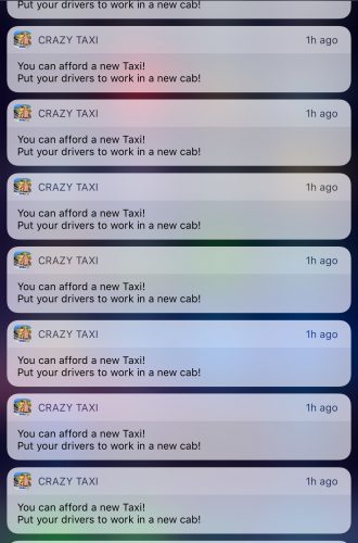
A perfect example of terrible engagement notifications. Image via Reddit.
Transactional push notifications are used to deliver information to the user at a specific time. When you get notifications about an order shipping, your driver arriving, or a flight delay, these are all transactional notifications. They’re the most useful and practical notifications. Users see the value in this type of notification.
Engagement notifications are used to get the user to open your app. These are generally the most irritating for the user. They bug you to open the app, with a prompt that’s supposed to gin up your interest. The problem is, most of the time, the content isn’t interesting. Engagement notifications are typically a transparent attempt to get you to buy something or open the app. And users hate that.
If you’re designing push notifications to improve engagement, you must be judicious. Use them with great care and precision. Make them practical and useful. Allow users to customize the types of things they’re bothered about, or use user data to guess what the user would like to hear about. Provide toggles to select the types of sales they’re notified about, or alert users to things they’ve shown interest in.
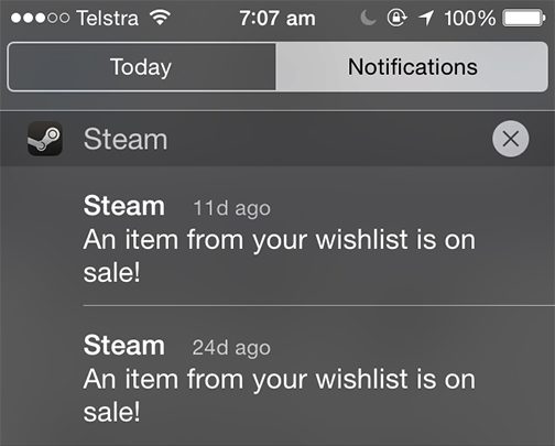
Steam, for example, pushes a notification when an item on your wishlist is on sale. This encourages the user to open the app, since they’ve already shown interest in the product, and it’s useful: who wants to miss a sale? The notification could be improved by informing the user about the specific game on sale, or taking the user directly to that game’s page instead of their general wishlist. But it’s a good example of a more useful engagement notification.
Make microcopy useful and direct
Explain the value of the notification in clear, direct language. Image via Braze.
Every push notification has two main parts: title and text. Make sure both of these things are useful. The title is like an email subject line: it should grab the user’s attention and encapsulate the content of the notification. The text below that is the body text. This is where you flex your microcopy muscles. Use active, punchy language that clearly explains why the user will be happy to receive this notification. “New sale items available” is bad, since it’s generic and vague. “Men’s Khakis on Sale Now” is better, but only actually useful if the user is a man that would buy khakis.
Personalizing notifications is the best way to improve engagement and clickthrough rates. Remember that personalization means more than just the user’s name. With marketing automation, you can slice users into small segments and send notifications that are especially relevant to that segment. If you improve usefulness, you’ll improve user engagement.
Provide notification actions (if relevant)
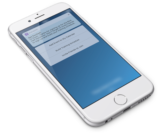
Both iOS and Android provide a framework for interacting with notifications in custom ways. Users can swipe on notifications to reveal other options. If you have the coding chops, make sure you provide relevant, useful actions. Replying to a message or archiving an email can both be done directly from the notification. If a notification enables a meaningful interaction, users are more likely to appreciate it.
As with all user experience design, you’ll need to create a narrative for your user interaction. What do they want to do at this point? What should be available as a pull down action, and what should show up on a swipe? Will tapping the notification simply open the app, or go to a specific page?
Not every push notifications will have relevant contextual actions. Some types of notifications, especially engagement notifications, simply want to the user to open the app. Provide actions when relevant, but don’t kill yourself trying to come up with something that runs counter to your goal.
Designing push notifications with respect
User experience design starts with respect. You need to respect the user’s goals, time, and intellect. Spamming users is ineffective and counter-productive. Designing useful push notifications is hard, but the effort will be rewarded with a positive user experience. Don’t make trash because someone says it’ll push up engagement numbers.
You might also like the following posts:
Best (And Worst) Practices for Collecting Email Addresses
Your Guide to Developing Microcopy Like a Pro
Microcopy Tips to Improve Your Site’s UX
Image credit: designed by Freepik