
If you are a website designer, you probably already know that every niche is different and there are certain rules to follow if you want to meet the users’ expectations.
Some designers have already learned from their own mistakes but if you have almost no experience designing legal websites, it is better to be safe than sorry. With that in mind, today, we are going to take a look at 5 major mistakes that are to be avoided at all costs when building a legal website.
If you get familiar with the ground rules and standards before you start planning your design, not only will the process be easier and faster, but the results will also be much better.
5 Mistakes to avoid when building a Legal Website
While there are many little details to pay attention to when building any kind of website, today we are going to talk about 5 major things you should keep in mind when designing legal websites.
1st Mistake: Stuffy Content Architecture
It is easy to make a mistake like this when designing a legal website. After all, legal websites are nothing if not filled with content but that is where you have to get a bit creative if you don’t want the users to get overwhelmed with the stuffy content architecture.
However, the solution isn’t simply eliminating half of the content. In fact, you can keep all of it if you organize it right and make it easy to navigate.
The key to doing that is using clearly labeled categories and making the navigation as intuitive as possible. The amount of content will not be a problem if you make it possible for the users to easily find the piece of information they were looking for quickly and easily.
Check out the Legal Anchor website to see a good example of clear content architecture.

2nd Mistake: Eliminating Creativity
Yes, we agree that the legal industry is quite rigid but that doesn’t mean you have to eliminate creativity altogether.
Unfortunately, the designers often do this mistake and you can easily see the problem when you look at the number of legal websites that all look the same, especially when it comes to the color palette.
Using the same navy-gray-black color combination is not only quite boring but it definitely won’t make your website stand out from the crowd either.
A smart thing to do would be incorporating a “disruptive” color into the mix to give your website a touch more personality. Look what Keglebrown did there with the yellow and you will understand what we’re talking about.

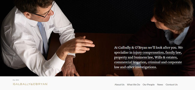
3rd Mistake: Using Stock Photos that don’t tell a Story
The first and most important purpose of using images in design isn’t to make it look prettier – it is to tell a certain story.
Avoid using impersonal stock photos and get some real images of the legal team doing their job behind the curtains. People want to see who is handling their business and using photos of the actual employees not only gives the website a dose of personality but it also shows the human side of the business.
Photos of the client meetings, captions of the office atmosphere, and similar are a great way to tell a story and to establish trust from the very start.
Lewisrice and Galballyobrian websites are some of the great examples of using images in design just right.

4th Mistake: No Dynamic Elements
Building a website that is completely static is a thing from the past that has to be left there. New trends promote dynamic elements and you just have to roll with it if you want to make modern websites that meet the users’ expectations.
By adding elements such as the videos of the team, the services, client testimonials, or other presentational videos, you will easily get the user’s attention and make them stick around longer.
A good example of using dynamic elements just right is the MSK website.
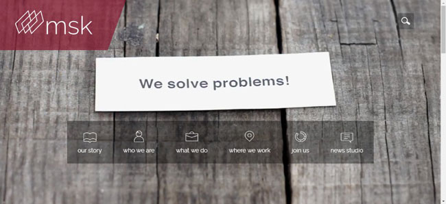
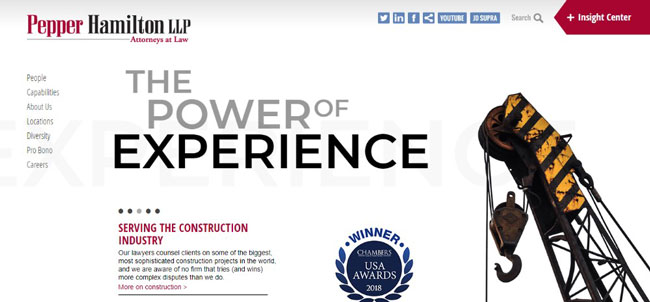
However, keep in mind that the videos aren’t the only dynamic elements that are good for your design. Things like 3D animated logos, taglines, slider galleries, and similar are also great for getting the users’ attention.
Check out the Pepperlaw website to see what it is supposed to look like in practice.
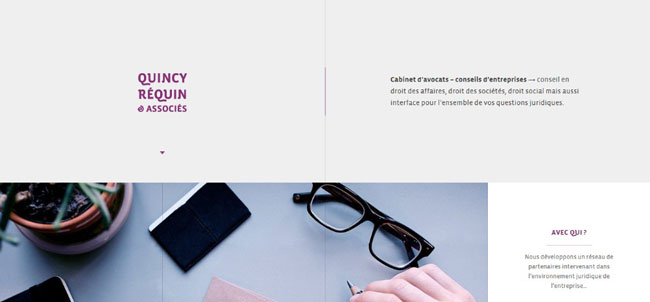
5th Mistake: Pulling Focus off the Content
Let’s face it: legal websites tend to be pretty overwhelming as they are with all that legal content and professional language. Logically, one thing that should be avoided at all costs is making them even more overwhelming by adding all kinds of elements that compete for the users’ attention.
Imagine a homepage filled with huge blocks of text surrounded by the banners, award icons, presentations of the team, articles etc. With so many things in one place, the user probably wouldn’t know where to look.
To avoid situations like that, you have to ensure there is enough white space on the page to make it comfortable to look at the page. Also, make sure the content is well organized using blocks and bullet points.
Good examples of well-organized content are Jennyodegard and Quincy-requin-avocats websites.

Conclusion
Before you start designing a brand new legal website, think about the rules and standards that have to be followed and learn from other designers’ mistakes.
If you leap into the project without getting familiar with the niche first, there a good chance you will make many mistakes down the road and ultimately, the users will not be satisfied with the results.
However, if you keep the 5 above-mentioned rules in the back of your mind at all times, you should be able to create well-designed legal websites that will follow the industry standards yet have a dash of personality and an unique touch.