Photo by Talles Alves on Unsplash
How many of you drink Coca-Cola? Did you know that initially it was not sold in supermarkets, but in pharmacies? In the beginning, the recipe included alcohol and was used to cure headache, nausea, and even addiction to morphine.

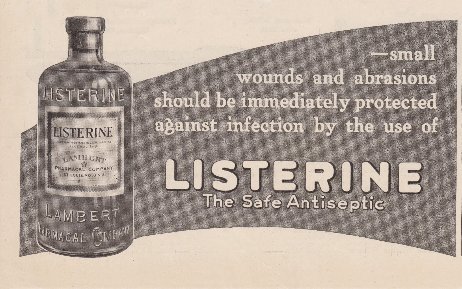
A vintage 1917 Listerine Antiseptic ad. Credit: Vintage Art Clips
Let’s try another: How many of you know Listerine? Let me tell you that Listerine was born as a cleaning product. Then it was used as an antiseptic, to disinfect operating rooms and wounds. And since it didn’t work there either, they created their own brand of menthol cigarettes, before becoming the most widespread mouthwash in the world.

The famous blue pill. Credit: El Viajero
And well, the last example. The famous blue pill was initially conceived as a medicine to cure angina. It was withdrawn from the market for a while, but quickly returned thanks to its side effects, and today it is used by more than 30 million men in more than 120 countries.
We are surrounded by products that were created for a certain use, and ended up being used for another. Or that were intended for a particular audience, and find success in another that perhaps they had not even imagined. Our job, as user experience designers, is to reach as many people as possible with our products. But what does that really mean?

Photo credit: Maitena Moreno Ugartemendía.
I want to bring a slightly different example: ramps for disabled. This is not a product itself, like the previous ones, it’s what we call a comparable experience: Ensuring that people can accomplish tasks in a way that suits their needs without undermining the quality of the content.
But these ramps are not used exclusively by them: Parents use them to carry their babies in strollers, we use them when leaving the supermarket with our trolley, or to carry our luggage through an airport. It’s amazing how a product that was not intended for these uses makes our lives easier.
And now I would like to talk to you about accessibility. I don’t want to dive on all the arguments that we have already heard many times, but I’d like to present a different approach to think about the discipline, more global and comprehensive:
If we make our product accessible, we improve the experience of all users, not just those who have difficulties interacting with it.

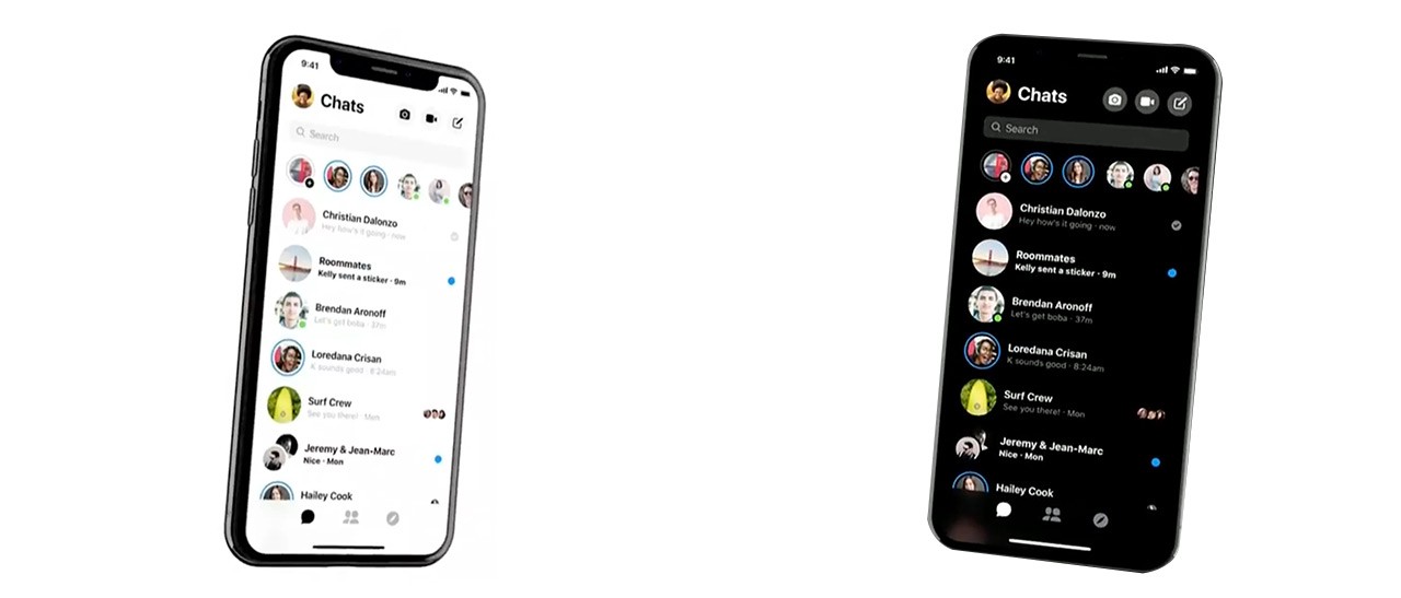
The redesigned Facebook Messenger app will include a dark color scheme. Via The Verge
Just as the ramp improves the experience of multiple users, offering the possibility to adapt the font size or color schemes in our interfaces, can help my mom, who’s not exactly a millennial , to have a better experience using the small screen of her mobile phone.
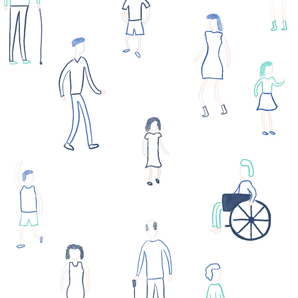
Accessibility must be designed for everyone, regardless of their conditions or abilities.

Some situations pushes us to interact differently with the tools we use everyday. Photo Credit: The Telegraph
In addition, these abilities or limitations can be temporary: What would happen if I broke my arm tomorrow, and I need to use a cast? And if I have to answer an email holding my child in one of my arms? How could I interact with the tools I use every day? Thinking about this kind of situations helps us change the way we approach accessibility.

The ALS Ice Bucket Challenge. Credit: CNN
Do you remember the Ice Bucket Challenge? That contest where the participants threw a bucket of ice water in their heads, and upload the video to their social networks? Few of them knew that the contest was an awareness campaign about Amyotrophic Lateral Sclerosis, a degenerative disease that affects the nervous system and atrophies mobility and speech. A person with advanced ALS operates a computer with just one finger, and with the help of voice commands.

He had ALS. Photo Credit: Net Joven
He had ALS. Can you imagine how complex it is for someone with ALS to write a password with an uppercase letter, a number, special characters, and all those security measures that they ask us for?
Can you imagine the loss for the scientific community if Stephen Hawking had resisted using a computer, because it was difficult for him to log in to Gmail?

For situations like these UX designers came up with the “show password” buttons, or “magic links” that are sent to our inbox, and now we all use those functions in our day to day.
These examples that we mentioned were possible thanks to many people that understood that accessibility is not just another task to complete in a list or a tool that must be learned, but a philosophy, new lens to think our profession through them, so that everyone, regardless of their abilities, can use digital products in their full potential.
It’s a path that can have many ways, and that seems to have no ending point. However, if we can adopt understand the impact that accessibility has on the experience of all our users, we may have found the starting point.

Illustration Credit: Juani Serrovalle
