In this article, we’ll analyze some album cover design examples that have an emphasis on typography. Then, we’ll take some of these album cover ideas and experiment with them in a sample typographic album cover. Whether your focus is on CD album covers, a cover for your podcast, or creating and preparing a design for print, these guidelines should help point you in the right direction—especially if a focus on typography is your jam.
Tutorial Assets
We’ll use the following assets in our album cover:
However, if you’re looking to jump right in and experiment with your own album cover right now, consider giving Placeit a look! Not only is it super user friendly—it’s also super fun to just dig in and experiment with layouts! If you’re looking for an album cover maker, look no further.

Now, let’s look at some cool album covers!
Typographic album covers are unique in that they have to hold their own—there’s typically minimal (or supplemental) imagery there to create interest or drive a message home. The type is the star of the show. For this reason, I would suggest that extra attention, even more than usual, should potentially be devoted to the expressive nature of the type.
Remember, I’m talking about how the text communicates visually.

For example, check out this album cover for No Doubt’s “Rock Steady”. It’s all type. Certain parts are highlighted in red—notice how this commands our attention, while the black type stays more supplemental.
It has a rather excited flow to it, doesn’t it? The strokes feel intense and heavy hitting.
Imagine this concept with different type—something really very different, like Times New Roman.
It would be really different, right? We would probably lose that energetic vibe. The original has rather organic-looking brush strokes, but a more uniform serif could look considerably more stiff. The idea here is not that “Times New Roman is boring”—but rather that the type, itself, as a visual element, has communicative properties.
Let’s illustrate this idea further with a basic example.
We’ll work with a test album cover to explore this premise, an imaginary album (and an imaginary band) called “The Album” by Example Band.

The above example is pretty bland. It’s black text on a white background. It’s been set with a rather unassuming typeface. It looks unfinished, doesn’t it? It looks bland, boring… there’s really nothing to note here, and the focal point isn’t all that strong.
Observe how the visual appearance of the typeface itself potentially changes how it communicates.
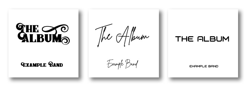
These three examples are very different, even though the layouts themselves are quite similar.
On the left, we have bold, ornate type (Braton Composer Font). The title of the album is in all caps and it’s so large. It’s really “screaming” to the viewer. Notice how scale here (one of the principles of design) really helps reinforce that the title is large and loud; the band’s name is much smaller in comparison.
In the center, the type looks handwritten (Brittany Signature Script Font). There is a human factor to it that feels rather personal and organic—the letters are imperfect. What kind of music does this make you think about?
On the right, the type is rather geometric and uniform (Voyager Font). How does this visually communicate to you, in comparison to the other two?
We can push this idea even further when we start incorporating other elements of art and principles of design. For example, color is very communicative, as is proximity and the visual relationships the different parts of your composition share.
Let’s take this idea and look at some more examples.

Here’s the cover of Blood, Sweat, and Tears’ Greatest Hits. It incorporates woodblock type to spell out the name of the band. This is supplemented with white text in a sans serif typeface; notice how this type is supplemental to the larger type. Why? There are several reasons: it’s smaller and it’s less decorative, to name a couple.
But how does this visually communicate? I would argue that it implies age. These letters have been printed on before; they’ve been around the block, and they’ve seen some action. It visually communicates the idea of “blood, sweat, and tears”—a phrase often associated with putting in hard work and dedication.

Here’s an interesting cover—it’s Duran Duran’s “Big Thing”. Notice how the “I” isn’t actually “there”; it’s created via the negative space in the composition. The words themselves are separated and disjointed. They’re also “stuffed” into square spaces.
This design is from 1988, and it shows—notice the color choices, the aesthetic. Being aware of and playing into trends can work to a design’s advantage; it can up its visual appeal.
In regards to communication, notice how “big” the letters are here. They are generally large and loud, with added emphasis on “big”. It’s also interesting to note that there was a dedication to Andy Warhol, who had died the year prior. Warhol’s work often featured a similar, blocky direction, with saturated colors—perhaps this was an intentional reference.

Beyoncé is a powerful force in popular culture, and this is an interesting cover, isn’t it? It’s quite minimal, but that’s not a bad thing. Personally, I find minimalism to be potentially very successful—but it can also be a challenging direction to pull off successfully.
In this case, we have a bold, strong typeface on black. It’s a name, isolated in this space, in a muted, pink color. It has a lot of contrast against the background, so it really commands our attention. I would argue that it communicates being “larger than life” or “needing no introduction”. It’s a confident design.
Imagine, for example, this same design but in a muted, dark gray—lower contrast, maybe even a hand-written typeface. It would feel more like an informal whisper and less like a strong, powerful statement.

This cover, “Brothers” by The Black Keys, is an interesting one to analyze after Beyoncé’s. They both take an approach with text on a black background—but notice how they communicate differently.
This one is considerably more casual, maybe even conversational. We see that not only in the appearance of the type but what the type itself says. Emphasis is created with scale and contrast—we see it in the band’s title.
I find that this one comes off as personal; we’re being introduced in an informal, maybe even biographical way. It rather reads like a story. These are my interpretations—what do you think?

Pink Floyd’s “The Wall” visually communicates in multiple ways. First, we literally see the text on the wall—this is an obvious association, and the imagery plays a strong, supplemental role.
However, look at the text itself. It has a rough, organic quality to it—like spray paint. Imagine, for example, that this text was set in something like Times New Roman or Helvetica. It might look more like a sign than a handwritten message—how do you think that might change its communicative qualities?
Let’s Create a Cover
Step 1
So let’s take these ideas and come up with an example cover of our own. Our goal is to make the typography the emphasis, but we’ll work with some supplemental imagery, as well.
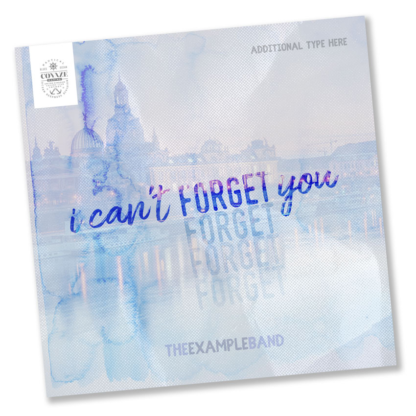
I’m going to create an album cover for a single titled “I Can’t Forget You”, by Example Band. We’re going to work with type as the composition’s focal point, although we’ll work in some imagery as supplemental elements, to push our concept further.
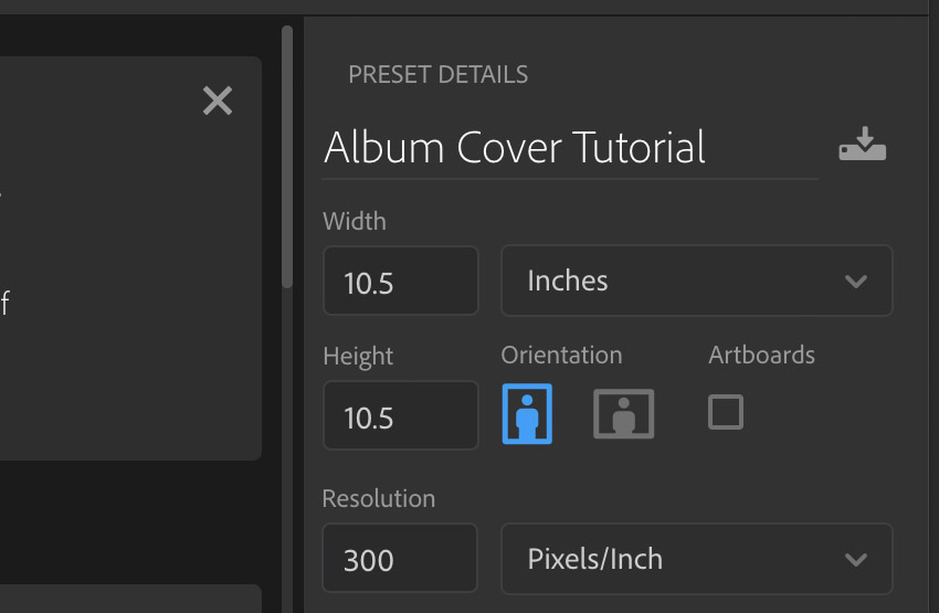
First, start by creating a New Document. I’ll be working in Adobe Photoshop.
When creating your album cover, remember to consult the specifications of your project, as it might vary! I’m going to be working at a 1:1 aspect ratio, since album covers tend to be square. When in doubt, I typically work larger than I think I’ll need; that way, I can always resize without losing quality.
For this example, I’ll be working at 10.5″ x 10.5″, at 300 dpi.
Step 2
I’m going to create some simple guides here, so my composition is Full Bleed.
To create guides, go to View > New Guide Layout.

Step 3
We don’t need to create Columns or Rows; let’s just go straight for Margins. Set each to 0.25″. This way, we have a nice 0.25″ border around our entire composition, to ensure the Bleed is accommodated.
Note, again, check with your printer, publisher, or other source for your specific project guidelines! Your sizes and specs might differ!

Step 4
Next, let’s think about what we want to communicate here. Is it an upbeat song? Slow and melancholy? Maybe there’s something genre specific we need to consider too—like a trendy aesthetic or something relevant to the musician.
In this case, I’m going to approach this with a goal of communicating the haunting nature of not being able to forget someone. A great next step could be creating a mood board—a collection of relevant imagery, type, textures, colors, or anything that makes you think of the concepts you’re trying to target.
Lay out your required type and don’t be afraid to experiment. I started out by placing the essential type: the name of the album/song and the name of the band. Then, you can rearrange and think about how your work visually communicates.
Use the Text Tool to add text to your document.

Step 5
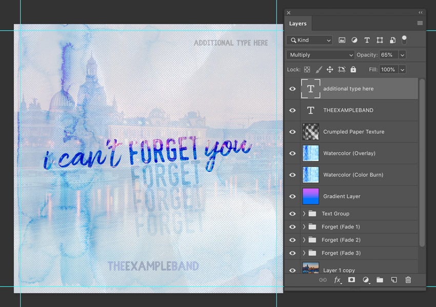
I decided to put emphasis on the word “forget” since it’s the essence of the song—that the subject can’t forget someone. It’s haunting them. I pushed the idea further by duplicating this text and making it slowly fade away, by lowering the opacity for each consecutive instance.
I decided on a type with a handwritten aesthetic so it would feel personal and emotional, but I wanted “forget” to be more bold and command attention.
You’ll notice, below, that I separated the text into different layers, so I could more easily control them independently.

Pushing the Type Further
Step 1
In pushing this further, I thought it might be interesting to associate the type with a place, so I added a background image. I lowered its opacity, because I wanted it to remain supplemental.
I put each of the fading “Forget” Text Layers into their own Folder (or Group), just to help keep my Layers organized.

Step 2
However, I wanted the background to be visible within the type itself, too—clearer, at 100%—I wanted to, again, visually communicate the idea of hazy, haunting memories.
To do this, I copied the Background and pasted it on top of each Text Layer. Then, Right Click (on PC) or Command Click (on Mac) and select Create Clipping Mask. Now, the background will be isolated within the type.
This is where those folders come in handy as, again, I did this for each Text Layer.

Step 3
The nice thing about this is that I can move the type around now, and the background image is going to stay put. Give it a try! The text color will appear to correspond to the background (unless you move the clipping mask).
That said, I thought it might be a good idea to strengthen the visual association between the text and the background. I selected the Type Layers (you can select multiple layers at once by holding down Shift and then selecting them), and then rotated them slightly.
Now, they visually associate with the water’s edge.

Step 4
I decided to tweak the colors here a little. Add a New Layer, and using the Gradient Tool, add some color—I used a transition from blue to purple. Set the Layer Blending Mode to Overlay, at Opacity 30%.

Step 5
We need to add this same color tweak to our Text Layers too—Duplicate your Gradient Layer and place them over your Text Layers. Remember to make them Clipping Masks!
I put the rest of my text into another folder. This is optional; I just like to keep my work organized!
Since our goal is to keep the text as the emphasis, let’s set the Layer Blending Mode to Color Dodge, at 46% Opacity. This is going to stand out more, while still drawing on those same colors.
No need to do so for the “disappearing forget” type—we want those to quietly disappear anyway.

Step 6
I also associate memories with writing, so I thought it might be a fun idea to experiment with some texture.
I added some watercolor texture here (Watercolor Texture Blue if you’re following along), Duplicated on two New Layers. The first has a Blending Mode set to Color Dodge, Opacity 25%. The second (on top) is set to Overlay, 50%.
I aligned the variation in the watercolor texture with the word “can’t”. I also thought it was an interesting visual association with the buildings in the background. These were just my design decisions—don’t be afraid to experiment in your own way. However, general recommendation here: visual associations can often help unify a composition.

Step 7
To push the paper aesthetic further, I decided to try out some folded paper with a halftone pattern (Crumpled Paper Halftone Textures if you’re following along).
Simply Create a New Layer, adding this texture to it. Set the Blending Mode to Hard Light, and the Opacity to 20%.
I tried to align the folds so they radiate outwards from the word “Forget”, in an attempt to add more emphasis to it. I really want this part of the text to be the focal point.

Adding Finishing Touches
Step 1
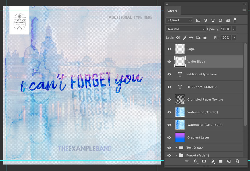
Let’s not forget the band’s name!
This is going to be a supplemental part of the composition—we don’t want or need it to compete with the focal point. So I’d recommend making it smaller, with less contrast.
In this case, I decided to use the same typeface as “forget” (Fibre Vintage)—just because we want it to be supplemental doesn’t mean it shouldn’t visually associate.

Step 2
I decided to use cool grays for this text, as again, I don’t want it to fight for attention. For style’s sake, I thought it might be fun to omit spaces between the words, and instead, differentiate between them with a value change (i.e. “Example” is darker than the other two words).
I set this Text Layer’s Opacity to 33% and the Blending Mode to Multiply.

Step 3
But what if we’ve got some extra text we need to include here? Something like an edition or some other type of information? I decided to stick an example up in the upper right-hand corner. It’s a simple Text Layer with the Blending Mode set to Multiply, Opacity 65%.
Keep your Margins in mind—I want to give a little extra space here, because my Margins represent my Bleed right now.
To further visually imply that this is a supplemental element, again, I used the same typeface as the band name. However, I made this type even smaller, to try to push the hierarchy further (i.e. using scale to help promote “importance”).
Step 4
But what if the extras we need to include are a symbol, mark, or logo? Again, let’s keep this supplemental.
On a New Layer, create a small, white rectangle in the upper left-hand corner of your composition (I used the Rectangular Marquee Tool and the Paint Bucket Tool, but you can do this any way you like—for example, with the Shape Tool). I’ll use this as an isolated space for my mark.
This technique could also work well for things like price tags, barcodes, ratings, or even for indicating where you might like a sticker to go—since it’s on its own layer, you can toggle it on and off as needed.
For example purposes, I grabbed a logo over at Envato Elements (Vintage Logo and Badge No. 35) for this part of my mockup—there are lots to choose from!
And That’s a Rap (Pun Intended)!
I hope you’ve enjoyed exploring how to make an album cover, as well as what makes them “tick”, with me! There are endless possibilities here—and endless ways to reach a strong solution! I’d say the best album covers are the ones that engage the viewer in a way that resonates with the album itself.

Feeling overwhelmed? Maybe you just need a little jump start on your next project—or maybe even a full album cover art maker. Check out these designs and others on Placeit. It’s such a fun tool—and a great source of inspiration, too!

If you enjoyed this tutorial, here are some others you might enjoy, too!