Key takeaways 💡 In-person research allows UX designers to observe micro-gestures, facial expressions, and behaviors that remote methods might miss. 🔍 While face-to-face studies provide rich data, they require higher budgets, careful scheduling, and logistical planning. 🍯 Use in-person research for tasks requiring physical interaction, observing detailed non-verbal cues, or testing early prototypes. 🔦 Clear… Continue reading In-Person Research: Is It Worth the Effort?
Category: UX
Top 22 Website Visitor Tracking Tools You Should Use in 2025
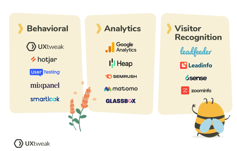
Wondering what visitor tracking is, how it can improve your website, and what tools to use? Well, you don’t have to wonder anymore. We prepared this article to help you decide if website visitor tracking tools are the right thing for you (spoiler: They most likely are). First, let’s take a look at the basics,… Continue reading Top 22 Website Visitor Tracking Tools You Should Use in 2025
Taking Control of Your Design Leadership Role: A Comprehensive Guide
If you’re a design leader, I bet you’ve had moments where you’ve questioned your role and impact. You’re not alone. Many UX professionals, including myself, have found themselves in leadership positions with high expectations but little clarity on how to navigate their responsibilities. This disconnect can lead to frustration, ineffective design efforts, and missed opportunities… Continue reading Taking Control of Your Design Leadership Role: A Comprehensive Guide
UX Conference March Announced (Mar 2 – Mar 7)
How will the Live Online Event work? Meetings will take place using the video conferencing tool Zoom, collaboration tools (such as group document editing and whiteboarding tools), and the social discussion tool Slack. You’ll also be able to use Slack before, during, and after the event to participate in social events and network with… Continue reading UX Conference March Announced (Mar 2 – Mar 7)
Design System governance
[unable to retrieve full-text content] Models for consistent User Experience Continue reading on UX Planet »
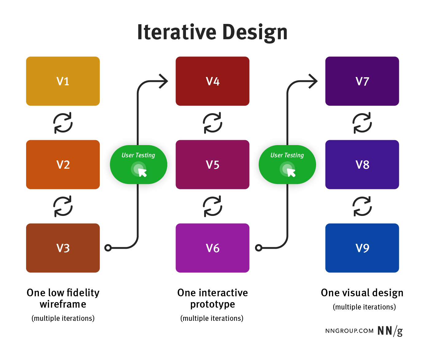
3 Design Processes for High Usability: Iterative Design, Parallel Design, and Competitive Testing
Summary: 3 methods for increasing UX quality by exploring and testing diverse design ideas work even better when you use them together. This is an updated version of an article written by Jakob Nielsen in 2011. There’s no one perfect user-interface design, and you can’t get good usability by simply shipping your one best idea.… Continue reading 3 Design Processes for High Usability: Iterative Design, Parallel Design, and Competitive Testing
15 Best Creative WordPress Themes to Showcase Your Digital Agency Portfolio
Responsive and creative WordPress themes for digital agencies that wow your clients are essential for leaving a lasting impression. A well-designed website not only highlights your agency’s expertise but also reflects your creative flair. To make a remarkable online presence, you need the perfect theme tailored to showcase your portfolio and captivate potential clients. A… Continue reading 15 Best Creative WordPress Themes to Showcase Your Digital Agency Portfolio
Treat Yourself to an Early Gift With The Winter Wonderbox
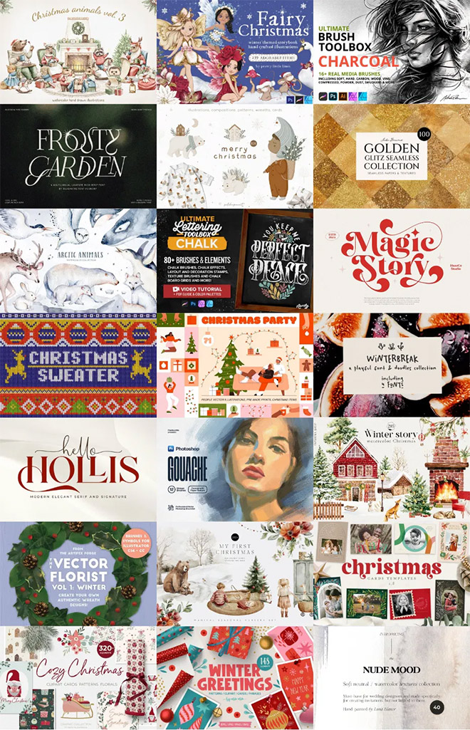
Unwrap a hamper full of fresh art and design tools with this festive-themed bundle! The Winter Wonderbox has everything you need—from frosty watercolor cliparts and shimmering textures to heartfelt greeting cards and fun ugly sweater effects. This collection is perfect for the holidays and will keep you inspired for Christmases yet to come. Don’t miss… Continue reading Treat Yourself to an Early Gift With The Winter Wonderbox
Eye Health Tips for Graphic Designers
Today, graphic design work continues to be a competitive career path, with over 21,000 job openings projected yearly, according to the US Bureau of Labor Statistics. As digitization and online marketing continue to be essential elements for businesses and brands worldwide, graphic design talent is in demand. However, graphic designers must maintain their health and… Continue reading Eye Health Tips for Graphic Designers
New Year, New Fonts: Fresh Free Fonts for Graphic Designers
As we usher in the New Year, it’s the perfect opportunity to revamp your design toolkit with a fresh collection of fonts. Typography is a vital element in any creative project, setting the tone and conveying the message with style. This year’s collection offers a range of free fonts tailored for every designer’s needs—whether you’re… Continue reading New Year, New Fonts: Fresh Free Fonts for Graphic Designers
Website Security Tips: Why It’s Important and How to Protect Your Site
In today’s increasingly digital world, websites have become the backbone of businesses, organizations, and personal brands alike. They serve as a point of contact, a source of information, and often, a means to conduct transactions. However, with the rise in website usage comes the rise in cyber threats. Whether it’s a personal blog, an e-commerce… Continue reading Website Security Tips: Why It’s Important and How to Protect Your Site
Hurry! 30% Cyber Sale Now Live – Don’t Miss Out!
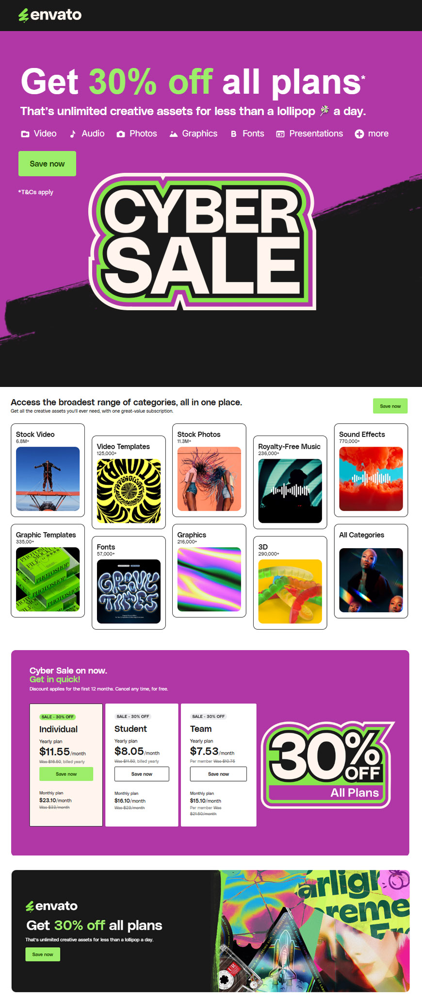
It’s the most wonderful time of the year! Envato’s Annual Cyber Sale is officially live, offering an unbeatable 30% off all plans for the first 12 months. Whether you’re a creative professional, a business owner, or a hobbyist, this is your chance to save big on the resources you need to take your projects to… Continue reading Hurry! 30% Cyber Sale Now Live – Don’t Miss Out!
15 UX research deliverables to convince stakeholders
In this article, we’ll explore 15 essential UX research deliverables that can help you effectively communicate user insights and drive alignment across teams. Key Takeaways 👉 UX research deliverables help connect user needs with stakeholder goals, making it easier to align teams and improve designs. 👉 Clear, simple deliverables show real user insights, helping stakeholders… Continue reading 15 UX research deliverables to convince stakeholders
What is SEO and Why Does Your Business Need It?
We live in a digital age where everything is a two-edged sword—for example, it’s easy to get data online, but it is hard to filter that data into specific things that you need, especially in your business. Almost everyone is on the world wide web now, and people are there searching for recommendations and even… Continue reading What is SEO and Why Does Your Business Need It?
Customer Journey Management: Framework & Tools
Key Takeaways 🔦 Understanding the customer journey is critical for enhancing the overall user experience. 🔍 Customer journey management provides businesses with a comprehensive view of the customer experience. 💡 A customer journey is the set of interactions that the customer experiences with a particular product service or brand. Competition in the digital marketplace… Continue reading Customer Journey Management: Framework & Tools
The Rhetorical Triangle for Stakeholders: Make Your Point and Get Your Way
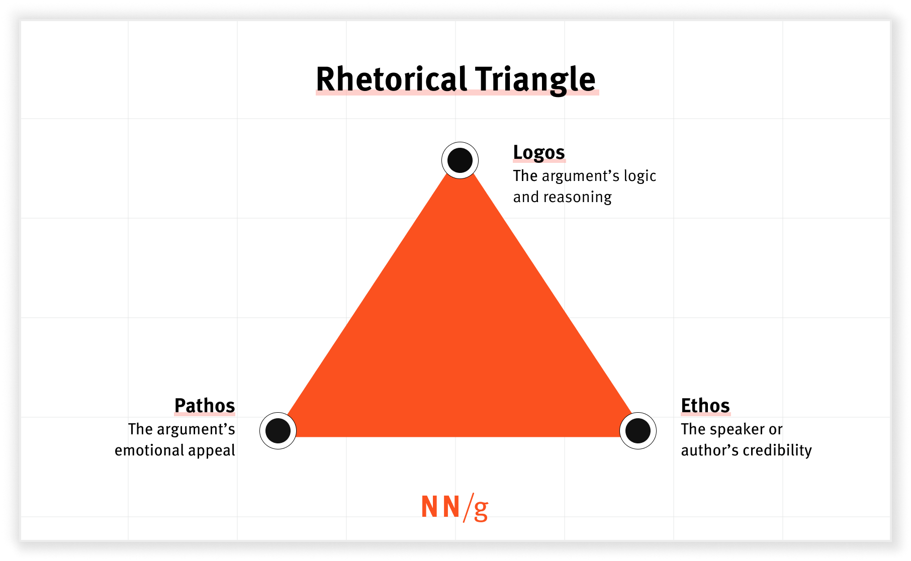
Summary: Ethos, logos, and pathos can help you get buy-in from stakeholders. Communicating with stakeholders has long been a challenge for UX professionals. Luckily, rhetoric provides strategies for navigating these difficult interactions. The Rhetorical Triangle Rhetoric is the art of using language to persuade an audience. The rhetorical triangle (more commonly known as ethos, logos,… Continue reading The Rhetorical Triangle for Stakeholders: Make Your Point and Get Your Way
Designing Experiences: Can We Really Design an Online Experience, and If So, How?
I’ve spent years working in the world of designing experiences, and I can tell you it’s a complex field that’s all about shaping how people interact with products, services, and digital spaces. At its heart, designing an experience aims to create meaningful, engaging interactions that really click with users. But here’s a question I often… Continue reading Designing Experiences: Can We Really Design an Online Experience, and If So, How?
The Four P’s of Service Design: People, Partners, Products, and Processes
[unable to retrieve full-text content] Photo by Frames For Your Heart on Unsplash We live in a world where everything seems complex yet simple. The realization of simplicity is built on our belief in recognizing the interactions between multiple systems of an environment. At first look, you might feel overwhelmed by seeing clutter of all types… Continue reading The Four P’s of Service Design: People, Partners, Products, and Processes
70+ Best Japanese-Style Fonts for Modern Design and Branding
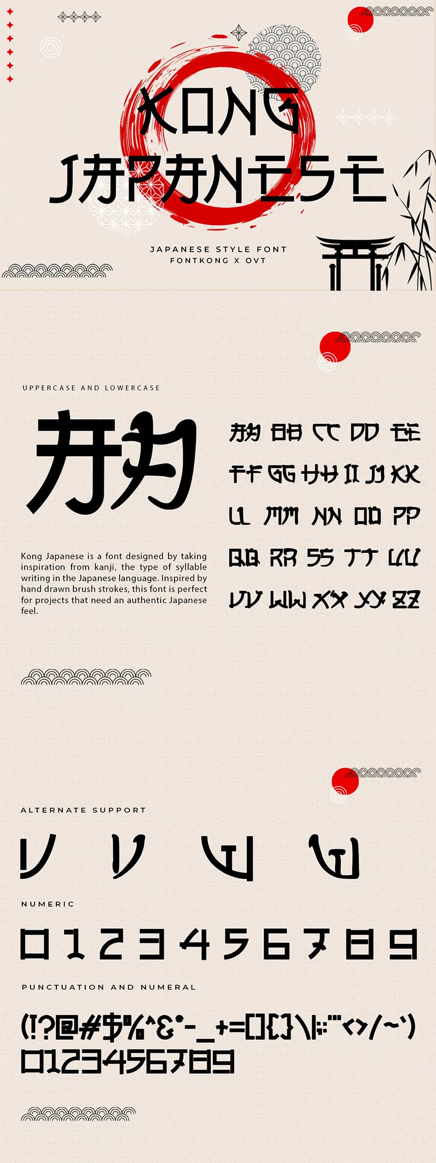
Japanese-style fonts bring a unique blend of tradition and modernity to design projects, making them a popular choice for businesses and creatives alike. Whether you’re working on branding, packaging, or web design, the right Japanese-style font can evoke cultural authenticity, elegance, or contemporary simplicity. This guide explores 70+ Japanese-style fonts, categorized by their design styles,… Continue reading 70+ Best Japanese-Style Fonts for Modern Design and Branding
AI Features Must Solve Real User Problems
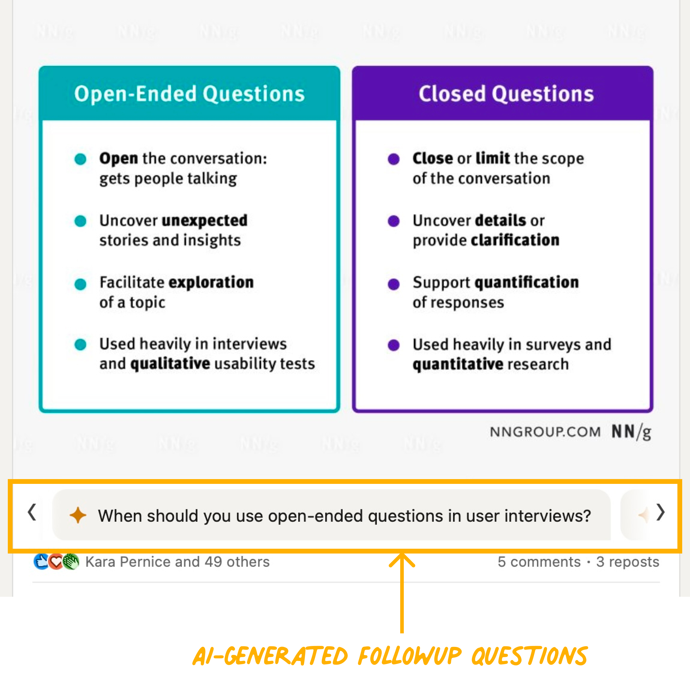
Summary: AI features must solve real problems, not be implemented for novelty. Unnecessary AI chatbots and features can harm rather than help users. Generative AI has been bringing plenty of change over the past two years. While it’s substantially changing what and how we design, some things stay the same. One important UX principle is… Continue reading AI Features Must Solve Real User Problems
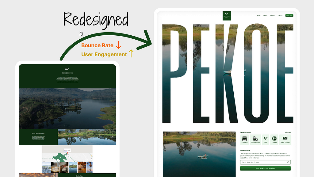
Website Redesign To Increase User Engagement
[unable to retrieve full-text content] While searching for a villa for a vacation with my friends, I stumbled upon the stunning Pekoe Villa, which boasts an incredible view. However, when I visited their website for more information, I realized it didn’t do the villa justice, so I decided to redesign it. Since this is a simple… Continue reading Website Redesign To Increase User Engagement
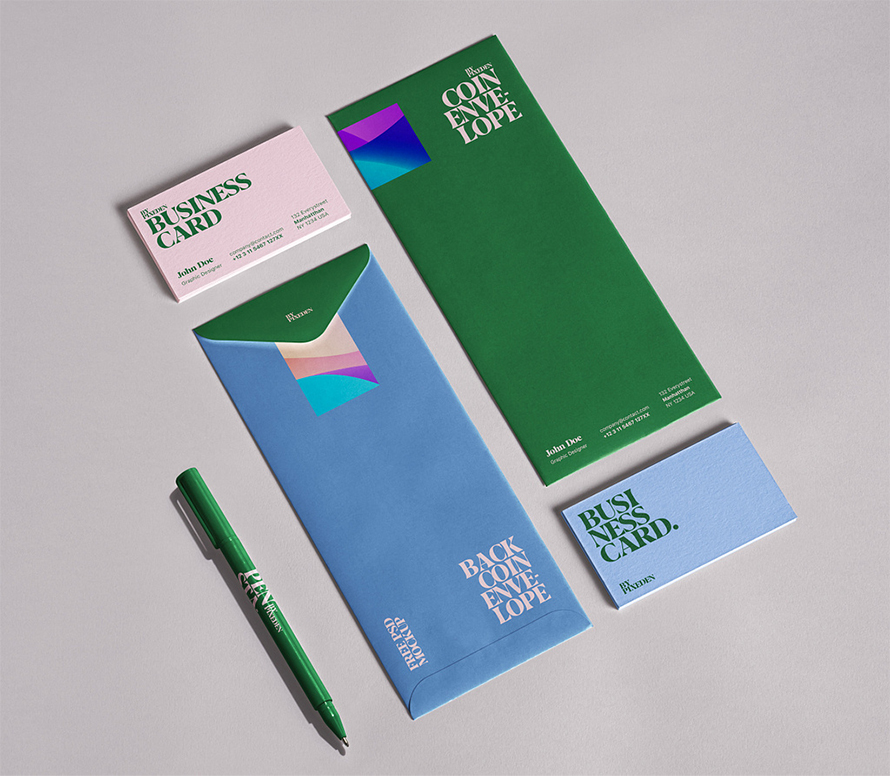
15+ Free Stationery Mockups to Elevate Your Branding Presentations
In today’s highly competitive business environment, branding is essential for making a memorable impression. When presenting a brand to clients or stakeholders, one of the most powerful tools is a well-designed stationery mockup. Stationery mockups provide a realistic, cohesive look at how a brand’s design elements will appear on everyday office items, helping to communicate… Continue reading 15+ Free Stationery Mockups to Elevate Your Branding Presentations
Test smart: which automation strategy to choose for peace of mind?
[unable to retrieve full-text content] Among diverse approaches, the teams can find a unique way on their test automation journey and select the strategy that matches their needs. So let’s dive deeper into pyramids, diamonds, hourglasses and other interesting objects. In the massive hype around automation in the QA field, it is easy to get… Continue reading Test smart: which automation strategy to choose for peace of mind?
How To Create A Budget-Friendly Sensory Room For Kids
Creating a sensory room for children, especially those who are neurodivergent, can greatly enhance their learning, relaxation, and overall sensory experience. A sensory room is a space carefully designed to stimulate the senses and support sensory processing. Whether your child experiences sensory seeking or avoiding tendencies, a sensory room can help them regulate their environment… Continue reading How To Create A Budget-Friendly Sensory Room For Kids

