Styleguides are an essential tool for ensuring that everyone in an organization is on the same page. After all, maintaining a consistent style is vital to brand recognition, readability and it just looks more professional. The great thing about these Styleguide resources is that there is undoubtedly one that will let you work the way… Continue reading Styleguide Toolbox – Templates, UI Kits, Tools & Generators
Tag: color
8 Essential Bootstrap Tools For Web Designers
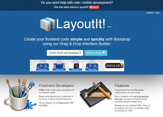
There are so many trendy and time saving things available in internet world. Bootstrap tools are one of them. Bootstraps tools have many wonderful and outstanding features like Add-ons, pre-styled modules of library and so many. This is the reason that every talented web designer and web developer always keep an eye on bootstraps tools.… Continue reading 8 Essential Bootstrap Tools For Web Designers
Create a 3D Abstract Photo Manipulation Style in Photoshop
Create a beautiful and stylish photo manipulation in abstract style. This picture is a poster with a large number of interesting effects and creative solutions. In this tutorial I’ll show you a new and interesting effects, talk about alternative ways of selection, retouching, working with a variety of filters, tools and much more. We all… Continue reading Create a 3D Abstract Photo Manipulation Style in Photoshop
Editing Images in CSS: Combining Techniques

In last two tutorials of this series, we have discussed how filters and blend modes can completely change the appearance of images. In this tutorial, I will cover the basics of editing images by using both these properties together. The Basics of Layering Image Effects With CSS Any non-primitive image editing usually requires more than… Continue reading Editing Images in CSS: Combining Techniques
How to Conduct an Interface Inventory With InVision
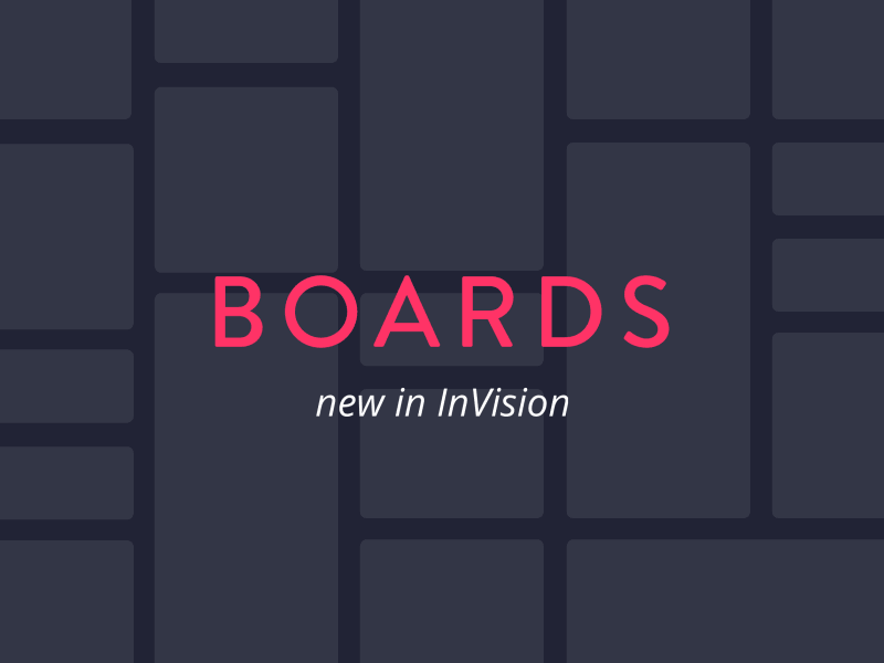
By definition: an inventory is a gathering of items tracked in a list. This term isn’t anything new, but the idea of using this concept towards interfaces is. Brad Frost, who coined the term “Atomic Design”, states that creating agnostic patterns helps to build far more versatile components that can be used widely across a… Continue reading How to Conduct an Interface Inventory With InVision
20 Free WordPress Themes (2016 Edition)
Thinking about launching a WordPress site? Not sure if you want to hire a professional web designer or buy a WordPress theme? What about a nice cocktail of free WordPress themes for any kind of project, all collected together in this blog post? Will these freebies brighten your mood? We are sure they will. So,… Continue reading 20 Free WordPress Themes (2016 Edition)
10 Reasons Why Your Design Skills May Seem Lame

The design field is pretty crowded. If this is your “calling,” then you have to accept that you are in competition with a lot of creatives that may know more than you. You have to accept that you will have to take all of that creativity you have and translate it into products that others… Continue reading 10 Reasons Why Your Design Skills May Seem Lame
15 Premium Business Card Templates (In Photoshop, Illustrator, & InDesign Formats)
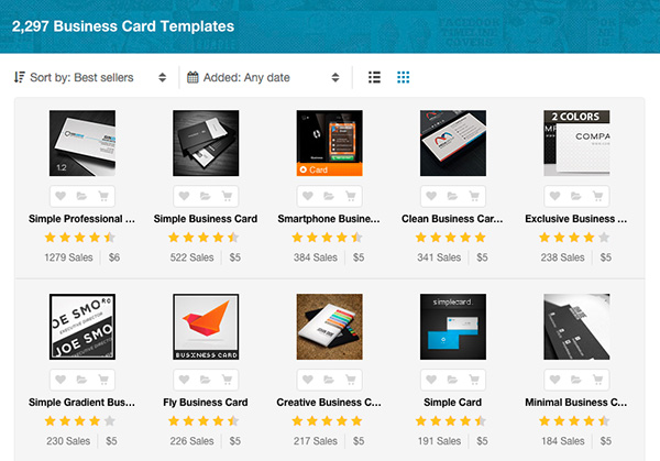
Are you rebranding or launching a new business? Maybe you have a big conference or meetup fast approaching? Or is your current business card just not at the quality level you’d like? Is it not representing you well anymore or does it have outdated info on it? You don’t want a wrong phone number, changed… Continue reading 15 Premium Business Card Templates (In Photoshop, Illustrator, & InDesign Formats)
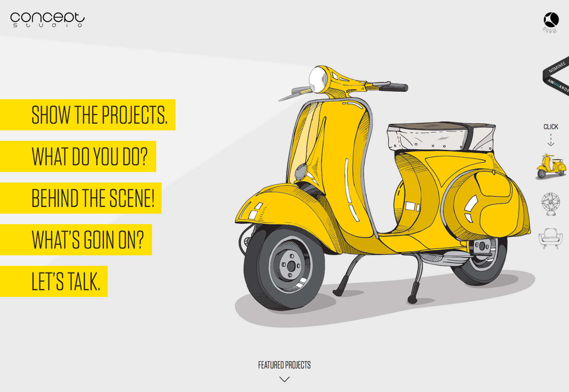
The greatest portfolio that is new, January Edition
Hello all! And welcome to January’s portfolio roundup. There will be a lot to appreciate about each portfolio listed here, so why not grab a coffee and browse through some of the best sites that are new display design work. You’ll find a few of the most exciting designers working away in studios throughout… Continue reading The greatest portfolio that is new, January Edition
Create An Emotional Photo Manipulation Of A Sad Angel In Photoshop

Rate this post Learn how to create a fantasy photo manipulation of a desperate angel in sorrow and bleak rainy scene with Photoshop. In this tutorial, you’ll learn how to create your winged angel with ordinary stock images, do some retouch and enchantment on the angel with shadows and lighting, then complete it with rain… Continue reading Create An Emotional Photo Manipulation Of A Sad Angel In Photoshop
Polaroid Stack to Grid Intro Animation
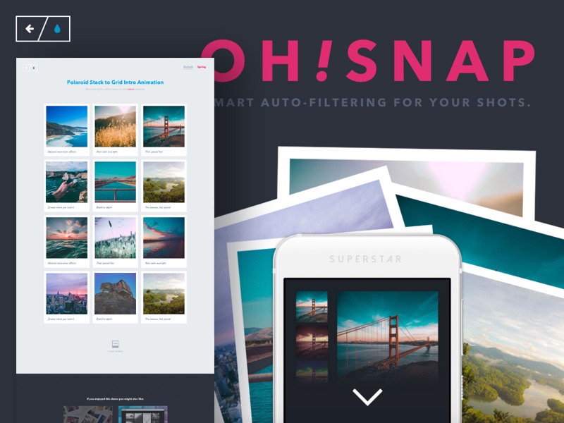
A tutorial on how to create an intro animation where a decorative Polaroid stack becomes a grid similar to the effect seen on the takeit website. View demo Download source Today we’d like to show you how to create a very simple intro effect similar to the one seen on the takeit website where a… Continue reading Polaroid Stack to Grid Intro Animation
Best Black and White Websites from 2016
Best Black and White Websites from 2016 is hundred and twenty-fourth edition of our Inspiring Sites of the Week weekly series, where we feature hottest websites following best practices and latest trends. We like creative, unusual and inspiring designs, and will strive to deliver the best inspiration we can get our hands on. This week we collected… Continue reading Best Black and White Websites from 2016
New Course: Write Customizer-Ready WordPress Themes
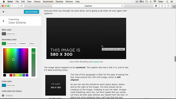
What You’ll Be Creating Themes let you customize every aspect of the design and functionality of a WordPress site. But what if you want to let your client customize some aspect of the theme? Perhaps you want to sell a theme on Envato Market and you want to let buyers adjust the color scheme and logo to… Continue reading New Course: Write Customizer-Ready WordPress Themes
The Best New Portfolio Sites, February 2016
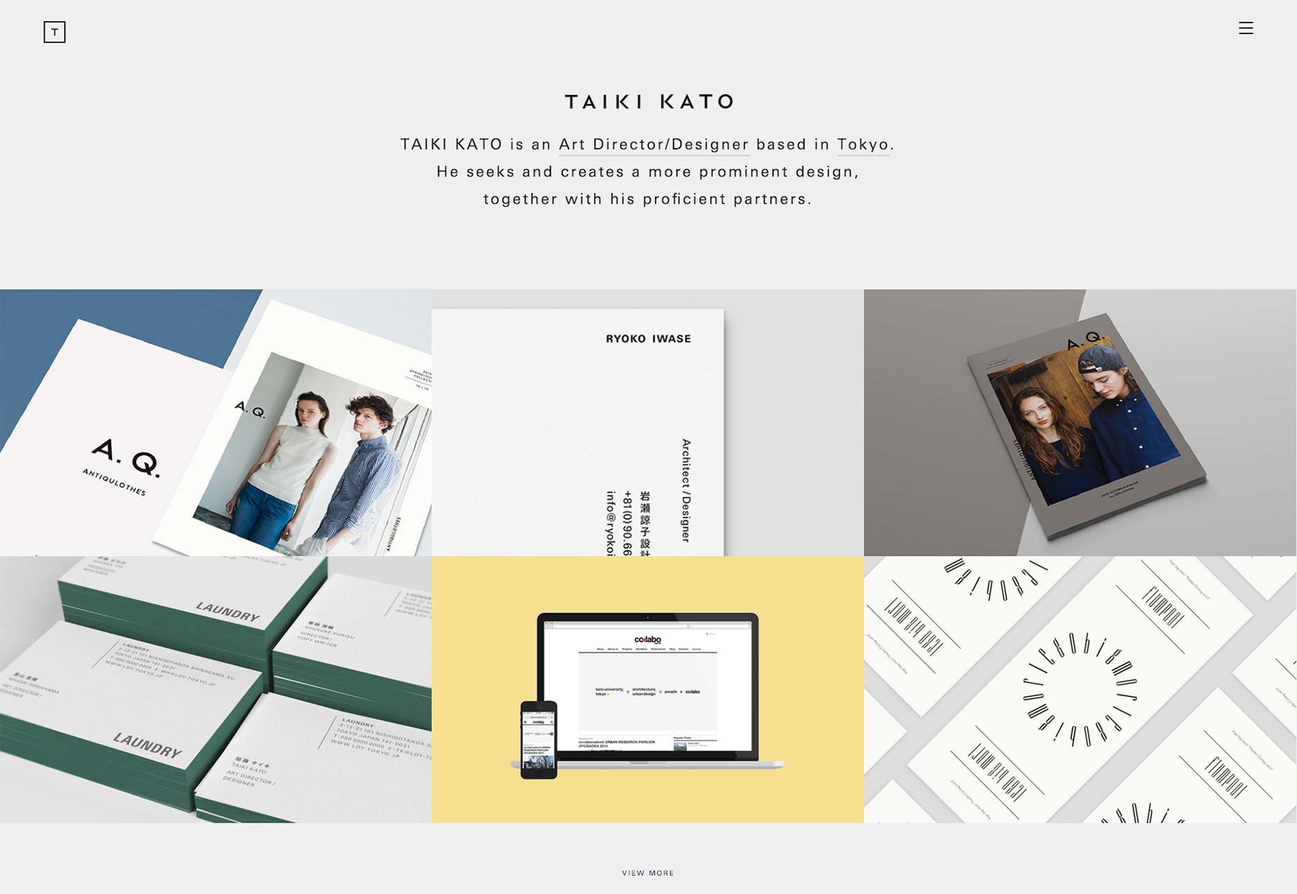
Welcome everyone to February’s portfolio roundup. It’s time to fall in love with all-new work, by all-new designers. Yes, I went there. So, when looking at this list, I recommend that you take inspiration from the good ideas, and simply ignore the bad. All right, let’s do this… Taiki Kato Taiki Kato’s portfolio proclaims him… Continue reading The Best New Portfolio Sites, February 2016
9 Useful Javascript Color libraries
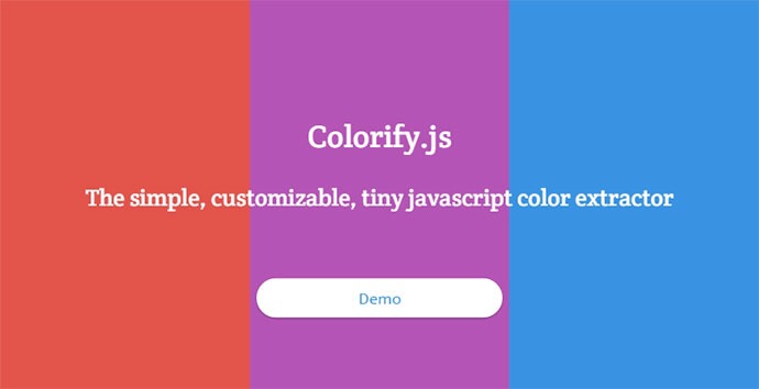
Here are 9 useful Javascript libraries which allow you to perform many different manipulations on colors. Colorify Colorify is a script written in Javascript, that allows you to extract colors from images, and manipulates them. From a simple plain color, based on the dominant color, to a beautiful gradient based on the image edges colors,… Continue reading 9 Useful Javascript Color libraries
First look at Adobe’s Animate CC
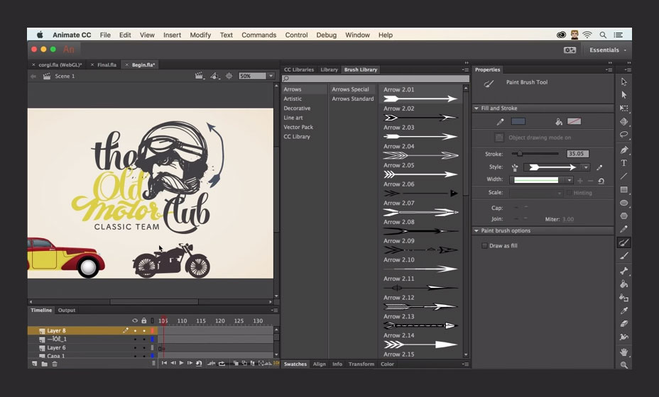
Adobe have just launched their ‘new’ application, Animate CC. A major component in the Creative Cloud application suite, Animate CC replaces Flash Professional CC, and is available to download now. As we previously reported, Animate CC is an evolution of Flash Professional. The name change is based on the changing role of the application. Adobe… Continue reading First look at Adobe’s Animate CC
20+ Brilliant Examples of Impressive Color Schemes in web designs
What’s the most exciting feature of a website? The answer would be simple- its colors and how they are used. The way a website is presented forms a huge part of our user experience and the way a website is presented. Websites can be of various topics and depending on that factor there can be… Continue reading 20+ Brilliant Examples of Impressive Color Schemes in web designs
The Importance Of Usability When Designing A Site
Web usability is an approach to make web sites easy to use for an end-user, without the requirement that any specialized training be undertaken. The user should be able to intuitively relate the actions she needs to perform on the web page with other interactions she sees similar contexts, e.g., press a button to perform… Continue reading The Importance Of Usability When Designing A Site
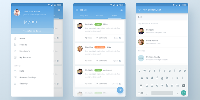
50+ fresh resources for designers, February 2016
Hey there! This month’s roundup comes with some amazing freebies for you to download and try out; including line icons, material design assets, gesture icons, mobile app presentation kits, a restaurant menu template, branding stationery mockups, watercolor illustrations, device mockups, stunning web and mobile UI kits, fancy fonts for all purposes, PSD templates, and landing page themes… Continue reading 50+ fresh resources for designers, February 2016
Illustrating the Web: deconstructing the trend
Illustrations are taking over the Web. Designers are creating websites with everything from full-screen illustrations to hand-drawn divots that are used throughout projects. It’s a trend that’s likely to keep growing because illustrations make a design feel custom (even if it’s not). Here’s how to make the most of them in your design. Website illustration… Continue reading Illustrating the Web: deconstructing the trend
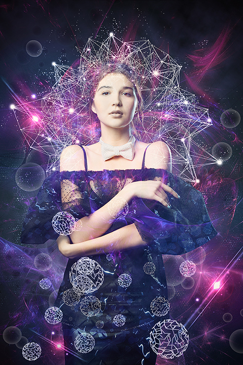
Create a Sci-Fi Chamber Photo Manipulation in Photoshop

Create a Sci-Fi Chamber Photo Manipulation in Photoshop 5.00/5 (100.00%) 1 vote Learn how to create a sci-fi photo manipulation of a mysterious chamber with amazing light flares and great entrance with Photoshop. In this tutorial, you’ll learn how to contruct your own chamber with textures , place a model in front of the entrance… Continue reading Create a Sci-Fi Chamber Photo Manipulation in Photoshop
10 fresh examples of diffuse shadow UIs
It seems like some of web design trends aren’t going anywhere soon. We’ve seen Material Design initiation and evolution, advanced animations and microinteractions, vibrant color schemes, beautiful typography, great use of minimalism, new responsive design technique and tools and much more interesting stuff. We also noticed a new trend that is making its way through… Continue reading 10 fresh examples of diffuse shadow UIs
Enfold – Responsive Multi-Purpose Theme – 4519990
Enfold is a clean, super flexible and fully responsive WordPress Theme (try resizing your browser), suited for business websites, shop websites, and users who want to showcase their work on a neat portfolio site. The Theme is built on top of the fabulous Avia Framework and offers support for the WPML MULTI LANGUAGE plugin, just… Continue reading Enfold – Responsive Multi-Purpose Theme – 4519990
An Introduction to Intel RealSense Technology for Game Developers
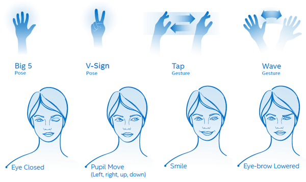
Intel RealSense technology pairs a 3D camera and microphone array with an SDK that allows you to implement gesture tracking, 3D scanning, facial expression analysis, voice recognition, and more. In this article, I’ll look at what this means for games, and explain how you can get started using it as a game developer. What is… Continue reading An Introduction to Intel RealSense Technology for Game Developers