Best Black and White Websites from 2016 is hundred and twenty-fourth edition of our Inspiring Sites of the Week weekly series, where we feature hottest websites following best practices and latest trends.
We like creative, unusual and inspiring designs, and will strive to deliver the best inspiration we can get our hands on. This week we collected Best Black & White Websites from 2016 that caught our eye. Get inspired and receive a portion of your weekly creativity boost.
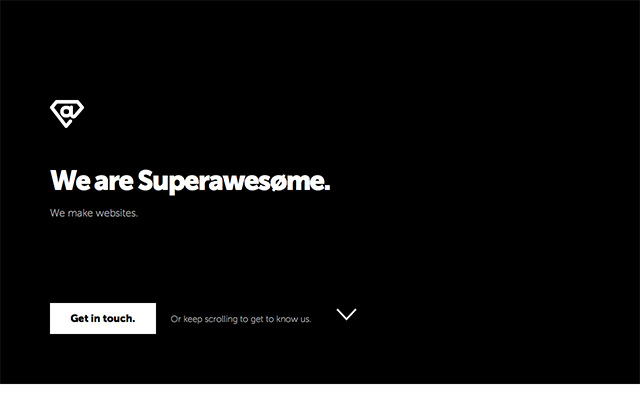
Superawesome
Why it made the list: Overall simplicity combined with subtle and smooth interactions and grayscale imagery.
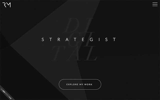
Raphael Malka
Why it made the list: Good typography combination, likeable content animations.
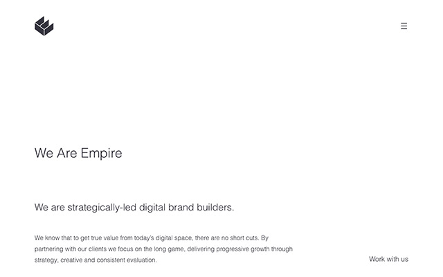
We Are Empire
Why it made the list: Smart usage of whitespace, simple and elegant.
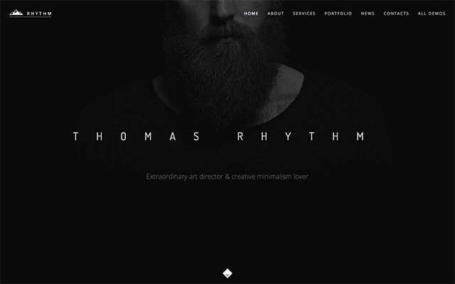
Thomas Rythm
Why it made the list: One-page portfolio website with good color balance and likeable iconography.
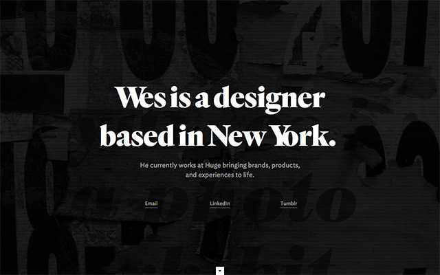
Wesley Gott
Why it made the list: Minimalistic and simple design approach, catchy welcome screen and nice product presentation.
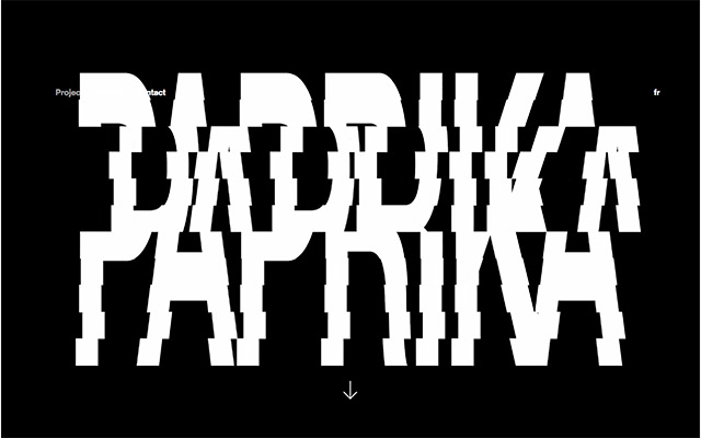
Paprika
Why it made the list: Perfect smooth interactions, parallax effects, nice and simple.
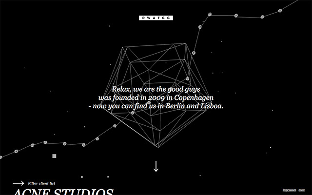
Rwatgg
Why it made the list: Beautifully done interactive background animations, great-looking typography, simple and fast.
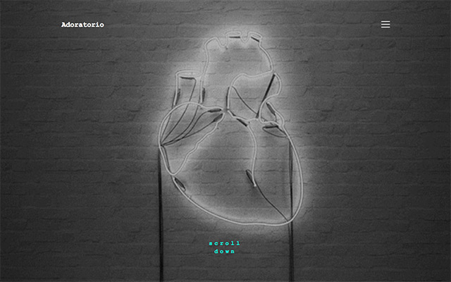
Adoratorio
Why it made the list: Minimalistic style, parallax effects on images, great SVG animations and overall look and feel.
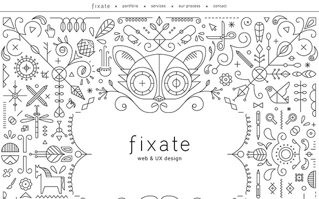
Fixate
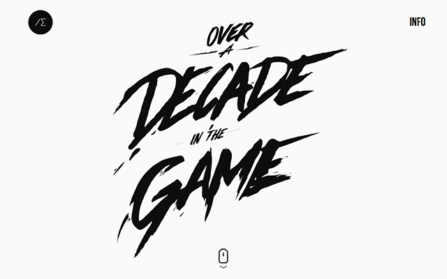
Why it made the list: Awesome welcome screen with doodle art, lovely typography.
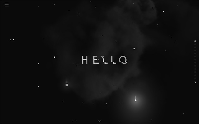
Hello I’m V
Why it made the list: Stunning WebGl animations, great storytelling and overall look and feel.
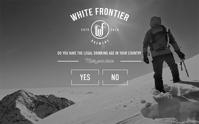
White Frontier
Why it made the list: Grid based fullscreen layout, nice page transitions, outstanding imagery.
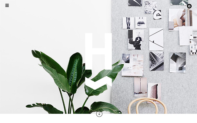
We Are Huntly
Why it made the list: Good-looking asymmetrical layout, lot of whitespace.
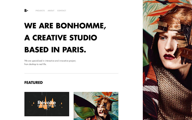
Bonhomme
Why it made the list: Nicely mixed bold and thin typography, great product presentation, and likeable interactivity.
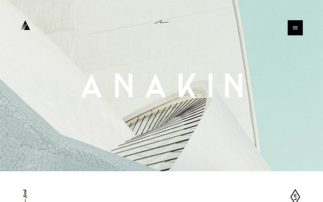
Anakin
Why it made the list: Great usage of parallax effects with imagery, nice and sharp product imagery.
Alexander Engzell
Why it made the list: Catchy welcome screen, great transform effects on grids, likeable typography animation.
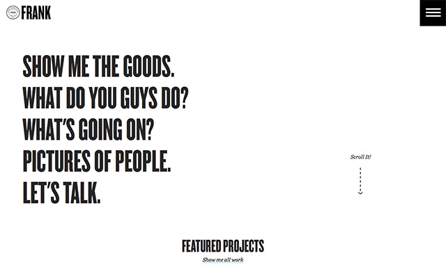
Frank Collective
Why it made the list: Really great bold typography usage, fullscreen layout and good color balance.
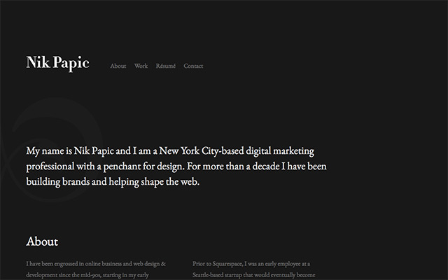
Nik Papic
Why it made the list: Typography style, simple minimalistic approach but effective and powerful.
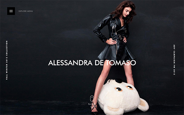
Alessandra De Tomaso
Why it made the list: Beautiful typography and great imagery mixed with parallax effects and dark colors. Interesting overlay navigation.
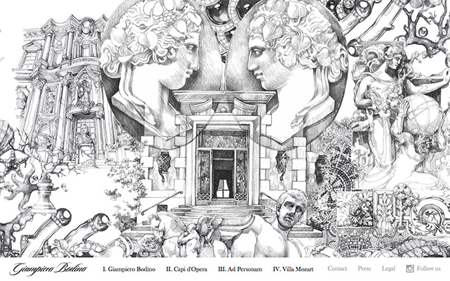
Giampiero Bodino
Why it made the list: Astonishing artwork, inspiring and unique.
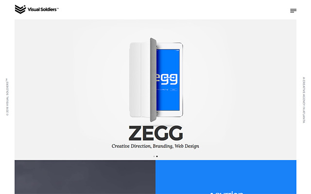
Visual Soldiers
Why it made the list: Good color balance, great product presentation and likeable typography.
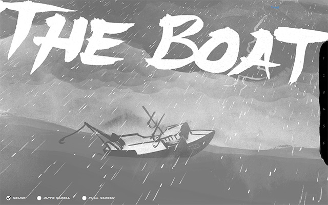
The Boat
Why it made the list: Awesome interactive website with great storytelling and amusing graphics.
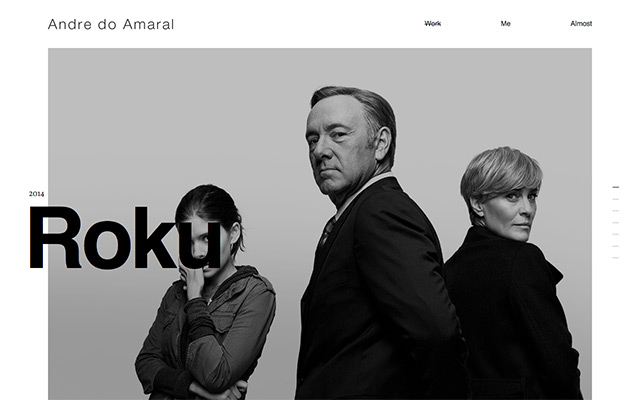
Andre Do Amaral
Why it made the list: Image slider with nice effects, huge typography and overall simplicity.
