One of the great things about looking at trends each month is catching a glimpse of what designers are experimenting with. In particular, you start to see a distinct crossover of elements that you might have missed at first glance.
That exact thing happened with this month’s collection. Note all the yellow and gold tones. Even in picking out examples of great work for other trends, websites with these hues kept creeping in.
Here’s what’s trending in design this month:
1. Yellow and gold tones
Color trends are fun to watch. Sometimes colors tend to coincide with seasonal elements or simply reflect branding, but sometimes the use of color shows the mood and feelings of the designer.
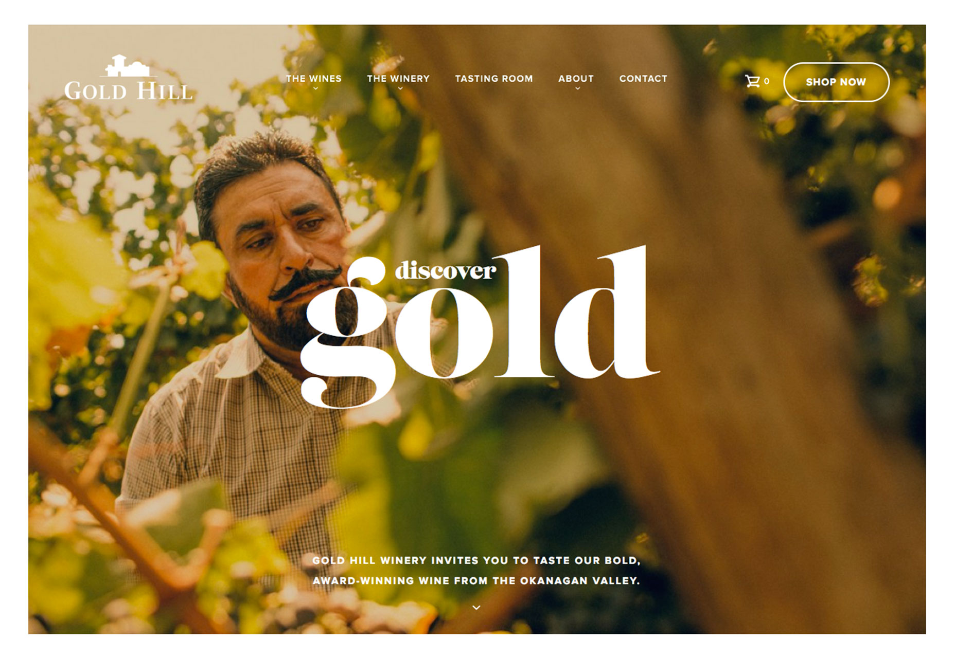
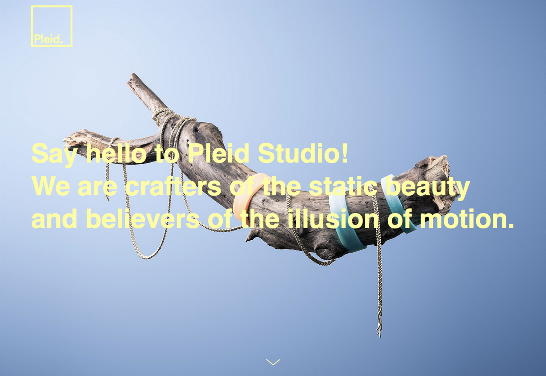
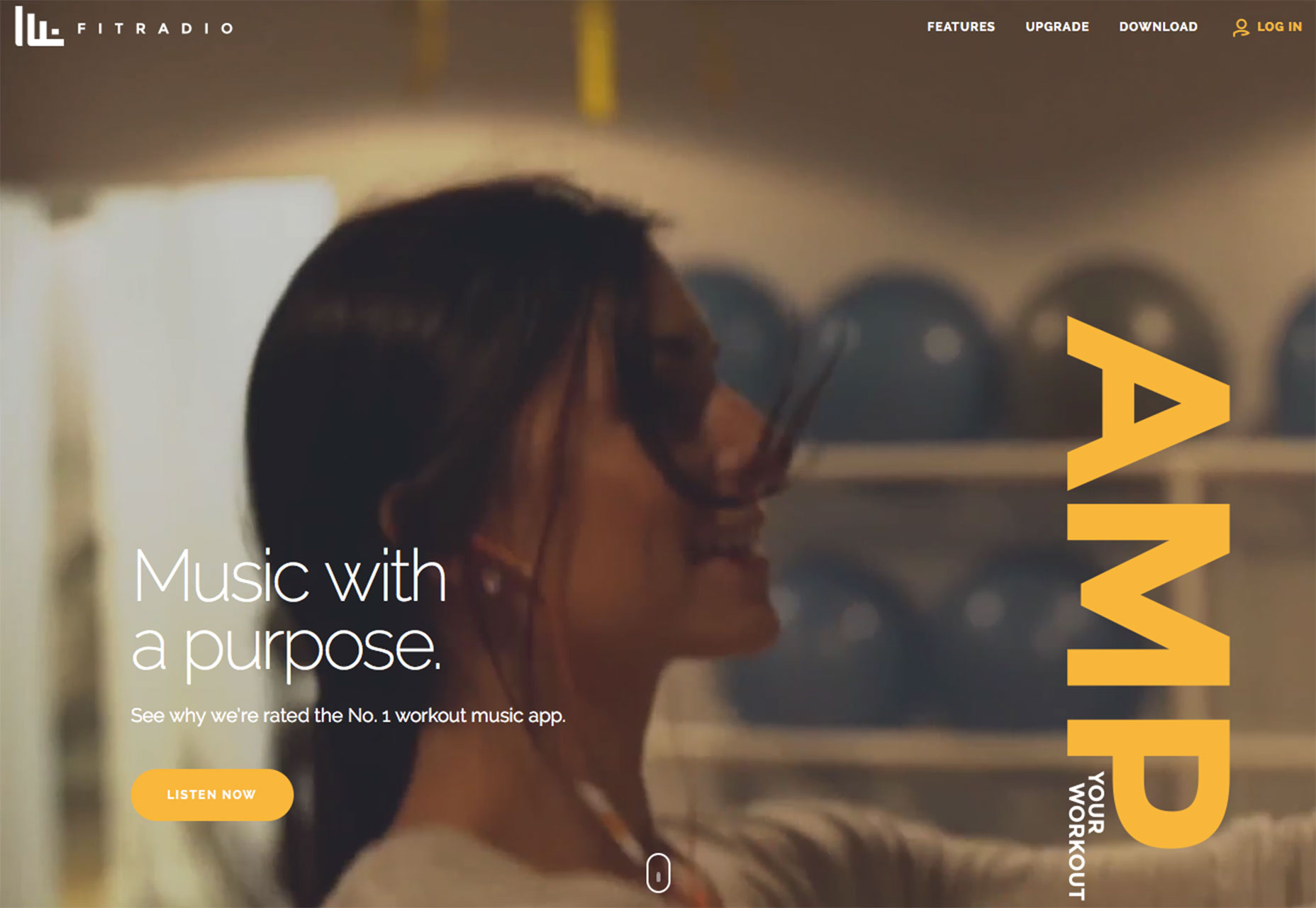
Yellow and gold tones are popping up everywhere. From full screen color wash effects, such as Gold Hill Winery, to accents or bright lettering, yellow and gold are popular options right now.
Yellow tones are a good way to set the right emotional connection to a project. The color is commonly associated with joy and happiness. It’s linked to intellect and energy. More golden tones feel special, elaborate and regal. More importantly in the context of design, the right shade of yellow can be a showstopper, grabbing user attention and providing a visual point of reference for every element on the screen.
Using this type of color palette though takes a great deal of thought. Pale yellows can get lost if they aren’t paired with another color in a way that establishes distinct contrast. (Whites and yellows often don’t mix.) Too much yellow – think Big Bird-style coloring – can have an overwhelming feel and might be too distracting for users.
That’s where the deeper yellows with more reddish undertones and golden hues come in. These yellow tones are easier to work with because they aren’t so over-stimulating. For maximum impact, pair yellow tones with a darker overall palette to create maximum contrast and impact. Consider pairing gold tones against lighter backgrounds for the same reason. Opt for a yellow tone that creates the right feeling for your design – brighter yellows are more energetic and happy, while golden tones might feel more classic or one-of-a-kind.
2. Vintage everything
The hipster lifestyle isn’t just a fashion trend; it’s connected to website design as well. One way this is manifesting itself is in the use of vintage styles for almost everything. “Vintage” design elements are having a moment right now.
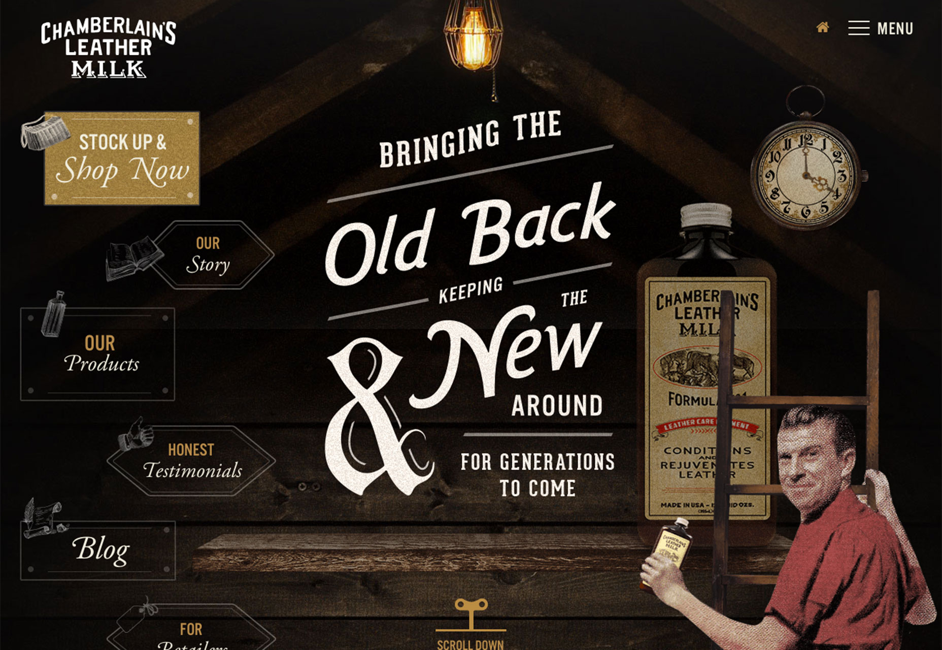
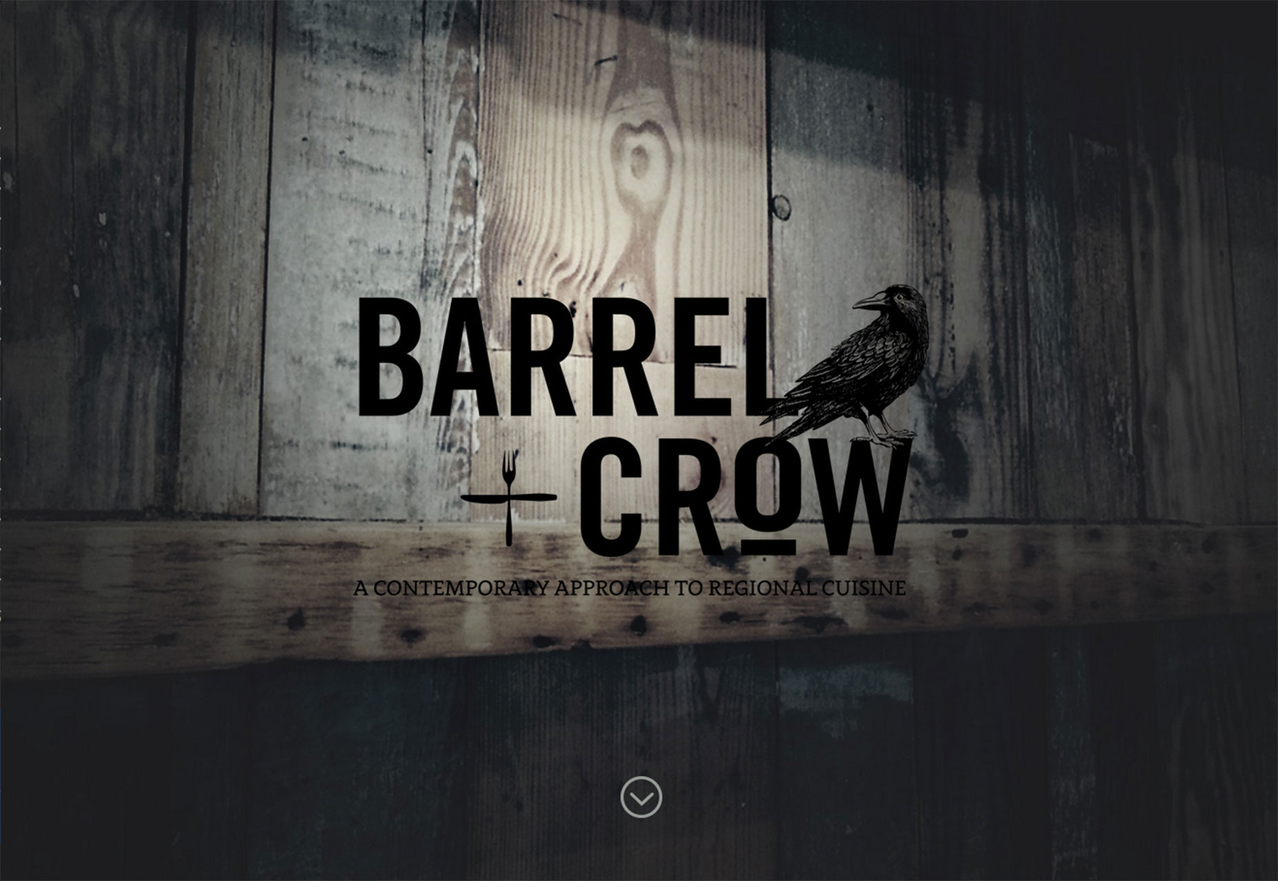
This extends to multiple elements—typography, color options, backgrounds and imagery. The vintage look might be artificially created using old-style looking elements—vintage typography styles are incredibly popular—or by incorporating elements that are actually old into the design. Look at the image of the man in the bottom corner of the Chamberlin’s Leather Milk website; he looks as if he could have been pulled right out of an old photo. The same old-style effect applies to the Barrel and Crow design with the old wood background and stark black logo style that feels like it could have been picked out of a design from 70 years ago.
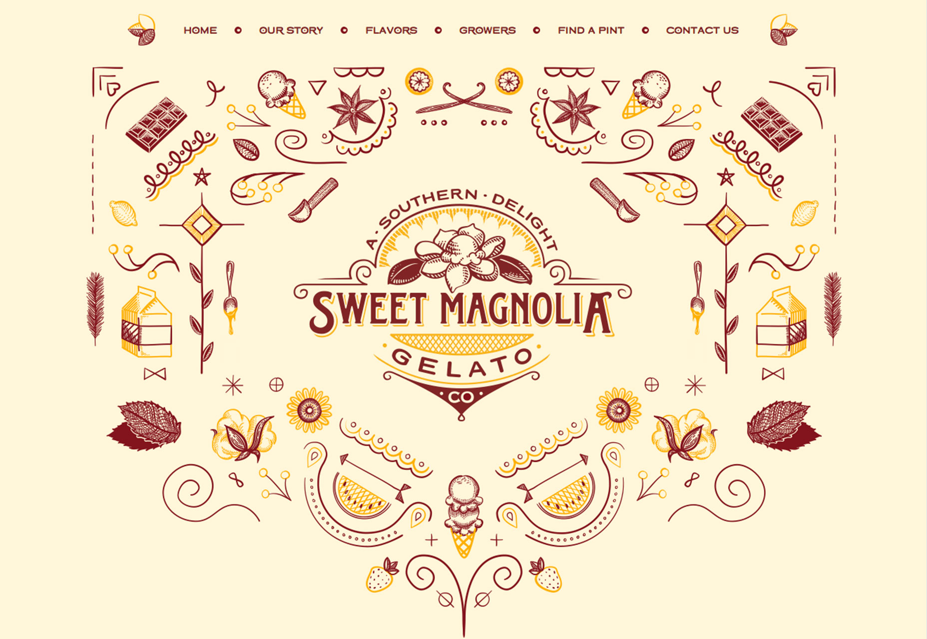
Vintage typography styles are a little more difficult to classify, but you’ll likely know them when you see them. They are often characterized by simple lettering with small, but elaborate divots. Note the small flourishes on the characters for Sweet Magnolia Gelato. The primary lettering also includes a colored offset shadow for greater impact. Other things you will commonly see with vintage typography styles are letters with light texture, such as Chamberlin’s Leather Milk, and a mix of two typefaces, one more simple and one with the more elaborate look, such as the combination for Sweet Magnolia Gelato Co. But note the imperfection in the sans serif typeface here, that small element contributes to the overall feeling of “oldness” in the design.
Now here’s the thing about vintage: It is cool for a design to look old, but it must function in a modern way. Find ways to incorporate elements with animation, parallax scrolling or video for a contemporary touch.
3. Interaction
Websites featuring elements “you can touch” continue to grow in popularity. This is a little more than interaction; it’s a more immersive interaction experience.
What does this mean exactly?
Website designers are creating unique experiences that rely on the user for movement. Moving the mouse might make something on the screen move or shift in a particular way. A flick or scroll might cause another action to happen. Overall, the user should feel as if he or she is dictating the action on the screen based on his or her physical motions. (Pretty cool, right?)
This type of interaction is becoming more and more popular. It integrates with a number of other design elements to create an overall experience that is as much about delight and feeling as information.
Make sure to click over to each of these examples as well, to see these interactions in practice. Here’s an idea of what you’ll find:
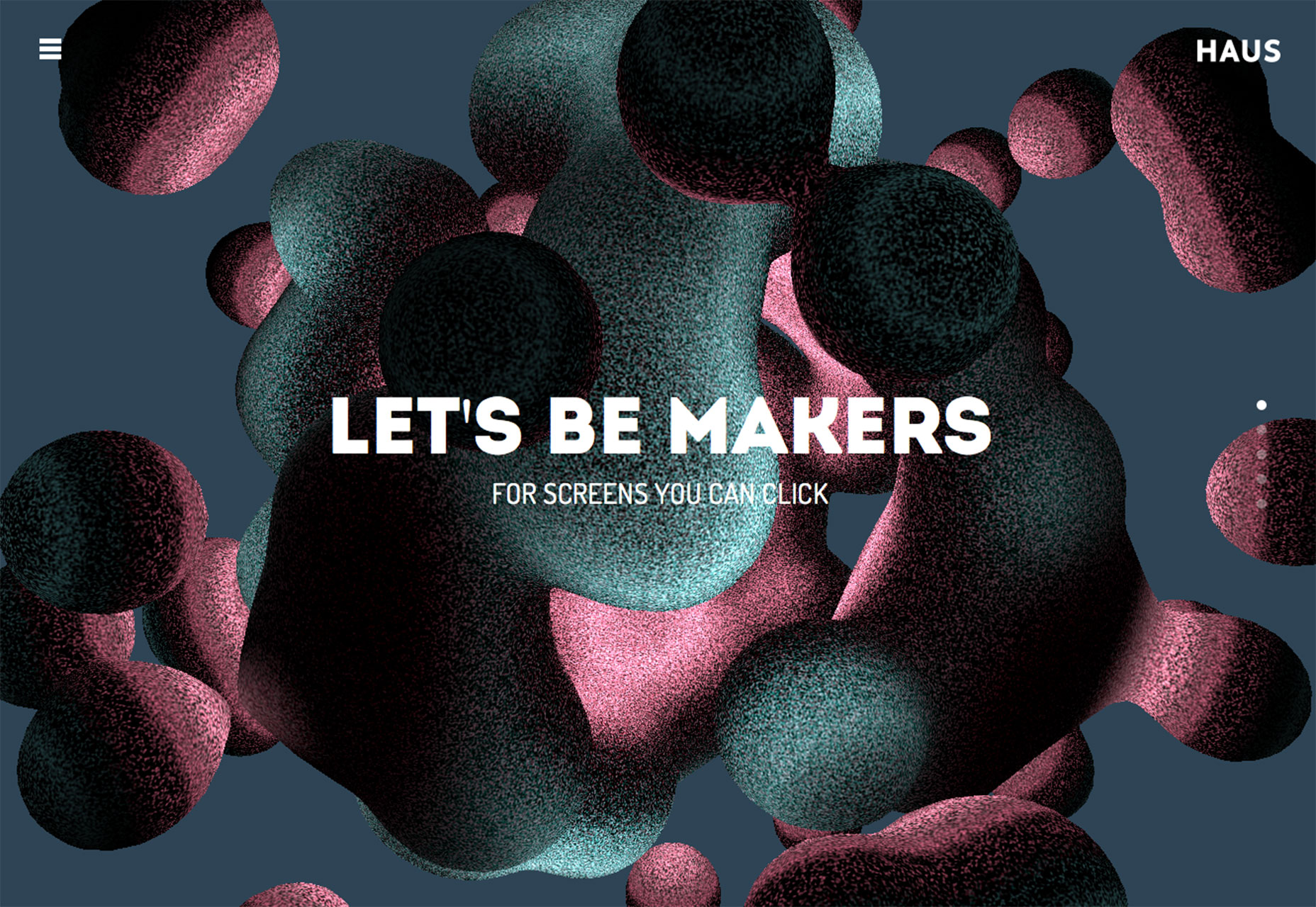
- Haus: Click anywhere on the screen and move the colored blob with a 360-degree motion effect. The animation responds to user movements while continuing its slow in-shape movement.
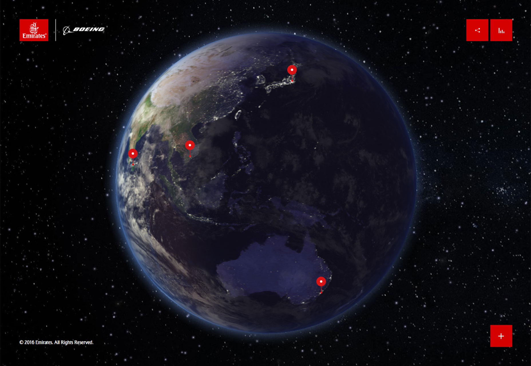
- Emirates: Use the mouse to spin the globe. The motion seems to also mimic the time and speed of the click to showcase destinations.
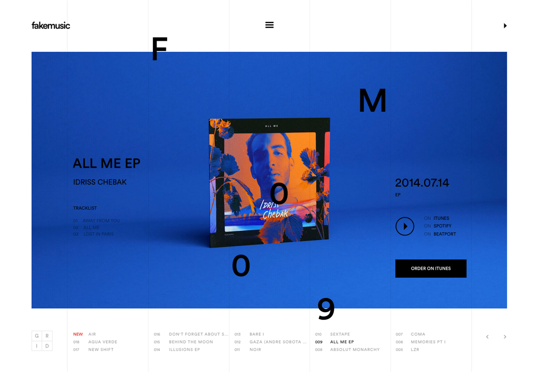
- Fake Music: Every flick of the mouse changes the featured homepage element. Click around for more animated effects, such as navigation movement, a grid style layout and options to find and buy music.
Conclusion
Now that you’ve seen all the examples, did you notice one theme that really stood out among the trends? Once seen as a color that was nearly impossible to use well, yellow and gold tones are being showcased in a number of interesting ways. The same can be said for vintage elements, which are almost everywhere.
What trends are you loving (or hating) right now? I’d love to see some of the websites that you are fascinated with. Drop me a link on Twitter; I’d love to hear from you.
