Sounds easy, right? The key to delighting users is to think like one. Don’t try to reinvent the wheel with every new design project; use tools and techniques that users like and understand to make the process a little easier and give you more time to focus on other visual elements. Today we’re sharing a few tips to get you focused on this line of thinking!
1. Personalize It
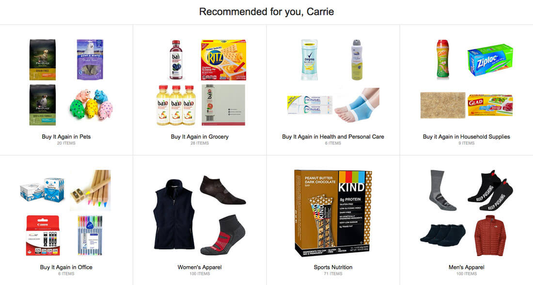
One of the biggest trends in web design is personalization. Users want their experiences to be just for them when they visit a website, play a game or shop online.
An interface that “knows” the user creates a definite wow factor. Consider some of the most visited websites in the world and how they use personalization. Amazon.com offers shopping recommendations based on purchases and viewed items, Netflix offers suggestions for what movies or shows to watch next and Twitter offers potential follows for you based on users you already interact with.
Each of these small customizations makes each user feel like the UX is made just for them. It can help increase engagement and user loyalty. And most of all, it can make users happy to be part of a certain website community.
2. Keep Animations Simple
Another big design trend can also be great for UX. Animations can delight, surprise and help users navigate through a design.
The trick is to keep animations simple. You don’t want to create movement that makes users feel dizzy or overwhelmed. Animation should have a purpose – just like any other design element – and fulfill that goal.
Ensure that your animations move in a manner that makes sense to the user. The “Illusion of Life: Disney Animation” by Frank Thomas and Ollie Johnston still provides the framework for animation today. (Get a complete introduction to animation in website design in this previous Design Shack article.)
- Squash and stretch
- Anticipation
- Staging
- Straight Ahead Action and Pose to Pose
- Follow Through and Overlapping Action
- Slow In and Slow Out
- Arc
- Secondary Action
- Timing
- Exaggeration
- Solid Drawing
- Appeal
3. Use Accepted Design Patterns
Design patterns are repeatable solutions to commonly occurring problems. Simply stated, it’s the most common way of group information and interacting with an interface, such as clicking or tapping a button to perform an action or scrolling from top to bottom of a webpage.
You want to design with these patterns in mind for most user interfaces. It’s a UX that people understand and won’t have to think about to use with ease.
Create design patterns within your design as well, using common visuals that work in the same manner from page to page. You can do this by making all call-to-action buttons the same color or placing them in the same location on the screen or incorporating cards or other container elements in to the project.
4. Give it Personality
Nobody likes a boring design. Your UX should have the same personality as the rest of your brand.
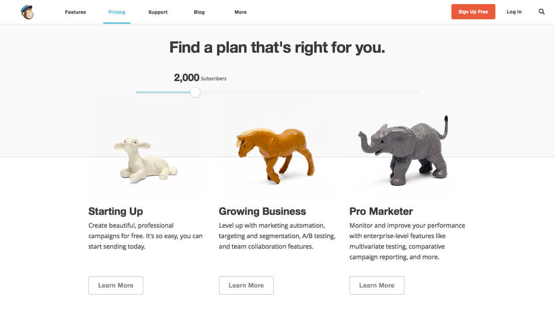
Incorporate it using microcopy and conversational cues. Not sure how to develop your UX personality? Look at MailChimp for inspiration. (They’ve got it figured out. Note how the imagery and text are seamlessly connected.)
5. Think in Screens
Users interact in screens. Whether they are looking at a website on a desktop computer or mobile phone, the experience is limited to one screen at a time. Design your projects to work in that manner.
This concept is why parallax scrolling and card-style interfaces are so popular. Both techniques create “screens” that contain a certain amount of information in an on-screen container and then help users move to the next element.
This can be a little tricky because of the amount of information that needs to be conveyed on a screen. What works as a single screen for desktop resolutions might need to be broken into several screens for handheld devices.
While customization might add a level to design planning, the end result is worthwhile for users because of the more device-centric interface.
6. Incorporate Interactive Content
Video, games, quizzes and other elements that beg for a user to react serve a purpose: To drive user engagement with the design. The more a person wants to interact with an interface the better the experience for that user.
Fun elements can make all the difference.
Keep interactive content simple and without a lot of involvement so that users can see how to respond at a glance and don’t get bored by the experience. (Remember attention spans are shorter than ever.)
7. Make it Easy and Orderly
Finally, one of the easiest ways to create a great user experience is with a design that is clean, neat and orderly. Design using a grid so that every element has a place. Think responsively so that experiences transfer from device to device.
Simplicity and minimalism are the “it” design trends for a reason. Users understand them. The visual simplicity makes the interfaces easy to interact with. A design does not have to be overly complicated to work great and make users happy.
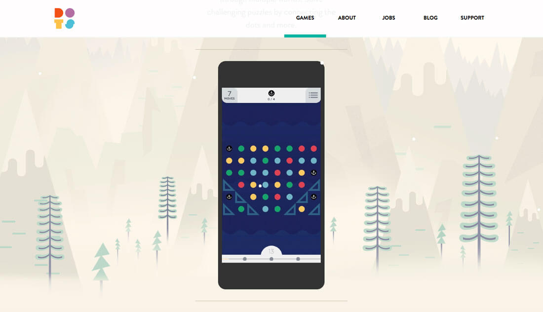
A great example of this is the game Two Dots. The Editors’ Choice game in the iTunes App Store and on Google Play is a top-played game all over the world because anyone can pick it up and play without any explanation almost immediately. The design is simple, clean and easy to interact with. There is plenty of room around elements for users to touch without making inadvertent moves in the game, and the experience is engaging on multiple levels. Single players can test themselves or share scores or challenges on social media for a more competitive style of play.
Conclusion
When it comes to UX, delight can often be tough to define. Rethink delighting users as providing an experience that users want.
A good – and delightful – UX is easy to understand, navigate and interact with. It looks great but is also usable. It does what users expect while offering a few surprises along the way. I love to see new user interfaces and play around with them; have you seen anything cool lately.
