The other day I found myself writing down a list of 5 questions I was asking myself more frequently than ever in the projects I am working on — and decided to pass it on to my team as well.
The agency life is extremely fast-paced. Each Experience Designer on my team is simultaneously involved in two or three projects, on average. You can imagine how hard it is for any design manager to keep track of all the nitty-gritty happening across so many projects. Instead of micromanaging the team and giving them instructions that are too tactical or prescriptive (“avoid using carousels”), I’d rather equip them with the right mindset so they can make their own decisions — and simply give them strategic guidance on how they can make smarter contributions to the projects they are already engaging with.
The questions:
- Is this what the project needs?
- What happens next? And after that? And then what?
- What’s wrong in this meeting, and how can I help?
- Would someone stop what they are doing to use your product?
- How can I make this (thing, UI, mockup, slide, workshop) simpler?

1. Is this what the project needs?
People aren’t always 100% confident that what they are asking you to do is exactly what the project needs at that point in time. When the project manager, or product manager, or producer comes to you asking for a sitemap, a flow, a persona document — whatever it is — both of you should have a conversation about whether that feels like the right thing to do and the right way to invest your time.
You’re the expert and the one who will be working hard on getting that done, so you need to ensure everyone is aligned on what you’ll be doing, how you’ll do it and why you’ll do it.
Ask questions and make sure you understand how this specific task fits within the broader project and roadmap. If doing that thing you’re being asked to do doesn’t feel right, push back and bring suggestions of other types of activities and deliverables that you think will be more valuable for what you and your team are trying to achieve.

2. What happens next? And after that? And then what?
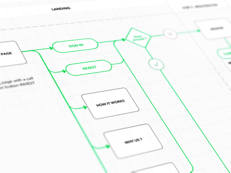
As Experience Designers, our brains have been shaped to think about experiences in a more holistic way. We are less focused on specific UI moments, and more interested in how that one moment connects to other moments in the flow, other entry points and other touch points in that brand’s ecosystem. But not everyone is trained to think in the same way.
Helping the team to understand and visualize how the entire experience will unfold is one of the most valuable contributions UX Designers can make to the project.
This sounds obvious, but seeing the big picture allows everyone to think more strategically about what you are trying to do as a team, and will avoid having designers spend time on tasks that are not entirely relevant for the broader user flow.

More frequently than ever I find myself challenging other designers and creatives to think through the step-by-step of how an idea or product feature will work.
- Where are users coming from?
- What is the first thing they see?
- And where do they click next?
- And then what happens?
Simple questions like these and encouraging the team to collectively answer them out loud will force alignment across teams and disciplines — and ultimately let everyone use their time the smartest way possible.

3. What’s wrong in this meeting, and how can I help?
Experience Designers are (or at least should be) empathy machines. All the years running user testing sessions and observing the gap between what people say versus what they do makes you flex your empathy muscles and become more aware of unspoken human behaviors.
I always ask my team to apply that same observation to the meetings they are in.
- The first step is to look around and understand: what are some of the misalignments happening in this meeting, right now? Am I getting signals that the product owner and the lead developer are not talking about the same feature? Does the marketing manager have the wrong expectation about what a feature does or how it works? Are people saying everything is a priority (which means nothing is really a priority)?
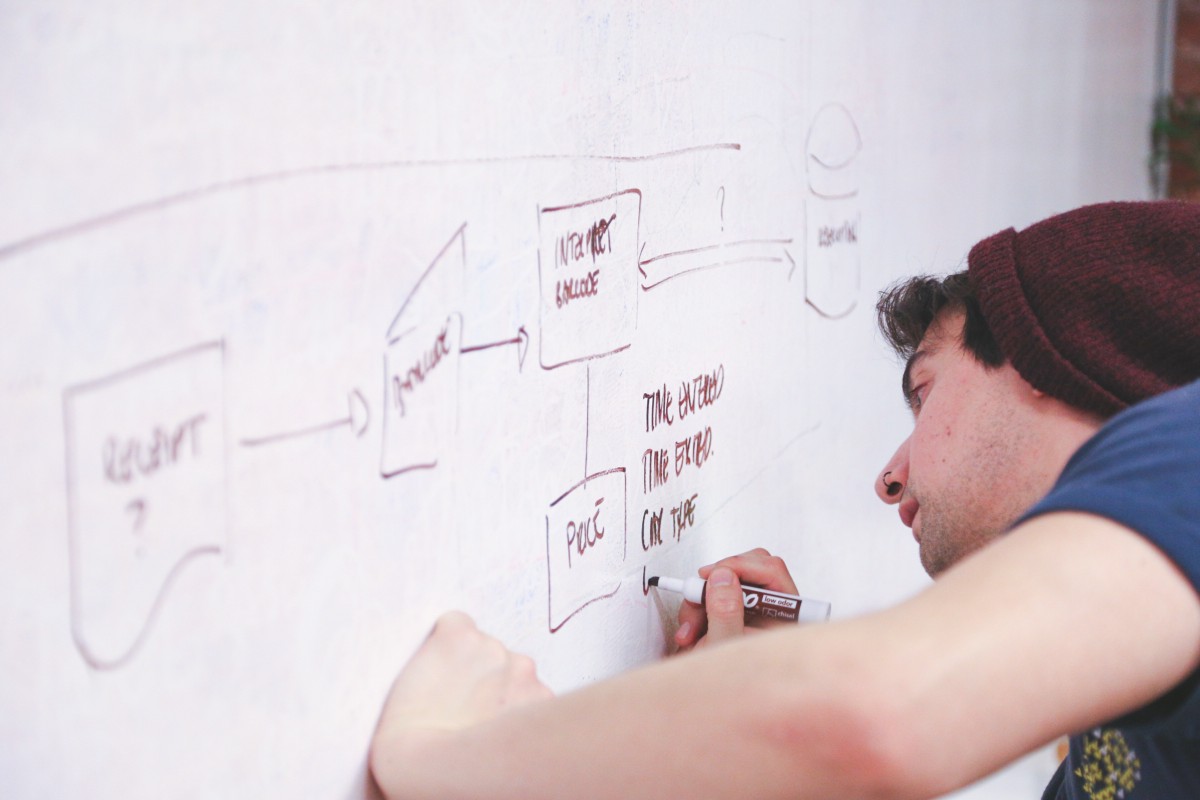
- The second step is to understand how you can help and take action immediately. Is it worth getting out of your chair and write on the whiteboard what people are saying? Would a quick sketch on a piece of paper be helpful to give people something to react to? Should we open the previous versions of the designs, to remind people that certain paths have already been explored?
The main message here is: take action.
Don’t let miscommunication ruin the meeting, and create unnecessary spin for the team. After all, as a designer you are a specialist in communicating things — make sure you use that superpower internally as well.

4. Would someone stop what they are doing to use your product?
Seriously, would they?
We’re often times too involved in the work and can get caught in a confirmation bias loop, where everyone in the room will only reinforce that that is a great idea, without ever questioning whether people would actually use it.

As Experience Designers, we are responsible for representing the user’s voice in the room. Pull up your personas and challenge your team: “Would Jane, our hard-working single mom that is not very tech-savvy, stop what she’s doing to open our mobile app?”

5. How can I make this (thing, UI, mockup, slide, workshop) simpler?
UX Designers are working hard all day to create simple, easy-to-use, intuitive experiences that people will use and love. Good design is all about simplicity, removing or combining elements to make the information more concise and easier to digest.
A designer knows he has achieved perfection not when there is nothing left to add, but when there is nothing left to take away. — Antoine de Saint-Exupery
What I encourage my team to do is to activate the same “simplicity mode” in everything they do — not only when judging interfaces.
The way you talk in meetings or present your work should be simple. No jargons. Jargons exclude other people.
If you see a slide from the Strategy team that looks messy, you should speak up and help simplify it.
If you are preparing a workshop and you feel like the agenda has too many items, narrow it down.
If you are making a list of items on a whiteboard and the list feels too long, save a few minutes at the end of the session and ask the team to pick the 5 most important things.
Simplicity should be embedded into everything you produce as a designer, not only designs.

Hope this is helpful. See you in the next post.
