Welcome everyone to February’s portfolio roundup. It’s time to fall in love with all-new work, by all-new designers. Yes, I went there.
So, when looking at this list, I recommend that you take inspiration from the good ideas, and simply ignore the bad.
All right, let’s do this…
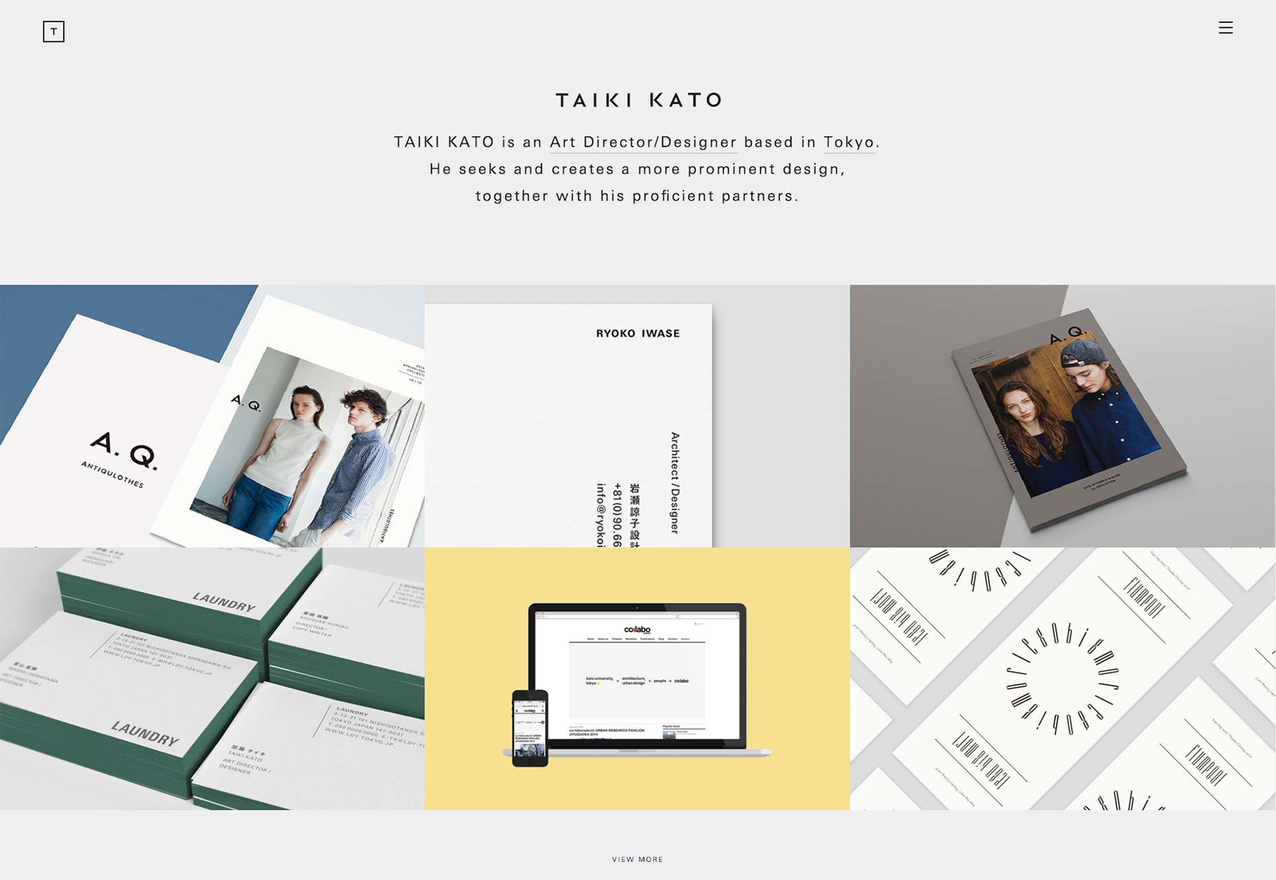
Taiki Kato
Taiki Kato’s portfolio proclaims him an art designer, and it shows in the design. This distinctly minimalist site makes exceptional use of typography, both in English and in Japanese. It’s not easy to feature two languages side by side and make it look good, but he manages it.
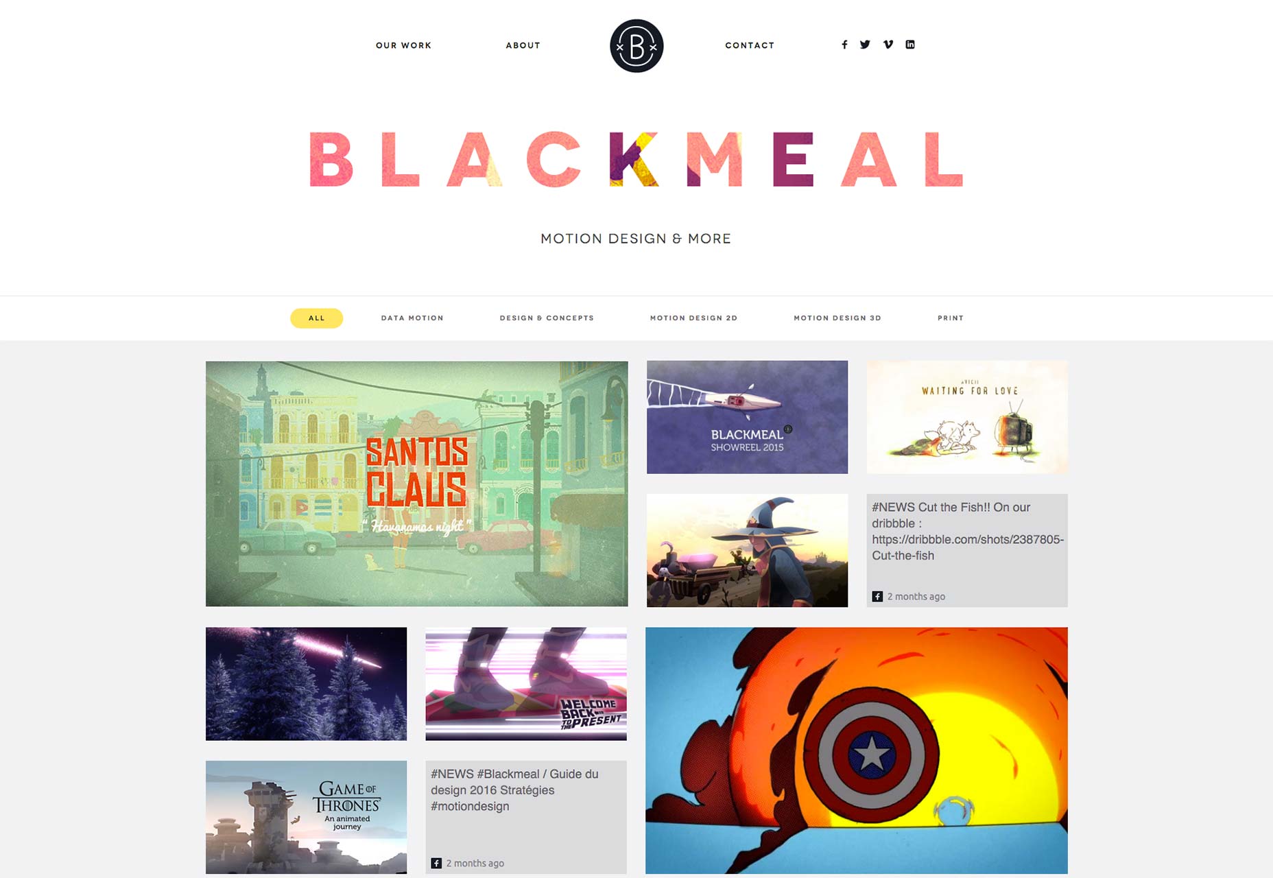
Blackmeal
Blackmeal is a studio that specializes in motion design. Like many others, they have chosen to craft a minimal design that lets their work speak for itself. With a simple design, good UX, and obvious talent to show off, Blackmeal’s portfolio is, to my mind, the best kind.
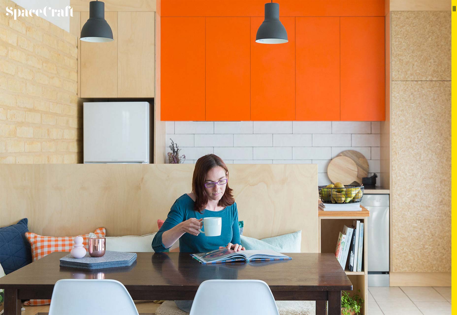
SpaceCraft Joinery
SpaceCraft Joinery showcases their furniture-building and interior design in a decidedly work-first portfolio with short, sweet case studies. They’re only a couple of sentences long, but interspersed with the chosen imagery, they make a compelling statement about the thought process behind each project.
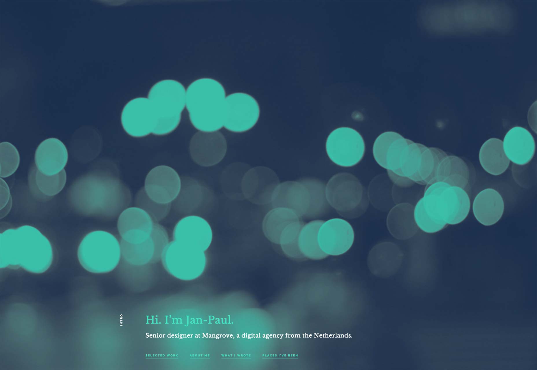
Jan-Paul Koudstaal
Jan-Paul Koudstaal’s portfolio looks great, works great, and finally does something interesting with the whole screenshot-of-site-in-mobile-device trend. Instead of using a big one for the hero image, the format is used to create medium-sized thumbnails for each project.
I don’t know how I feel about each project linking to Behance instead of a page on his own site… but I bet it’s easier for him. On the whole, it’s a fantastic one-page portfolio.
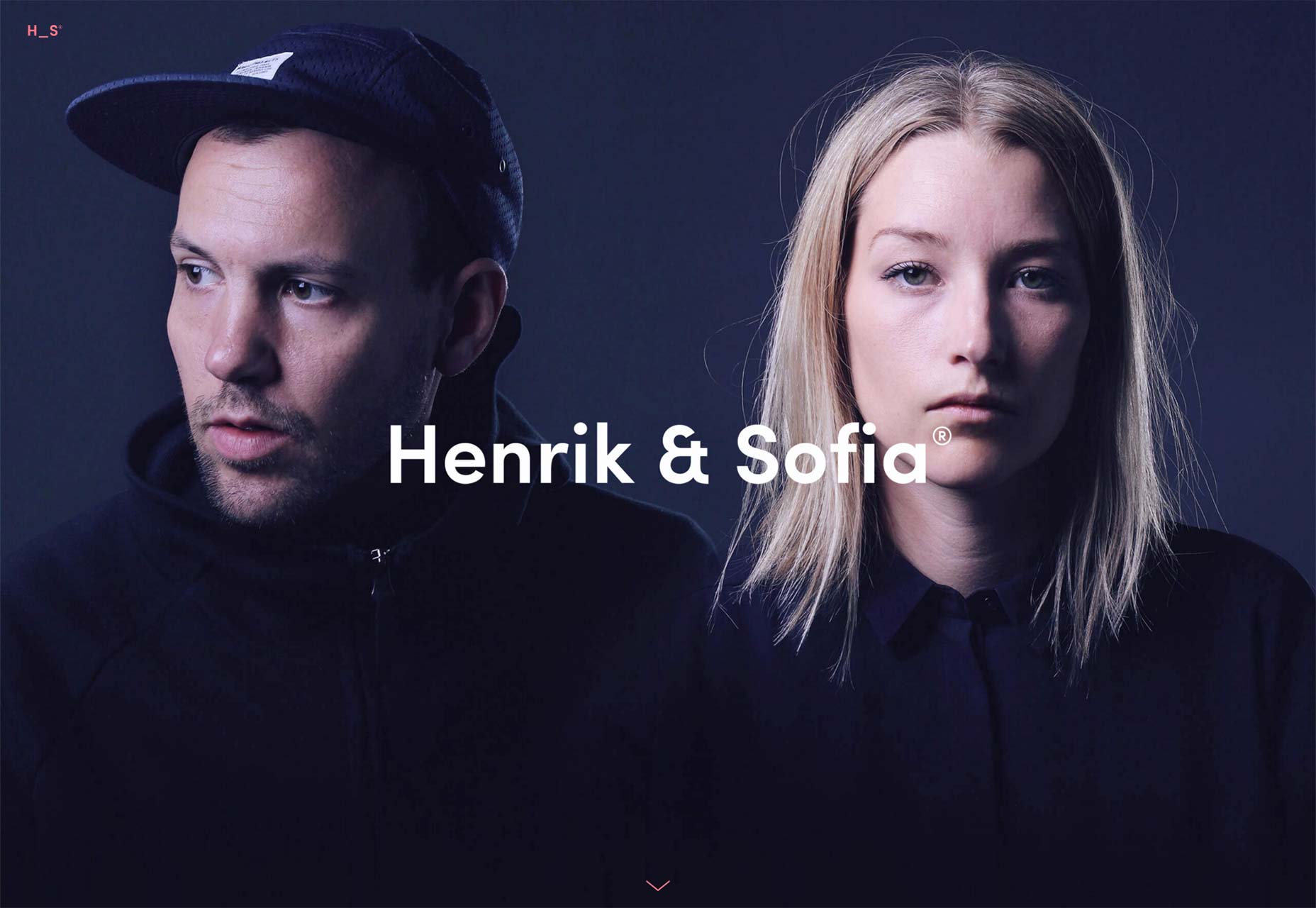
Henrik and Sofia
Henrik Leichsenring and Sofia Gillström work together as partners in a design studio. Their portfolio is a pretty fantastic example of what happens when designers workout what their style is, and largely stick to it.
The low-contrast between text and background in the “about us” section of the home page may come back to bite them, but the rest of the site is a fantastic combination of decent UX and modern style.
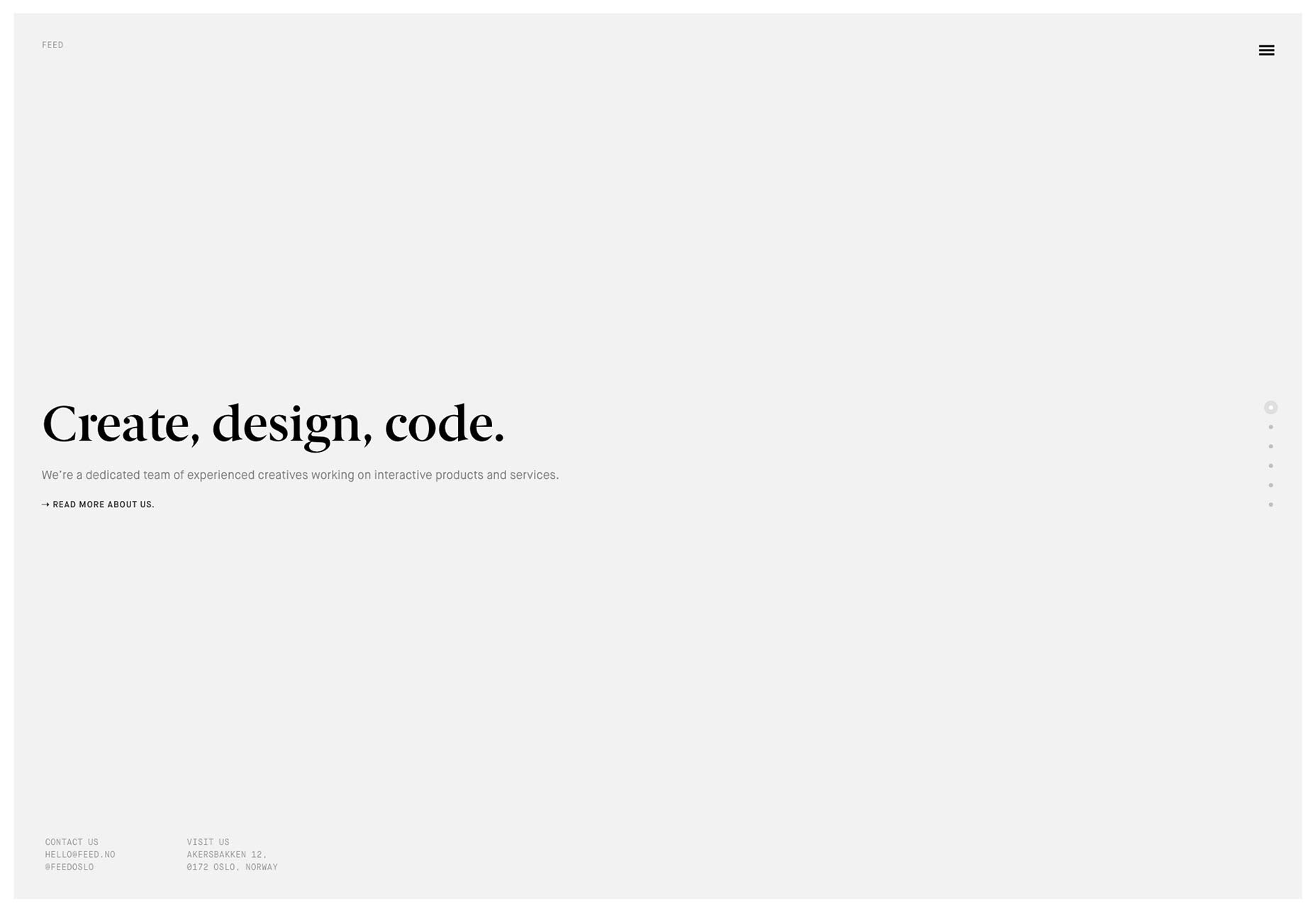
Feed
Let’s get the bad out of the way: I don’t like it when sites depend on JS for displaying content and navigation to the point that the site breaks down without it. I don’t like parallax either.
That’s why I’m surprised that I like Feed’s website so much. The parallax effect that they use for their portfolio runs fast, feels understated, almost natural. I like understated and natural. Now if only they’d fix their UX bugs.
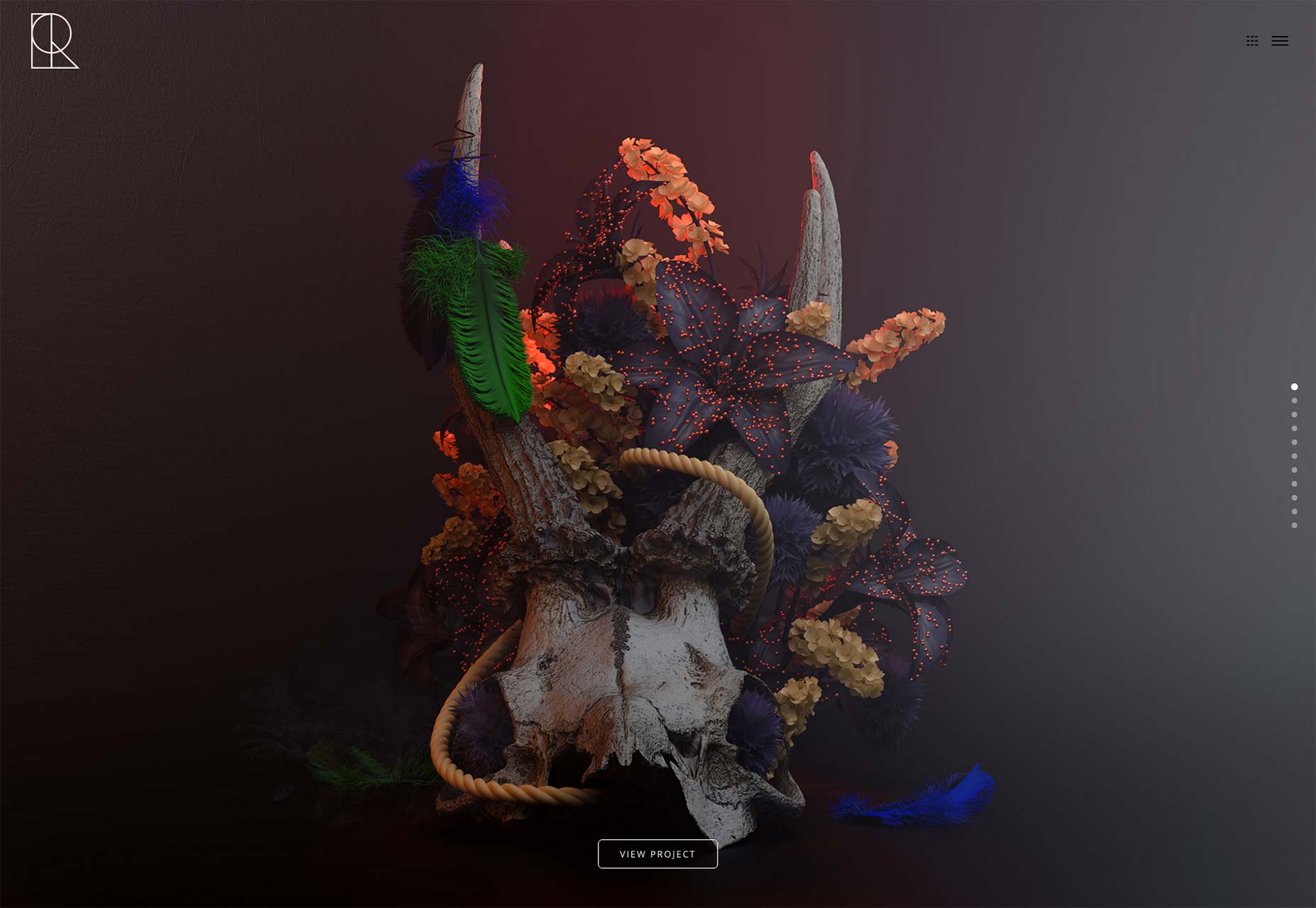
Rafael Merino
Rafael Merino’s portfolio is just pretty enough to look at in full-screen mode. You won’t find anything groundbreaking in the typography or the layout, but it all gets tied together with the imagery in a way that makes you want to scroll through every page.
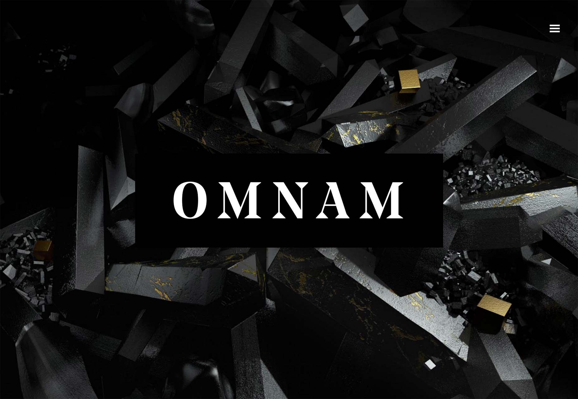
Omnam Group
The Omnam Group’s portfolio centers around their property development in a pleasantly minimalist fashion. I especially noticed their excellent use of whitespace. It’s hard to make a design featuring monospaced body text look this good, but they’ve done it.
Filip Turner
Filip Turner’s work is full of geometric design, and strong typography. His portfolio site is no different. While he follows the trend of giving the entire “first screen” to his slogan, his work is otherwise brought front and center, and then left to its own devices.
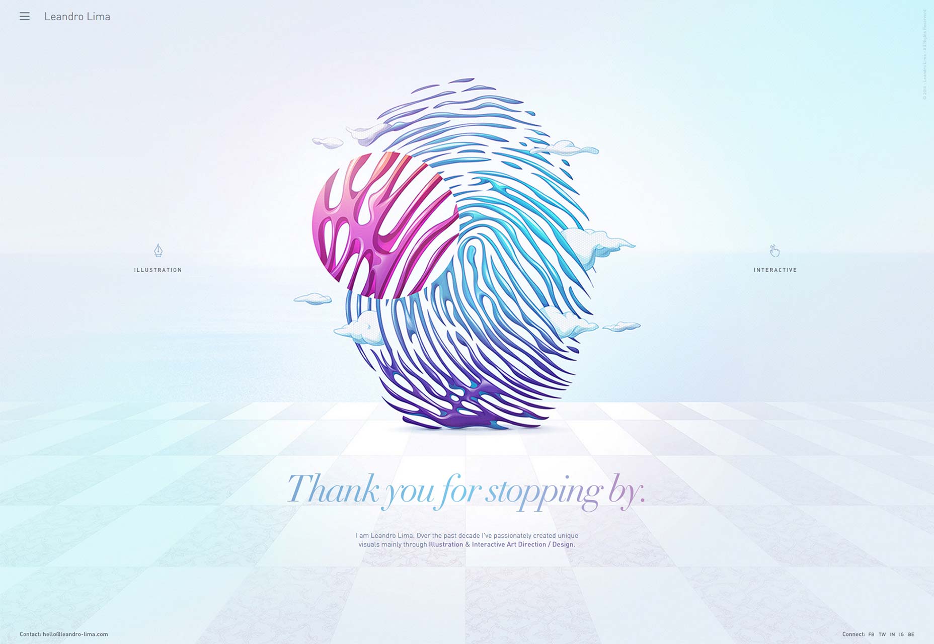
Leandro Lima
Leandro Lima shows off his illustration and interactive art direction in a dead-simple portfolio that uses strong story-telling on each project page.
Combined with a design that can truly be described as relaxing, it makes you want to spend a while just scrolling through his work. It’s almost therapeutic.
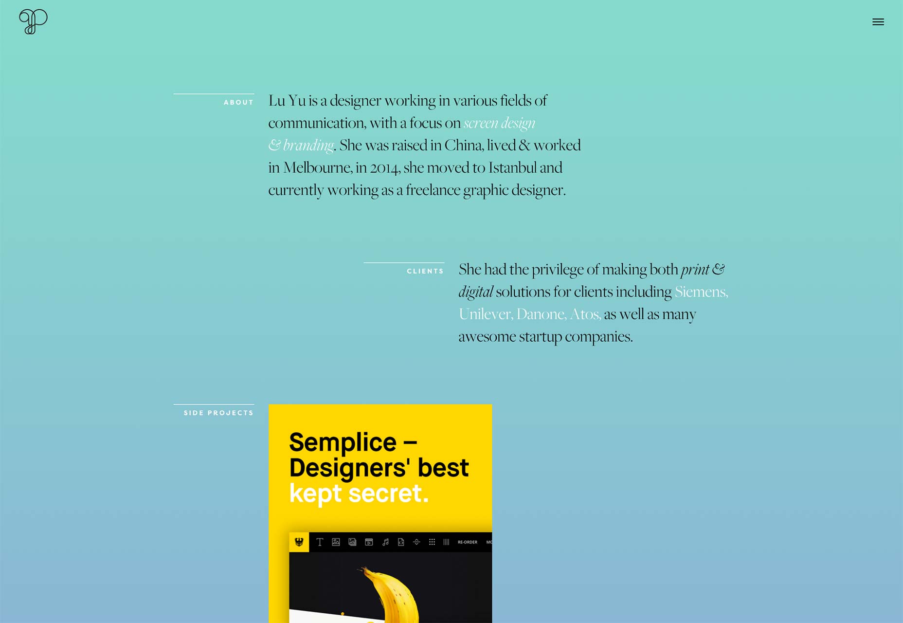
Lu Yu
Lu Yu’s portfolio demonstrates her distinct style on every page. Every page is almost like a unique work of art, with varying color schemes, and a layout designed to match the content. There’s no cookie-cutter work here.
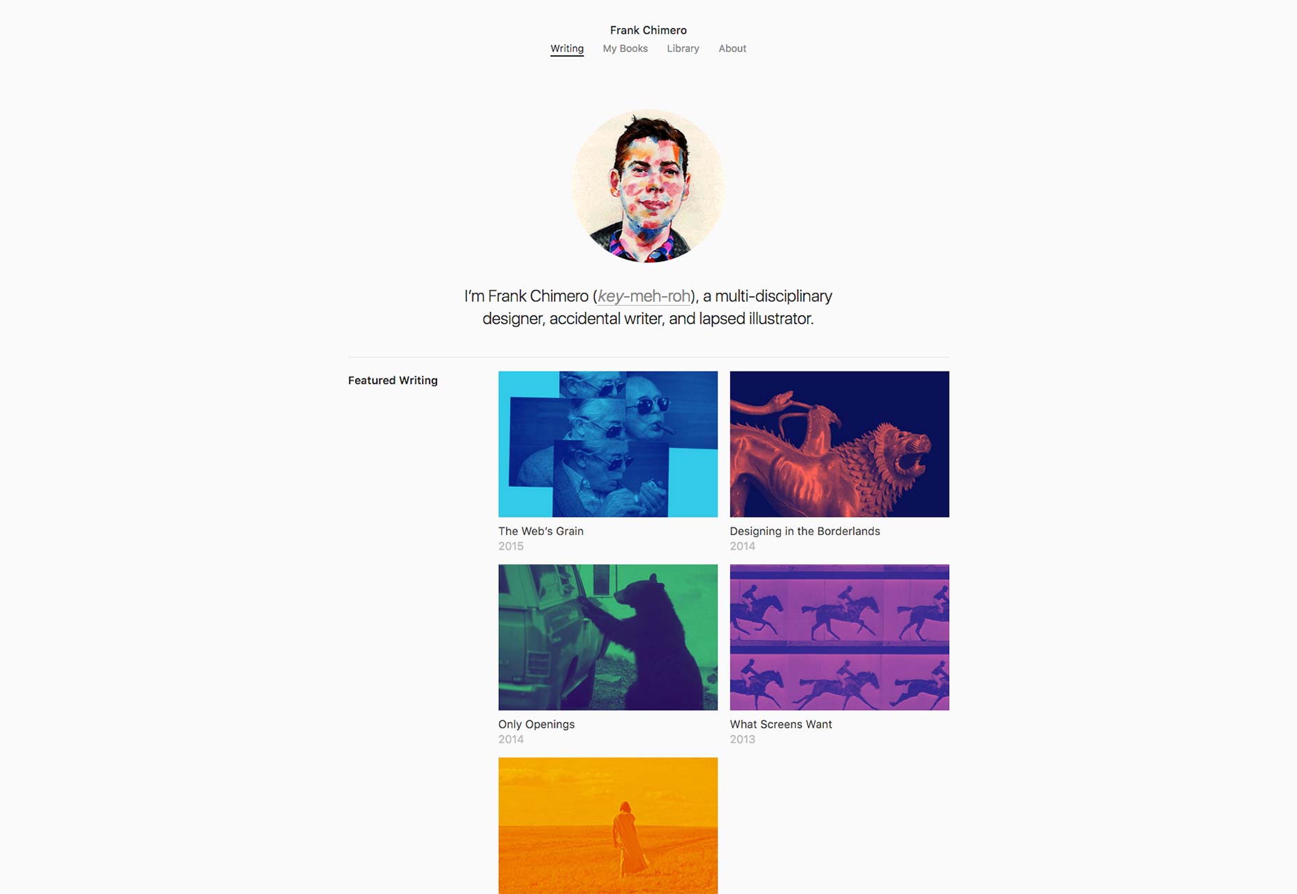
Frank Chimero
Frank Chimero’s writing portfolio does a fantastic job of showcasing the best of his work. Only his featured articles get thumbnails, though. The rest are put in a list.
I suspect that the entirety of his article portfolio is designed to help him sell his books, which is fair. With his simple, no-nonsense design, and pleasant-to-read typography, it works.
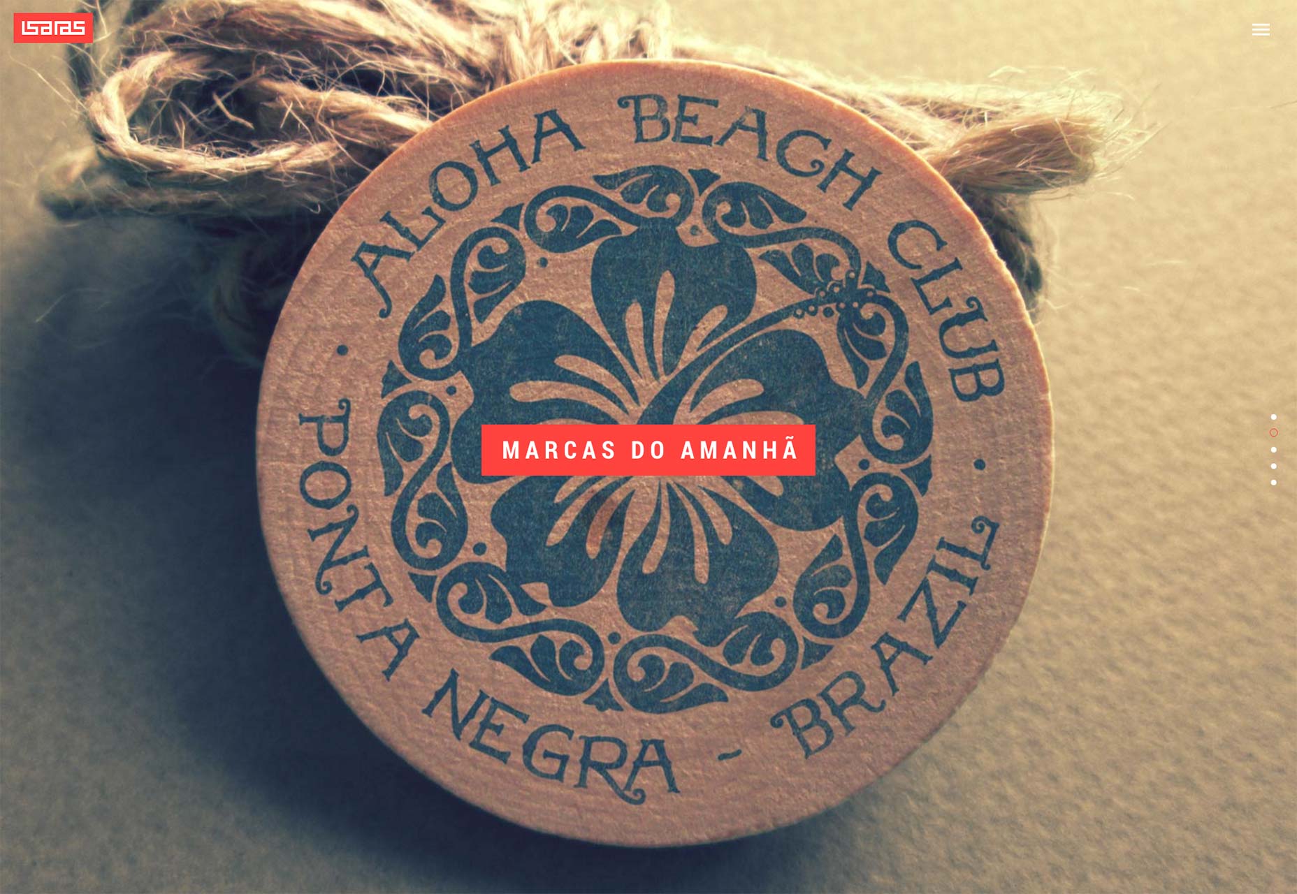
Isaias Mulatinho
Isaias’ portfolio is reminiscent of magazine layouts, but it’s very obviously built for the Web. It mixes a highly animated design with a classic dark-grey-and-bold-red scheme.
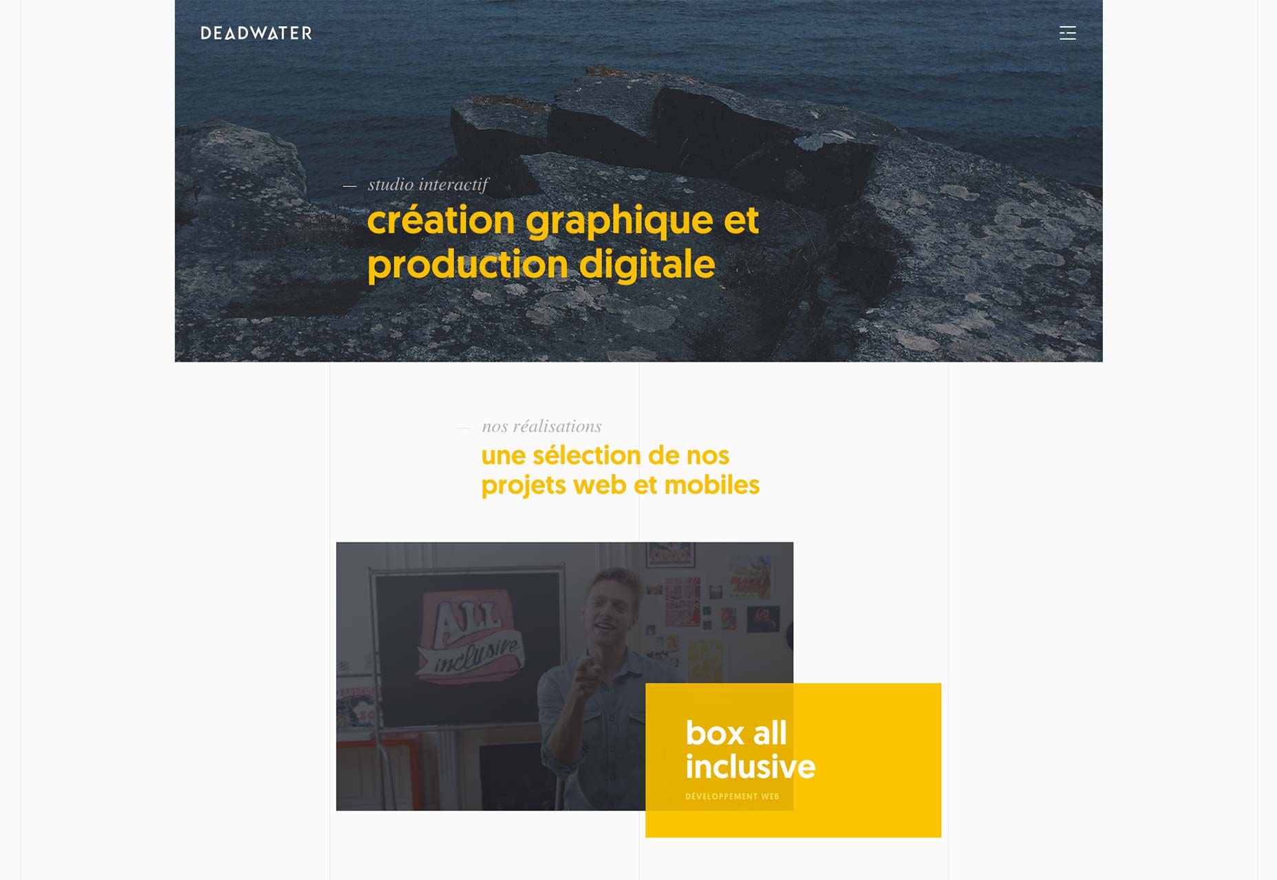
Deadwater
Deadwater’s site features a simple, though unconventional (for the Web) design. Their design is enhanced by the use of simple animations. That, and it’s just pretty.
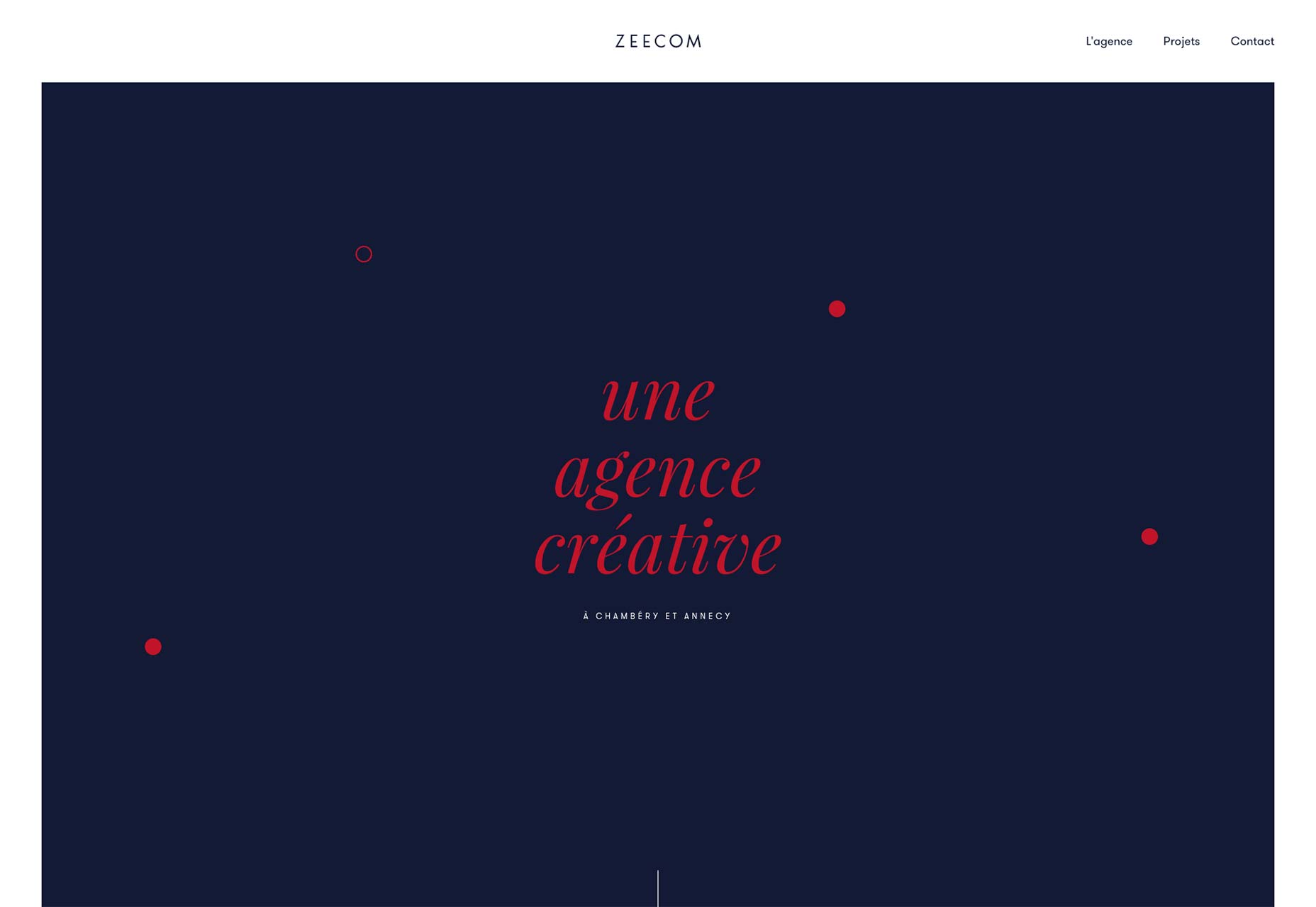
Zeecom
The design over at Zeecom seems to follow the recent trend of half-overlapping your text (and other elements) onto images, or across background colors in an asymmetrical design. While this often makes other sites harder to read, the people at Zeecom got it right.
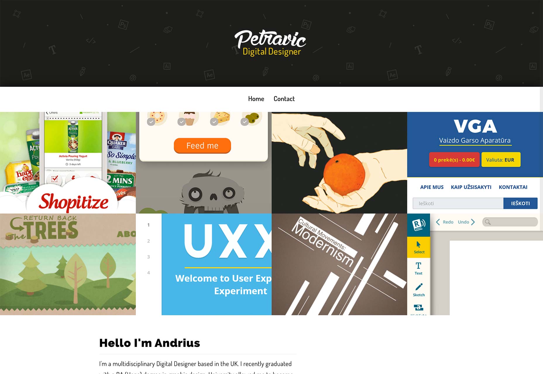
Andrius Petravicius
It’s hard to create a design that looks simultaneously playful and business-serious, and Andrius Petravicius makes it look easy. His illustration-rich design plays well with the all-business color scheme to say, “I make stuff look quirky, fun, and pretty on a deadline.”
It’s odd, but cool.
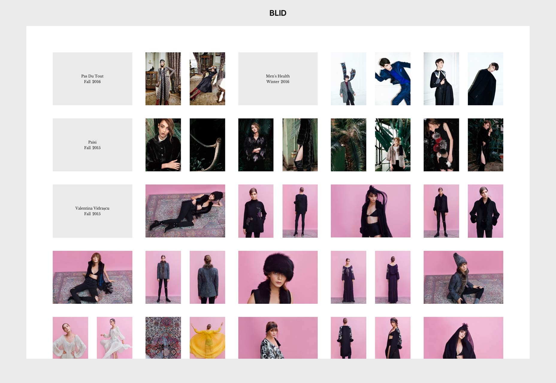
Blid
This fashion design portfolio puts the work right in front of your eyeballs from the get-go. It’s simple, pretty, and organized by fashion seasons.
The designers did make some odd choices about the way people are supposed to interact with the site, but from an aesthetic and organizational standpoint, it’s minimalism in its most perfect form.
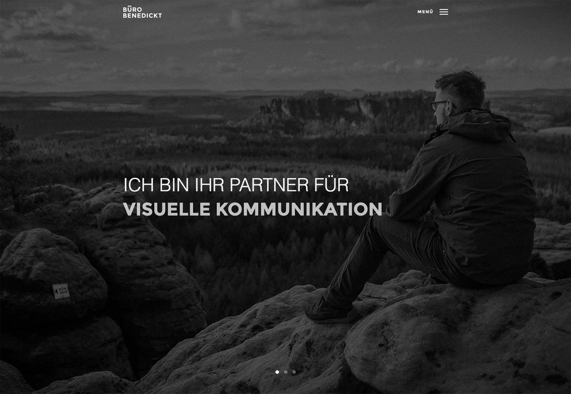
Būro Benedickt
I’m actually a huge fan of monochromatic designs, but they’re hard to pull off. With no color to help you out, your layout and typography had better be fantastic. This one pulls it off, though there is actually some color, in the portfolio section, which is appropriate.
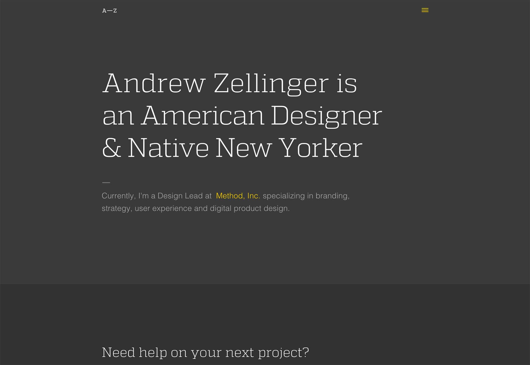
Andrew Zellinger
Andrew Zellinger went with the classic big typography, big images, no subtlety approach. Hey, why mess with a good thing, if it’s still working?
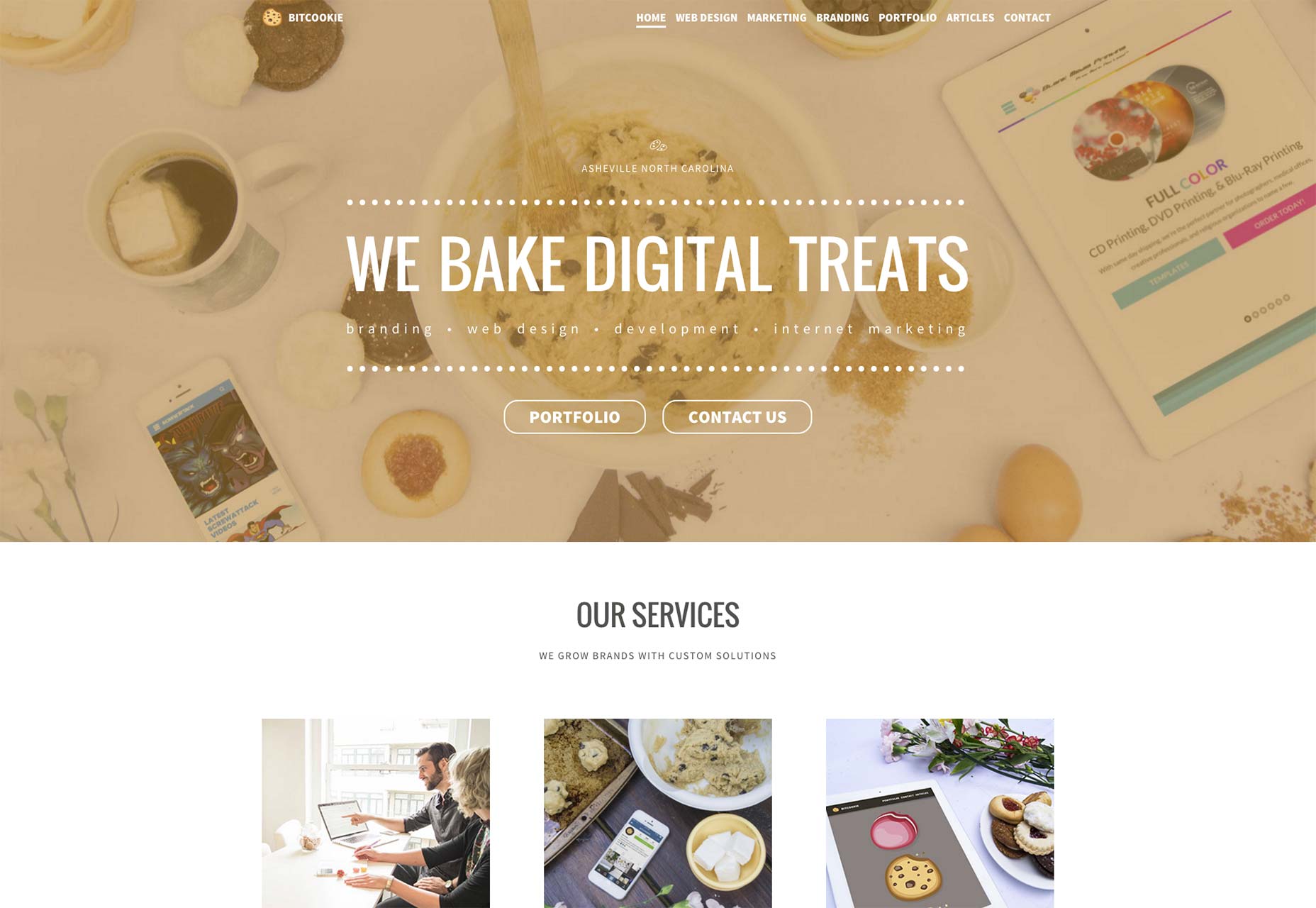
Bitcookie
Bitcookie almost feels like a throwback, in terms of site structure and imagery. Half their navigation links are about their services, and you have to click through to see their portfolio. It’s not hard to find, but it bucks the trend of putting your work right on the front page.
Bitcookie also seems to do a little bit of everything, and this is reflected in their imagery. They’ve got photos, screenshots, illustrations, and some images that are definitely stock. Despite all that, it works. It could easily have come out cluttered and disorganized; but Bitcookie’s site feels professional, imparting a feeling of trust.
That’s impressive.
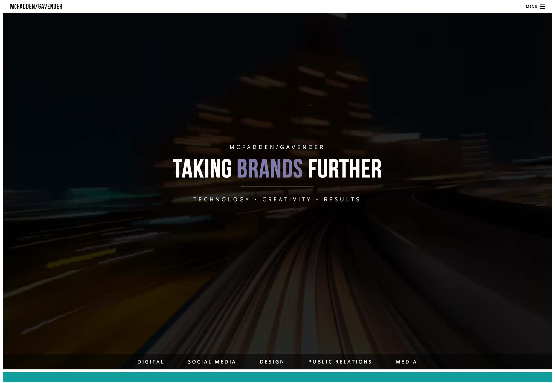
McFadden/Gavender
McFadden/Gavender’s site is an excellent example of simplicity as opposed to minimalism. No one would accuse their site of being complex, but it feels “full”. There’s lots to see, but you’re not going to get lost.
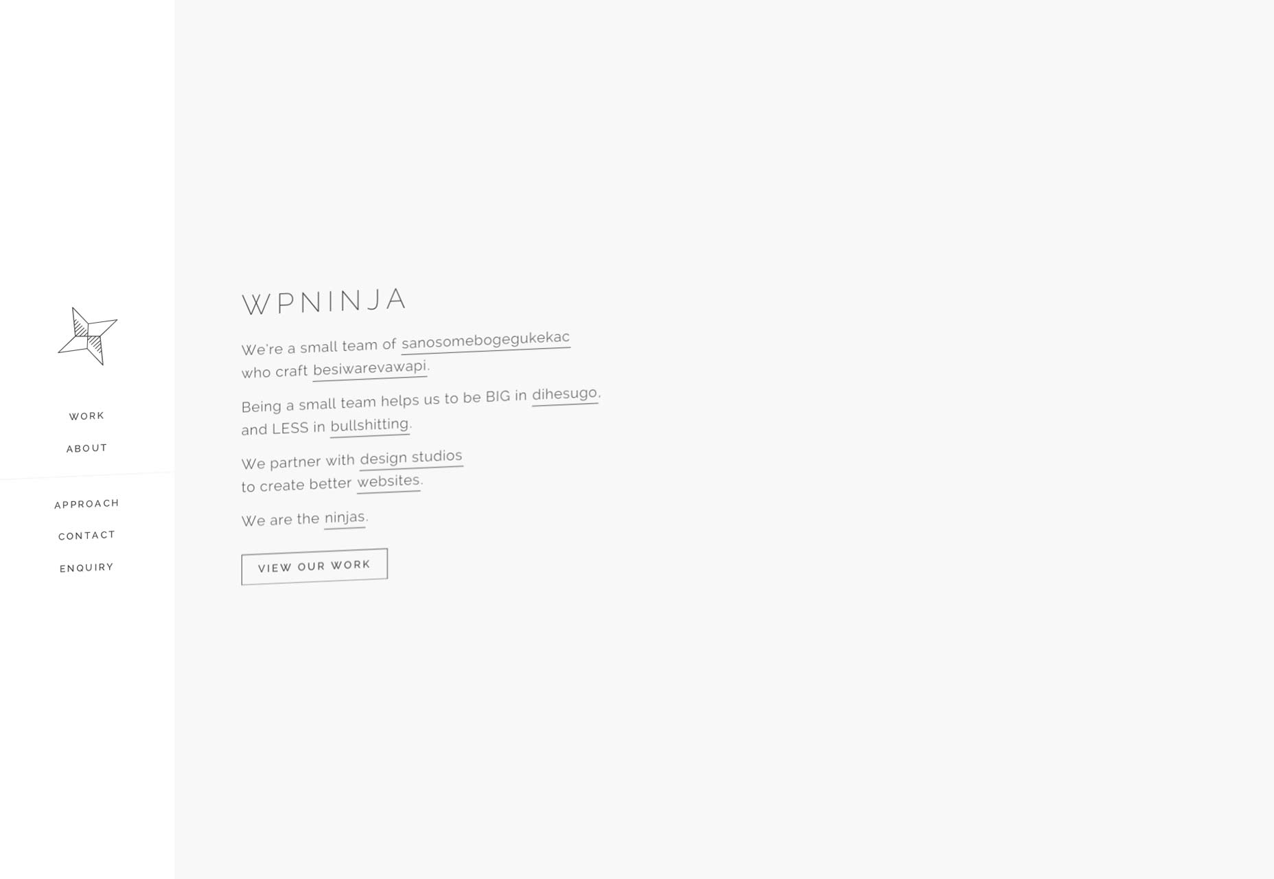
WP Ninja
I’m a bit envious of WP Ninja because their site effortlessly pulls off something I’ve been attempting to create for years: a good looking “tilted” website. Every element is set at an angle, and it looks good.
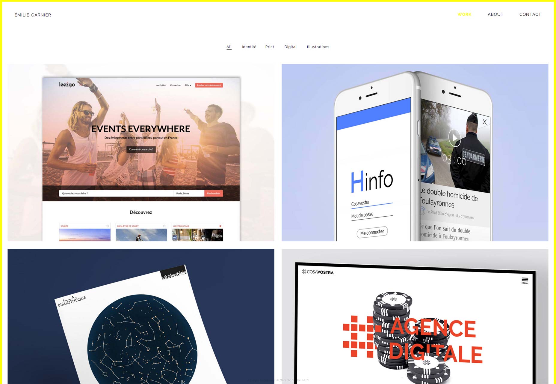
Emilie Garnier
Emilie Garnier’s site is simple and pretty. Nothing revolutionary here. Just a site that looks good, works great, and introduces you to the Emilie’s elegant sense of style from the get-go.
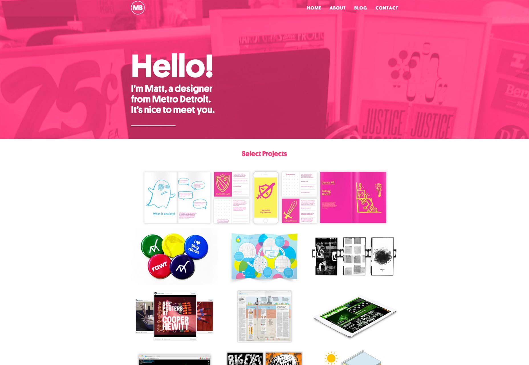
Matthew Bambach
Matthew Bambach’s portfolio is boldly accented, perhaps saturated, with hot pink. Sometimes you’ll see hot pink around in different places, accompanied by dons of dark grey to balance it out.
Matthew put the site’s pinkness front and center, and it works for him.