It seems like some of web design trends aren’t going anywhere soon. We’ve seen Material Design initiation and evolution, advanced animations and microinteractions, vibrant color schemes, beautiful typography, great use of minimalism, new responsive design technique and tools and much more interesting stuff. We also noticed a new trend that is making its way through web design community: diffuse shadow design.
To better understand and analyze this hot design trend, we’ve comprised a list of 10 fresh UIs with diffuse shadows. Let’s have a look:
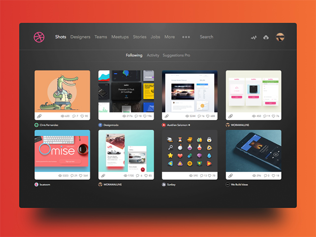
Dribbble shots UI by Worawaluns
IKEA Get Growing! by Jason Zigrino
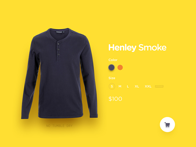
Customize Product by Goutham
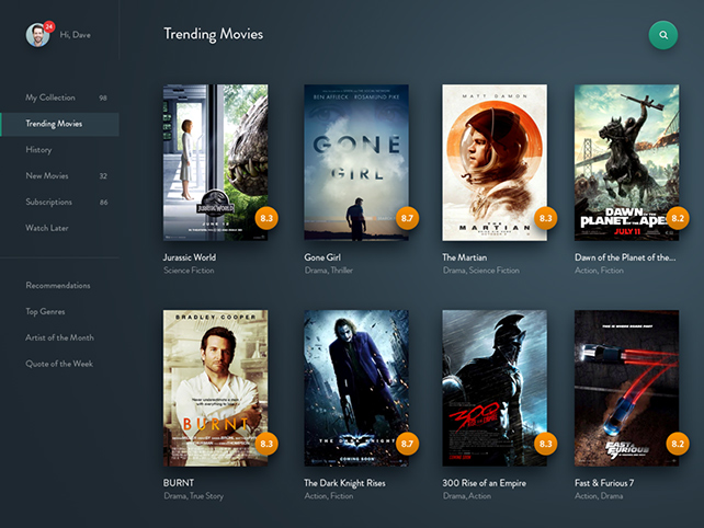
Movie Streaming by Dwinawan Hariwijaya
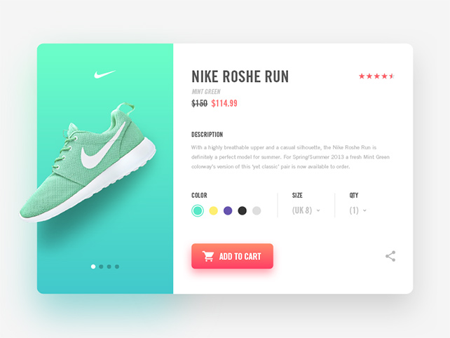
Nike Product Page by Ilja Miskov
Calling Card by Willionaire
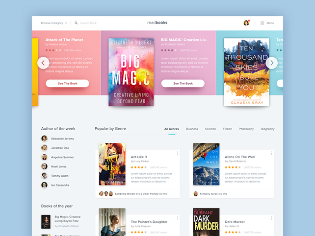
Book Store Website by Dwinawan Hariwijaya
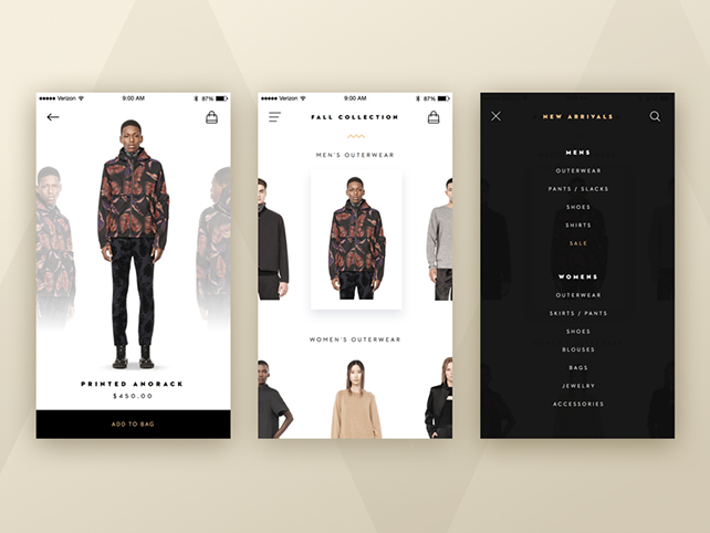
Fashion App by Willionaire
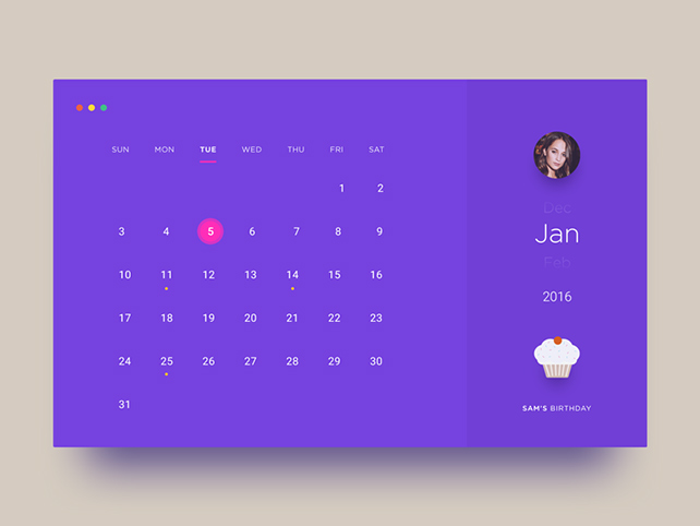
Calendar by Goutham
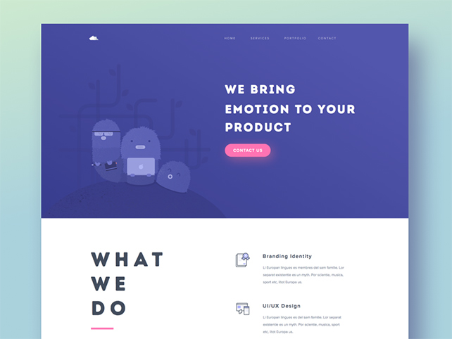
Paperpillar Studio Landing Page by Ghani Pradita
Have you spotted some other cool examples? Let us know by inserting a link in the comments. Cover image source.
