Web usability is an approach to make web sites easy to use for an end-user, without the requirement that any specialized training be undertaken. The user should be able to intuitively relate the actions she needs to perform on the web page with other interactions she sees similar contexts, e.g., press a button to perform some action.
Usability is a combination of factors including:
- Intuitive design: a nearly effortless understanding of the architecture and navigation of the site
- Ease of learning: how fast a user who has never seen the user interface before can accomplish basic tasks
- Efficiency of use: How fast an experienced user can accomplish tasks
- Memorability: after visiting the site, if a user can remember enough to use it effectively in future visits
- Error frequency and severity: how often users make errors while using the system, how serious the errors are, and how users recover from the errors
- Subjective satisfaction: If the user likes using the system
Why is usability important in website design?
The importance of usability when designing a website is huge.

Obviously, people use the web with a specific purpose. Online space is not like a TV program, which can be watched just because. Most of time, users go online to look for information, communicate with others, or buy something they need. It is our task to make sure they’re actually able to do it.
Usability, combined with the visual appearance of the website creates the user experience (UX). Translated to mathematical terms, we need to find and establish symmetry between these components, in a way which will not give priority to the one over the other.
Doesn’t function come first? Actually, it does. Not because it is more important than appearances, but because it represents the entire purpose of our online presence. Proper combination of both will assure users you’re presenting them a professional brand, which offers nothing but a flawless experience.
Then, optimal usability depends on the complexity of the process-if your design elements are easy and intuitive to use, and they comply with an already established standard, you’re on a good way to create an understandable visual language and to ensure excellent communication.
User experience is not something we ‘design’
Designers nowadays pay more and more attention to user experience, and they interpret it as the particular part of their work which can delight users. Obviously, the ultimate purpose is to make users love the website, but there is still certain confusion concerning the impact of design on user experience.
To start with, many designers misinterpret the term; and they believe they could enhance the quality of UX with modification of their design elements.
How to plan for usability
Many designers ask themselves when is the best time to plan for usability and that is a question with a really simple answer, right before everything. All your answers to questions about purpose and audience will shape the layout of the site.
You have to take into account a few ideas and ask yourself a few questions. For example, why do you want a website? What do you want to do with it? These are important because an e-commerce website will most likely look different than a portfolio one. You should clarify your goals before beginning to design your site.
After that, you should think about your audience. Targeting everyone is stupid. You have to target a specific group of visitors and create your site layout in such a way to make it easier for that group of people to navigate.
Designing a site
The easiest way to sketch the overall site schematic is on a white board. I always enjoyed at the office that we had one of these useful tools. Don’t have a white board? No problem, use sheets of paper. The process is the same.
- The navigation bar should be the starting point. Try to organize the buttons in order of importance from top to bottom or left to right, depending on your site design.
- Try to be concise and decide what content you will put on the pages before actually creating them. Eliminate any pages that the visitors won’t want or that don’t have interesting information to them
- Less clicks, more conversions. Make sure your visitors won’t get lost in content trying to find what they are looking for by putting links on the homepage towards the most important pages.
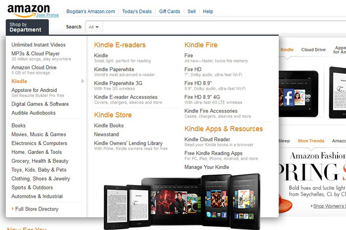
- If you have an information-rich site, create multiple navigation bars or mega menus. This will make it easier for the visitor to get quicker to what he is interested in.
-

Image source: amazon.com[3]
- Make the menu stand out so that it can be noticed easily. You can do this by making it of a different color, or surround it with a box.
-

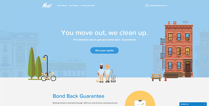
- Use colors that reflect the content and identity of the site or product showcased. If the site or product doesn’t prefer a certain color palette, you’ll have to choose them, but be aware that red and yellow build excitement, blues and greens are calming and you should use a dark body text on a white background to make it readable.
-

Image source: thisisneat.com.au[5]
- Make sure you choose the color palette with your target audience in mind. It is known that men prefer blue and orange, while women prefer yellow and red. Young people will like bright primary colors, whereas middle-aged and old people will like pale colors.
-

Image source: Bethany Heck[6]
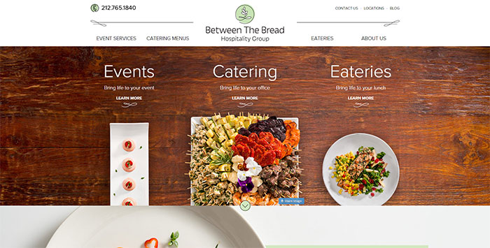
- As I mentioned before, readability is really important. You should choose a font that is suitable for your audience and make sure it is readable. If a visitor starts to read a sentence with difficulty, after a paragraph will exit your site and look at your competition instead. Also, there must be some space between paragraphs, a simple detail that is really important
-

Image source: betweenthebread.com[7]
Designing individual pages
Designing the overall design is only one step of the design process. A lot of people think that if you managed to do that, your work is almost done. Far from the truth. Designing the individual pages demands a lot of attention to details. Here are a few tips on how to make your project better.
- Use short sentences (15-20 words) and short paragraphs (3-5 sentences). A lot of people may be lazy readers, but they still are possible clients
- Keep articles on one page. I always hated websites which split articles in two or more pages. A lot of admins are doing this to get more ad impressions to squeeze money from advertisers. This is plain stupid. You will end up losing visitors and advertisers with this move.
- Break up long articles by using descriptive headings. Also, you should use numbered or bulleted lists for easier skimming.
Details that many designers ignore
Till now we covered the basics which every web designer should know and should not forget, but there are other techniques which give you an advantage in front your competition and which it is likely that you haven’t thought of, but as soon as you will read them you will agree that this is the best solution:
Develop precise objectives
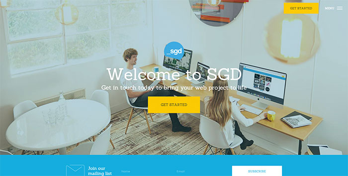
Image source: sgd.com.au[8]
You need to have a clear purpose for designing a website: Why would people visit it? What would be their objective?
Think about it and organize content accordingly. Forget about ego and personal priorities and adjust the style to your users’ expectations. For instance, ensure confidence, speed, and convenience; and provide information about your brand in a consistent way.
Successful designs are usable designs
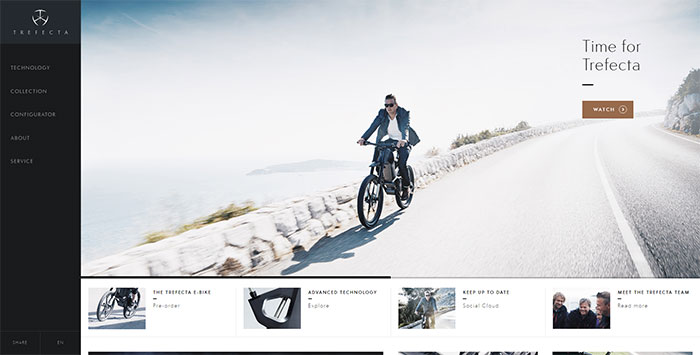
Image source: trefectamobility.com[9]
Beauty comes from the inside. Or at least, that’s what some designers say! According to them, beauty is superficial in nature; and its power is highly limited. What really matters is the content of a website, while appearances never go deeper than the very surface.
It is up to you to decide whether to trust this. We would say that websites are, after all, virtual products; and that beauty is an absolutely necessary first step to attract attention towards the ‘inside’. However, breathtaking appearances are not so difficult to achieve and users will not keep their initial fascination is you fail to produce ‘the better is yet to come’ feeling.
What does good design mean?
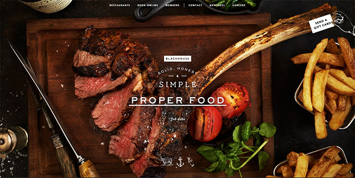
Image source: blackhouse.uk.com[10]
Within the balanced combination of aesthetics and usability, usability is more important for the quality of your design.
Good design usually looks beautiful; and it is obvious that the designer worked hard to achieve it.
However, appearances would mean nothing if there is no usefulness to support that image and to keep users on board for the entire experience.
After designing: usability testing?
Yes, that is important too. Testing your own site for usability is like trying to find corners in a circle. You will be tempted to think that it’s the best possible design, but your opinion is not that important, the clients matter most.
You have to be aware that big businesses spend loads of money on usability testing for their websites and that doesn’t mean that a small business like yours can’t do it. Everyone of us has friends and relatives and we can ask for their help especially if they don’t know what the site is about or if they are interested in that specific service that the site offers.
You should pay attention to what catches their attention on the website and what doesn’t. Their view is different from yours, but is most likely the same as everybody’s in your target audience.
Final thoughts
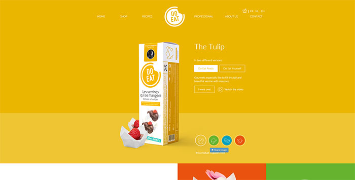
For what we know now, UX depends upon various factors; but the crucial one is to secure a balanced relationship between aesthetics and usability. Don’t let yourself be confused by the general perception that you need to create something overwhelming and unique – while it will almost certainly draw attention, it is not powerful enough to give sense to your content and to keep users satisfied.
A good tactic that could help you to establish balance is to look at both successful and unsuccessful examples. We hope that your observations will enable you to ‘read between the lines’ and to understand what is truly important for the success of your website.
You will most probably conclude that prettiest and sophisticated websites are not the ones that generate most conversion rates. On the other hand, there will be many websites looking like total disasters, but are still applied by users in order to satisfy a particular need.
There is a lot of psychology behind human preferences. As we already mentioned, people tend to confuse beautiful for trustful; or ugly for useless. What does this tell us? It tells us that appearances are only one of the factors, but a fairly important one. You can improve your UX in many ways, but none of them should undermine the importance of aesthetics.
