Every language app in your pocket inherited a teaching method built for Latin. Understanding why that happened is a more useful design lesson than anything the apps themselves will teach you. Article Continues Below Article Continues Below 3 Comments Share this:#section1 Become a patron Ready to advance in content strategy, UX/UI, data communication, or learning… Continue reading Designed for a Dead Language
How to Improve Video Editing Efficiency With AI Tools
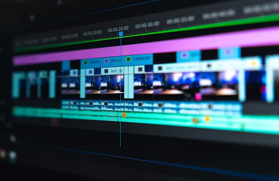
Video has become one of the most effective ways to capture attention online, whether for marketing, content creation, education, or personal projects. However, traditional video editing can be time-consuming, requiring users to trim clips, add captions, adjust audio, and optimize videos for different platforms. AI video editors are changing that by automating many of these… Continue reading How to Improve Video Editing Efficiency With AI Tools
How to Upscale Images and Remove Backgrounds with the Creative Fabrica Studio Desktop AI Tool
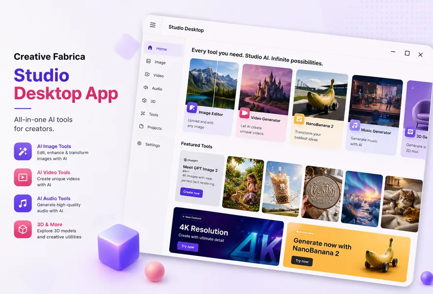
If you work with product photos, print-on-demand designs, or digital graphics, you’ve probably spent more time than you’d like removing backgrounds or improving image quality. Many online AI tools require you to upload every file, wait for cloud processing, or purchase credits before exporting the final image. Recently, I tested Creative Fabrica Studio Desktop to… Continue reading How to Upscale Images and Remove Backgrounds with the Creative Fabrica Studio Desktop AI Tool
The “100x Developer” Paradox: Is AI “Brain Fry” Killing the Craft?

The “10x Developer” used to be a myth—a legendary creature who could out-code a whole team through sheer brilliance and an unhealthy amount of caffeine. Then came Large Language Models (LLMs), and suddenly, we all became 100x developers overnight. But there’s a catch. While your GitHub contribution graph is bleeding green and your Jira tickets… Continue reading The “100x Developer” Paradox: Is AI “Brain Fry” Killing the Craft?
Minimal Free Business Card PSD Template
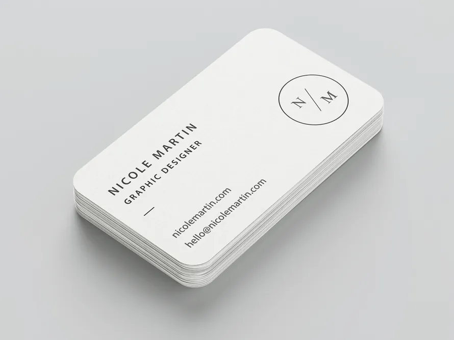
AI tools can make many print layouts, though fully editable PSD files are still made by skilled designers. This freebie is free business card template that is easy to change for your own name, job title, company, and contact details. The business card template is vert simple, clean, and ready for personal or client work.… Continue reading Minimal Free Business Card PSD Template
VASA Fitness: A Complete Guide to Memberships and What to Expect

VASA Fitness: A Complete Guide to Memberships and What to Expect VASA Fitness has grown into one of the more prominent regional gym chains across the Mountain West and parts of the Midwest, building a reputation around a combination of accessible pricing, a broad range of amenities, and a genuinely extensive group fitness class schedule… Continue reading VASA Fitness: A Complete Guide to Memberships and What to Expect
Day 87: mask properties

You can use mask properties to apply a mask to an element. .post img { border: none; } .mask { -webkit-mask-image: url(/blog/2023/100daysof-day87/htmhell_logo.svg); mask-image: url(/blog/2023/100daysof-day87/htmhell_logo.svg); } .mask-size { -webkit-mask-size: contain; mask-size: contain; -webkit-mask-repeat: no-repeat; mask-repeat: no-repeat; -webkit-mask-position: center; mask-position: center; } .element { max-width: 400px; aspect-ratio: 1; background-color: red; -webkit-mask-image: url(/blog/2023/100daysof-day87/htmhell_logo.svg); mask-image: url(/blog/2023/100daysof-day87/htmhell_logo.svg); -webkit-mask-size: contain; mask-size:… Continue reading Day 87: mask properties
30+ Top Modern Serif Fonts for Logos and Visual Identity
Download the top modern fonts for logos and give your brand a strong starting point. These fonts already have a logo-style look, so you can spend less time creating a logo from scratch. Simply choose the font that matches your brand and start designing with confidence. Many logo designers also like modern serif fonts because… Continue reading 30+ Top Modern Serif Fonts for Logos and Visual Identity
30+ Best Old Style Fonts for Classic Typography and Timeless Design
Old style fonts can make a logo, poster, or brand feel more personal. Many designers still enjoy classic logo fonts because they have a clean shape and a familiar look. Old style vintage fonts also work well for product labels, book covers, café menus, and simple product packaging. If you want a design with a… Continue reading 30+ Best Old Style Fonts for Classic Typography and Timeless Design
Day 89: higher-order custom properties

Style queries may change the way we write CSS significantly. Caution: If you’re a fan of Tailwind or similar utility frameworks, you might find this post offensive because it suggests using fewer classes instead of more. On day 80 I’ve introduced you to container style queries. I’ve showed you a practical example from a project… Continue reading Day 89: higher-order custom properties
Understanding the Basics of Two-Way Radio Communication

Understanding the Basics of Two-Way Radio Communication “Can someone meet the delivery truck at the north entrance?” Silence. The supervisor reaches for a phone, starts scrolling through contacts, and waits for the call to connect. Meanwhile, the truck is still sitting outside, employees are wondering what to do next, and five perfectly productive minutes quietly… Continue reading Understanding the Basics of Two-Way Radio Communication
Hollywood Legends: Hand-Drawn Artistic Portraits of 40 Iconic Movie Stars

Hollywood movie stars have captivated audiences for decades with their charisma, talent, and unforgettable performances. From action-packed blockbusters to emotional dramas, these actors shape cinema culture. Hand-drawn illustration posters bring a personal, artistic touch, turning iconic characters into collectible drawing portraits that fans cherish. Movie stars posters have evolved from glossy prints to digital art… Continue reading Hollywood Legends: Hand-Drawn Artistic Portraits of 40 Iconic Movie Stars
Cheap Car Insurance in Texas: How to Find the Best Rates

Cheap Car Insurance in Texas: How to Find the Best Rates Texas car insurance rates run higher than the national average, driven by factors including the state’s size, traffic density in major metro areas, weather-related claims (hail, flooding), and a high rate of uninsured drivers that pushes up uninsured motorist coverage costs for everyone else.… Continue reading Cheap Car Insurance in Texas: How to Find the Best Rates
10 Ways to Build Radical TRUST in the Age of AI Junk

We have reached the era of the “Instant Website.” You can now whisper a few sentences into a chatbot, wait for your instant coffee to dissolve, and watch a fully functioning landing page blink into existence. On the surface, it’s a miracle. Under the hood, we are sprinting toward a crisis of soul. As web… Continue reading 10 Ways to Build Radical TRUST in the Age of AI Junk
Day 93: the lch() color function

The lch() color function allows you to pick colors from the CIELAB color space, which is device-independant and covers the entire gamut (range) of human color perception. Currently, the CSS colors we can define are in the sRGB color space. For the longest time, professional monitors weren’t able to display all possible colors in this… Continue reading Day 93: the lch() color function
Crafting AI Explanations for Every Role in Your Enterprise
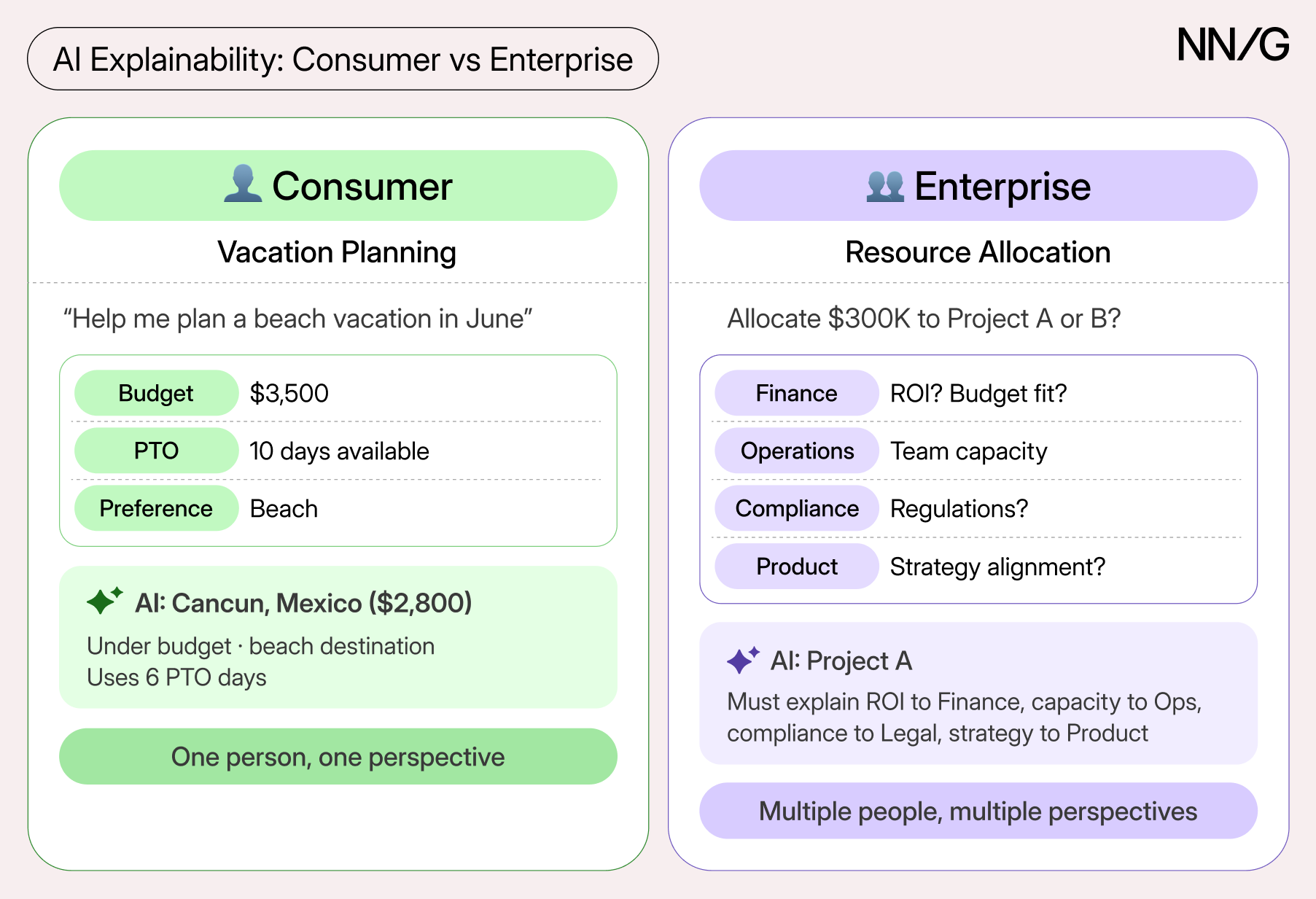
Summary: Different enterprise roles need different types of explanations for AI outputs. Enterprise AI is a hot topic, but many organizations still struggle to achieve meaningful employee adoption and usage. This article focuses on what it takes to develop and deploy AI solutions that both organizations and employees can trust. In particular, it examines how… Continue reading Crafting AI Explanations for Every Role in Your Enterprise
4th of July Posters That Hit Different: Do We Still Love America Like We Used To?

Hey friends, another 4th of July is here. Fireworks, flags, BBQs, and all that good stuff. But this year I’ve been thinking deeper. We made all these 50 beautiful posters – modern, vintage, stylish, and ones celebrating people’s achievements. They look amazing, but they also make me ask the real questions: Do we still truly… Continue reading 4th of July Posters That Hit Different: Do We Still Love America Like We Used To?
Progressively enhancing Grid Lanes

This post is a follow-up on my previous post. I was wondering whether it’s safe to use Grid Lanes today. I came up with a solution I find okay, but there is a caveat. Note: This post contains interactive demos. If you want to see them instead of screenshots, enable the CSS Grid Lanes Layout flag… Continue reading Progressively enhancing Grid Lanes
Context Engineering for Claude Code

Most people start using Claude Code the same way they use ChatGPT: they open Claude, submit a prompt describing the task, and expect a… Continue reading on UX Planet »
Free Simple Business Card PSD Template
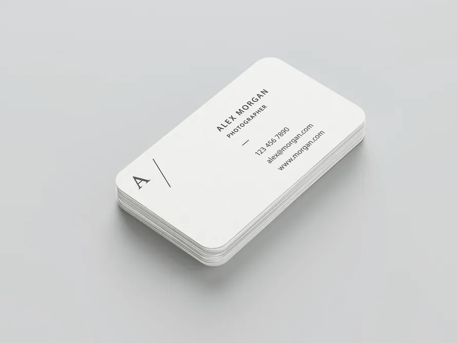
AI can generate almost any print design or template, but creating fully editable and customizable PSD files still requires the expertise of professional designers. That is why a good freebie is still useful for many people. This free business card template gives you a simple layout that is easy to edit. If you need a… Continue reading Free Simple Business Card PSD Template
Game UX: the cursor that wasn’t supposed to be there

A data-backed investigation into one of console gaming’s most debated design patterns. Where it came from, who kept using it, and what ten years of releases actually show. There’s a specific kind of frustration that comes from navigating a console menu with an analog stick cursor. You know exactly what you want. The item is right… Continue reading Game UX: the cursor that wasn’t supposed to be there
Day 95: the color-mix() function
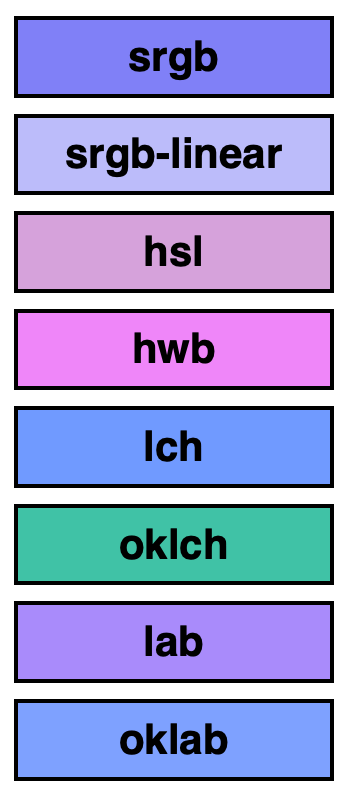
The color-mix() function takes two colors and returns the result of mixing them, in a given color space, by a specified amount. To mix colors, pass the in keyword, followed by the color space, and 2 colors. body { background-color: color-mix(in srgb, blue, white); } The syntax is pretty straightforward, but the result is not… Continue reading Day 95: the color-mix() function
Moving Beyond UX: The Rise of the Agentic Experience (AX) Designer

AX Design stands for Agentic Experience Design. It is an emerging design discipline focused not on creating human-facing user interfaces (UI), but on designing, structuring, and auditing the environments where autonomous AI agents operate. While traditional UX (User Experience) solves human problems by designing screens, forms, and workflows for people, AX Design solves business process problems. It focuses… Continue reading Moving Beyond UX: The Rise of the Agentic Experience (AX) Designer
Kick the Bots Out of Your Survey Data
Summary: Learn to spot and filter out survey bots’ responses before analysis so fake data doesn’t distort your findings. If you distribute surveys through open channels like social media, online communities, or public links, there’s a good chance some of your responses aren’t coming from real participants. Instead, they may be coming from survey bots,… Continue reading Kick the Bots Out of Your Survey Data