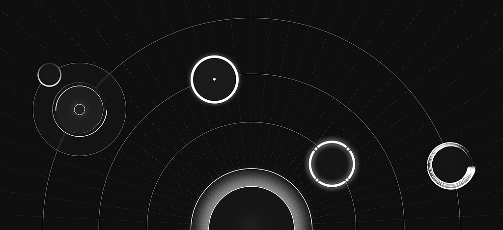
The lch() color function allows you to pick colors from the CIELAB color space, which is device-independant and covers the entire gamut (range) of human color perception. Currently, the CSS colors we can define are in the sRGB color space. For the longest time, professional monitors weren’t able to display all possible colors in this… Continue reading Day 93: the lch() color function
Crafting AI Explanations for Every Role in Your Enterprise
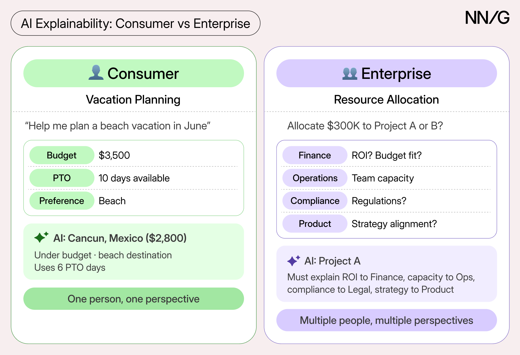
Summary: Different enterprise roles need different types of explanations for AI outputs. Enterprise AI is a hot topic, but many organizations still struggle to achieve meaningful employee adoption and usage. This article focuses on what it takes to develop and deploy AI solutions that both organizations and employees can trust. In particular, it examines how… Continue reading Crafting AI Explanations for Every Role in Your Enterprise
4th of July Posters That Hit Different: Do We Still Love America Like We Used To?

Hey friends, another 4th of July is here. Fireworks, flags, BBQs, and all that good stuff. But this year I’ve been thinking deeper. We made all these 50 beautiful posters – modern, vintage, stylish, and ones celebrating people’s achievements. They look amazing, but they also make me ask the real questions: Do we still truly… Continue reading 4th of July Posters That Hit Different: Do We Still Love America Like We Used To?
Progressively enhancing Grid Lanes

This post is a follow-up on my previous post. I was wondering whether it’s safe to use Grid Lanes today. I came up with a solution I find okay, but there is a caveat. Note: This post contains interactive demos. If you want to see them instead of screenshots, enable the CSS Grid Lanes Layout flag… Continue reading Progressively enhancing Grid Lanes
Context Engineering for Claude Code
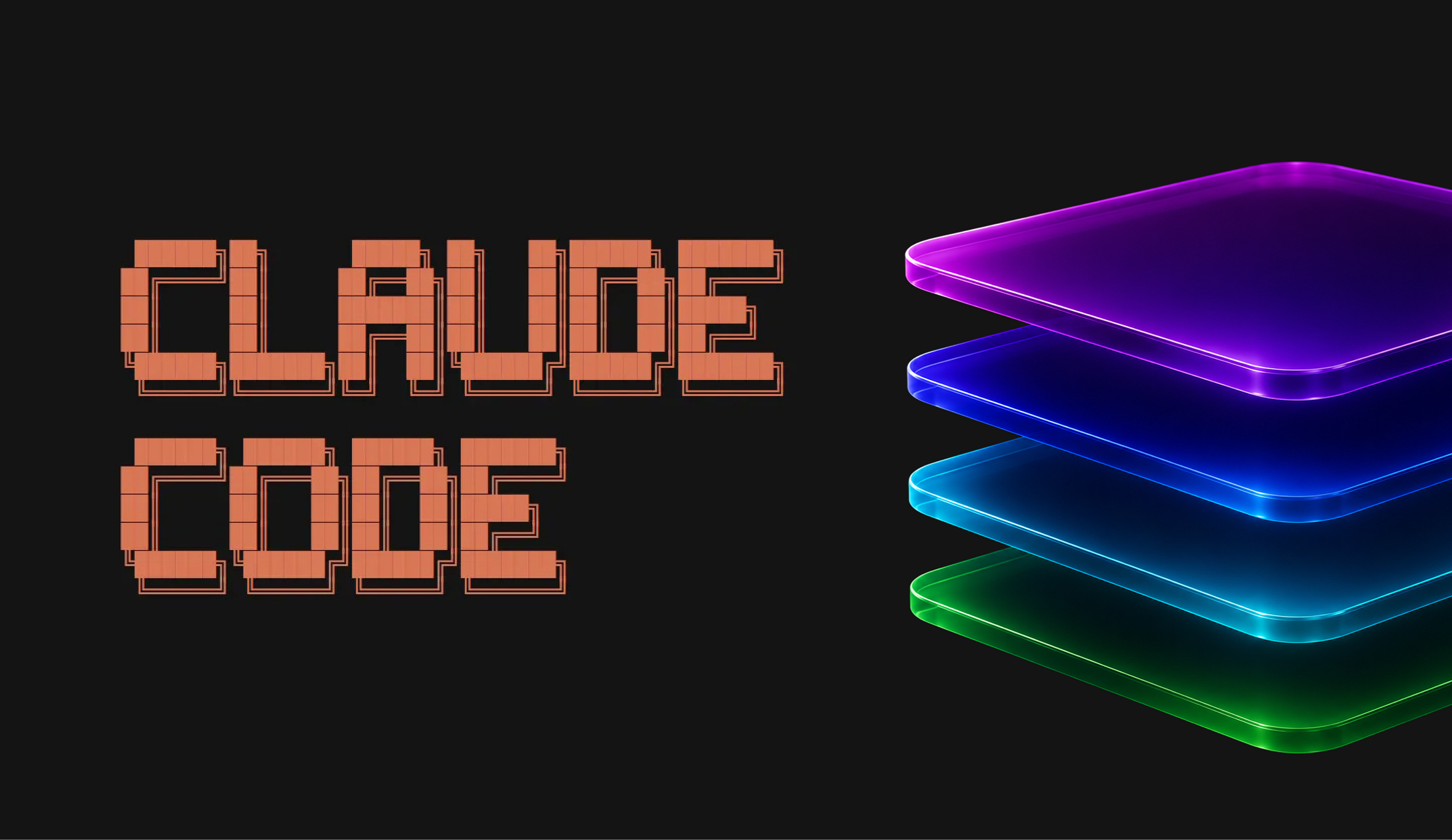
Most people start using Claude Code the same way they use ChatGPT: they open Claude, submit a prompt describing the task, and expect a… Continue reading on UX Planet »
Free Simple Business Card PSD Template
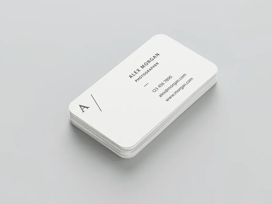
AI can generate almost any print design or template, but creating fully editable and customizable PSD files still requires the expertise of professional designers. That is why a good freebie is still useful for many people. This free business card template gives you a simple layout that is easy to edit. If you need a… Continue reading Free Simple Business Card PSD Template
Game UX: the cursor that wasn’t supposed to be there
A data-backed investigation into one of console gaming’s most debated design patterns. Where it came from, who kept using it, and what ten years of releases actually show. There’s a specific kind of frustration that comes from navigating a console menu with an analog stick cursor. You know exactly what you want. The item is right… Continue reading Game UX: the cursor that wasn’t supposed to be there
Day 95: the color-mix() function
The color-mix() function takes two colors and returns the result of mixing them, in a given color space, by a specified amount. To mix colors, pass the in keyword, followed by the color space, and 2 colors. body { background-color: color-mix(in srgb, blue, white); } The syntax is pretty straightforward, but the result is not… Continue reading Day 95: the color-mix() function
Moving Beyond UX: The Rise of the Agentic Experience (AX) Designer

AX Design stands for Agentic Experience Design. It is an emerging design discipline focused not on creating human-facing user interfaces (UI), but on designing, structuring, and auditing the environments where autonomous AI agents operate. While traditional UX (User Experience) solves human problems by designing screens, forms, and workflows for people, AX Design solves business process problems. It focuses… Continue reading Moving Beyond UX: The Rise of the Agentic Experience (AX) Designer
Kick the Bots Out of Your Survey Data
Summary: Learn to spot and filter out survey bots’ responses before analysis so fake data doesn’t distort your findings. If you distribute surveys through open channels like social media, online communities, or public links, there’s a good chance some of your responses aren’t coming from real participants. Instead, they may be coming from survey bots,… Continue reading Kick the Bots Out of Your Survey Data
What Actually Makes People Happy? The Real Research, Explained Simply

Decades of psychology research, including Harvard’s 85-year happiness study, reveal what genuinely predicts a happy life. Learn what the science actually says about money, relationships, and the habits within your control. In 1938, Harvard researchers began tracking 724 teenage boys, checking in on their lives every two years, for the rest of their lives. Nobody involved… Continue reading What Actually Makes People Happy? The Real Research, Explained Simply
Top 10 AI Logo Design Tools in 2026
Artificial intelligence has changed the way people create logos. A few years ago, designing a business logo usually meant hiring a designer or spending hours learning graphic design software. Today, AI logo design tools can generate dozens of logo ideas within seconds, making the process much faster for startups, freelancers, and small businesses. The best… Continue reading Top 10 AI Logo Design Tools in 2026
25+ Simple Resume Templates and CV Designs
Download simple resume templates and professional CV designs that are ready to use. Edit them in minutes or let GraphicDesignJunction customize your resume for you. Looking for a clean resume that is easy to edit? Our collection of Resume Templates includes simple layouts for students, fresh graduates, and experienced professionals. Every CV and Resume Template… Continue reading 25+ Simple Resume Templates and CV Designs
Personalization Pyramid: A Framework for Designing with User Data
As a UX professional in today’s data-driven landscape, it’s increasingly likely that you’ve been asked to design a personalized digital experience, whether it’s a public website, user portal, or native application. Yet while there continues to be no shortage of marketing hype around personalization platforms, we still have very few standardized approaches for implementing personalized… Continue reading Personalization Pyramid: A Framework for Designing with User Data
Your New UX Habit: Establishing Baselines for Impact
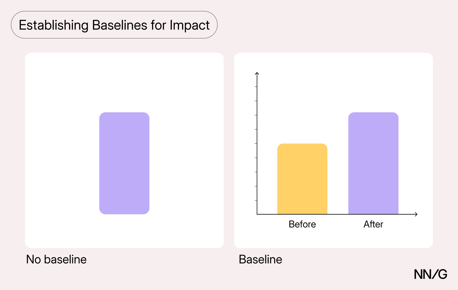
Summary: Gather baseline metrics before starting a project so your team can demonstrate its impact. Between delivery timelines and limited resources, cutting data collection upfront seems like an efficient choice. Without benchmarks to compare to, however, it’s impossible to demonstrate improvement. (Don’t worry, we have some other options for reducing UX waste.) In fact, one… Continue reading Your New UX Habit: Establishing Baselines for Impact
Your Grid Lanes will likely fail WCAG 2.4.3

I saw a great introduction to CSS Grid Lanes, aka Masonry Layouts, by Patrick Brosset at CSS Day 2026. I liked the versatility of its use cases, but I was also concerned that it’s inaccessible by default. Note: This post contains interactive demos. If you want to see them instead of screenshots, enable the CSS… Continue reading Your Grid Lanes will likely fail WCAG 2.4.3
Rethinking Figma in an AI world
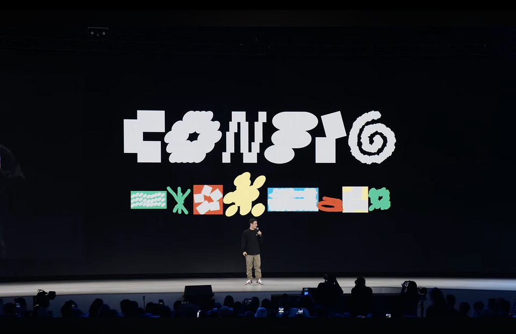
As AI pulls product development closer to code, Config 2026 reveals Figma’s high-stakes gamble to survive an era of agentic workflows in a code-native environment At Config 2026, Figma is responding to AI pressure by expanding its canvas into code layers, motion, and shaders to prevent teams from bypassing design handoffs entirely. The real test… Continue reading Rethinking Figma in an AI world
20 Best Digital Illustration Posters by Ryan Smallman – Masterpieces of Modern Art
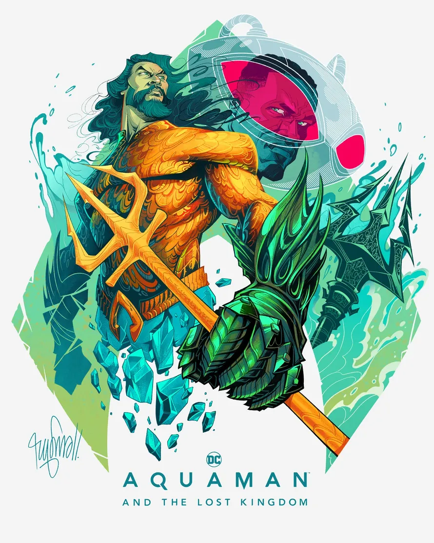
Today we are featuring “Ryan Smallman” digital artist and his incredible digital illustration artwork. Ryan is a multimedia artist and creative, originally from Michigan and now based in São Paulo, Brazil. His portfolio includes work for some of the world’s biggest entertainment brands, including Fortnite, Marvel, DC, UFC, FIFA, and officially licensed posters for blockbuster… Continue reading 20 Best Digital Illustration Posters by Ryan Smallman – Masterpieces of Modern Art
Website Design Inspiration: 50+ Fresh & Modern Examples
A modern and UI/UX friendly website design does not happen by accident. Every landing page you admire was built with clear decisions about layout, color, fonts, and user flow. Web design has changed a lot over the past few years, and what worked in 2018 looks outdated today. If you are building or refreshing a… Continue reading Website Design Inspiration: 50+ Fresh & Modern Examples
Recapping our multi-city European roadshow celebrating the EAA’s one-year anniversary
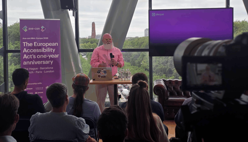
When the European Accessibility Act (EAA) came into effect in June of 2025, it was a milestone for digital accessibility that sent positive reverberations across Europe and around the world. As we approached the EAA’s first anniversary, we knew exactly how we wanted to mark the occasion: meeting across Europe and engaging directly with the… Continue reading Recapping our multi-city European roadshow celebrating the EAA’s one-year anniversary
Free AI Image Editor: Easy Ways to Edit Photos for Any Project
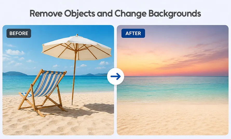
Whether you’re making a social media post, YouTube thumbnail, images for website, or school project, editing photos is something almost everyone does today. The good news is that you don’t need expensive software or advanced design skills anymore. A Free AI Image Editor can help you make quick changes in just a few clicks. AI… Continue reading Free AI Image Editor: Easy Ways to Edit Photos for Any Project
Single Letter Logo Designs: 50 Modern Ideas for Strong Branding
A single letter logo is a smart choice for brands that want a clean and minimal logo design look. Many companies use one letter to build a strong identity that people can remember. Creative logo design does not need many shapes or colors. It starts with a clear idea. Many designers also begin with logo… Continue reading Single Letter Logo Designs: 50 Modern Ideas for Strong Branding
25+ Modern Furniture Catalog Brochure Templates for Interior Brands
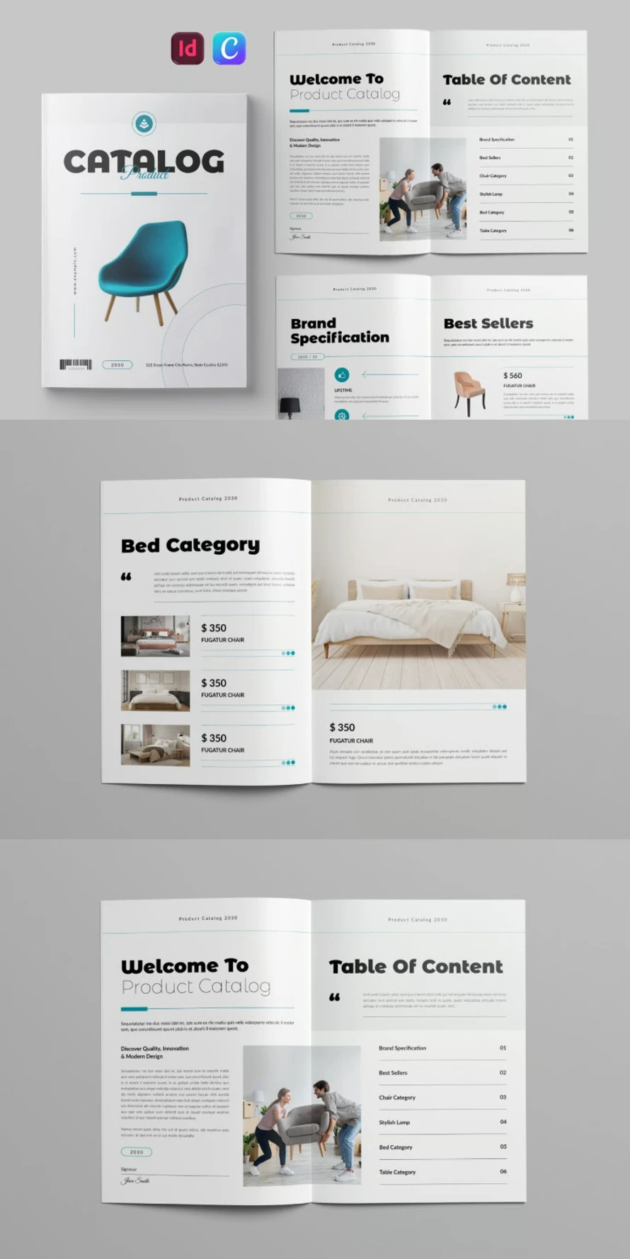
A furniture catalog brochure helps customers see products in a clear way. High quality brochure templates keep every page eye-catching and easy to read. Each product catalog can show photos, prices, sizes, and short details without making the layout feel crowded. A simple structure also helps people compare different furniture pieces before making a choice.… Continue reading 25+ Modern Furniture Catalog Brochure Templates for Interior Brands
Day 98: oklab() and oklch()
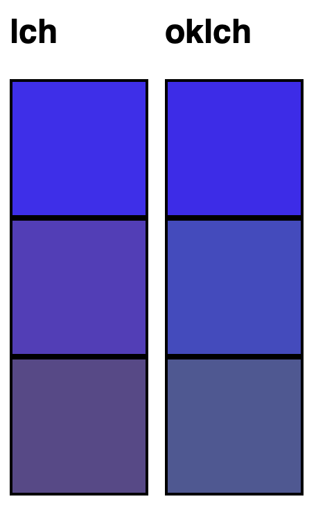
oklab() and oklch() are okay versions of lab() and lch() because lab() and lch() are not okay. I will not pretend that I really understand this whole color on the web thing, how it works or why one color function offers many more options to developers than the other, but I did learn several things… Continue reading Day 98: oklab() and oklch()