
The tragic tale of a modern-day Isaac Newton, plus some thoughts from beyond the recursive loop. Gil Scott-Heron performs in Chicago on Nov 4, 1978. Paul Natkin/Getty Images “The revolution will not go better with CokeThe revolution will not fight germs that may cause bad breathThe revolution WILL put you in the driver’s seatThe revolution… Continue reading Falling apples and crumbling algos
Category: UX
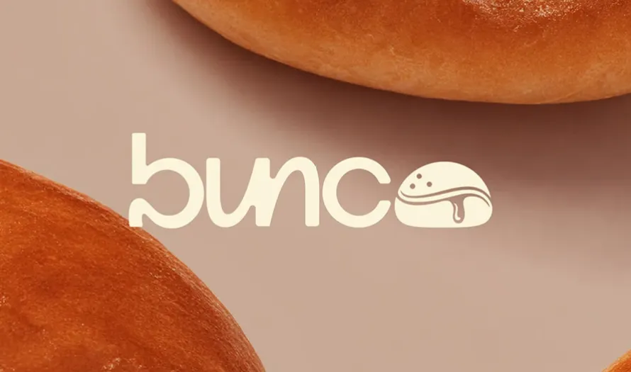
Beautiful Logos with Bold Typography
Designers often ask how to design logos that stay clear and easy to read. Many turn to type as the main element. Beautiful logos do not always need icons or complex marks. A strong wordmark can carry the full identity. The focus shifts to letter shapes, spacing, and balance. Choosing a typeface with clear structure… Continue reading Beautiful Logos with Bold Typography
Minimum Viable Product (MVP): Definition
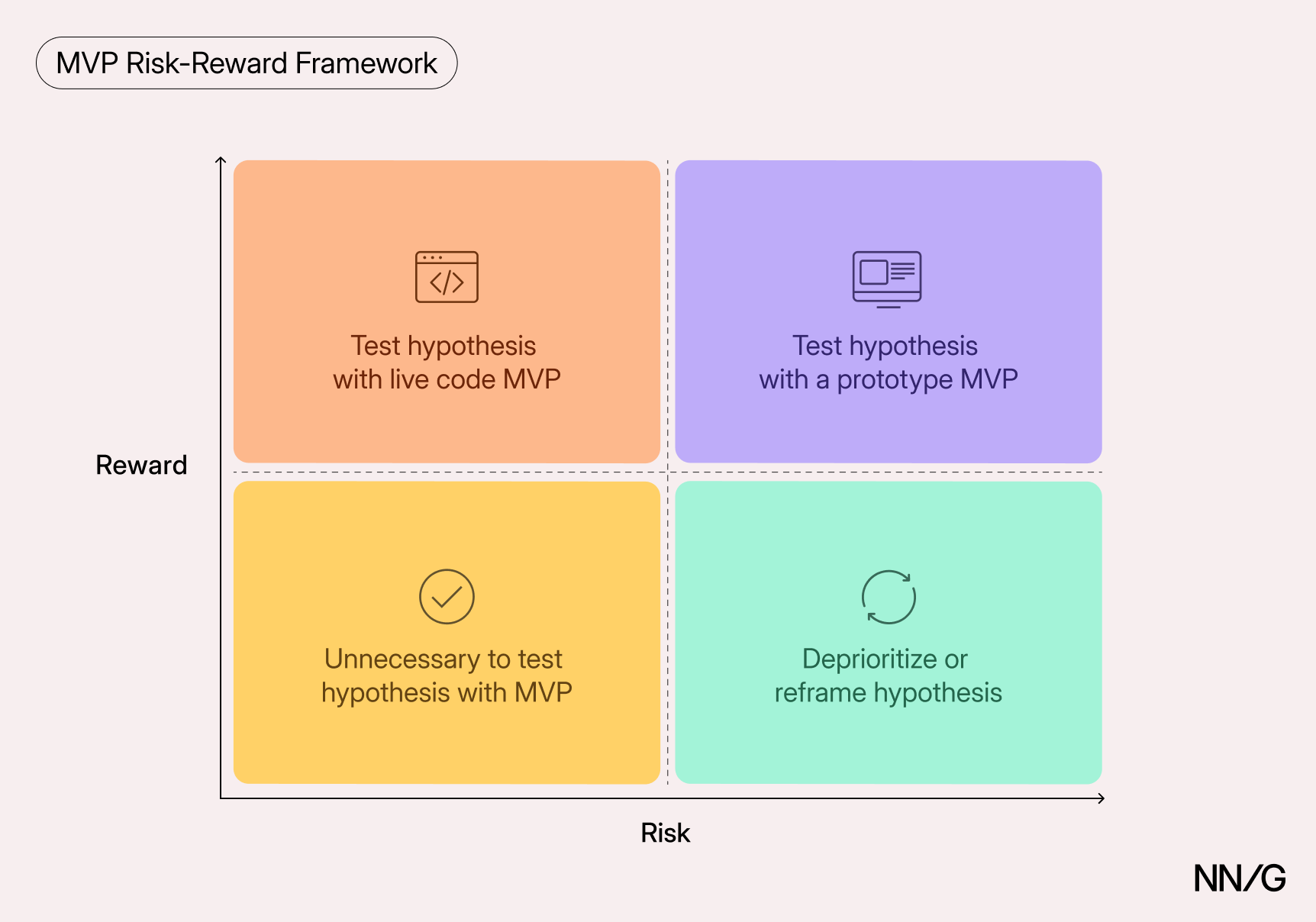
Summary: MVPs are learning tools that test whether an idea is valuable to users. Low-code platforms and AI-assisted design tools have made it faster than ever to build new products. But speed of creation can obscure the critical question in product development: Are we building the right solution for our users? Minimum viable products (MVPs)… Continue reading Minimum Viable Product (MVP): Definition
GenUI vs. Vibe Coding: Who’s Designing?
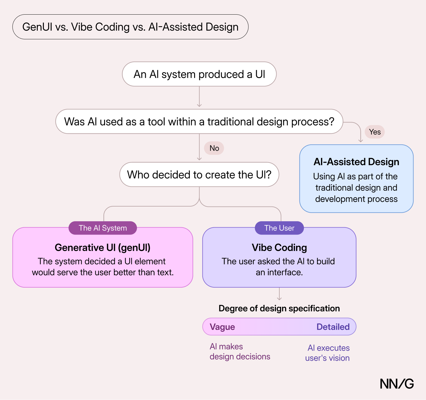
Summary: With generative UI, the AI system decides to generate an interactive element or entire product in response to a user need. Vibe coding is when users request the AI to build it. Since Andrej Karpathy coined the term “vibe coding” in early 2025, the concept has taken over the conversation about AI and interfaces.… Continue reading GenUI vs. Vibe Coding: Who’s Designing?
UX Conference May Announced (May 11 – May 22)
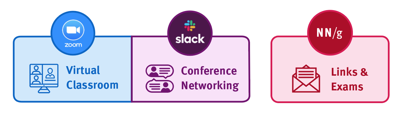
How will the Virtual Event work? Meetings will take place using the video conferencing tool Zoom, collaboration tools (such as group document editing and whiteboarding tools), and the social discussion tool Slack. You’ll also be able to use Slack before, during, and after the event to participate in social events and network with other… Continue reading UX Conference May Announced (May 11 – May 22)
The Best Vintage Fonts Every Designer Should Have in Their Toolkit
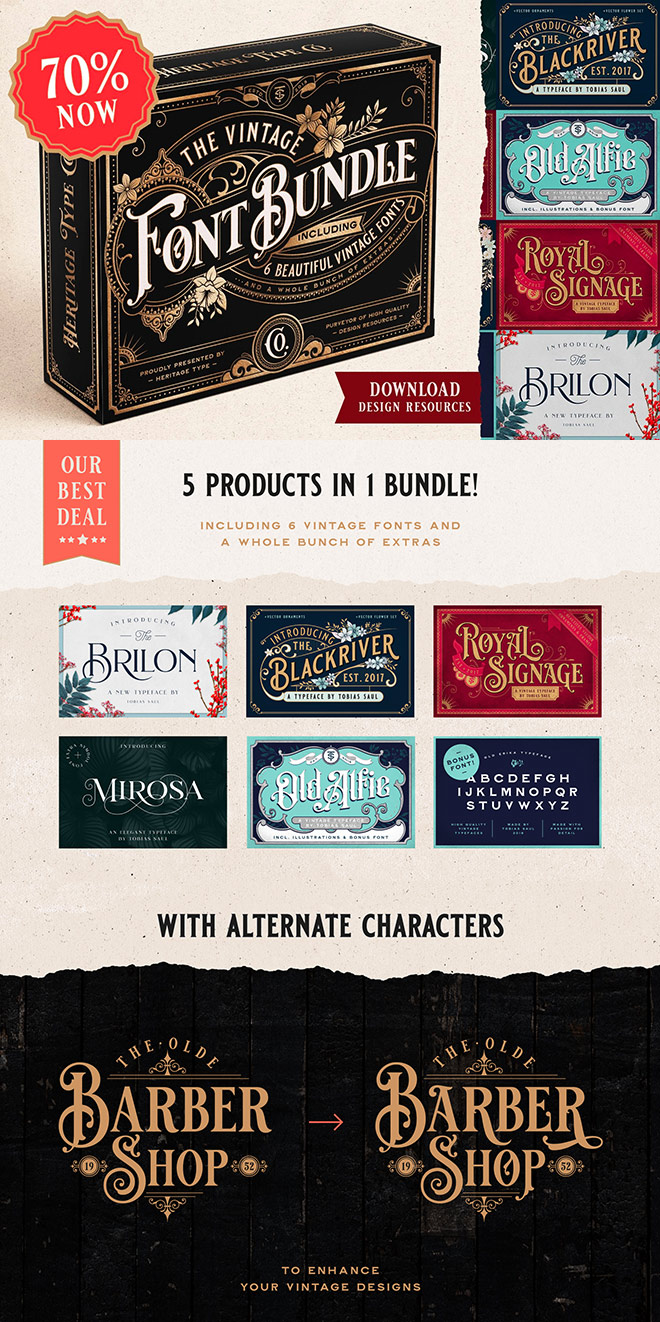
There are many vintage fonts out there, but not many have been expertly crafted by a talented lettering artist who lives and breathes the vintage aesthetic. The Vintage Font Bundle from Heritage Type Co. contains 6 typefaces designed by Tobias Saul, whose inspirational vintage logos and type designs have been featured many times in showcases… Continue reading The Best Vintage Fonts Every Designer Should Have in Their Toolkit
35 Best Condensed Fonts Of 2025
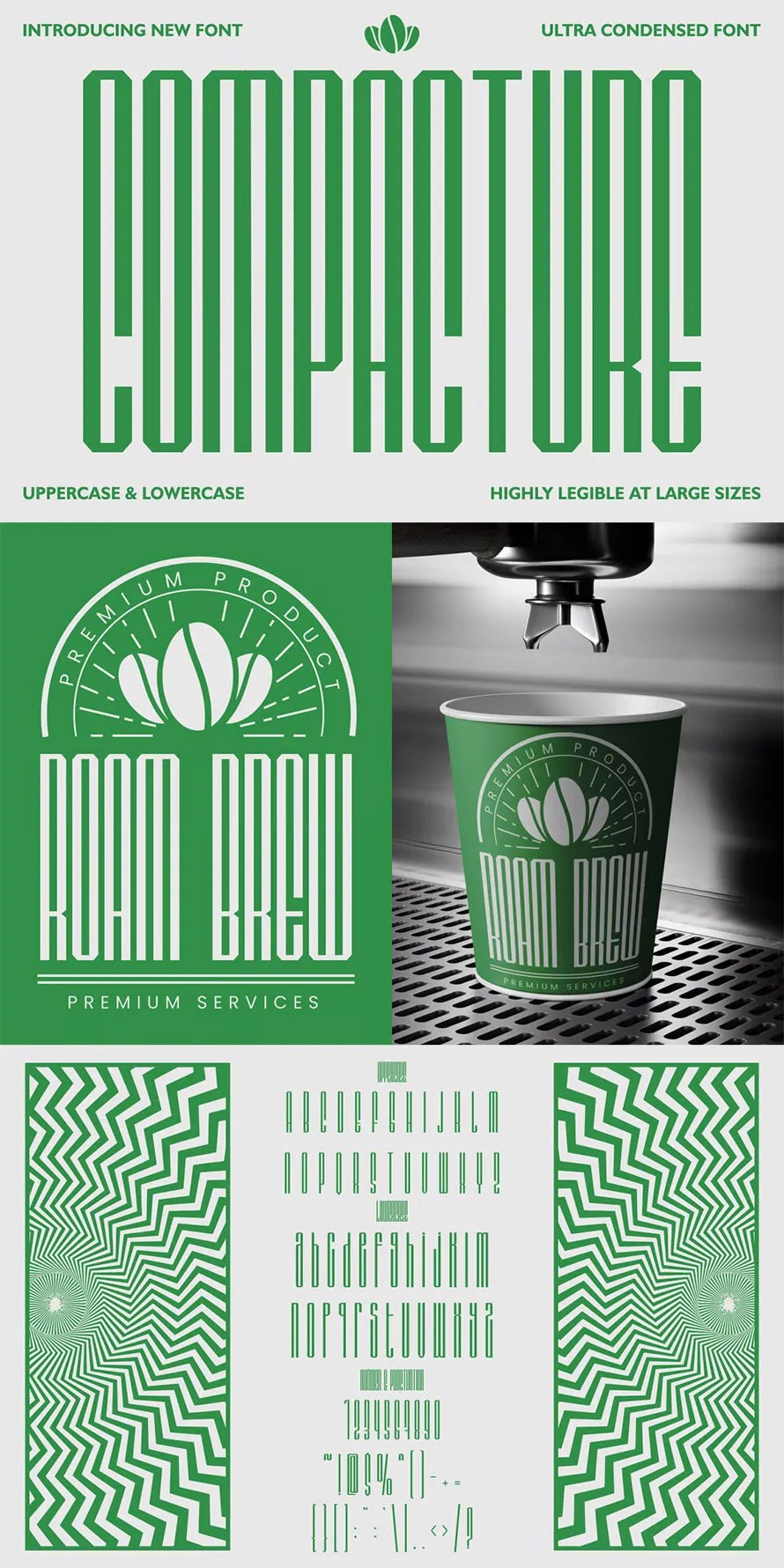
Condensed fonts are having a strong moment in 2025. Designers are using slim, narrow style fonts in poster making, branding, thumbnail design, and big bold headlines that need to say more with less space. In 2025, best condensed fonts feel confident, modern, and practical. They don’t try too hard. They simply work. If you want… Continue reading 35 Best Condensed Fonts Of 2025
TaxBuddy, Making Taxes Feel Less Taxing
[unable to retrieve full-text content] TaxBuddy — Making Taxes Feel Less Taxing Simplifying financial complexity through intuitive UX and Visual Design. Project Summary When we first began working on TaxBuddy, the goal was simple — to make the process of filing taxes feel less intimidating for everyday users. But soon, we realized the real challenge wasn’t just about simplifying steps, it… Continue reading TaxBuddy, Making Taxes Feel Less Taxing
10 Top Visual Trends for 2026

2026 is shaping up to be a strange but exciting year for visual design. A lot of the visual trends bubbling up in late 2024 and 2025 are now maturing, and designers everywhere are experimenting in new ways. Some of these trends come from AI tools becoming better and faster. Some come from creators trying… Continue reading 10 Top Visual Trends for 2026
35 Best Christmas Fonts for Festive Graphics & Creative Projects
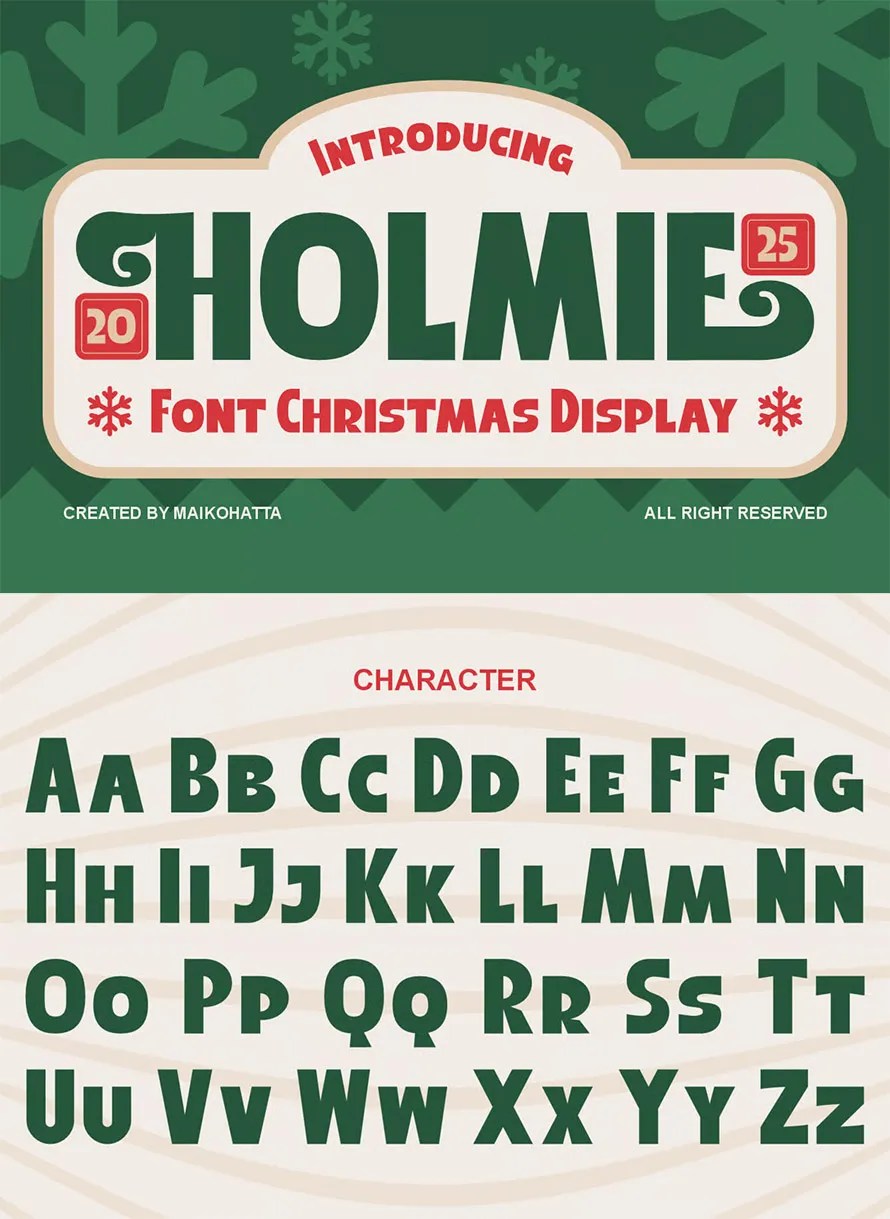
Once December rolls around, fonts and typefaces suddenly become way more important. Swap out your usual look with Christmas fonts that make everything feel snug and cheerful in seconds. No matter if it’s greeting cards, flyers, social media pics, video covers, or DIY printables – picking the right seasonal holiday lettering shapes the vibe completely.… Continue reading 35 Best Christmas Fonts for Festive Graphics & Creative Projects
It’s Time to Move to Experience First

[unable to retrieve full-text content]Organizations should shift to an “Experience-First” mindset — designing around the full, end-to-end experience that people have with a brand, product, content, and service, rather than starting from technology, devices or isolated design touches. This holistic approach — combining business strategy, technical feasibility and human centered design thinking — yields far… Continue reading It’s Time to Move to Experience First
Foremost Font
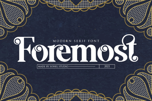
Foremost Font Foremost Font is a bold, modern display typeface designed to make a strong visual statement. With its clean geometry, solid structure, and confident weight, it works perfectly for headlines, logos, posters, and branding. Foremost delivers clarity, strength, and a professional contemporary look in any design. ➤ Font Name: Foremost ➤ Designer: Sohel Studio… Continue reading Foremost Font
20+ New Logo Fonts for Logo Design
Logo design keeps changing, but one thing stays important “the font“. A logo font sets the whole attitude of a brand, and in 2025 we’re seeing new styles that feel cleaner, sharper, and more flexible and hope this will continue in 2026. This roundup shares the best new logo fonts designers are picking this year… Continue reading 20+ New Logo Fonts for Logo Design
Customer Experience Design: Process & Tools You Need in 2025

Key takeaways 💡 CX design aligns every customer touchpoint into a cohesive experience that drives business results. 🔁 The CX design process follows six phases: Discovery, Mapping, Ideation, Design, Validation, and Optimization. 🔧 The best CX tools combine qualitative and quantitative methods for research and analytics. 📈 CX design in 2025 emphasizes personalization, consistency, accessibility,… Continue reading Customer Experience Design: Process & Tools You Need in 2025
1923 Font

1923 Font What Font is 1923? The 1923 Font closely resembles Broadway Engraved No2 by SoftMaker, a commercial typeface that reflects the era’s refined, engraved lettering. Its bold cut-in serif detailing and vintage sophistication match the identity of the 1923 logo remarkably well — balancing historical elegance with frontier grit. We also found a free… Continue reading 1923 Font
Quantifying UX Success and Proving Value
Learn to measure and communicate UX value through quantitative data, qualitative stories, and financial impact calculations. Last week, I talked about building credibility by looking outside your organization for validation. External benchmarking, expert opinions, and industry recognition all help shift internal perception. But validation only works if people understand the actual value you’re delivering. That… Continue reading Quantifying UX Success and Proving Value
Smarter Surveys in UXtweak
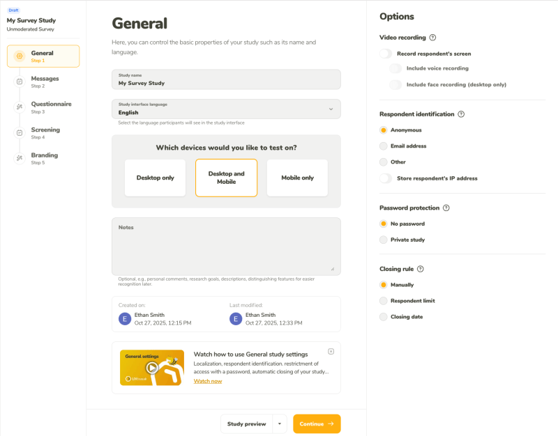
Hi UXtweakers! We’re excited to share another step forward on our journey to becoming the best UX research platform on the market–the release of a reworked version of our Survey tool and its related features. Surveys are a quintessential research method, helping you better understand your users–their needs, opinions, and motivations. Knowing how important they… Continue reading Smarter Surveys in UXtweak
Good Visual Design, Explained
Summary: To create appealing designs, align type and elements to a grid, build a clear visual hierarchy, use color intentionally, and stay consistent with every design choice. In this 3rd article in the anatomy-of-good-design series, I explain visual-design principles that contribute to good-looking designs, with real-site examples. How something looks does affect the perception of… Continue reading Good Visual Design, Explained
Beyond the Primary User: 3 Types of Smart-Home Users
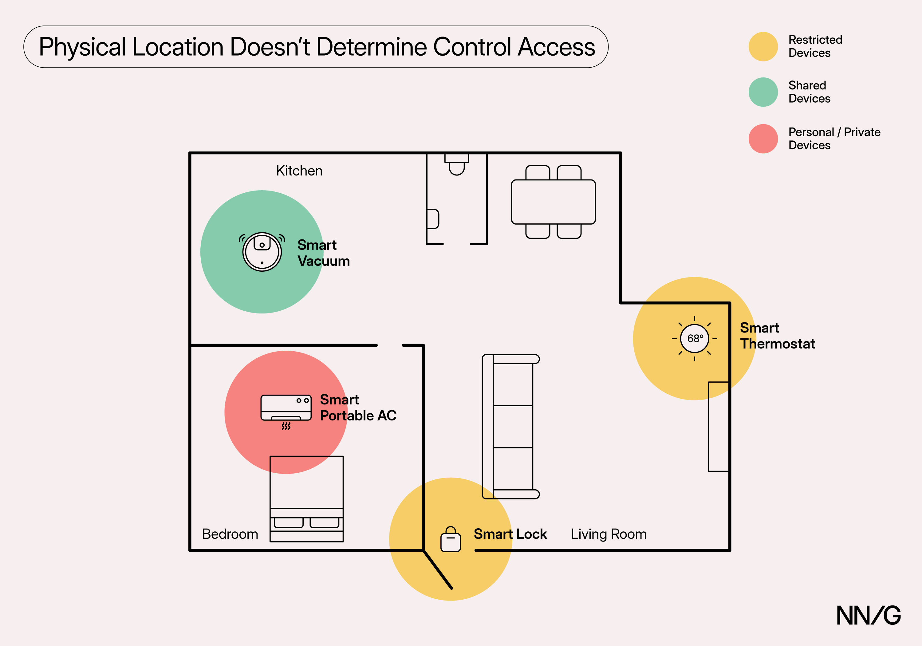
Summary: Smart-home devices often serve multiple users with different needs and preferences. Designing for shared use can reduce unnecessary friction and dependency. Smart-home devices, such as smart cameras, thermostats, and lights, are becoming increasingly ubiquitous, with Horowitz Research and Aviva reporting that nearly half of American households and about 80% of adults in the UK… Continue reading Beyond the Primary User: 3 Types of Smart-Home Users
Free & Premium Poster Fonts for Powerful Visuals
Poster visuals depend heavily on typography, and the right poster font can instantly transform a simple layout into a striking design. Bold letterforms, sharp contrasts, and expressive styles help capture attention from a distance, making your message stand out in busy environments. Whether you’re designing event posters, promotional graphics, or creative artwork, choosing the right… Continue reading Free & Premium Poster Fonts for Powerful Visuals
WPLP Compliance Platform Review: A Practical Look at How Well It Handles Modern Privacy Requirements
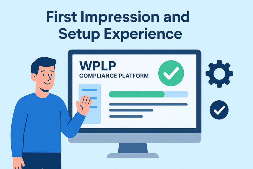
If you own a website, you probably know that a point comes when “just adding a cookie banner” doesn’t cut it anymore. Browsers keep changing how cookies behave, and you must adopt your approach to the evolving privacy laws to stay on the safe side. If your site handles traffic from the EU, California, Brazil,… Continue reading WPLP Compliance Platform Review: A Practical Look at How Well It Handles Modern Privacy Requirements
25+ Remarkable Typography Quotes for Inspiration
Typography quotes have become a powerful source of motivation and visual inspiration, blending meaningful words with artistic design to create messages that truly stand out. 25+ Remarkable Typography Quotes for Inspiration celebrates this creative fusion, showcasing how type, layout, and style can transform simple phrases into impactful visual statements. These designs transform simple sentences into… Continue reading 25+ Remarkable Typography Quotes for Inspiration
40+ Corporate Business Card Designs and Creative Ideas
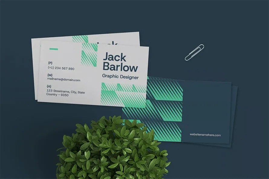
Download the most popular corporate business card templates, designed with high-quality layouts, pro concepts, and creative ideas. Each template looks like it was made specifically for your corporate brand. These designs are not “easy to edit” by anyone. Every business card needs a professional designer who understands your brand, color theme, and business nature, so… Continue reading 40+ Corporate Business Card Designs and Creative Ideas
Kaleidoscope Font
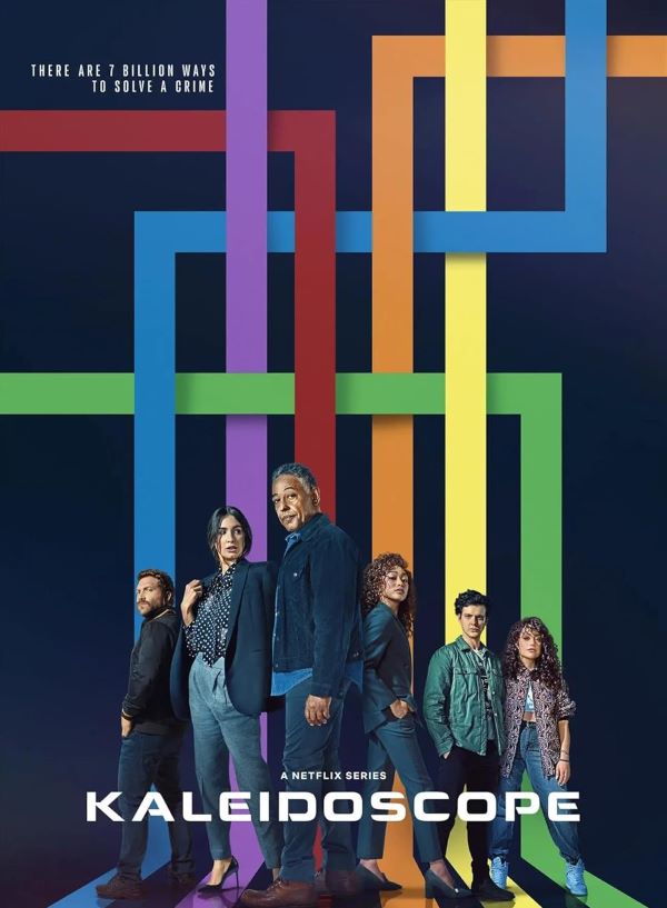
Kaleidoscope Font What Font is Kaleidoscope? Kaleidoscope Font captures the bold and vibrant energy reflected in the series’ mysterious and dramatic tone. The typography most closely matches Montalban Bold, a striking sans-serif typeface with strong geometric lines and a cinematic feel. This font conveys confidence and intrigue, much like the shifting narratives in the show.… Continue reading Kaleidoscope Font