Discover how editorial design and graphic design merge in ISA International Style, emphasizing simplicity and structure with bold typography. Editorial design has always played a critical role in shaping visual storytelling. When combined with graphic design, the result is often powerful and cohesive. One striking example of this is the ISA International Style of Architecture,… Continue reading Exploring the Fusion of Editorial Design and Graphic Design in ISA Style
Category: UX
Breathtaking Digital Portrait Illustrations from Top Artists and Designers
Digital portrait illustrations have become a significant art form in today’s creative world. Artists worldwide are pushing the boundaries of digital tools to create stunning, lifelike images that leave a lasting impression. From their unique styles to their intricate details, these artists are redefining what portrait illustrations can achieve. Here are six top artists whose… Continue reading Breathtaking Digital Portrait Illustrations from Top Artists and Designers
30 Creative Branding Design and Logos For Inspiration
Branding is the soul of any business. It’s not just about logos or colors; it’s about creating a lasting impression in the minds of customers. Creative branding design goes beyond aesthetics, reflecting the core values, mission, and personality of a business. Whether you’re starting a new company or rebranding an existing one, the process of… Continue reading 30 Creative Branding Design and Logos For Inspiration
10 best UXtweak alternatives (often misspelled as UX Tweak) in 2024
UXtweak is a highly rated UX research platform allowing research teams to recruit for, conduct, analyze, and share research all-in-one place. With the ability to conduct moderated and unmoderated studies, from concepts to production, effortless recruitment and management of participants, comprehensive analysis, and reports it became a strong contender in the market… Continue reading 10 best UXtweak alternatives (often misspelled as UX Tweak) in 2024
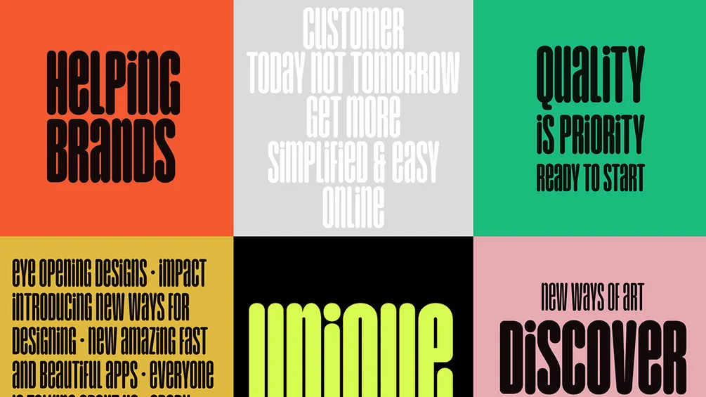
Free Font Of The Day – Unique
Here on Designbeep,we also aim to help designers to find free yet high quality resources whether for your web design projects or graphic design projects.Who doesn’t like freebies? Well, although we bring together free font collections time to time we decided to share a free font everyday and today’s free font Unique is designed by… Continue reading Free Font Of The Day – Unique
Your AI UX Intern: Meet Ari
Summary: Work with AI tools in UX the way you’d work with an intern: Treat their work as a first pass, double-check their facts, and provide specific instructions. We’ve long recommended working with AI tools like you might work with an intern — providing lots of instructions, guidance, oversight, and correction. This analogy helps avoid… Continue reading Your AI UX Intern: Meet Ari
The Proliferation and Problem of the ✨ Sparkles ✨ Icon
Summary: The sparkles icon has become increasingly prevalent in user interfaces, particularly in association with AI-driven features, but it suffers from ambiguity and lacks a standardized meaning. This article features content from the book Digital Icons That Work: A Comprehensive Guide to Enhancing User Experience with Effective Iconography by Kate Kaplan (with a contributing chapter on icon… Continue reading The Proliferation and Problem of the ✨ Sparkles ✨ Icon
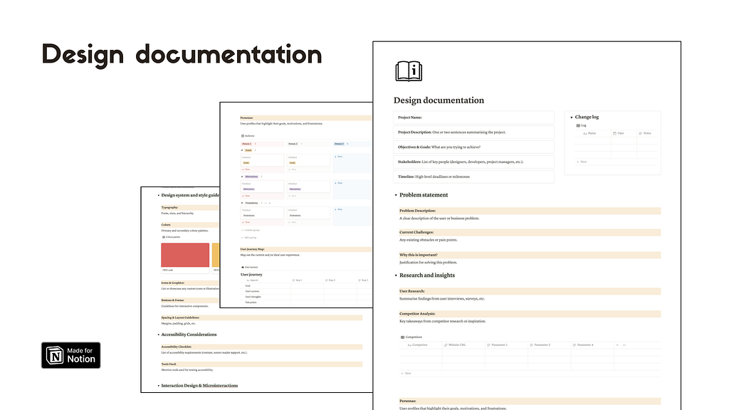
Documenting design process with Notion
[unable to retrieve full-text content] An ultimate approach to Design Documentation Managing projects efficiently is crucial to keep your work process moving smoothly. Working within a design team, or collaborating with multiple stakeholders, staying organised can be a challenge. This is where a Design Documentation Notion Template comes into play. Design documentation – Notion template A… Continue reading Documenting design process with Notion
Serial Position Effect — How does human memory work while recalling?
[unable to retrieve full-text content] Recently we visited an art gallery, with all its amazing artworks lining the walls. Photo by Eric Park on Unsplash As we walk through the exhibition, we notice the careful arrangement of the artworks and how they evoke different emotions and leave a lasting impression Our eyes are naturally drawn to the… Continue reading Serial Position Effect — How does human memory work while recalling?
Free Hanging Poster Mockup
Looking for the perfect way to showcase your poster designs? Our free hanging poster mockup PSD template is the ideal solution. This high-resolution poster mockup offers incredible quality and detail, ensuring your artwork looks professional and polished. Designed with smart objects, it’s easy to use, allowing you to effortlessly drag and drop your designs into… Continue reading Free Hanging Poster Mockup
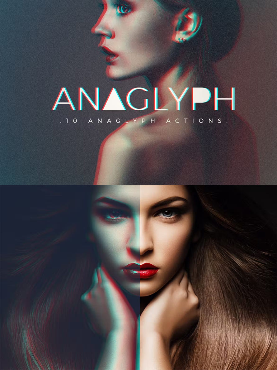
Transform Your Photos: 50 Best Photoshop Actions
In today’s fast-paced digital world, creating stunning visuals is more important than ever. Whether you’re a photographer, graphic designer, or content creator, Photoshop actions are essential tools that simplify complex edits and enhance your photos with just a few clicks. These pre-recorded steps allow users to achieve professional-quality results without the need for advanced technical… Continue reading Transform Your Photos: 50 Best Photoshop Actions
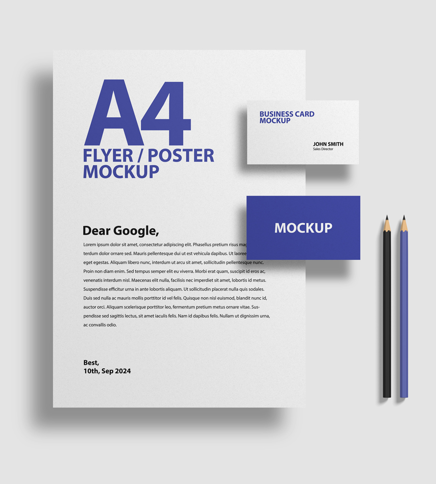
Free Simple Branding Stationery Mockup
Presenting your branding concepts professionally can make all the difference in winning over clients and securing contracts. A well-designed Stationery Mockup allows you to showcase your branding assets in a realistic and visually appealing way. Whether you’re designing for a corporate client or creating personal branding projects, having the right branding mockups is essential for… Continue reading Free Simple Branding Stationery Mockup
Continuous Product Design: Step-by-step Guide
Most IT-supplied products and functions are not used in practice. Resources, applications, and software remain idle. Not all companies consider whether their products are effective for the users. Consequently, 91% of unsatisfied customers don’t complain about their bad experience. They simply leave without giving feedback. A vivid proof is the mobile development market, which has… Continue reading Continuous Product Design: Step-by-step Guide
Best Figma User and Usability Testing Plugin
Key Takeaways 👉 UXtweak seamlessly connects with Figma, making it easy to start testing your prototypes without complicated setup. 👉 The plugin provides in-depth analytics, including statistics, heat maps, and funnels, to help you understand user behavior. 👉 UXtweak offers access to a reliable pool of testers, ensuring dependable feedback from your respondents. 👉 The… Continue reading Best Figma User and Usability Testing Plugin
Top 9 Fintech Design Agencies – 2024
If you need to hire FinTech designers or find an agency to improve your digital presence, choosing the right one is key. Designing for FinTech means combining creativity with technical know-how to make sure everything from UI to UX is top-notch. When choosing a fintech branding firm, it’s crucial to consider your specific needs, budget,… Continue reading Top 9 Fintech Design Agencies – 2024
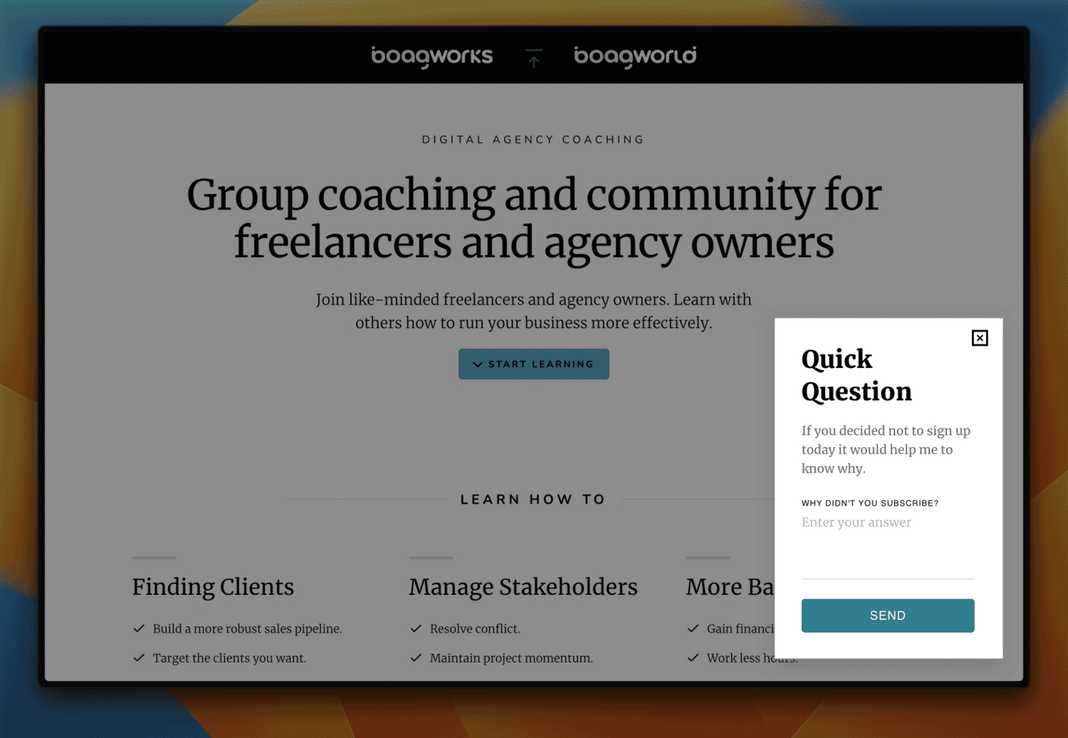
Objection Handling: The Secret to Improving Your Website Conversion Rate
Let’s face it, users are naturally cautious online. They’ve got questions buzzing in their heads and concerns that need addressing before they’ll even think about clicking that “Buy Now” button. In the digital marketplace, understanding and addressing these customer objections is crucial for success. In this article, I will explore sales objection handling techniques, its… Continue reading Objection Handling: The Secret to Improving Your Website Conversion Rate
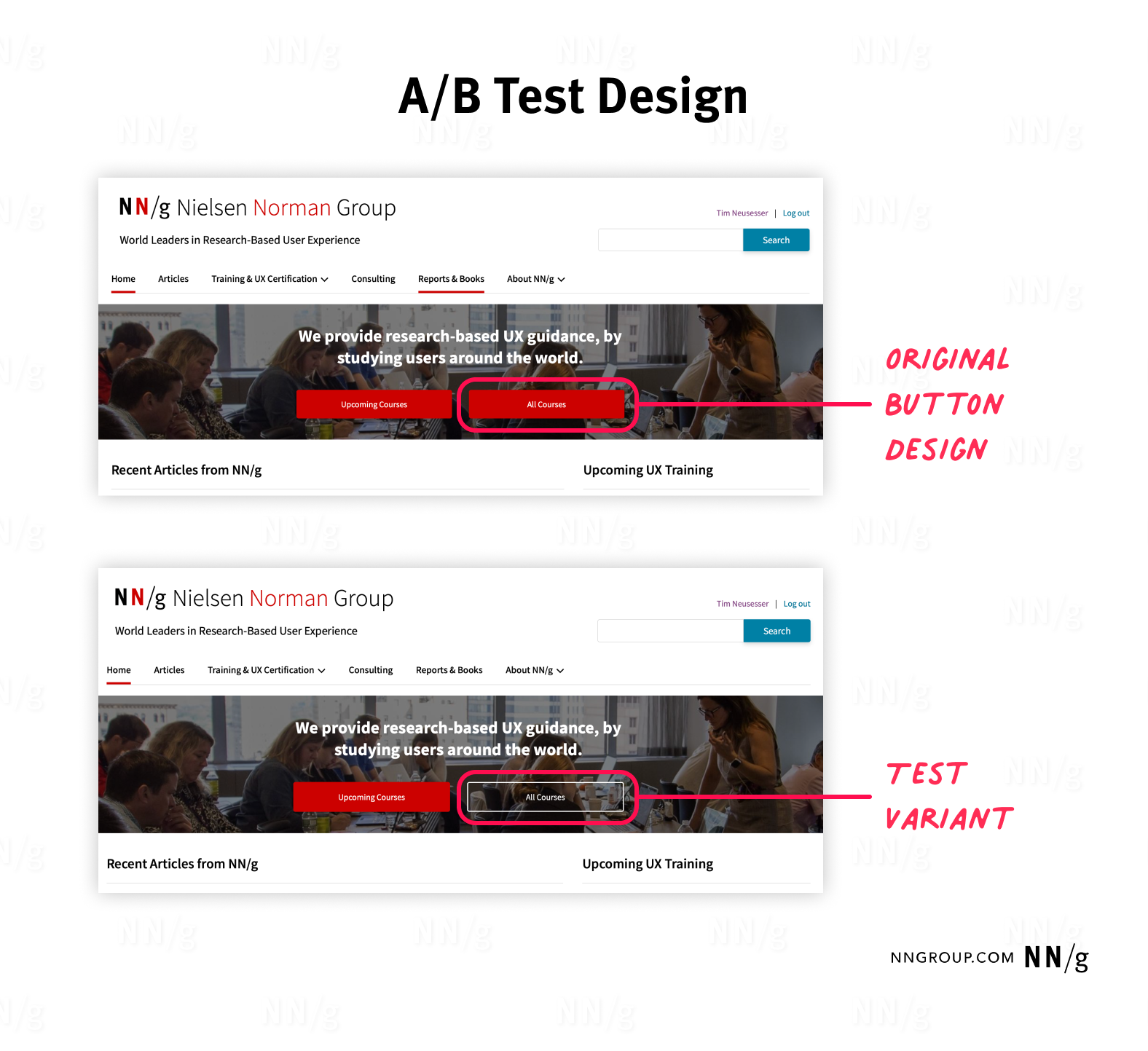
A/B Testing 101
Summary: A/B tests incrementally improve the user experience of a product while effectively reaching business goals. A/B testing (sometimes also referred to as split testing) is a popular UX research method, with widespread adoption across businesses and industries. To ensure reliable, meaningful, and beneficial results for your organization, follow best practices and avoid common mistakes… Continue reading A/B Testing 101
UX Design Mistakes of the B2C E-Commerce Galaxy
Want to know more? Come with me to meet some design mistakes in the galaxy of e-commerce far, far away. 1. The petrol station approach – main navigation issue Finding the toilet in a petrol station’s cafeteria can be stressful.You enter the main door and find yourself in an open space. While figuring out if… Continue reading UX Design Mistakes of the B2C E-Commerce Galaxy
Dark Theme: 5 UI Design Tips
[unable to retrieve full-text content] Light and dark modes. Image by Brainly When designing a dark theme, you should consider a few factors to maintain usability and aesthetic appeal. Why to use dark theme A dark theme reduces the luminance emitted by device screens, creating a more comfortable experience for a viewer. 1. Avoid pure black (#000000) When… Continue reading Dark Theme: 5 UI Design Tips
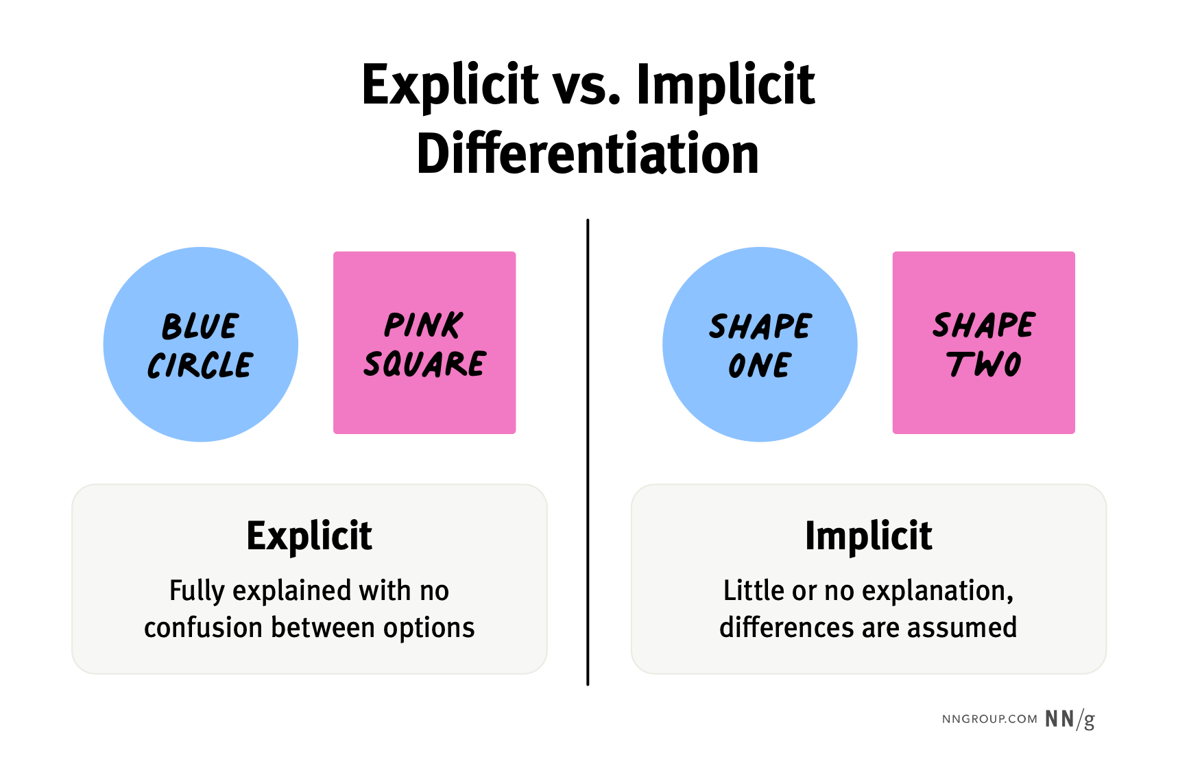
Explicitly State the Difference Between Options
Summary: When the key differences between choices are implied or buried, users often select the wrong option or misunderstand the features. This is an updated version of an article written by Jakob Nielsen in 2013. Users are bombarded with choices on the internet. That’s why the best websites make it easy for users to analyze… Continue reading Explicitly State the Difference Between Options
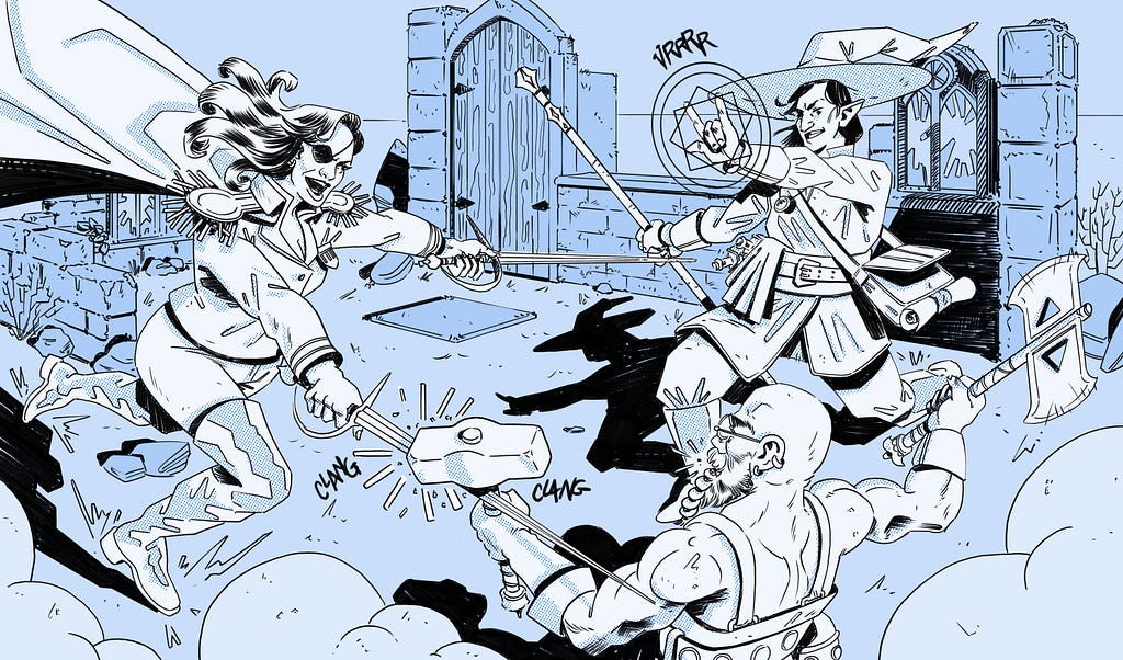
The software development war
[unable to retrieve full-text content] Fantasy characters face each other in terrible combat. Just how typical stakeholders on a project fight about how best to build their software product. Credit: Me. Turning product managers and engineers from frustrating foes into advocating allies DESIGNERS! TO ARMS!!! Each and every one of our UX compatriots on every software production… Continue reading The software development war
Prepare, shelve, reveal (don’t push) — an in-house product design tip
[unable to retrieve full-text content] Have you ever tried to raise a concern about a usability issue, only to be met with a silent nod? — a question for in-house product… Continue reading on UX Planet »
Photoshop Pencil Sketch Effect Tutorial
This simple combination of Photoshop filters creates a pencil sketch effect that quickly converts a photograph into a realistic drawing. The result features a mix of rough sketch lines and shading, along with a subtle paper texture which makes the effect much more believable. Choose between a traditional graphic pencil appearance, or toggle off the… Continue reading Photoshop Pencil Sketch Effect Tutorial
Flow: Revolutionizing Creative Design with a Free AI Generator
Digital design is a wild ride. To stay ahead of the game, you need to jump on the latest tech trends and create mind-blowing designs. One such groundbreaking innovation is Flow, a cutting-edge Free AI Generator that has captured the attention of designers, artists, and creators worldwide. Unlike traditional AI tools that offer basic image… Continue reading Flow: Revolutionizing Creative Design with a Free AI Generator


