
This Portfolio Template is a clean and simple free Bootstrap Template website designed layout for multi-purpose options, this is perfect for any web works. This Template built with bootstrap 3.3.2 and it is totally mobile responsive. It includes 5 Header or Home Section Variations (default, parallax, video, app, and slider), 5 Extra Pages for 3… Continue reading Free Download : Portfolio Template With 5 Different Header/Home Section Layouts
Tag: different
Posts, Pages and Post Types
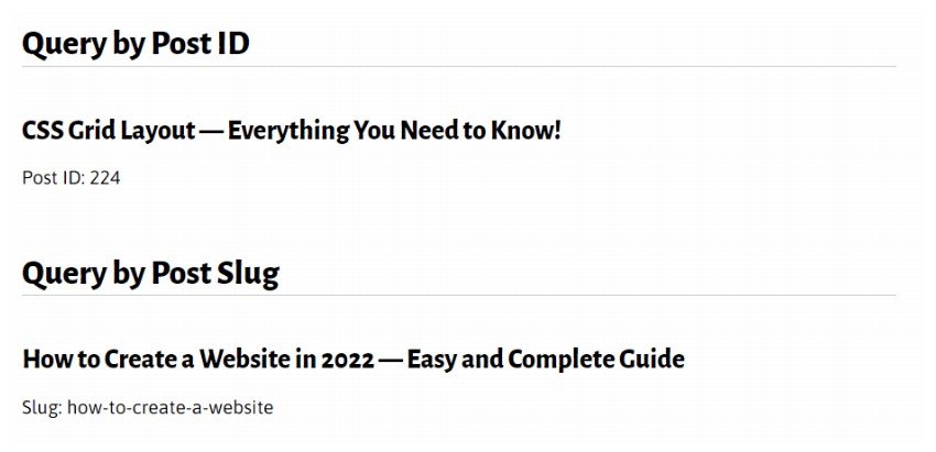
In this part of this series on WP_Query, you’ll learn how to use WP_Query to query for posts, pages and custom post types. You can query for specific posts and pages or you can run a query to return posts of one or more post types. A Recap on How Arguments Work in WP_Query Before… Continue reading Posts, Pages and Post Types
How to Handle and Manage Different Types of WordPress Web Design Clients

The client that you choose to take on defines you. Most of the problems in work can be avoided by taking the time to choose a client carefully. This means, you should know what you want out of your client relationships. Psychological approach is an effective strategy that can be used to read your clients’… Continue reading How to Handle and Manage Different Types of WordPress Web Design Clients
Ten Useful jQuery Plugins For Fullscreen Images

On a recent project I needed to serve an image as a full size background on both a page and a block level element, the image had to be scaled correctly and also be responsive on small devices. Serving fullsized images onto backgrounds or block level elements can pretty much be done with pure CSS3,… Continue reading Ten Useful jQuery Plugins For Fullscreen Images
Make Shapes with CSS: How to Create Different Shapes in CSS

One of best cool features of CSS3 is that it reduces the use of images in web designs and allows you to create different shapes in CSS. Commonforms that you usually see in Photoshop or Illustrator can now be done using CSS3. New CSS properties like transform and border-radius add complexity with shapes instead of creating… Continue reading Make Shapes with CSS: How to Create Different Shapes in CSS
11 showcase sites to get your user interface design inspiration

There are many galleries online that showcase the best in web site designs. As we move towards a more interactive web, we need more than just beautiful aesthetics. Designers and developers need to look for user interfaces, specifically different types of user interactions designs, to inspire them on how to design websites that users can… Continue reading 11 showcase sites to get your user interface design inspiration
HTTP: The Protocol Every Web Developer Must Know – Part 1
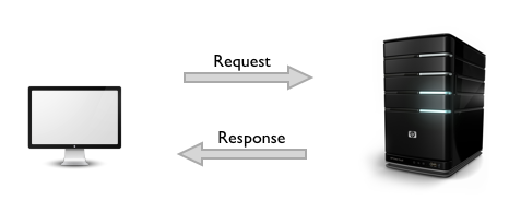
* { box-sizing: border-box; } body {margin: 0;}*{box-sizing:border-box;}body{margin-top:0px;margin-right:0px;margin-bottom:0px;margin-left:0px;} Learning the fundamentals of the World Wide Web is crucial, especially if you are planning to build web apps. And, HTTP is at the heart of any web application you could build. HTTP stands for Hypertext Transfer Protocol. It’s a stateless, application-layer protocol for communicating between distributed… Continue reading HTTP: The Protocol Every Web Developer Must Know – Part 1
A Beginner’s Guide to HTTP and REST
Hypertext Transfer Protocol (HTTP) is the life of the web. It’s used every time you transfer a document, or make an AJAX request. But HTTP is surprisingly a relative unknown among some web developers. This introduction will demonstrate how the set of design principles, known as REST, underpin HTTP, and allow you to embrace its… Continue reading A Beginner’s Guide to HTTP and REST
Top 20 Most Usable Content Management Systems
There are plenty of options when picking a content management system for a development project. Depending on how advanced you need the CMS to be, what language it’s built in, and who is going to be using it, it can be a nightmare trying to find the “perfect” CMS for a project. However, some CMSs… Continue reading Top 20 Most Usable Content Management Systems
8 habits of successful designers that I know

This is by no means a scientific list from formal studies. What I have written here is my impression from the list of designers whom I personally known. I observed their habits and what make them more successful in their career or business relative to others. Again, this is not meant to be a comprehensive… Continue reading 8 habits of successful designers that I know
20 Creative Portfolio WordPress Themes

WordPress is best and easier platform to create a website which is easy to edit and navigate. It is the tool that set up your identity in the professional world. Let’s go to the real and quick world when i’m talking about wordpress themes style. Every new or old photographer, artist, designer, theme layout is… Continue reading 20 Creative Portfolio WordPress Themes
The Creation of “Mechanical Man” Photo Manipulation in Photoshop

In this tutorial, I will show you the process of creating this “Mechanical Man” digital art in Photoshop. We will use a number of photo manipulation techniques to merge several objects into one piece, and apply image adjustments to fine-tune each of the objects to achieve the desired effect. This is an immediate level tutorial… Continue reading The Creation of “Mechanical Man” Photo Manipulation in Photoshop
Tell A Story With Your Web Design – It Always Works

The most popular websites on the World Wide Web are able to impressively convey information about their brand and what it stands for. This helps generate user interest in their brand and ensures the website message is delivered in a way that makes maximum impact on website visitors. They do this by using one of… Continue reading Tell A Story With Your Web Design – It Always Works
Free E-Commerce Icon Set

Free 33 flat e-commerce icons made by Responsive. Icons are available in different sizes and are drawn using smart objects. Just download the layered PSD and enjoy! Just click the link below to visit the source link. Visit Download Page
20 Responsive Menu Tutorials with Free Scripts

Responsive designs are more and more frequently used today. Many people started using mobile devices, like smartphones or tablets, to browse the internet, and thus, having a fully responsive website is a must! But what is a responsive design? Responsive designs have specific CSS media queries added, in order to make them fit on any… Continue reading 20 Responsive Menu Tutorials with Free Scripts
40+ Portfolio WordPress Themes to Get You Noticed

For freelancers and business owners, Portfolio WordPress Themes are essential to have when showcasing your work to potential clients. Many bloggers will agree that WordPress is a fantastic platform for Portfolios, they are easy to update and comes with thousands of plugins to choose from. Deciding on the right Portfolio WordPress Theme for you can… Continue reading 40+ Portfolio WordPress Themes to Get You Noticed
Rawr! How to Draw an Anatomically Correct Dragon

Dragon anatomy is a problematic topic, mainly due to the fact that they’re mythical creatures. However I can show you how to design a believable body for this mythical creature based on basic anatomy theory. In this tutorial you’ll learn about dragon skeleton, muscles and movement. If you want your dragons to look real, this… Continue reading Rawr! How to Draw an Anatomically Correct Dragon
Responsive Web Design: Will this bubble burst?

There is a lot of hullabaloo about Responsive Web Design (RWD). Why not? After all Google recommends Responsive Web Design. So is it time for you to join the RWD bandwagon? With mobile internet surpassing the desktop-only era, with loads of tablets and mini tablets coming up and new phenomenon called ‘phablets’ hitting the scene;… Continue reading Responsive Web Design: Will this bubble burst?
8 wordpress theme for government and politicians

Here are 8 wordpress themes for government and politicians. I used to really hate visiting government websites because they are slow and ugly to look at. Fortunately, times have changed and I am seeing more and more government adopting the latest in web design and aesthetics. A case in point is using wordpress as the… Continue reading 8 wordpress theme for government and politicians
25 Top WordPress Metro Theme Creations

WordPress metro theme designs are based on the user interface that was popularized by Microsoft on the Windows Phone 7. Since then, this beautiful style has attracted a lot of followers. In the new Windows OS version, you will see the metro start screen that is the foundation of Win8 interface. I think that one… Continue reading 25 Top WordPress Metro Theme Creations
Create Fresh Fruit 3D Text Effect in Photoshop

In this Photoshop tutorial, I will show you the process of creating fresh fruit 3D text effect in Photoshop. You will learn a few trick to render a nice and unique 3D text effect and apply various fruits around it. We will use a number filter to add some extra effect for our text. This… Continue reading Create Fresh Fruit 3D Text Effect in Photoshop
20 Examples of Effective Image Use in Web Design

The Quilt App Bridge 2 Rwanda Ink & Spindle Bright Bright Great Kettle Cuisine Belancio Jonathan Moreira Inc Strategik iZettle What You Are Taasky Forgetful Chef Somewhere Hayden WordPress Theme Sort Bench Supper Club App Web Design Fact
10 Terrific Time-Saving CSS Cleanup Tools

The benefits of having clean, organized CSS are numerous. A site with immaculate CSS will load more quickly, appear more prominently in search results, and serve as a stellar testament of your professionalism for future clients. Everyone from the everyday visitor to the most scrutinous fellow designer will benefit from your diligent, clean CSS markup. … Continue reading 10 Terrific Time-Saving CSS Cleanup Tools
A Web Designer’s Typographic Boilerplate

I like to use a typography.css in my projects; a separate file which houses all the basic structural typographic styles I’ll need. A lot of what’s found within it is obvious stuff (heading sizes, for example) but it also contains less obvious things which I don’t want to forget. Let’s work our way through the… Continue reading A Web Designer’s Typographic Boilerplate