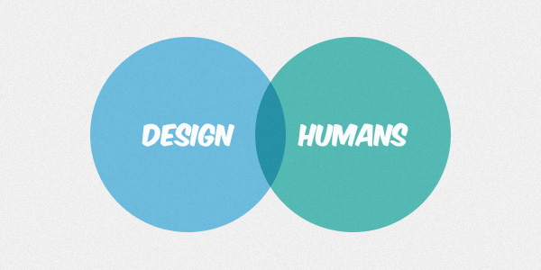
Human-centric and user-centric design are two terms we often hear in the industry, though sometimes both designers and developers consider them to mean the same. User-centered design is something most of us aim to put high on our list of priorities; having the end-user in mind and reflecting this philosophy in our products. Human-centered design is taking user-centered design to the next level.

It’s an interesting concept, though in web design it’s not a common philosophy we apply. Today, we’ll explore the possibilities of human-centered design for websites and how it can help during your daily projects.
Why?
It really improves your workflow. It’s a feasible process.
First of all, why does human-centered web design matter? In general, either as designer or developer, it seems that we’re doing a pretty good job at what we do. We build websites, mainly for clients, and we get paid for that. Sounds neat, right? I personally look at human-centered webdesign as a method of getting a better grip on projects. It’s not just something which we should do, such as so many aspects in webdesign, but it really improves your workflow. It’s a feasible process to guide you.
The underlying idea is using specific approaches on making your workflow as smooth as possible. Besides which, it’s a great asset in helping you connect with clients, transform concepts to achievable ideas and increase the speed and effectiveness of deploying those concepts.
What?
In human-centered web design we look at humans as the reason a system (your website) exists in the first place; not just an essential part (a user) of it.
We can use the concept of human-centered webdesign as a concrete design process. As some of you remember, we explored the creative thinking process a while ago, which specifically explored how our creative thinking process works. With human-centered web design, we’re going to expand this into a complete design process for delivering final products. A practical, guiding method to have more structure and efficiency in your flow and in your products.
This concept differs slightly from user-centered web design. Whenever we’re keeping the final user in mind, we’re often solving a certain straightforward problem. Think of usability, legibility or confusing elements on your website. In human-centered web design we start from a larger scope and look at humans as the reason a system (your website) exists in the first place and not just an essential part (a user) of it, which is often the focus of user-centered design.
Our work is defined by three major parts. Each part is an important milestone during any project. The three steps which we’re going to discuss are:
- exploration
- design
- implementation
1. Exploration
Whenever you start, the first couple of steps are important for defining the course of the rest of your project. You try to frame the why of a website, you finish your research and come up with a realistic schedule to deliver a final product. The output of these initial steps are a concrete, deeper understanding of the client’s wishes, their needs and potential barriers before you deliver the solution.

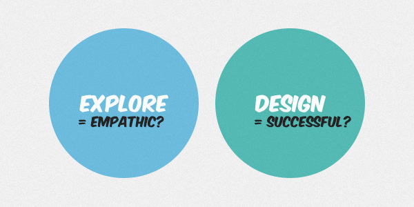
Naturally, every project starts with a brief and expectations from the client. In my opinion, great designers try to empathize with people they are providing a solution for. They question assumptions, inspire new solutions and use their research to inspire themselves. Even at the very beginning, your research can be evaluative. What do other websites of the same type do? Why are they successful (or why do they fail)? Would a different design or set of features make a strong difference? You can learn a lot during the early part of a project with the client’s response to ideas and proposed solutions. A concrete method for achieving this is to use prototypes. The key words during this part of the project are early and often. It’s a very smart investment of time to create a couple of minimum viable products: wireframes, sketches, concepts on paper, early mock-ups, other inspiring websites, …
Talk to stakeholders about these early minimum viable products. If you invest a day in building two or three minimum viable products and you have short conversations about these with the client, other designers and potential users (family, friends, other designers, even random people), you receive a lot of useful information that helps you shape the final product. This initial feedback is extremely interesting. Developers and designers who have the “just do it” mentality and show progress when the product is nearly finished risk seeing a lot work going to waste when it doesn’t answer the expectations or simply doesn’t offer much added value to clients and users in the long run.
The “just do it” mentality is not effective. You risk completing work which eventually might get rejected, either by clients or users.
A good brief focuses on human terms, rather than technology, product or functionality of the final product. After all, your product solves something, both for the targeted audience and for the client. This is the human aspect you keep in mind, a website is simply a medium which offers that solution. Have it as sticky note on your screen, as comment on top of your code or even print it out and have it on your desk. It’s the empathy with the user which is the best possible motivation for creating amazing products. It’s this empathy which makes your final product so good as you recognize the importance of the different stakeholders (clients and users) and how your product benefits them.
It’s the perspective of human-centered web design which makes innovation easier. Let’s look at the smartphone for example. The creation of this product didn’t begin with designers wanting to build a phone with amazing capabilities. Rather, the initial concept was to design something which offered the power to have access to information, nearly anywhere, nearly instantly. Many people believe that hardware is often the center for innovation, though, software and even web design have amazing capabilities. After all, look at the different social media platforms, the ease of online buying and learning through websites and other amazing concepts which have had a certain influence on our life. They all understood what would be useful to us.
2. Design
Solitude while building a website is very common, though it’s not the most successful way to create a final product.
So, here we are! We have a good idea of what is expected. You’ve also gained useful insight into what users want through early prototyping and most of all, you haven’t invested a lot of time to achieve this either. It’s perfectly possible to create a couple of minimum viable products and present them in less than a day. Great job, this means you can now use your precious time to design and/or develop the website.

Often you start with a blank canvas. The opportunity to create something amazing. Through inspiration and brainstorming you get your first ideas to build that fantastic product based on one of your successful minimum viable prototypes.
One of the challenges when it comes to human-centered webdesign is that you are too focused on your work. Solitude while building a website is very common, though it’s not the most successful way to create a final product. Try to make contact with other people regularly. Do you work alone? Well, perhaps working in a corkworking space once a week could be an interesting solution for you. Show your work to others while it evolves. Sometimes we don’t like showing our work to others as we believe it isn’t perfect. It doesn’t reach our standards, though, that’s not what matters. It’s not the finishing touches which matter while gathering feedback on your work. it’s the general impression which does. Show your work, even if you consider it to be bad. Don’t sell it, or defend certain choices either. Present it neutrally. Other people look with different eyes than the ones of designers or developers and that’s the kind of feedback which is often more meaningful than the feedback of your colleagues.
Human-centered design is not about creating the perfect product, it’s all about finding the best compromise.
Take calculated risks during your early work. Perhaps a new, innovative way to navigate a website or getting information on your website could be interesting if it truly helps your users. Or, take a different approach and try co-operative design. There are many opportunities for you every day to try co-operative design and involve others in your work besides just giving feedback. Human-centered design is not about creating the perfect product, it’s all about finding the best compromise between you as designer, your client and the target audience of the website.
Adapt on the fly. Certain feedback might prove you’re doing something critically wrong. We tend to defend our work far too much and that’s a behavior we can change for the better good. If it only works for you and not for others, it simply doesn’t fit. Certain features distract people from your core solution. Eliminate them. Involve stakeholders with one simple question as your product evolves:
How could this be better for you?
A conversation which starts with this question could last five minutes and offer you a tremendous amount of ideas or other potential solutions which satisfy everyone who’s involved with the product.
3. Implementation
Let’s start with a statement. A web project is never finished. Do you agree, do you disagree? Certain agencies keep working on a website for example (measure results, perform testing to increase the sale rate for example), while others simply quit the project as soon as the final product is delivered. In my opinion, a web project is never truly finished. We’re in a fast moving industry and the slightest changes could have major consequences on user behavior on websites.

Consider it a learning cycle as developer. As you’ve adapted to feedback (being humble and learning on the way is a great gift), once you’ve put your first finished product online the learning cycle continues. This is the moment analytics start to matter.
In all honesty, all modern websites should have some kind of tools embedded such as Google Analytics to track the performance of a website. It’s the same when a toy manufacturer measures its sales after the development of a new product. Delivering a product is an important step, though not the final one. It’s how successful your product is that matters in the end. The strength of analytics is that you as developer can literally show what the added value of your product is and thus make customers more happy. It’s something everyone in our industry should have in mind. Never be afraid to show great statistics and show how your product achieves the goal of both customers and users, it doesn’t happen enough in the industry.
In general, it’s far more interesting to change the emphasis on certain features than completely overhauling a website to measure results and see influence on statistics.
Important while using analytics to understand how users behave on your website is asking yourself one important question. What am I going to measure? After all, you originally developed the website with a certain objective in mind. How can you translate this objective to a number? Sometimes this question is extremely obvious, such as sales rate, but sometimes it’s far more difficult. Not only the numbers are important, but also the way you visualize them and present them to clients.
Quite important is that you do something with the analytics you receive. Evaluation is fundamental for change. As in the start, try to involve users and try to adapt through simple and effective changes. Do a lot of users leave the website on a certain page? What if we temporarily remove it or change the flow of the website in general by emphasizing another page? In general, it’s far more interesting to change the emphasis on certain features than completely overhauling a website to measure results and see influence on statistics.
This final phase is a very interesting one and there are quite some different opinions on how a web project should ‘end’. After all, can you keep analyzing results forever? Can you keep changing a website slightly forever to satisfy stakeholders? How long are clients prepared to pay for improving a website through the use of analysis? What are your opinions, as professional or hobbyist?
Final Quick Tip
Sometimes I wonder why web designers don’t record progress for themselves. Either in the form of a public (or private) blog, some Dribbble shots which show the evolving design, or even some quick personal notes in your sketchbook.
Let’s face it, we often have problems during our design process. We get stuck on a design, fail to translate the brief correctly to a final product, or have problems in communicating with a client. Human-centered webdesign is also about you and the interaction with the industry. Naturally, you’re just as human as anyone else. It’s a good idea to keep track of problems you come across or how you’ve solved certain design problems along the way.
Do you have some tips yourself? Or criticism of why a certain human-centric method isn’t effective? Share your opinion, share your tips and tricks! Thank you for reading.
