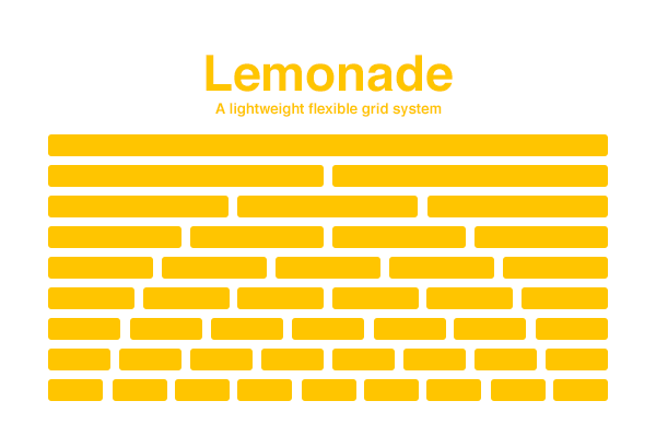
I’d like to talk to you about Lemonade. Not the refreshing citrus drink, but a grid system I created.
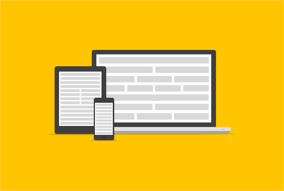
Lemonade is a grid system that was built in order to give designers and developers the confidence to make fully responsive websites, eliminating the frustration of flicking between browsers looking for bugs and errors. Let’s look at how it’s put together and how you can build your very own responsive grid system.

Choosing the Right Grid
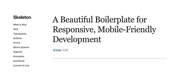
Before building my own, I often used Skeleton.css for my responsive layouts. However, as time went on, I felt like it was a bit of a lost cause, simply because I was constantly tweaking it to my needs and stripping away unnecessary elements that I felt weren’t usable. It’s a very good framework, but I would only recommend it to people who aren’t comfortable with front-end work, at all.

There are so many grids, frameworks and libraries out there, but picking the right one is a tough decision. The easiest way to decide is by asking yourself “What am I trying to make?” For example: I’m currently building a CMS (mostly PHP) and I don’t want to focus on the interface (the admin panel) at all, so I’ve opted for Bootstrap. Bootstrap is an amazingly comprehensive framework and literally takes care of you during every aspect of the design process.
When Life Gives You Lemons
I really wanted to make something which would give me full control, where I wouldn’t have to spend the majority of my time customising the grid. To begin with I thought making a grid was going to be a walk in the park, I actually thought I could make it in a few hours. On the 24th June 2013 at around 12:30am, I opened up my editor and started writing code, lots of it. But surprise, surprise, it was extremely difficult to get going; how do you create something that has been created hundreds of times, but better? I needed to think ahead, I needed to create it how I would want it to work, not how I thought a grid system should work, so I set myself three objectives (I wrote them on sticky notes and plastered them on my wall):
- Be small, but powerful
- Be modern
- Be useful
Let me run you through these objectives in a more detailed manner. I wanted the grid to be tiny, so small that if I ever had to edit it, I wouldn’t be cursing at the screen with frustration. It needed to work on modern browsers (forget IE8 and under); I wanted to remove the scenario of flicking through browsers worrying if everything looks OK. The final objective was all about using it, I didn’t want to make something and just stick it on GitHub and never use it again. If I was going to create something, it would need to be used in every project that I made.
Let’s Get Started
First let’s tackle the CSS. Remember the first objective: “Be small, but powerful”
*,*:after,*:before {
	margin:0;
	padding:0;
	/* Removes padding behaviour on widths */ -webkit-box-sizing:border-box;
	-moz-box-sizing:border-box;
	box-sizing:border-box;
}
/* Attribute selector */ [class*='bit-'] {
	float:left;
	padding:10px;
}
/* Floats last ".bit-" to the right */ [class*='bit-']:last-of-type {
	padding-right:10px;
	float:right;
}
/* Clearfix */ .frame:after {
	content:"";
	display:table;
	clear: both;
}
Essentially this is the grid’s backbone; this is what makes the grid function and holds the whole thing together.
Setting border-box with a universal selector keeps us from worrying about the padding of our elements messing with our widths.
Whilst we’re on the subject of selectors, the biggest space killer in our grid is the attribute selector. You can see the attribute selctor in action where I’ve used [class*='bit-']. This targets any elements whose class attribute contains “bit-”. We could also have used [class^='bit-'] which targets all elements where the class begins with “bit-”. Using an attribute selector to encompass all our various column classes will save us so much time when writing new column widths.
One more thing to note is the use of a last-of-type selector [class*='bit-']:last-of-type. Each row of “bit-”s will be contained within a frame element:
<div class="frame">
	<div class="bit-2">
	</div>
	<div class="bit-2">
	</div>
</div>
Using the last-of-type selector we can target the last “bit-” element in the group, instructing it to float right, instead of left. This makes sure everything aligns perfectly against the right edge, in supporting browsers.
One common question I hear a lot about Lemonade is: “Why such weird class names?” It’s not an exciting story, I just kept referring to the columns as “bits” in my notes, so it kind of escalated from there. Saying that, I think I subconsciously wanted the classes to be different to the standard “col-1″ seen in many other grid systems.
The Widths
I generated the widths of the columns using a calculator (see, you don’t have to be a math nerd). Calculating the columns wasn’t difficult at all, in fact it was really easy. For example, in my grid, each bit is a fraction of the whole width, bit-8 is an eighth. Therefore 100 ÷ 8 = 12.5, so we set the width of each bit-8 at 12.5%.
I thoroughly tested each column section with real content and they all function perfectly on different browsers and devices.
/* Main Widths */ .bit-1 {
	width:100%;
}
.bit-2 {
	width:50%;
}
.bit-3 {
	width:33.33%;
}
.bit-4 {
	width:25%;
}
.bit-5 {
	width:20%;
}
.bit-6 {
	width:16.6666666667%;
}
.bit-7 {
	width:14.2857142857%;
}
.bit-8 {
	width:12.5%;
}
.bit-9 {
	width:11.1111111111%;
}
.bit-10 {
	width:10%;
}
.bit-11 {
	width:9.09090909091%;
}
.bit-12 {
	width: 8.33%;
}
Now, as you can see, the widths are super clean, readable and this is what I initially wanted — you can easily see what’s what and if need be, you can mess around and edit the sizes with ease.

Customising Columns
Editing Lemonade is pleasantly simple. Grid systems are often intimidating to edit, so I challenged myself to make mine as simple as possible. The only rule for customising Lemonade is: as long as your columns equal 100%, it will work perfectly. Adding your own bits is straight-forward, as the attribute selectors take care of most of the grid structure:
.bit-25 {
	width:25%;
}
.bit-75 {
	width: 75%;
}
These two in combination would be fine.
<div class="bit-25">
</div>
<div class="bit-75">
</div>
Thinking Responsive
Making it responsive was pretty challenging, to get it perfect on every device and determine the breakpoints, was extremely frustrating. Let me run you through the code. I chose to work desktop down, rather than mobile first, but it’s entirely up to you which approach you prefer.
Large-ish
We’ve already set our base widths, so let’s now target devices between 800px and 1100px:
/*base tablet to small desktop styles*/ @media (min-width:800px) and (max-width:1100px) {
	.bit-2,.bit-7 {
		width:100%;
	}
	.bit-4,.bit-8,.bit-10,.bit-12 {
		width: 50%;
	}
}
We could loosely describe this as targeting Landscape Tablet to Desktop (though be aware that device widths are by no means set in stone). This was just as important as the other media queries – why? Because I found the majority of people who own 13″ notebooks rarely have the browser full width, they will have it a couple of hundred pixels short of full-width, so what looks good on landscape tablet, must look good on desktop too.
Smaller
/*base tablet styles*/ @media (max-width:800px) {
	.bit-4,.bit-6,.bit-8,.bit-10,.bit-12 {
		width:50%;
	}
	.bit-1,.bit-2,.bit-3,.bit-5,.bit-7,.bit-9,.bit-11 {
		width: 100%;
	}
}
This range I like to think of as targeting mobile to tablet (although, again, defining devices by screen resolution is rocky territory). Why the weird breakpoints? Nothing too crazy, it’s just what worked best — grids are very tedious when it comes to how strict the widths have to be, and I found these breakpoints worked well out in the wild.
The uniqueness of the column sizes was pretty tough to create and this was actually what I spent most of my research on; what do you usually see on desktop that changes dramatically on mobile? Mainly inline content that becomes stacked content – so I had to think what is more than likely going to be placed side-by-side and what will be stacked on top of each other.
Small
/*base mobile styles - everything 100%*/ @media (max-width:480px) {
	.bit-1,.bit-2,.bit-3,.bit-4,.bit-5,.bit-6,.bit-7,.bit-8,.bit-9,.bit-10,.bit-11,.bit-12 {
		width: 100%;
	}
This breakpoint addresses what most people would recognise as mobile. I tried to be more creative with setting the widths for mobile, but I felt I needed to keep it basic as I imagine most people aren’t looking for some sort of metro layout or anything too crazy like that.
The HTML
The HTML is super simple and that’s what’s great about this grid. To carry on with our example, let’s make a three-grid column (could be a gallery, for example).
<div class="frame">
	<div class="bit-3">
		<img src="http://placekitten.com/800/400"/>
	</div>
	<div class="bit-3">
		<img src="http://placekitten.com/800/400"/>
	</div>
	<div class="bit-3">
		<img src="http://placekitten.com/800/400"/>
	</div>
</div>
There you have it, a three-column responsive and browser compatible gallery. You can, of course, play around with the HTML and make all types of layouts.
Conclusion
Building Lemonade was a big learning curve for me, it taught me that if I’m not comfortable with something then I don’t have to stick around and wait for alternatives – I can create my own!
Make Lemonade!
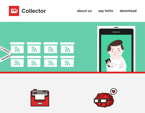
I hope this tutorial has given you an insight in to creating some pretty awesome stuff. Take a look at some sites in the wild, to see how others have used it:


If you have any questions or issues, leave a comment below or feel free to tweet me.
