
In a previous tutorial, we discussed how to build a responsive landing page with Bootstrap 4. Today, we’ll learn how to create an animated landing page with Material Kit, a free Bootstrap 4 UI Kit based on Google’s Material Design.
To implement it, we’ll use a combination of Bootstrap 4’s helper classes, Material Kit’s additional classes, and custom code when needed.
What We’ll be Working Towards
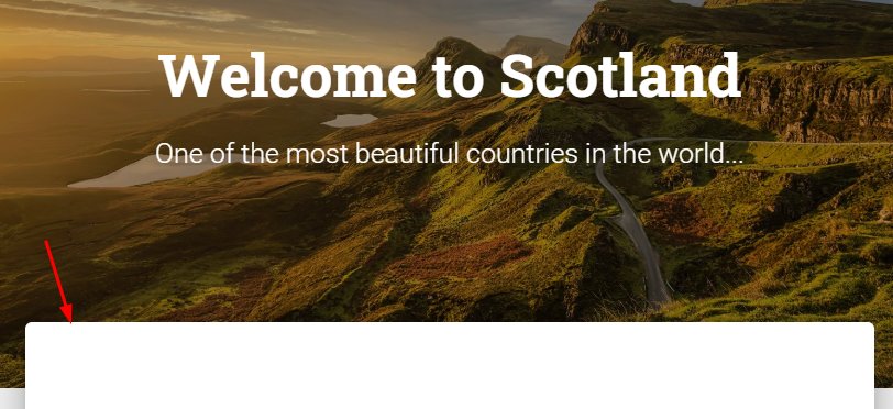
Here’s the page we’ll be building during this tutorial (take a look at the full page view for maximum effect):
The concept behind this page is to provide a quick overview of Scotland. The text content will come from Wikipedia, while the images will come from Unsplash.
Note: This tutorial assumes you have some familiarity with Bootstrap 4. If you need a refresher, check out the following tutorials:
![]()
Bootstrap 4
How to Build a Landing Page Template With Bootstrap 4
George Martsoukos
![]()
Bootstrap 4
How to Quickly Build Layouts With Bootstrap 4’s Responsive Flexbox Utilities
George Martsoukos


What is Material Kit?
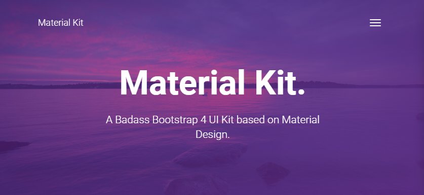
As already mentioned, Material Kit is a free Bootstrap 4 UI Kit inspired by Google’s Material Design.
“Material Design is a design language that Google developed in 2014. Expanding on the “card” motifs that debuted in Google Now, Material Design uses more grid-based layouts, responsive animations and transitions, padding, and depth effects such as lighting and shadows.”
Created by Creative Tim, not only does it customize the default appearance of Bootstrap 4 components, but also it implements its own styles.
Apart from the free standard version, there’s also a premium variant called Material Kit Pro with even more features and capabilities. Happily enough, this UI Kit comes with well-organized documentation and three pre-built pages for speeding up the learning process.
1. Include the Required CSS & JS Libraries
For the purposes of this exercise, we’ll have to download and include a bunch of files in our pen.
First, we’ll import the required Material Kit files by following the instructions on this page. Keep in mind that we’ll only include the assets that we’re going to use. For example, our page won’t contain a range slider, so there’s no need to incorporate the noUISlider slider.
Next, we’ll import AOS.js, an easy-to-use library which will reveal our elements as we scroll down the page.
With all the above in mind, in the CSS editor of our pen we’ll include three files:

Similarly, the JavaScript editor will contain five files:

2. Set Out the Markup
With all the required stuff in place, let’s examine the page markup.
We’ll first define a header, five sections, a footer, and a back to top button. We’ll place the last four sections inside the main element. Later, as we’ll see, this wrapper element will receive a negative top margin, so its contents will overlap the bottom part of the first section.
Note: you might find this tutorial on collapsing margins interesting whilst we’re on the subject:

Here’s the page structure:
<header>...</header>
<section>...</section>
<main>
  <section>...</section>
  <section>...</section>
  <section>...</section>
  <section>...</section>
</main>
<footer>...</footer>
<button>...</button>
3. Build the Header
The page header will behave as a fixed positioned element and include only an external call-to-action button. Initially, its background will be transparent, but after 50px of scrolling it will become white:

Here’s its structure:
<header class="navbar navbar-transparent navbar-color-on-scroll fixed-top navbar-expand-lg" color-on-scroll="50">
  <div class="container">
    <a class="btn btn-rose btn-round" href="" role="button" target="_blank">
      <strong>...</strong>
      <i class="material-icons">flight</i>
    </a>
  </div>
</header>
Note that in a real page, inside the header we would have a navbar with links to the different sections.
4. Build the Hero Section
The hero section (or “banner section”) will contain a fullscreen background image and two headings. Plus, for readability reasons, we’ll create an empty image overlay by using the ::after pseudo-element:

Here’s its structure:
<section class="page-header text-center position-relative banner-section" style="background-image: url(scotland-unsplash.jpg);">
  <div class="container">
    <h1 class="title">...</h1>
    <h3>...</h3>
  </div>
</section>
And the styles for the overlay:
.banner-section::after {
  content: ’’;
  position: absolute;
  top: 0;
  right: 0;
  bottom: 0;
  left: 0;
  background: rgba(0, 0, 0, 0.25);
}

.banner-section .container {
  z-index: 1;
}
5. Build the Main Sections
As we’ve discussed above, the main element will cover the bottom part of the hero section:
To achieve this layout, we have to append the main and main-raised classes to it:
<main class="main main-raised">...</main>
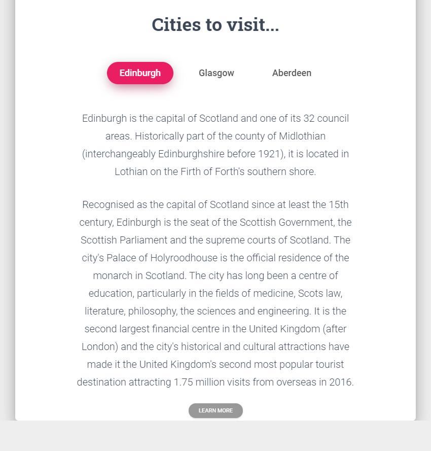
Section #1
The first section inside the main will contain a heading and two paragraphs:

The section markup:
<section class="section text-center">
  <div class="container">
    <div class="row justify-content-center">
      <div class="col-12 col-md-10">
        <h2 class="title mb-4">...</h2>
        <p>...</p>
        <p>...</p>
      </div>
    </div>
  </div>
</section>
Section #2
In this section, we’ll use tabs to present some details for the largest cities of Scotland:
Here’s the markup:
<section class="section text-center">
  <div class="container">
    <div class="row justify-content-center">
      <div class="col-12 col-md-10">
        <h2 class="title mb-4">...</h2>
        <ul class="nav nav-pills nav-pills-rose justify-content-center mt-5" role="tablist">
          <li class="nav-item">
            <a class="nav-link active" id="pills-edinburgh-tab" data-toggle="pill" href="#pills-edinburgh" role="tab" aria-controls="pills-edinburgh" aria-selected="true">Edinburgh</a>
          </li>
          <li class="nav-item">
            <a class="nav-link" id="pills-glasgow-tab" data-toggle="pill" href="#pills-glasgow" role="tab" aria-controls="pills-glasgow" aria-selected="false">Glasgow</a>
          </li>
          <li class="nav-item">
            <a class="nav-link" id="pills-aberdeen-tab" data-toggle="pill" href="#pills-aberdeen" role="tab" aria-controls="pills-aberdeen" aria-selected="false">Aberdeen</a>
          </li>
        </ul>
        <div class="tab-content tab-space pb-0">
          <div class="tab-pane active" id="pills-edinburgh" role="tabpanel" aria-labelledby="pills-edinburgh-tab">...</div>
          <div class="tab-pane" id="pills-glasgow" role="tabpanel" aria-labelledby="pills-glasgow-tab">...</div>
          <div class="tab-pane" id="pills-aberdeen" role="tabpanel" aria-labelledby="pills-aberdeen-tab">...</div>
        </div>
      </div>
    </div>
  </div>
</section>
Note: We’ll build the tabs/pills mainly by following Bootstrap’s markup instead of entirely using Material Kit’s markup. I think Bootstrap’s example is more complete and makes more sense with regards to accessibility.
Lastly, we’ll specify some simple styles for making the tab links bigger:
.nav-pills .nav-item:not(:last-child) {
  margin-right: 20px;
}

.nav-pills .nav-item .nav-link {
  font-size: 18px;
  padding: 10px 25px;
  text-transform: none;
}
Section #3
The third section will contain a heading and a Masonry-like grid of cards. Each card will have an image along with a caption that will be part of its overlay. To do this, we’re going to take advantage of the CSS Multi-column Layout.
On small screens (< 576px), all cards will be stacked:

On larger screens though, we’ll have a two column layout:

Here’s the section structure:
<section class="section text-center">
  <div class="container">
    <h2 class="title mb-4">...</h2>
    <div class="card-columns text-white">
      <div class="card bg-dark">
        <img class="card-img" src="http://webdesign.tutsplus.com/IMG_SRC" alt="Card image">
        <div class="card-img-overlay d-flex flex-column align-items-center justify-content-center">
          <h4 class="card-title">...</h4>
          <p class="card-text mt-0">...</p>
        </div>
      </div>

      <!-- more cards here -->
    </div>
  </div>
</section>
The styles that will produce this behavior:
.card-columns {
  column-count: 1;
  column-gap: 20px;
}

.card-columns .card {
  margin: 0 0 20px 0;
}

.card-columns h4 {
  font-size: 22px;
}

.card-img-overlay {
  background: rgba(0, 0, 0, 0.3);
}

@media (min-width: 576px) {
  .card-columns {
    column-count: 2;
  }
}
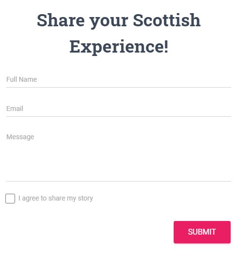
Section #4
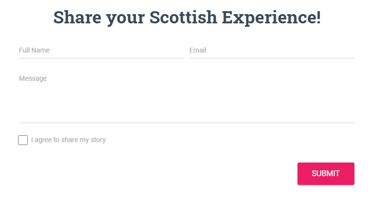
The fourth section will include a heading and a form.
Similarly to the previous section, on small screens (< 576px), all cards will be stacked:
On larger screens, we’ll have a two column layout:
Here’s the section structure:
<section class="section pb-5">
  <div class="container">
    <h2 class="title text-center mb-4">...</h2>
    <form>
      <div class="form-row">
        <div class="col-12 col-md-6 mb-4">
          <input type="text" class="form-control" placeholder="Full Name">
        </div>
        <div class="col col-md-6 mb-4">
          <input type="email" class="form-control" placeholder="Email">
        </div>
        <div class="col-12 mb-4">
          <textarea class="form-control" rows="5" placeholder="Message"></textarea>
        </div>
        <div class="col-12 mb-4">
          <div class="form-check">
            <label class="form-check-label">
              <input class="form-check-input" type="checkbox" value="">
              ...
              <span class="form-check-sign">
                <span class="check"></span>
              </span>
            </label>
          </div>
        </div>
        <div class="col-12 text-right">
          <button type="submit" class="btn btn-rose">Submit</button>
        </div>
      </div>
    </form>
  </div>
</section>
By default, Material Kit adds a purple color to the checkbox. In addition, the form elements receive an animated bottom purple border during the focus state. At this point, we’ll replace that color with the common rose (deep pink) one which is used throughout the page.
The required styles:
:root {
  --rose: #e91e63;
}

.form-control,
.is-focused .form-control {
  background-image: linear-gradient(0deg, var(--rose) 2px, rgba(156, 39, 176, 0) 0),
    linear-gradient(0deg, #d2d2d2 1px, hsla(0, 0%, 82%, 0) 0);
}

.form-check .form-check-input:checked + .form-check-sign .check {
  background: var(--rose);
}
6. Build the “Back to Top” Button
The back to top button will be a fixed positioned element which will initially be hidden:

Here’s its structure:
<button class="btn btn-rose btn-fab btn-fab-mini btn-round position-fixed back-to-top is-hidden">
  <i class="material-icons">keyboard_arrow_up</i>
</button>
Notice the is-hidden class responsible for hiding it.
The associated button styles:
.btn.back-to-top {
  bottom: 50px;
  right: 30px;
  z-index: 10;
  opacity: 0.5;
  transition: all 0.2s;
}

.btn.back-to-top.is-hidden {
  opacity: 0;
  visibility: hidden;
}

.btn.back-to-top:hover {
  opacity: 1;
}
As long as a user scrolls to the bottom of the page, the button will appear. Then, if the user clicks on it, they will smoothly return to the top of the page.
The following JavaScript code handles the aforementioned functionality:
const $backTop = $(".back-to-top");
const isHidden = "is-hidden";

$(window).on("scroll", function() {
  const $this = $(this);
  if ($this.scrollTop() + $this.height() == $(document).height()) {
    $backTop.removeClass(isHidden);
  } else {
    $backTop.addClass(isHidden);
  }
});

$backTop.on("click", () => {
  $("html, body").animate({ scrollTop: 0 }, "slow");
  return false;
});
Note that the footer section doesn’t include anything special, so we’ll omit it for the sake of simplicity. You can check it on your own!
Great job, folks! Without putting too much effort, we managed to build a beautiful Material Design landing page.
But, let’s be honest, there’s still enough room for improvement, right!
7. Animate Elements on Scroll
Up to this point, our page looks great! But, let’s go one step further and bring life to specific elements as they come into view. There are a number of different ways (e.g. JS plugins, Intersection Observer API, etc.) to accomplish it. In actual fact, I’ve already covered that requirement in previous tutorials:

For this example, we’re going to use AOS.js, a straightforward JavaScript library that I really like.
As a first step, we’ll add the custom data-aos attribute to the target elements. The value of this attribute can receive different keywords such as fade-up, fade-down and flip-left which indicate the type of effect. In our case, the majority of elements (apart from the masonry elements) will appear with a small slide animation, thus we’ll give them data-aos="fade-up", like this:
<h2 class="title mb-4" data-aos="fade-up">...</h2>
Next, we’ll initialize the plugin and modify a few of its default options. Most importantly, we’ll set once: true. That will cause the animations to fire only once. Specifically, as you scroll down the page for the first time:
AOS.init({
  offset: 200, //default 120
  delay: 50, //default 0
  once: true //default false
});
It’s worth noting that we also add a second custom attribute (data-aos-delay) to the last two tab links (cities):
<li class="nav-item">
  <a class="nav-link active" data-aos="fade-up">...</a>
</li>
<li class="nav-item">
  <a class="nav-link" data-aos="fade-up" data-aos-delay="150">...</a>
</li>
<li class="nav-item">
<a class="nav-link" data-aos="fade-up" data-aos-delay="300">...</a>
</li>
The value of this attribute will override the one passed within the configuration object (delay: 50). Its job is to sequentially animate the tab links/cities. By default, they would appear all at once because they have the same vertical position.
Lastly, as we navigate through the tabs, the page height will change. In such a scenario, we have to inform the plugin about this change and let it recalculate the positions of the target elements. Of course, this case makes sense only when the once option is set to true and animations happen all the time. Anyhow, if you ever need such behavior, here’s the required code:
$(’a[data-toggle="pill"]’).on("shown.bs.tab", e => {
  AOS.refresh();
});
Conclusion
That’s all folks! Thanks for following along, I hope the journey was worth the effort and you gained some new knowledge. If you have ever built any pages with Material Kit, or any other Material Design framework, be sure to share them with us in the comments below.
What is your favorite Material Design framework?
Here’s a reminder of what we built:
As a last thought, just keep in mind that the best way to understand and perhaps extend this page is by checking the code via the developer tools. The same approach is recommended if you decide to dig into Material Kit’s pre-built pages.
As always, thanks a lot for reading!
More Bootstrap 4 Tutorials
Take your Bootstrap 4 skills to the next level with these tutorials: