
When constructing a simple webpage, it can often make sense to fit the content into a single layout rather than multiple pages. These single-page websites are beneficial when you have a small project or portfolio which needs some online presence. If you split up content into neat sections, then visitors might use a small sliding navigation to quickly advance along the page.
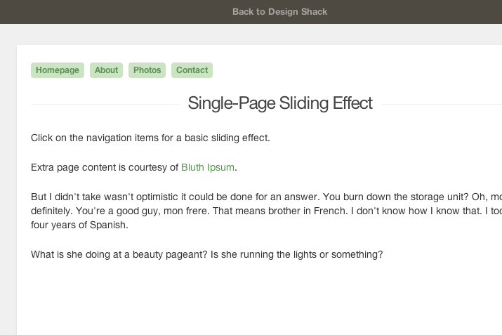
In this tutorial I want to demonstrate how you can build a custom sliding navigation with jQuery. There are many alternative plugins which provide these features and will also save time. But I want to show how we can make this effect using only jQuery and the scrollTo plugin for optimized performance. Check out my live sample demo to catch a glimpse of what we will be making.
Getting Started
First I’ve downloaded a local copy of jQuery to keep with the other script files. Also we need a copy of the jQuery.scrollTo plugin which is a single .js file. I have created two alternate files index.html and styles.css for the page structure. We can break down the main contents first.
<!doctype html><html lang="en-US">
<head>
<meta charset="utf-8">
<meta http-equiv="Content-Type" content="text/html">
<title>Single Page Sliding Layout - Design Shack Demo</title>
<meta name="author" content="Jake Rocheleau">
<link rel="shortcut icon" href="http://designshack.net/favicon.ico">
<link rel="icon" href="http://designshack.net/favicon.ico">
<link rel="stylesheet" type="text/css" media="all" href="css/styles.css">
<script type="text/javascript" src="js/jquery-1.10.2.min.js"></script>
<script type="text/javascript" src="js/jquery.scrollTo.js"></script>
</head>
The heading contents should be straightforward with nothing overly complicated. The index file uses an HTML5 doctype along with the stylesheet and the two JS files we downloaded. Obviously there are alternatives for customizing the scroll effect, but in this situation it is much easier to implement a plugin. Inside the page HTML we can see how the navigation is setup.
<div id="w">
	<div id="content">
		<nav id="stickynav">
		<ul id="nav" class="clearfix">
			<li><a href="#topbar">Homepage</a></li>
			<li><a href="#about">About</a></li>
			<li><a href="#photos">Photos</a></li>
			<li><a href="#contact">Contact</a></li>
		</ul>
		</nav>
All of the page is contained inside a wrapper using the ID #w. Another div #content marks the inner content on the page. This fixed navigation is kept within the page content for my demo, but you could theoretically move this anywhere else that fits nicely. Since it will be fixed you can always have the menu scrolling right along with the user no matter what placement.
The container #stickynav is used to keep all of the internal elements on top of the page content. I am using the CSS z-index property along with internal floats on all the list items. Notice the HREF values all point towards a hash sign located somewhere else on the page. We can use this value to determine where our slider should go.
Internal Content
After closing the navigation block we find a small number of content sections. There is a lot of extra spacing between content, just so you can see how it would behave in a typical webpage. Each block container is using the HTML5 <section> element along with a class name .section.
<section id="about" class="section">
<h2>About Us</h2>
 .... </section>
The class is used for duplicate styles found in each of the content areas. It will save room in the stylesheet when copying over multiple properties for each element. By targeting the section ID we could apply unique backgrounds, text colors, box shadows, and other similar effects.
This method can include as many internal content sections as you need. Although the navigation menu can eventually grow too wide. In this case it could also be placed at the very top as a fixed navbar. I kept it within the content div so we can see how the solution works built around a page template. Let’s jump into the CSS styles for more detail.
CSS Page Design
I really wanted to distinguish between the top bar and this fixed sticky navigation. We could have fixed the very top brown navbar which also holds a link, but this can eat up a small portion of the layout. Instead I’ve created a new unordered list and styled each link to float along next to each other – keeping the menu tighter and more compact.
#topbar {
	background:#4f4a41;
	padding:10px 0 10px 0;
	text-align:center;
	height:36px;
	overflow:hidden;
	-webkit-transition:height 0.5s linear;
	-moz-transition:height 0.5s linear;
	transition:height 0.5s linear;
}
#topbar a {
	color:#fff;
	font-size:1.3em;
	line-height:1.25em;
	text-decoration:none;
	opacity:0.5;
	font-weight:bold;
}
#topbar a:hover {
	opacity:1;
}
#stickynav {
	display:block;
	height:35px;
	width:100%;
	z-index:9999;
}
#stickynav #nav {
	position:fixed;
	z-index:9999;
}
#stickynav #nav li {
	display:inline;
}
#stickynav #nav li a {
	display:block;
	float:left;
	margin-right:8px;
	font-size:1.2em;
	font-weight:bold;
	padding:5px 7px;
	background:#cce4c4;
	-webkit-border-radius:4px;
	-moz-border-radius:4px;
	border-radius:4px;
}
#stickynav #nav li a:hover {
	text-decoration:none;
	background: #d8f0d0;
}
Looking at the container #stickynav you’ll notice this will span the entirety of the page width. Using a transparent background it certainly isn’t noticeable, but keep this in mind since you can expand the navigation even wider to fill the outer page wrapper.
Another interesting part of my stylesheet has the form inputs and page containers. These rules are all located at the bottom of the file along with typography updates. Notice how each header is centered on the page to offer space to the side for these navigation items. It wouldn’t be difficult to realign these headers to the right side giving even more space for navigation links.
form .basic {
	display:block;
	font-size:1.5em;
	color:#555;
	font-family:Arial,Tahoma,sans-serif;
	padding:4px 6px;
	margin-bottom:10px;
}
form .basictxt {
	display:block;
	width:550px;
	height:180px;
	font-family:Arial,Tahoma,sans-serif;
	color:#666;
	padding:5px 8px;
	font-size:1.6em;
	line-height:1.4em;
}
/** page structure **/ #w {
	display:block;
	width:750px;
	margin:0 auto;
	padding-top:30px;
}
#content {
	display:block;
	width:100%;
	background:#fff;
	padding:25px 20px;
	padding-bottom:35px;
	-webkit-box-shadow:rgba(0,0,0,0.1) 0px 1px 2px 0px;
	-moz-box-shadow:rgba(0,0,0,0.1) 0px 1px 2px 0px;
	box-shadow: rgba(0,0,0,0.1) 0px 1px 2px 0px;
}
I don’t have the contact form submitting anywhere but I did want it to have some decent custom styles. Certainly nothing special but it does reset the default fonts and colors. Also if you need to expand the central content area you can find the width: 750px property attached onto the outer wrapper. Nothing out of the ordinary but it is good to understand these basic styles.
Smooth Scrolling with jQuery
Now this final block of code is pretty simple even if you hardly understand scripting. I have added a new tag before my closing </body> which targets the fixed nav anchor links. Whenever a user clicks we pull out the hash value and immediately scroll to that page section.
$  (function(){
	$  ("#nav a").click(function(e){
		e.preventDefault();     $  ('html,body').scrollTo(this.hash,
		this.hash);
	});
});
The jQuery .click() method includes a parameter for the event handler. With this parameter we cancel the default behavior so the browser will not jump down the page. Then jQuery scrollTo is run targeting the current link value this.hash.
The effect is simple yet handy because you can implement the page concept very quickly. I am sure there are other similar plugins related to jQuery scrollTo, and if you have the time it can be fun toying around with alternatives.
Final Thoughts
Simpler websites don’t require a convoluted menu system and utilizing techniques like this can help when organizing content. I do hope this tutorial can provide some use for developers creating a simple webpage layout. jQuery is very extensible and it’s easy to expand this codebase into your own jQuery plugin. Feel free to download a copy of my source code and see if you can incorporate this effect with any future projects.