March 29, 2019 by Christopher Jan Benitez Instagram started out as a place for people to share and publish photos. It eventually gave way to professionals where they can showcase their creative skills and talents. Because of this, a growing number of designers now use Instagram to showcase their pieces to the world. Not only… Continue reading The 10 Most Awe-Inspiring Web Designers on Instagram
Tag: UX
The DOs & DON’Ts of interviewing senior UX designers
Committing to a process You probably experienced it yourself; at the last minute, the HR department sends you an invite to join a job interview which will take place in the next hour. In your invite, you will find a few links to the candidate’s portfolio, CV and perhaps a LinkedIn profile. You take ten minutes… Continue reading The DOs & DON’Ts of interviewing senior UX designers
Differences Between UI Designer and UX Designer: What Does Each One Do?
For many people who don’t know much about the tech world, understanding what UI designers and UX designers do is a bit challenging. From early times, designers were known to be in the clothing and furniture industry. But the industry has grown over time to many more areas including tech. The evolution of technology as… Continue reading Differences Between UI Designer and UX Designer: What Does Each One Do?
Can we gain the user’s trust for digital apps through UX design?
The Fundamentals of trust in UX design In my previous article I described what trust exactly is, and what the fundamentals of trust are. Using these fundamentals (Benevolence, Integrity, Credibility, and Reliability) and knowing what UX contains, we can make a relationship between the Fundamentals of Trust and UX design. 1. Benevolence in UX “UX is, by… Continue reading Can we gain the user’s trust for digital apps through UX design?
Best UX/UI tools of 2019: Choose yours to create awesome work for your clients
Posted · Category: Best Collections Software companies have long worked to produce products that are as bug-free as possible. They knew that doing so will save them money in the long run, and create greater user satisfaction as well. These same companies have been slower to recognize one crucial thing. It is that working to… Continue reading Best UX/UI tools of 2019: Choose yours to create awesome work for your clients
10 Best React Native App Templates of 2019
React Native has been gaining in popularity for one obvious reason: it allows developers to target different mobile operating systems with a single codebase. This means that you no longer have to build the same app for both iOS and for Android from scratch, and you don’t have to forgo one or the other platform. Now you… Continue reading 10 Best React Native App Templates of 2019
My passion for UX explained through my other life passions
Today, I had a mind-changing interview. And it all started with the simple question of… “What makes you stand out as a Designer?” I blurted out some cookie-cutter response like “I am someone who is extremely empathetic and detail-oriented.” Suffice to say, my interviewer was not impressed. Suffice to say, I did not stand out to him… Continue reading My passion for UX explained through my other life passions
Best Practices for Better Mobile commerce UX
With the share of mobile users advancing exponentially, the number of users who shop via mobile phones is also increasing drastically. According to eMarketer, online sales through mobile devices would amount to $3.5 trillion by the end of 2021. It is a huge segment of total revenue and the total number of eCommerce shoppers. Mobile… Continue reading Best Practices for Better Mobile commerce UX
3 things I wish UX designers would do when in a new job
Anirudh B BalotiaaBlockedUnblockFollowFollowing Jan 30 ONE: Be curious 24×7 Photo by Joseph Rosales on Unsplash If you are a parent, this is fairly easy. Just observe your child. If you have a child who is less than 3 years, you will be surprised how curious they are. When joining a new place of work, have this kind… Continue reading 3 things I wish UX designers would do when in a new job
Dark mode, white space, brain surgery, Sketch 53 — and more UX this week
Do I have to add a dark mode now? ›Drawbacks and benefits of adding a dark mode to an app or website. Why isn’t the internet more fun and weird? ›Sure, we have Dark Mode now. But where did all the glitter go? Humans, not users ›UX has a big problem: instead of seeing human… Continue reading Dark mode, white space, brain surgery, Sketch 53 — and more UX this week
UX designer’s identity crisis
Kaja Laura ToczyskaBlockedUnblockFollowFollowing Jan 22 If you’ve worked as a UX designer for at least 2 or 3 years now, you must have read all these stories and tweets about how UX design is dead, it doesn’t really exist, or how the industry is changing and UX design will be dead in a few years… Continue reading UX designer’s identity crisis
Productivo time management — a UX case study
After hearing many of my friends and co-workers talk about forgetting assignments or their problems balancing school with work, I made my next UX case study a daily planner app. As someone who lives with a bullet journal attached to her hip, I wanted to understand why the people around me didn’t use the myriad… Continue reading Productivo time management — a UX case study
The Benefits of User Experience in Web Design
Every small-scale business or large-scale enterprise requires a website as it helps in achieving business goals, provide essential information to the prospective client and assists in improving the online presence of the company. These websites differ according to the business specification but what’s important is that it should offer an excellent user experience or UX.… Continue reading The Benefits of User Experience in Web Design
Stop being clever — a UX case study
My answer: “Be the opposite of clever… show the painfully obvious.” Allow me to explain with a story: Imagine you work with an engineering team. Both you and the team are very close to the product. You both know where the bugs lie. The team has outlined each bug in a ticket. Time after time… Continue reading Stop being clever — a UX case study
Facebook’s language settings — a UX writing case study
Anh Thu NguyenBlockedUnblockFollowFollowing Dec 23 Photo by NordWood Themes on Unsplash When I was scrolling my feed on Facebook, I came across something oddly unfamiliar. I saw a post from a Vietnamese food page that was written in English, and underneath, it says ‘Rate this Translation’ with a gear icon. I found this encounter strange because… Continue reading Facebook’s language settings — a UX writing case study
Our favorite UX initiatives this year
Caio BragaBlockedUnblockFollowFollowing Dec 15 Fabricio and I are big believers in the power of the design community: sharing knowledge, honing our practice, and bringing a critical perspective on our work. Of course, like any industry that is expanding and maturing we have our growing pains, but when we put our energy as thinkers and makers… Continue reading Our favorite UX initiatives this year
Top 7 UX Topics All Beginners Need to Know
User experience is the most important element and the success of your design depends on it. UX is everything that happens when the user interacts with your design, such as their reactions, emotions, attitudes and behaviors. The better it is, the higher are your chances at making a sale or increasing your revenue. Basically, user… Continue reading Top 7 UX Topics All Beginners Need to Know
How Technology Has Impacted the Four Orders of Design
Unless you are a professional designer who has remained current in your respective field, you may not be familiar with what many of today’s designers know as the “Four Orders of Design”, as developed by Professor Richard Buchanan and extensively written about in his book of the same name released in 1999. However, if you… Continue reading How Technology Has Impacted the Four Orders of Design
Five pitfalls to avoid when writing UX research questions
UX research, as a discipline is growing rapidly. When I started my UX career, the few UX researchers I knew about were all based in Silicon Valley and were almost always from a HCI background. Things have changed, for the better, with UX research evolving as a separate discipline and more people becoming UX researchers.… Continue reading Five pitfalls to avoid when writing UX research questions
Nappy: a digital solution to nap at work — a UX case study
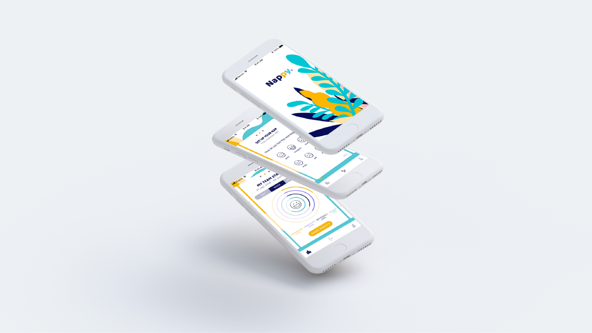
Nappy iOS app design During my bootcamp to learn UX/UI at Ironhack Paris, I had to create a digital solution in the wellness field. I decided to focus on tiredness at work. In less than two weeks, my goal was to identify the problem regarding how to deal with tiredness at work & solve it. To… Continue reading Nappy: a digital solution to nap at work — a UX case study
The overlap between designing and acting — and more UX links this week
Shared lessons for actors and user researchers › It’s a Monday evening and my first day of acting class at the Berkeley Repertory Theater. Jack, our instructor, starts our class off with a couple improv games and then goes over our schedule for the next 10 weeks. We don’t touch a play until Week 6.… Continue reading The overlap between designing and acting — and more UX links this week
Modernising the hiring process — a UX case study
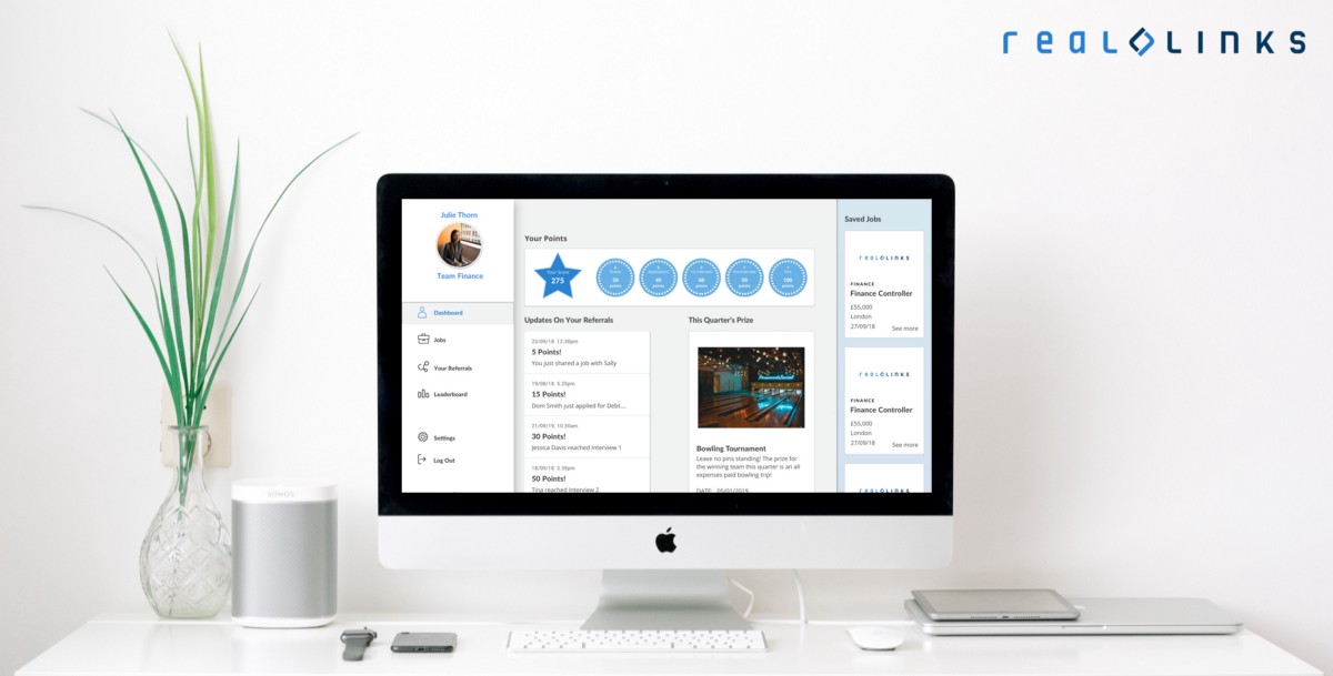
Competitor Analysis From the competitors we looked at 2 key insights were found: The most effective way employees were keeping up to date with their referrals was through continuous updates. The preferred methods were through notifications e.g. HR email updates, live job boards updates, and newsfeeds. A few of the competitors we looked at also… Continue reading Modernising the hiring process — a UX case study
Benchmarking in UX research
Credit Many user researchers, especially those who focus on qualitative methods, are often asked about quantifying the user experience. We are asked to include quantitative data to supplement quotes or video/audio clips. Qualitative-based user researchers, including myself, may look towards surveys to help add that quantitate spice. However, there is much more to quantitative data… Continue reading Benchmarking in UX research
Hidden privilege in design — and more UX links this week
The hidden privilege in design ›By Hareem Mannan. “Did you get anyone else’s insight on this project? Was it just you all? Have you considered how that might be limiting at all?” I felt the question permeating through every fiber of my being, reverberating in my mind until it was the only thought I had.… Continue reading Hidden privilege in design — and more UX links this week


