Dec 23

When I was scrolling my feed on Facebook, I came across something oddly unfamiliar. I saw a post from a Vietnamese food page that was written in English, and underneath, it says ‘Rate this Translation’ with a gear icon. I found this encounter strange because I used to read it in Vietnamese. It was obvious to me that Facebook auto-translated this, but I never asked it to. I know I set the default language to ‘English’ 10 years ago, when I set up my Facebook account, but that doesn’t mean I wanted literally everything to be in English. I want to read my Vietnamese posts in Vietnamese, and my French posts in French because I love reading the original tone of a language.
This made me go on the ‘Language Settings’ page to see what I can fix. Here’s what I found:
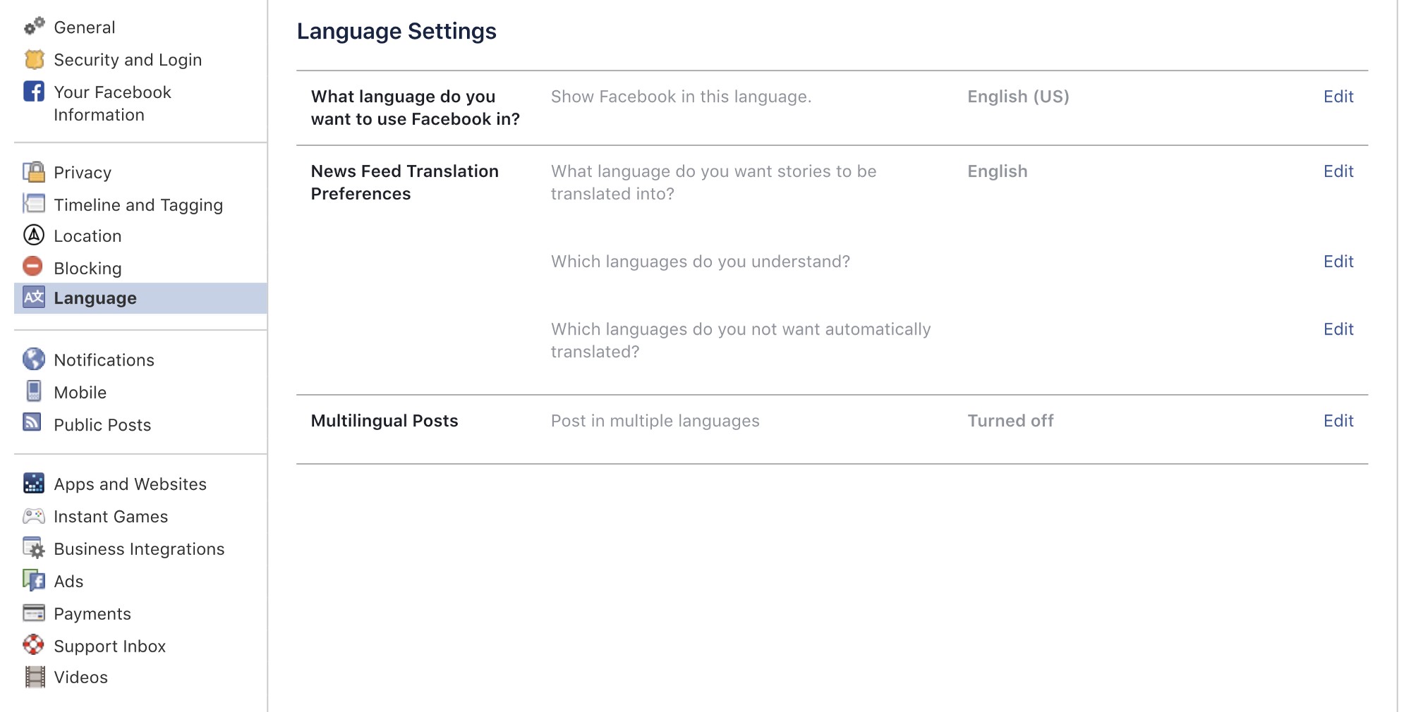
This page is a little different from what I remembered because ‘Language’ used to be part of ‘General’. I like the idea that it is now a separate tab but I didn’t find it intuitive when trying to achieve what I want, which is to turn off auto-translate for French and Vietnamese. As a word-nerd as I am, I decided to make this a UX Writing Case Study.

Problem
Here’s my first impression and analysis of the page:
Green = Good
Red = Issues/Questions
Blue = Other mental notes
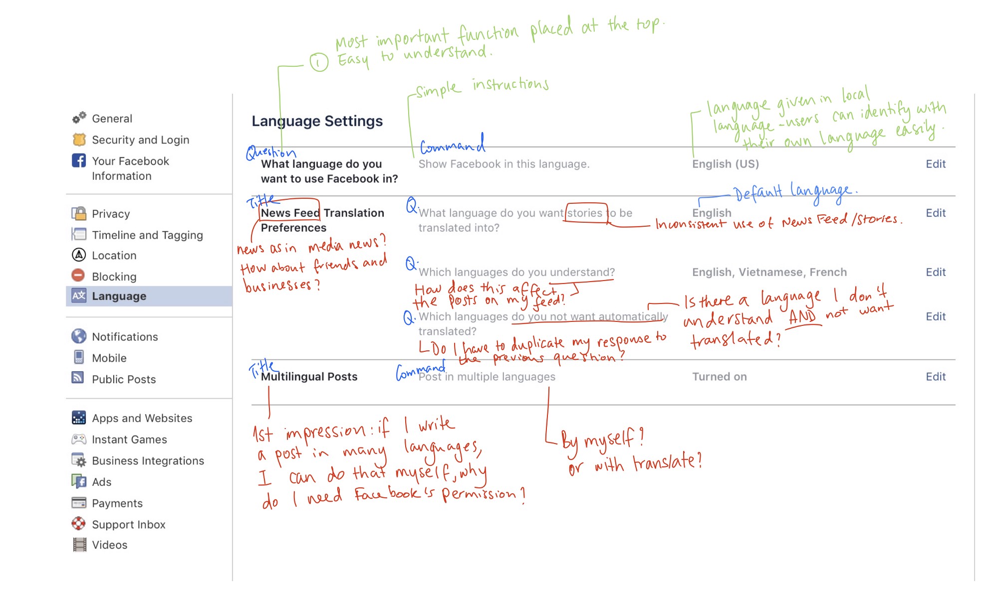
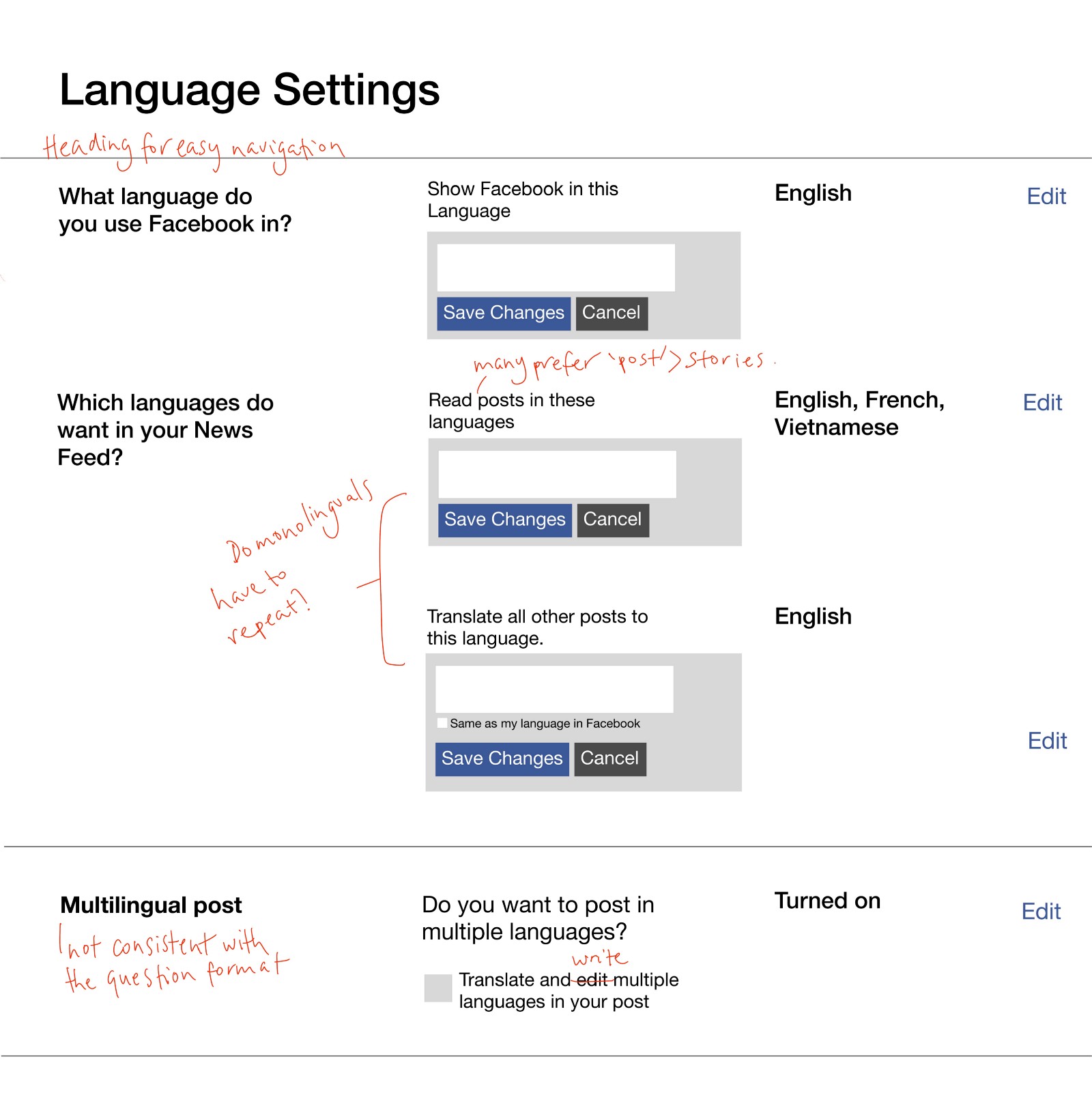
Structure — If you notice the sentence types of each column, it’s rather inconsistent. The bold letters consists of a Question and 2 Subheadings. The grey copy in the 2nd column consists of 2 Commands and 3 Questions. Is this making me uncomfortable because I’m a creature of formality? Is this mix bag of questions, commands and titles helping anyone navigate here?
‘What language do you want to use Facebook in?’ I understood this question right-away because it’s straight forward and self-explanatory. It’s also great that the language option is written in the local alphabet for better identification.
‘News Feed Translation Preferences’ — The ‘News’ threw me off a little. I follow a lot of media sites around the world so I wasn’t unsure if we’re talking about media news (like CNN, BBC, The New York Times), or news including friends’ and Business posts too? I checked the left sidebar of the Facebook homepage, which I barely pay attention to, and I guess the correct terminology to the Everything Feed is called the ‘News Feed.’
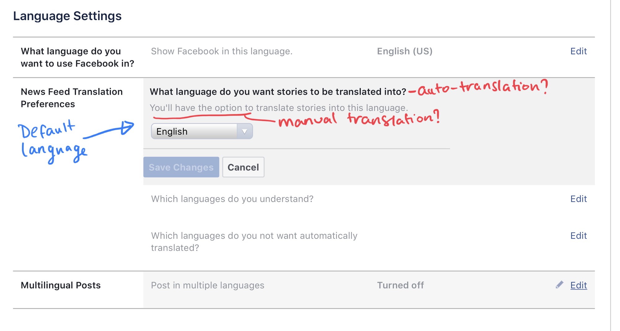
‘What language do you want stories to be translated into?’ ‘Stories’? How did we move from ‘News’ to ’Stories’. And when did the term ‘Facebook post’ became a ‘story’. Aren’t stories for Medium? And tweets are for Twitter? Facebook should be proud that it invented the ‘post’. ‘Stories’ sounded unfamiliar to my ear. I’m still unsure if we’re talking about long story-like news articles, or simply just ‘post’.
When you click on the ‘Edit’ button, there’s a short explanation of what the function does — ‘You’ll have the option to translate stories into this language.’ It explains well that this is the ‘default language’, and the ‘you’ is friendly, so that’s good. However there’s seem to be a clash between auto-translation and manually pressing the ‘See Translation’ option. If I have previously experienced auto-translation, why would they say that this is an ‘option’?
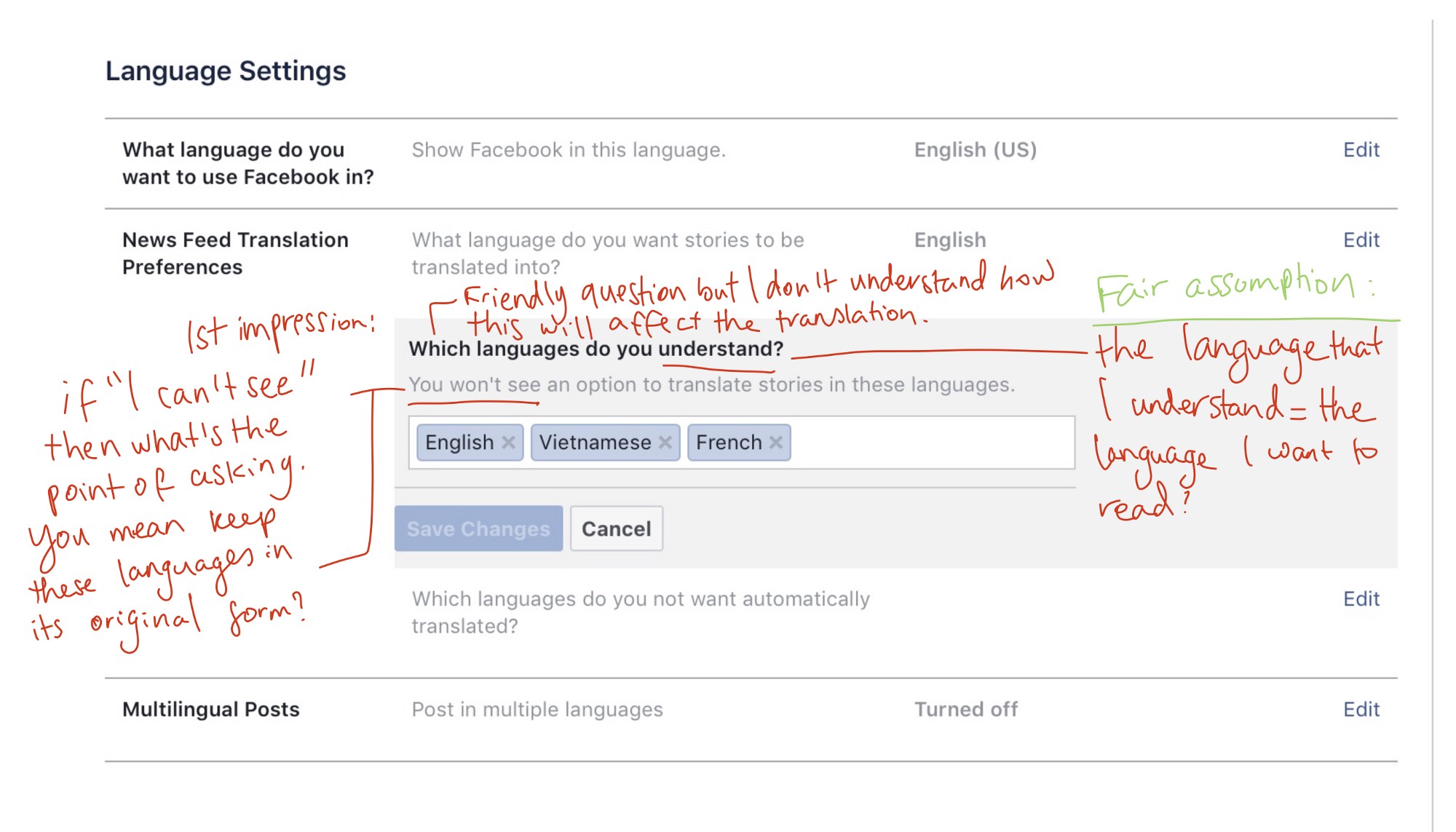
‘What languages do you understand?’ This question caught me out of the blue because the wording is not related to the ‘News Feed Translation’. Will my answers to this question affect the language of my feed? I admire that it sounded friendly, just like how Facebook shapes their brand voice. But in a ‘Settings’ scenario, where we expect the tone to be serious, I’m not sure if the vague/conversational tone is relevant here.
When you ‘edit’ this function, Facebook explains that ‘You won’t see an option to translate stories in these languages.’ It sounds like I’m going to miss out on something if I use this, because the negative of the ‘You won’t’ sounds discouraging. This contradicts with the open-mindedness of the original question (‘Which languages do you understand?’).
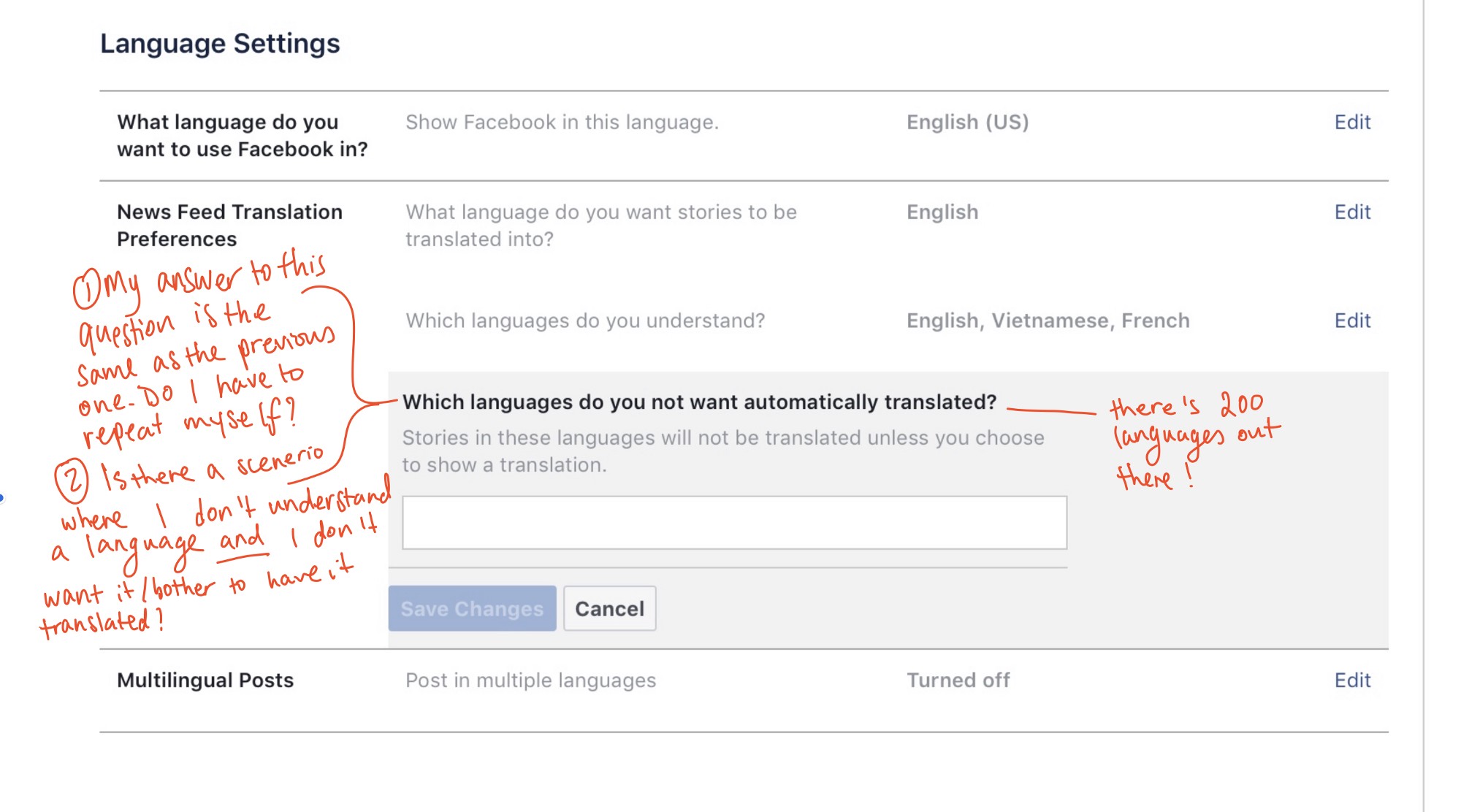
‘Which languages do you not want automatically translated?’ This question is similar to the previous one, so do I have to duplicate my responses? I’m trying to think of a reason why this question is asked in the beginning. Could there be a scenario where a person doesn’t like a certain language and doesn’t want it translated. There’s something uneasy about the negatives here…
‘Multilingual Posts’ — This feature lets you ‘Write posts in multiple languages’. It’s a cool function but not worded very well. If I want to ‘write’ a post in multiple languages, I can do that myself. In fact, I’ll do that better than any translation can so why do I need Facebook’s permission to do so? I turned it on and gave it a shot anyways.
This is what happens when your ‘turn on’ the ‘Multilingual Posts’ option.
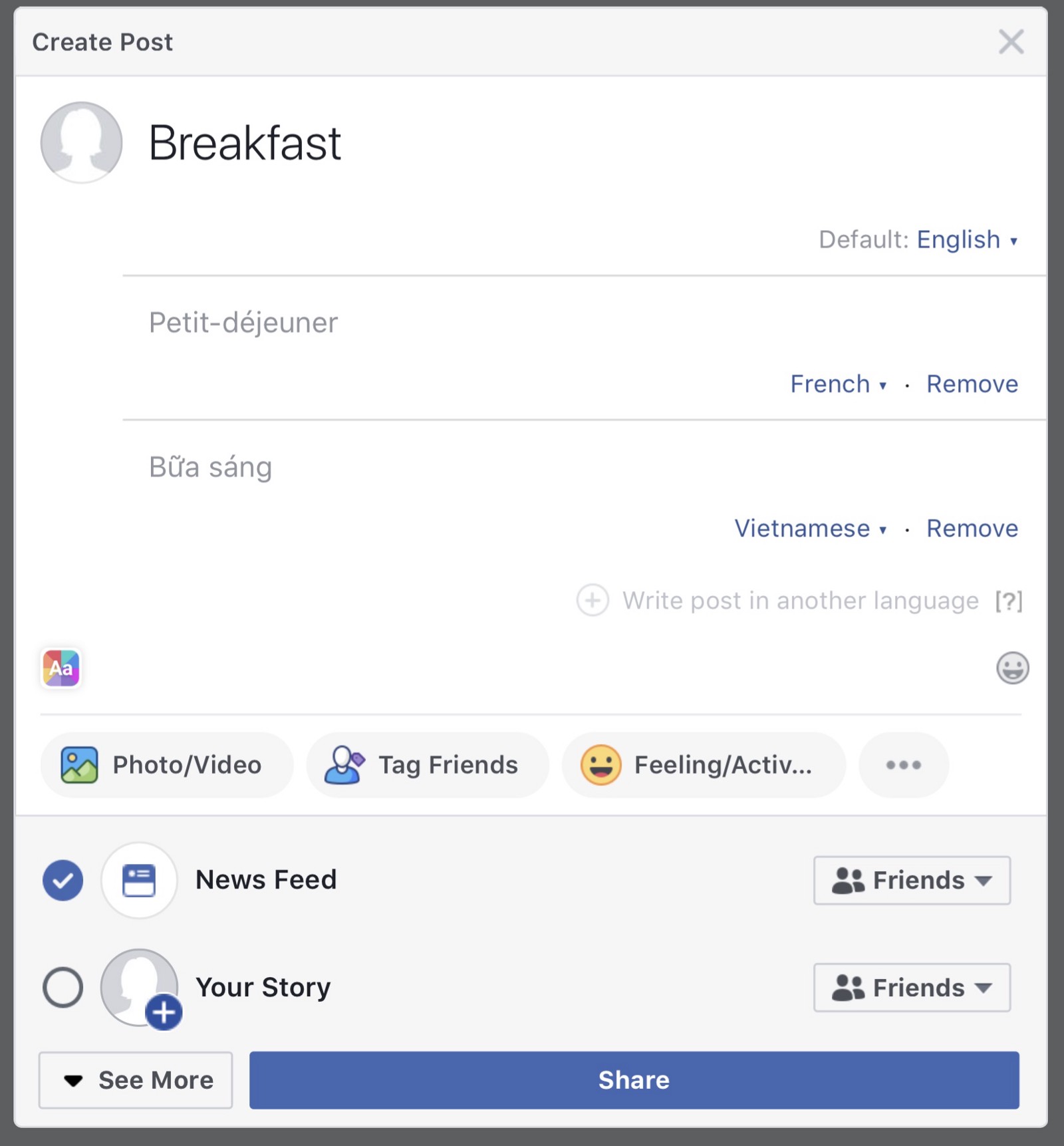
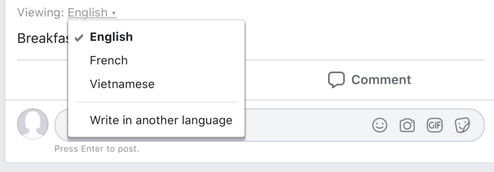
Facebook gives you an option to translate your words to as many languages as you want. It also allows customization of other languages for better translation.
When we make a post, you can change the ‘Viewing’ to see other languages. I was instantly hooked to this idea because now I can write more personalized notes to my family and friends abroad. Amazing!
However, I do have some questions I have in mind:
- Why can’t the translated languages be stacked on top of one another like what Justin Trudeau is doing here? It’s better identification of the language you want, better comparison if you’re trying to learn a language, and less buttons pressed.

- Can you have an option to translate to all the languages available? It would be a better use of the ‘Viewing’ to see 200 languages as opposed to finding 2–3.
Approach
Trying to understand Facebook’s Approach
I’m still quite unsure as to why Facebook asks “Which languages do you not want to automatically translated?” because I couldn’t think of a situation where I have to use it. So I made this Venn diagram to try to understand Facebook’s thinking.
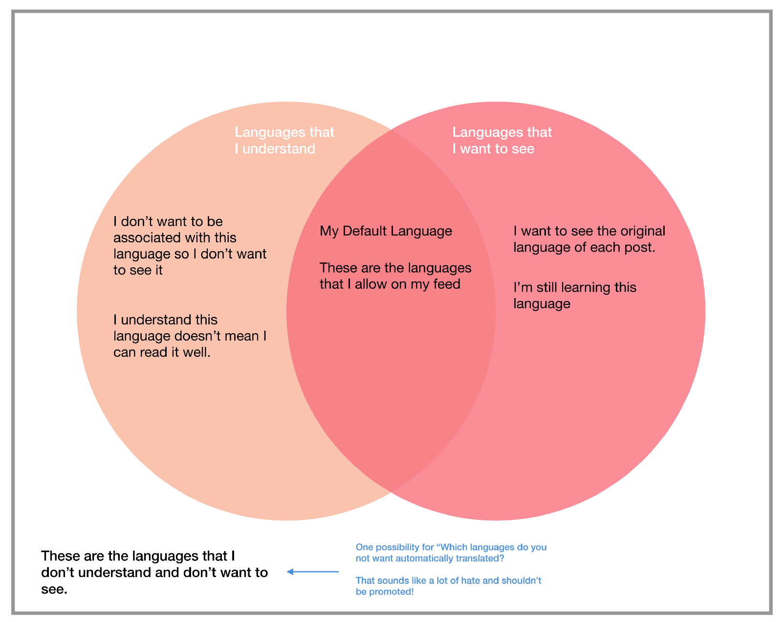
I’ve also made a list of the ways we use language. When we personalize our Language Settings, it is important to understand how different users approach language in their lifestyle. Some people only know one, whilst other know many.
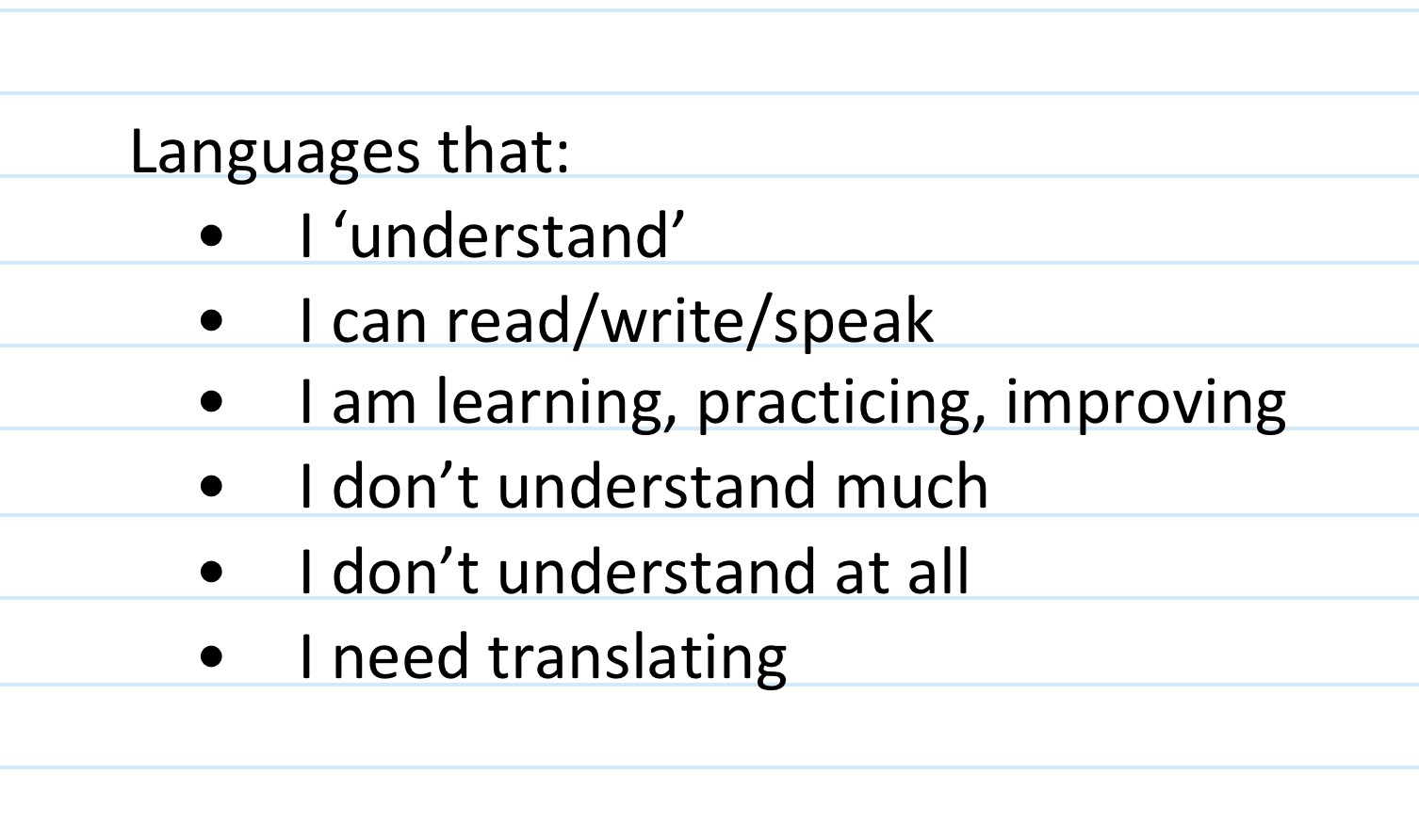
Although Facebook does not categorize language into such detail, it is important to be inclusive of all types of users. This made me think about 3 key user-centric questions from this Guy Ligertwood article. He talks about how asking these 3 questions help you get to know your users’ problems and select the right Tone for your product.
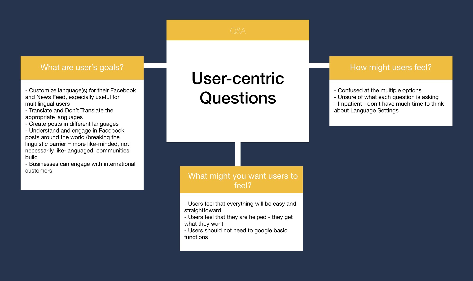
The information above is taken from late-night brainstorming and talking to friends. I decided the tone of should be informative. It also gave me a clear idea of what I’m trying to approach, which led me to formulate a mission statement for Facebook’s Language Setting: “To make languages convenient for users so they can understand anything”
I found this quote when I asked a friend what he might use the Language Settings for. It’s funny how these light-bulb moments appear out of spaces that you never expect to happen. The quote really hit me like a wrecking ball because it suddenly gave me a sense of direction in what I’m trying to achieve.
It also taught me one thing: always have a clear goal in whatever product you’re trying to make. Bonus points if you can summarize that goal into a mission statement. It’ll help you a long way.
Content-First Design
My first step to re-designing the Language Settings is through the ‘Content-First Design’ approach. This method acts as a guideline on how the content should be organized.
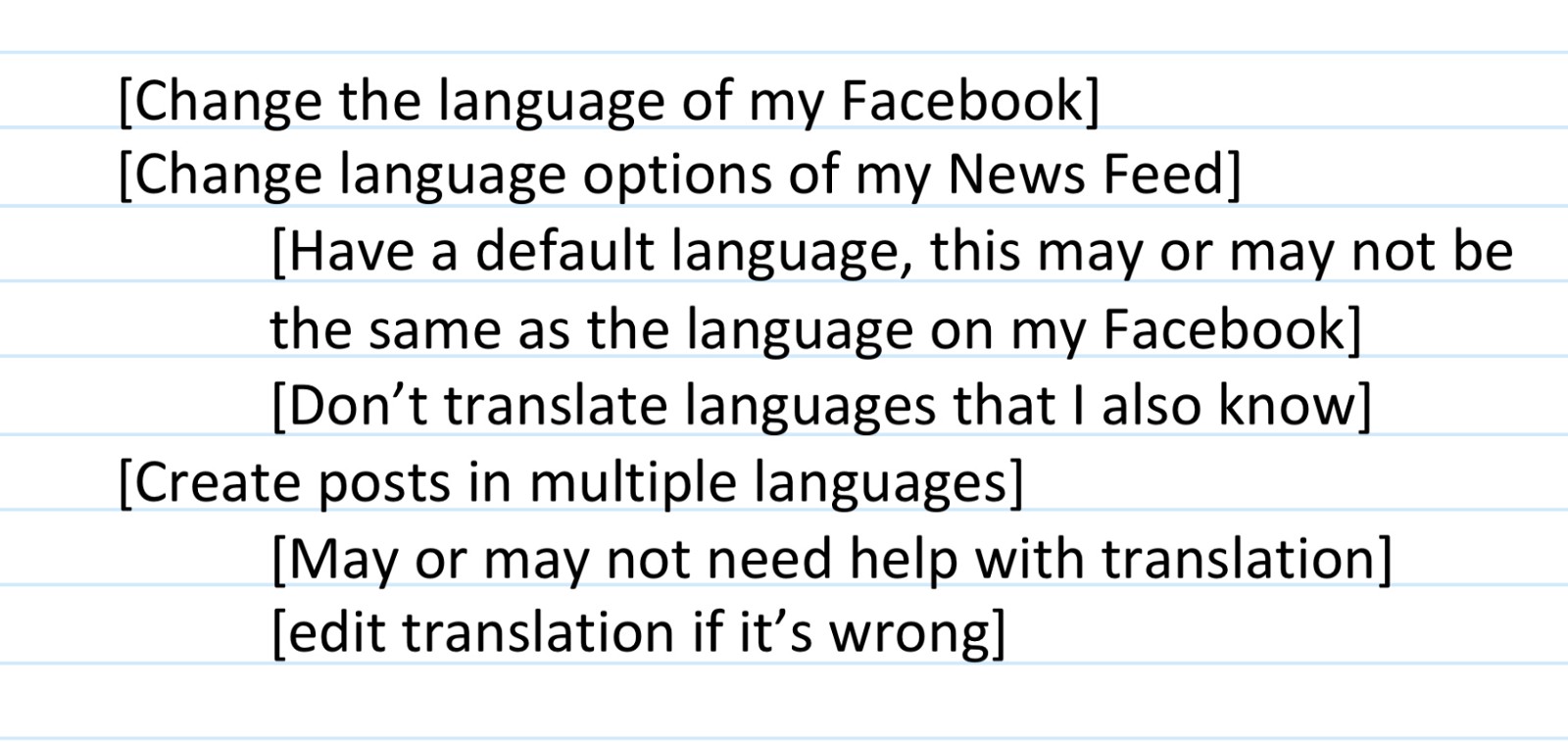
From this Content model, I made a mini User-Journey to humanize the reason behind each function.
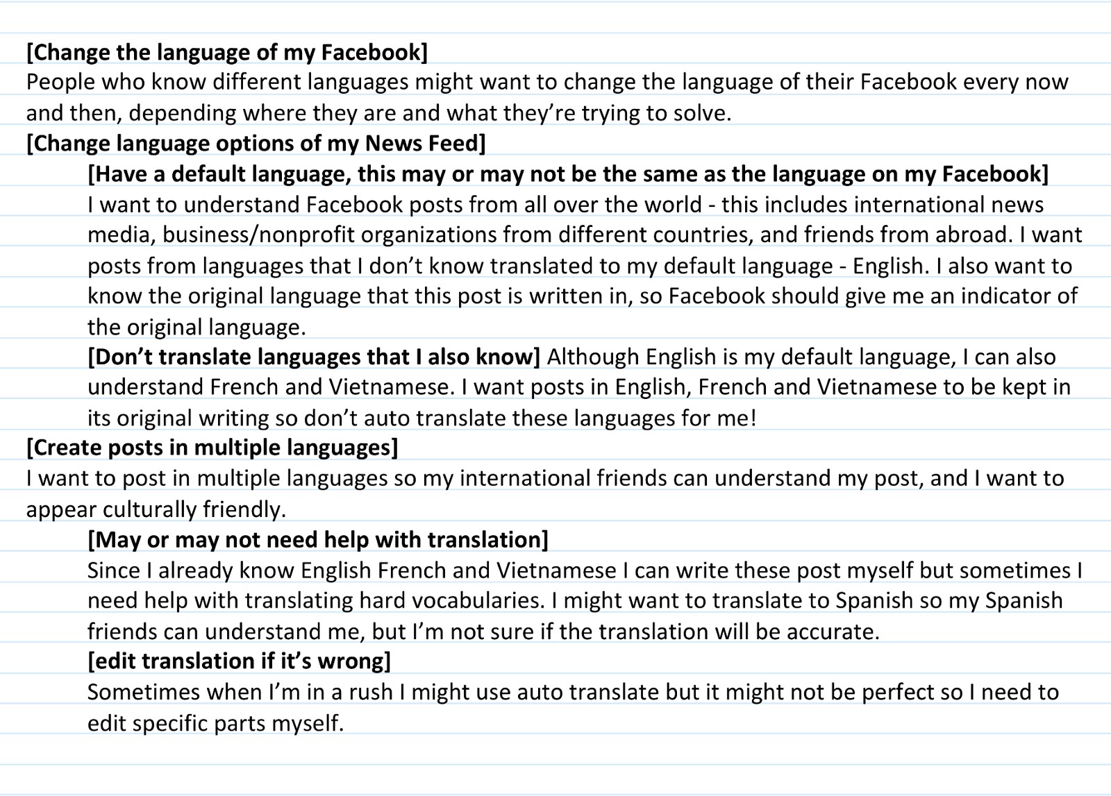
Process
My ‘Problems’ and user analysis gave me sufficient information to start the writing process. I always start by having a UX Writing Checklist.
UX Writing Checklist
Again, inspired by Guy Ligertwood, he states 4 things to remember when writing your copy.
To be successful your interface text needs to:
– Be clear
– Be concise
– Be useful
– Reflect your brand’s natural voice
I made 2 copies to experiment with 2 different types of structure, shown below. Everything in the light gray box (including the checkbox) appears when you click the ‘Edit’ button, just like the current interaction of the Language Settings. First drafts should only be the outline, or statements, of what you’re trying to achieve, not the final language. It should also give you a clear idea of the flow of the instructions.
Here are the differences:
- Heads and subheadings are place differently.
- Same interaction, but different outcome.
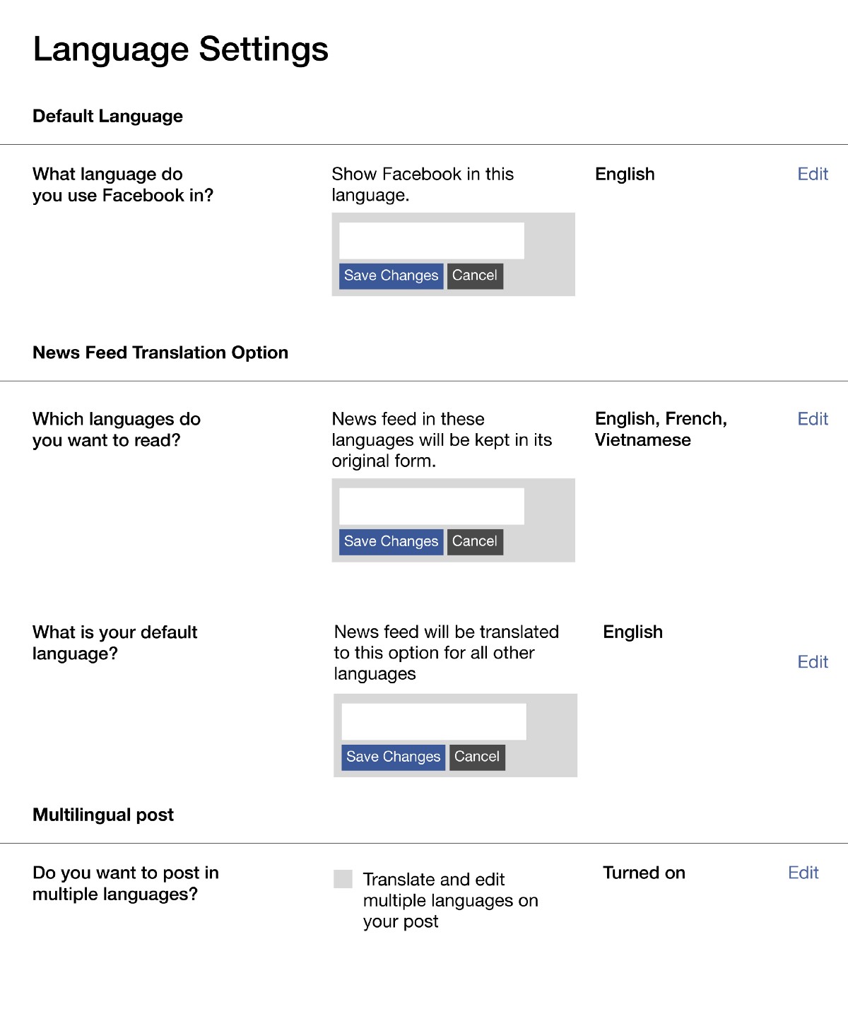
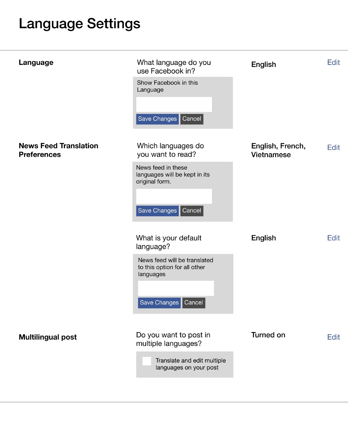
Checklist:
- Clear? (Somewhat)
- Concise? (Nope)
- Useful? (Pretty useful)
- Brand Voice? (Nope)
Identifying Facebook’s Brand Voice
My next step is to work on being ‘Concise’ and speaking the ‘Brand Voice.’ I learned about Facebook’s voice design through their Design’s Medium page. I found a great quote by a John Campbell article that says Facebook voice is:
“simple, straightforward and human — we use to talk to our community so that we create experiences that are clear, consistent and compassionate.”
Moreover, Facebook creates experience that is:
“more thoughtful, more human and better for the people using them.”
This sums up Facebook’s voice and tone very neatly and it is no doubt that we, as Facebook users, are aware of it too. On a different note, check out this UX Writing Case Study on Facebook’s policy. Here’s a screenshot of it:
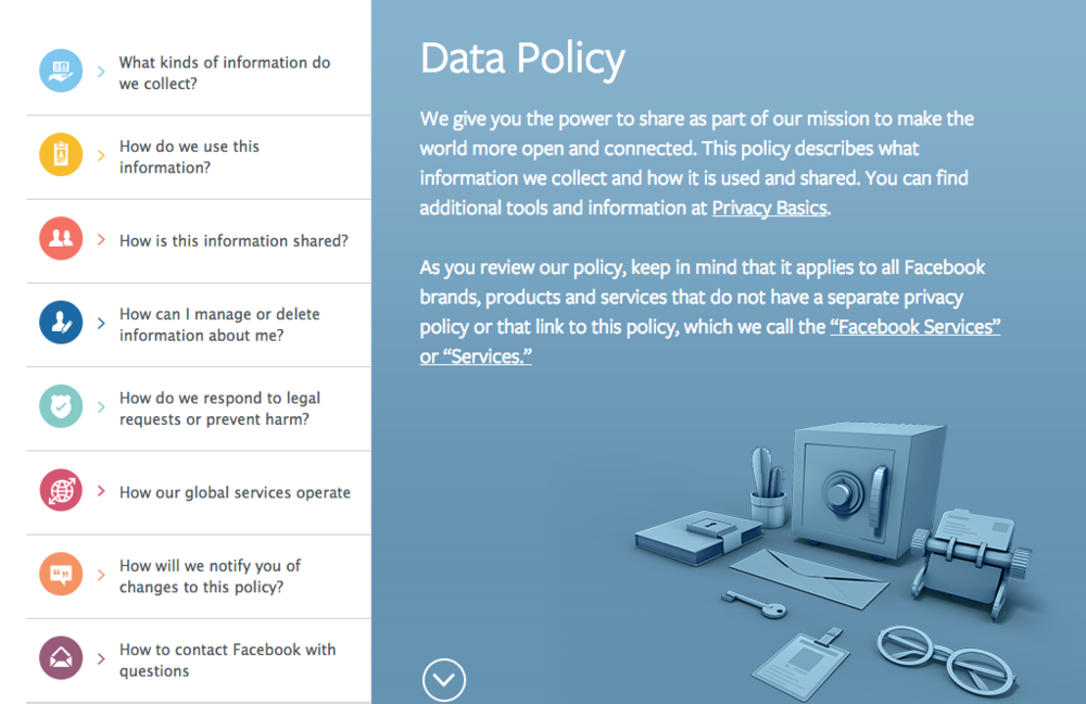
The language above really changed the way I look at Facebook’s voice design. On the side bar, it doesn’t give titles of each part of the Data Policy, it asks questions that we might have in our head. It also addresses them and us as ‘we’ and ‘you’, adding to the friendly, human tone.
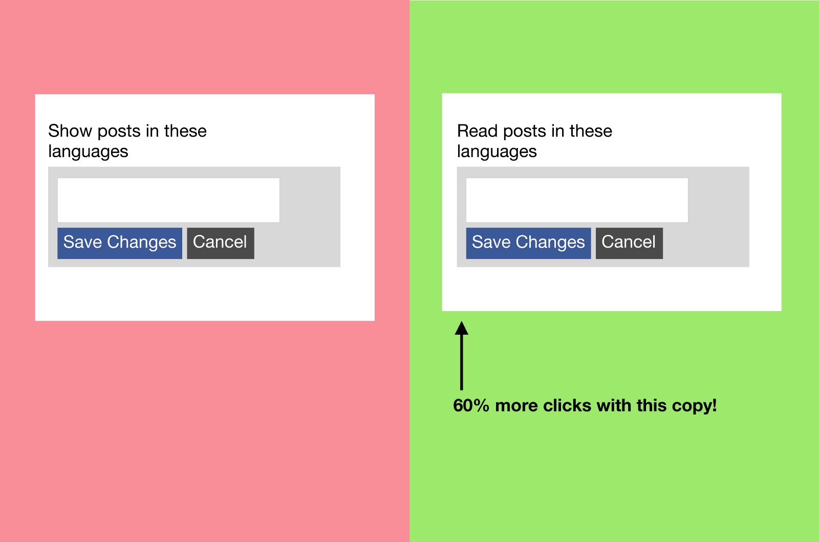
I attempted to use this ‘question’ format in my next draft to make the copy more human and concise. Again, I also made 2 copies — it’s just a habit that I make 2 of everything! Draft #1 is the one that makes sense, and Draft #2 is the ‘How can I make #1 better?’
Not much differences between the two:
- ‘Show’ and ‘Read’ in the second row, second column

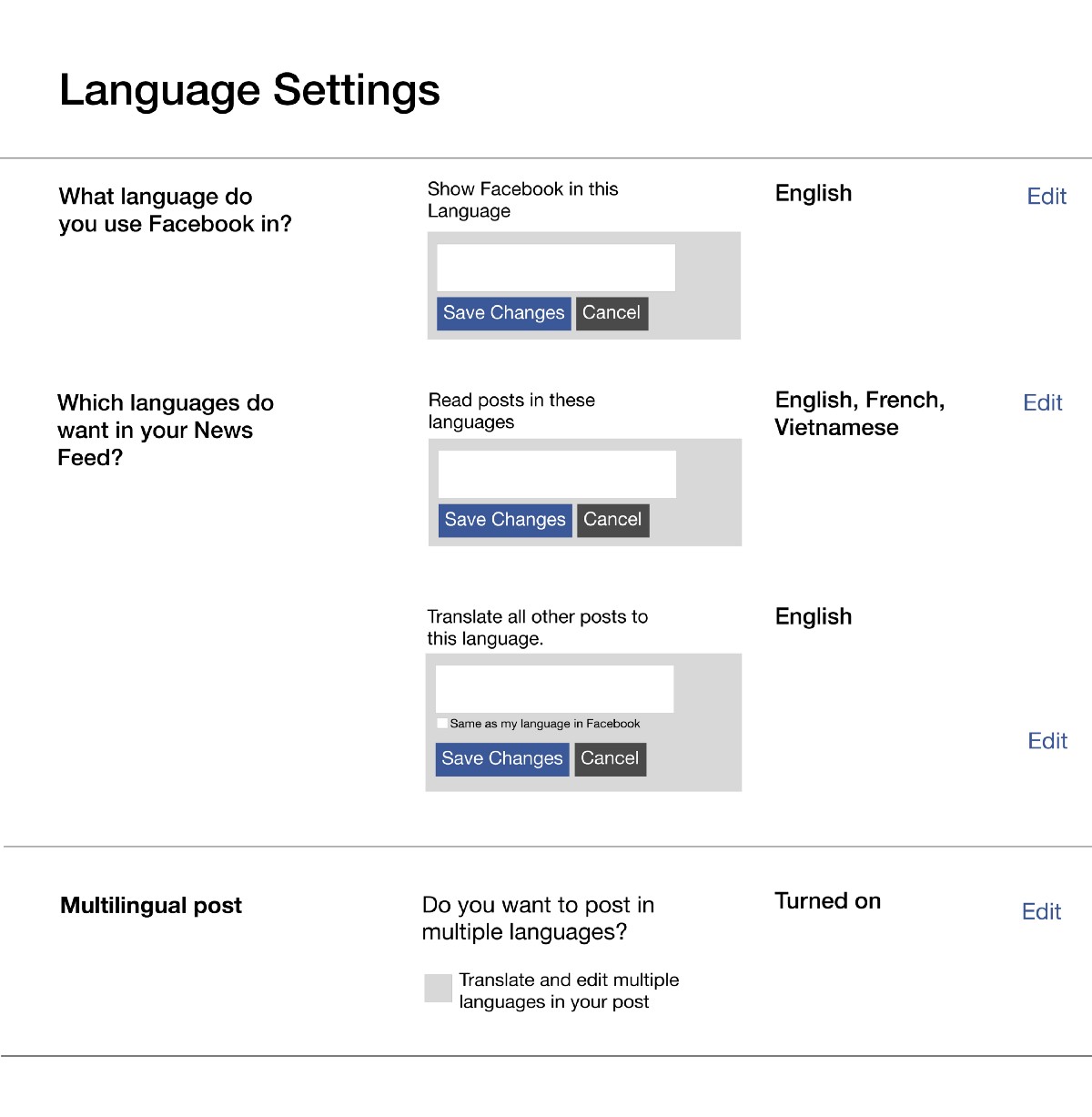
Checklist:
- Clear? (Yes)
- Concise? (Yes)
- Useful? (Yes)
- Brand Voice? (Yes)
I can’t decide between 2 copies, so this calls for an A/B testing. And I’m not sure if these copies are understandable to ‘new eyes’ so I’m going to need user feedback too.
A/B testing
I gathered some friends to a coffee shop and asked each of them to navigate through the copy, which I placed side by side on my iPad.
I took notes of their feedback here:
Final Design
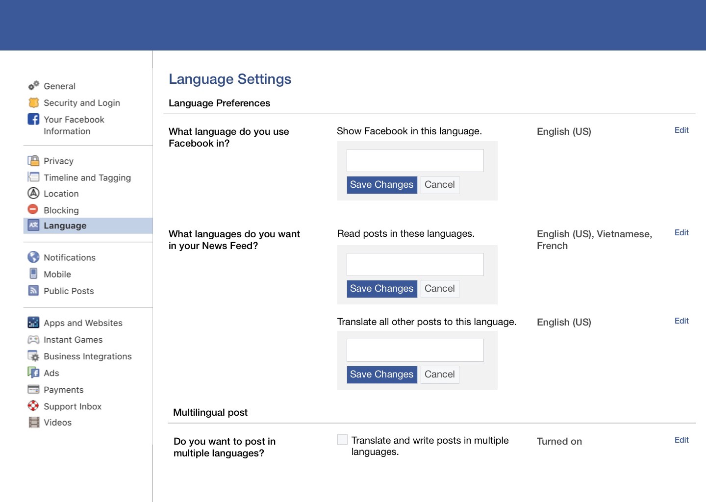
After countless hours of research and analysis, I made the final design of how the Facebook Language Settings should look.
Reflection
So why does it matter? Why is it important for Facebook to have a variegated language option? What started as finding an on-off button got me thinking of the global impact the social media is trying to make.
Language is something that is personal because it is a tool that we use to make sense of the world. However, language can also be a barrier when it comes to education or simply trying to understand another person’s point of view. For those who could read this, we sometimes take our English proficiency for granted because it’s an internationalized language. However for certain users, having a software that doesn’t support their language can stop them from reaching their goal. Whatever language you speak, we all deserve the opportunity to express our opinions and learn from others. Like I’ve said previously in this case study, we want to build communities based on like-minded groups of people, and not necessarily like-language.
Facebook is definitely upgrading the language game with its new Settings — it’s definitely changing the way we read and write with more language combinations. We used to think communication as a one-language exchange, but now with smarter translation and language readability, two or more individuals can interact without having a common language at all. Facebook is the bridging the communication gap that was once deemed impossible, and thus ‘bringing the world closer together.’
Last time I check Twitter, their mono-‘Language’ option is still in the ‘Account’ setting. So, next time you open your language option, don’t frown because it’s not a one-stop-shop, think about the 200 different languages that’s typing on Facebook everyday.
